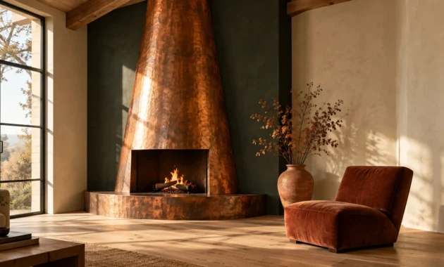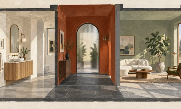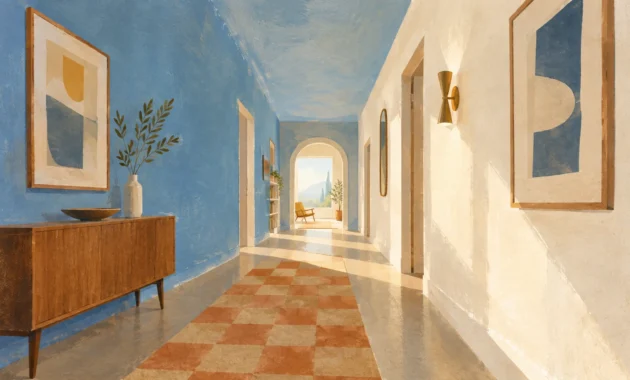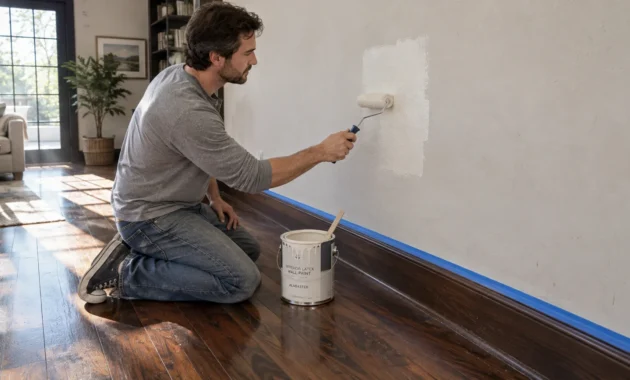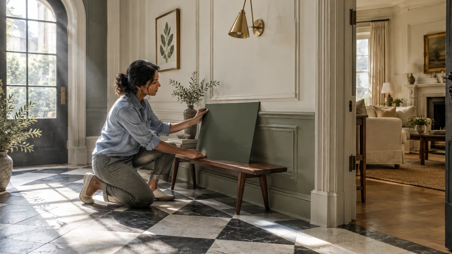
Black and white tile creates a sharp, graphic foundation that instantly commands attention in any interior space. Pairing this pattern with intentional wall colors softens stark contrast, elevating your home with tailored balance.
Whether you desire dramatic depth or sunlit serenity, deliberate paint choices unlock the architectural power of monochrome flooring. The ideal shade anchors your lighting and turns classic geometry into an artful statement.
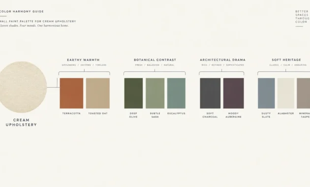
Explore eleven refined shades that transform checkerboard tile decor and intricate mosaics into timeless interior showcases.
Trend #1: Deep Forest Green
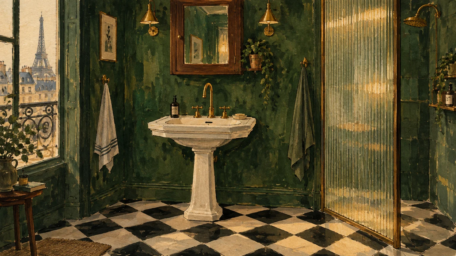
Deep forest green introduces an organic, biophilic anchor that tempers the geometric rigidity of monochrome stone. It evokes the historic grandeur of Parisian apartments while delivering fresh modernity.
This rich hue functions as a grounding neutral that softens high-contrast floors without competing for visual dominance. It allows crisp porcelain fixtures to pop with renewed brilliance.
When choosing bathroom paint colors to balance dark grout lines, prioritize undertones of moss and pine. These botanical pigments absorb excess glare and ground soaring ceiling heights effortlessly.
Pair forest green walls with unlacquered brass hardware, fluted glass, and warm walnut millwork. The warm metallic tones illuminate the paint, cultivating an intimate, sanctuary-like environment.
Apply an eggshell or satin finish to ensure moisture resistance while preserving rich, velvety depth across your walls.
This combination proves that natural tones can effortlessly tame formal checkerboard tile decor.
Trend #2: Warm Alabaster and Cream
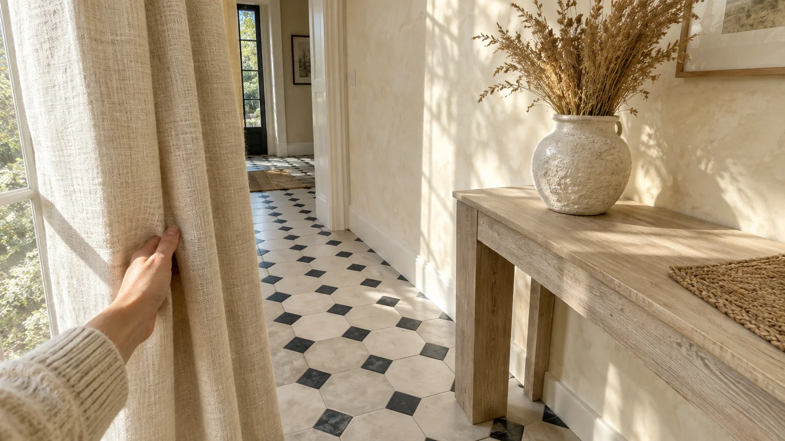
Stark white walls can make monochrome flooring feel sterile and cold under contemporary ambient lighting. Warm alabaster and buttery cream provide the subtle warmth needed to soften graphic contrast.
This tonal strategy exemplifies quiet luxury by prioritizing subtle texture over jarring visual competition. It catches natural daylight beautifully while wrapping your living areas in inviting comfort.
When curating wall colors for black tile borders, select formulas containing subtle yellow, beige, or linen undertones. These pigments bridge the visual transition between dark slate and bright ceramics.
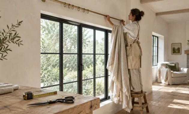
Incorporate tactile accessories such as heavy linen drapery, woven jute runners, and limewashed oak cabinetry. These natural textures enhance creamy walls and prevent monochrome rooms from feeling flat.
Test your swatches at various hours to confirm southern sunlight does not make the cream appear overly yellow.
The resulting palette feels effortlessly serene, timeless, and bathed in gentle warmth.
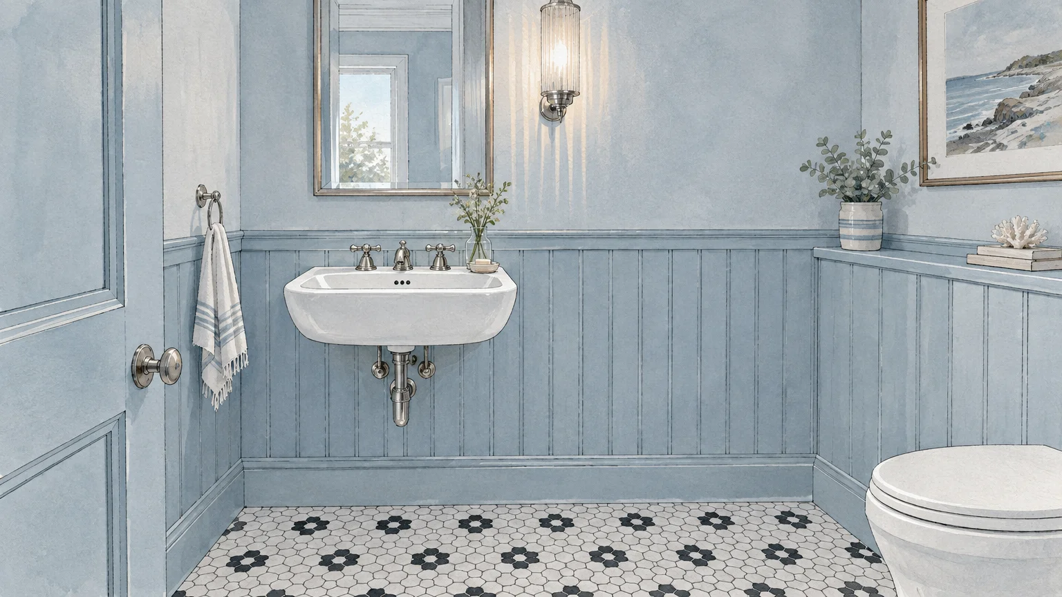
Trend #3: Dusty Powder Blue
Dusty powder blue introduces tailored tranquility into graphic spaces, marrying Scandinavian serenity with heritage coastal style. The muted cool tone softens high-contrast floors with understated elegance.
This delicate shade contains slate gray undertones that keep it looking sophisticated rather than youthful. It creates an airy backdrop that complements both antique porcelain and matte black fixtures.
If you need versatile bathroom color ideas, soft slate blue creates an expansive, breathable atmosphere. It visually enlarges compact powder rooms by gently dispersing ambient light.
Accentuate this color scheme with polished nickel faucets, ribbed glass sconces, and bright white millwork. The cool metal highlights the blue pigment, establishing a crisp, boutique hotel aesthetic.
Apply a durable satin finish on lower paneling to maintain clean lines against the floor.
The quiet contrast fosters an enduring, spa-like escape within your home.
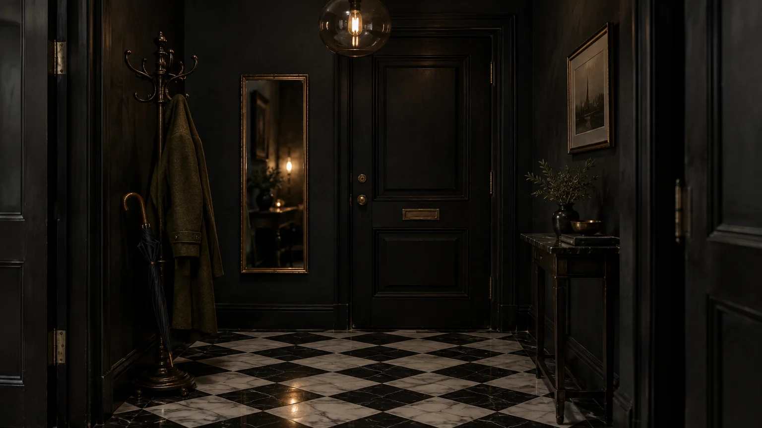
Trend #4: Moody Charcoal and Soft Black
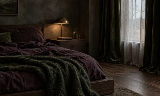
Fully embrace drama by aligning your wall surfaces directly with the darkest tiles across your floor. Saturated charcoal and velvety off-black create an enveloping jewel-box environment filled with mystery.
This dark color-drenching technique dissolves structural corners, making small rooms feel expansive rather than confined. It turns irregular architectural angles into intentional design highlights.
Select a chalky matte finish when curating paint colors black and white tile spaces require for drama. Low-sheen finishes diffuse reflection and lend the walls a rich, suede-like texture.
Contrast the shadowy envelope with deliberate ambient lighting, including glowing alabaster sconces and backlit mirrors. Strategic lighting ensures the dark space feels sumptuous rather than cavernous.
Integrate honed marble surfaces and brushed chrome hardware to introduce crisp, luminous counterpoints throughout the room.
This confident aesthetic turns modest bathrooms and hallways into unforgettable design moments.
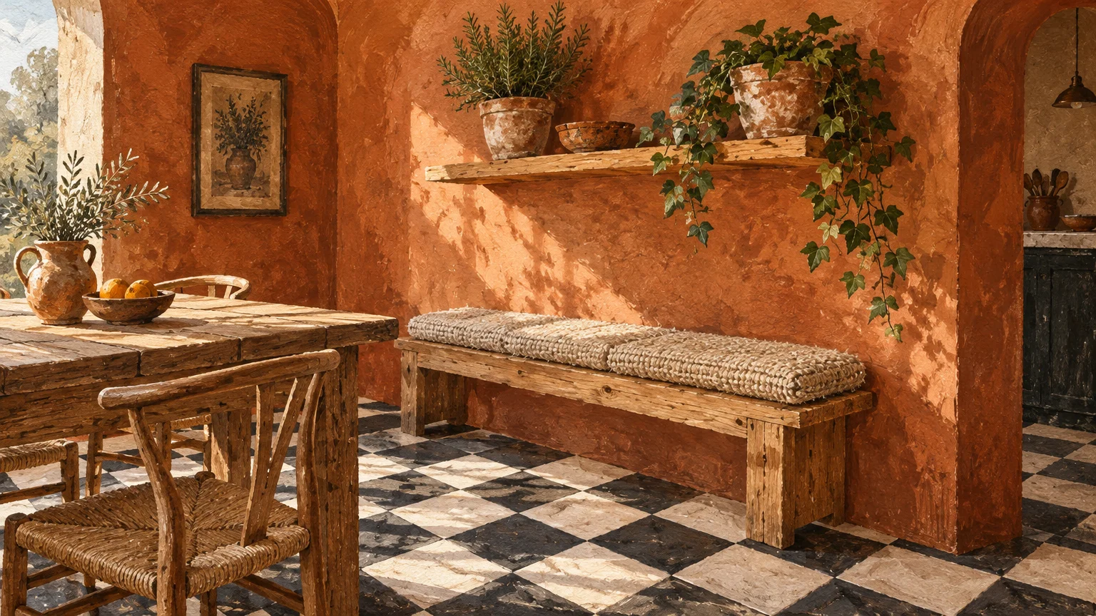
Trend #5: Spiced Terracotta and Burnt Clay
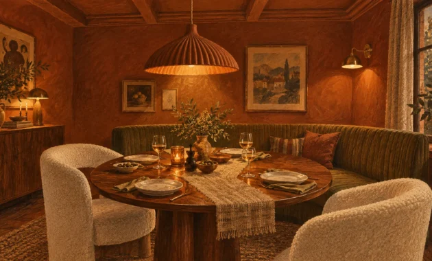
Spiced terracotta and earthy clay introduce sun-drenched Mediterranean warmth to graphic black and white flooring. The fired-earth tone immediately counters the cool formality of polished marble or porcelain.
This grounding aesthetic reflects the rise of tactile interiors that honor craftsmanship and natural provenance. Terracotta infuses structured checkerboard floors with relaxed, lived-in character.
In entryways and kitchens showcasing checkerboard tile decor, warm clay paint establishes a convivial, hospitable mood. It harmonizes with exposed wood beams and radiates under warm evening lamplight.
Style your terracotta walls alongside blackened iron lighting, raw travertine accessories, and olive branches. This layered textural variety keeps your interior grounded, intentional, and inviting.
Consider mineral paints or Roman clay applications to achieve nuanced, artisanal surface variation.
The rich earthiness transforms cold stone floors into a warm, grounded foundation.
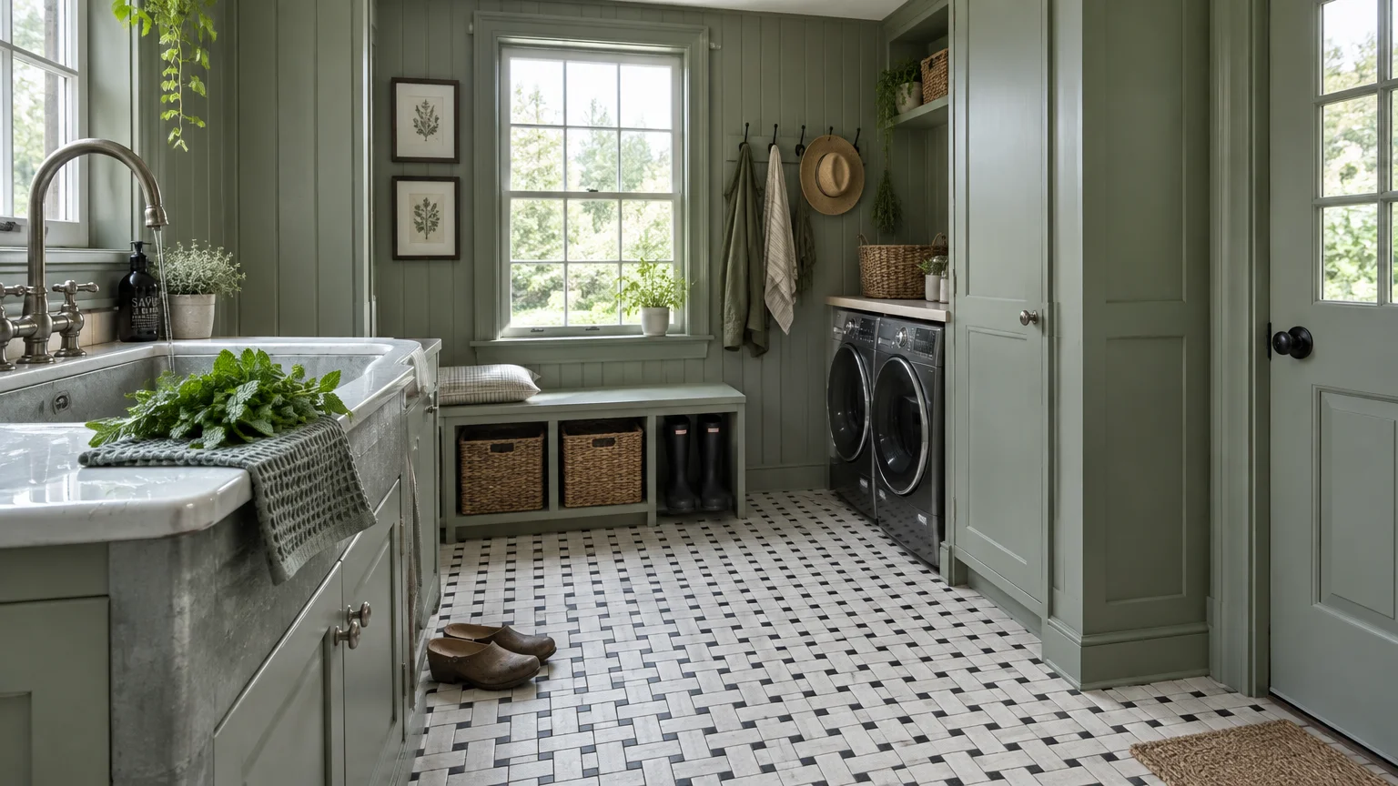
Trend #6: Sage and Muted Eucalyptus
Sage green offers a restorative, nature-inspired wash that bridges traditional architecture with modern sensibilities. Its soft gray undertone ensures a quiet elegance that never overpowers patterned tilework.
Design enthusiasts choose muted eucalyptus to create a tranquil wellness retreat inside everyday spaces. It pairs naturally with stone, ceramic, and decorative encaustic flooring patterns.
For uplifting bathroom color ideas, paint both the upper walls and decorative wainscoting in matching sage. This continuous envelope elongates vertical height while celebrating vintage floor borders.
Accompany this organic green with honed marble counters, matte black faucets, and handwoven seagrass storage. The materials strike an artful balance between architectural structure and organic ease.
Test your paint samples against both dark and pale tiles under varying lighting conditions.
This botanical shade remains an enduring favorite for serene, timeless home design.
Trend #7: Blush Pink and Plaster Rose
Plaster rose and muted blush deliver a delightfully sophisticated counterpoint to graphic tile. This tonal juxtaposition tempers masculine geometric lines with subtle Parisian romance and vintage whimsy.
Avoid saturated pastel pinks; instead, choose chalky roses infused with beige, taupe, or gray undertones. These nuanced pigments act as warm neutrals that cast a flattering glow across the room.
This palette flatters heritage interiors, particularly rooms featuring hexagonal or basketweave mosaic patterns. It transforms standard porcelain sinks into sculptural design centerpieces.
Decorate your rose walls with antique oil paintings, unlacquered bronze faucets, and beveled vanity mirrors. The antique metals balance the playful wall color with stately architectural weight.
Apply an ultra-matte paint finish to replicate the soft texture of authentic European lime plaster.
The completed room radiates charm, modern refinement, and distinctive personality.
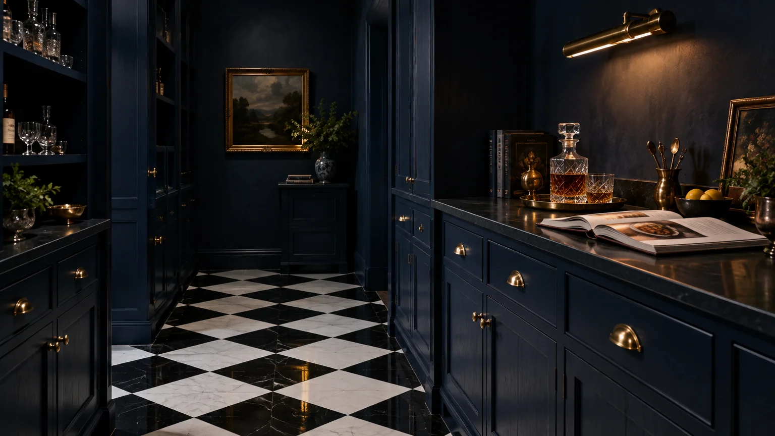
Trend #8: Midnight Navy and Classic Indigo
Midnight navy provides crisp architectural authority and timeless elegance when paired with graphic monochrome tiles. It delivers the anchoring presence of black while introducing rich, multi-layered color depth.
This maritime hue evokes bespoke tailoring, reminiscent of historic boutique hotels and private libraries. It organizes visual energy, elevating standard mosaic floors into luxurious design statements.
When choosing bathroom paint colors for compact footprints, deep indigo creates an alluring background for polished chrome. The reflective metal stands out brilliantly against the dark paint.
Balance navy walls with bright white architectural trim, beadboard paneling, or marble accents. This thoughtful division anchors the floor pattern while ensuring upper sightlines stay luminous and open.
Incorporate reeded walnut vanities and warm linen shades to infuse textural warmth into the palette.
The bold balance delivers an enduring look that never succumbs to fleeting fads.
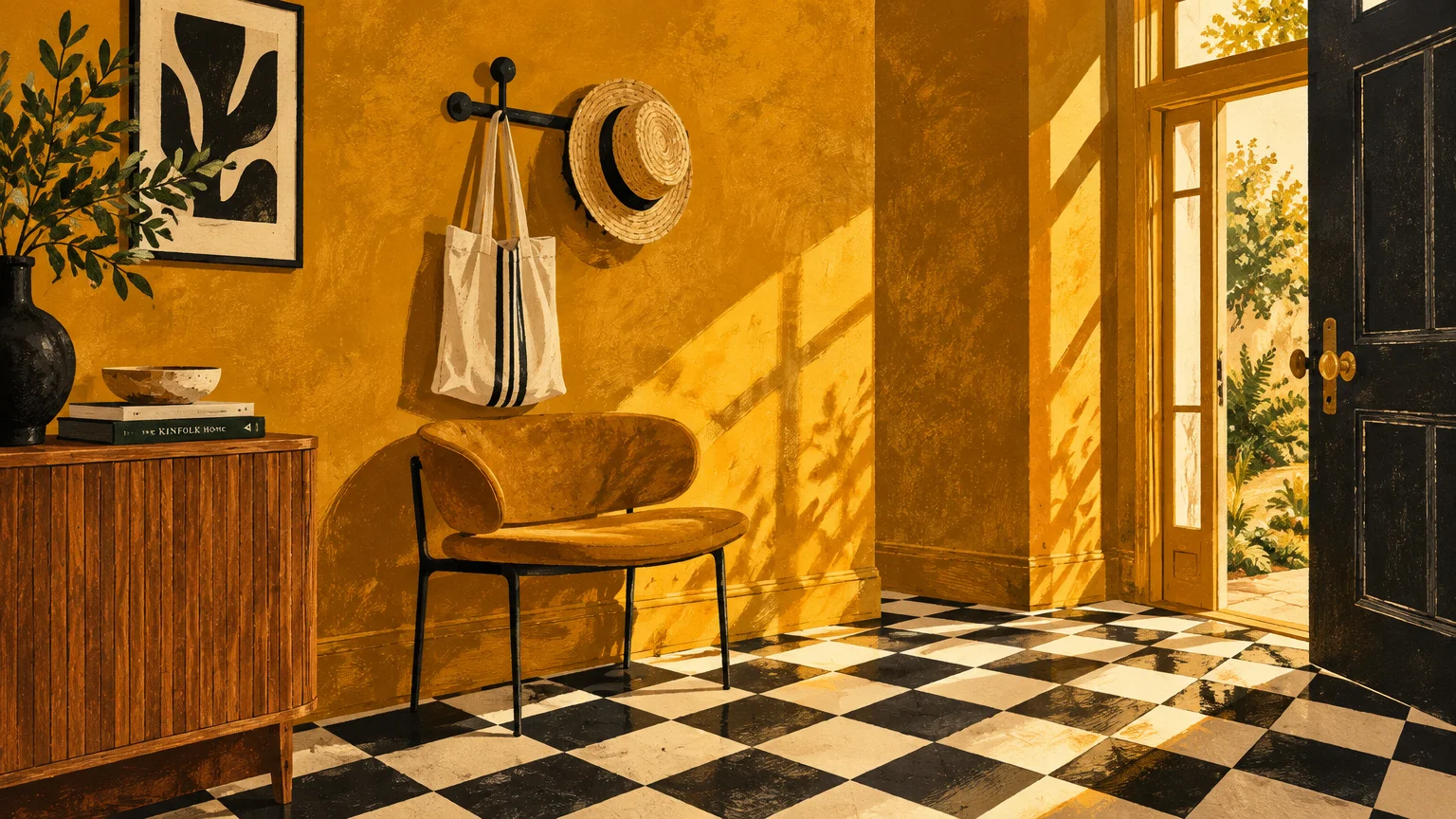
Trend #9: Warm Ochre and Mustard
Warm ochre and vintage mustard inject vibrant mid-century energy that enlivens high-contrast flooring. This radiant tone brings historical warmth and optimistic character to geometric home interiors.
The chromatic tension between rich gold, snowy white, and deep black evokes mid-century modern artist studios. It pays homage to bold Bauhaus design principles and European cafe culture.
In spaces featuring checkerboard tile decor, mustard paint prevents the floor from appearing rigid or formal. It infuses your home with daring, curated individuality that feels joyful and authentic.
Pair golden ochre with matte black sconces, smoked oak cabinetry, and natural linen accents. These grounded organic elements keep the bold yellow looking mature, refined, and intentional.
Select an eggshell or satin finish so ambient light reflects softly across the golden surfaces.
This daring combination energizes living spaces and compact powder rooms alike.
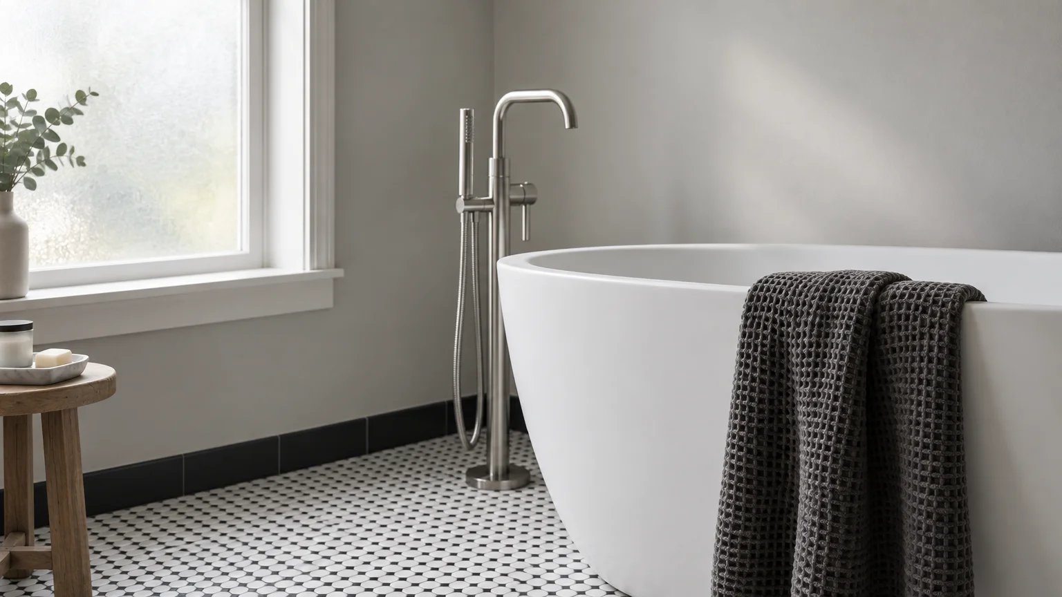
Trend #10: Soft Dove Gray
Soft dove gray provides a graceful transitional bridge between stark black borders and luminous white tiles. It softens the visual impact of graphic floors while maintaining a tailored, contemporary aesthetic.
Unlike industrial cement shades, dove gray carries gentle lilac or greige undertones that produce welcoming warmth. It captures morning and evening sunlight with quiet refinement.
This versatile shade ranks among the most reliable wall colors for black tile surrounds and intricate borders. It allows complex floor geometry to remain the primary architectural focal point.
Layer your gray interior with ribbed white ceramics, honed soapstone counters, and polished nickel plumbing. Varied textural elements prevent monochrome rooms from feeling one-dimensional or dull.
Always sample gray paint on different walls to verify it does not look chilly under northern exposures.
The resulting room achieves effortless balance, quiet sophistication, and lasting appeal.
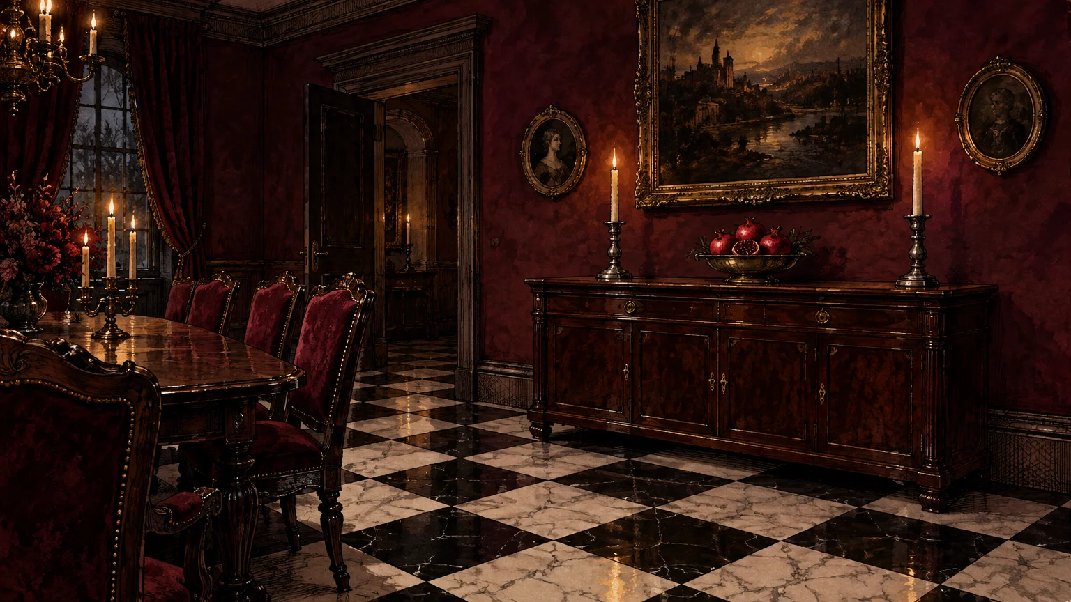
Trend #11: Rich Burgundy and Deep Wine
Rich burgundy and deep wine tones introduce theatrical drama alongside graphic black and white flooring. This decadent palette recalls grand Victorian entry halls and moody Parisian cocktail bars.
Saturated wine red provides deep visual warmth, transforming cool monochrome floors into a grounded, luxurious foundation. It anchors large living rooms and creates delightfully intimate dining spaces.
When evaluating paint colors black and white tile floors demand for historic depth, wine hues excel. The intense pigment enhances the pristine clarity of surrounding white marble and ceramic tiles.
Furnish burgundy rooms with heavy unlacquered brass hardware, antiqued mirrors, and rich mahogany woodwork. These heritage materials complement the dramatic paint with timeless substance.
Select a velvety matte or eggshell finish to give the deep red paint an opulent appearance.
The bold pairing establishes a regal aesthetic that commands immediate admiration.
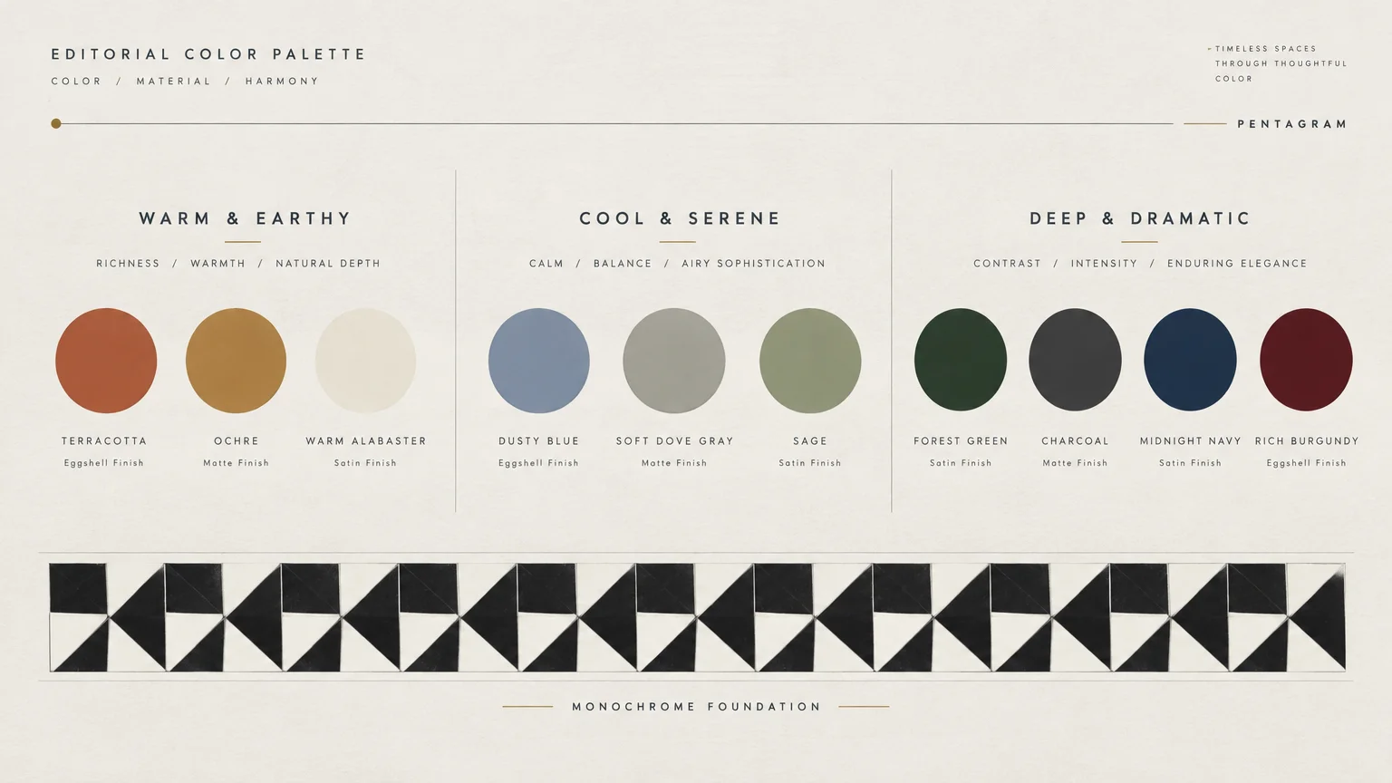
The Big Picture: Weaving These Trends into Your Home
Pairing bold or nuanced wall colors with graphic flooring requires careful attention to balance and proportion. You must evaluate how natural light moves across your tiles throughout the day.
High-contrast floors generate significant visual movement, so your wall paint should either ground that energy or harmonize with it. Decide whether your flooring should star as the focal point or serve as an anchor.
In smaller spaces like powder rooms, color drenching across walls, trim, and ceilings produces cohesive, immersive luxury. In larger living spaces, pairing saturated wall colors with crisp white wainscoting maintains balance.
Keep hardware finishes consistent to unify the space. Unlacquered brass introduces warmth to cool greens and blues, while polished nickel complements darker charcoals and navy pigments.
Always test oversized paint swatches against your tiles under both morning sun and artificial evening lighting. The subtle undertones of grout lines and stone veining shift noticeably under different color temperatures.
For the latest color forecasts, consult industry leaders like Pantone and paint companies like Benjamin Moore. For professional design standards, refer to the American Society of Interior Designers (ASID).
Disclaimer: This article reflects design trend analysis and predictions. Personal taste and timeless design principles should always guide your decorating choices.
Frequently Asked Questions
Does checkerboard tile decor limit future color choices?
Black and white tile functions as an architectural neutral rather than a decorative limitation. Because black and white sit at polar ends of the color spectrum, they pair seamlessly with almost any shade.
You can switch between botanical greens, serene blues, and moody charcoals over time without altering your flooring. Aligning the paint undertones with your grout ensures long-lasting visual harmony.
What paint finish works best with high-contrast floor tile?
Matte and eggshell sheens perform best on walls paired with geometric flooring. Flat finishes absorb excess light and eliminate glare, allowing contrasting floor patterns to ground your room comfortably.
Reserve semi-gloss or high-gloss sheens for doors and moldings to frame your room with clean architectural definition.
Should your wall color match the white in your tile exactly?
You do not need to match the tile white precisely; in fact, exact matches can feel clinical. Layering slightly warmer alabaster or soft greige adds intentional depth and visual richness to your space.
Subtle tonal variations make an interior look organically collected over time rather than rigidly manufactured.
How do you prevent a small bathroom with black tile from feeling dark?
Design a layered lighting scheme using vertical sconces at eye level alongside recessed ceiling lights. High-CRI fixtures, wide mirrors, and polished metallic hardware bounce brightness across deep wall colors.
Additionally, coating the ceiling in a clean, reflective off-white draws the eyes upward and balances moody wall tones.