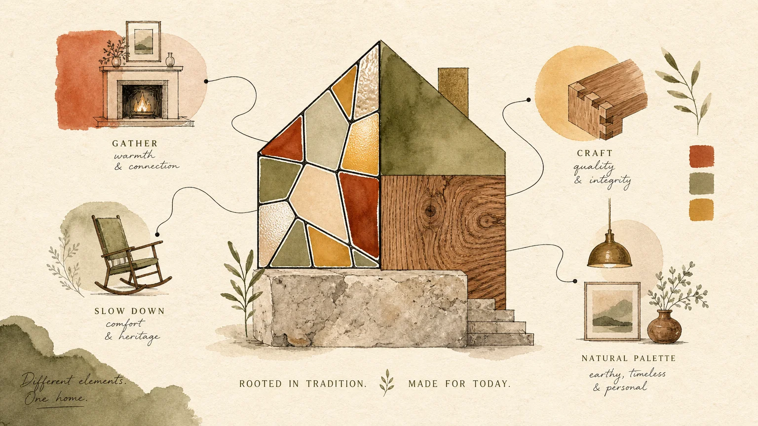
Professional designers step into a room and instantly read its visual language, instinctively spotting the disjointed layouts and missed opportunities that prevent a space from reaching its full potential. You can bypass years of trial and error by recognizing these common pitfalls and shifting your approach toward intentional, cohesive styling. Today’s most sophisticated interiors abandon rigid rules in favor of organic flow, elevated textures, and personal authenticity. Understanding the specific decorating mistakes that industry experts notice immediately empowers you to refine your eye and elevate your environment. We translate these crucial designer secrets into actionable insights, helping you replace outdated habits with the refined trends shaping modern interior design.
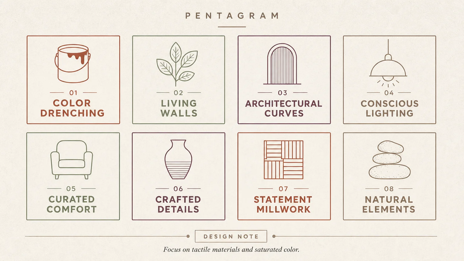
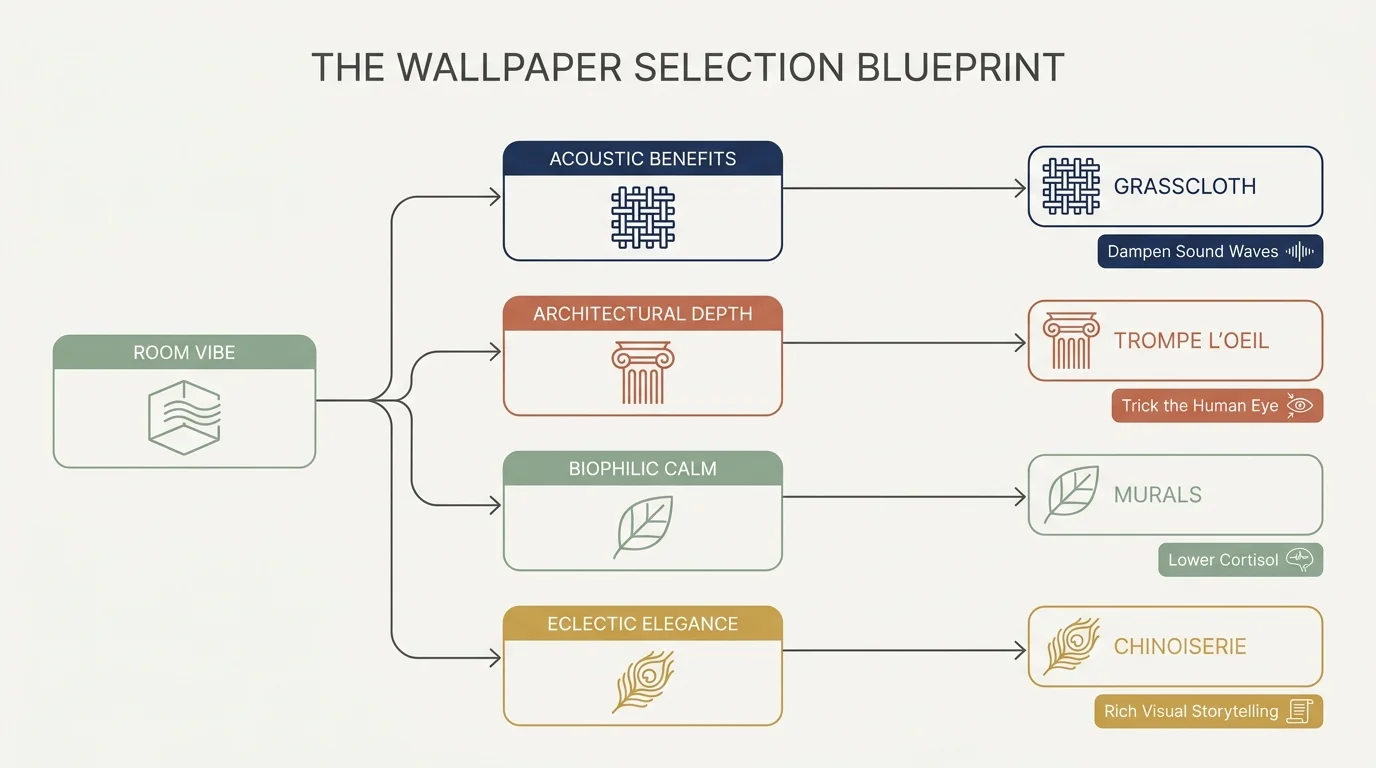
Trend #1: Curated Eclecticism Over Matching Sets
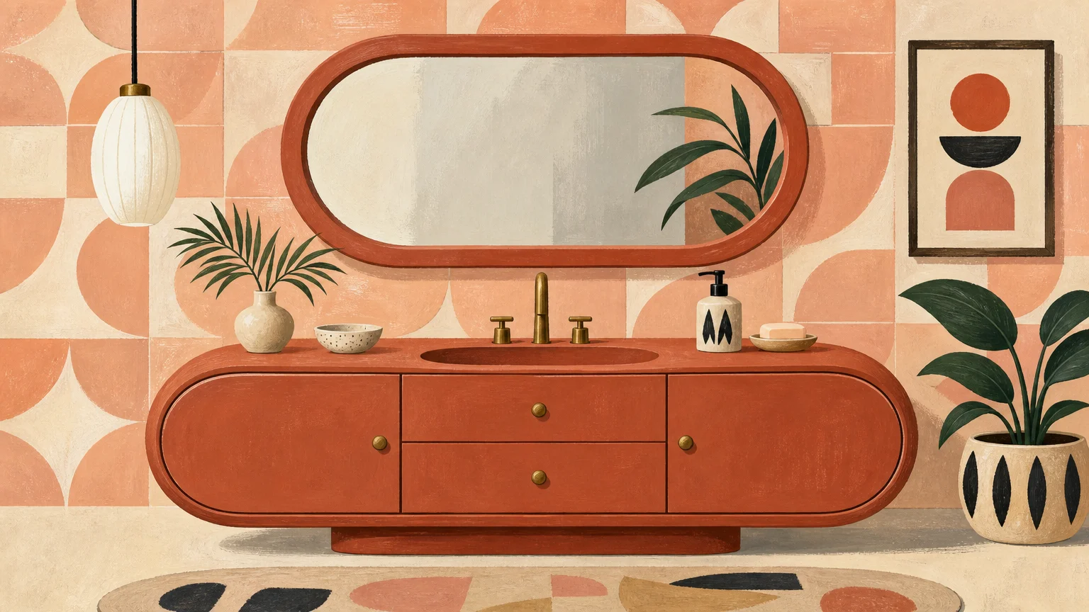
When interior designers evaluate a room, nothing gives away an amateur approach quite like a fully matching furniture set. Buying the entire coordinating bedroom or living room suite creates a flat, sterile showroom aesthetic rather than a lived-in, highly personal home. You rob your space of character and provenance when every wood tone, fabric, and silhouette perfectly mirrors the piece next to it.
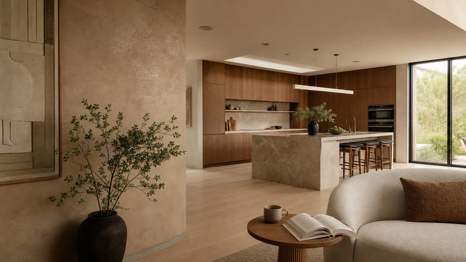
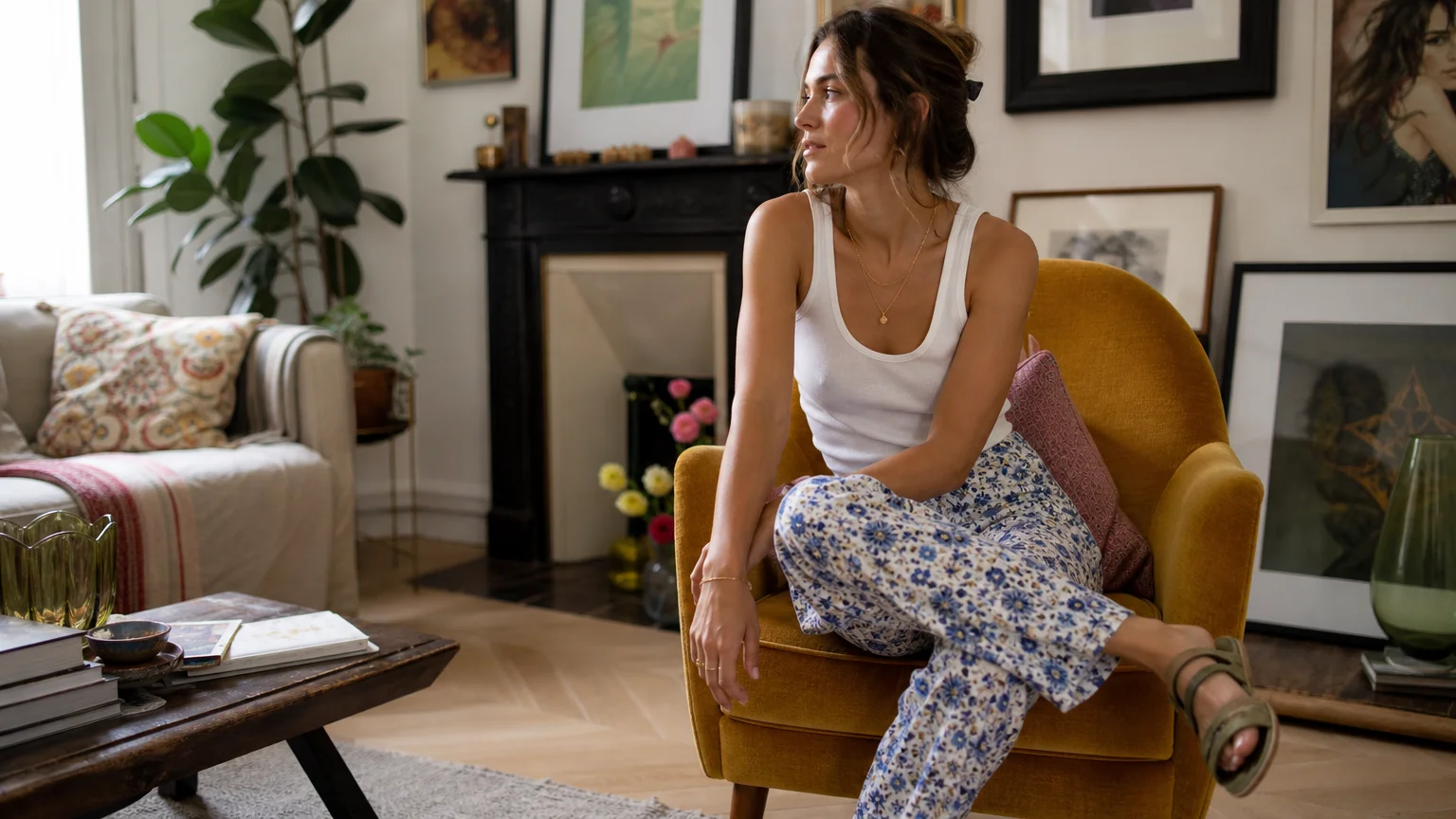
Curated eclecticism serves as the sophisticated antidote to this widespread decorating mistake. This approach champions the artful blending of eras, materials, and styles to create a space that feels organically gathered over time. You achieve this elevated look by anchoring the room with a foundational piece, such as a clean-lined modern sofa, and pairing it with contrasting elements like a vintage burled wood coffee table or mid-century architectural accent chairs.
Embracing this trend requires you to trust your eye and focus on overarching harmony rather than exact replication. Tie disparate pieces together using a unified color palette, a repeated geometric shape, or complementary textures. This designer secret instantly elevates your home styling, transforming a rigid catalog look into a dynamic, customized environment that speaks directly to your distinct personal taste.
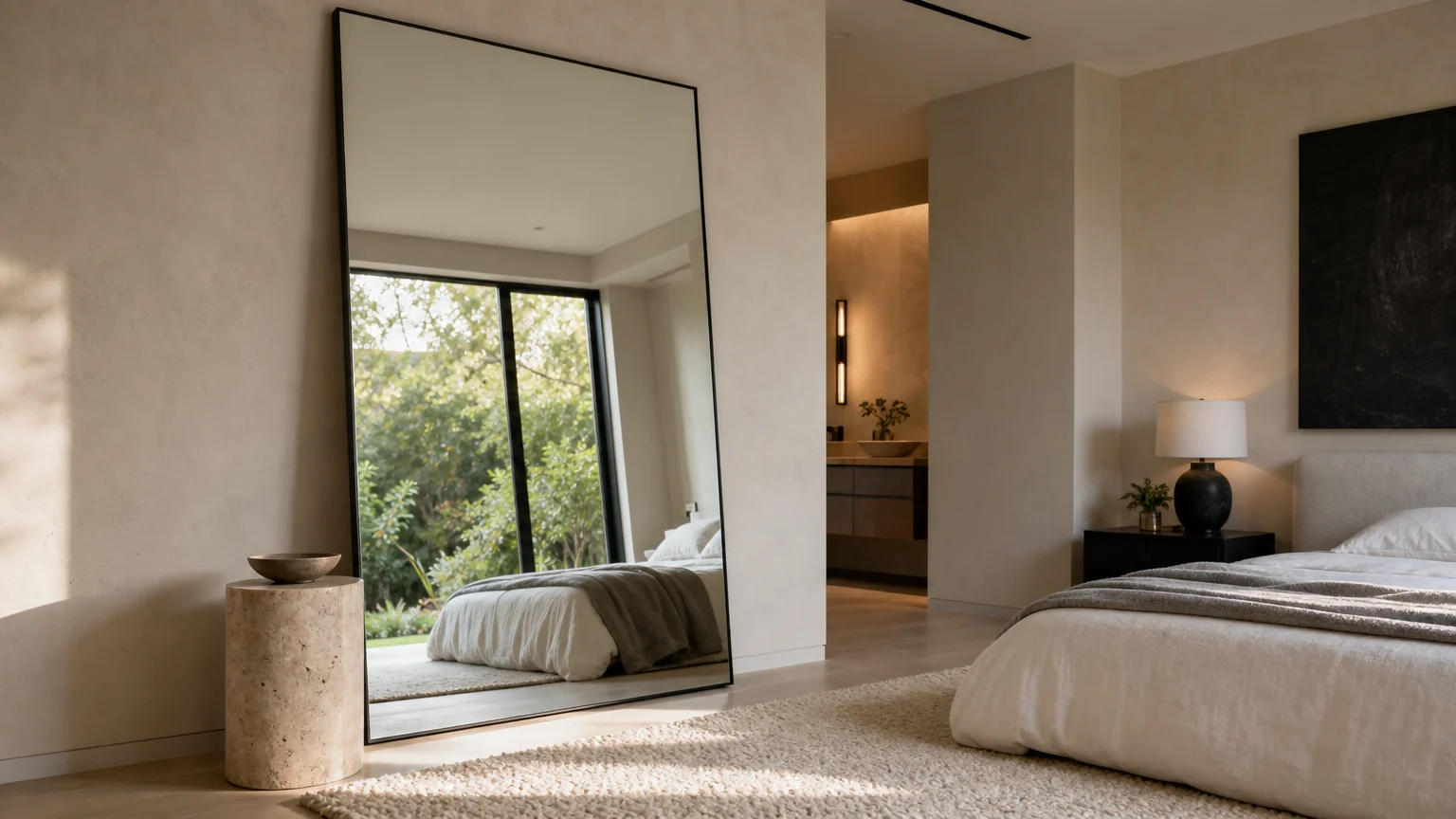
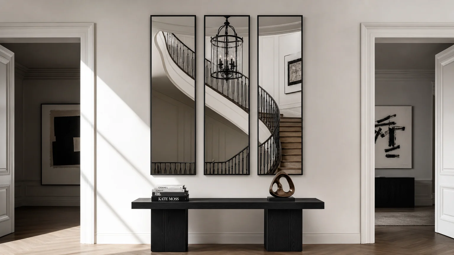
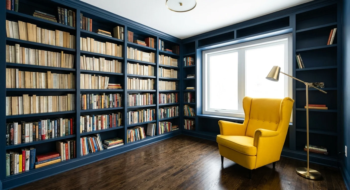
Trend #2: Grounded Scale and Proportion
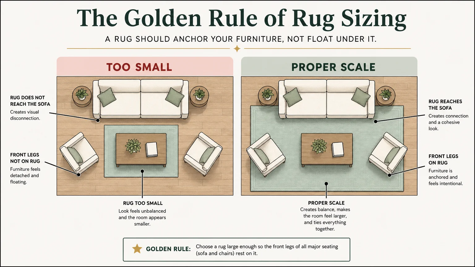
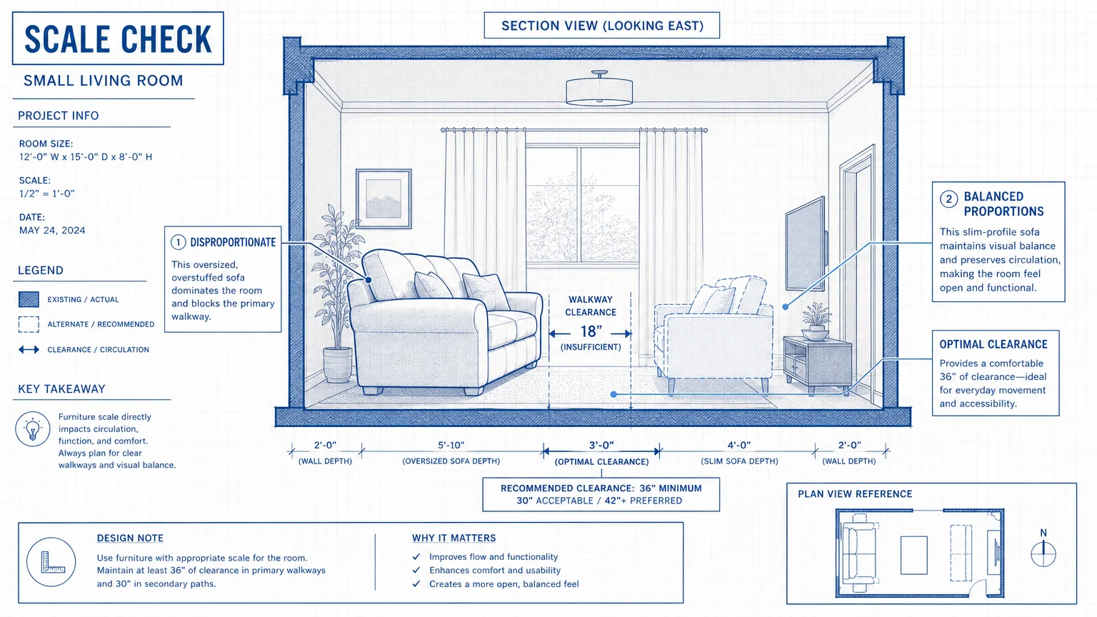
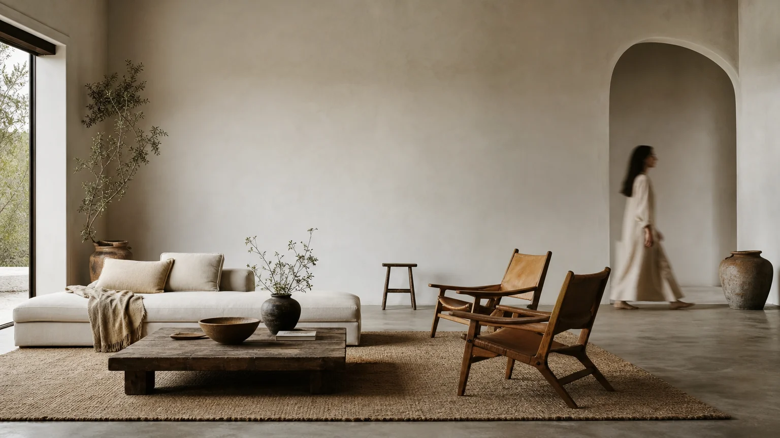
Walking into a living room anchored by a tiny, floating rug is one of the most jarring decorating mistakes you can make. Undersized rugs chop up your floor plan visually, making the room feel significantly smaller and disjointed. Similarly, hanging small pieces of art too high on a massive blank wall disrupts the visual equilibrium of your entire space, pulling the eye toward awkward, unintentional voids.
Designers employ the trend of grounded scale and proportion to correct these spatial imbalances. You must view your room as a singular composition where every piece relates proportionally to the architecture and surrounding furnishings. An appropriately sized rug should extend at least 18 to 24 inches beyond the edges of your main seating arrangement, allowing the front legs of all major furniture pieces to rest comfortably on the textile.
Implementing proper scale also applies directly to your vertical spaces. When installing artwork, position the center of the piece exactly 57 to 60 inches from the floor to align naturally with human eye level. By sizing up your foundational pieces and respecting architectural proportions, you anchor the room properly; this makes your home decor ideas feel intentional, luxurious, and professionally executed.
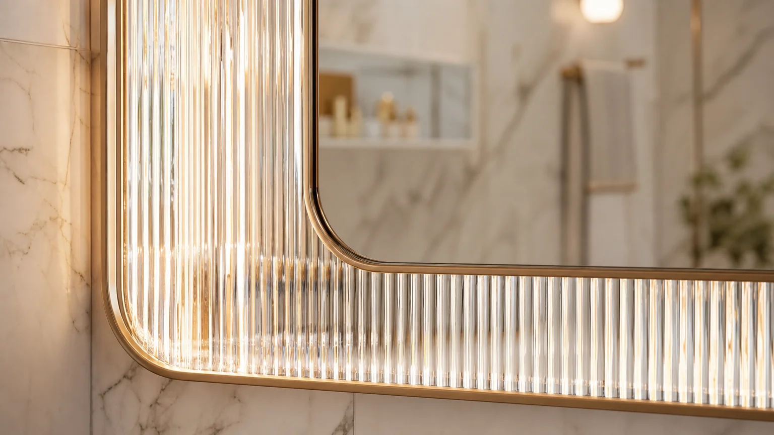
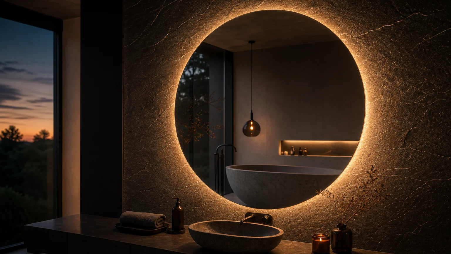
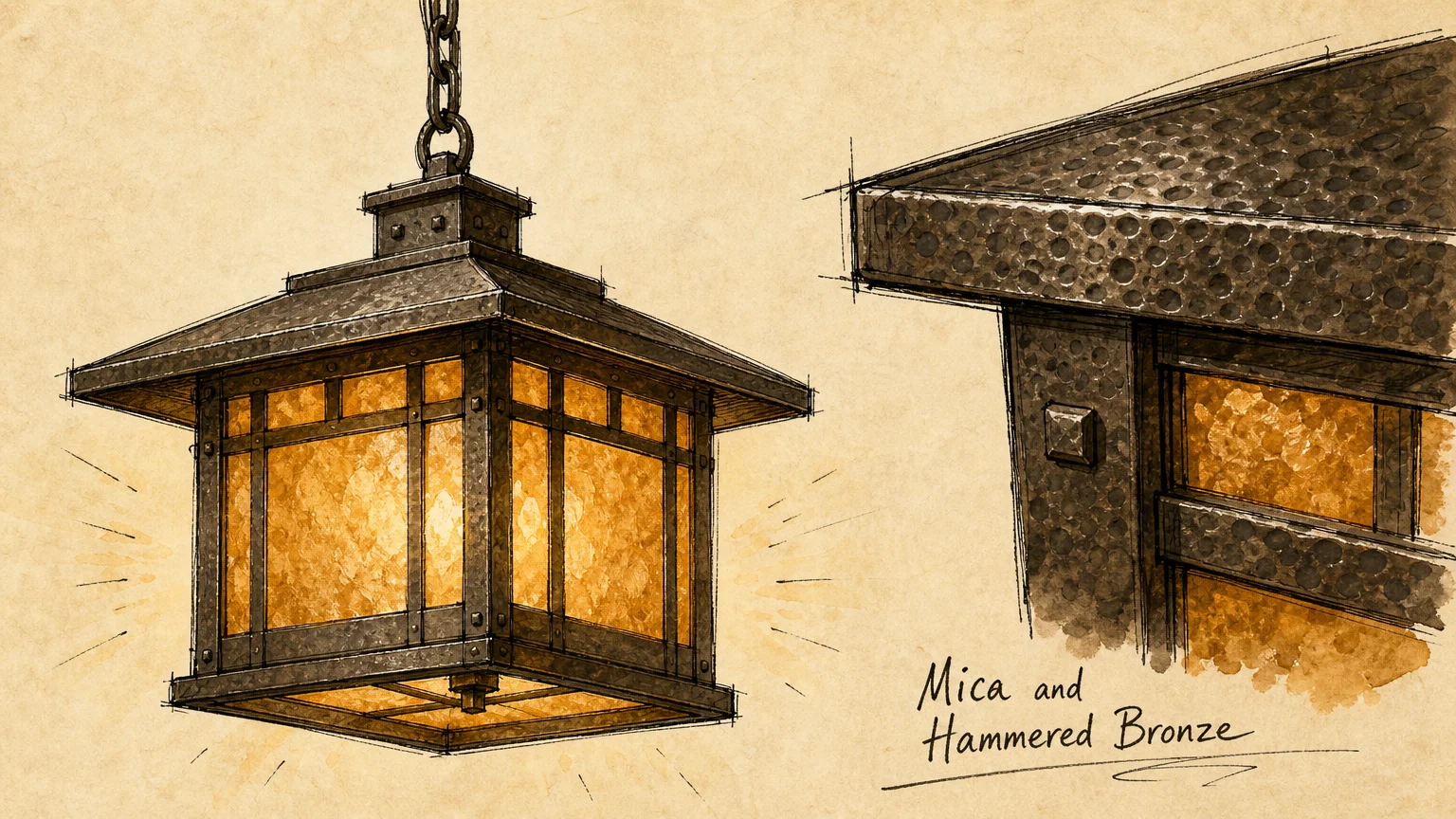
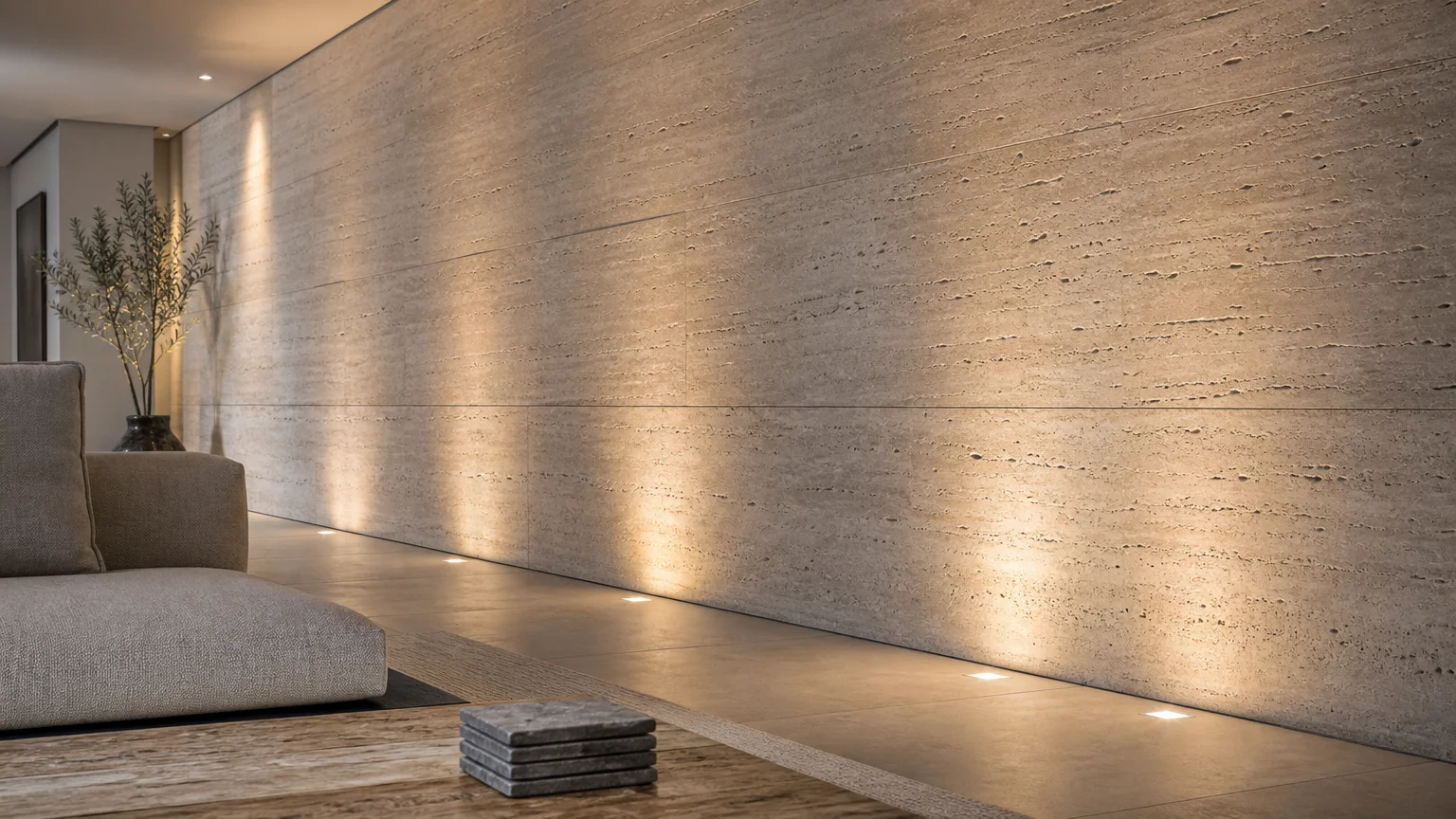
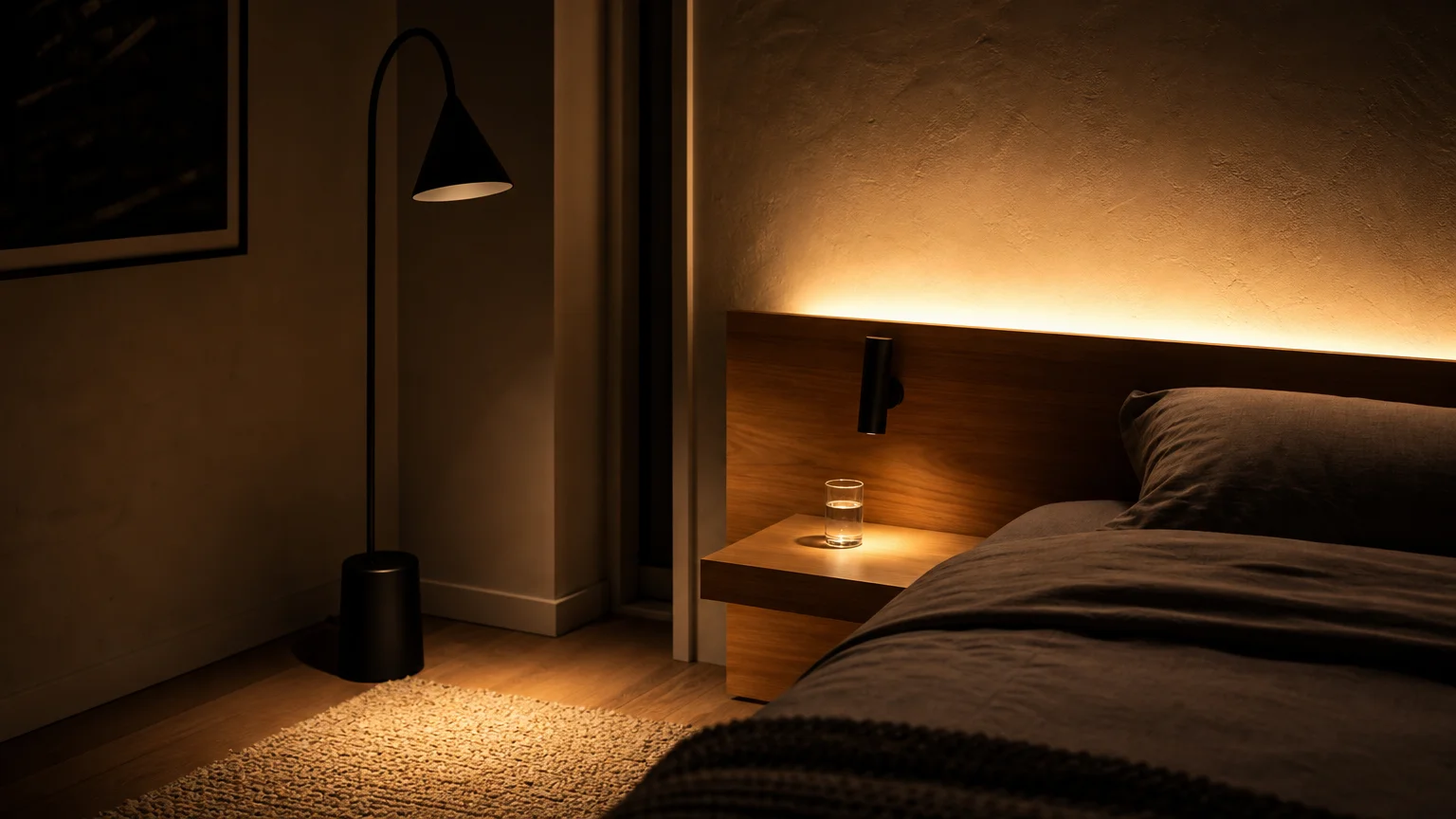
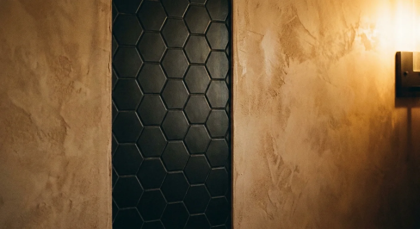
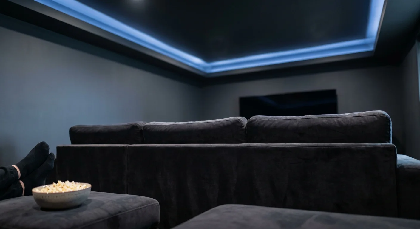
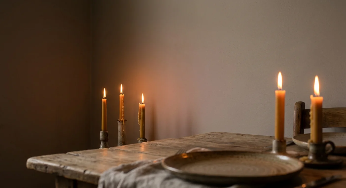
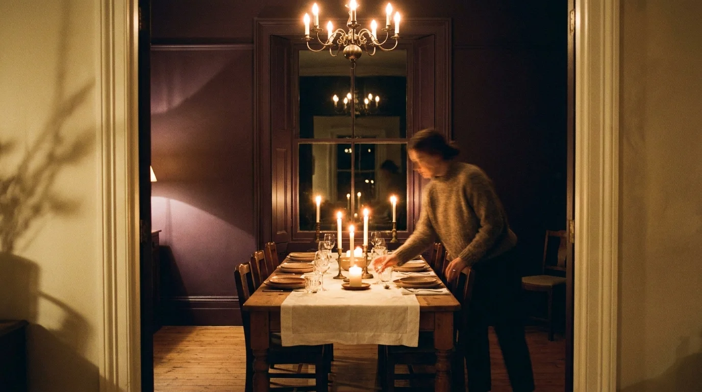
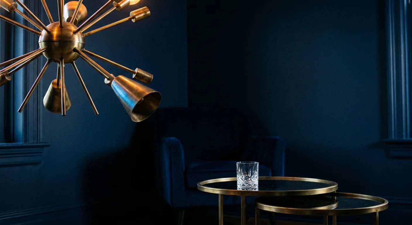
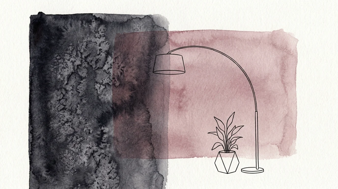
Trend #3: Architectural and Layered Lighting Design
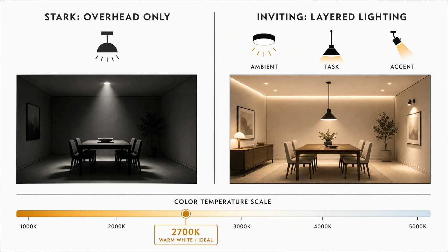
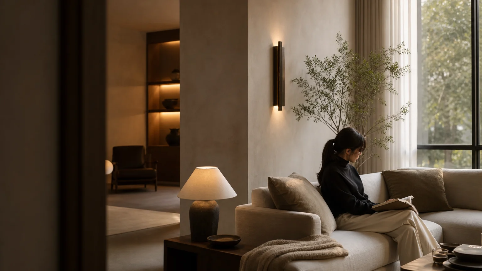
Relying exclusively on the harsh, flat illumination of builder-grade recessed lighting is a critical error that ruins the ambiance of otherwise beautiful spaces. Single overhead light sources cast unflattering downward shadows, flatten the gorgeous textures you carefully selected, and create an atmosphere reminiscent of a commercial office rather than a relaxing, sophisticated sanctuary.
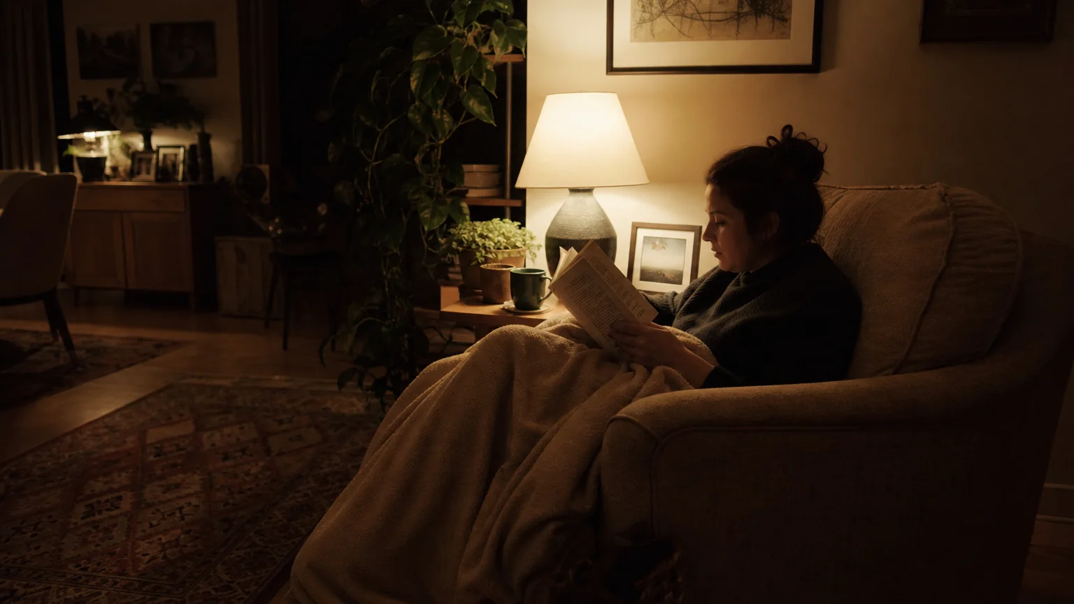
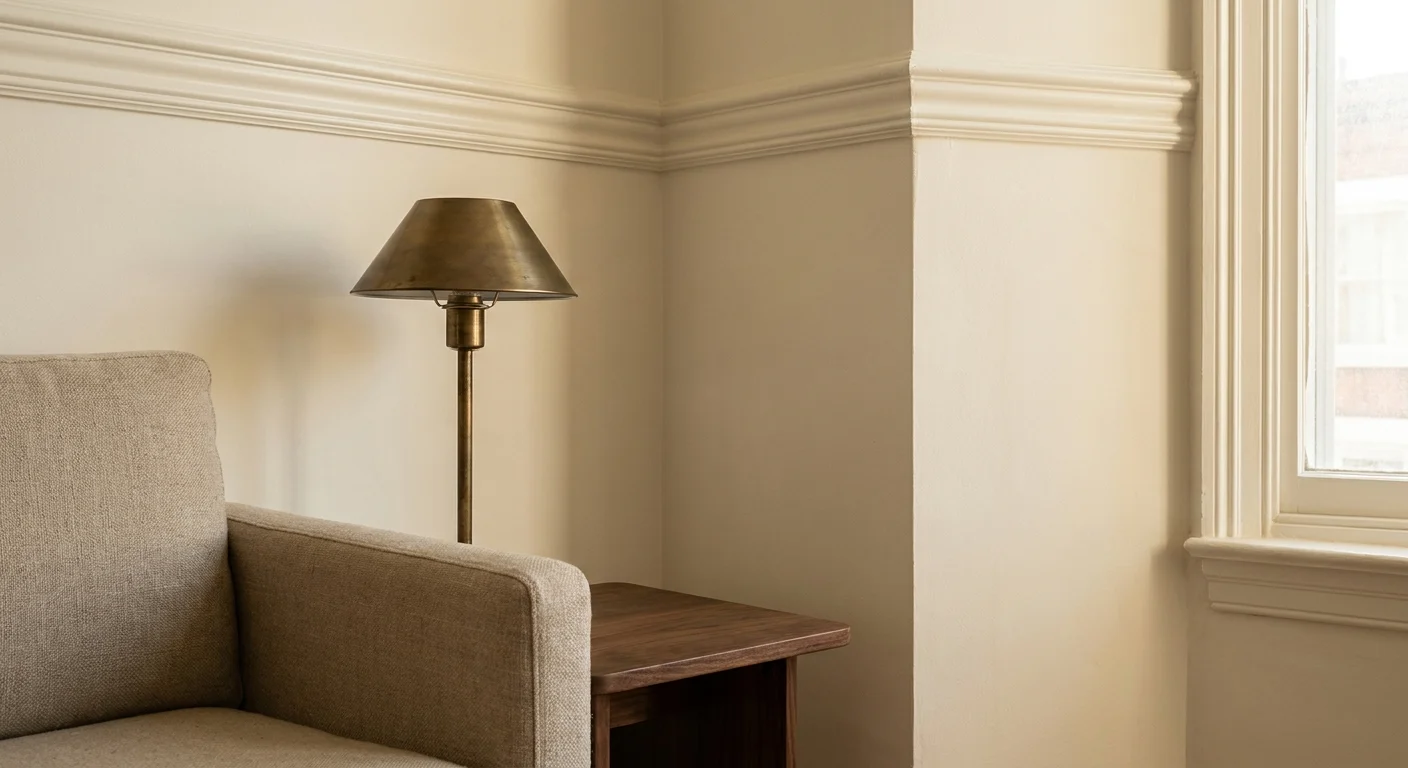
The transition toward architectural and layered lighting design revolutionizes the way a room feels and functions. Exceptional home styling relies on a meticulously planned lighting scheme that incorporates three distinct layers: ambient, task, and accent lighting. You build this scheme by introducing varied light sources at different heights throughout the room to create multidimensional warmth.
Start by installing dimmer switches on all overhead fixtures to easily control intensity and mood. Add sculptural floor lamps to illuminate dark corners, utilize substantial table lamps to create intimate pools of light near seating areas, and mount brass or matte black sconces to highlight architectural features or artwork. Pay close attention to your bulb temperatures—industry experts overwhelmingly recommend utilizing bulbs between 2700K and 3000K to cast a warm, inviting glow that instantly enhances the sophistication of your interior.
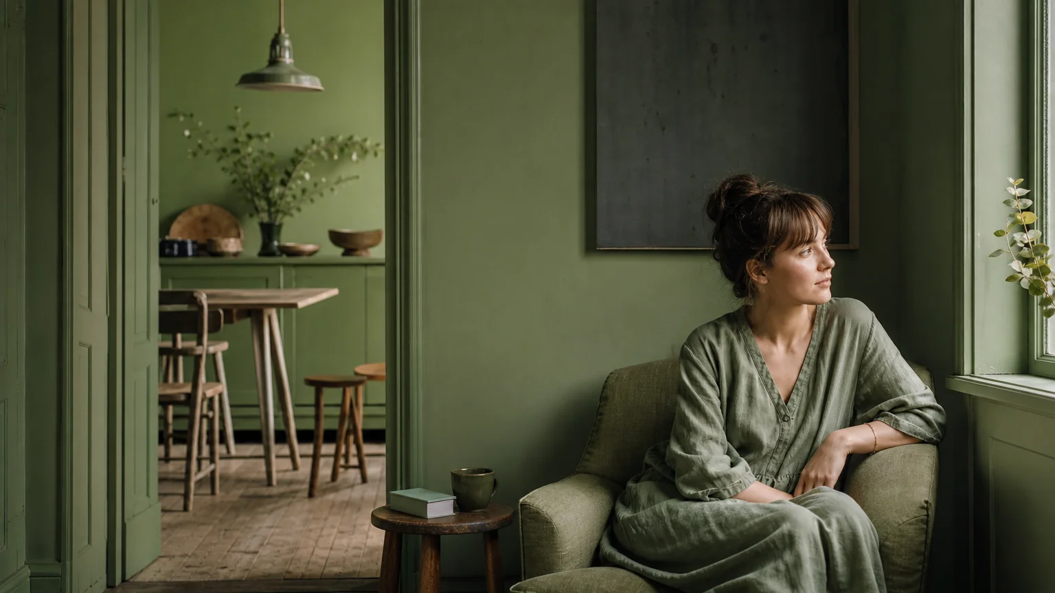
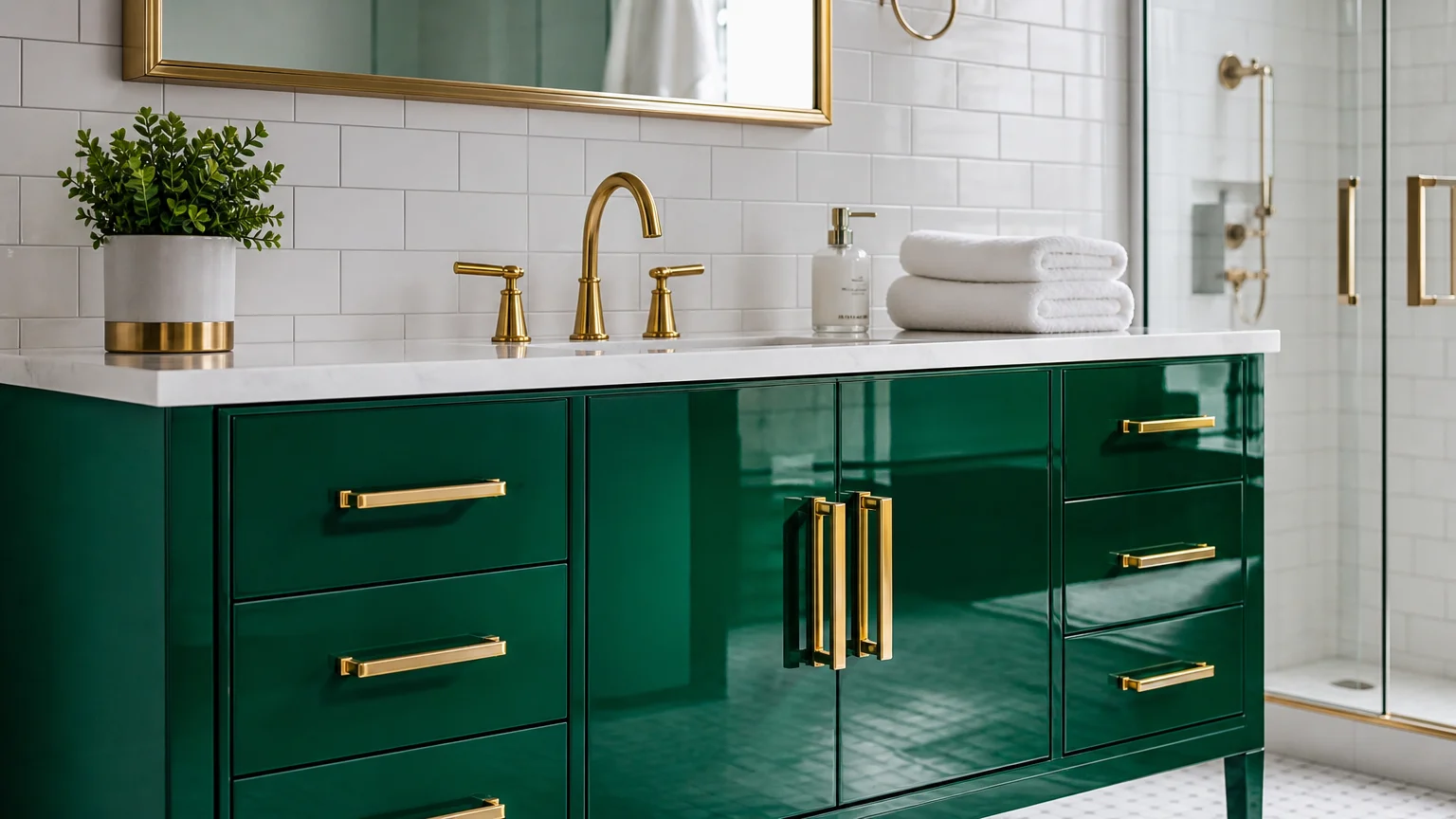
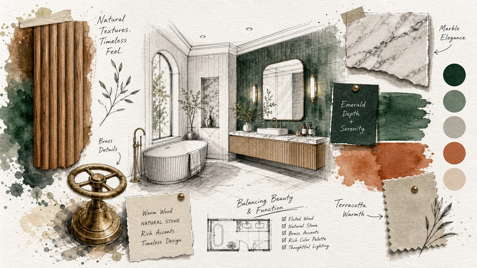
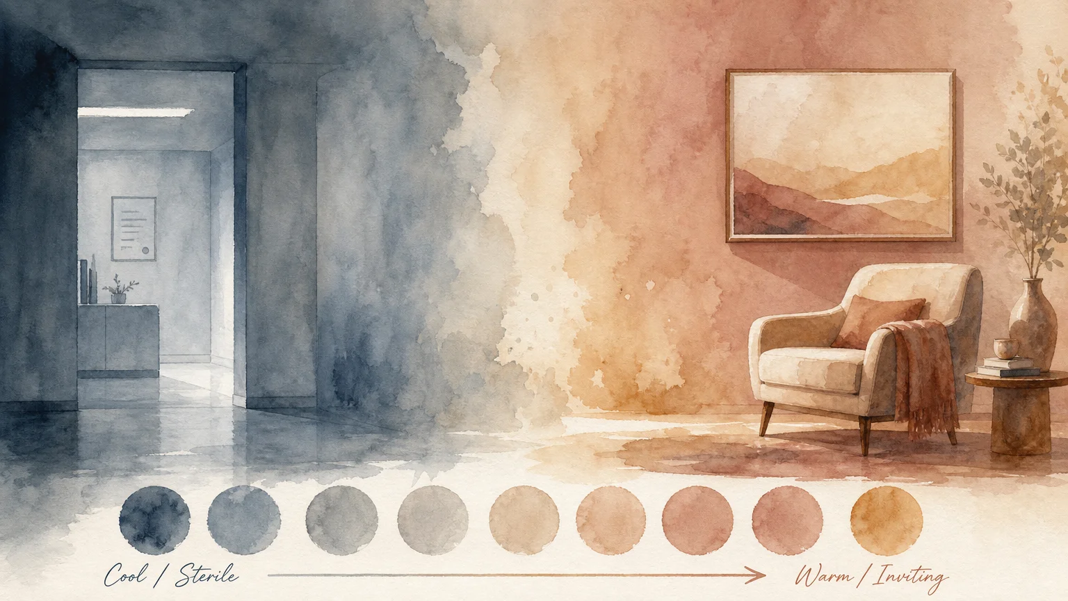
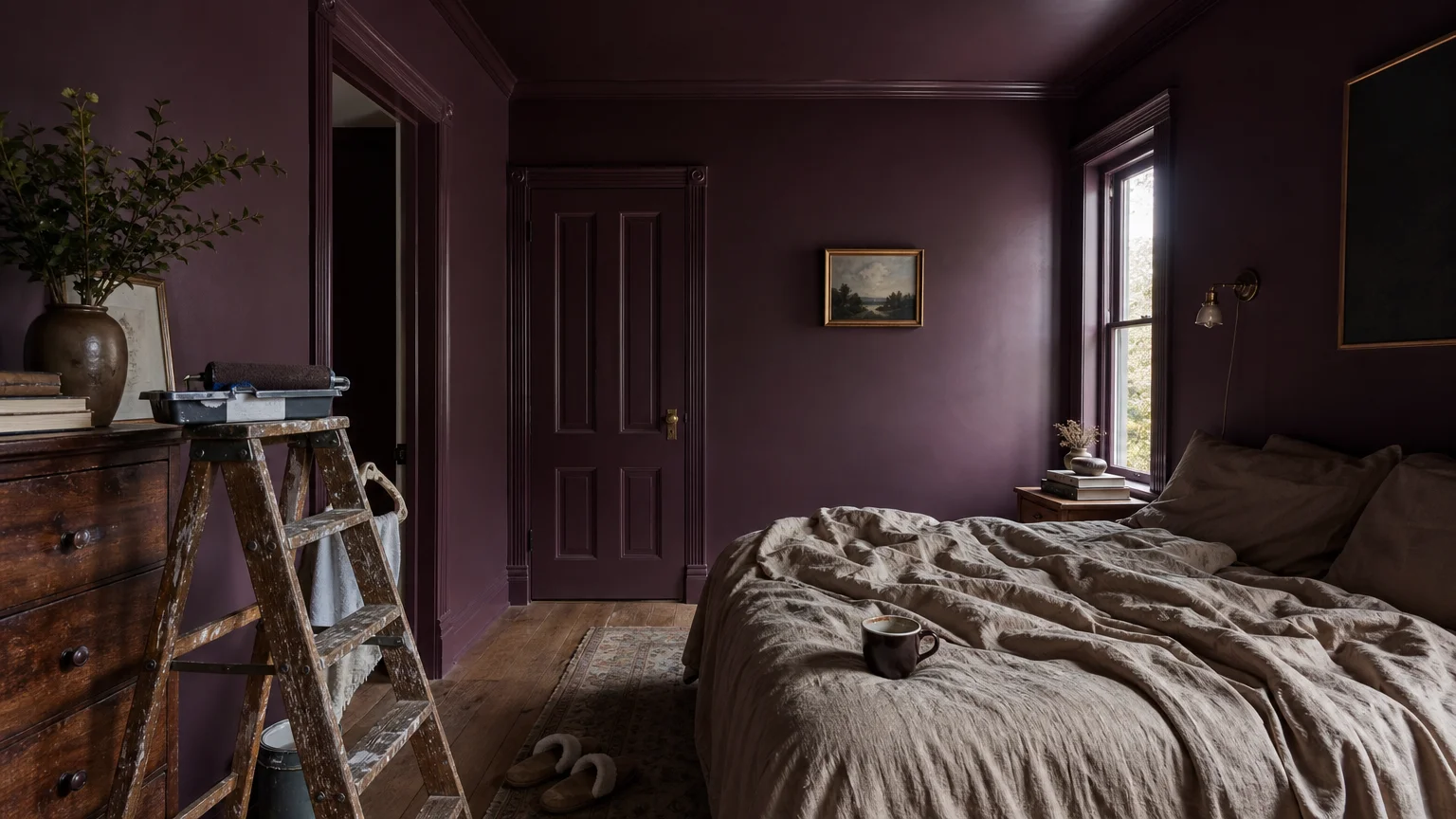
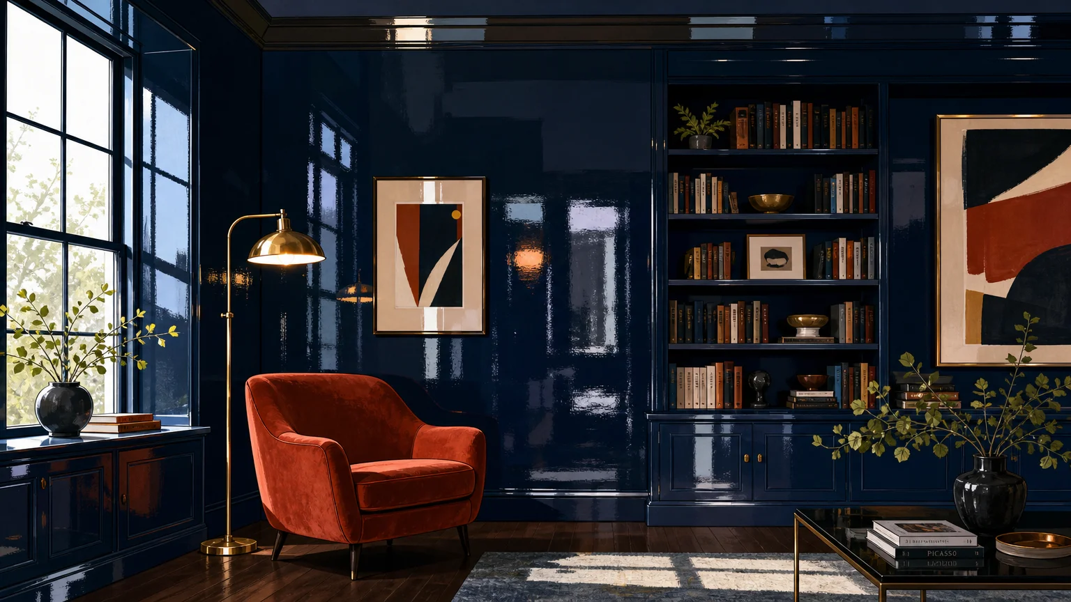
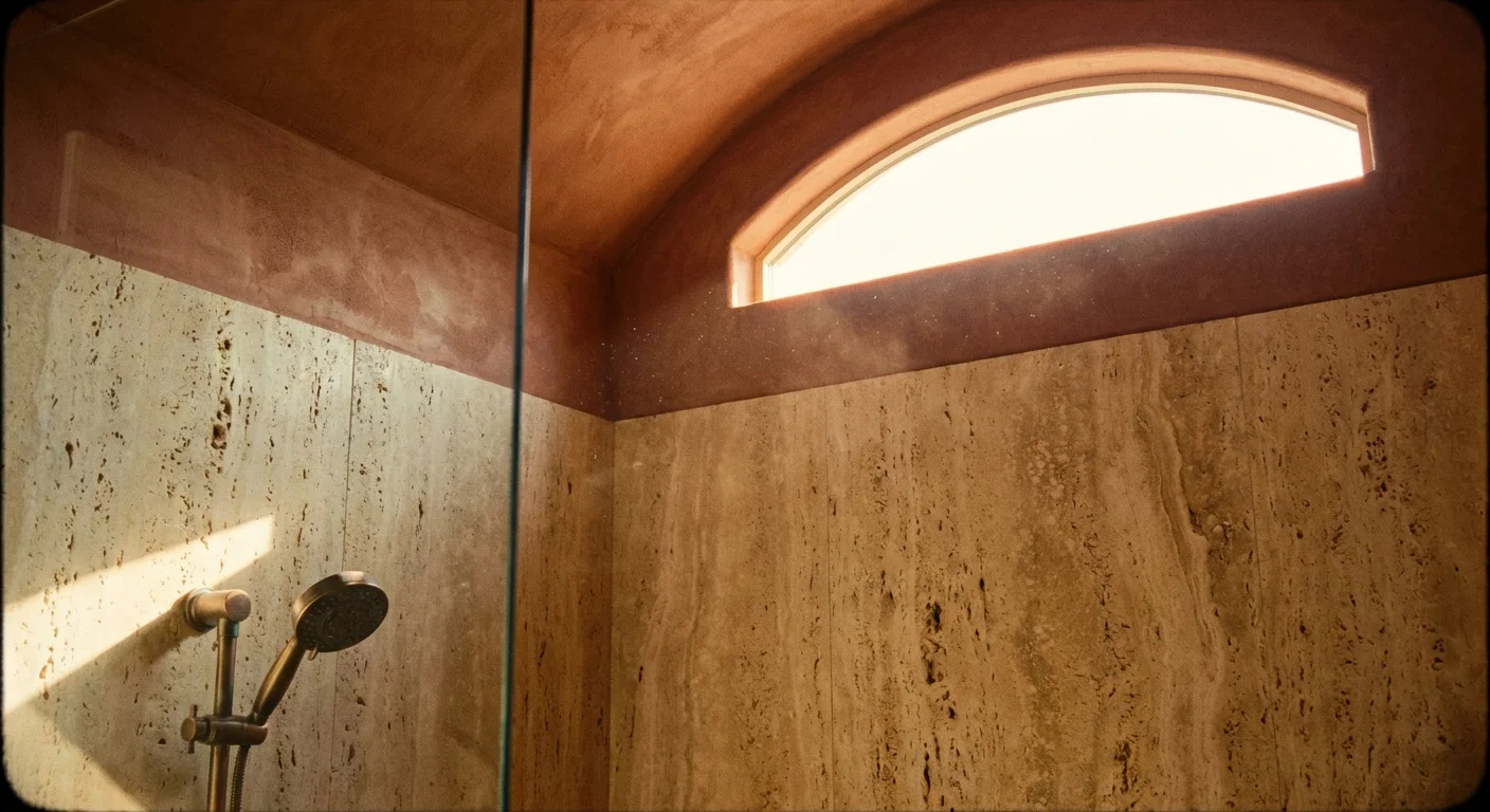
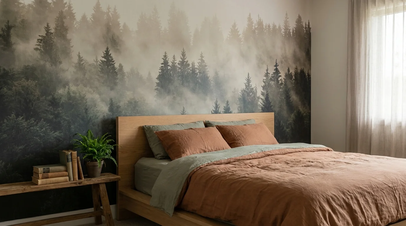
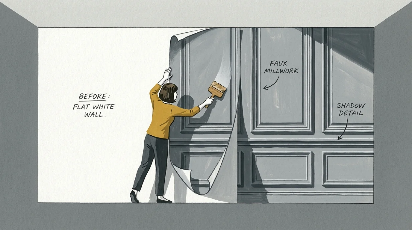
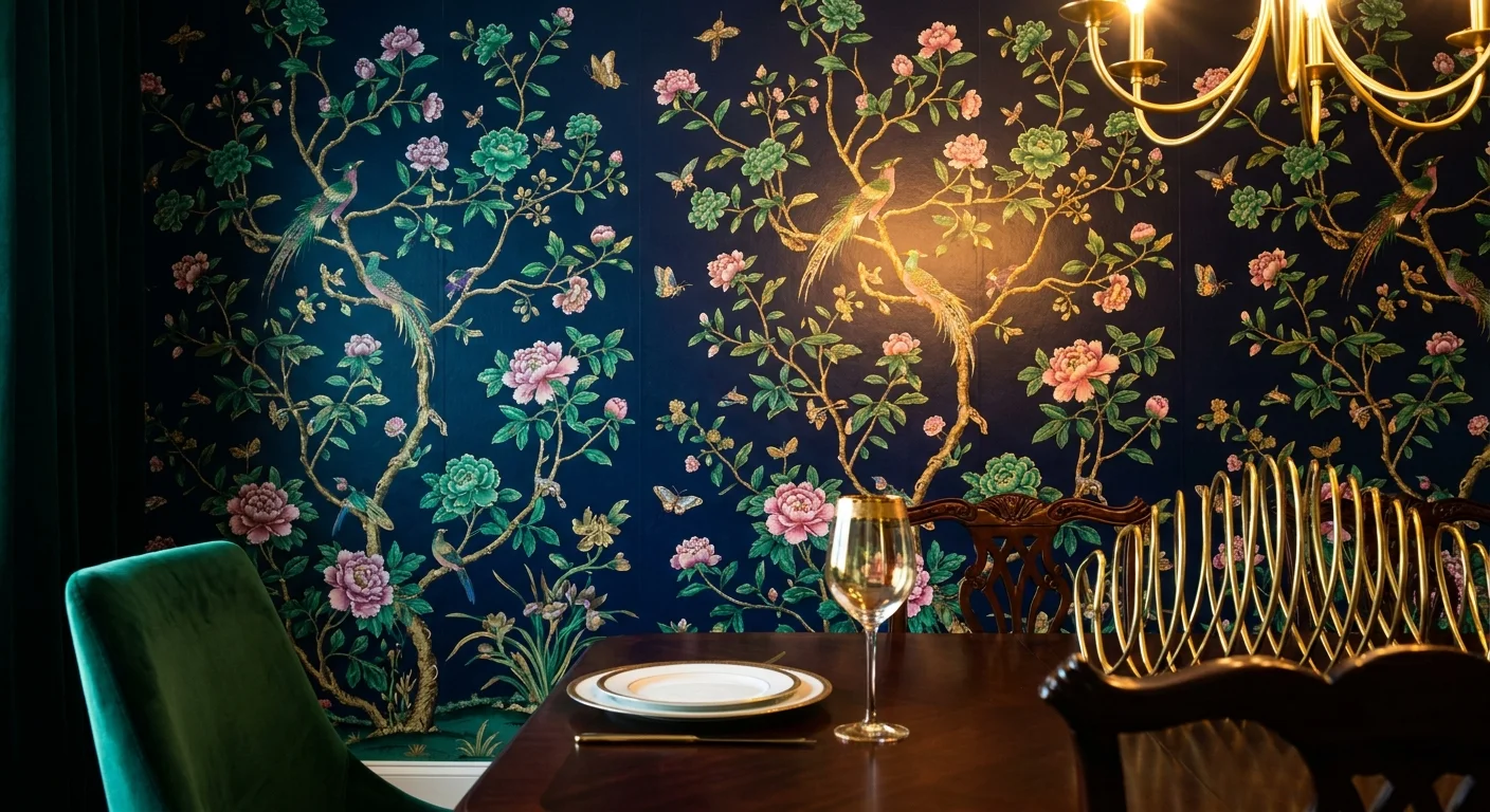
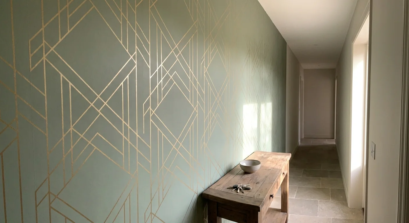
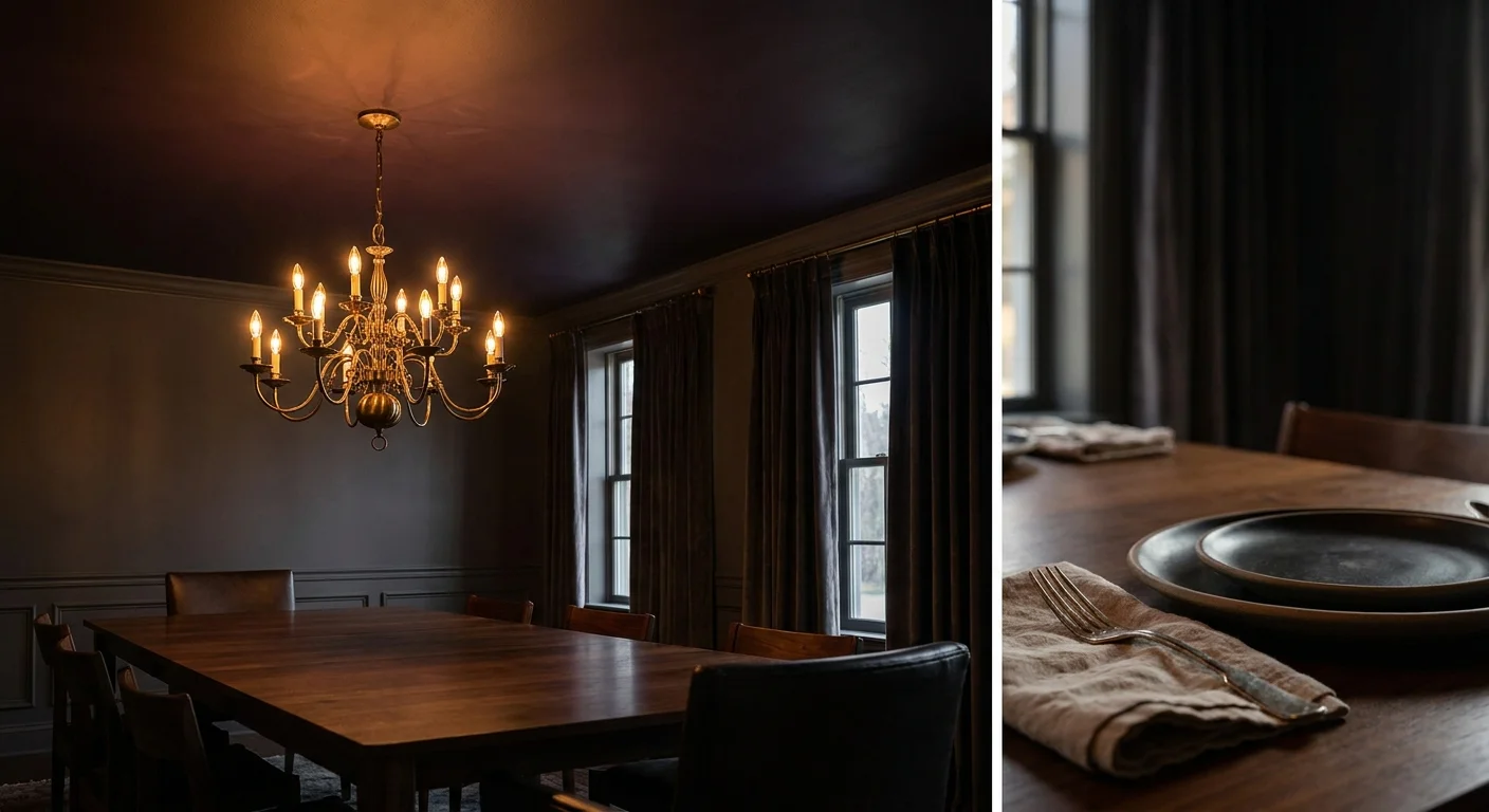
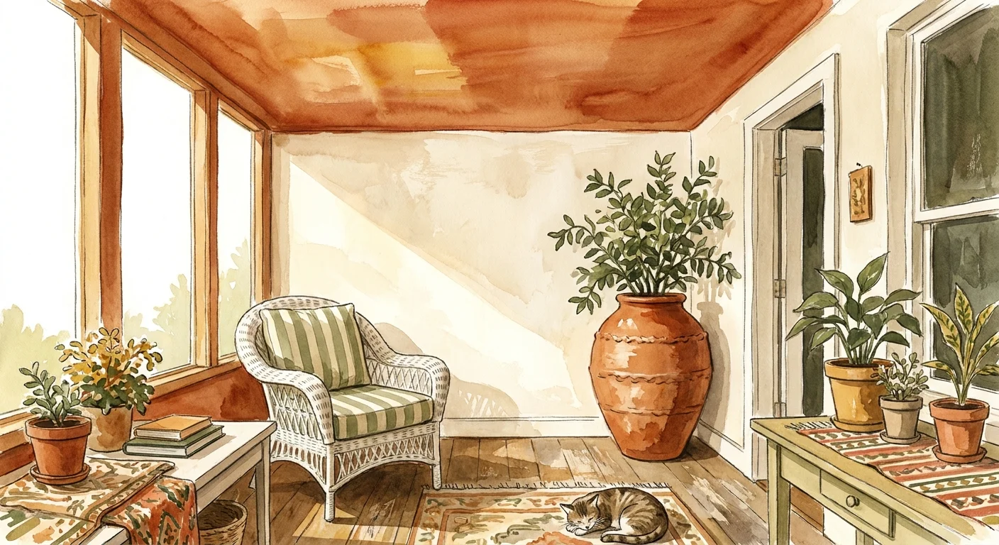
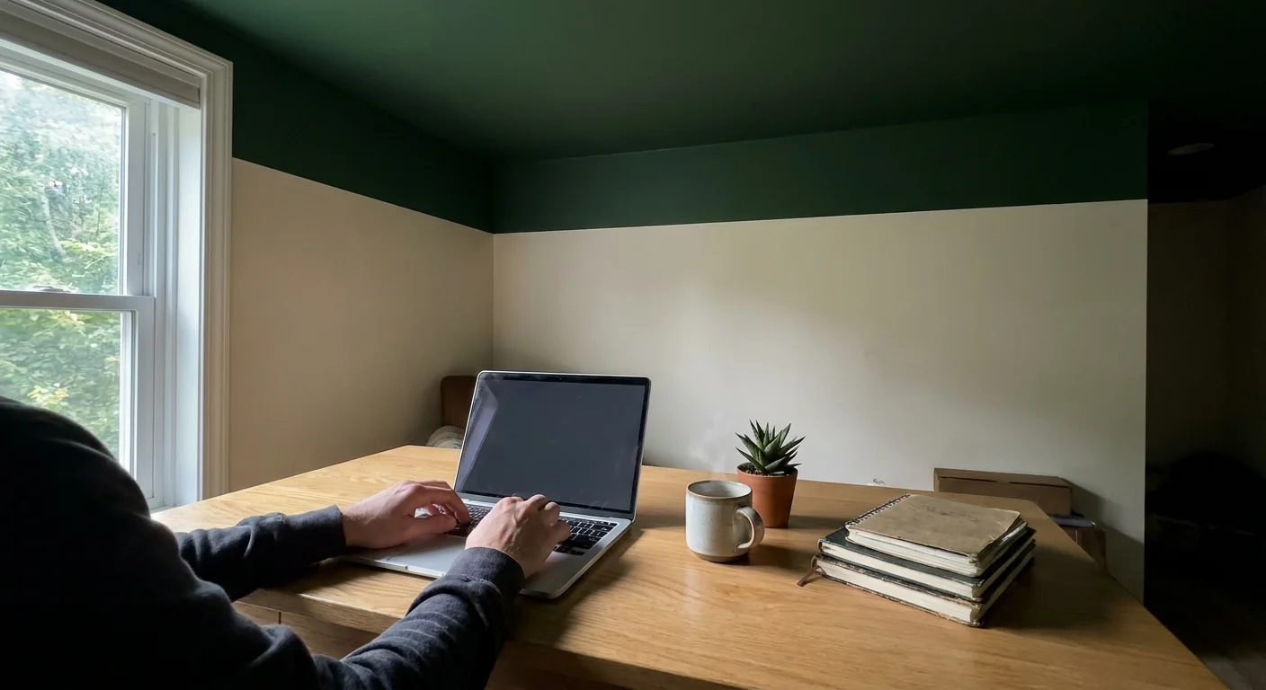
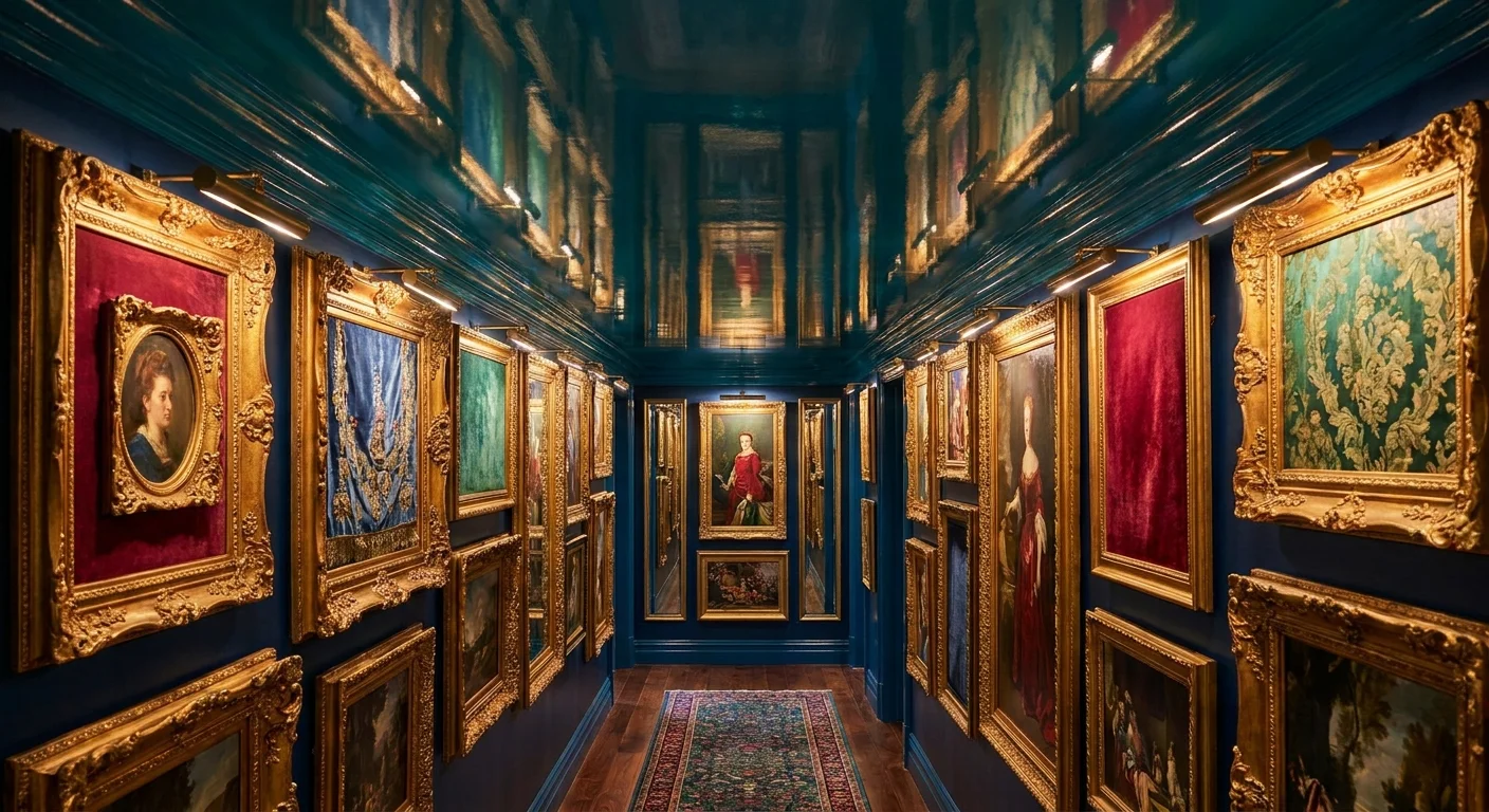
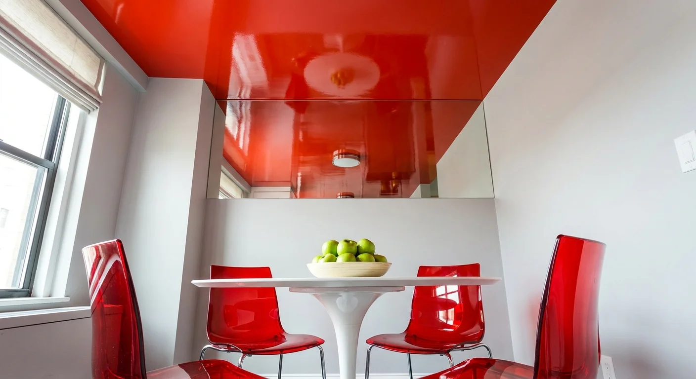
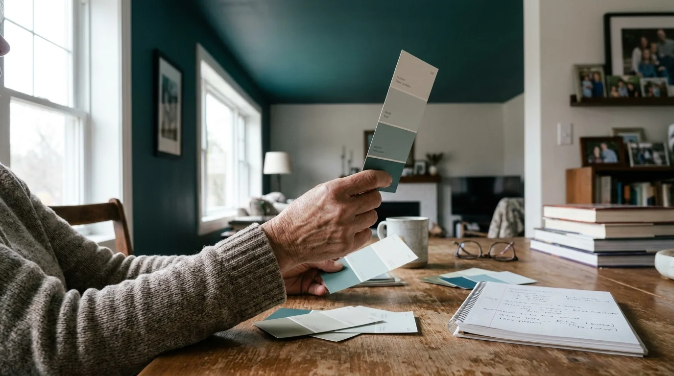
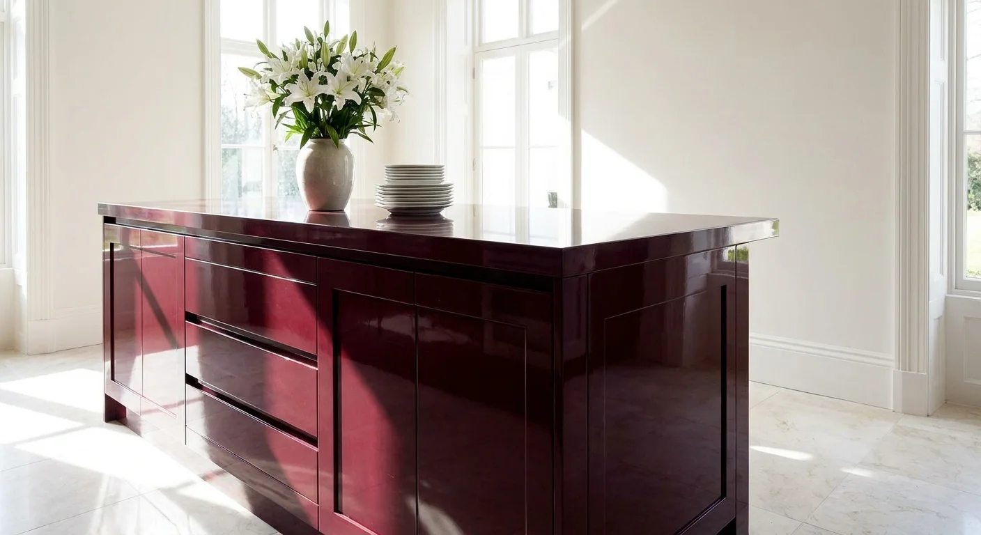
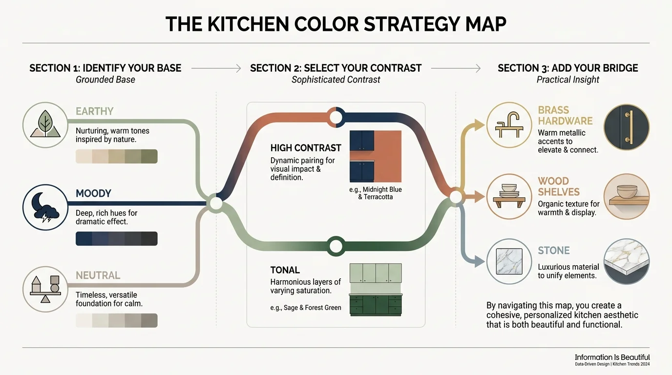
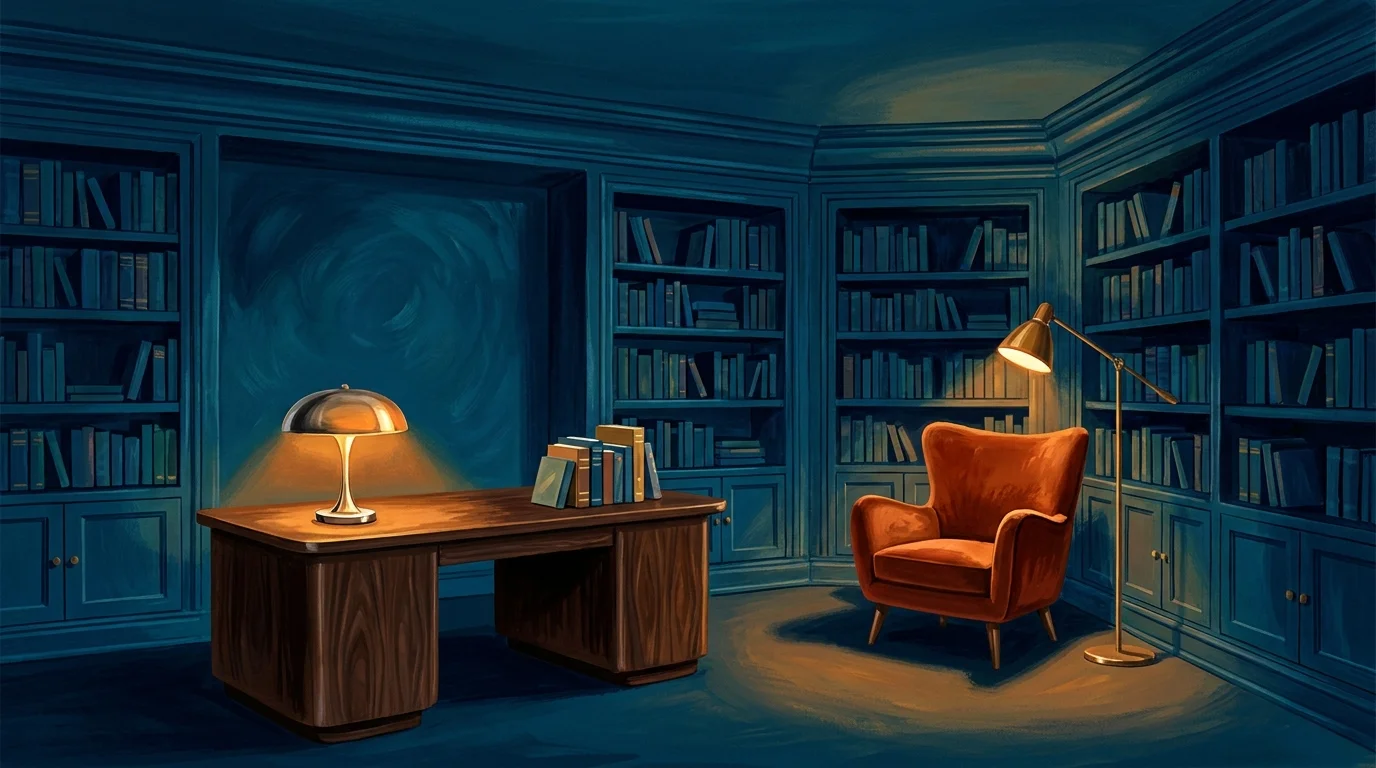
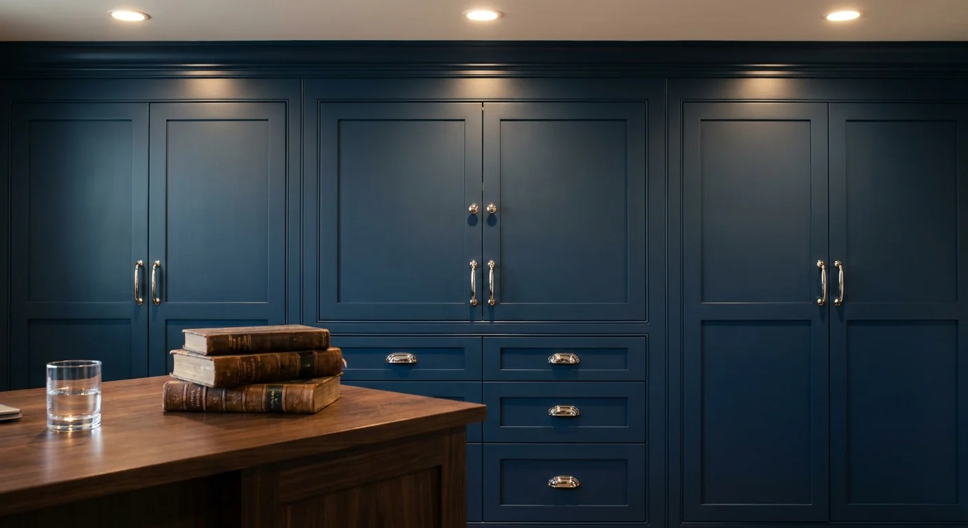
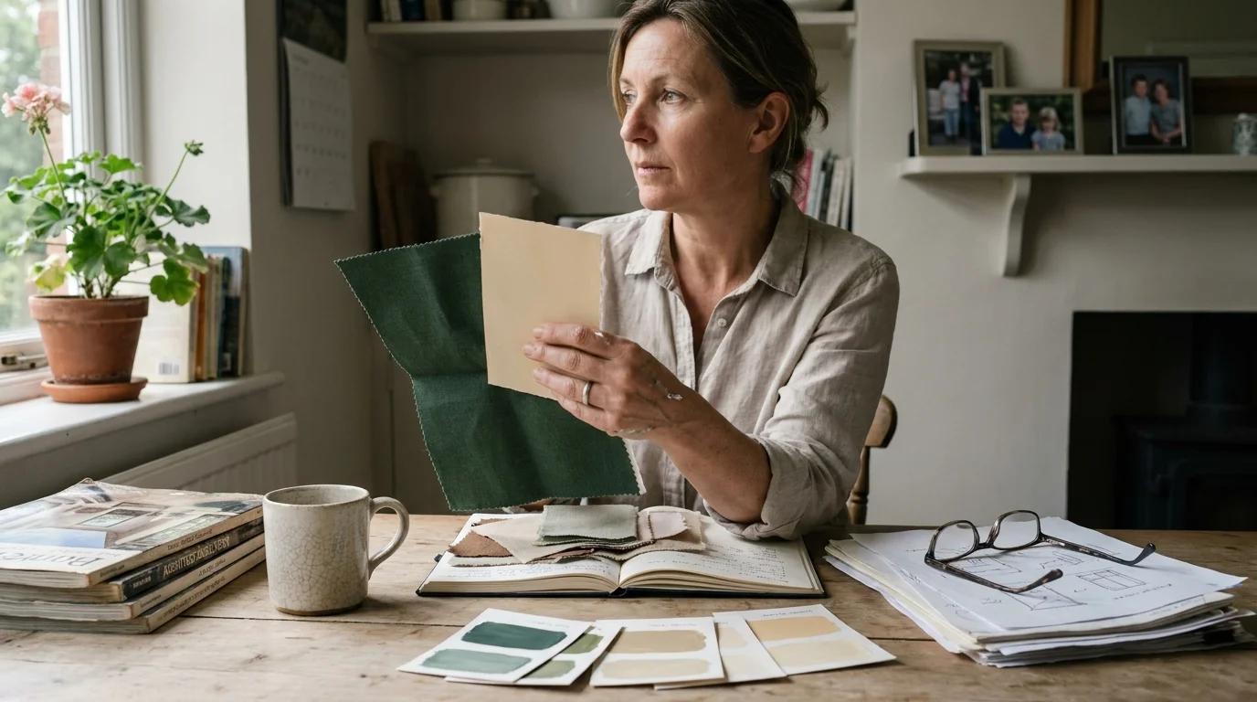
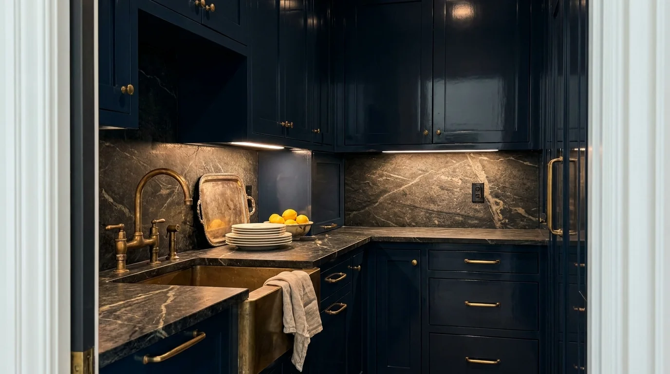
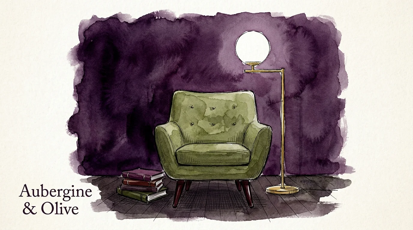
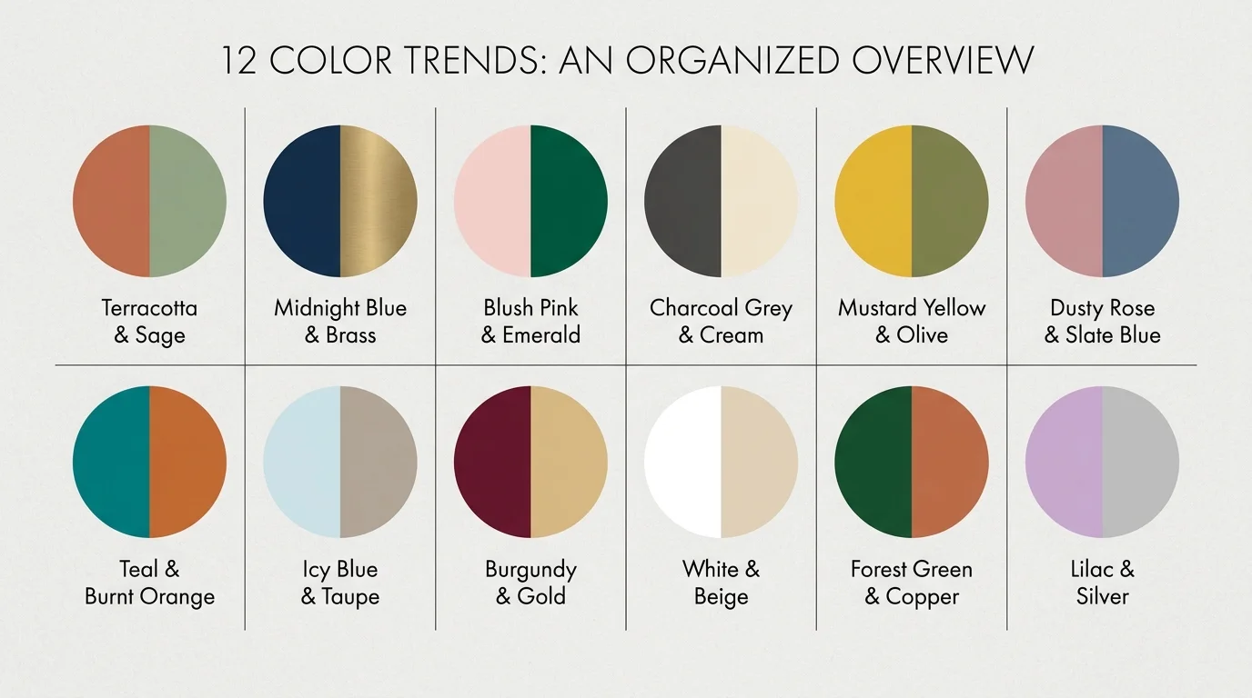
Trend #4: Contextual Color Drenching
The isolated, brightly painted accent wall is an outdated trend that fragments a room and breaks the visual flow. Designers immediately notice when an accent wall feels like a timid afterthought rather than a bold, cohesive design statement. This approach often highlights the wrong architectural features and inadvertently makes the space feel smaller by visually pulling one contrasting wall forward.
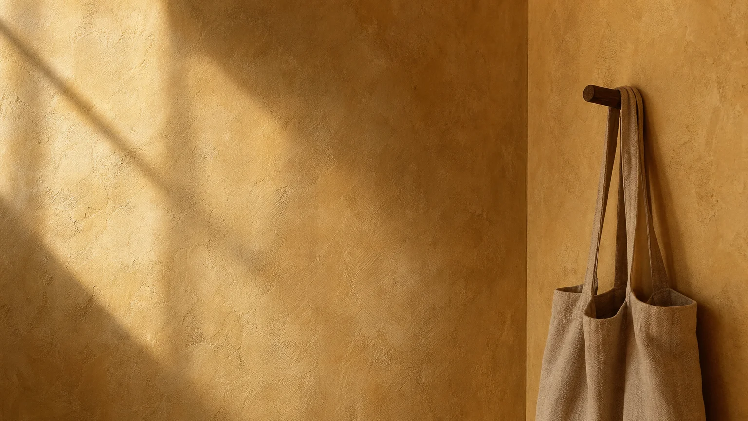
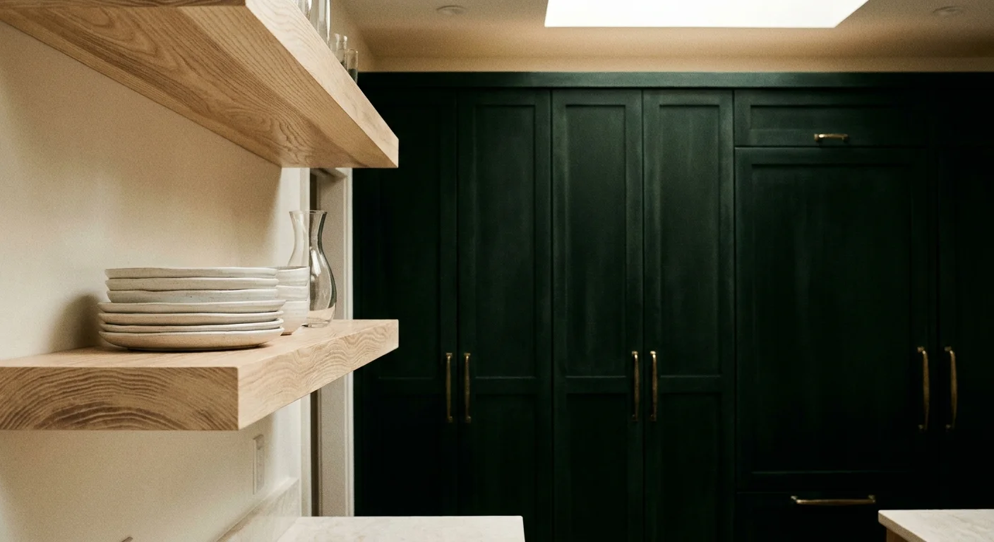
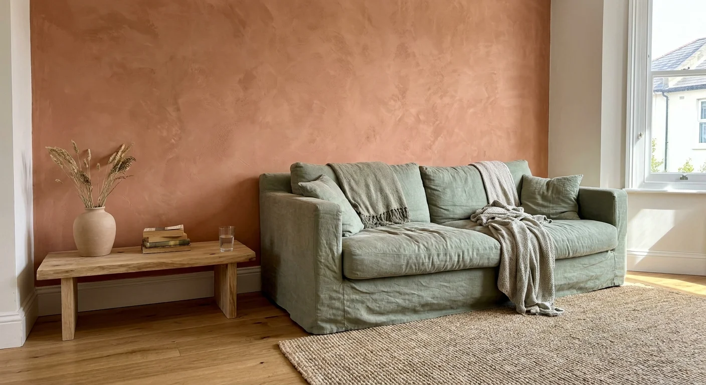
Contextual color drenching emerges as the luxurious, modern replacement for the isolated accent wall. This powerful trend involves painting the walls, trim, baseboards, interior doors, and sometimes even the ceiling in a single, unified color. Enveloping the entire room in one continuous hue eliminates jarring visual breaks, allowing your eye to travel smoothly across the space without interruption.
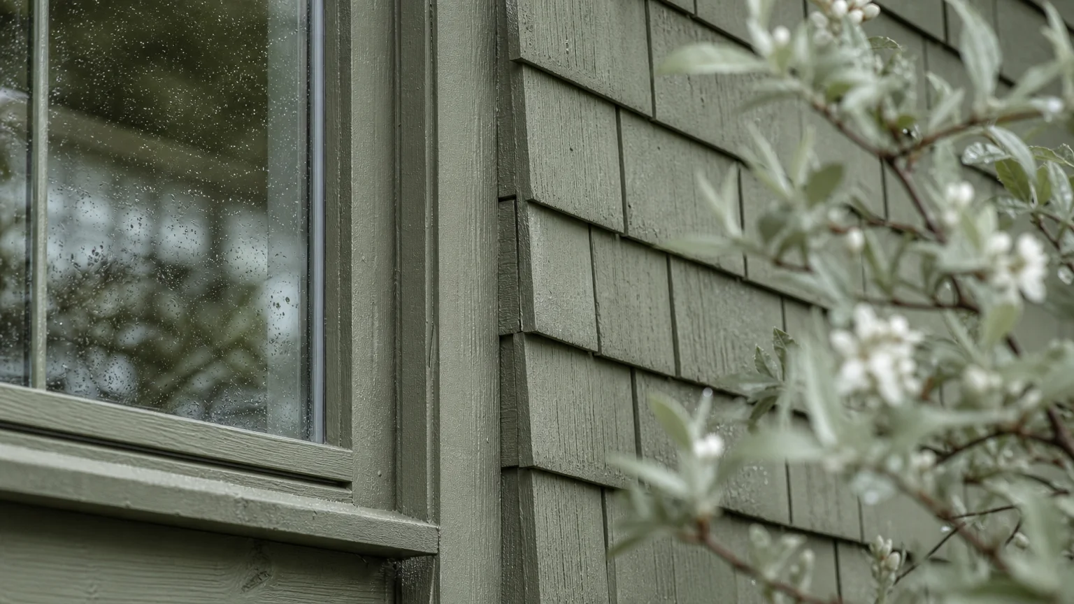
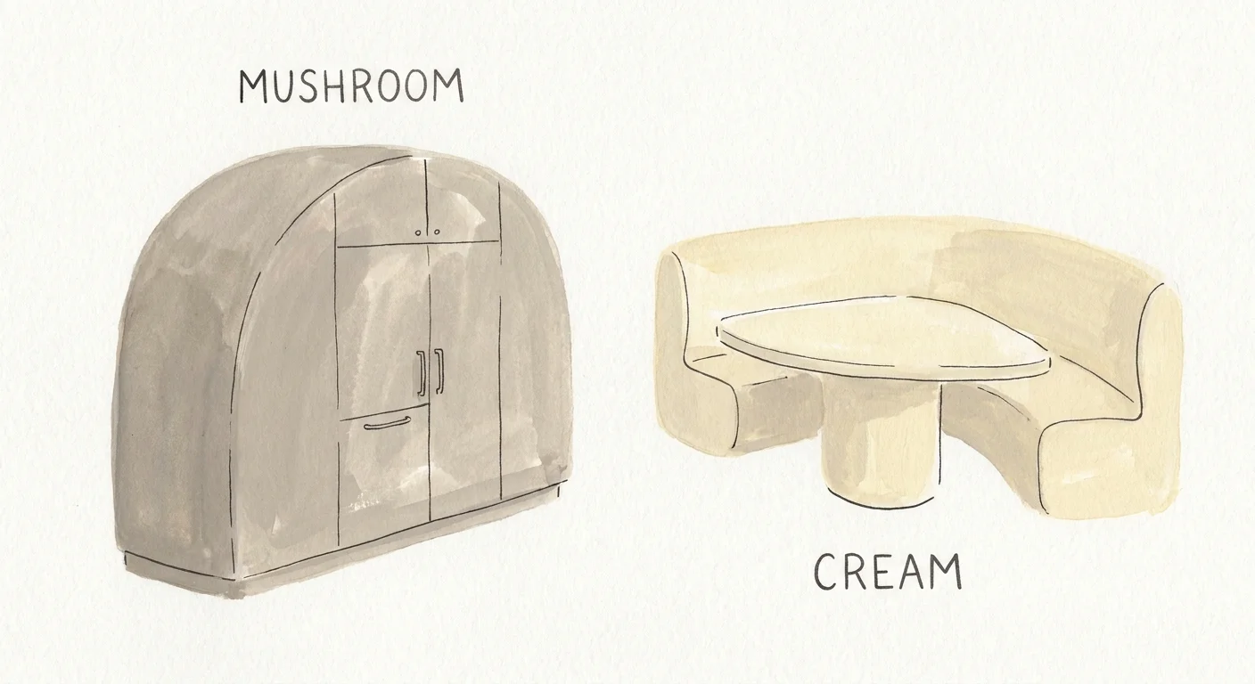
When you apply a single rich color across all surfaces, you elevate the perceived value of the room and create a profound sense of quiet luxury. Dark, moody tones like deep forest green or aubergine create an intimate, jewel-box effect in dining rooms or studies, while soft, muddy neutrals generate an expansive, calming atmosphere in main living spaces. This technique shifts the focus away from the drywall and directly onto your curated furnishings and artwork.
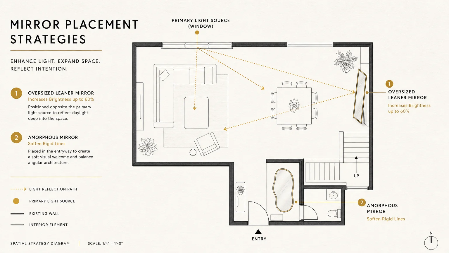
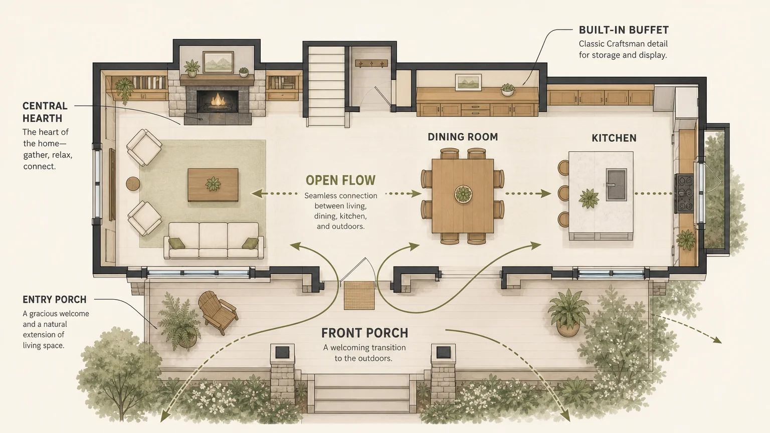
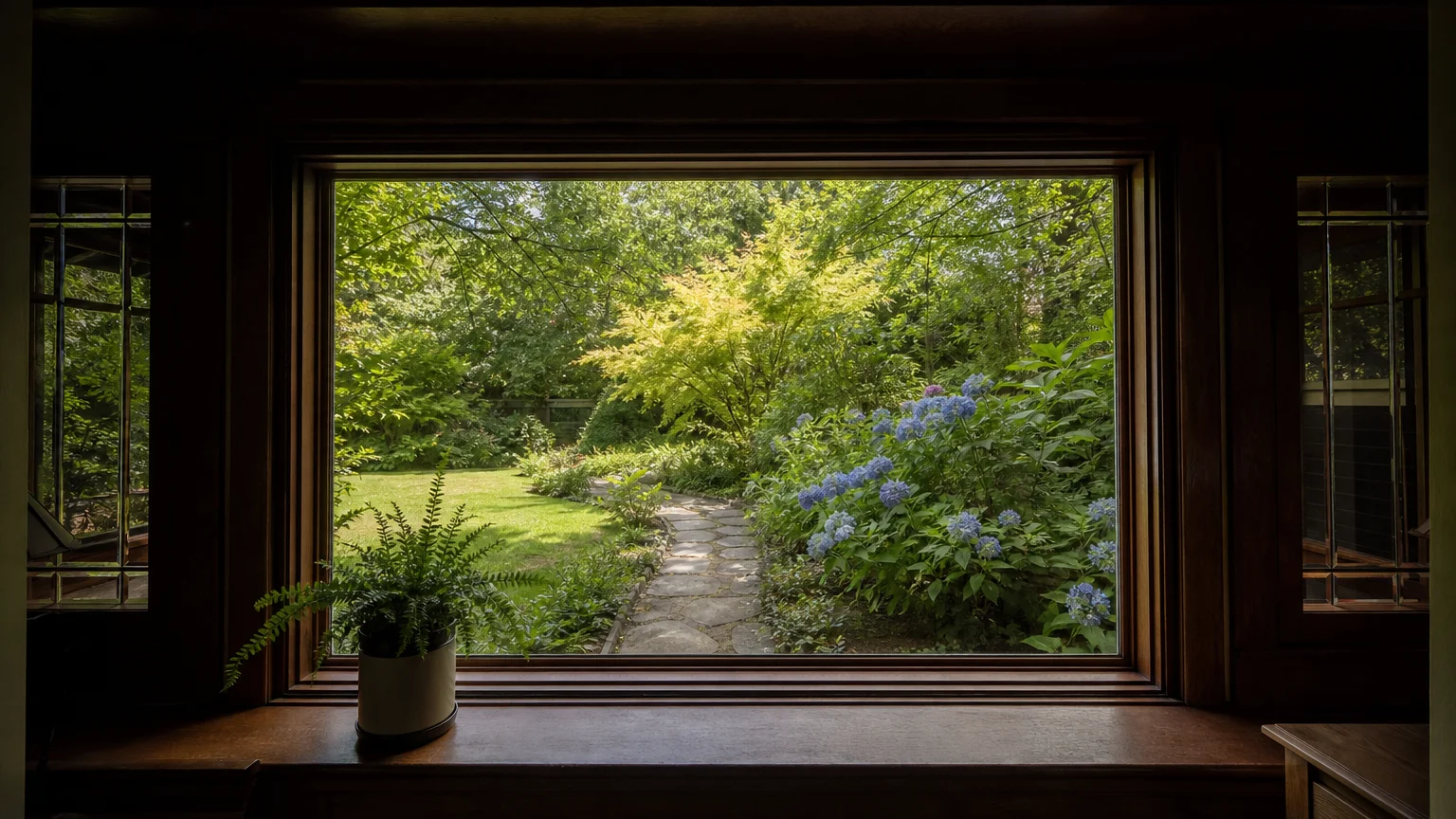
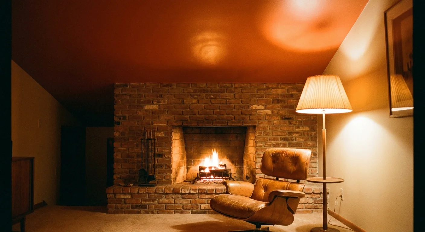
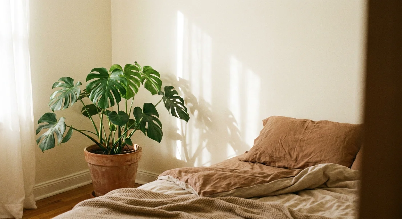
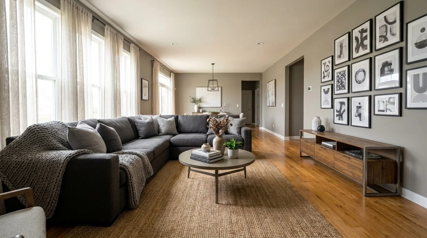
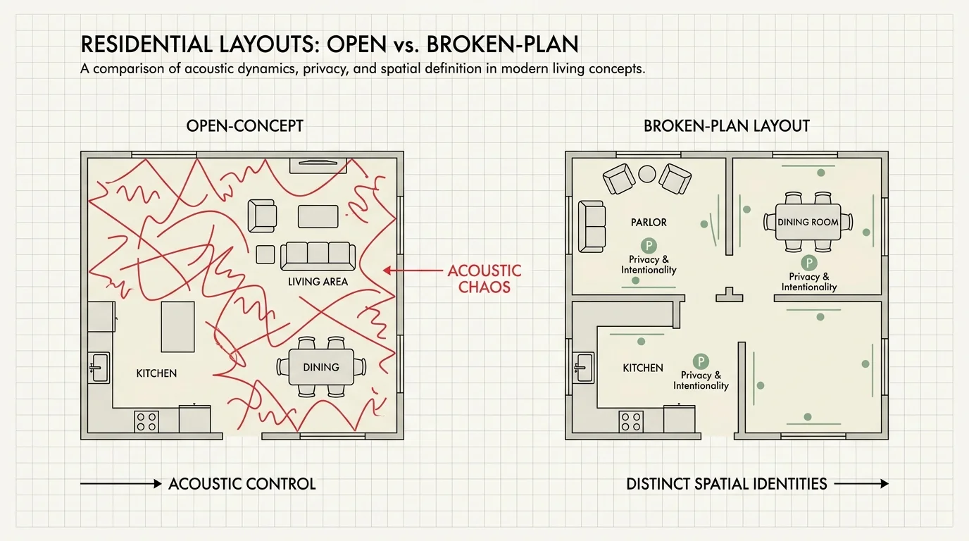
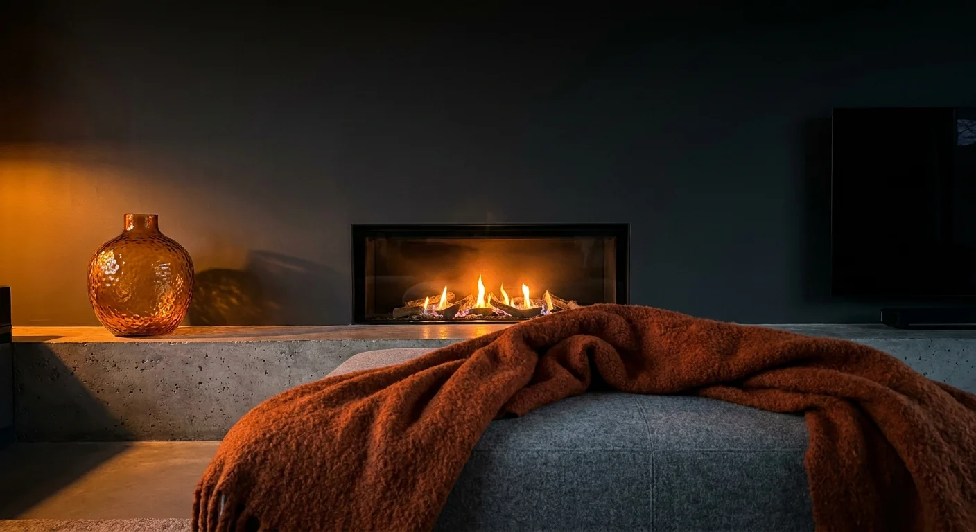
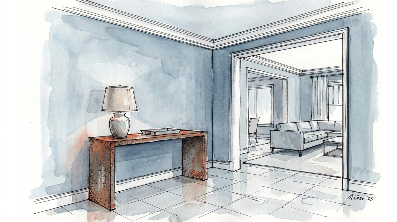
Trend #5: Intentional Negative Space and Floating Layouts
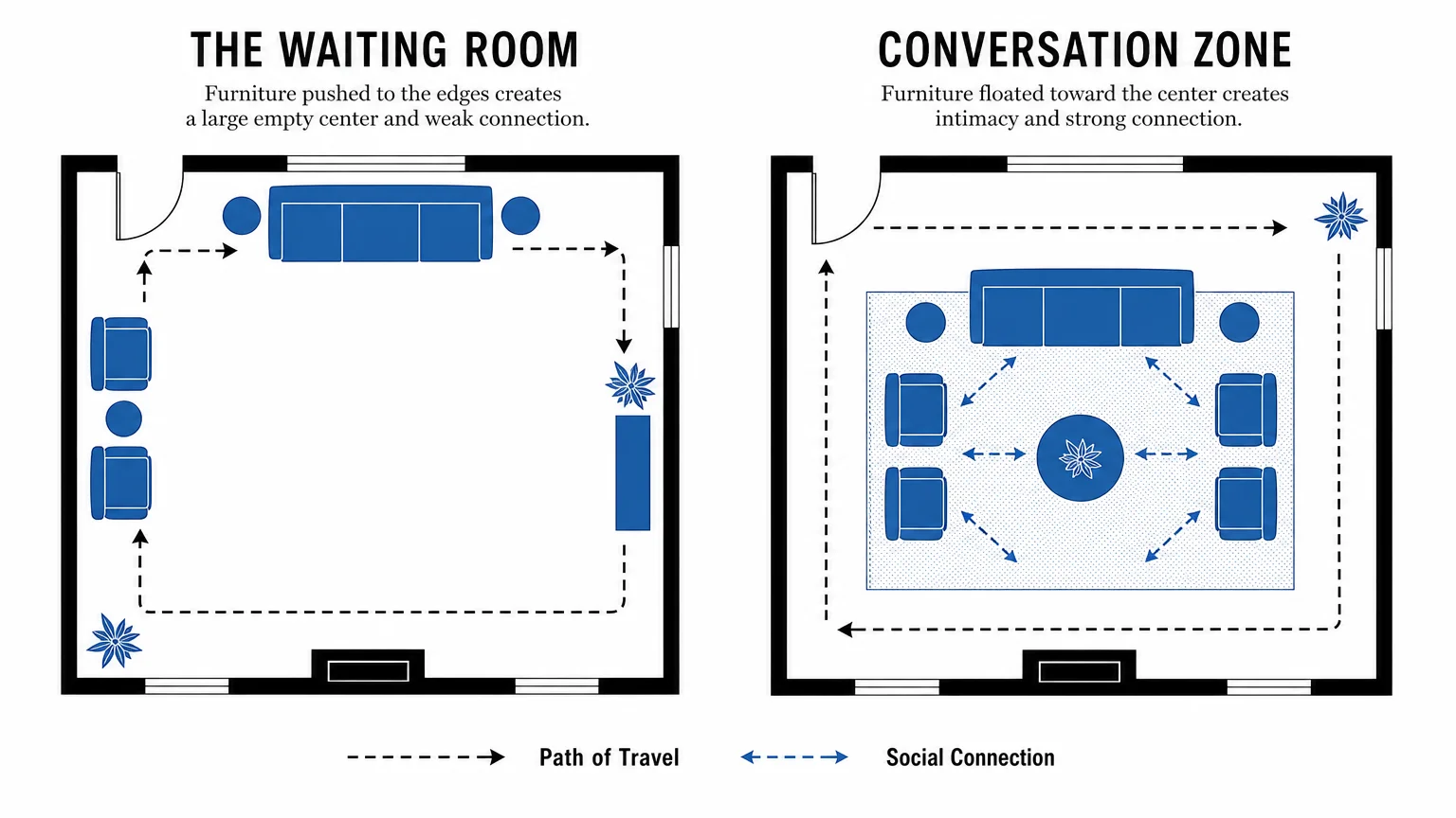
Pushing every piece of furniture flush against the perimeter walls ranks highly among the decorating mistakes that ruin spatial flow. Homeowners often utilize this strategy in a misguided attempt to create more space in the center of the room, but it achieves the exact opposite. A vast, empty center surrounded by wallflower furniture creates a disconnected, cavernous environment that impedes natural conversation; it effectively neutralizes the warmth of your home.
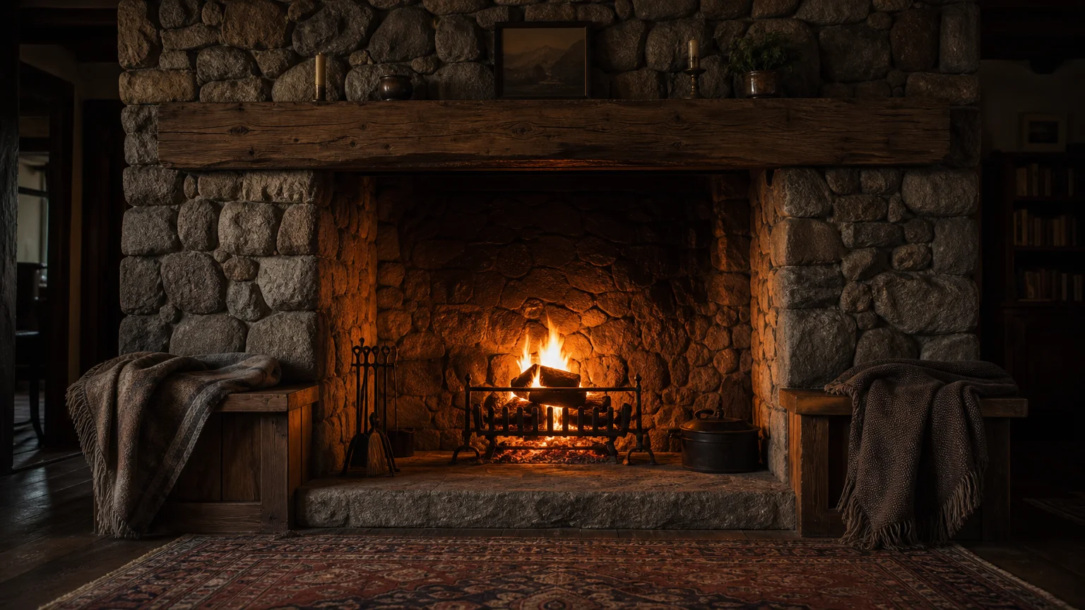
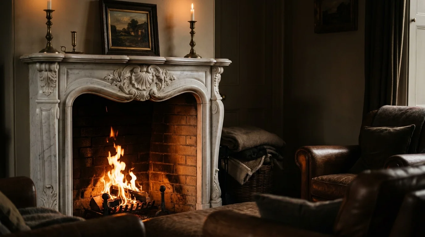
Designers counter this by embracing intentional negative space and floating furniture layouts. You construct a far more engaging and intimate environment by pulling your seating away from the walls and arranging it around a central focal point, such as a cast-stone fireplace or an exceptional window view. Leaving a minimum of three feet of walking space behind sofas or heavy chairs allows the architecture to breathe naturally.
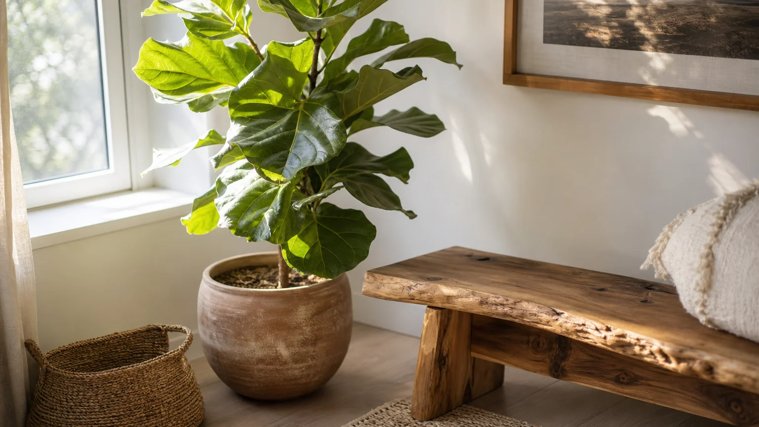
Negative space—the intentional empty areas around your furnishings—is just as crucial as the physical objects within the room. Resisting the urge to fill every corner with a fake plant, an unnecessary side table, or a decorative basket prevents visual clutter. This masterclass in restraint highlights the quality of your chosen pieces and fosters a serene, deeply functional atmosphere.
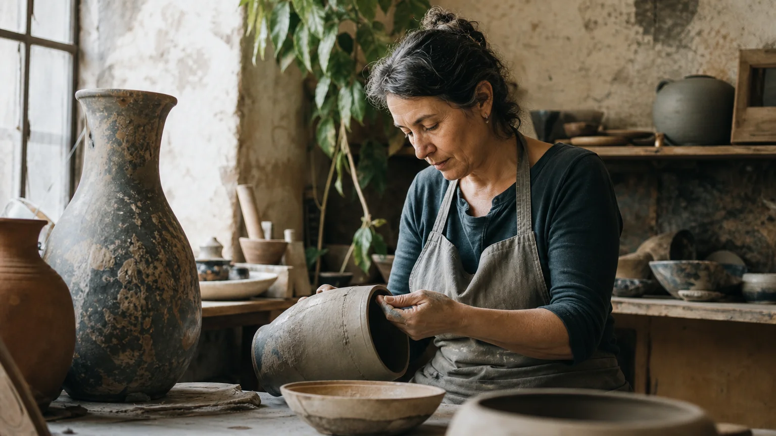
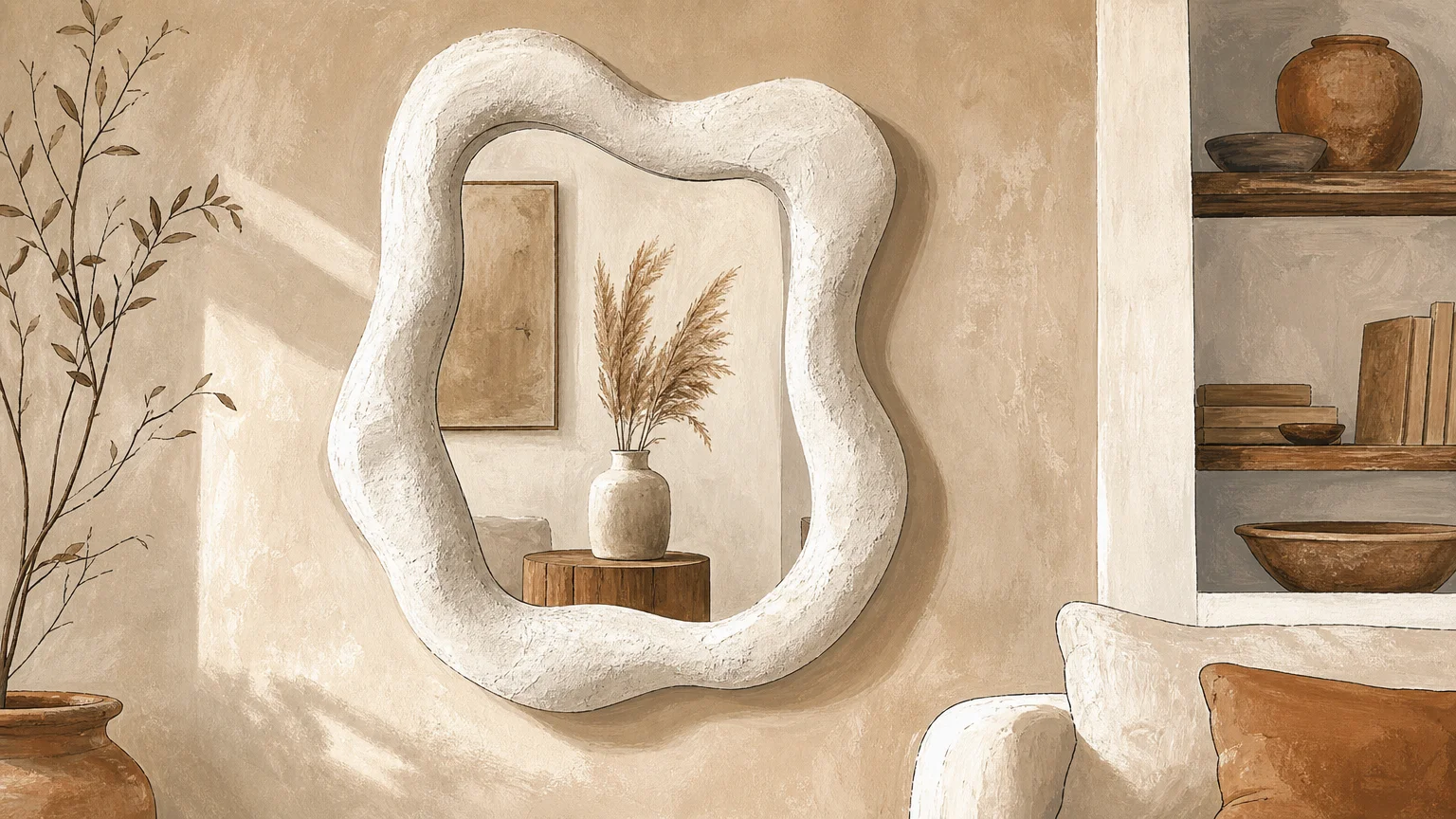
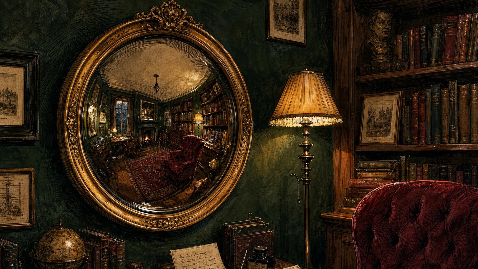
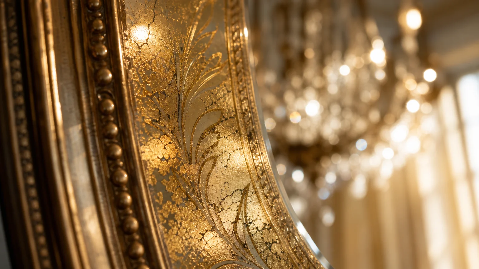
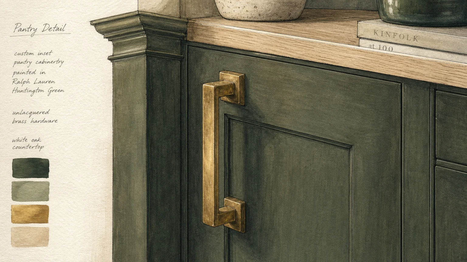
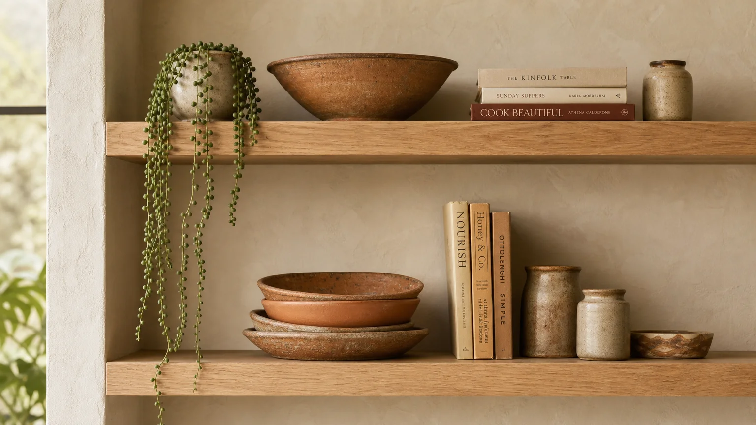
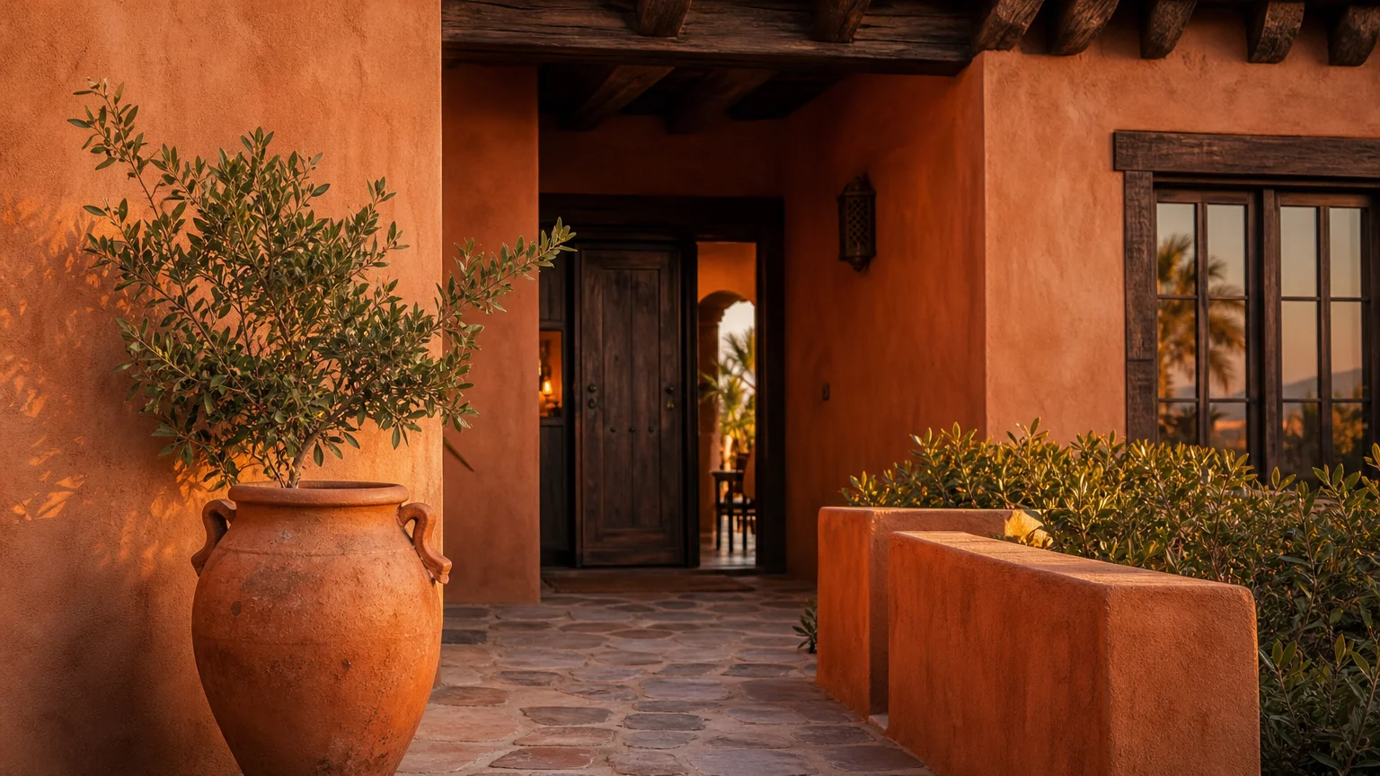
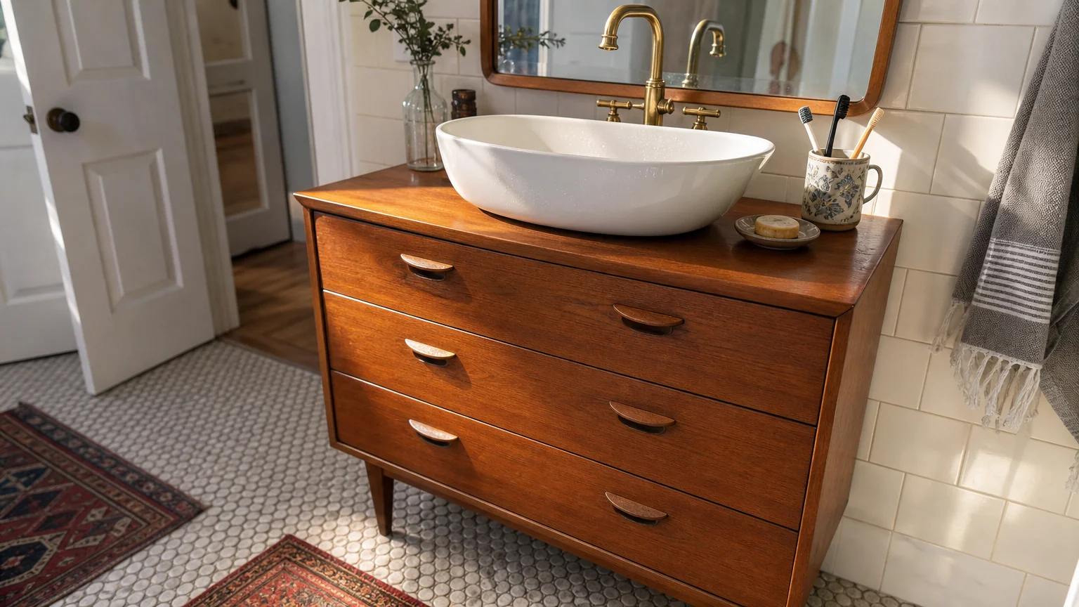
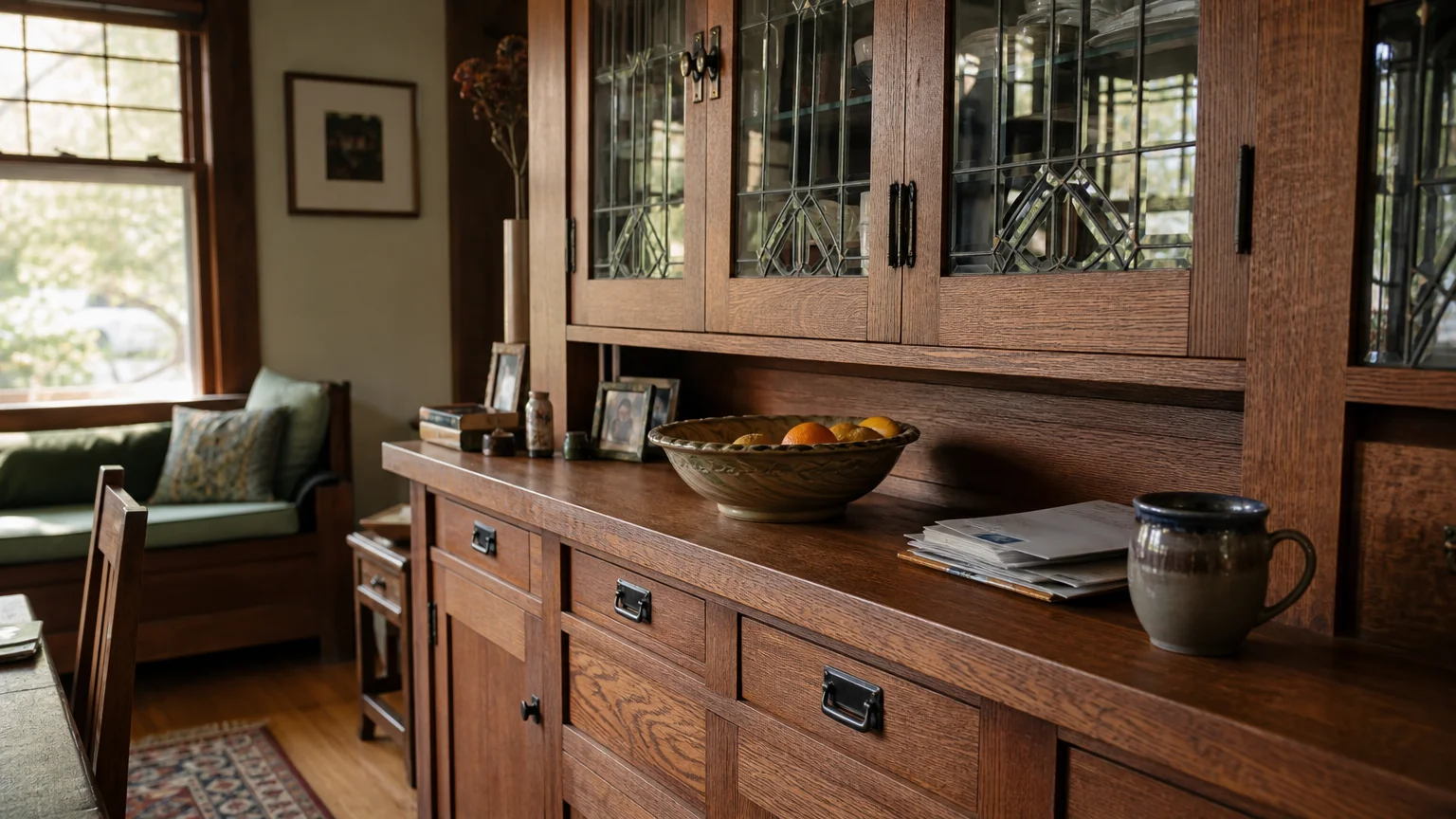
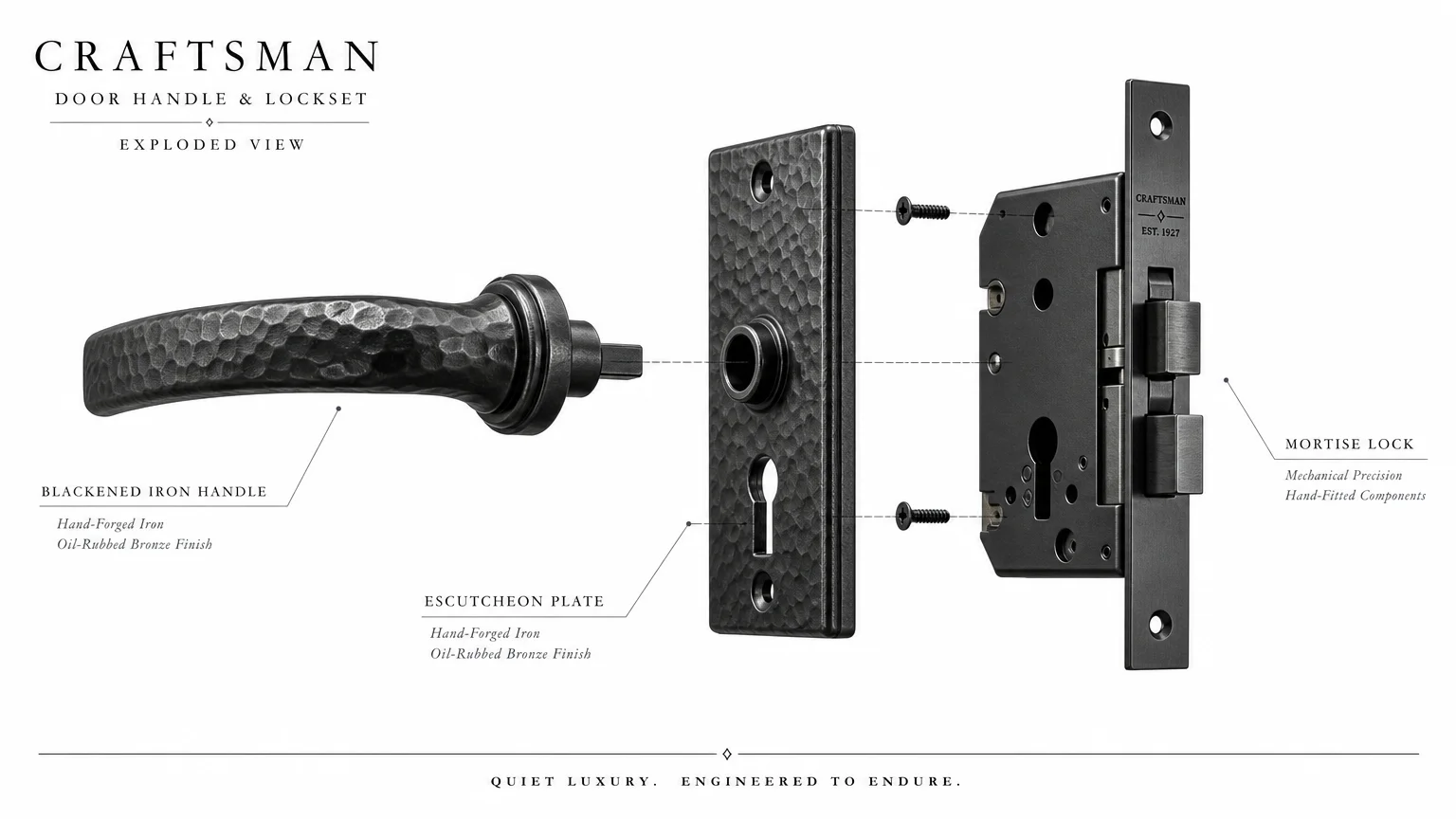
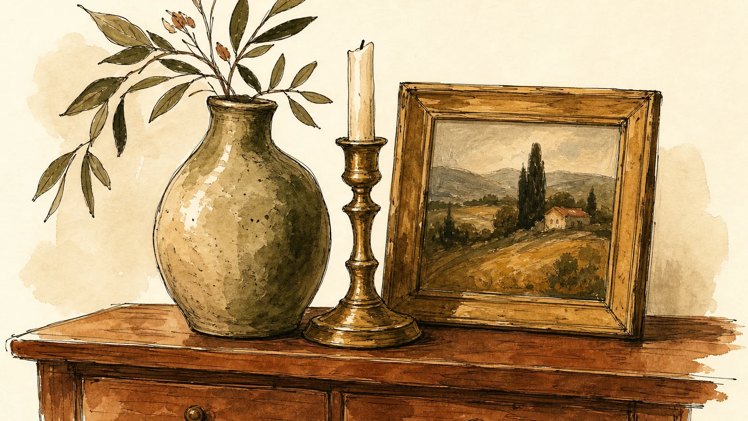
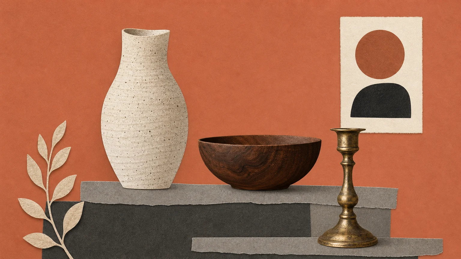
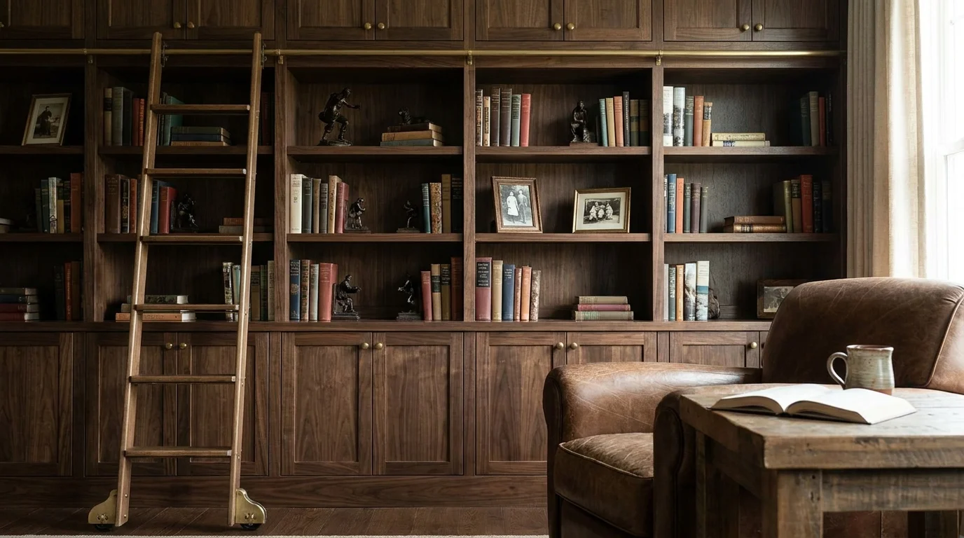
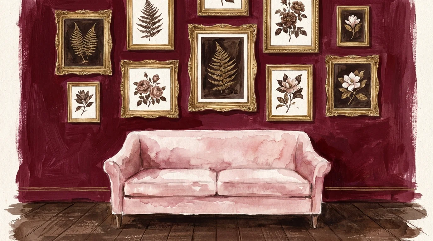
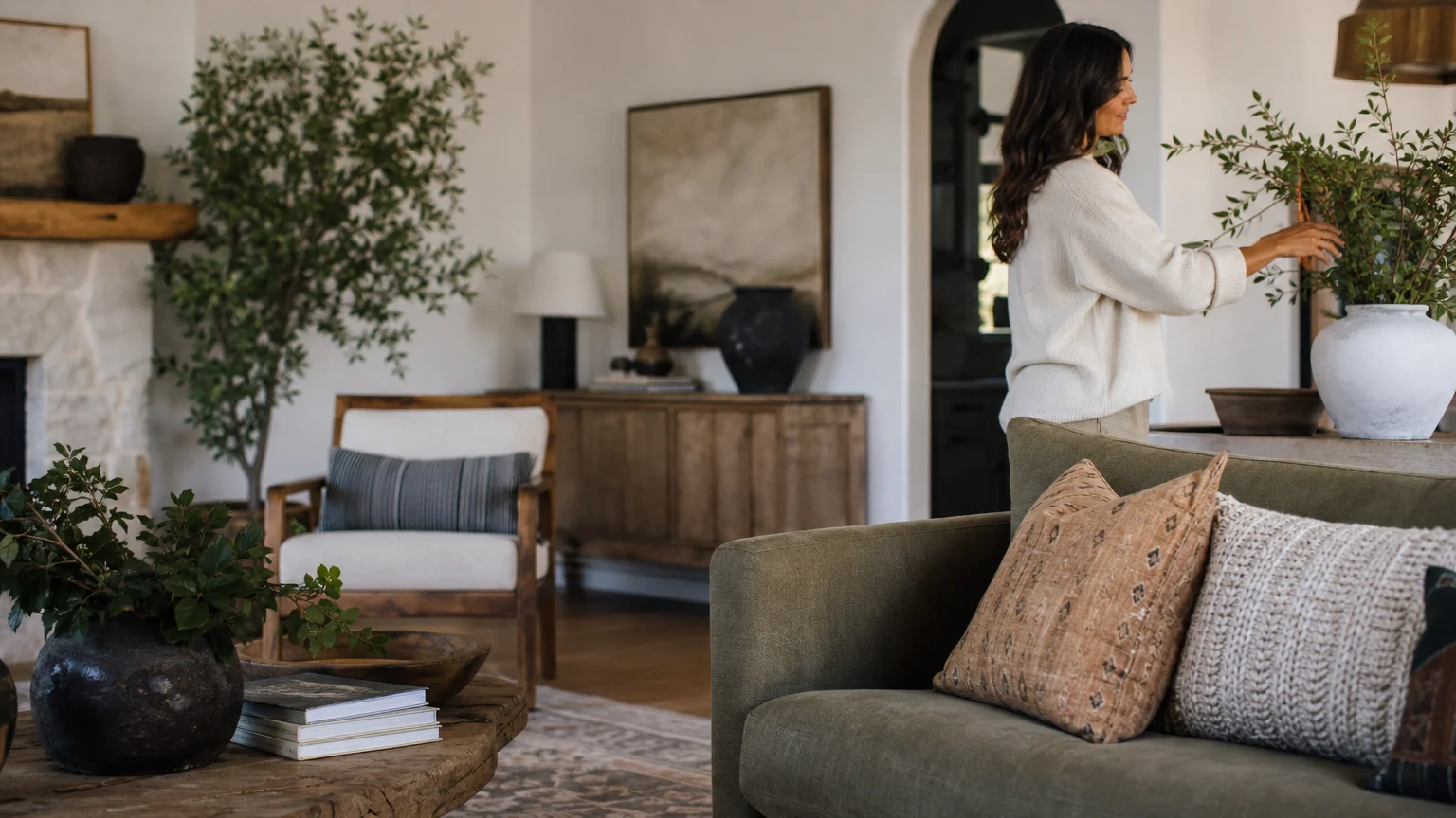
Trend #6: Authentic Provenance Over Mass Production
Filling your walls and shelves entirely with generic, mass-produced word art or ubiquitous big-box store accessories creates a visually shallow environment. Designers quickly identify these pieces because they lack a unique narrative and fail to reflect the personality of the people living in the home. An over-reliance on fast decor generates a space that feels highly temporary, trend-obsessed, and creatively uninspired.
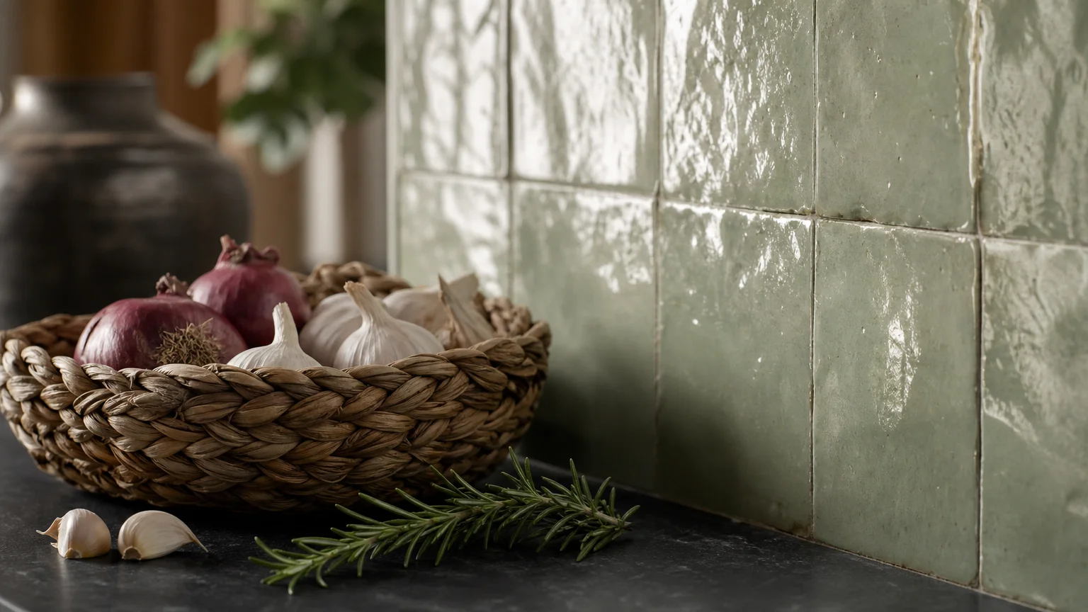
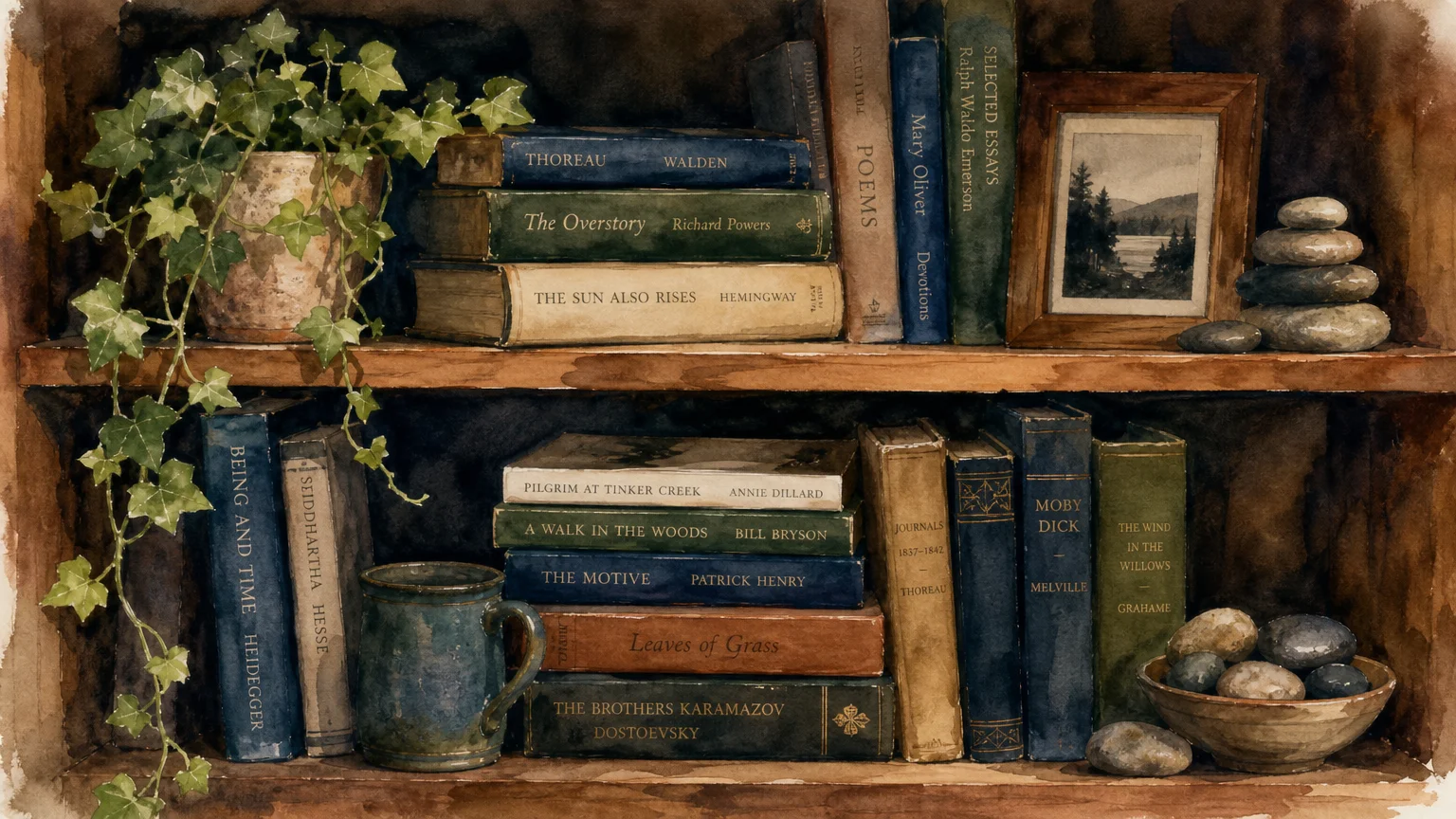
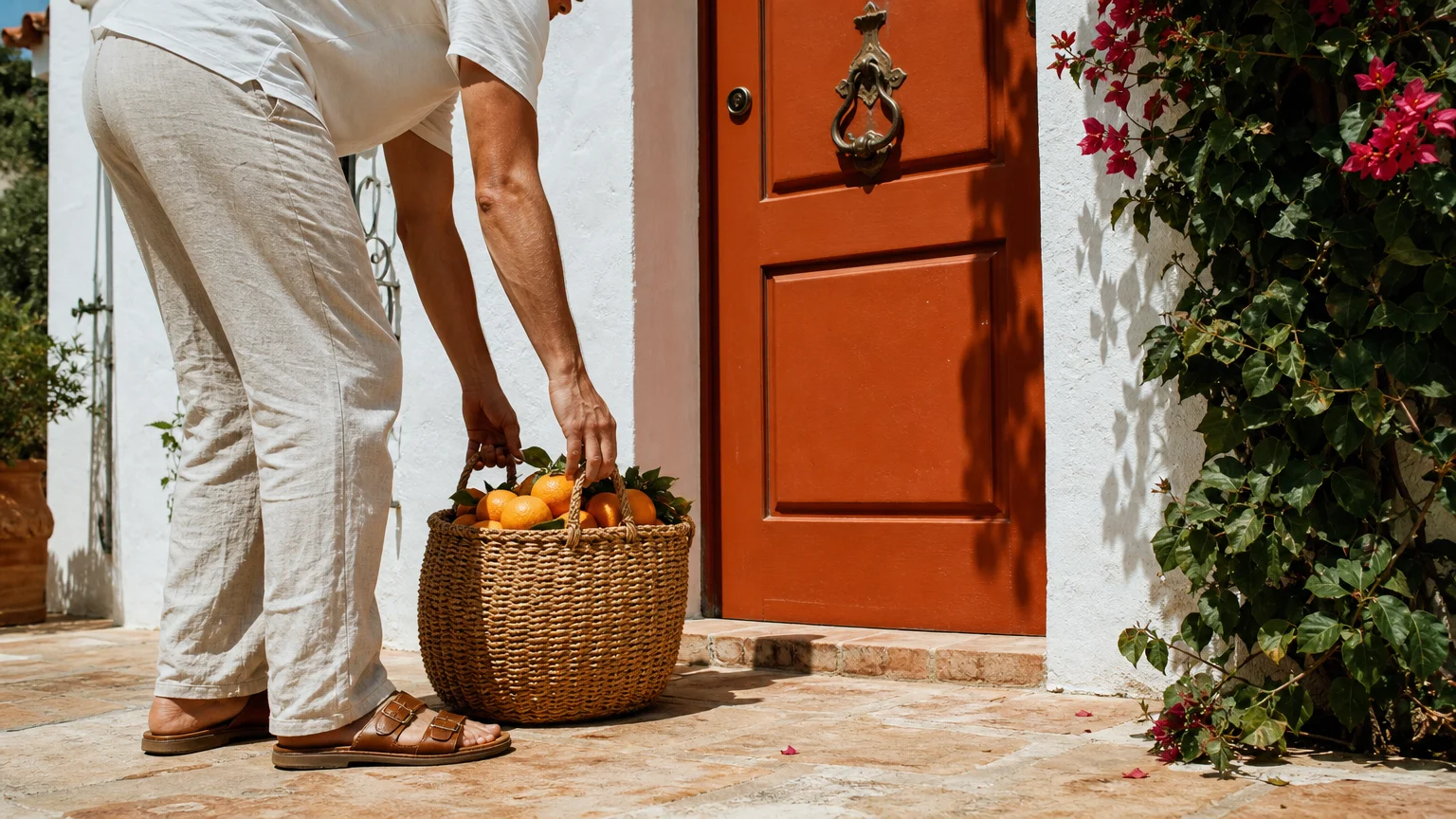
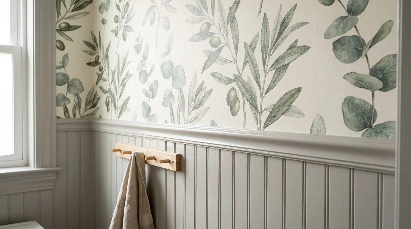
The industry is shifting rapidly toward authentic provenance, prioritizing items that carry history, craftsmanship, and profound meaning. You instantly upgrade your home decor ideas by incorporating original artwork, handmade ceramics, and vintage textiles. The story behind a piece—its provenance—adds an intangible layer of sophistication that mass-produced replicas simply cannot duplicate.
You do not need an unlimited budget to achieve this designer aesthetic. Sourcing raw charcoal sketches from local artists, hunting for sculptural travertine vases at estate sales, or custom-framing inherited textiles introduces immense character into your home. Mixing these one-of-a-kind discoveries with your contemporary staples anchors the room in authenticity and ensures your interior design remains completely unique to you.
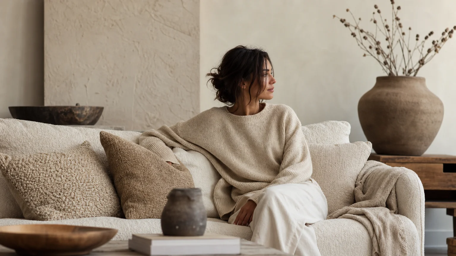
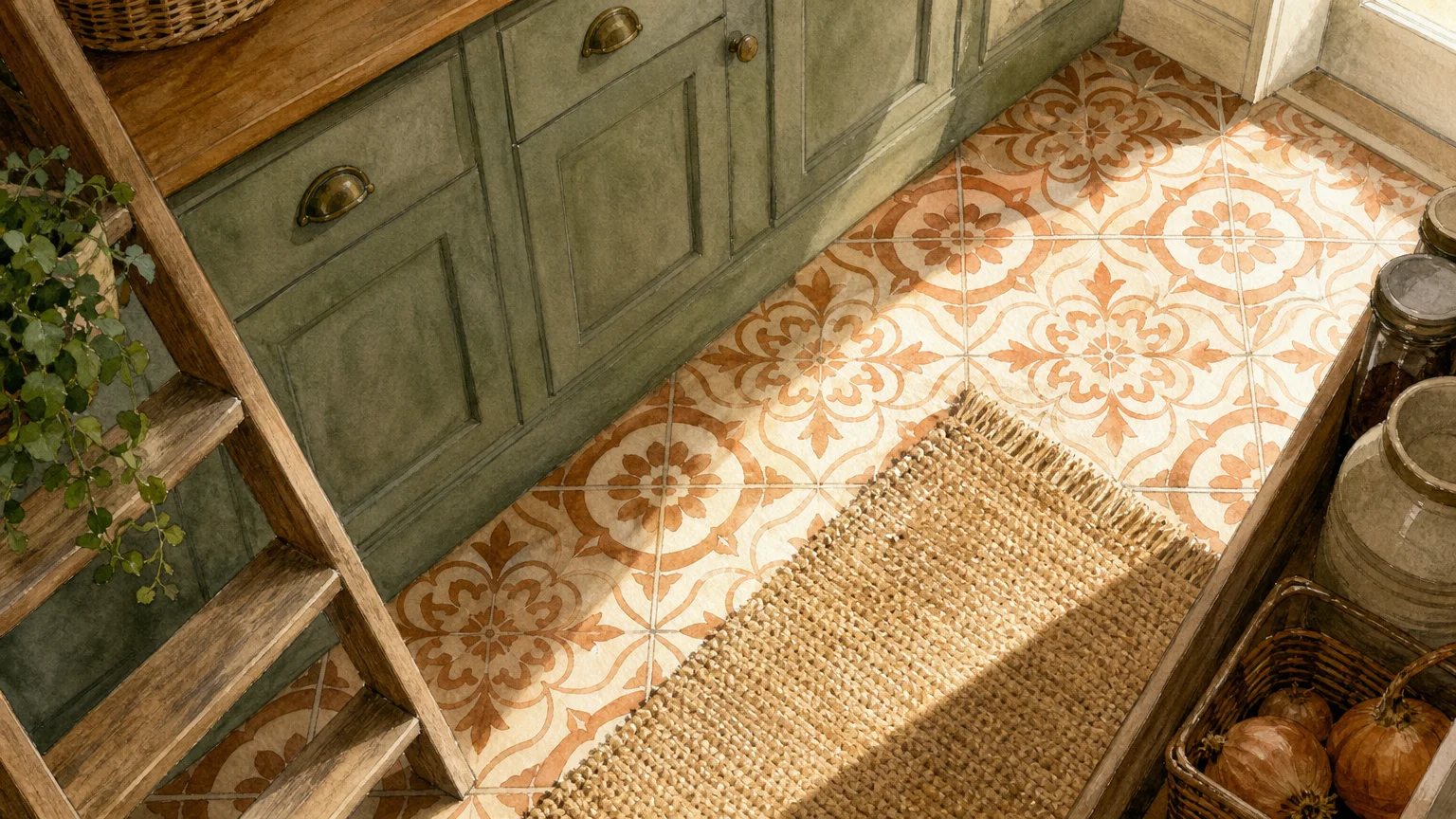
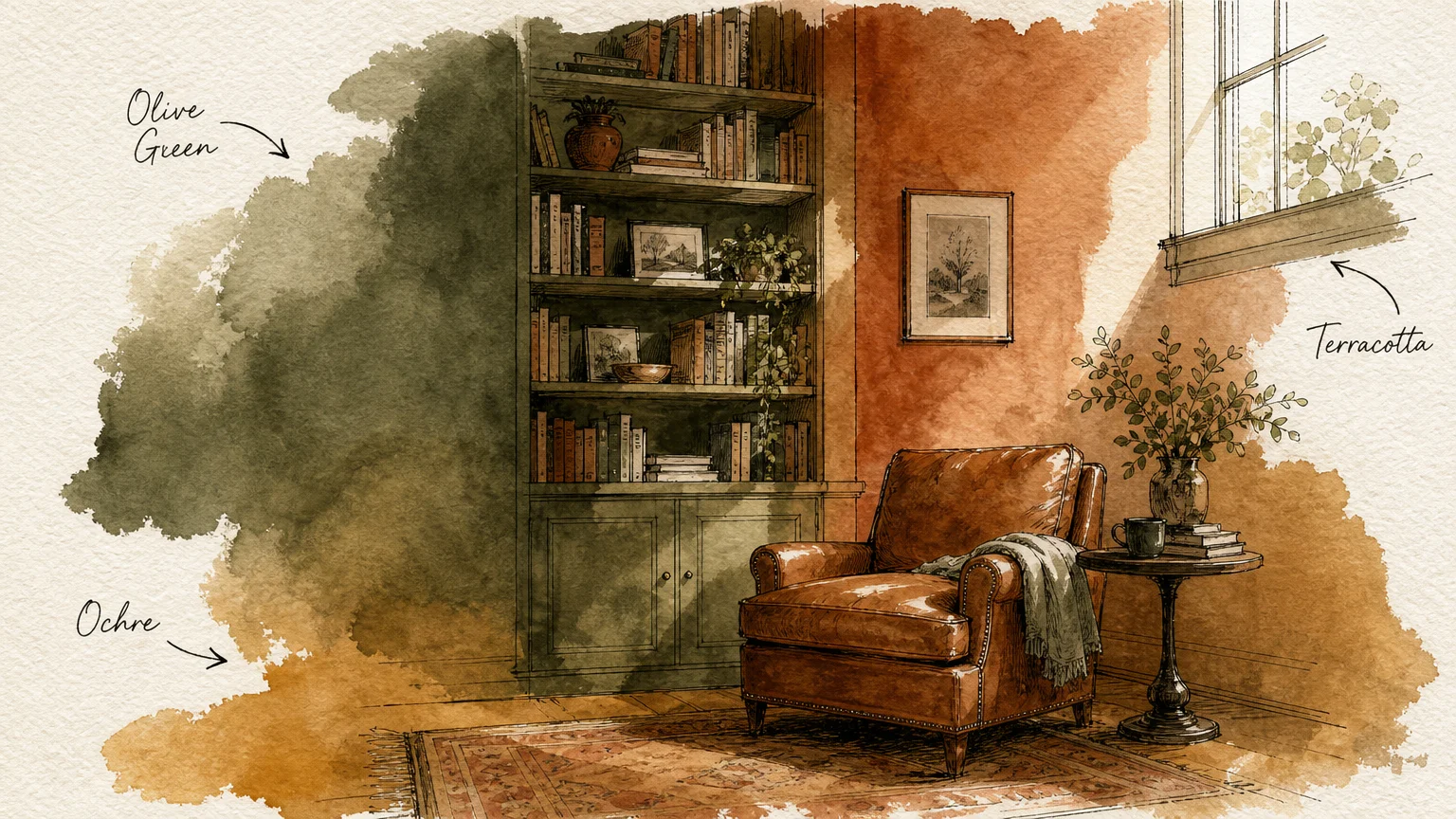
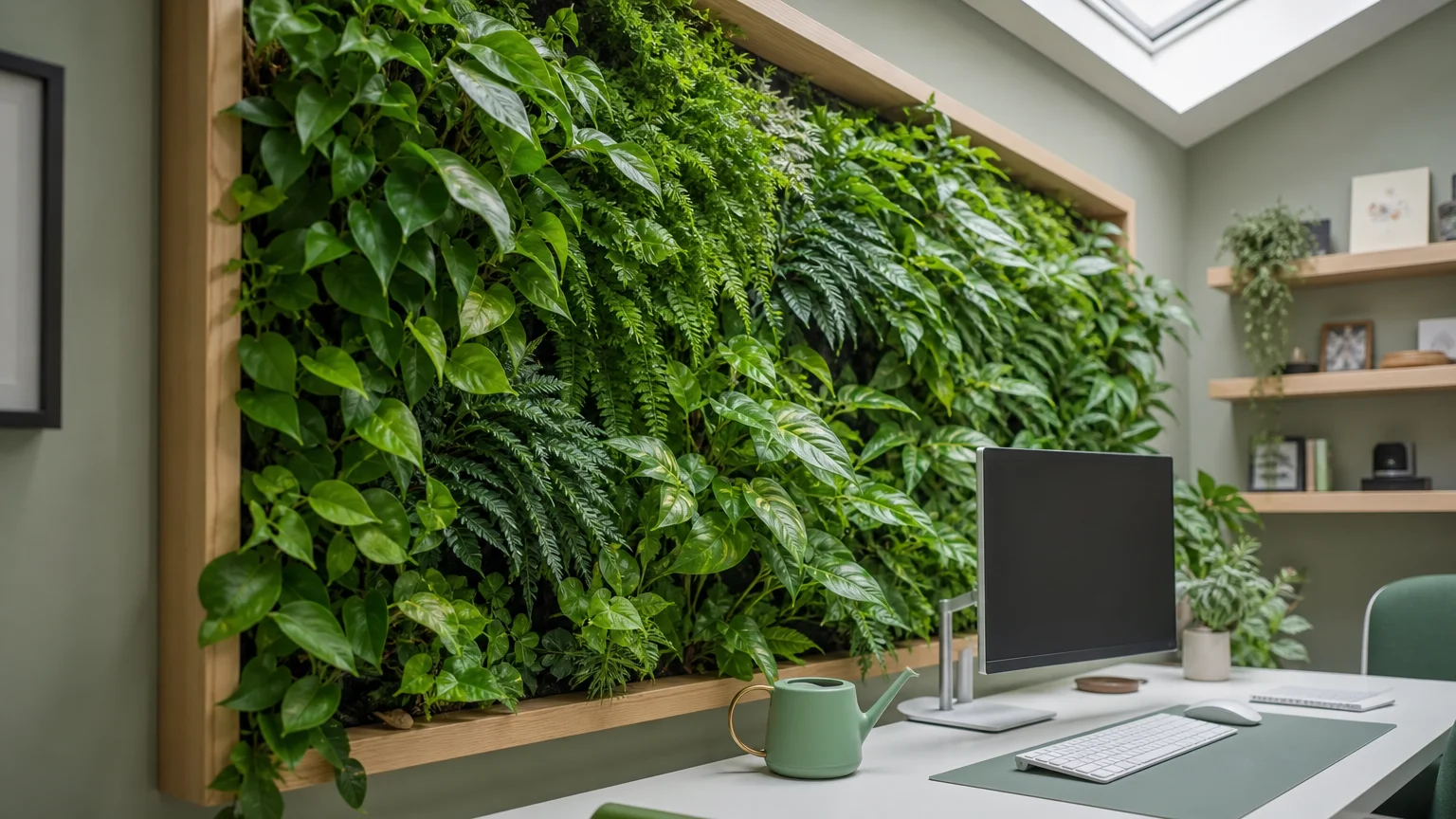
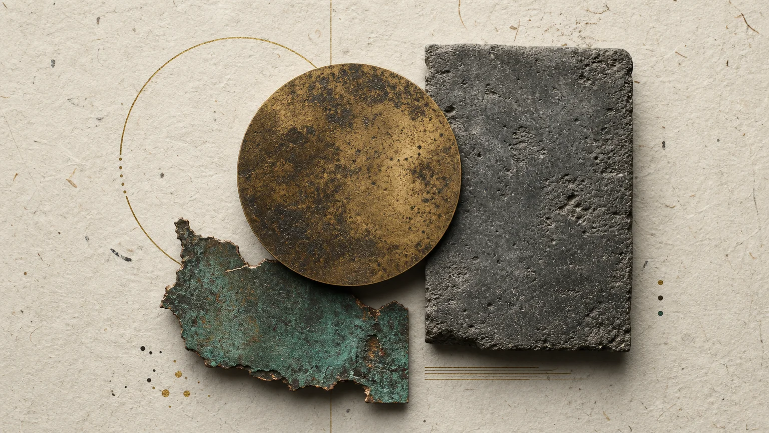
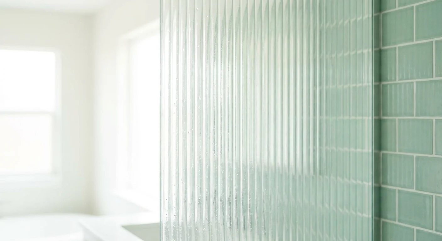
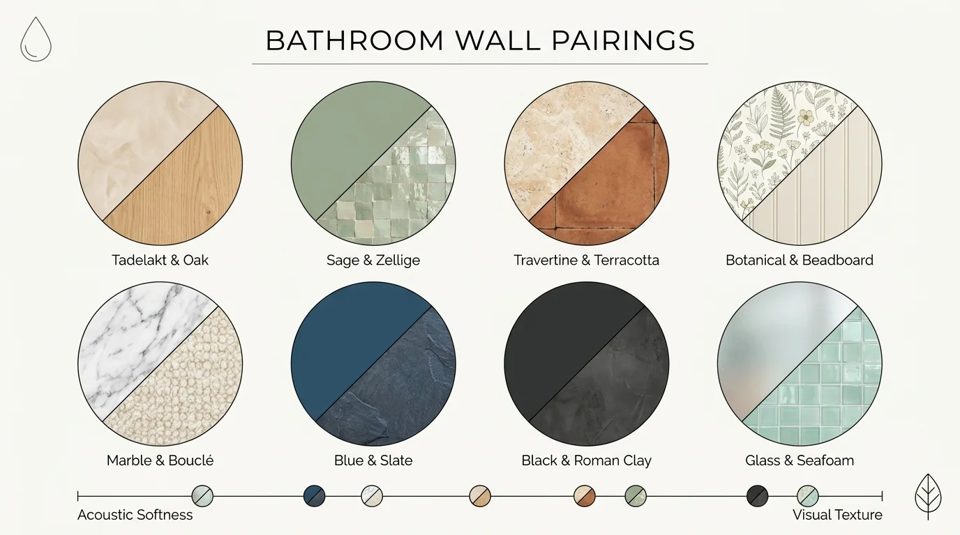
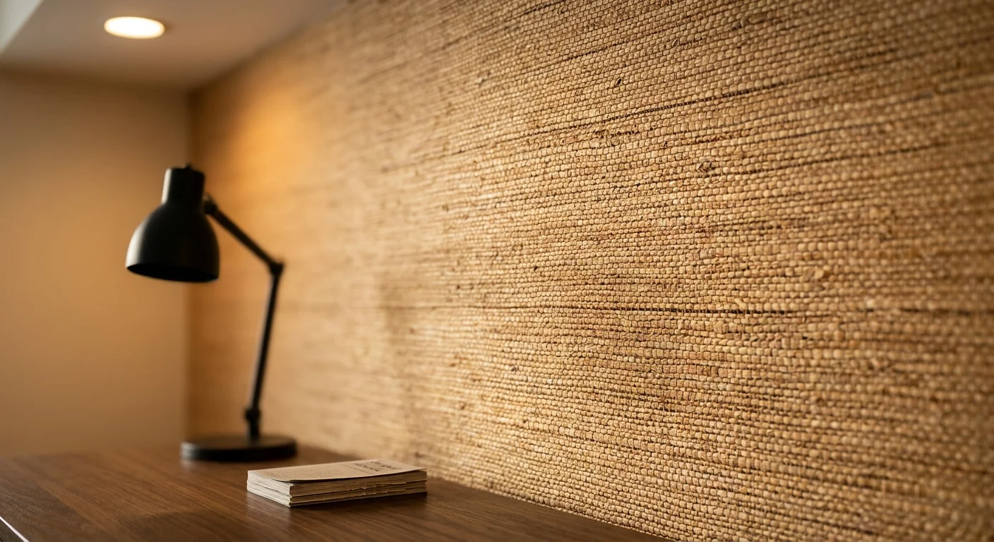
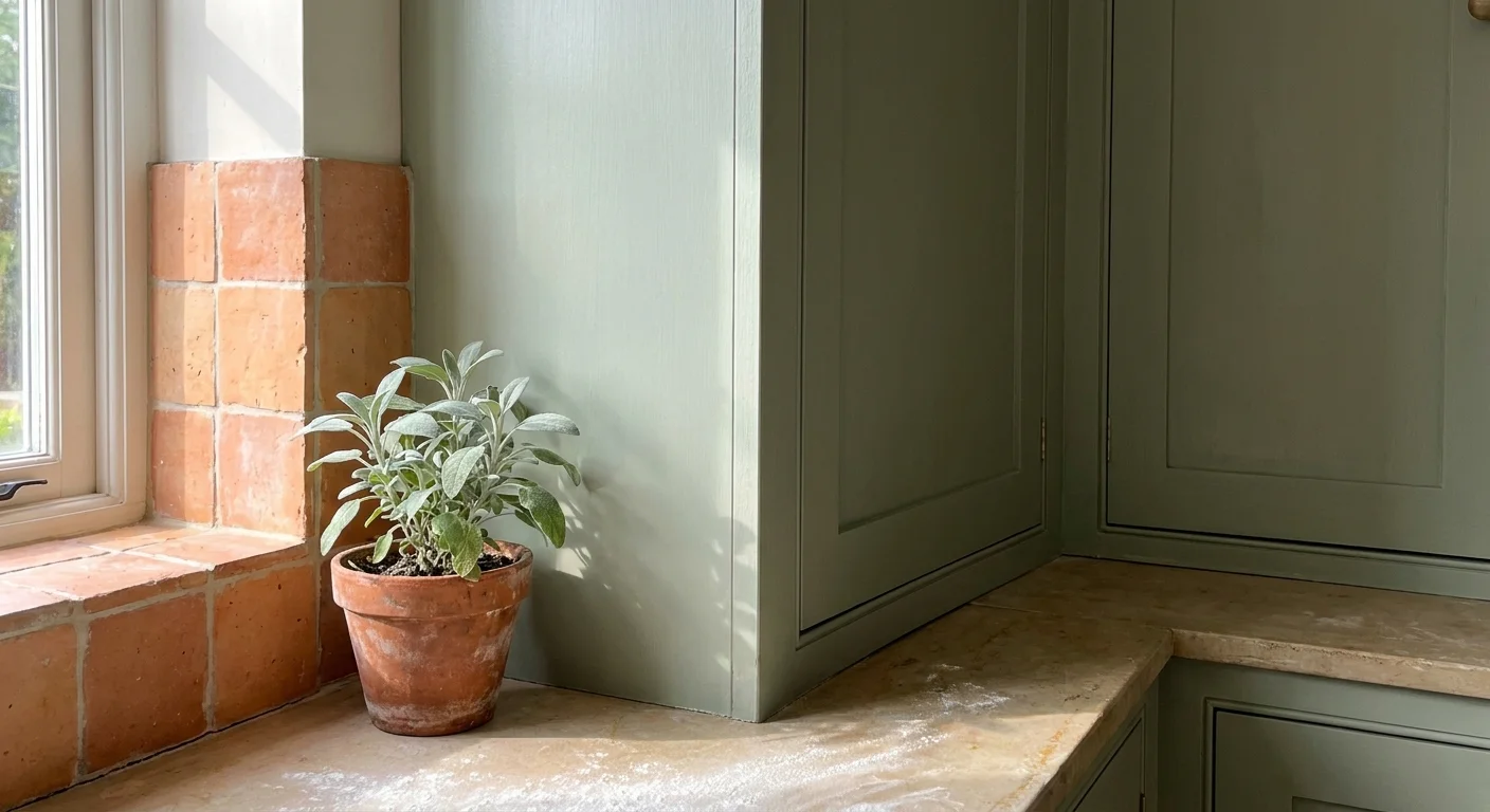
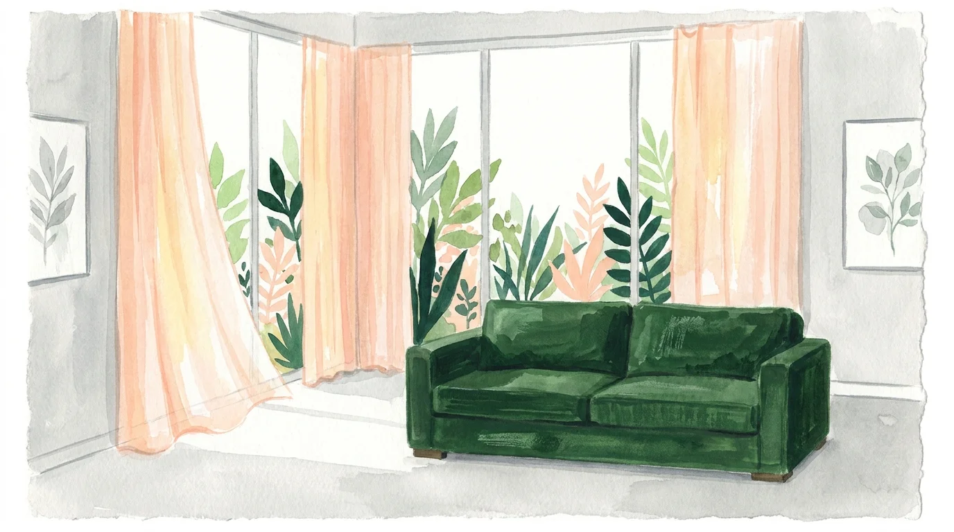
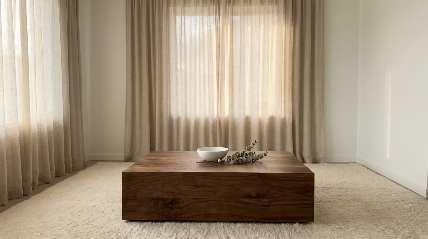
Trend #7: Layered Textural Depth in Neutrals
Designing a monochromatic or neutral room without varying the textures results in a flat, lifeless environment. When your sofa, drapery, and rug all share a similar smooth finish, the eye has nothing to engage with, causing the entire room to fall visually flat. This is a common trap for homeowners attempting to recreate a minimalist aesthetic without understanding the essential mechanics of visual weight.
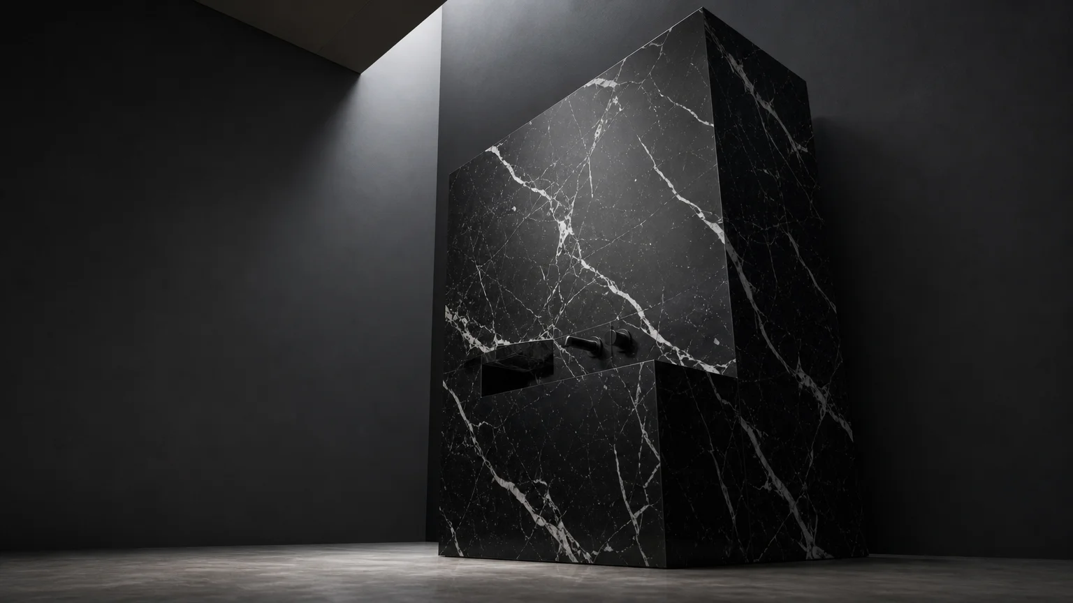
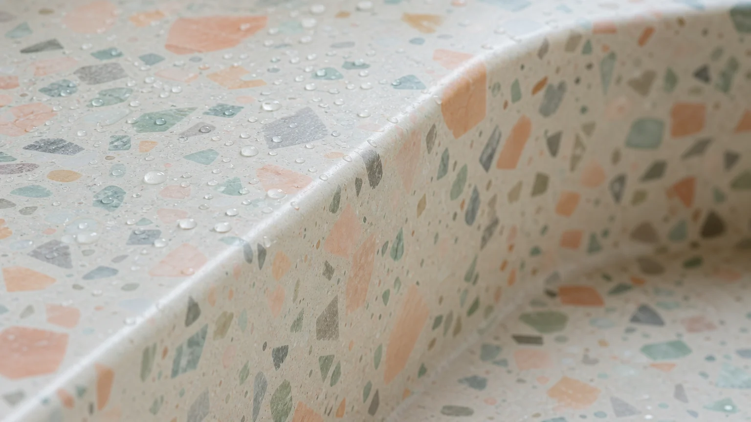
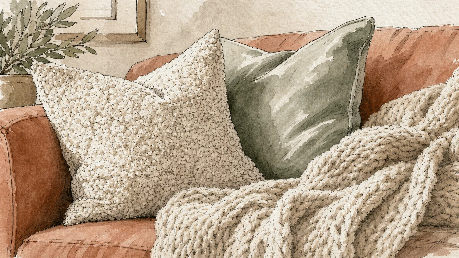
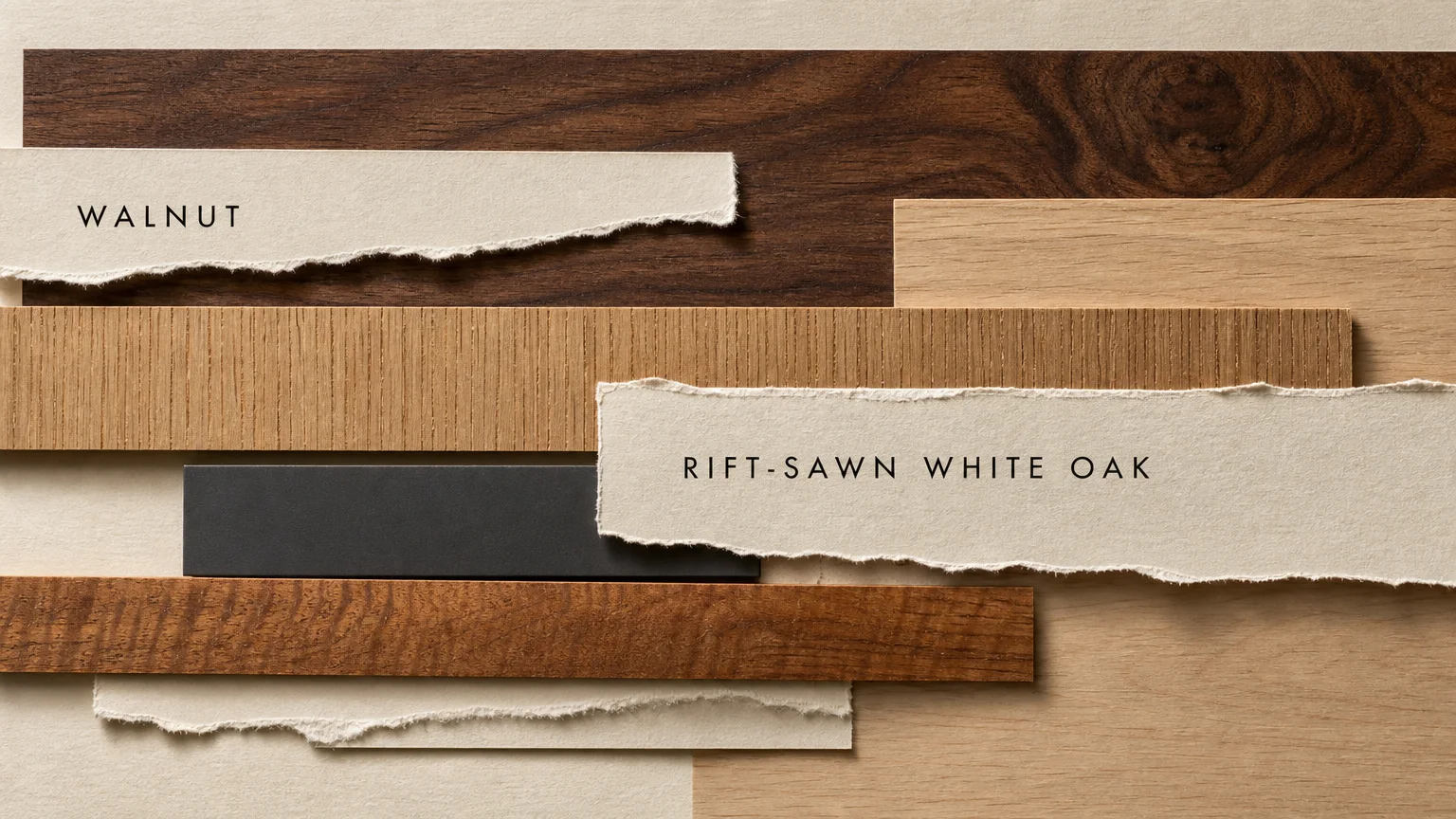
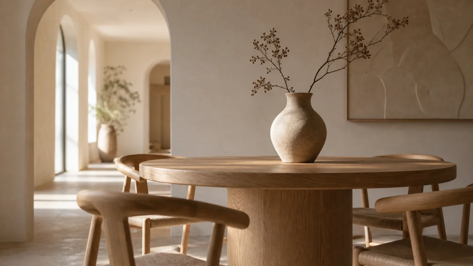
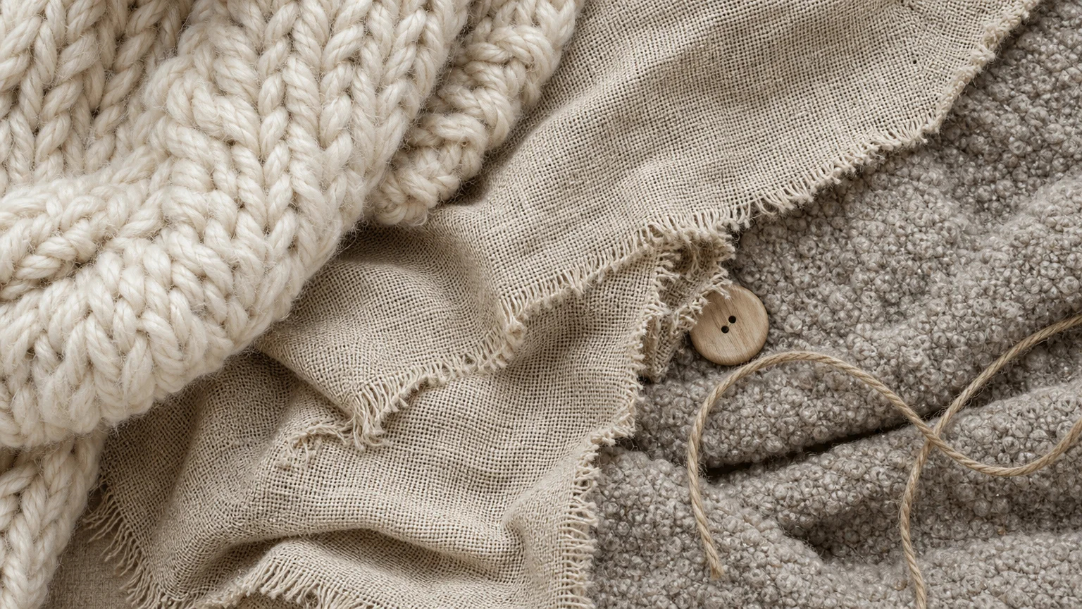
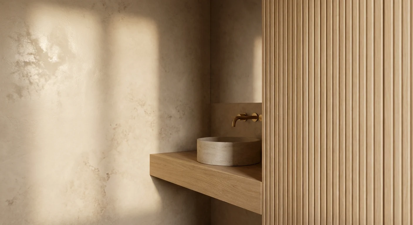
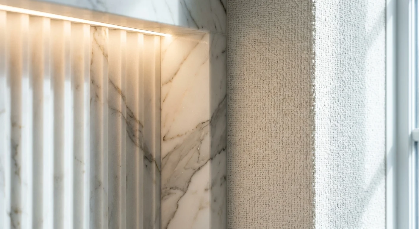
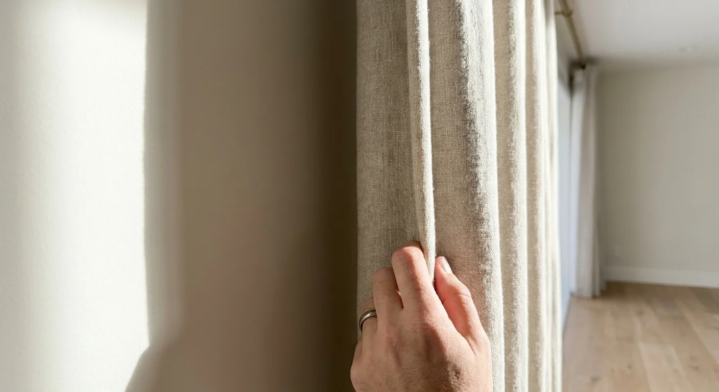
Layered textural depth transforms sterile spaces into warm, inviting sanctuaries. When working with a restrained color palette, tactile contrast becomes your primary design tool. You must intentionally clash materials to create tension and visual interest. Pair the soft, matte finish of a Belgian linen sofa with the hard, reflective surface of a polished marble coffee table.
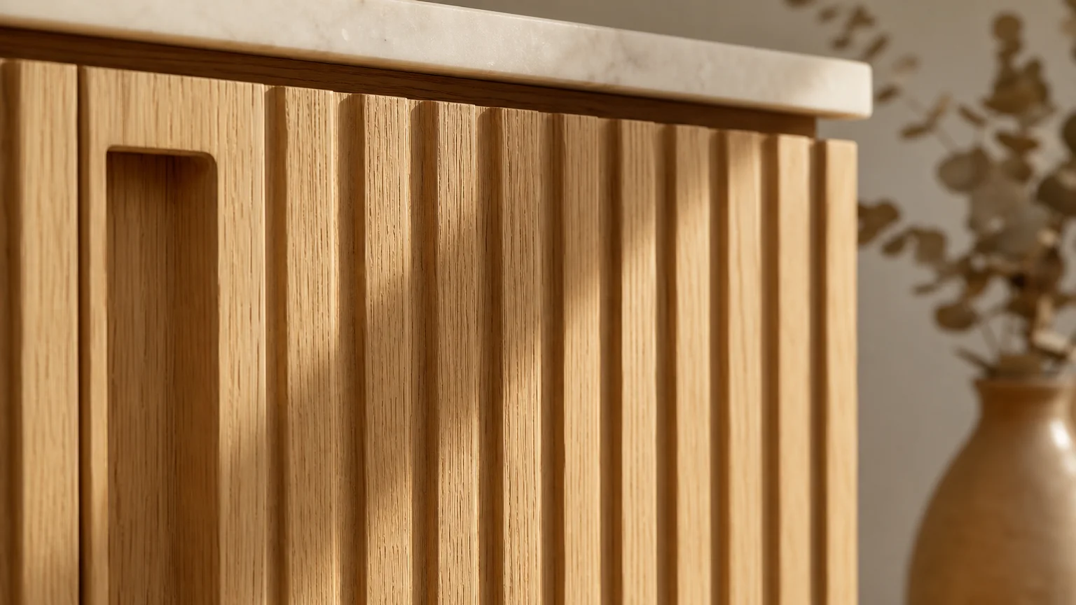
Incorporate biophilic elements like heavily grained walnut, woven jute, and raw concrete to introduce organic imperfections into the space. Toss a chunky bouclé throw over a smooth leather armchair, or install sheer wool drapery against a high-gloss painted window trim. By building a rich tactile landscape, you ensure that even the most subdued neutral palettes feel dynamic, luxurious, and expertly executed.
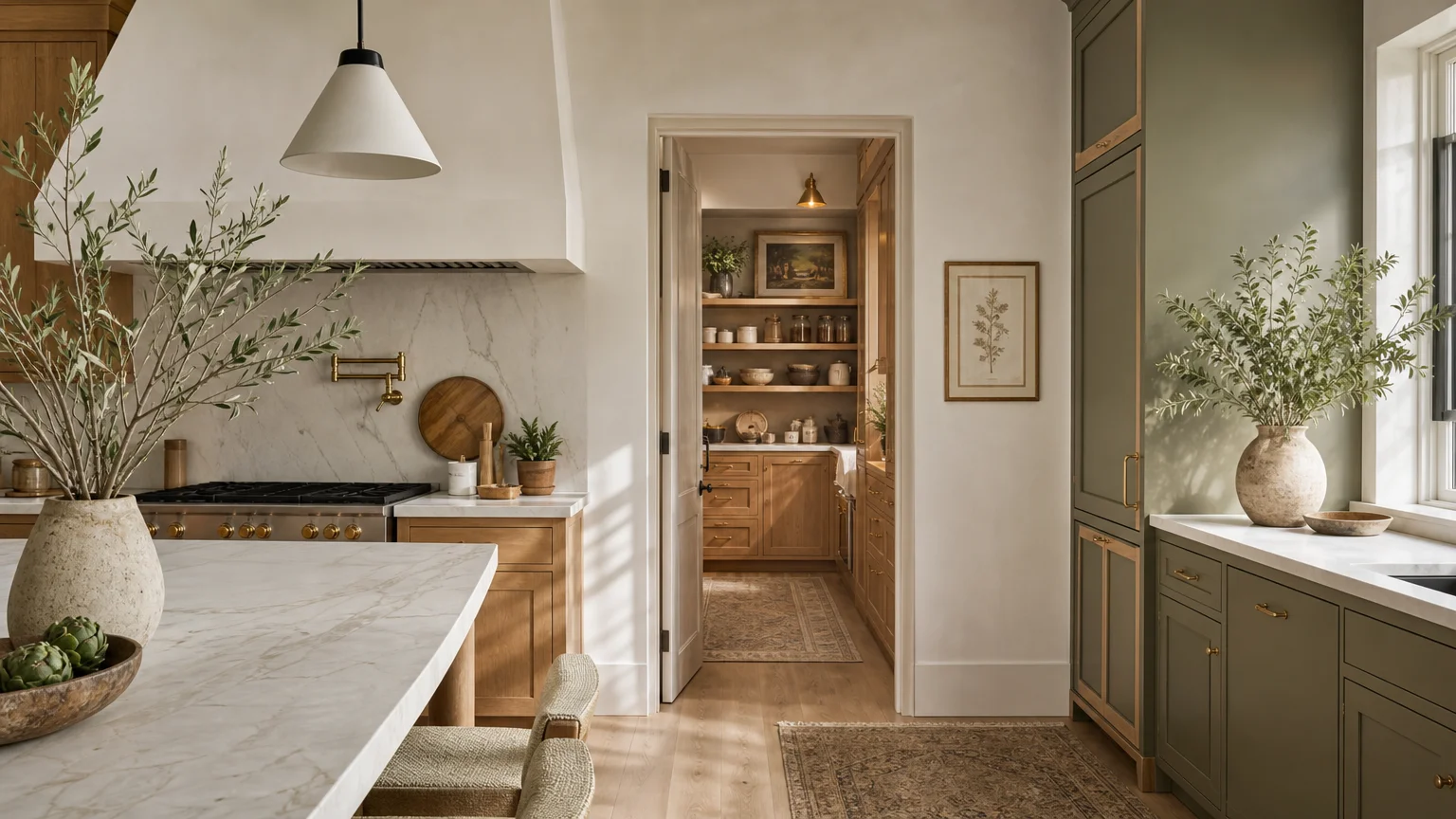
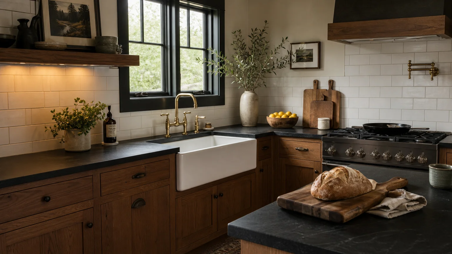
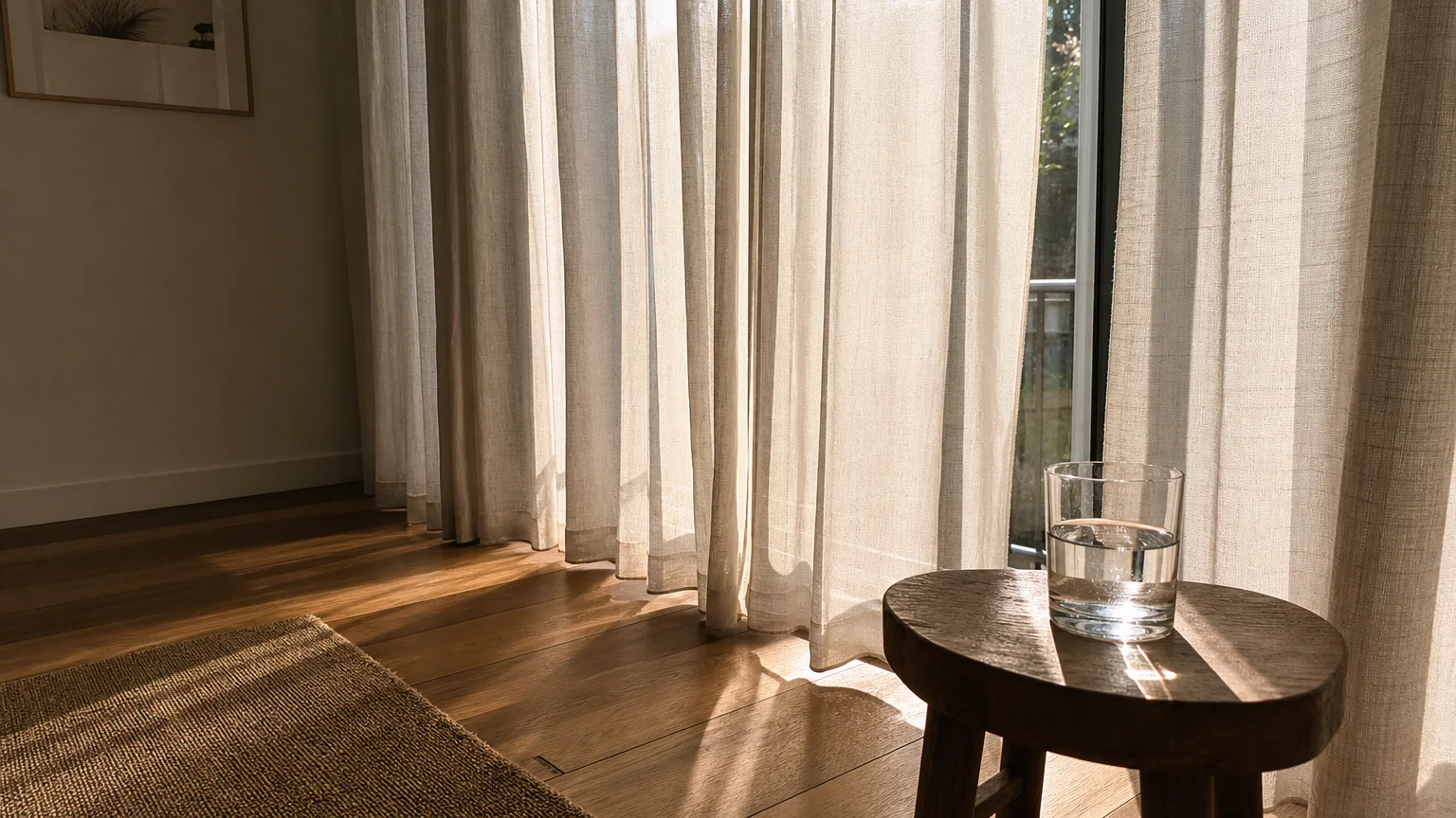
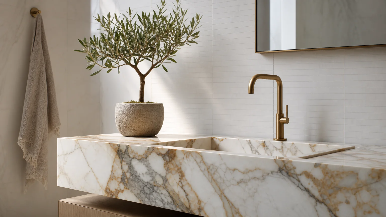
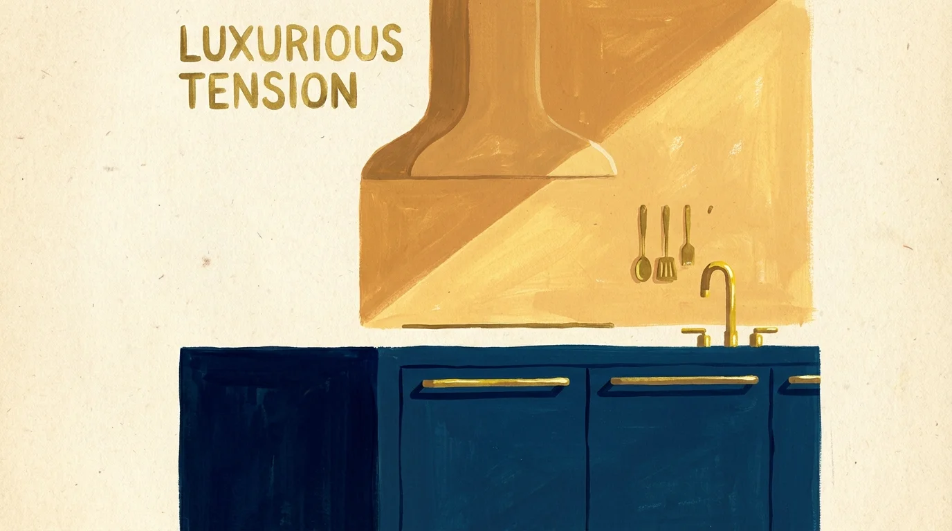
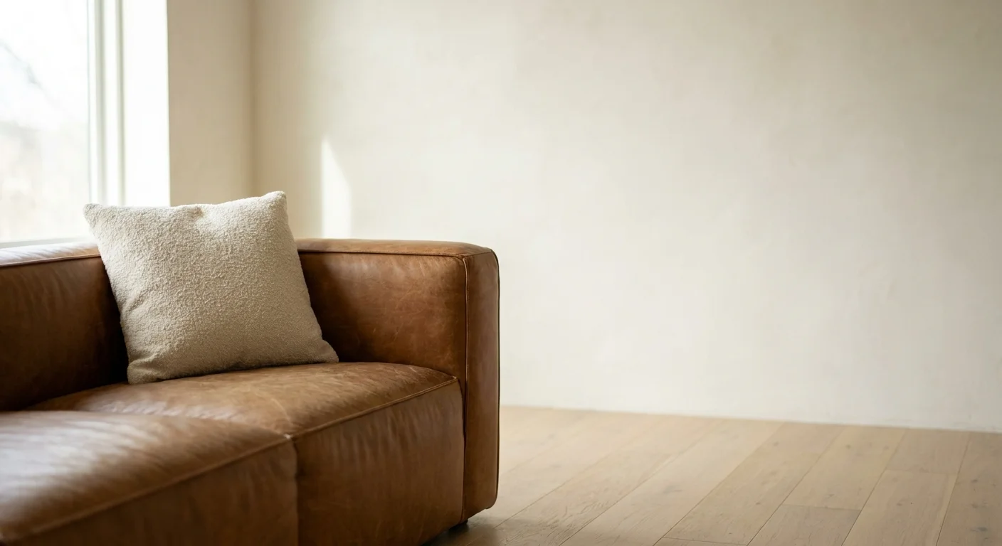
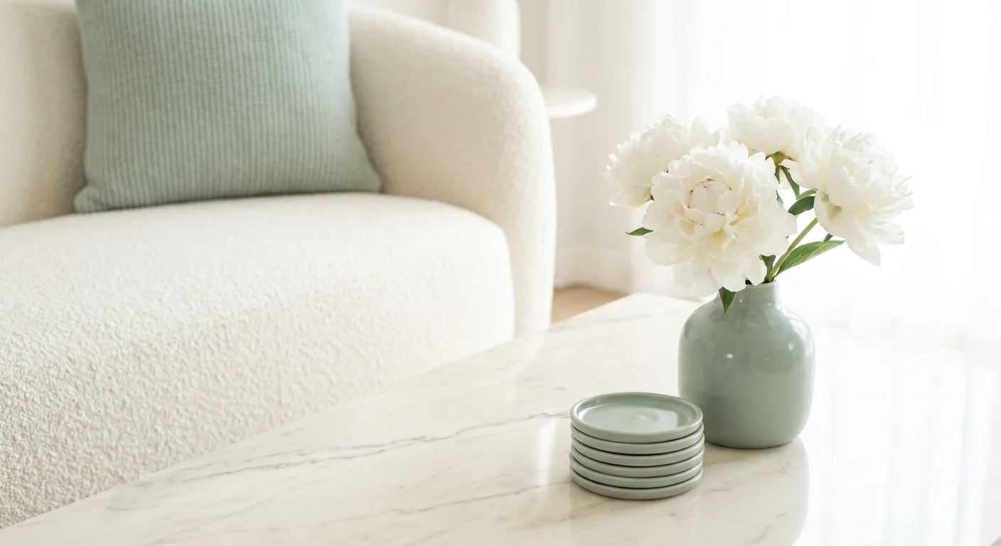
Trend #8: Functional Quiet Luxury
Sacrificing everyday comfort for the sake of a viral design trend is a fundamental error. Designers wince at rigid, unyielding seating, aggressively sharp coffee tables in family rooms, and delicate fabrics placed in high-traffic zones. Beautiful interior design tips hold absolutely no value if the resulting space is too fragile or uncomfortable for you to actually live in.
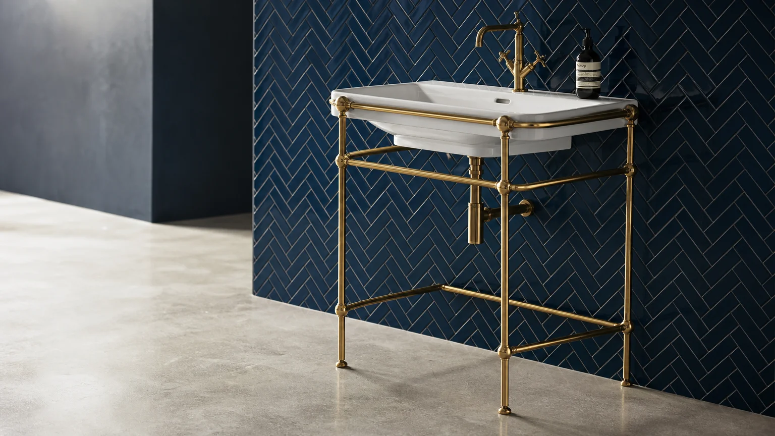
The definitive trend dominating high-end interiors today is functional quiet luxury. This philosophy dictates that true elegance lies in the intersection of impeccable aesthetics and effortless usability. You achieve this standard by investing in modern performance fabrics that mimic the look of delicate linens and rich velvets but withstand the rigors of daily life without staining, pilling, or fading.
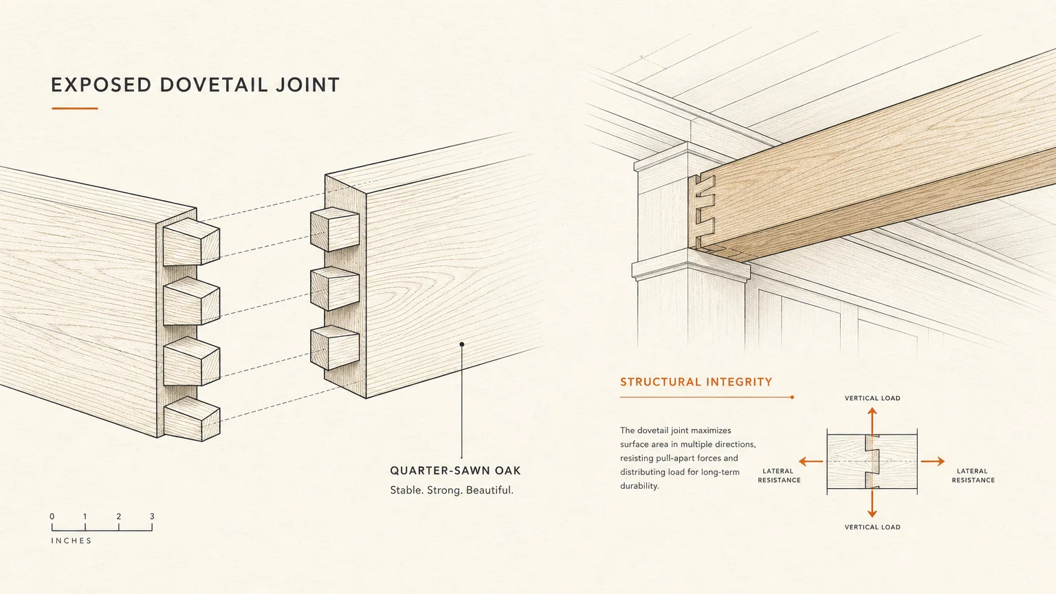
Prioritize ergonomic silhouettes and highly durable, authentic materials. A solid white oak dining table that develops a beautiful patina from daily use is inherently more luxurious than a fragile, easily chipped veneer alternative. By aligning your aesthetic goals directly with the practical realities of your lifestyle, you create a home that feels inherently welcoming, deeply comfortable, and unapologetically sophisticated.
The Big Picture: Weaving These Trends into Your Home
Recognizing these common decorating mistakes and understanding the trends that resolve them provides a powerful framework for elevating your home. However, the ultimate goal of interior design is not merely to follow a checklist of rules, but to cultivate a space that resonates with your daily life. You weave these concepts together successfully by applying them with intention, patience, and restraint.
Start by evaluating your current layout and identifying areas where the scale feels off or the lighting falls flat. Address foundational elements like floating furniture placement and undersized rugs before investing in new statement pieces. Introduce layered architectural lighting and rich, clashing textures gradually, allowing the room to evolve naturally over time. Remember that exceptional home styling is a marathon, not a sprint. By focusing on authentic provenance, functional luxury, and grounded proportions, you construct an enduring environment that avoids fleeting fads while remaining fresh, deeply personal, and aesthetically timeless.
Frequently Asked Questions
How do I mix design trends without creating a chaotic space?
You prevent visual chaos by establishing a cohesive foundational palette. Choose a dominant color scheme and a consistent wood tone to ground the room. Once your baseline is established, you can layer varying trends—such as curated eclecticism and biophilic textures—as secondary accents. Ensure that every piece shares at least one common attribute, whether it is a subtle color thread or a similar geometric shape, to maintain absolute visual harmony.
What is the most cost-effective way to fix a poorly scaled room?
The most impactful and budget-friendly correction is adjusting your furniture layout. Pull your seating away from the walls to create an intimate floating arrangement. Next, properly position your existing artwork at the optimal 57-to-60-inch eye level. If your current rug is too small, purchase an inexpensive, oversized natural fiber rug and layer your smaller, more expensive rug directly on top of it to instantly correct the scale of the room.
Do designers consider neutral color palettes a decorating mistake?
Neutral palettes are never a mistake when executed correctly. The error lies in failing to introduce textural contrast within that muted palette. Designers love neutral spaces, but they rely heavily on layered textural depth—mixing raw woods, honed stones, woven textiles, and matte ceramics—to keep the environment visually engaging and far from sterile.
For the latest color forecasts, consult industry leaders like Pantone and paint companies like Benjamin Moore. For professional design standards, refer to the American Society of Interior Designers (ASID).
Disclaimer: This article reflects design trend analysis and predictions. Personal taste and timeless design principles should always guide your decorating choices.