8 Front Door Colors That Feel Fresh

Revitalizing your home exterior starts with a single, transformative focal point: the front door. Selecting the right front door paint colors instantly elevates your property and sets a sophisticated tone for the spaces within. Today, conventional primary reds and stark whites give way to nuanced, complex hues grounded in biophilic design and quiet luxury principles. Choosing modern exterior paint ideas involves evaluating your surrounding landscape, architectural provenance, and natural lighting conditions. 
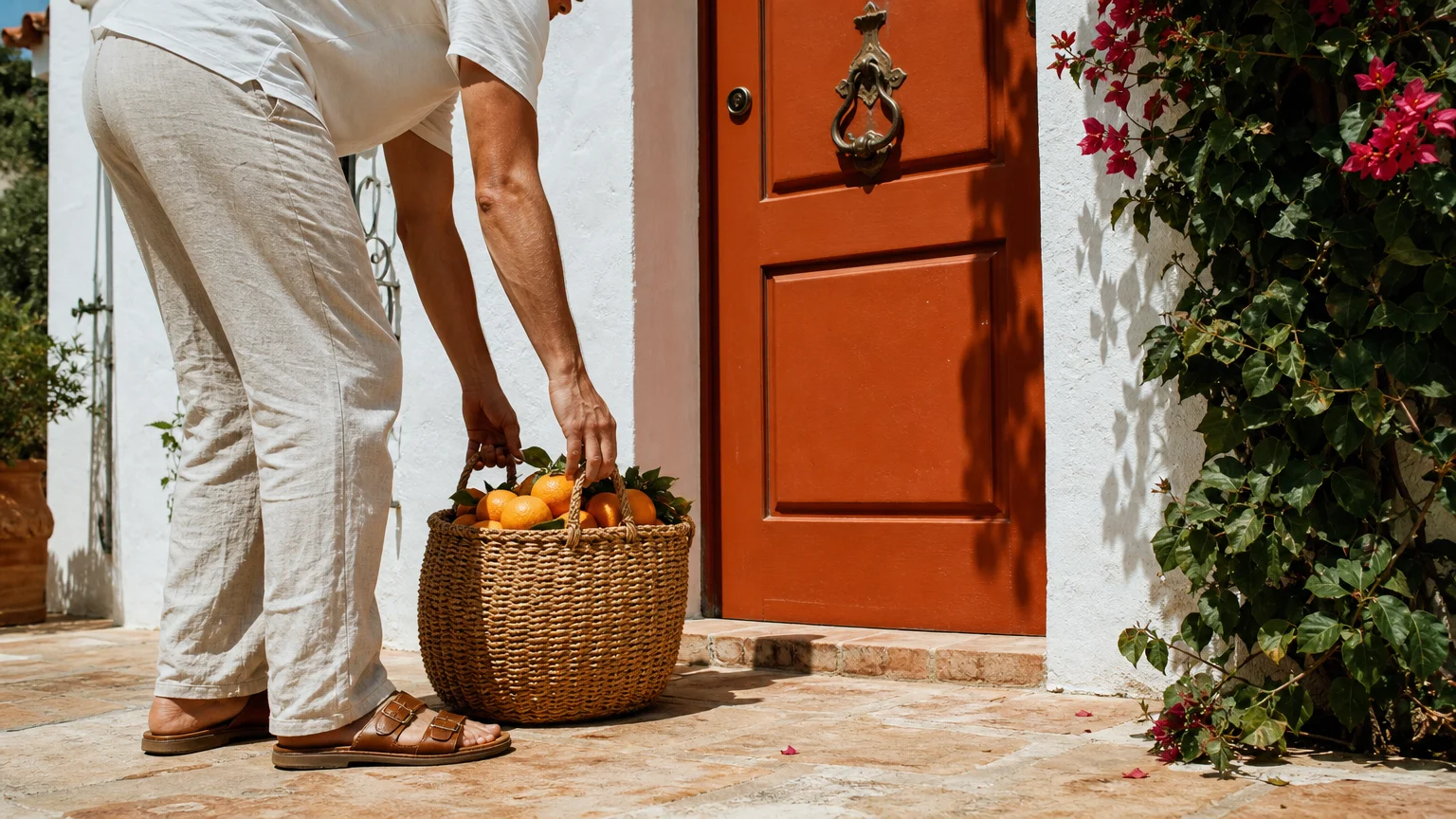
Whether you own a historic colonial or a streamlined midcentury property, embracing these fresh front door shades creates an immediate sense of arrival. Explore the eight most compelling curb appeal colors currently dominating modern exterior design, offering both undeniable longevity and visual impact for your entryway.

Trend #1: Earthy Terracotta

Organic modernism continues to heavily influence interior design, and this aesthetic seamlessly extends to your home exterior through earthy terracotta. This baked, sun-drenched hue provides a tactile warmth that stark neutrals simply cannot achieve; it bridges the gap between raw nature and structured architecture. Homeowners increasingly crave environments that feel grounded and authentic, actively moving away from hyper-polished, synthetic color palettes. Terracotta channels the rich, mineral-heavy soils of Mediterranean landscapes, immediately signaling a welcoming, relaxed environment to your guests.

To implement this color successfully, you must evaluate your existing siding and hardscaping. Terracotta looks exquisite against warm white stucco, creamy brick, or natural wood cladding. It creates a striking, complementary contrast when surrounded by lush green foliage, making your entryway pop organically. When selecting your paint finish, opt for a satin or eggshell sheen. High-gloss finishes often make earthy colors appear plastic and artificial, which entirely defeats the purpose of an organic aesthetic. Pair your terracotta door with unlacquered brass or aged bronze hardware. These living metals develop a unique patina over time, further enhancing the bespoke, lived-in character of your front porch.

Trend #2: Muted Olive Green

Biophilic design prioritizes our innate human connection to nature, and muted olive green embodies this philosophy perfectly. Serving as the ultimate bridge between the built environment and the natural landscape, this shade acts as a highly versatile neutral. Unlike vibrant emeralds or hunter greens—which can feel heavily dated or overly traditional—muted olive carries sophisticated brown and gray undertones. These complex undertones prevent the color from reading as overly bright, ensuring your entryway feels established and timeless.

Olive green harmonizes beautifully with almost any textured exterior material. Whether your home features rough-hewn stone, classic red brick, or traditional cedar shake siding, olive adapts to its surroundings. If your property receives intense, direct southern light, choose an olive shade with a heavier gray base to prevent the sun from amplifying the yellow tones. Enhance this restorative color with matte black hardware for a crisp, contemporary edge, or select antique brass fixtures to lean into a more heritage-inspired aesthetic. Incorporate oversized, textured terracotta planters flanking the doorway to complete the cohesive, nature-inspired vignette.

Trend #3: Deep Aubergine

For those seeking drama without resorting to expected shades, deep aubergine represents the pinnacle of quiet luxury. This rich, saturated, purple-brown hue commands attention subtly. It is not loud, yet it completely transforms an exterior. Aubergine operates as a chameleon color; it appears nearly black during the early morning hours, reveals its deep plum warmth under direct midday sun, and settles into a velvety charcoal at dusk. This dynamic chromatic shift keeps your home exterior feeling fresh and engaging throughout the entire day.

Executing an aubergine front door requires a deliberate approach to contrast. Frame the door with crisp, warm white trim to highlight the depth of the color. It pairs phenomenally well with cool-toned exterior features, such as slate roofing or bluestone walkways. Because aubergine inherently feels luxurious and tailored, elevate the presentation by selecting polished nickel or chrome hardware. The brilliant silver tones pierce through the dark, moody background, offering a refined, jewelry-like accent to your entryway. Ensure you properly prep and prime the door before painting, as saturated dark colors often require a tinted primer to achieve a flawless, opaque finish.

Trend #4: Dusty Cerulean

Moving away from stark, nautical navy and overly bright coastal blues, dusty cerulean introduces a relaxed, historic European sensibility to modern exterior design. This soft, grayish-blue softens rigid, angular architecture and brings a romantic provenance to your facade. It evokes the faded shutters of French countryside estates, offering a universally flattering hue that works just as well in landlocked suburbs as it does in coastal retreats.

Dusty cerulean possesses remarkable adaptability, particularly concerning sunlight. It actively counteracts the harshness of intense southern or western light, maintaining its calming presence without washing out. This shade flatters warm-toned masonry, making it an exceptional choice if your home features orange or red brickwork. The cool blue-gray subtly neutralizes the aggressive warmth of the brick, creating a balanced, harmonious exterior palette. To maintain the historic charm of this color, equip your door with brushed pewter or antique iron hardware. Flank the entry with galvanized metal sconces emitting a warm, amber glow to enhance the welcoming atmosphere during the evening.

Trend #5: Warm Mushroom

The evolution of “greige” has officially culminated in warm mushroom. As homeowners steadily abandon stark whites and cool, clinical grays, complex neutrals step into the spotlight. Warm mushroom sits precisely between taupe, gray, and brown—offering an understated elegance that anchors your home exterior. It provides a sophisticated backdrop that allows your landscaping and architectural details to take center stage, rather than competing for visual dominance.

Because mushroom is inherently subdued, you must leverage texture and finish to create visual interest. We recommend applying this neutral shade in a high-gloss finish. The reflective sheen elevates the humble color, transforming it into a striking, luminous focal point that contrasts beautifully against matte siding or rough stone. A glossy mushroom door feels incredibly bespoke and high-end, instantly boosting your curb appeal. Complement this sleek finish with minimalist, unlacquered brass hardware. The warmth of the brass pulls the subtle brown undertones out of the mushroom paint, creating a cohesive, meticulously curated entryway.

Trend #6: Saturated Mustard Yellow

Channeling the optimism and energy of the midcentury modern revival, saturated mustard yellow makes a bold, joyful statement. Unlike the primary yellows of the past, today’s mustard is heavily infused with ochre and umber undertones. These earthy additions ground the color, giving it a mature, sophisticated edge that prevents it from looking overly juvenile. A mustard door signals a confident design perspective and instantly creates a cheerful, energetic entry point for your home.

This color requires a strategic exterior palette to truly shine. Mustard yellow thrives in high-contrast environments; it looks spectacular against deep charcoal, navy blue, or even fully black exterior cladding. The dark surroundings frame the bright door, turning it into a glowing lantern that guides visitors inside. If you have a classic midcentury property with warm wood siding, mustard honors the architectural provenance perfectly. Keep your hardware sleek and unobtrusive—matte black levers and simple geometric locksets work best. Avoid ornate or overly traditional fixtures, which will clash with the inherently modern, punchy nature of the mustard hue.

Trend #7: Softened Graphite

The classic black front door will never entirely disappear, but the current trend leans heavily toward softened graphite. Harsh, jet-black paints often read as a visual void on a home exterior, abruptly stopping the eye rather than inviting it in. Graphite, iron ore, and deep slate offer the same level of dramatic contrast but with a softer, more accessible layered appearance. These off-blacks absorb light gracefully and reveal subtle blue or brown undertones depending on the surrounding environment.

Softened graphite serves as a flawless transition color for modern farmhouse, transitional, or industrial architectural styles. It provides the necessary weight to anchor a bright white or light gray exterior without feeling aggressively harsh. When working with off-black shades, your hardware choice dictates the final aesthetic. Choose polished brass for a high-contrast, glamorous look that catches the light; alternatively, select tonal matte black hardware for a stealthy, monolithic appearance that feels ultra-contemporary. Always apply a high-quality, UV-resistant topcoat to dark doors to prevent the sun from fading or chalking the rich graphite pigment over time.

Trend #8: Pale Sage Waterway

Translating the wellness movement into exterior design, pale sage brings an ethereal, restorative presence to your threshold. This whisper of green-gray feels incredibly fresh, airy, and calming. It represents a deliberate departure from heavy, aggressive exterior colors, offering a serene greeting that lowers the heart rate the moment you approach the steps. Pale sage reflects the surrounding natural greenery, creating a fluid boundary between your front lawn and your interior sanctuary.

This delicate color interacts beautifully with morning light, taking on a luminous, pearlescent quality. It pairs effortlessly with lighter exterior materials, such as white painted brick, pale natural stone, or light gray cedar shingles. Because the color itself is so quiet, you have the freedom to be more expressive with your hardware and lighting. Brushed gold or polished copper hardware introduces a necessary touch of warmth and luxury, preventing the pale sage from feeling too icy or sterile. Enhance the welcoming vibe by installing a statement pendant light directly above the door, casting a warm, inviting glow over the subtle green paint.

The Big Picture: Weaving These Trends into Your Home

Your front door does not exist in a vacuum; it serves as the critical transition point between your neighborhood environment and your personal, interior sanctuary. When evaluating these fresh front door shades, you must consider the holistic journey a guest takes when entering your home. The color you select for your exterior should intuitively introduce the palette waiting in your interior foyer, living room, and dining room. If your interior leans heavily into warm, organic modernism, a terracotta or mushroom door sets the correct narrative from the curb.

Always test your exterior paint ideas before committing to a full transformation. Paint large foam boards with your top color choices and observe them outside against your doorframe. Evaluate the swatches at 8:00 AM, midday, and dusk. Natural light dramatically alters how saturation and undertones appear; a dusty cerulean that looks perfect at noon might read as a flat gray by late afternoon. By respecting your home’s architectural provenance and taking the time to test your colors in situ, you guarantee a sophisticated upgrade that feels both intentional and profoundly welcoming.

Frequently Asked Questions

How do I coordinate my front door color with my interior hallway palette?

Treat your front door as the prologue to your interior design story. You do not need to match the colors exactly, but they must share a cohesive undertone. If your hallway features cool, slate gray floors and crisp white walls, an aubergine or dusty cerulean door creates a logical transition. If your interior embraces warm woods and beige tones, opt for earthy terracotta or warm mushroom. Ensure the interior side of the door either matches the exterior bold color for a continuous flow or is painted to match your interior trim for a seamless, classic look.

Does sunlight exposure dictate which paint finish I should choose?

Absolutely. Doors facing south or west receive intense, direct sunlight for several hours a day. This harsh light quickly degrades lower-quality paints and aggressively highlights structural imperfections in high-gloss finishes. For high-sun exposures, a satin or semi-gloss finish formulated specifically for UV resistance offers the best longevity. Conversely, north-facing doors sit mostly in shadow, which can make colors appear flat and lifeless. A high-gloss finish on a north-facing door bounces available ambient light around, bringing vibrancy back to the shaded entryway.

What is the most effective way to test exterior paint ideas before committing?

Never test paint directly on the existing door, as the old color will alter your perception of the new swatch. Instead, purchase large, heavy-duty watercolor paper or foam core boards. Paint two coats of your chosen colors onto the boards. Tape these large swatches to your door and observe them over a 48-hour period. Pay specific attention to how the colors interact with your fixed elements—such as brickwork, roofing, and permanent hardscaping—during overcast conditions and bright, direct sunlight.

Can I apply contemporary colors to a heavily textured historic home?

Yes, contemporary colors beautifully update historic homes when chosen with respect for provenance. The secret lies in selecting muted, complex shades rather than bright, synthetic primaries. Muted olive, softened graphite, and dusty cerulean all feature the nuanced, muddy undertones characteristic of historical paint palettes. These colors feel fresh and modern but possess the visual weight and sophistication necessary to stand up to heavy stone, ornate woodwork, or classic brick facades without looking inherently out of place.

For the latest color forecasts, consult industry leaders like Pantone and paint companies like Benjamin Moore. For professional design standards, refer to the American Society of Interior Designers (ASID).

Disclaimer: This article reflects design trend analysis and predictions. Personal taste and timeless design principles should always guide your decorating choices.

zeidqi
Author and editor. I write about Interior designs, Beauty tips, IT services for business, Real estate and architectures. Strongly passionate about games, comics, art, design, fashion and decoration, I will tell you in detail the best stories in the world of beauty and will guide you through the most popular trends of the moment.

Recent Articles

Related Stories

Stay on op - Ge the daily news in your inbox