

Transforming your cooking space from merely functional to undeniably breathtaking relies entirely on the precise execution of kitchen color pairings. Selecting the right hues dictates the mood, spatial perception, and overall aesthetic value of the heart of your home. As we move away from sterile monochromatic palettes, top interior designers are embracing complex, sophisticated combinations that introduce depth and personality. Whether you favor the grounded elegance of earthy tones or the dramatic contrast of moody saturations, understanding the underlying color theory allows you to craft a deeply personal culinary sanctuary. By examining the pairings industry leaders consistently specify, you gain the practical insight needed to elevate your own remodel, ensuring your investment yields a timeless, curated environment.
Trend #1: Terracotta and Sage Green
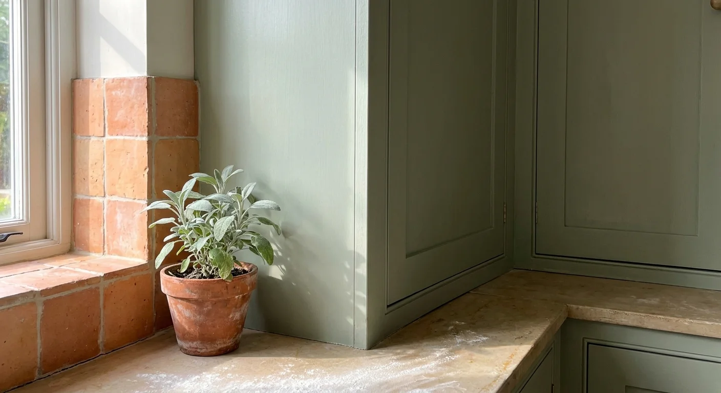
Designers increasingly turn to terracotta and sage green when crafting spaces centered around wellness and organic living. This pairing draws direct inspiration from nature; it instantly warms up a room while maintaining a refreshing, airy atmosphere. The baked clay tones of terracotta provide an incredibly grounding base, making large, echoing kitchens feel intimate and welcoming. When you introduce sage green on upper cabinetry or a central island, you balance that intense warmth with a subtle, cooling herbaceous hue. This combination excels in homes bathed in natural light, as the changing sun enhances the earthy undertones of both colors throughout the day. To execute this look flawlessly, opt for matte finishes rather than high-gloss lacquers. Matte surfaces absorb light, allowing the richness of these kitchen cabinet colors to take center stage without harsh reflections. You might also consider integrating terracotta floor tiles alongside sage green painted woodwork to build a fully immersive, biophilic environment that actively promotes mental wellbeing.
Trend #2: Midnight Blue and Warm Ochre
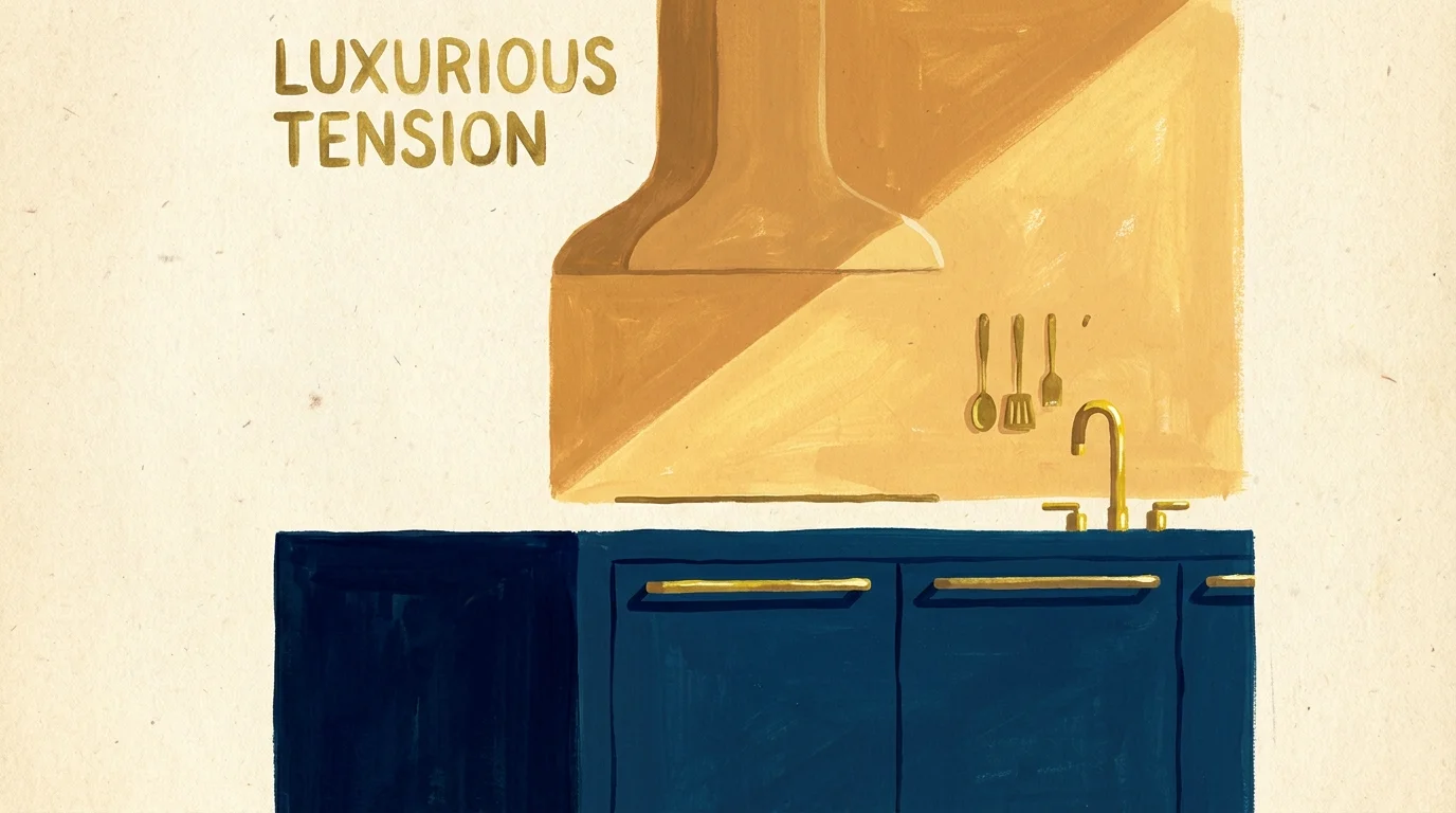
Moving away from stark black-and-white palettes, top-tier designers now utilize midnight blue and warm ochre to achieve striking, sophisticated contrast. Midnight blue offers the same visual weight and anchoring effect as charcoal or black, yet it carries a subtle luminosity that breathes life into the space. Pairing this deep, oceanic shade with the golden, sun-baked richness of ochre creates an undeniably luxurious tension. You can apply midnight blue to your base cabinets to hide everyday scuffs while painting a focal point—perhaps the range hood or an accent wall—in a vibrant ochre. This specific strategy represents one of the most effective two tone kitchen ideas currently dominating the market. The blue recedes, pushing the ochre forward to create dynamic depth. For a cohesive finish, integrate warm metallic hardware, like unlacquered brass, which acts as a visual bridge between the cool darkness of the blue and the vibrant warmth of the ochre.
Trend #3: Forest Green and Pale Wood Tones
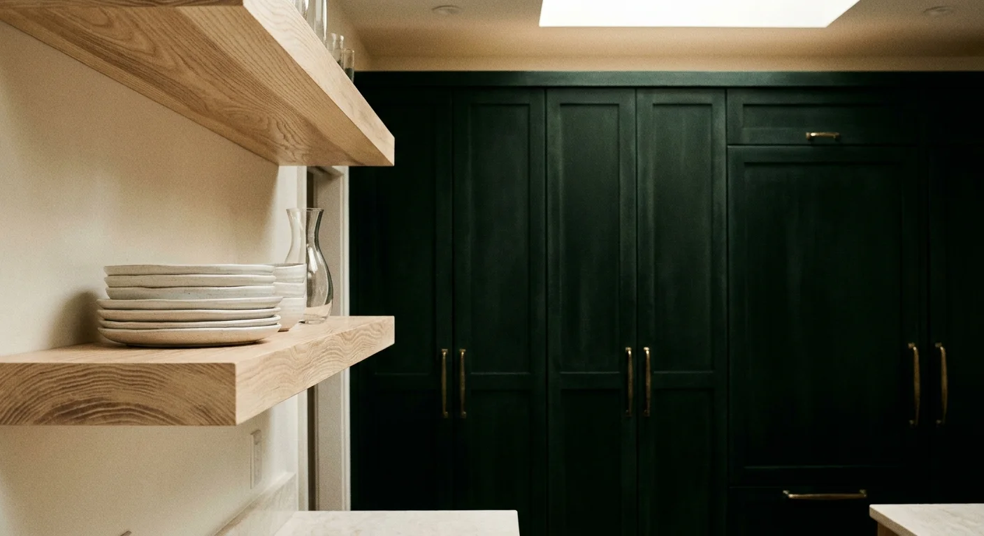
While wood is technically a material, pale oak and ash function as crucial color elements in contemporary design, particularly when juxtaposed against deep forest green. This pairing epitomizes the “quiet luxury” aesthetic dominating modern interiors. Forest green envelops the room in a rich, velvety calmness; it evokes the restorative qualities of old-growth woodlands. When you contrast this dark, saturated hue with the blonde, airy tones of pale wood, you prevent the kitchen from feeling heavy or cavernous. Industry professionals frequently specify forest green for extensive perimeter cabinetry, utilizing white oak for the kitchen island and open floating shelves. This distribution of color breaks up massive blocks of dark paint, introducing visual rhythm and organic texture. The resulting environment feels both historically rooted and sharply contemporary. If you want to elevate your home’s value, this is one of the kitchen color trends that buyers consistently respond to with immense enthusiasm and appreciation.
Trend #4: Mushroom and Cream
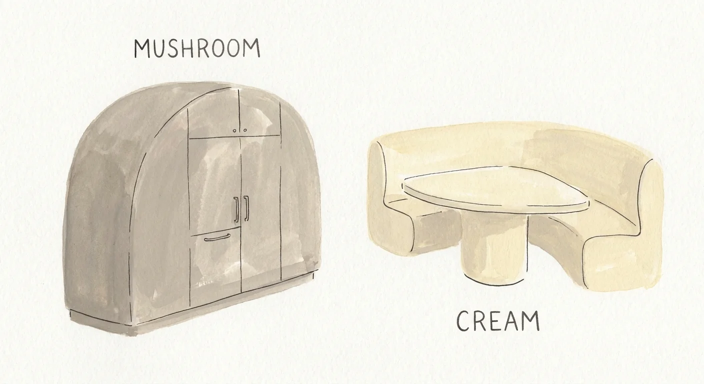
The era of stark, hospital-white kitchens has officially closed; in its place, designers champion the nuanced, textural pairing of mushroom and cream. Mushroom—a complex hybrid of gray, brown, and taupe—provides a sophisticated alternative to traditional neutrals. It possesses an inherent warmth that shifts beautifully under varying lighting conditions. Teaming mushroom with a soft, buttery cream creates a tone-on-tone landscape that feels incredibly expensive and meticulously curated. This low-contrast pairing works wonders in smaller kitchens, as the gentle gradation between the two shades blurs harsh architectural lines, tricking the eye into perceiving a larger, more expansive space. You can apply mushroom to your cabinetry and cream to your walls and countertops for a seamless, continuous flow. Because this palette relies on subtlety, introducing varied textures becomes paramount. Consider pairing matte painted cabinets with a polished cream zellige tile backsplash to add a layer of reflective brilliance to these designer kitchen colors.
Trend #5: Aubergine and Putty
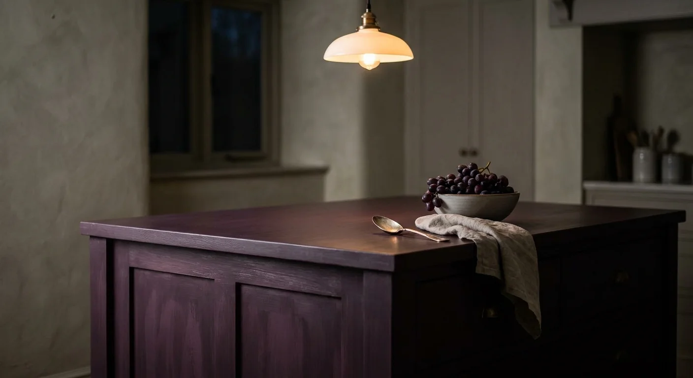
For those seeking unexpected elegance and a touch of dramatic provenance, the combination of aubergine and putty delivers unparalleled results. Aubergine, a deep, blackened purple, brings an element of regal sophistication to interior spaces. It acts as an incredibly rich neutral when applied in large doses, absorbing light and creating a moody, intimate culinary environment. However, aubergine requires a stabilizing counterpart to prevent it from overwhelming the room. Putty—a muted, earthy gray-beige—serves exactly this purpose. The gentle, dusty nature of putty softens the intensity of the purple, grounding the high-drama shade in approachable reality. Designers frequently use this pairing to delineate different zones within an open-concept floor plan. For instance, painting a walk-in pantry or a bespoke bar area in high-gloss aubergine while keeping the main kitchen elements in soft putty creates a thrilling sense of discovery. This bold yet calculated approach showcases exactly why mastering kitchen color pairings transforms a standard renovation into a bespoke masterpiece.
Trend #6: Slate Grey and Mustard Yellow
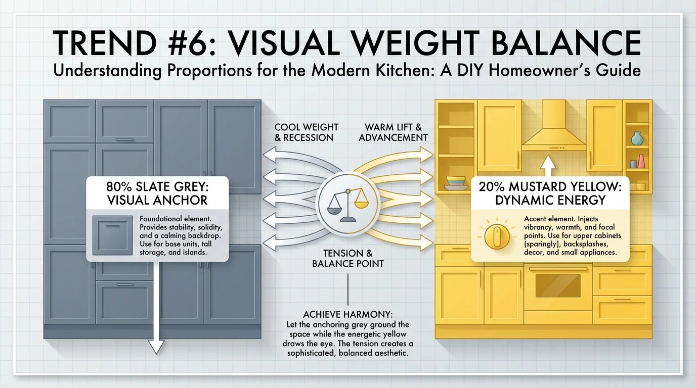
Injecting vitality into a hardworking space requires a masterful understanding of color theory, and the pairing of slate grey with mustard yellow executes this brilliantly. Slate grey provides a resilient, industrial foundation; its cool, stony undertones offer an excellent backdrop for daily culinary chaos. However, an entirely grey kitchen often reads as cold or uninviting. Enter mustard yellow—a complex, slightly muddied primary color that instantly injects warmth, joy, and vintage character into the room. This high-energy hue cuts through the severity of the grey, creating an environment that feels both professional and cheerful. You can implement this pairing by maintaining grey as your primary color for heavy cabinetry and utilizing mustard yellow for structural accents, such as the interior of glass-front cabinets or a statement kitchen island. This specific execution stands out among popular two tone kitchen ideas because it balances masculine and feminine design energies, resulting in a universally appealing space.
Trend #7: Dusty Blue and Rust
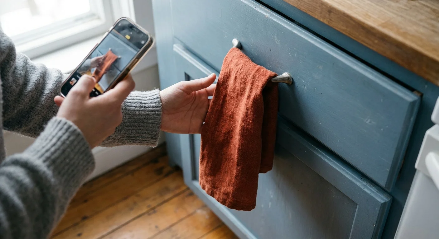
Drawing inspiration from classical art and vintage textiles, dusty blue and rust form a complementary pairing that feels instantly timeless. Sitting directly opposite each other on the color wheel, blue and orange naturally amplify one another. By muting these shades down to dusty blue and oxidized rust, designers harness that complementary power without creating a jarring, primary-colored room. The desaturated blue evokes a sense of calm and cleanliness—ideal traits for a food preparation zone. Conversely, the rust introduces a fiery, appetizing warmth reminiscent of aged copper and worn brick. This combination thrives in transitional and historic homes where honoring architectural heritage remains a priority. To apply this effectively, consider painting your lower cabinetry in the grounded dusty blue while using rust-colored Roman shades, runner rugs, or deeply veined natural stone countertops to carry the secondary hue. This method builds a layered, collected-over-time aesthetic that confidently defies fleeting micro-trends.
Trend #8: Charcoal and Terracotta
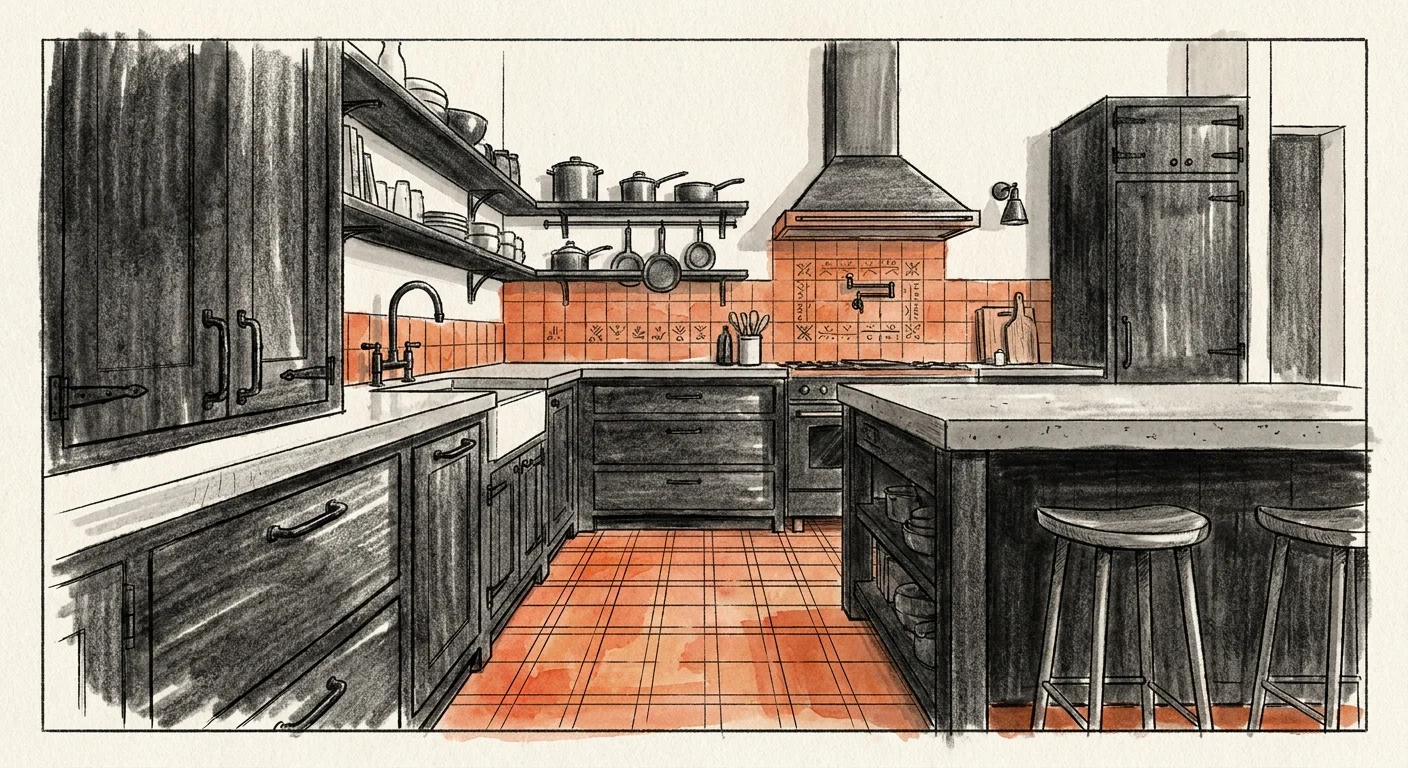
When dramatic impact and Mediterranean warmth collide, you get the breathtaking combination of charcoal and terracotta. While charcoal black delivers undeniable modern edge and sharp architectural definition, it can occasionally feel excessively severe. Terracotta acts as the perfect structural foil, introducing raw, baked-earth texture that instantly humanizes the dark palette. Industry leaders often utilize charcoal for sleek, handleless cabinetry to establish a minimalist foundation, then introduce terracotta through artisan floor tiles or lime-washed accent walls. This high-contrast pairing creates a deeply tactile environment that encourages guests to linger. Furthermore, charcoal absorbs ambient light, making the rich, sun-drenched tones of the terracotta practically glow by comparison. If you want to make a definitive stylistic statement, this ranks among the most powerful kitchen color trends available today. It commands immediate attention while maintaining a rugged, approachable authenticity that resonates deeply with modern homeowners who crave both luxury and comfort.
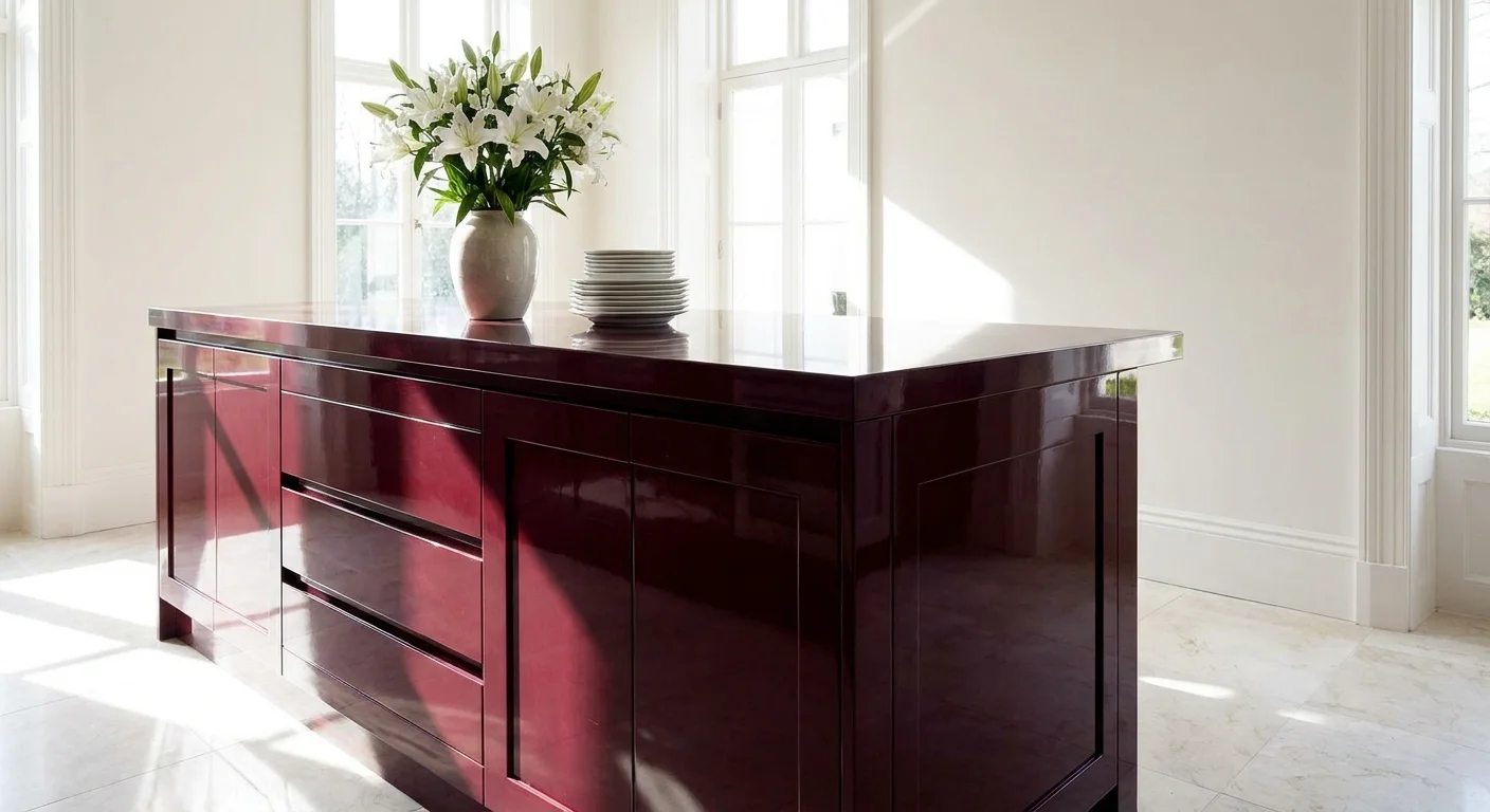
Trend #9: Burgundy and Bone White
Echoing the sophisticated allure of a classic Parisian bistro, burgundy and bone white offer a masterclass in elegant restraint. Burgundy is experiencing a massive resurgence in high-end design; its deep, wine-soaked undertones exude luxury, passion, and historic depth. However, utilizing such a heavy color requires ample negative space to allow the room to breathe. Bone white—an off-white shade with subtle warm, yellowish undertones—provides exactly that necessary relief. Unlike stark, cool whites that would clash harshly with the deep red, bone white shares a warming quality that creates a harmonious transition between the two hues. Designers often specify burgundy for a striking central island or a dramatic freestanding larder, allowing the surrounding bone white cabinetry to frame the piece like a curated work of art. This pairing fundamentally relies on the tension between saturated color and expansive lightness, proving that designer kitchen colors do not need to cover every square inch to make a profound impact.
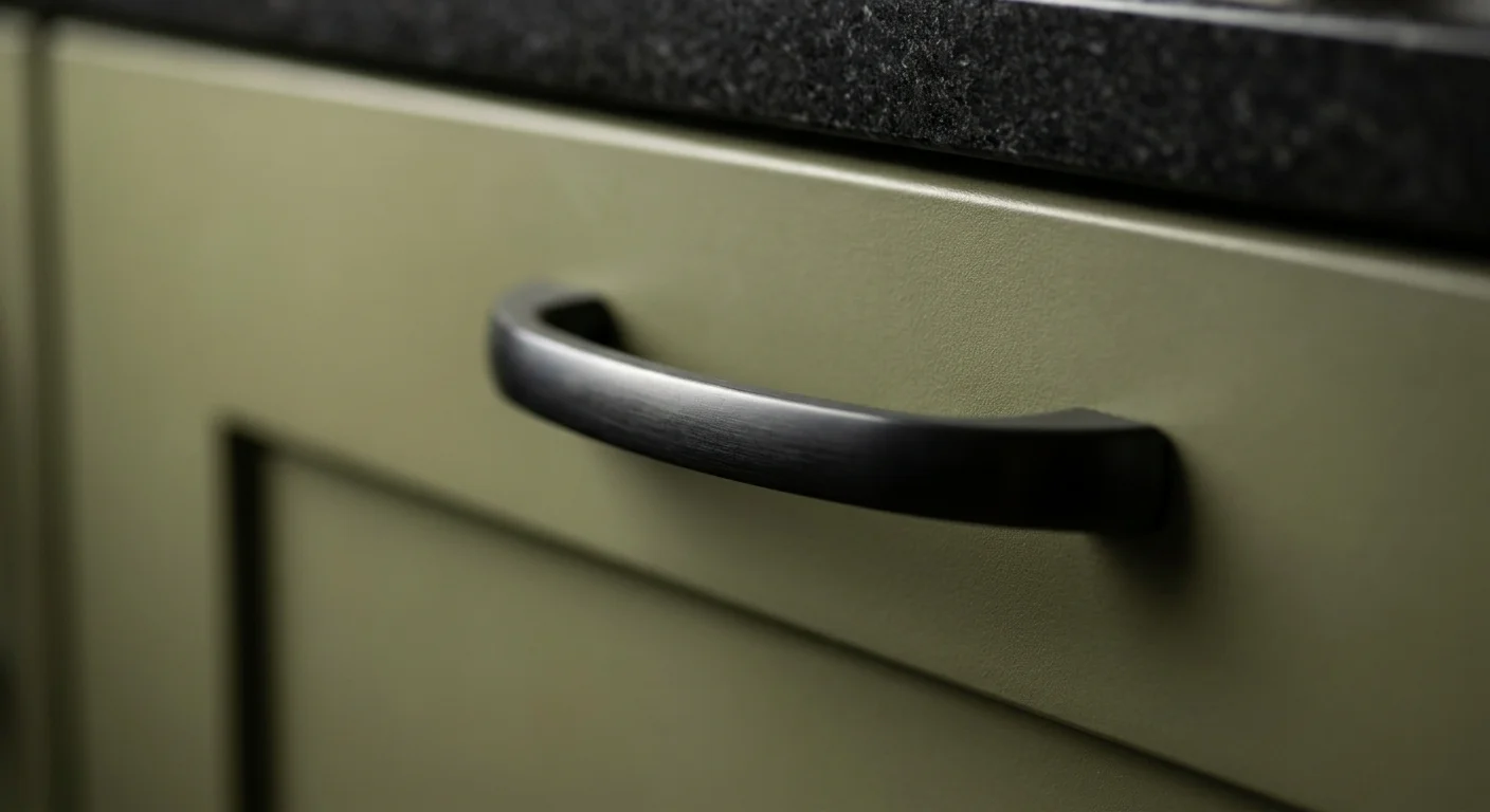
Trend #10: Olive Green and Soft Black
Rounding out our design forecast is the remarkably sophisticated pairing of olive green and soft black. This combination channels a moody, library-like intimacy that completely challenges the traditional concept of the bright, white cooking space. Olive green serves as a muddy, complex neutral; it bridges the gap between the outdoors and the interior while offering significantly more depth than a standard gray or beige. When you pair this nuanced green with soft black, the entire kitchen instantly feels more architectural and grounded. The black anchors the space, providing sharp visual contrast that makes the green undertones pop with unexpected vibrancy. Use soft black for your lower cabinets to anchor the room visually, and apply olive green to the upper cabinets or the surrounding walls. To keep the space from feeling cavernous, maximize natural light and incorporate reflective surfaces like polished stone. This pairing demands confidence, offering unmatched sophistication and dramatic flair.
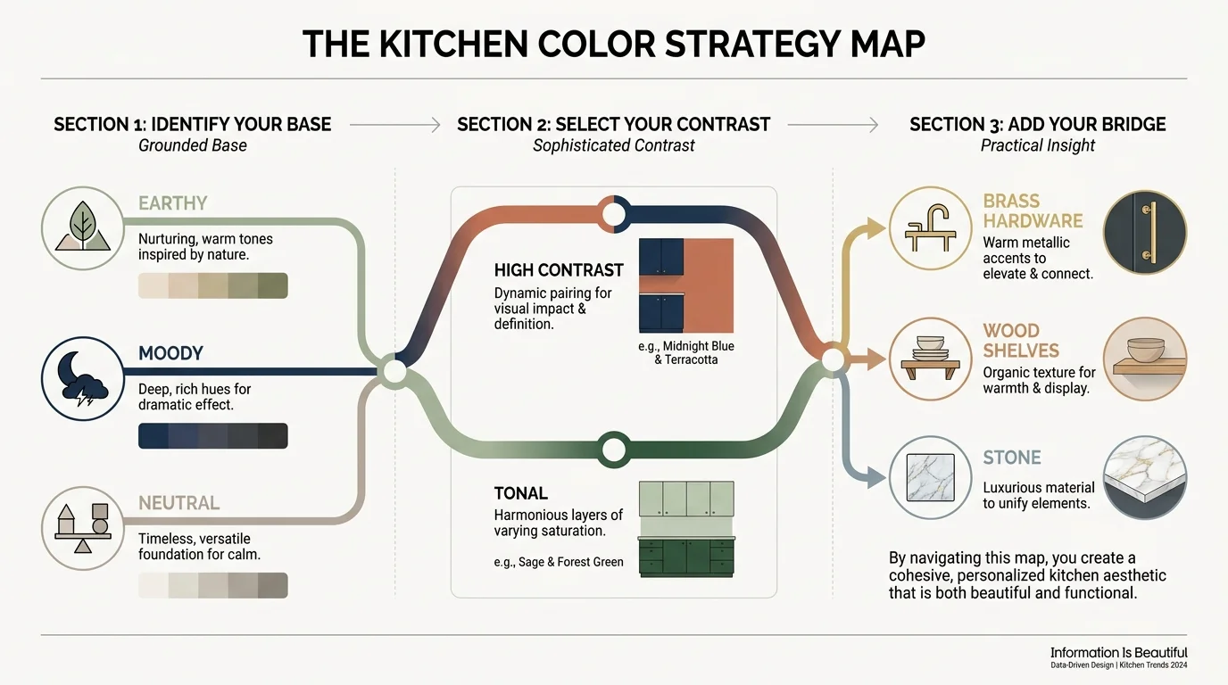
The Big Picture: Weaving These Trends into Your Home
Embracing these kitchen color pairings requires more than just a trip to the paint store; it demands a strategic approach to your home’s unique architecture, historical context, and lighting conditions. To prevent your space from feeling overly trendy or disconnected from the rest of your house, you must anchor these bold choices with timeless design principles. Start by evaluating the natural light in your room. South-facing windows amplify warm tones, making colors like terracotta or mustard yellow highly energetic, while north-facing light cools a room down, making shades like mushroom and dusty blue appear significantly more subdued. Always test large paint swatches on multiple walls and observe them throughout the day—from the bright morning sun to the artificial illumination of the evening—before committing to a full renovation.
Furthermore, remember that cabinetry and walls do not exist in a vacuum. Your flooring, countertops, hardware, and even your appliances play critical roles in your overall palette. Consider how a heavily veined marble countertop might compete with a high-contrast midnight blue and ochre pairing, and adjust your material selections to ensure one star element clearly takes center stage. Balance bold colors with restrained textures, and conversely, pair muted tones with highly tactile materials. Ultimately, the most successful designs reflect your personal taste, daily habits, and lifestyle, utilizing these industry forecasts as a foundational guide rather than a rigid, uncompromising rulebook. By acting with intentionality, you ensure your newly designed kitchen remains deeply personal and visually captivating for decades to come.
Frequently Asked Questions
How do I mix different kitchen color trends without overwhelming the space?
To successfully mix various design trends, you must establish a strict dominant color hierarchy before lifting a single paintbrush. Choose one primary color to carry the majority of the visual weight, typically applied to your main perimeter cabinetry or expansive wall surfaces. Next, select a secondary trend color specifically for structural accents, such as a large kitchen island, a custom range hood, or a built-in pantry. Finally, introduce a third, highly versatile neutral shade to act as a visual bridge between the two bolder colors, giving the eye a place to rest. This disciplined, architectural approach ensures the room remains cohesive, intentional, and elegant rather than chaotic or disjointed.
Do two-tone kitchen cabinets have long-term design longevity?
Yes; two-tone cabinetry has successfully transitioned from a fleeting stylistic trend into a fundamentally timeless design standard. By grounding your lower cabinets with a darker, heavier shade and keeping your upper cabinets significantly lighter, you mimic the natural visual progression of the outdoor landscape. This psychological grounding makes the indoor space feel more open, expansive, and structurally sound. To maximize the long-term longevity of your investment, stick to complex, muted hues—such as sage green, mushroom, or dusty blue—rather than overly vibrant, highly saturated primary colors that can quickly tire the eye and date your renovation.
How does lighting affect my chosen designer kitchen colors?
Lighting completely dictates how the human eye perceives color, meaning your carefully chosen palette will shift dramatically depending on the specific light source illuminating the room. Abundant natural daylight reveals the truest, most accurate version of a color, while warm incandescent or halogen bulbs heavily enhance yellows and reds but simultaneously muddy blues and greens. Conversely, cool LED lighting sharpens cool architectural tones but can make warm, earthy colors feel startlingly sterile. Always evaluate your final paint selections under both the natural daylight of your specific room and your chosen artificial lighting fixtures before authorizing your contractor to begin painting.
Can I incorporate bold colors in a very small kitchen?
Absolutely. In fact, utilizing deep, saturated colors in a small kitchen often yields a much more sophisticated result than simply painting the room white in a futile attempt to make it look larger. Dark colors, such as aubergine, midnight blue, or forest green, blur the sharp architectural boundaries of a compact room, tricking the eye into perceiving an endless, boundless space. The key to successfully implementing bold designer kitchen colors in restricted square footage lies in utilizing high-gloss finishes or reflective materials—such as glazed tile backsplashes and polished hardware—to bounce available light around the room and maintain a sense of dynamic energy.
For the latest color forecasts, consult industry leaders like Pantone and paint companies like Benjamin Moore. For professional design standards, refer to the American Society of Interior Designers (ASID).
Disclaimer: This article reflects design trend analysis and predictions. Personal taste and timeless design principles should always guide your decorating choices.
