

Securing the perfect foundation for your home begins with selecting designer paint colors that transcend fleeting fads and offer enduring elegance. You can instantly elevate your interiors and establish a sophisticated backdrop by relying on timeless paint colors curated by industry experts. Finding the exact shade that adapts to shifting light and evolving decor styles saves you from the exhaustive cycle of constant repainting. True classic wall colors possess a unique versatility, grounding vibrant accents while bringing depth to neutral palettes. Exploring these steadfast interior paint trends reveals the underlying psychology of color and how specific tones alter spatial perception. Let these nine proven selections guide your next design project toward a refined aesthetic.
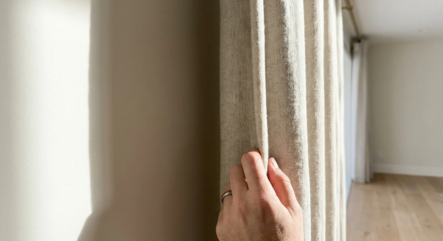
Trend #1: Benjamin Moore White Dove
White Dove anchors the quiet luxury movement with effortless grace. This warm, luminous white eliminates the clinical sterility often associated with starker shades; instead, it offers a soft greige undertone that responds dynamically to natural daylight. You will find industry professionals specifying this color for spaces demanding a seamless bridge between organic modernism and traditional elegance. By capturing the subtle interplay of light and shadow, White Dove establishes a serene environment that enhances architectural details without overwhelming the senses. Understanding the Light Reflectance Value—or LRV—proves critical when specifying interior paint trends. White Dove boasts a high LRV, meaning it reflects substantial light, bouncing sunshine deep into your interior corridors and making small rooms feel immediately larger. Pair this steadfast hue with natural light oak flooring, unlacquered brass hardware, and highly textural fabrics like heavy linen or bouclé. The resulting aesthetic feels both curated and inherently comfortable. Designers continually recommend this specific shade because it provides a foolproof foundation for evolving aesthetics—allowing you to swap accent colors, textiles, and furnishings over the decades without ever needing to touch the walls. You invest once in a premium finish, and the room continually reinvents itself.
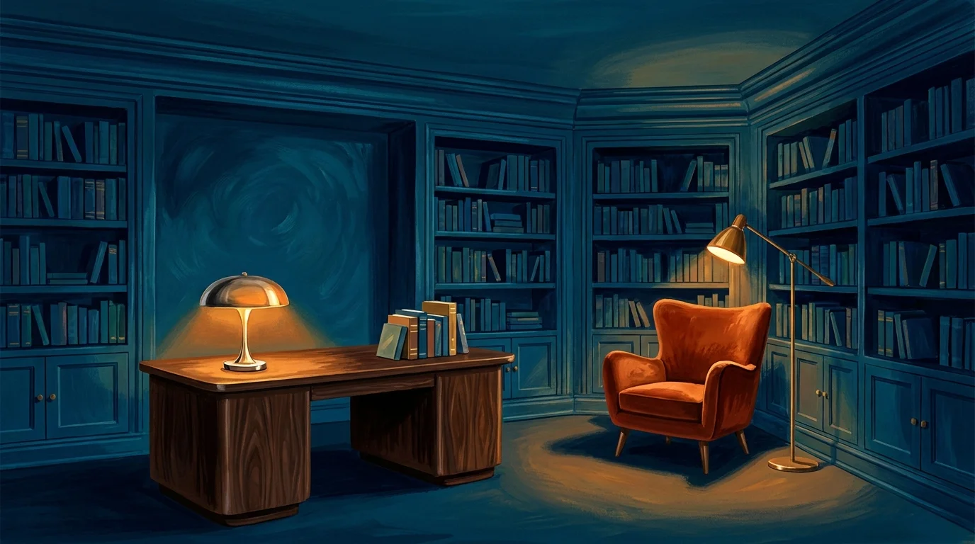
Trend #2: Farrow & Ball Hague Blue
Embrace profound depth and architectural drama with Hague Blue. This deeply saturated navy features subtle green undertones that evoke a sense of historic provenance while remaining fiercely contemporary. You can utilize this shade to execute the highly effective color-drenching technique—painting the walls, baseboards, crown molding, and ceiling in the identical dark hue to blur spatial boundaries and create an immersive, jewel-box effect. You elevate the sensory experience of your home when you drench a room in Hague Blue. The green undertones become highly pronounced in artificial evening light, transforming the ambiance from crisp and maritime to profoundly moody and enveloping. Hague Blue commands attention yet serves as a surprisingly versatile dark neutral. It sets an exquisite backdrop for rich walnut furniture, polished nickel fixtures, and tactile elements like rust-colored velvet upholstery. Industry data reveals a massive shift toward emotive dining rooms, private studies, and intimate libraries, and Hague Blue delivers that exact psychological weight. The color transforms dim spaces into luxurious retreats, proving that you do not always need brilliant white paint to make a room feel sophisticated and visually expansive.
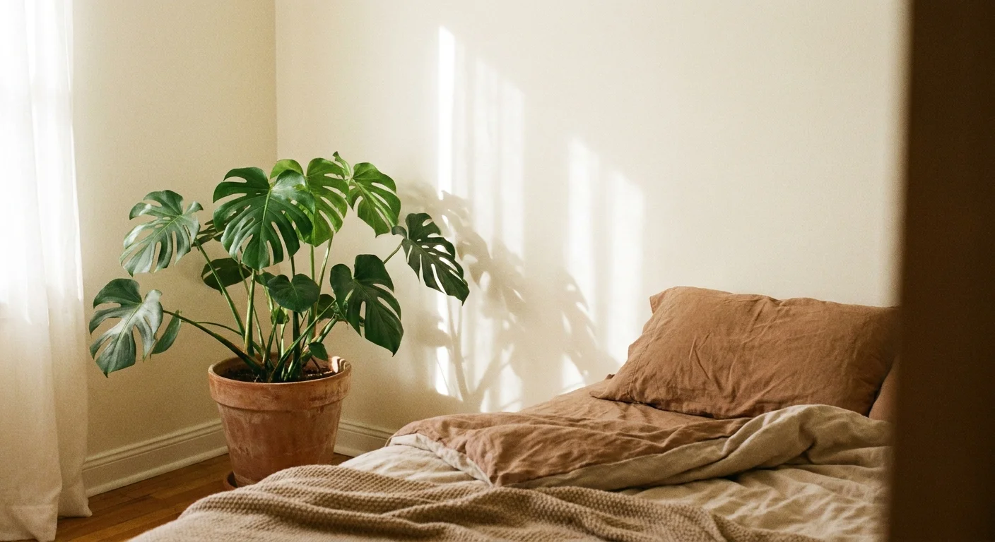
Trend #3: Sherwin-Williams Alabaster
Shift your focus toward a softer, more nurturing environment with Alabaster. Unlike crisp gallery whites that occasionally read as harsh or blinding, this creamy off-white possesses a subtle warmth that heavily supports biophilic design principles. You can instantly soften the hard edges of modern architecture by enveloping your living spaces in this highly approachable tone. Alabaster mimics the organic lightness found in natural stone, raw cotton, and unbleached parchment, making it a permanent fixture among the best paint shades for residential interiors. The industry frequently notes that residential clients increasingly crave comfort over stark minimalism. Alabaster satisfies this demand perfectly; it removes the intense glare of titanium dioxide-heavy whites, giving your eyes a much-needed resting place. When you introduce terracotta floor tiles, honed marble countertops, and tumbled brass hardware alongside Alabaster walls, you create a tactile, sunbaked atmosphere that feels perpetually welcoming. The shade effectively reflects ambient daylight while maintaining a cozy intimacy. Designers rely on this color when building layered, monochromatic spaces; its gentle undertones prevent the room from feeling bleak or uninviting during the colder, darker months of the year.
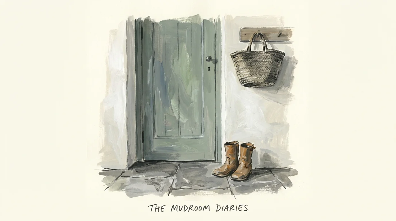
Trend #4: Farrow & Ball French Gray
Master the art of atmospheric design with French Gray, a true chameleon color that dances effortlessly between soothing green and historic gray. Depending on your home’s geographic orientation and the specific time of day, this complex shade reveals entirely different personalities—shifting from a cool, misty hue in the morning sun to a warm, earthy tone by late afternoon. You can leverage French Gray to dissolve the visual barrier between your interior rooms and the outdoor landscape. This intentional connection to nature remains a cornerstone of modern wellness-focused design. The historical provenance of French Gray adds an intrinsic layer of sophistication to your decorating scheme. During the 19th century, complex greens and grays signified immense wealth due to the expense of the natural pigments required to mix them. Pair this historic yet remarkably trendy color with aged copper accents, reclaimed timber ceiling beams, and natural linen drapery to emphasize its organic roots. Professional designers consistently turn to French Gray for high-traffic mudrooms, classic kitchens, and sun-drenched conservatories because it grounds the space while offering vastly more visual interest than a standard beige or gray.
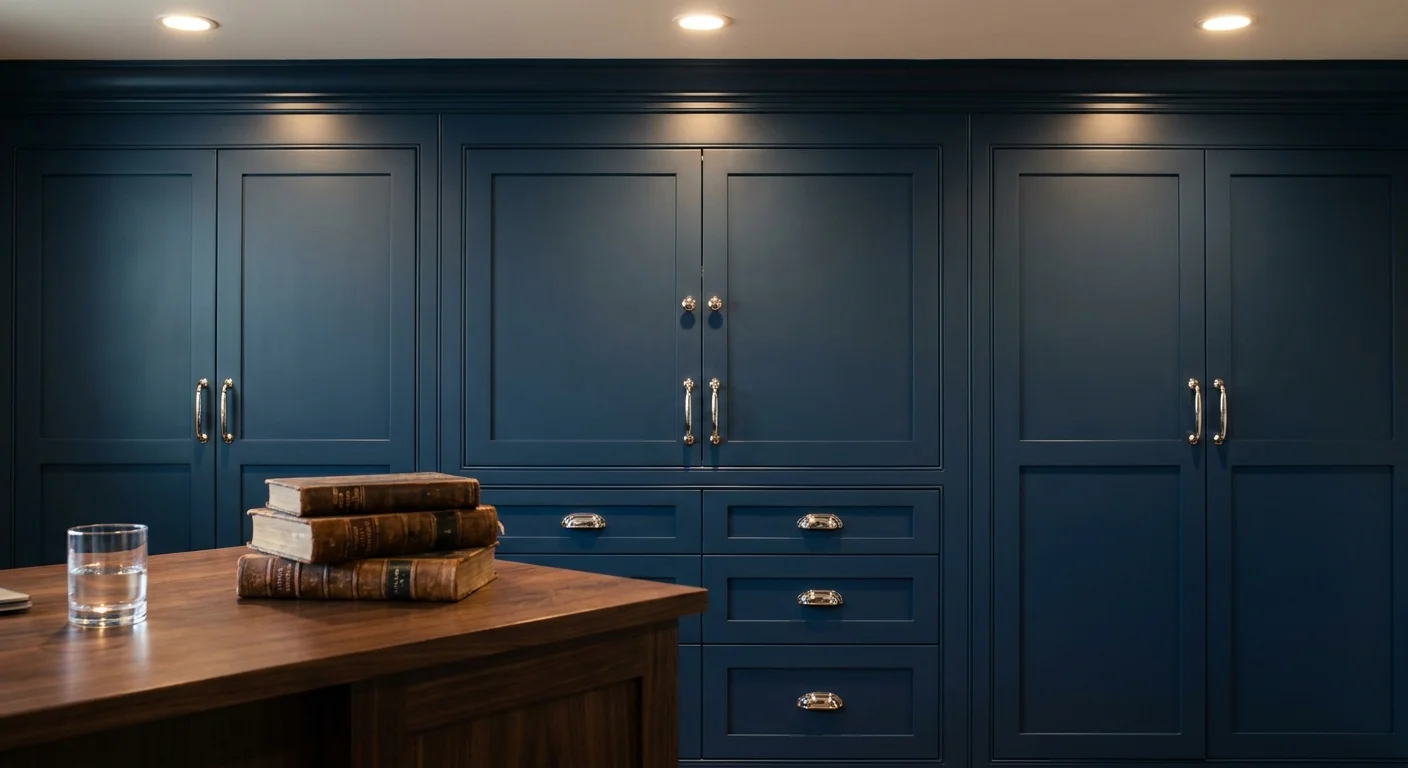
Secure a distinctly tailored, maritime-inspired aesthetic with Hale Navy. Widely considered the undisputed champion of dark blues across the industry, this color perfectly balances cool and warm undertones, ensuring it never inadvertently reads as overly purple or stark black. You can deploy Hale Navy to anchor bespoke millwork, kitchen islands, or expansive custom library shelving. The shade exudes a profound sense of stability and quiet luxury, making it an essential tool for homeowners seeking a sophisticated upgrade. Cabinetry finished in Hale Navy beautifully conceals daily wear and tear while providing a formal, grounded anchor for the room. Hale Navy pairs flawlessly with crisp, brilliant white trim—creating a timeless, high-contrast look that defines classic American interior design. You can also push the boundaries of traditional decor by combining this steadfast blue with bold, modern art pieces; the dark background makes vibrant reds, ochres, and mustard yellows visually explode. To modernize the application further, integrate warm cognac leather seating, brushed gold lighting fixtures, and deeply veined Calacatta marble. Designers champion Hale Navy because it successfully bridges the gap between traditional coastal aesthetics and sleek urban sophistication.
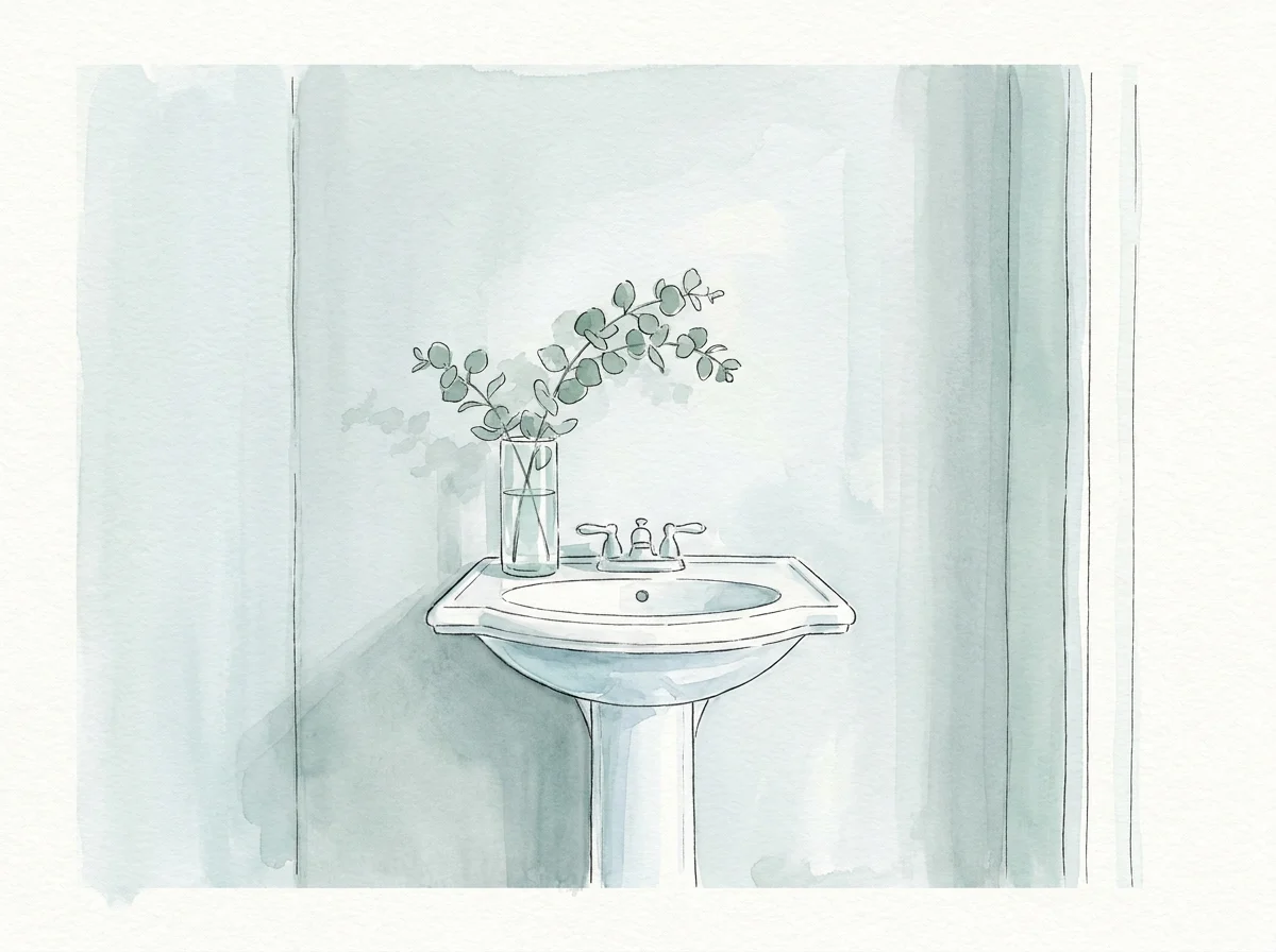
Trend #6: Sherwin-Williams Sea Salt
Cultivate an atmosphere of absolute serenity with Sea Salt, a muted coastal green-gray that practically breathes fresh air into your home. As the interior design industry increasingly prioritizes mental well-being and restorative living environments, this tranquil hue has solidified its status as an essential, timeless classic. Sea Salt contains a highly calibrated blend of green, gray, and subtle blue; this sophisticated complexity prevents the shade from looking like a flat pastel nursery color. Biophilic design relies heavily on our innate connection to the natural world, and Sea Salt directly translates the restorative essence of ocean water and morning coastal fog into a practical interior application. You actively mitigate the visual stress of urban living when you surround yourself with this soothing shade. You can utilize Sea Salt to visually expand smaller, darker spaces, particularly en-suite bathrooms and primary bedrooms, where a calming psychological effect is paramount. For a truly elevated approach, pair this color with light ash wood furnishings, matte black architectural hardware, and woven rattan textures. The juxtaposition of the soft, ethereal wall color against grounded, earthy materials yields a perfectly balanced interior.
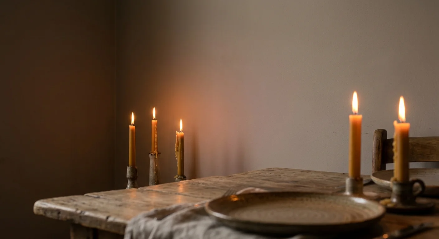
Trend #7: Farrow & Ball Elephant’s Breath
Elevate your transitional living spaces with Elephant’s Breath, an exceptionally sophisticated greige featuring an unexpected, highly nuanced hint of magenta. This underlying warmth actively prevents the color from feeling flat, cold, or industrial, instantly setting it apart from standard builder-grade grays. You can introduce this complex hue into sprawling open-concept living areas to establish a cohesive, contemporary flow that still feels deeply rooted in historic design principles. Greige continues to dominate the residential market, but you must select a shade with adequate depth to ensure your home feels bespoke. Elephant’s Breath delivers that requisite complexity. The subtle magenta undertone acts as a warming agent, interacting beautifully with the natural pinks and reds found in exposed brickwork, terracotta planters, or antique Persian rugs. Elephant’s Breath thrives in environments heavily focused on rich texture and sculptural form. Combine this shade with heavy bouclé seating, structural travertine coffee tables, and dark oil-rubbed bronze lighting fixtures to achieve a masterclass in quiet luxury. The color acts as a soft, enveloping shadow, highlighting your architectural curves and unique silhouettes without ever demanding direct attention from the eye.
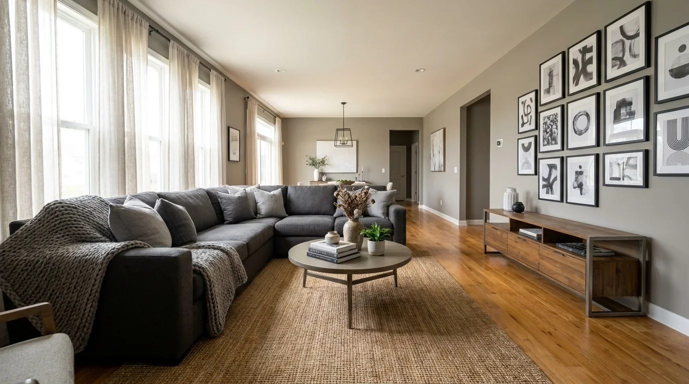
Trend #8: Benjamin Moore Revere Pewter
Bridge the formidable divide between cool modernism and warm traditionalism using Revere Pewter. Once heavily heralded as the defining color of the early 2010s, this muddy, warm gray has gracefully transcended its trendy origins to become a certified, heavily utilized classic. Revere Pewter succeeds because it acts as the ultimate architectural equalizer; it effortlessly harmonizes conflicting warm and cool undertones within your existing furniture and hard finishes. Transitional design thrives on exact balance, and Revere Pewter serves as the ultimate fulcrum. You can successfully blend a hyper-modern acrylic dining table with ornate antique Louis XVI chairs when grounded by this accommodating backdrop. You can apply this versatile shade in sprawling, open-plan homes to unify disparate living zones seamlessly. To keep the aesthetic entirely current, avoid pairing it with overly rustic or heavily distressed elements; instead, elevate the color with crisp gallery-white ceilings, deep charcoal window mullions, and polished natural stones like soapstone or slate. Revere Pewter continues to dominate timeless interior paint trends because it provides a reliably safe yet highly sophisticated canvas for homeowners who desire a neutral palette with genuine historical gravitas.
Trend #9: Sherwin-Williams Tricorn Black
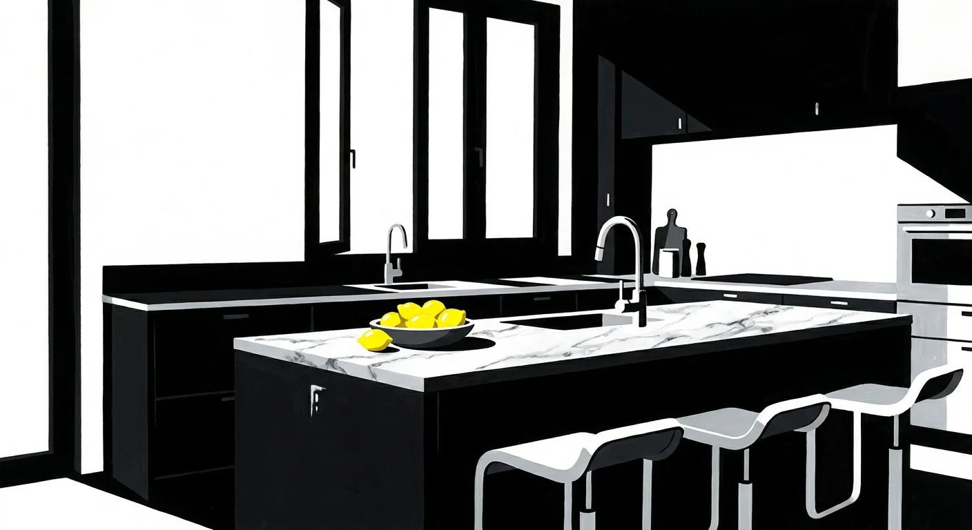
Inject unparalleled architectural definition into your home with Tricorn Black. Securing a true, deep black entirely devoid of muddy brown or distracting blue undertones presents a significant challenge for paint chemists, yet this precise shade delivers absolute perfection. You can utilize Tricorn Black to punctuate your overall design scheme—applying it strategically to interior doors, window sashes, custom handrails, or striking accent walls. Many homeowners initially fear applying black paint, yet professional designers understand that black acts as a necessary grounding element in almost every well-curated room. Tricorn Black absorbs light rather than reflecting it, effectively allowing the architectural lines and structural forms of your space to take center stage. This high-contrast approach frames your exterior views and highlights structural elements, acting much like a bold stroke of eyeliner for your rooms. Tricorn Black fully supports the modern gothic and organic modern movements when paired intentionally with heavily grained woods, lush indoor greenery, and raw concrete. Industry professionals consider this absolute black a non-negotiable tool in their design arsenals, ensuring that your boldest design choices remain undeniably timeless and impeccably grounded.
The Big Picture: Weaving These Trends into Your Home
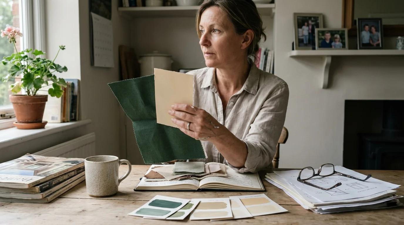
Synthesizing these timeless paint colors requires a strategic approach to proportion and spatial flow. You must view your home as a holistic, interconnected environment rather than a series of isolated rooms. Establish a cohesive architectural baseline by selecting a warm, expansive neutral—such as White Dove or Alabaster—for your primary living corridors, hallways, and open-concept spaces. This creates a breathing space for the eye. You can then deliberately inject moodier, saturated tones like Hague Blue or Tricorn Black into enclosed spaces, such as powder rooms, studies, or formal dining areas. This technique creates a dynamic psychological rhythm of expansion and compression as you transition through the house.
Pay strict attention to your lighting conditions; you must always apply generous physical paint samples directly to your walls and observe them at various points throughout the day. Natural daylight dramatically alters how these complex shades present themselves, turning a morning green into an evening gray. By balancing light and dark hues and intentionally integrating varied, highly tactile textures, you create a sophisticated, layered interior that entirely defies the relentless churn of micro-trends and stands resolutely stylish for decades.
Frequently Asked Questions
How do I successfully mix warm and cool timeless paint colors in an open-concept space?
You can mix warm and cool tones by relying on architectural transitions and intentional color mapping. Use a unifying, warm neutral on the primary walls, then apply your contrasting cool shades to distinct focal points like custom kitchen cabinetry, built-in bookshelves, or a central fireplace surround. Incorporate textiles, pillows, and area rugs that feature both color temperatures to bridge the visual gap and create a deliberate, cohesive palette.
Does the concept of color drenching work with classic wall colors, or is it merely a passing fad?
Color drenching—the act of painting your walls, trim, baseboards, and ceilings in a single, unified shade—is a historically rooted technique that has merely regained modern popularity. When you execute this method using profound, timeless hues like Hale Navy or French Gray, it minimizes visual clutter and beautifully highlights the shape and silhouette of your furniture. The technique possesses significant longevity because it prioritizes spatial atmosphere over complex, contrasting trim work.
How does natural light orientation dictate the success of these designer paint colors?
Geographic orientation drastically alters your daily color perception. North-facing rooms receive cool, indirect light that amplifies gray or blue undertones, meaning a color like Sea Salt might read quite cold; you should counter this by selecting warmer tones like Elephant’s Breath for northern exposures. Conversely, south-facing rooms flood with intense, golden sunlight, which beautifully balances moody hues and enhances the inherent luminosity of creamy off-whites.
Can I use bold, dark shades in small rooms without making the space feel claustrophobic?
Absolutely. Dark colors recede visually, blurring the corners and rigid boundaries of a room to create a distinct illusion of endless depth. You can confidently apply heavily saturated tones like Tricorn Black or Hague Blue in small powder rooms, entry vestibules, or snug libraries. Pair the dark walls with strategic ambient lighting and reflective surfaces—such as antiqued mirrors or polished brass metals—to cultivate a luxurious, expansive jewel-box atmosphere.
For the latest color forecasts, consult industry leaders like Pantone and paint companies like Benjamin Moore. For professional design standards, refer to the American Society of Interior Designers (ASID).
Disclaimer: This article reflects design trend analysis and predictions. Personal taste and timeless design principles should always guide your decorating choices.
