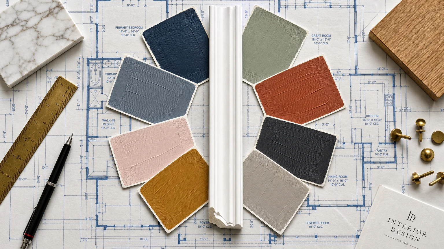
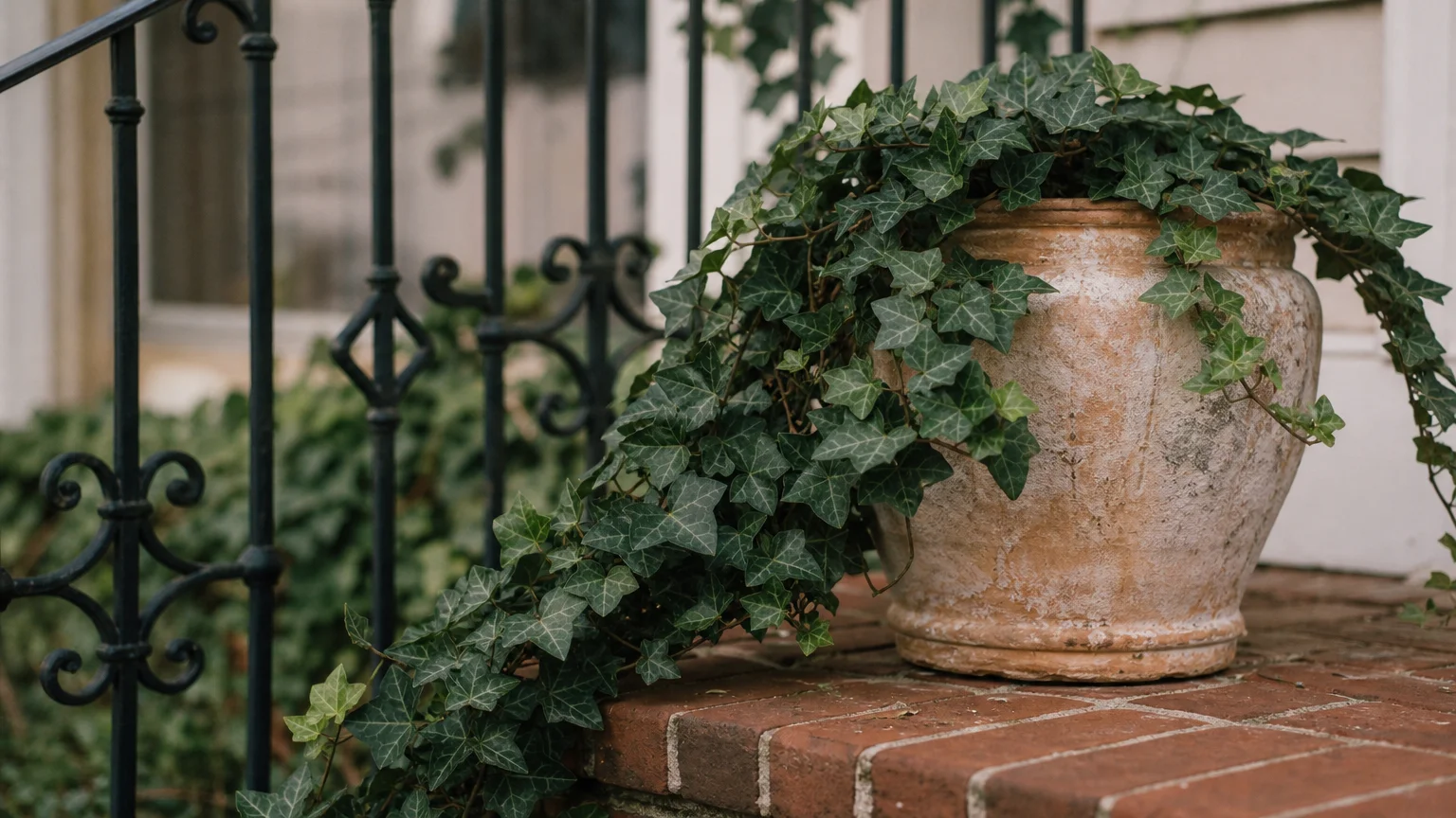
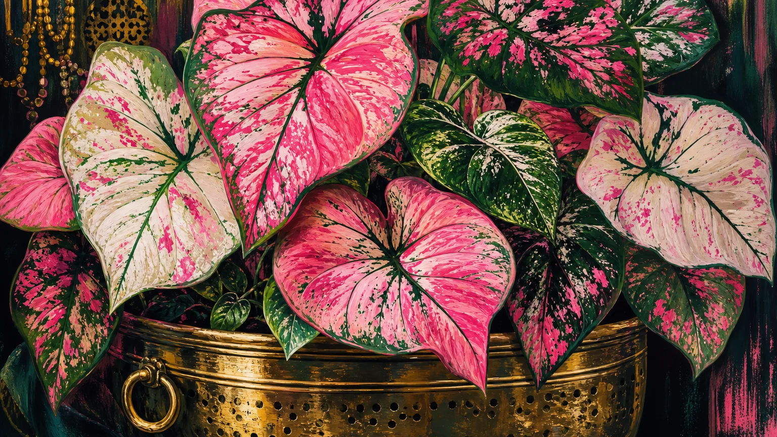
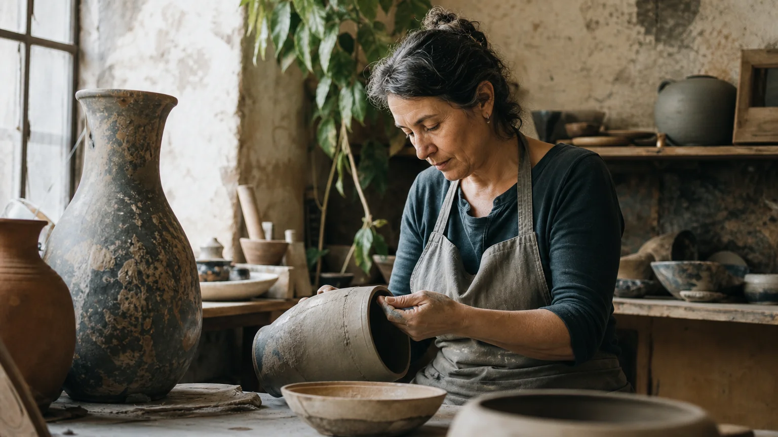
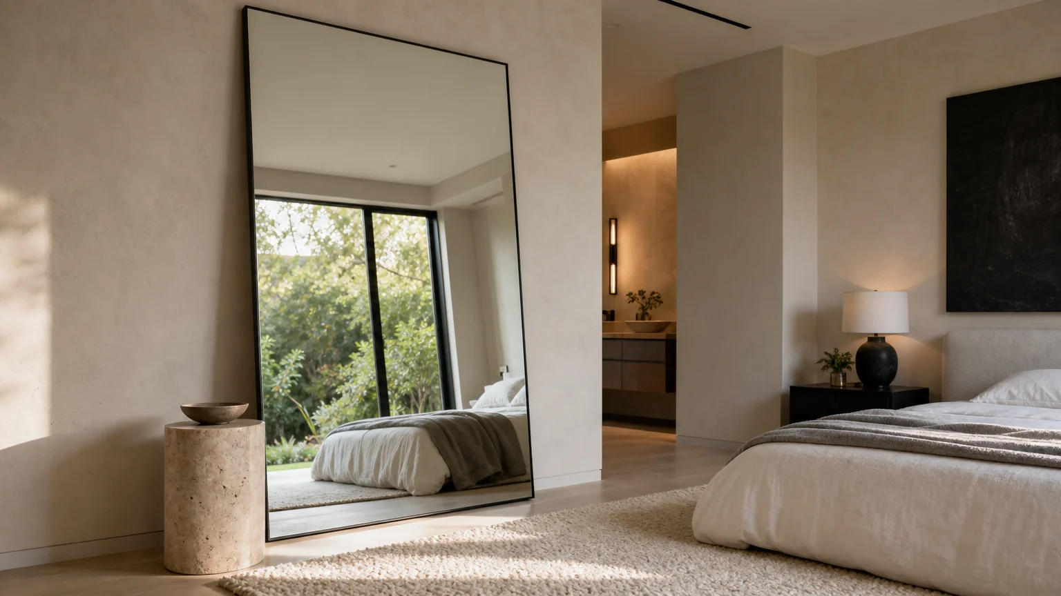
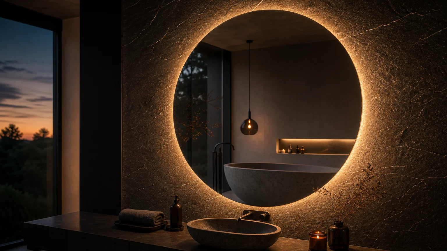
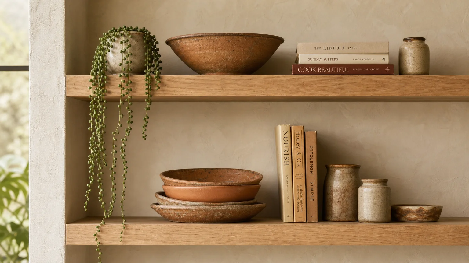
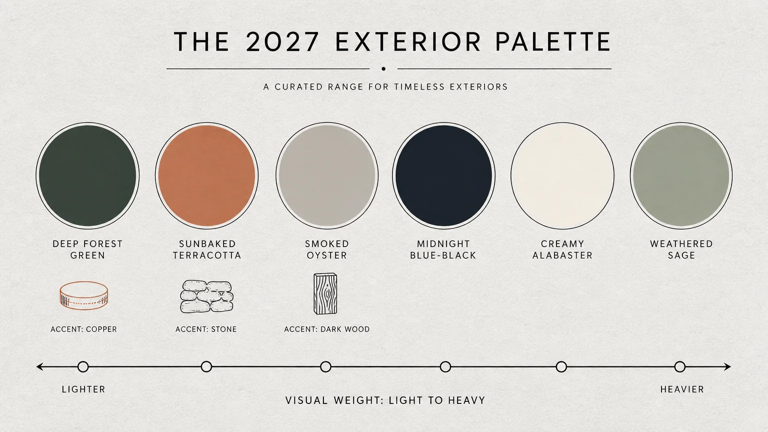
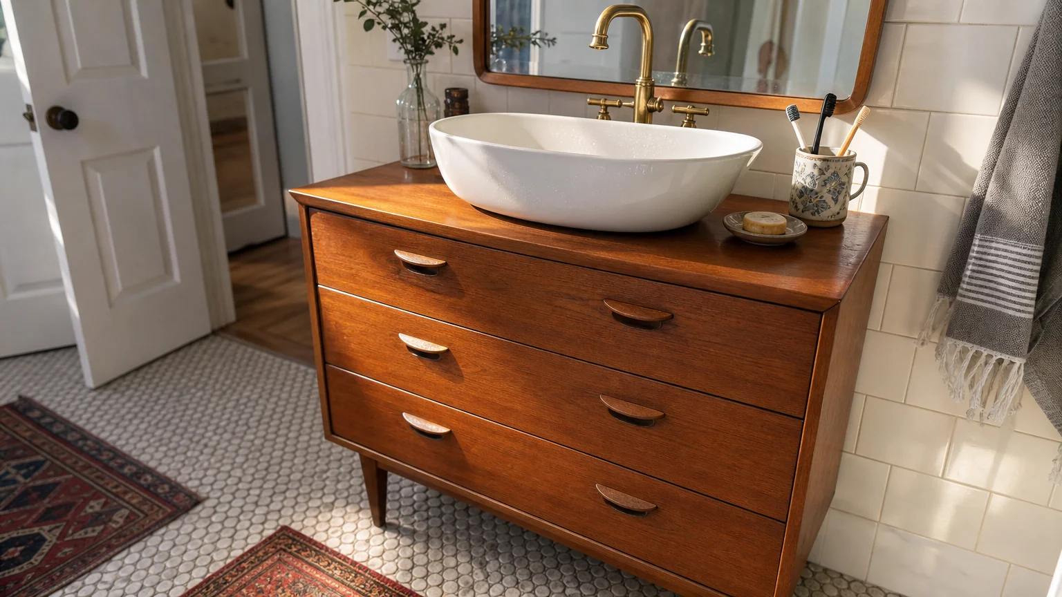
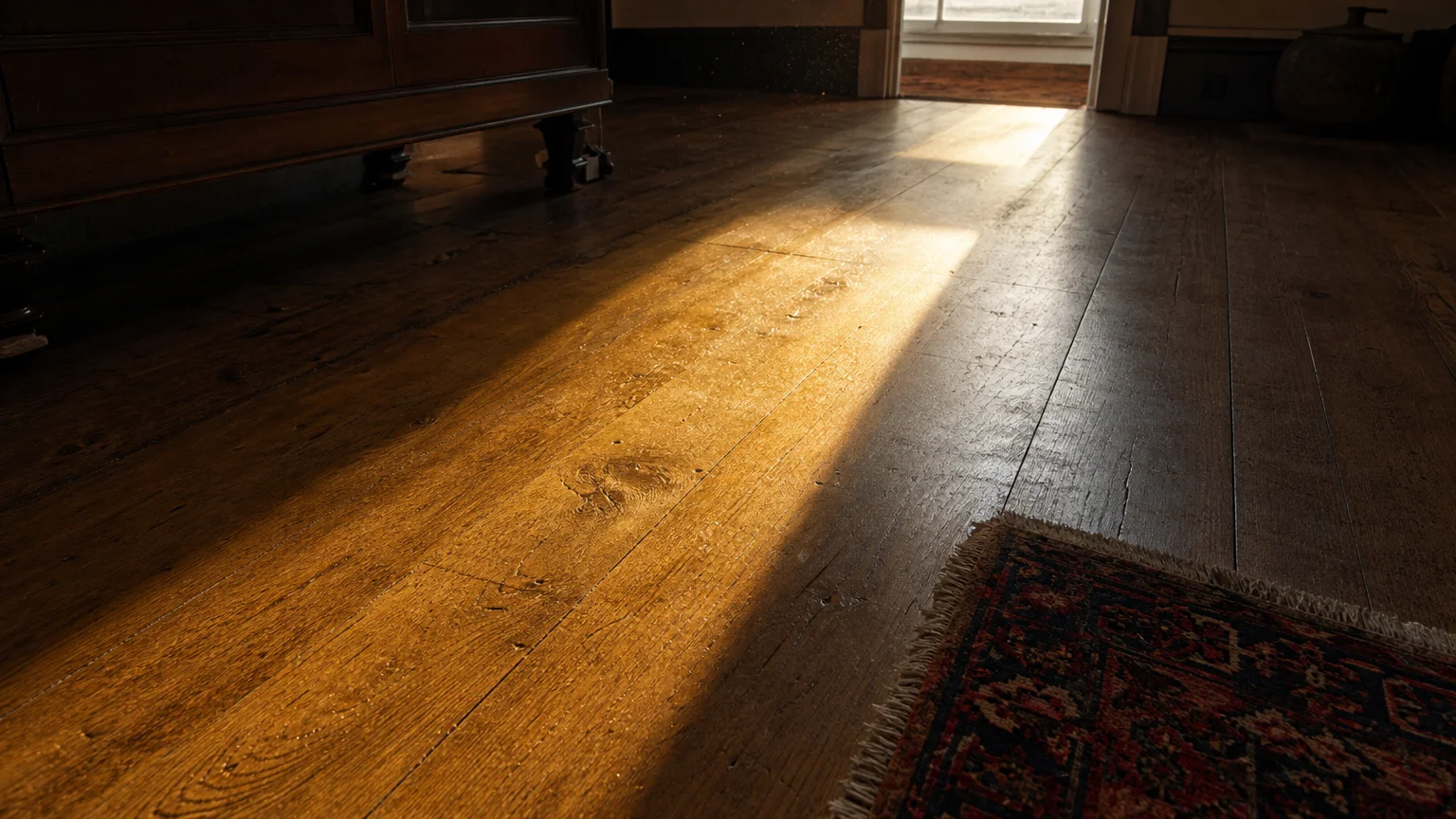
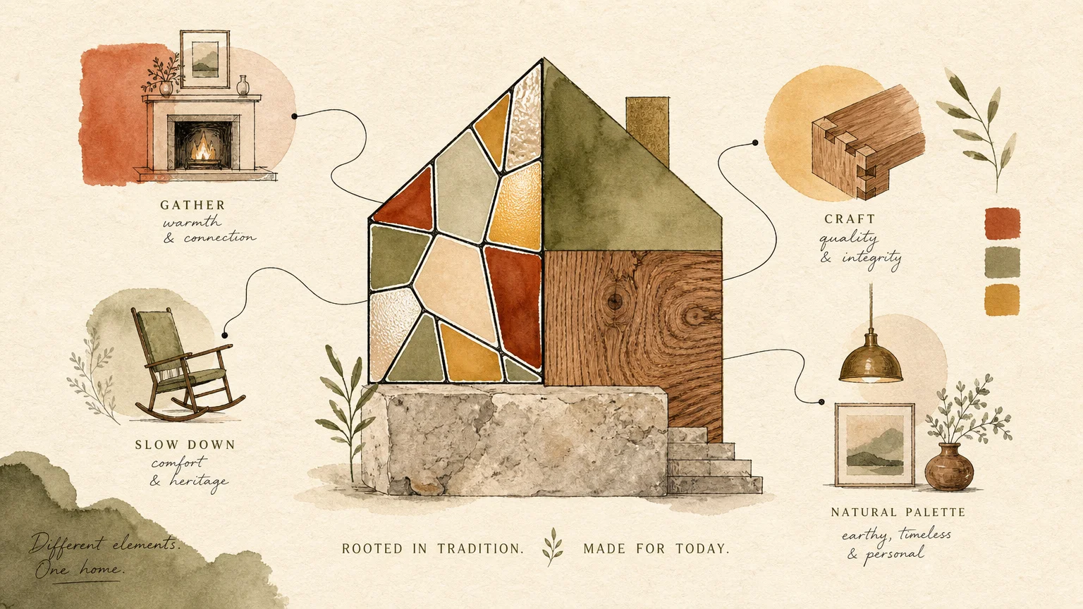
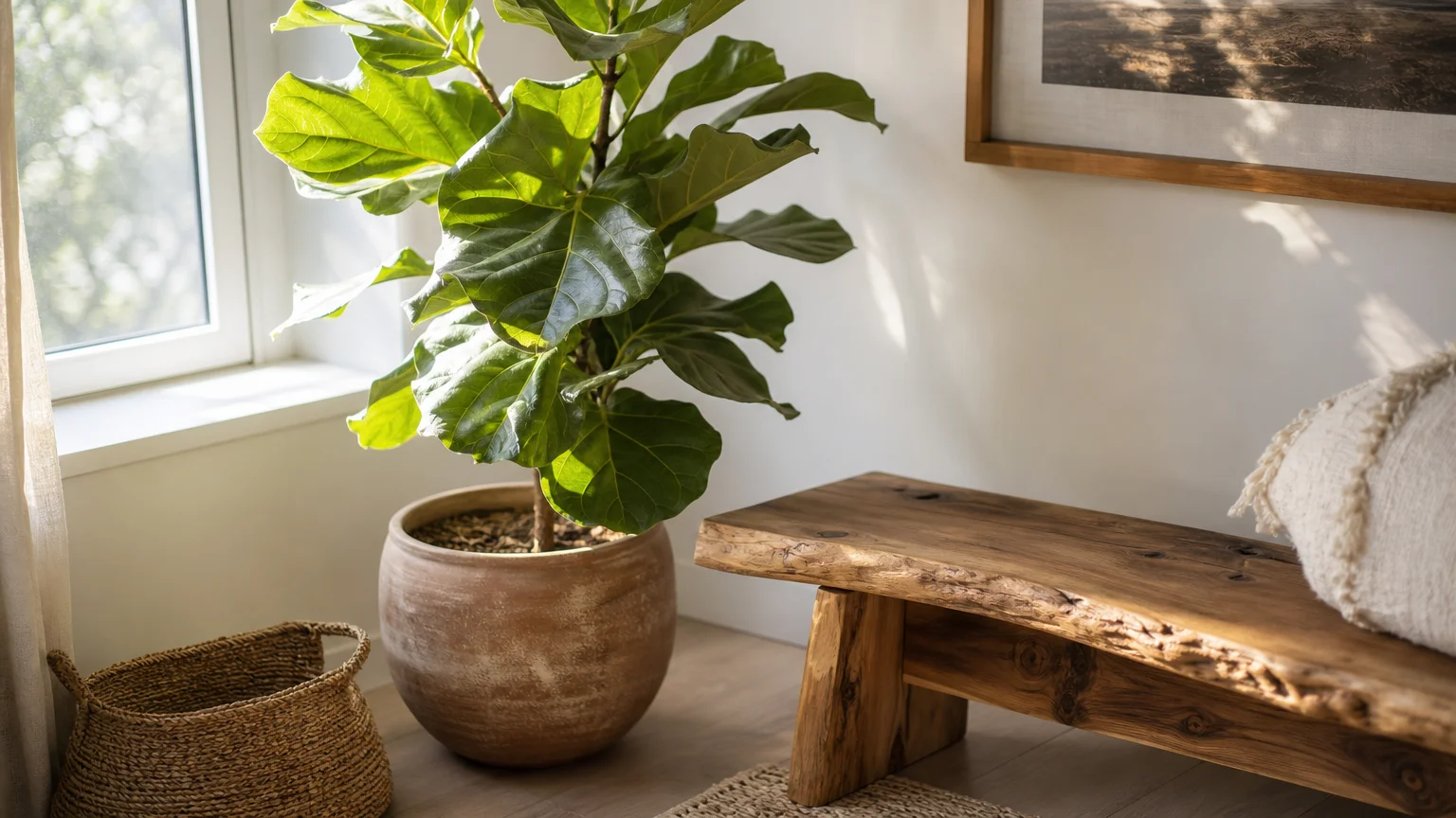
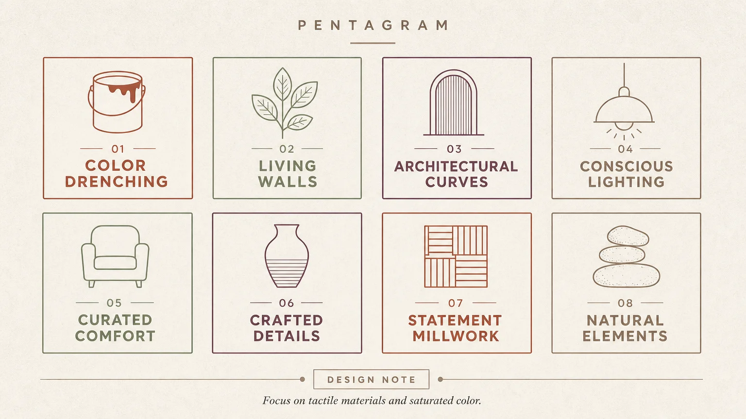
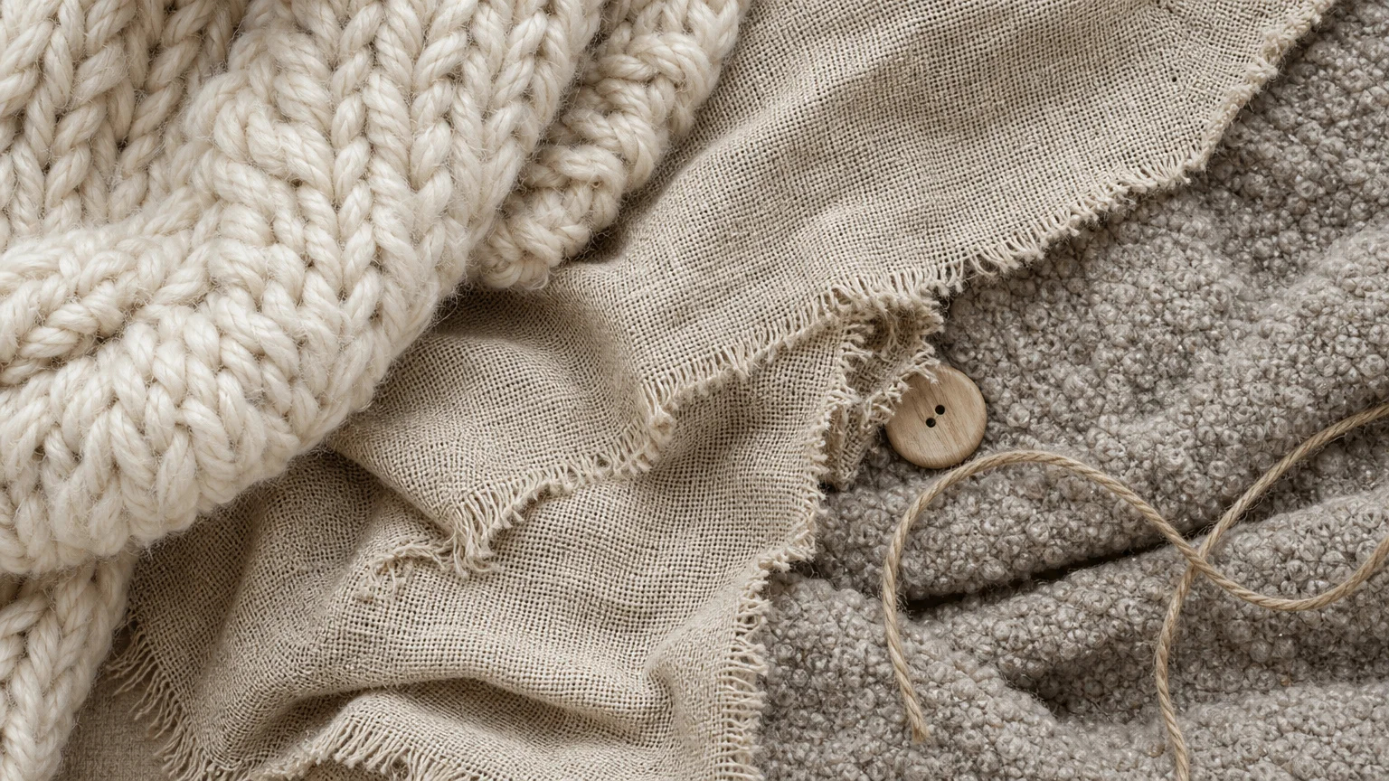
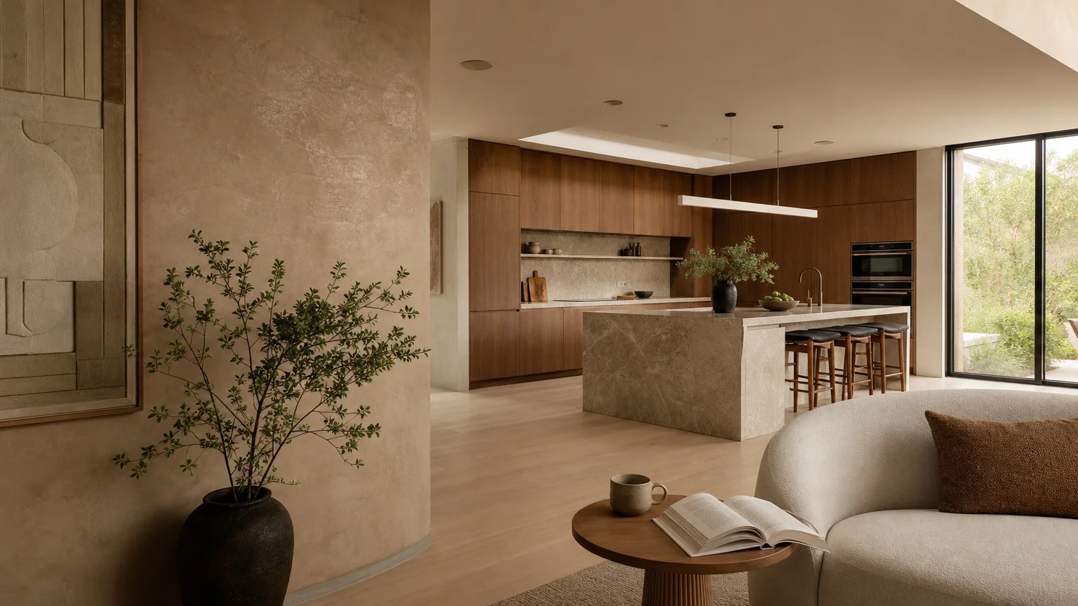
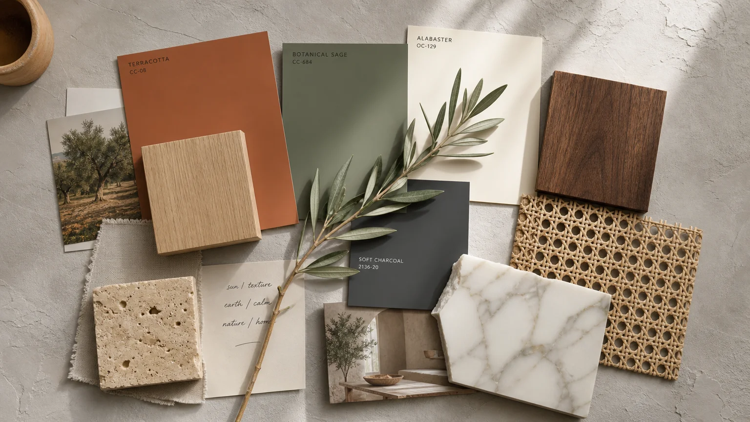
Natural materials elevate your living spaces with an undeniable sense of grounded sophistication, but unlocking their full potential requires the perfect backdrop. You can instantly amplify the warmth of wide-plank oak, the organic veining of marble, and the tactile richness of woven jute by strategically selecting paint colors that echo the natural world. This biophilic approach to home decorating transcends fleeting fads; it creates a sanctuary of quiet luxury. As interior design pivots toward authenticity and provenance, the dynamic interplay between organic textures and curated color palettes becomes the ultimate tool for elevated living. Explore these ten definitive hues that seamlessly bridge the gap between architectural elements and modern aesthetics.
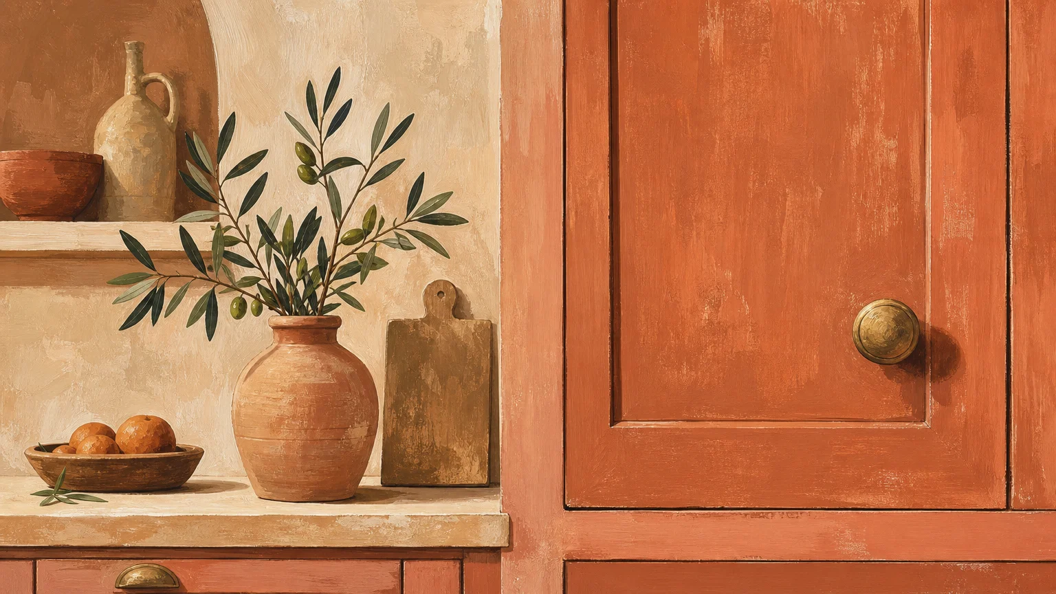
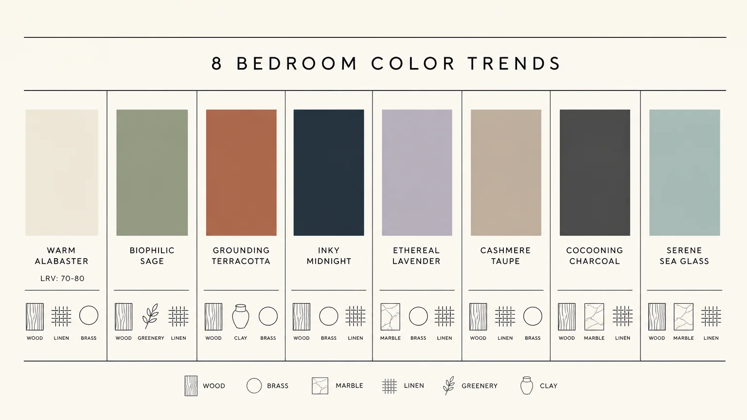
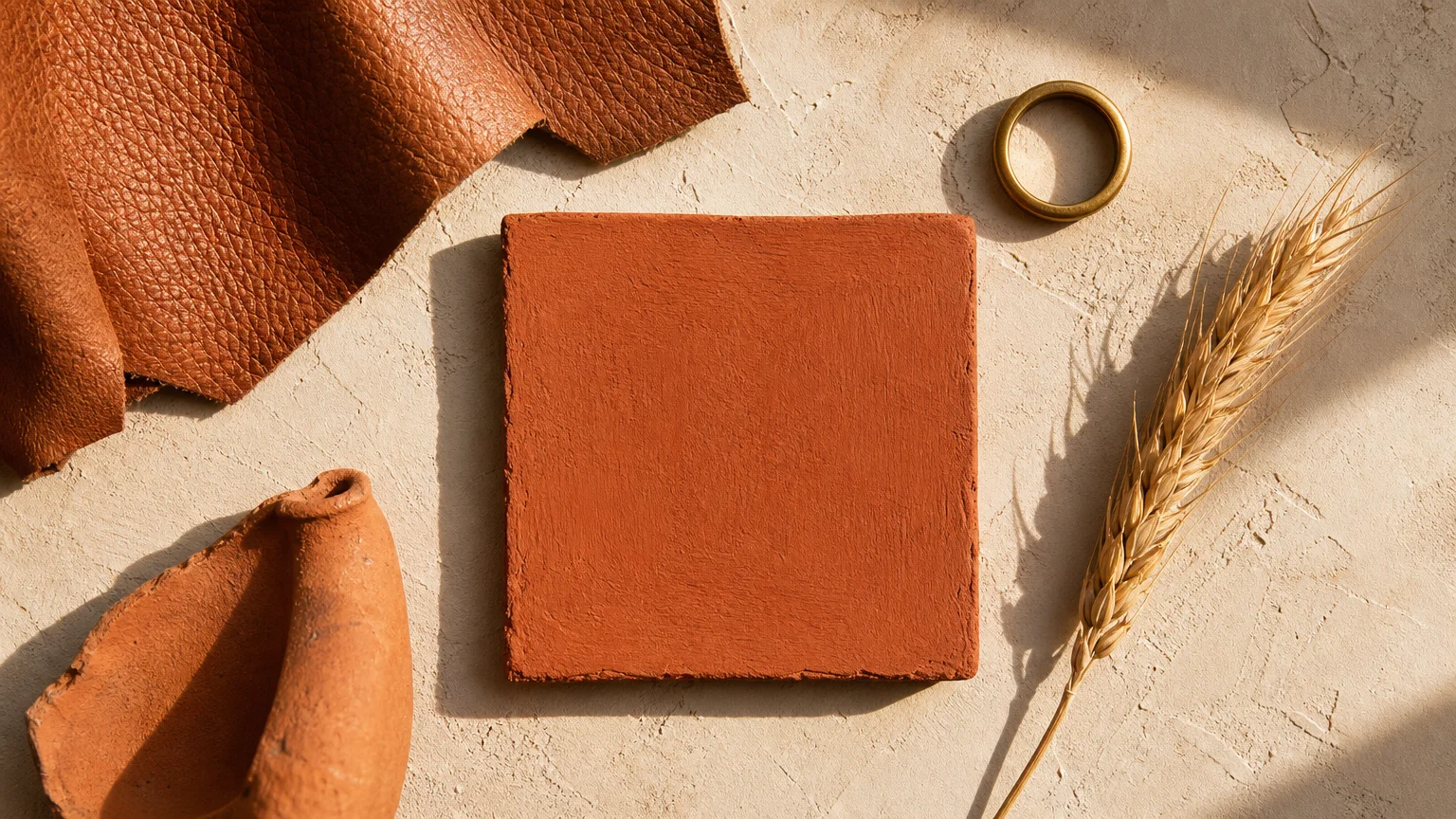
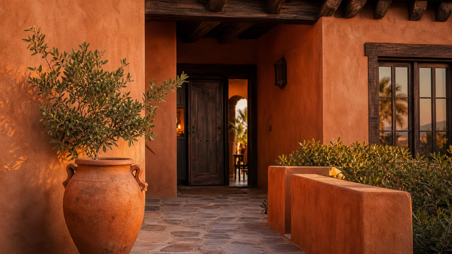
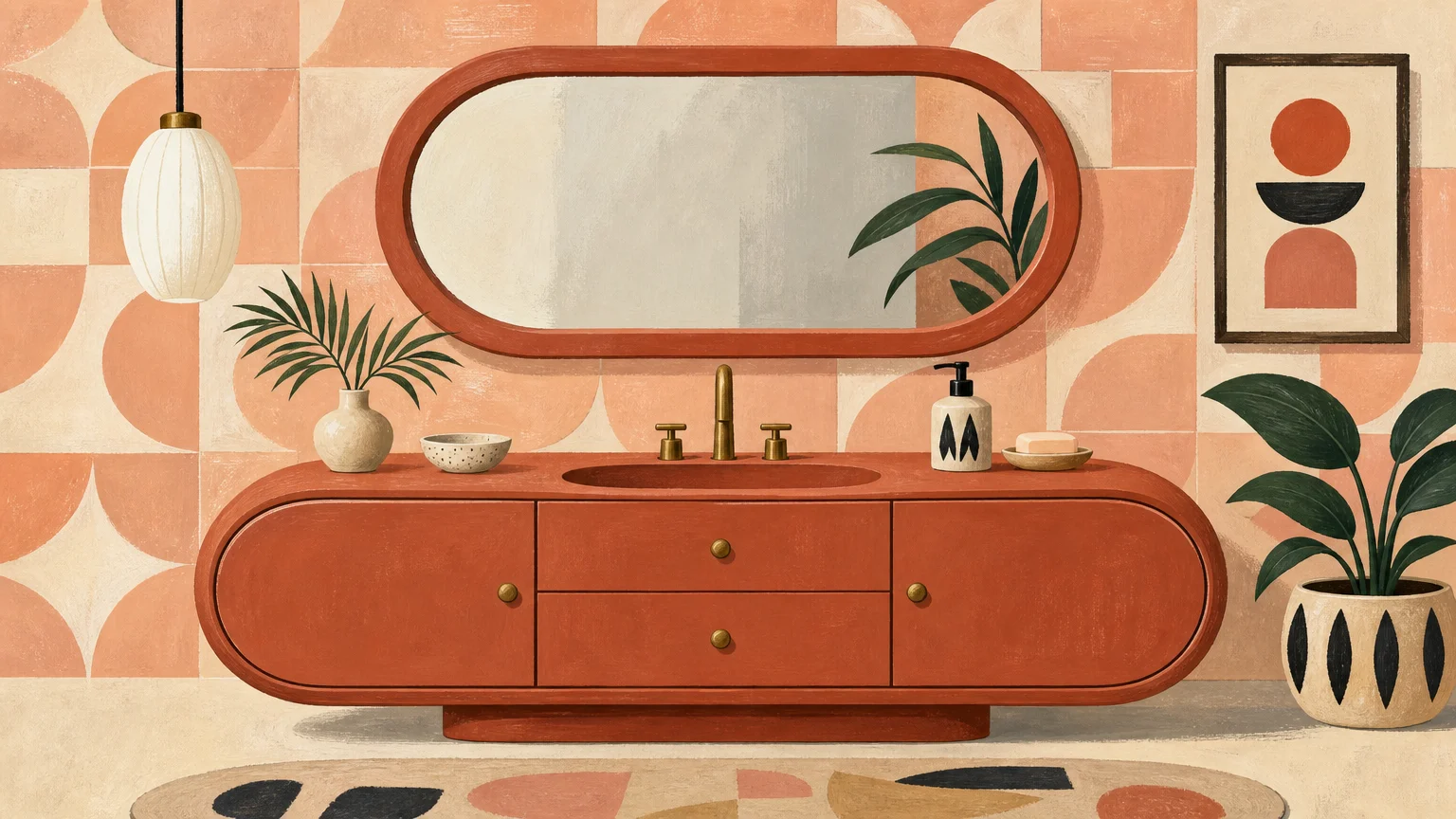
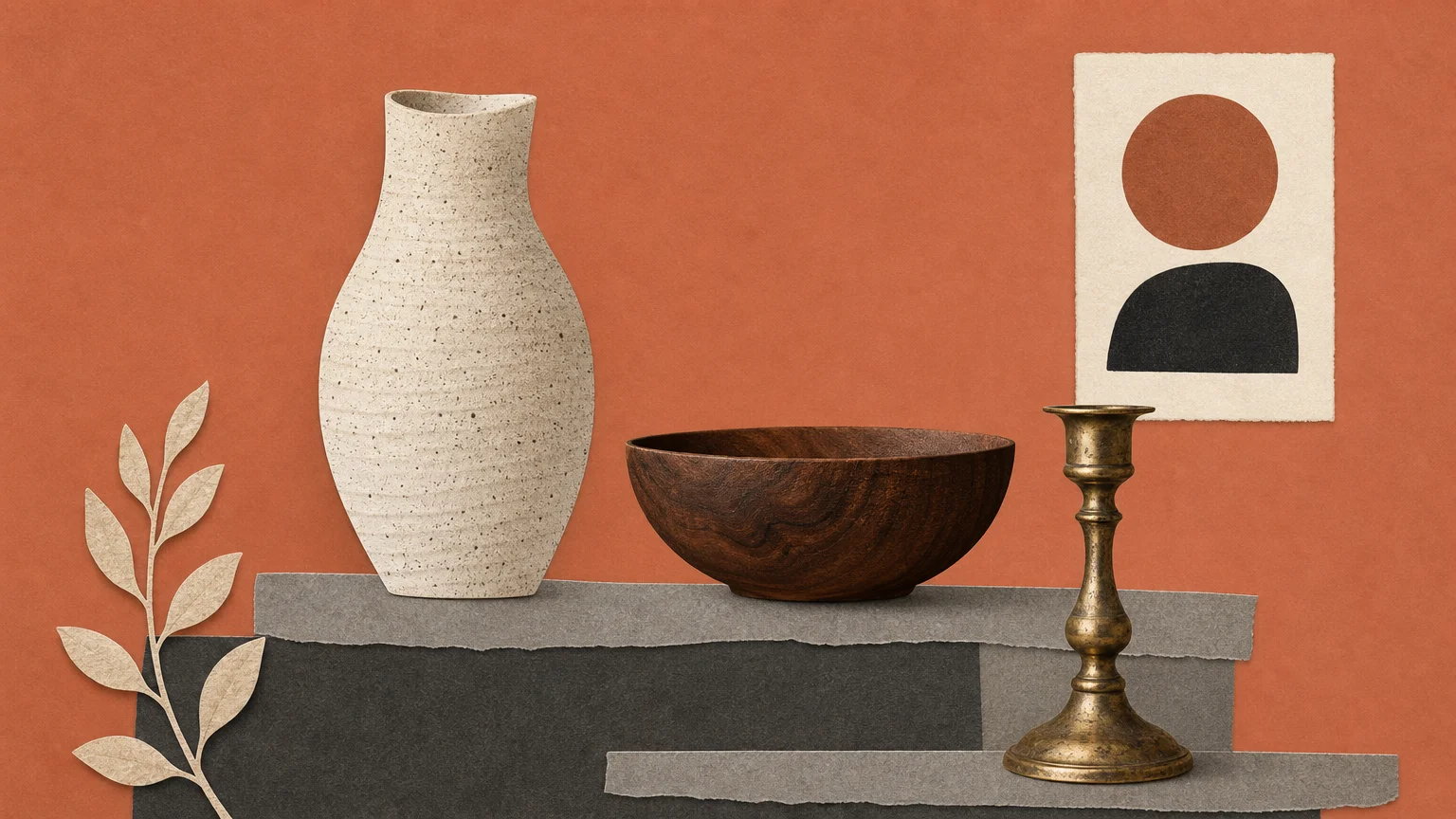
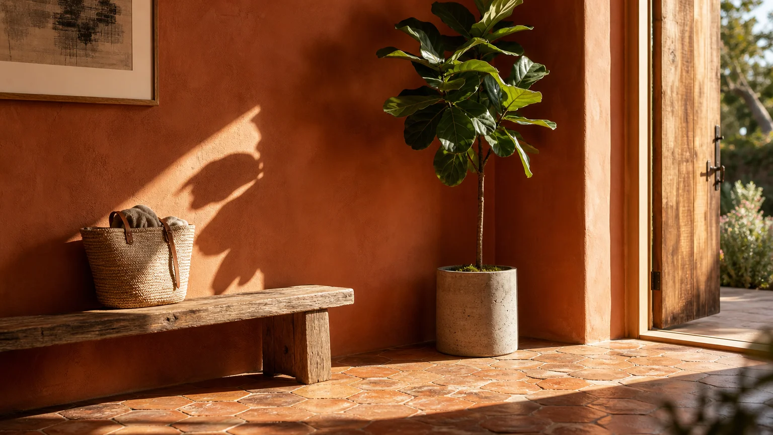
Trend #1: Warm Terracotta
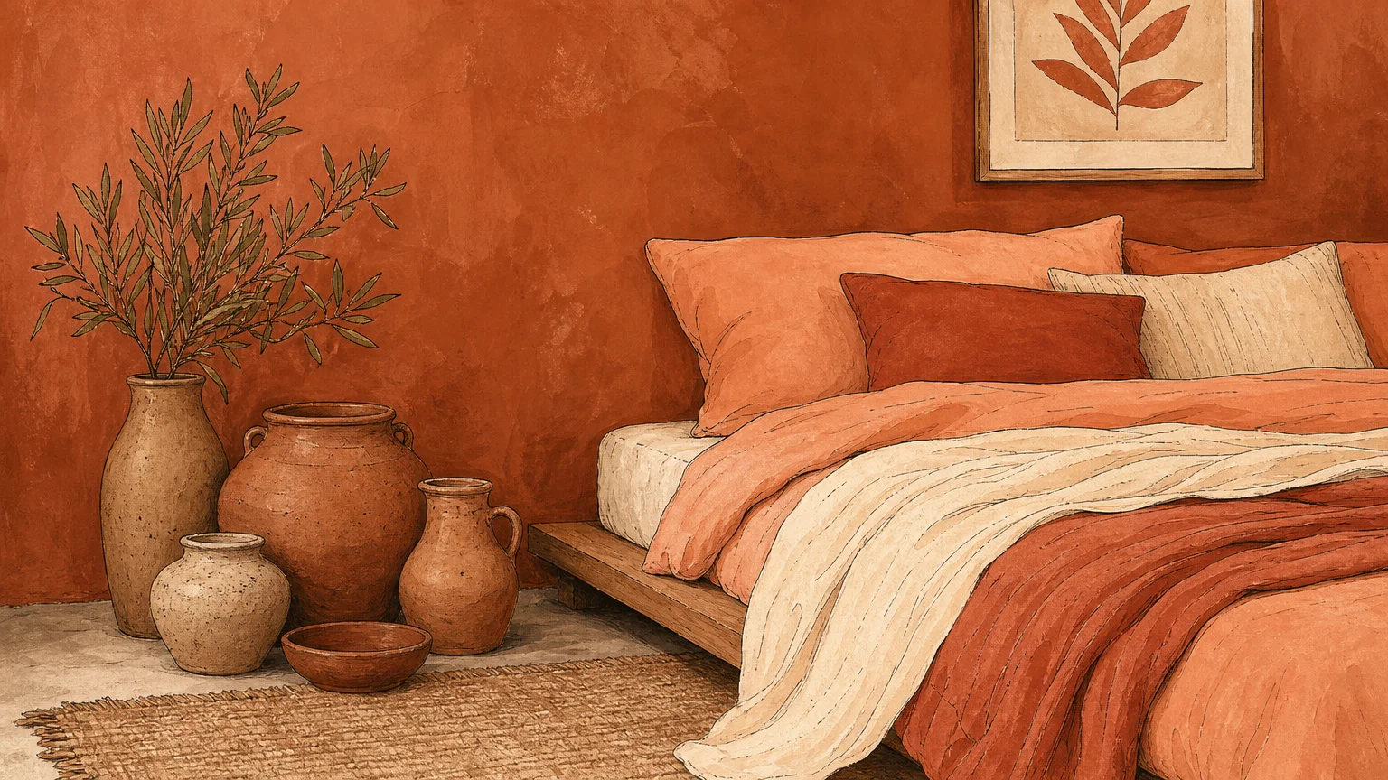
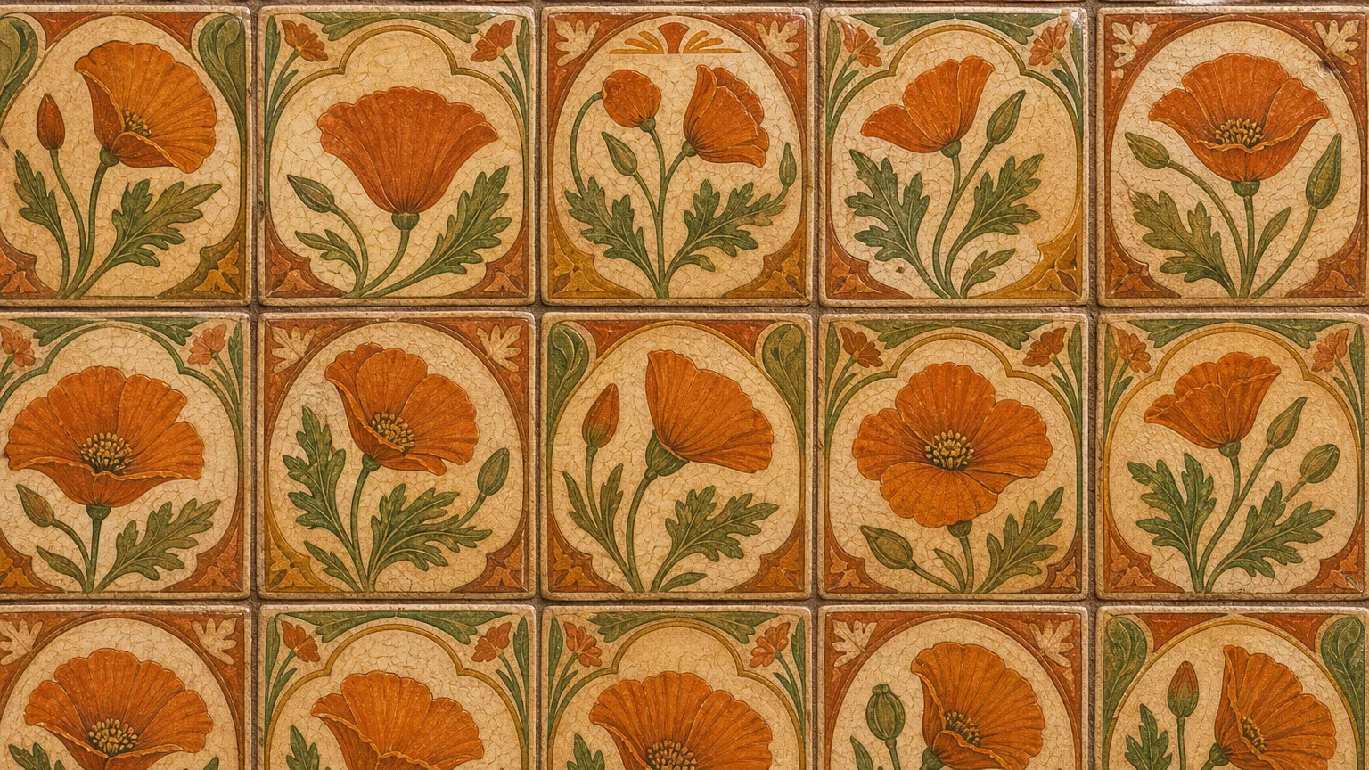
Warm terracotta introduces an immediate sense of grounded elegance to any room, functioning as a sophisticated bridge between raw architectural elements and refined interior design. This baked-earth hue relies on rich red and brown undertones to radiate warmth, making it the premier choice for spaces dominated by light, organic materials. You can dramatically enhance the honeyed tones of rattan, blonde ash wood, and woven seagrass by enveloping your walls in this sun-drenched shade. Terracotta embodies the essence of biophilic design; it mimics the natural clay found in arid landscapes, inherently soothing the human psyche. Apply this dynamic color to dining rooms or intimate reading nooks where you want to foster conversation and comfort. When dealing with natural materials like travertine or unpolished limestone floors, terracotta acts as a visual anchor. To implement this trend successfully, opt for a matte or flat finish. High-gloss variations easily distort the earthy provenance of the color, whereas a velvety matte surface absorbs light and emphasizes the tactile qualities of the adjacent raw materials. Designers consistently utilize this palette to achieve quiet luxury, proving that bold choices still feel remarkably organic when rooted in nature. The result is a deeply restorative environment that feels both historically grounded and impeccably modern.
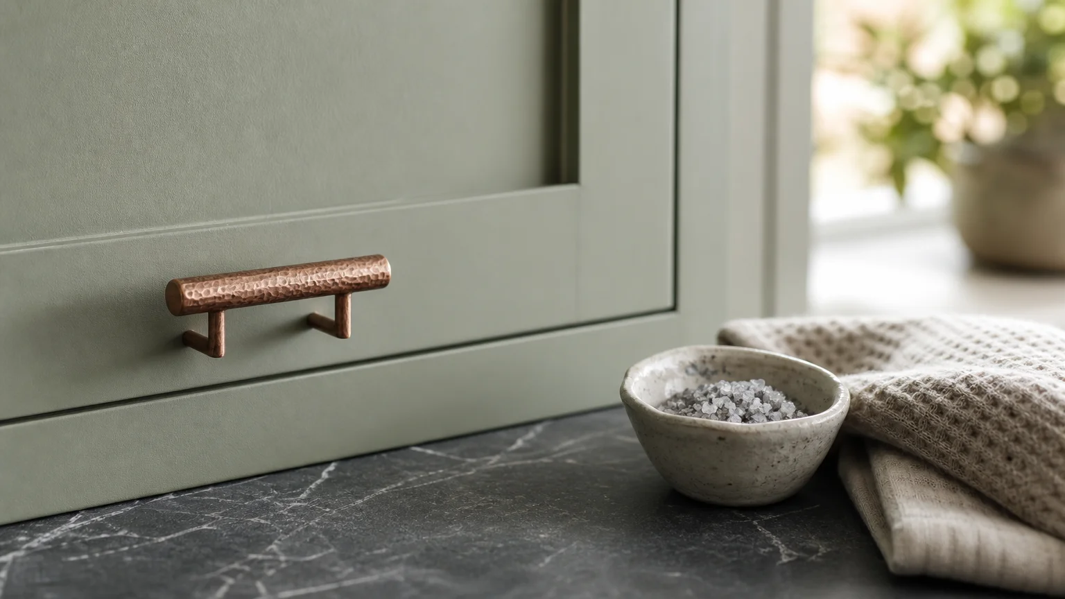
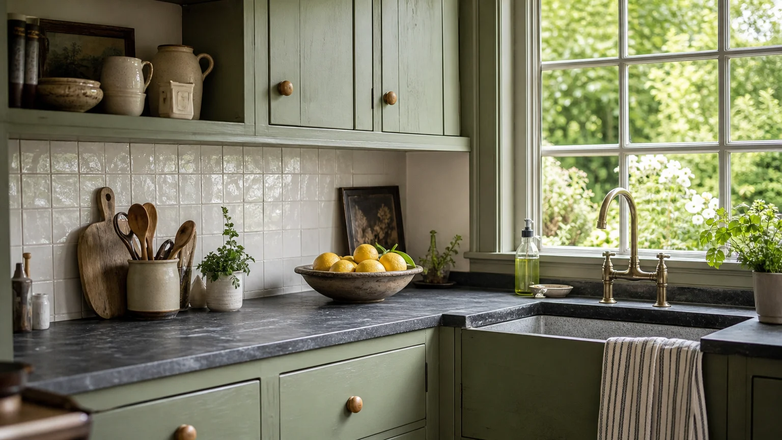
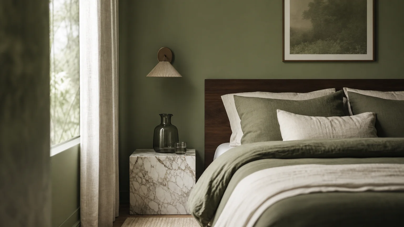
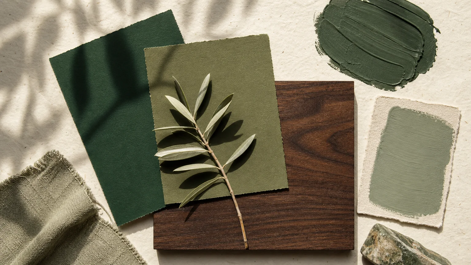
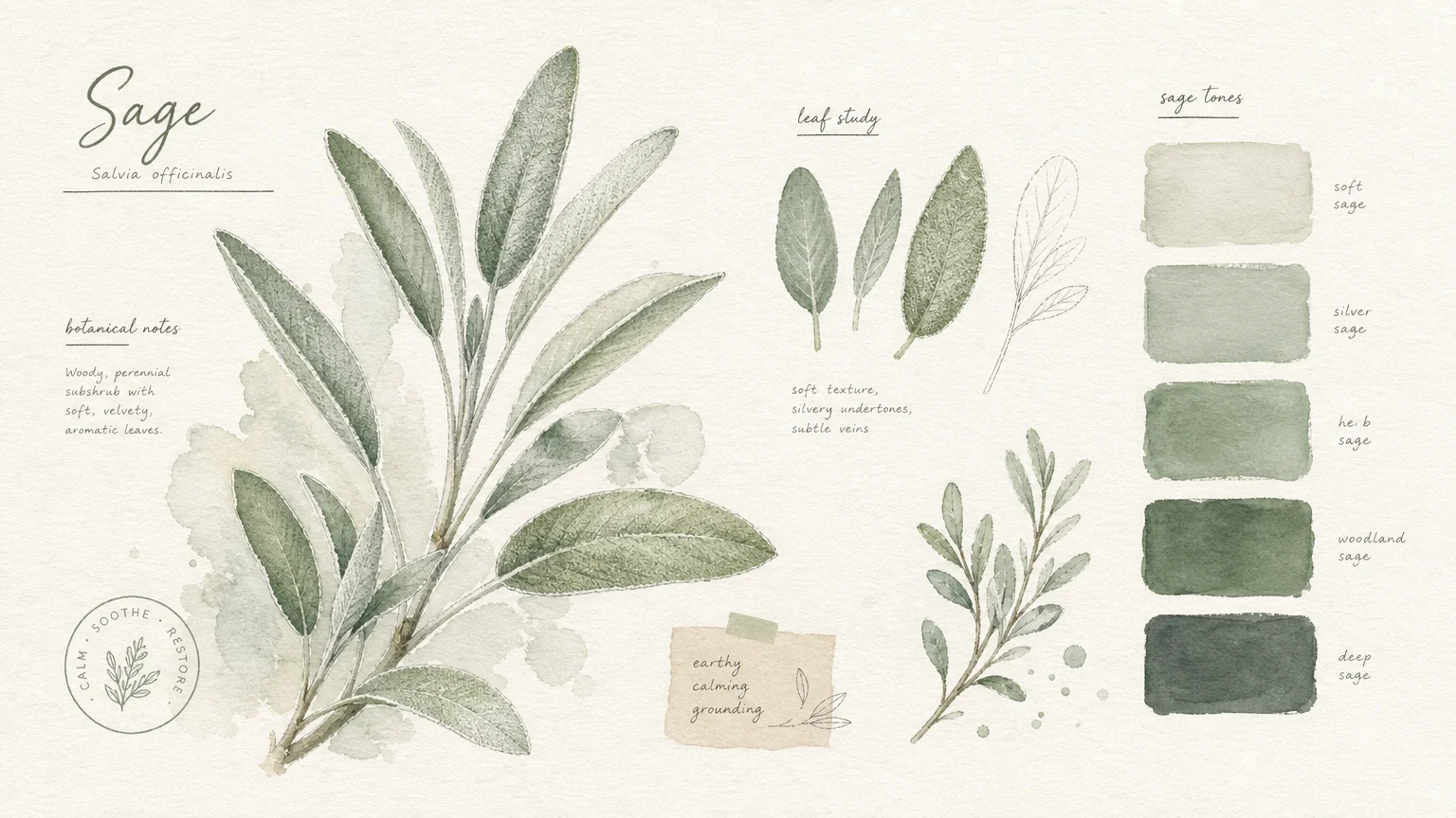
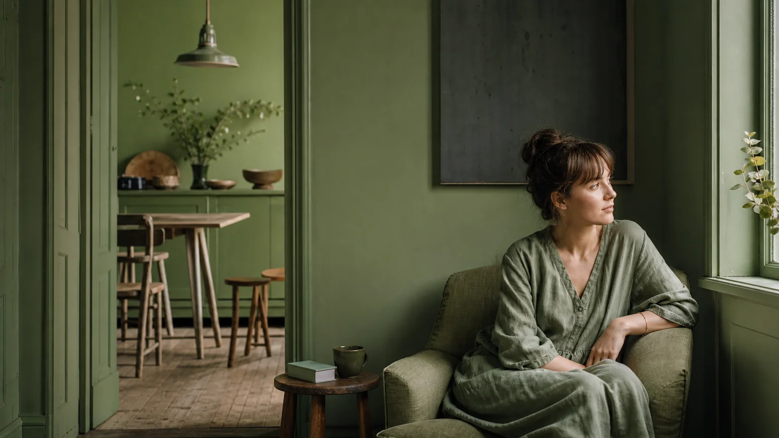
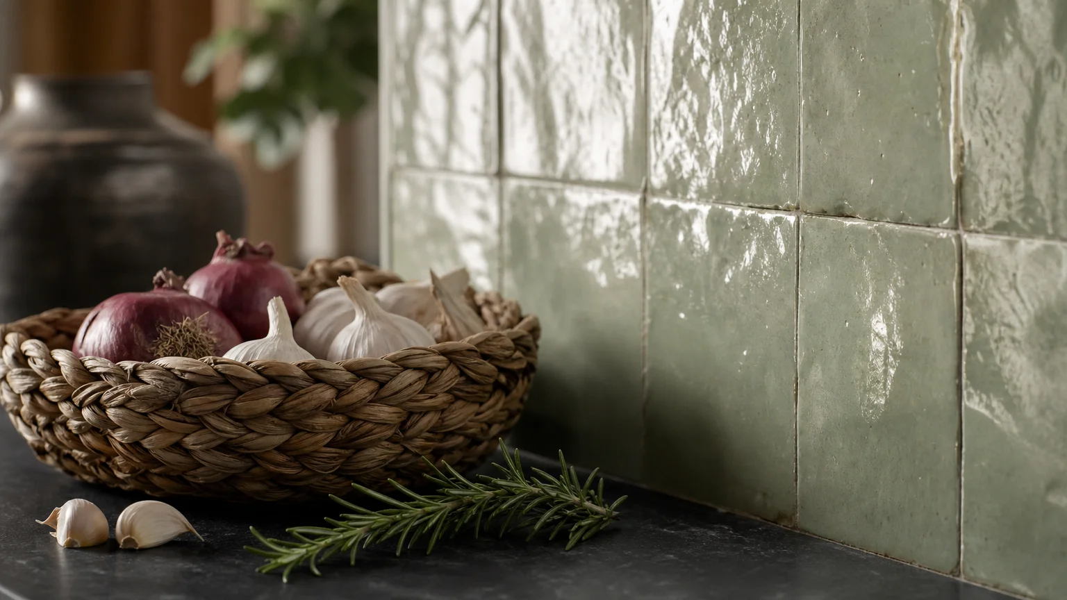
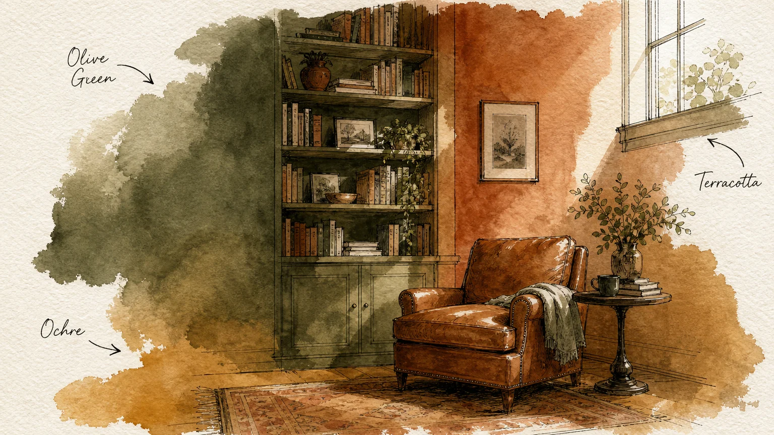
Trend #2: Botanical Sage Green
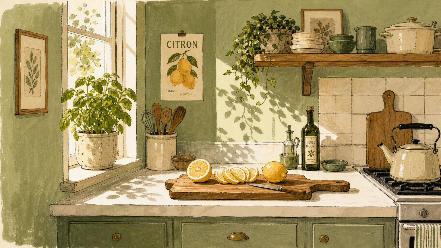
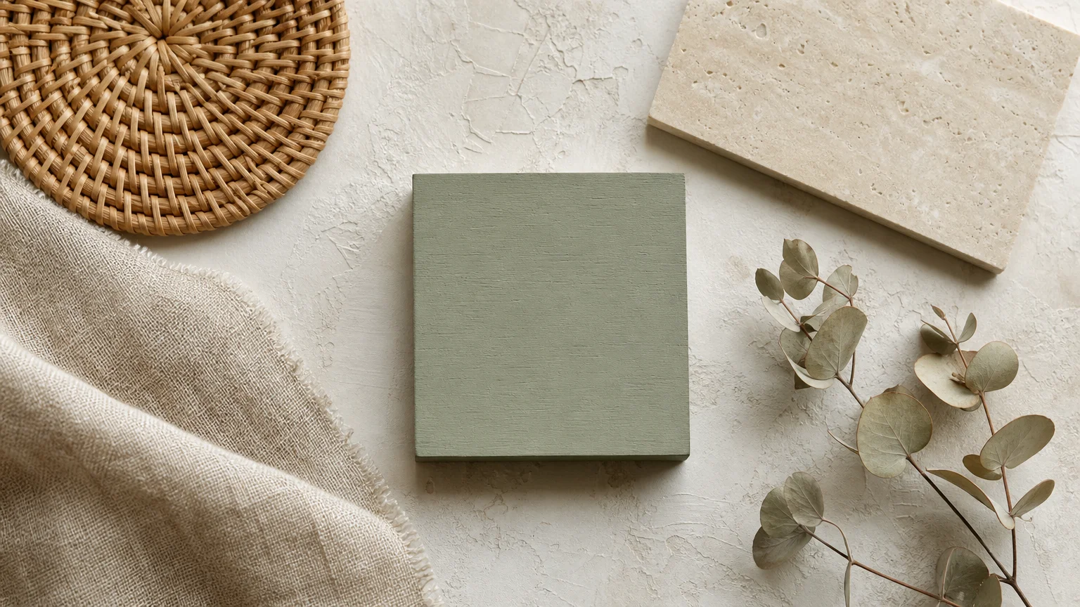
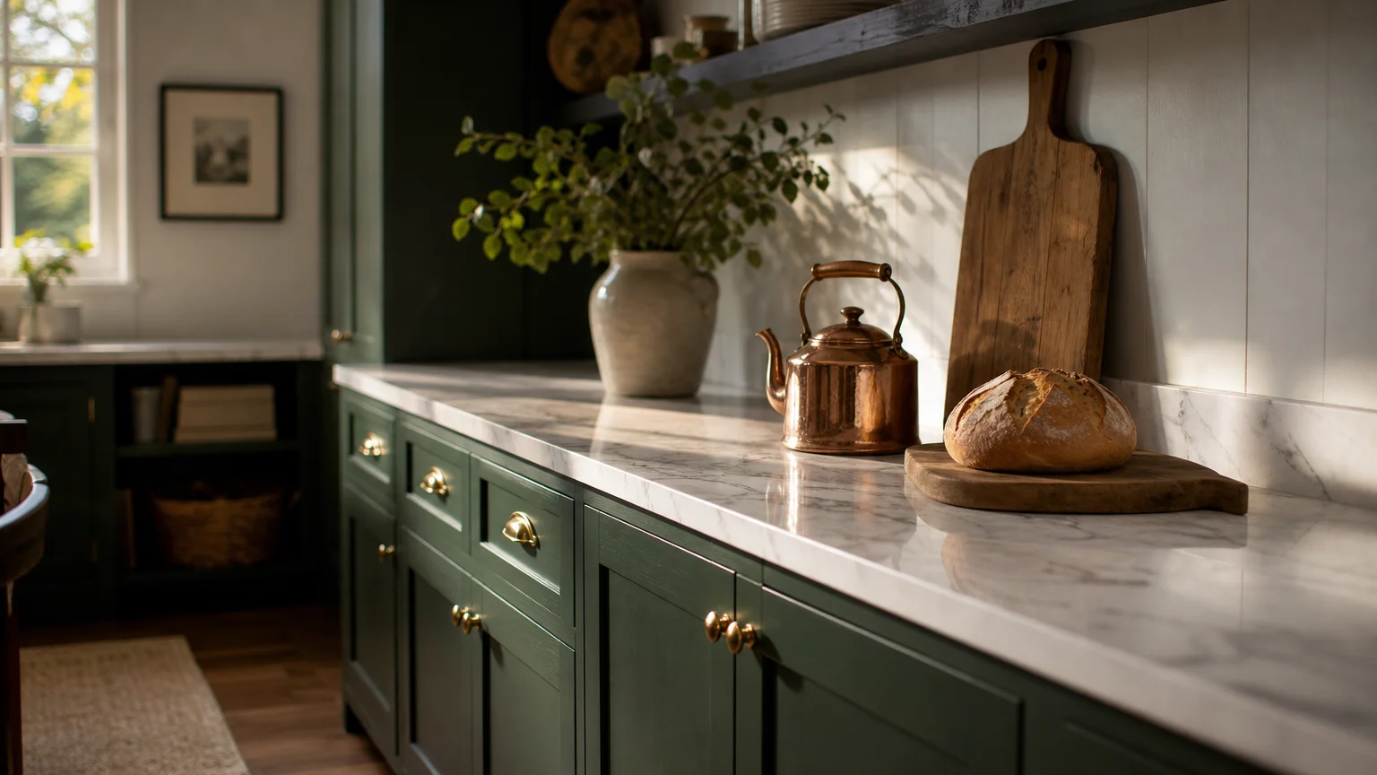
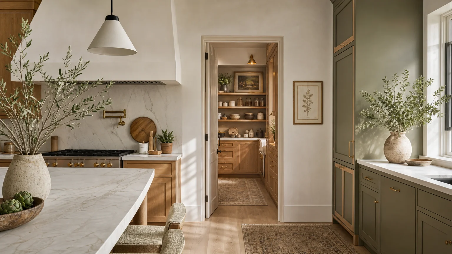
Botanical sage green stands as the ultimate chameleon in modern color palettes, offering a soft, muted energy that effortlessly mimics the outdoors. You bring the serenity of a dense forest canopy directly into your living spaces when you utilize this complex, silvery-green hue. Sage green inherently possesses a low-light reflectance value, which makes it particularly effective at grounding bright, sunlit rooms without absorbing too much natural light. This specific paint color creates a breathtaking synergy with mid-tone and dark natural materials. Pair it with rich walnut furniture, dark mahogany millwork, or deep slate flooring to establish a sophisticated, high-contrast environment. The cool, grey undertones present in sage mitigate the heavy, sometimes imposing weight of dark woods, resulting in a balanced, breathable aesthetic. Incorporate textural elements like jute rugs, raw linen drapery, and hammered copper hardware to layer additional visual interest against the green backdrop. For homeowners focused on sustainable and authentic home decorating, sage green provides a timeless foundation that resists the rapid turnover of seasonal micro-trends. Apply this shade to kitchen cabinetry or bedroom walls to cultivate a restful, restorative atmosphere. This careful layering of greens and natural browns mimics the varied undergrowth of a forest floor, establishing profound visual harmony.
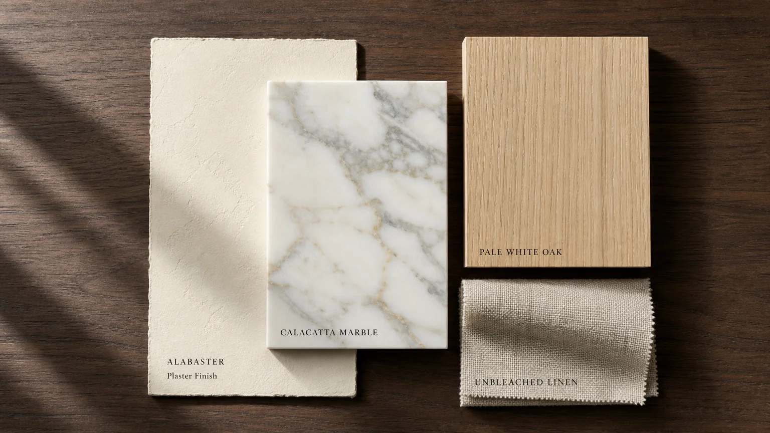
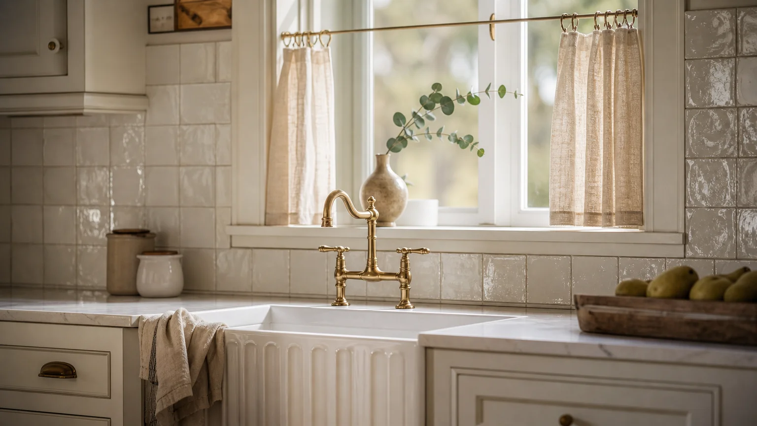
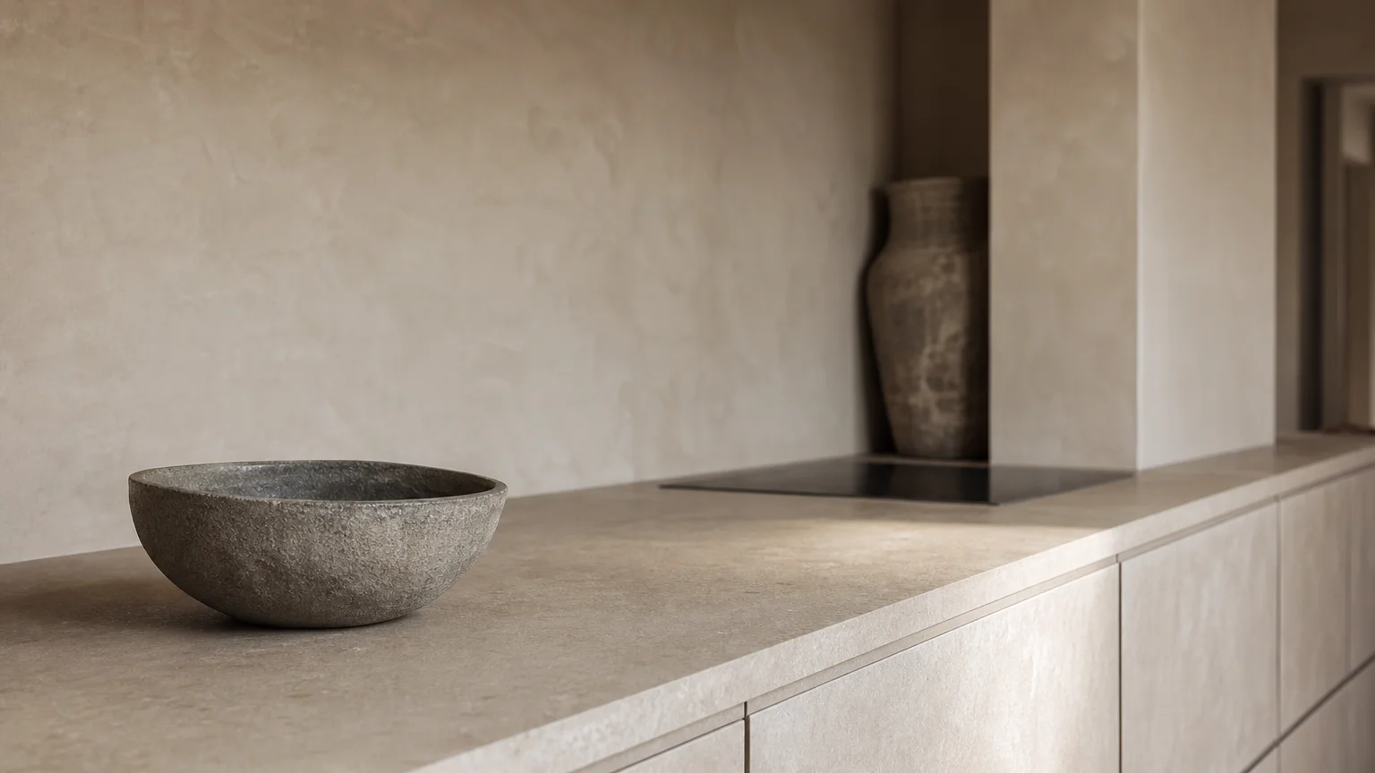
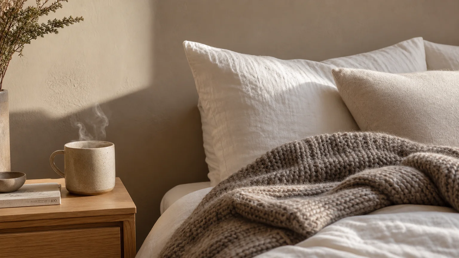
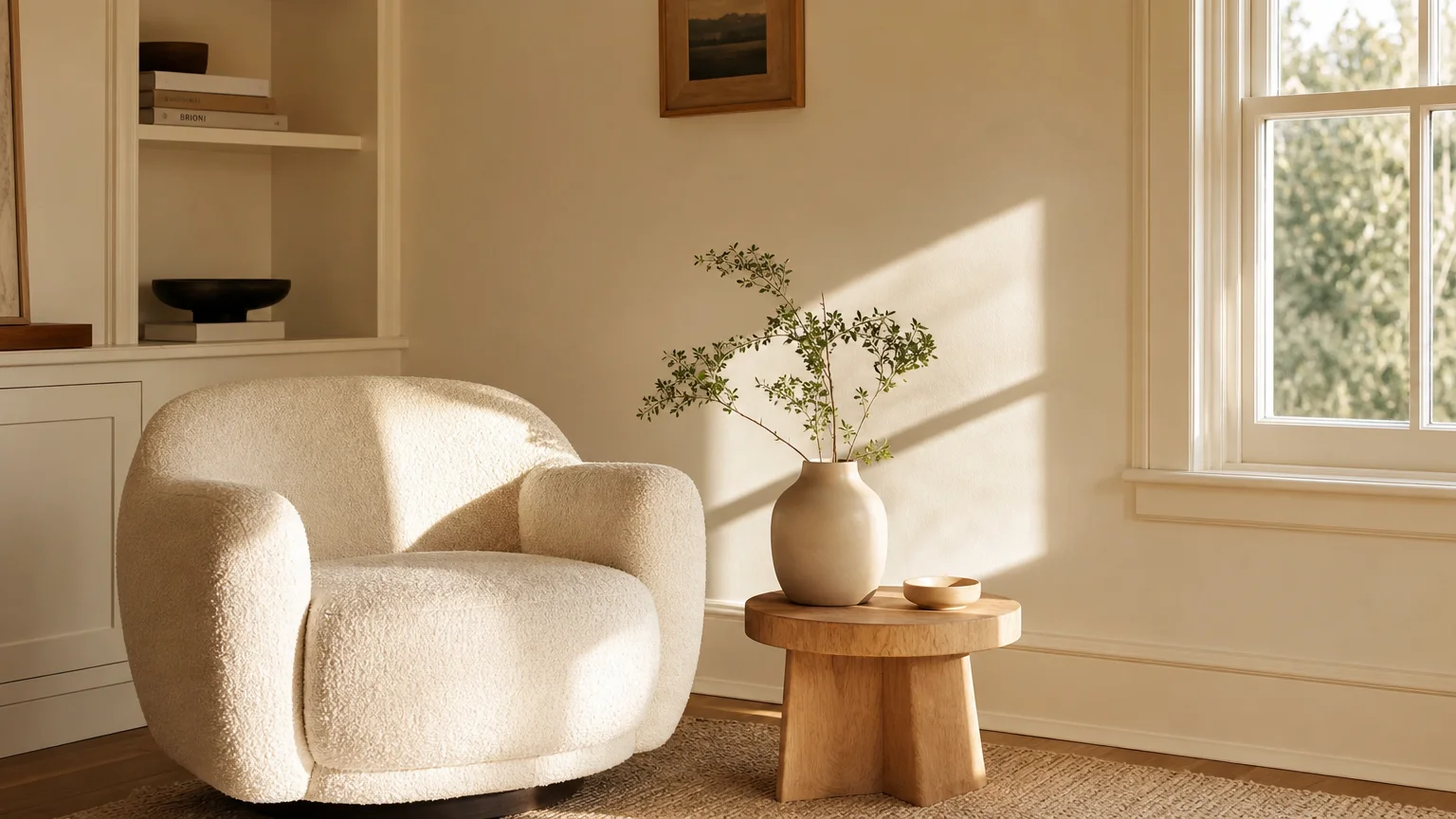
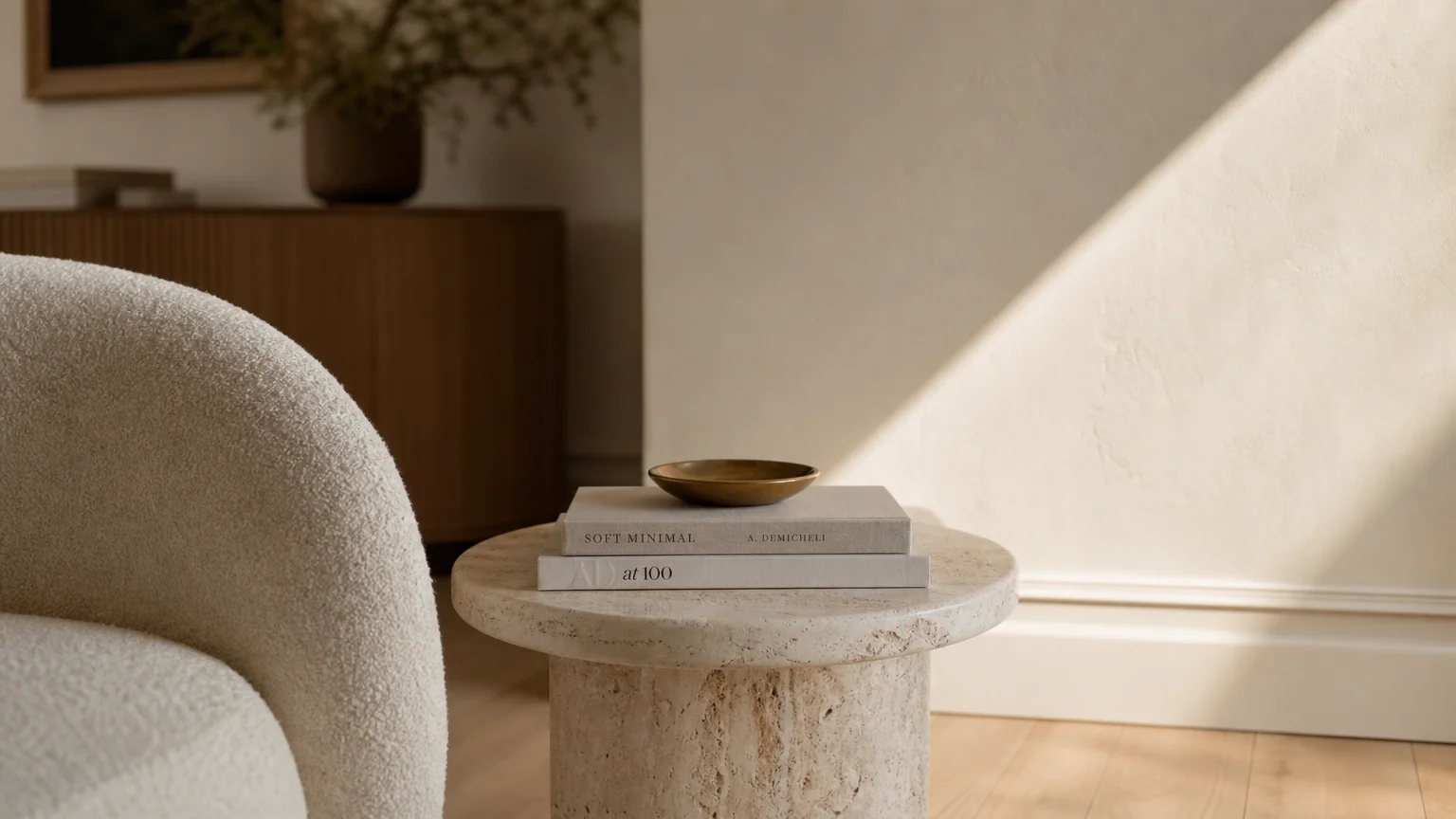
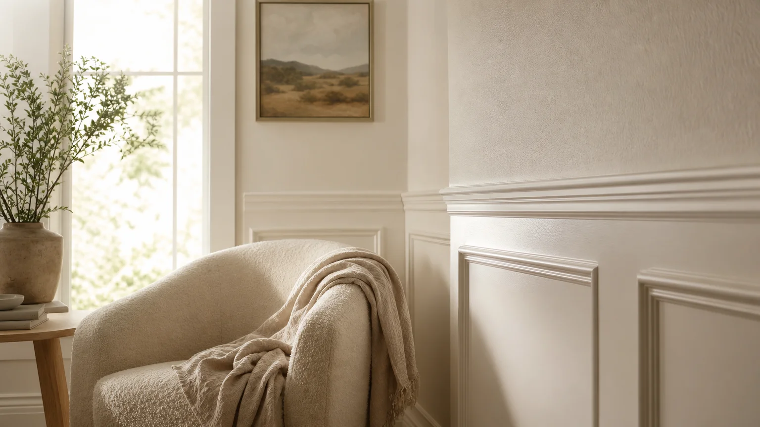
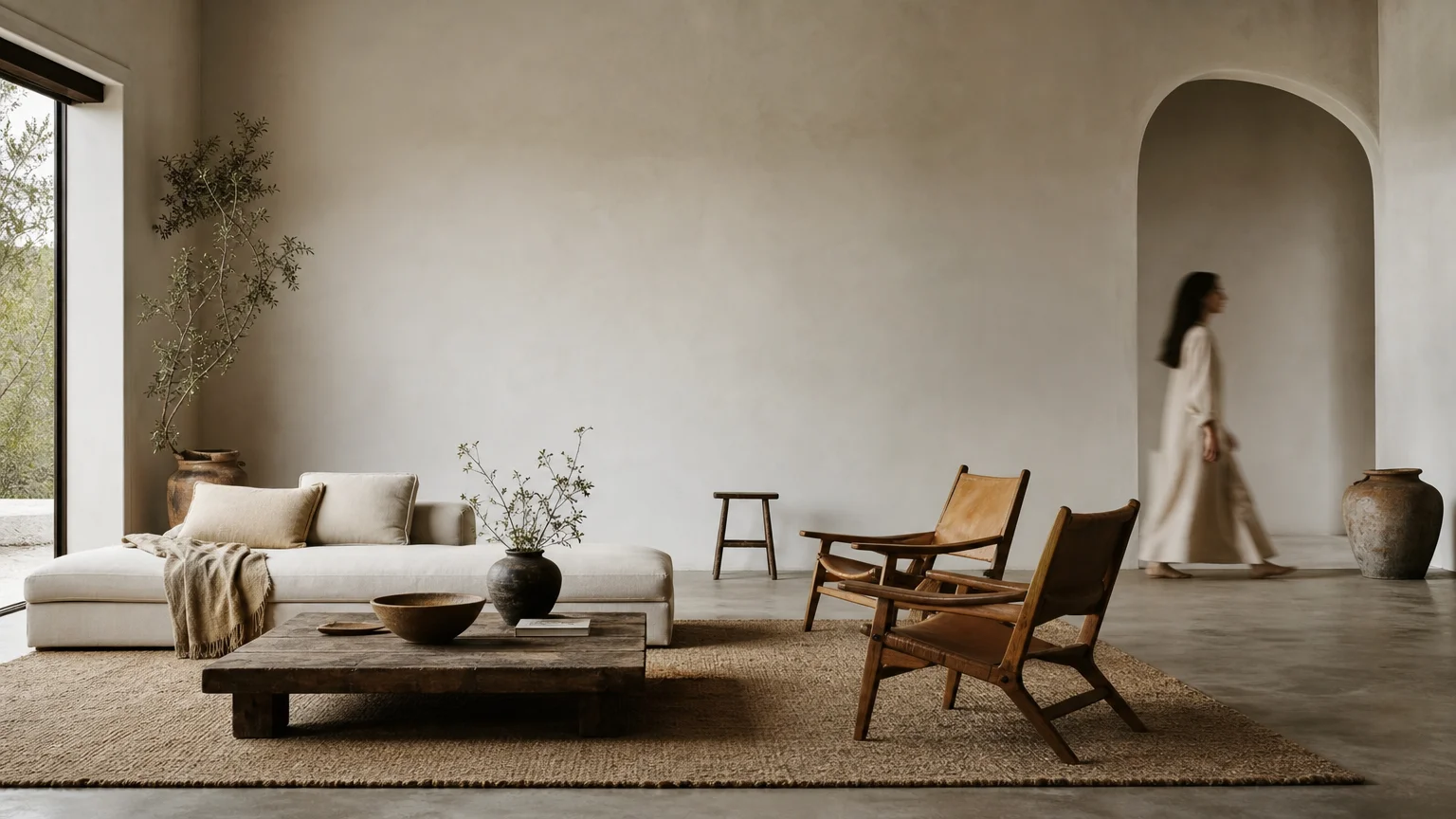
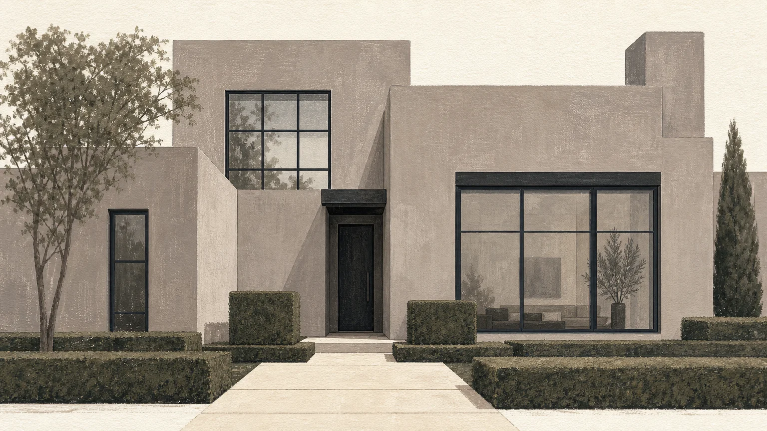
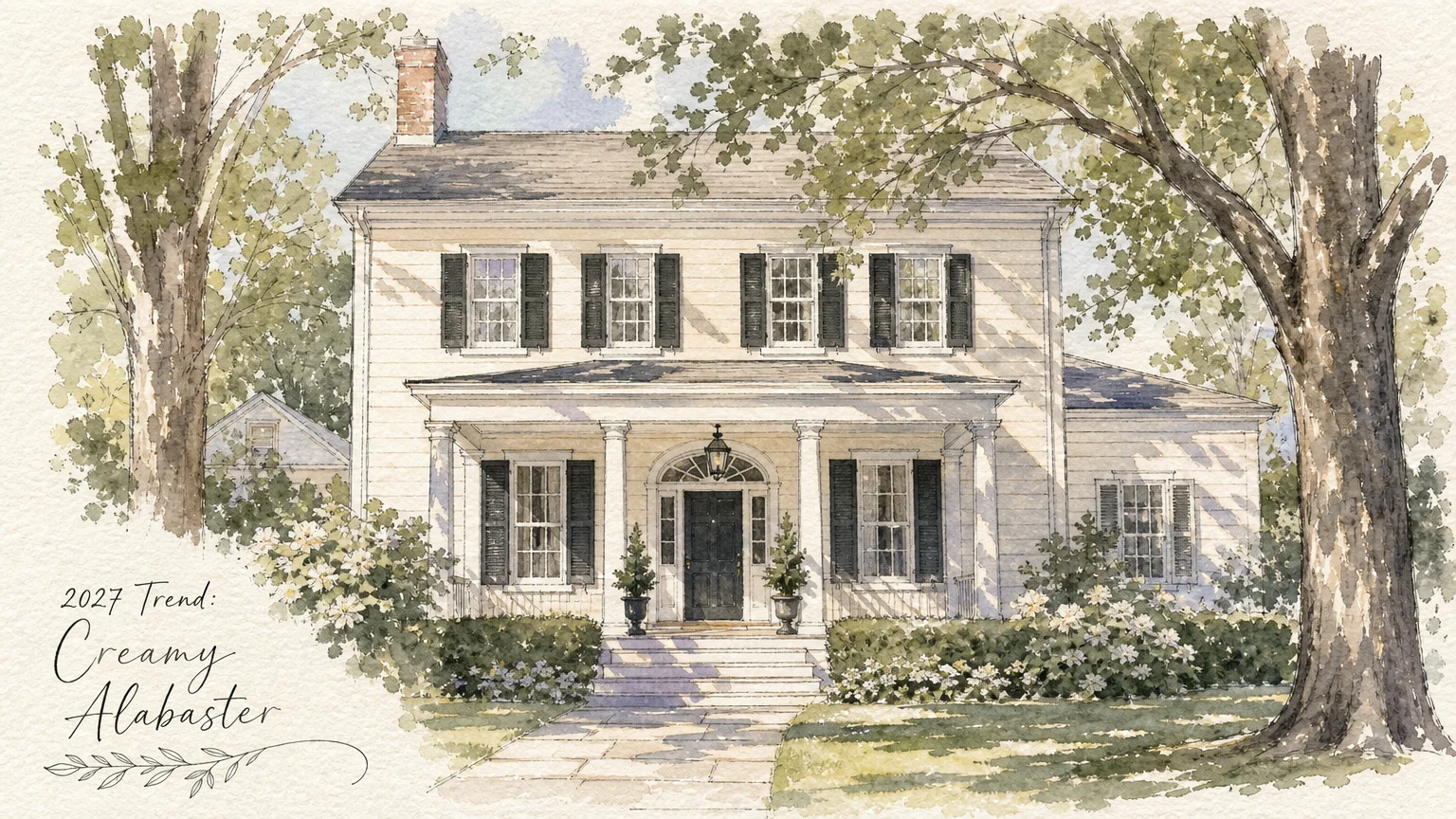
Trend #3: Creamy Alabaster
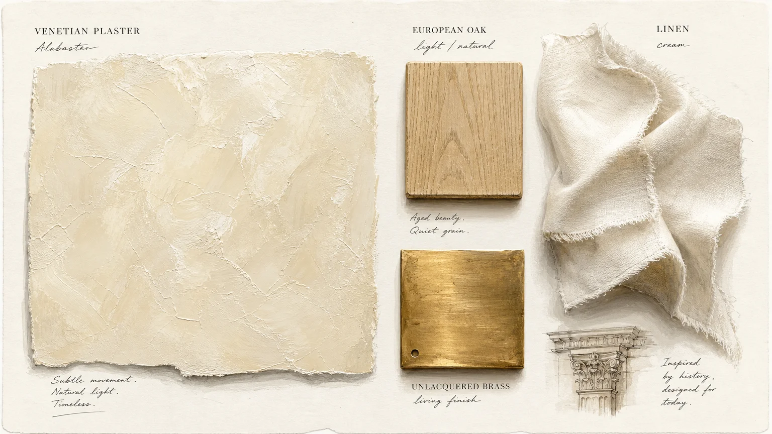
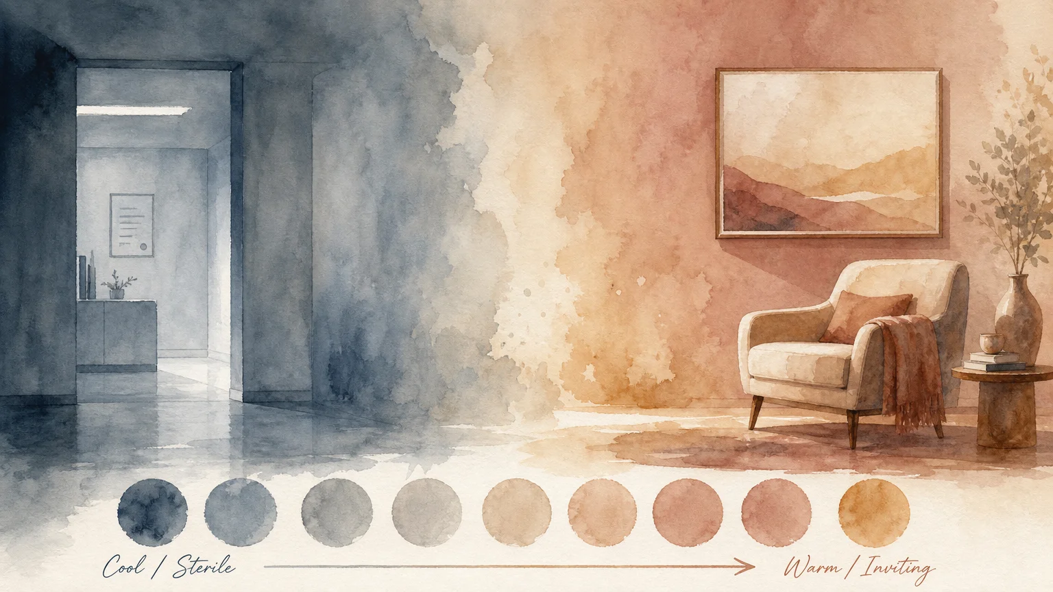
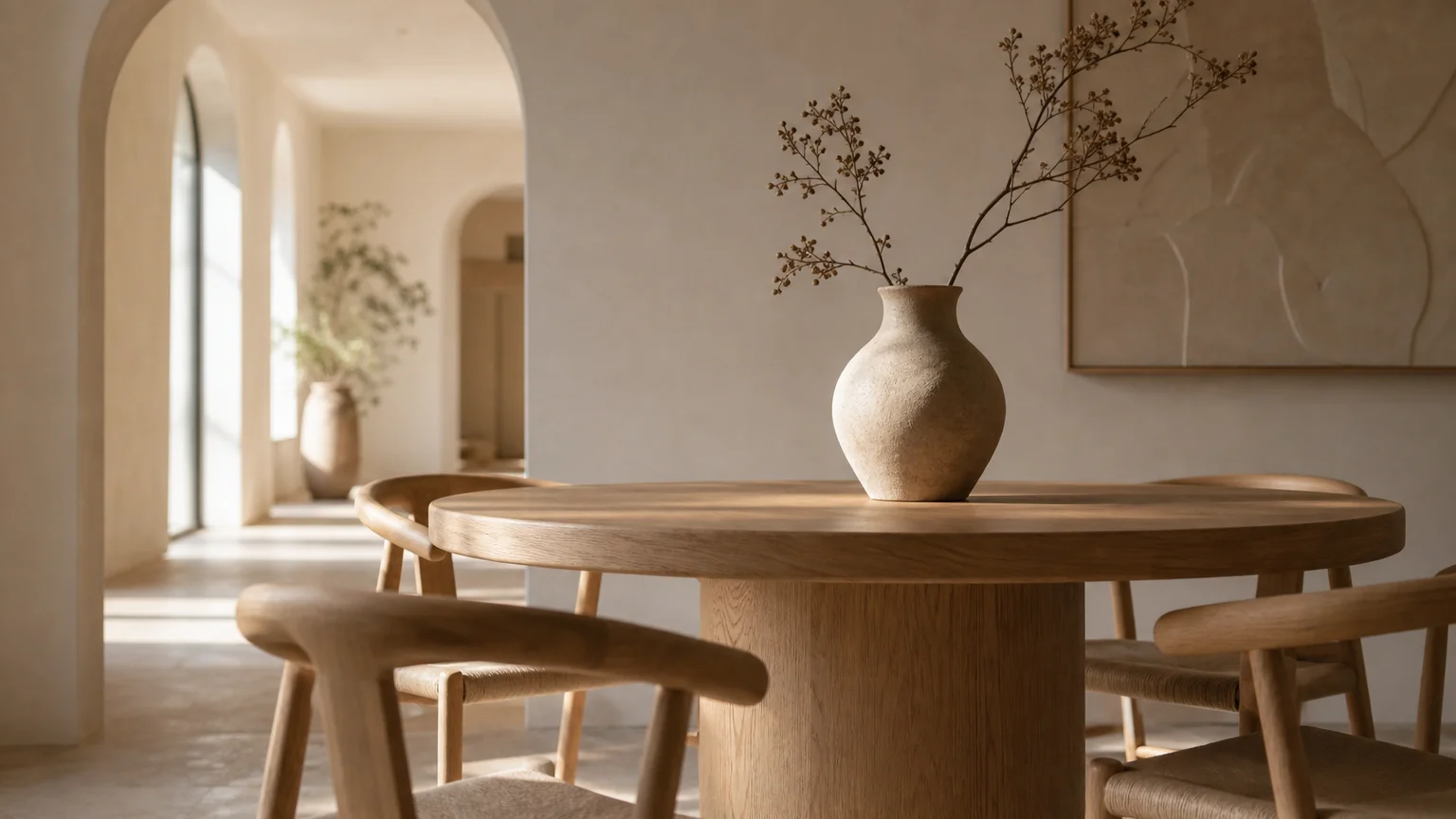
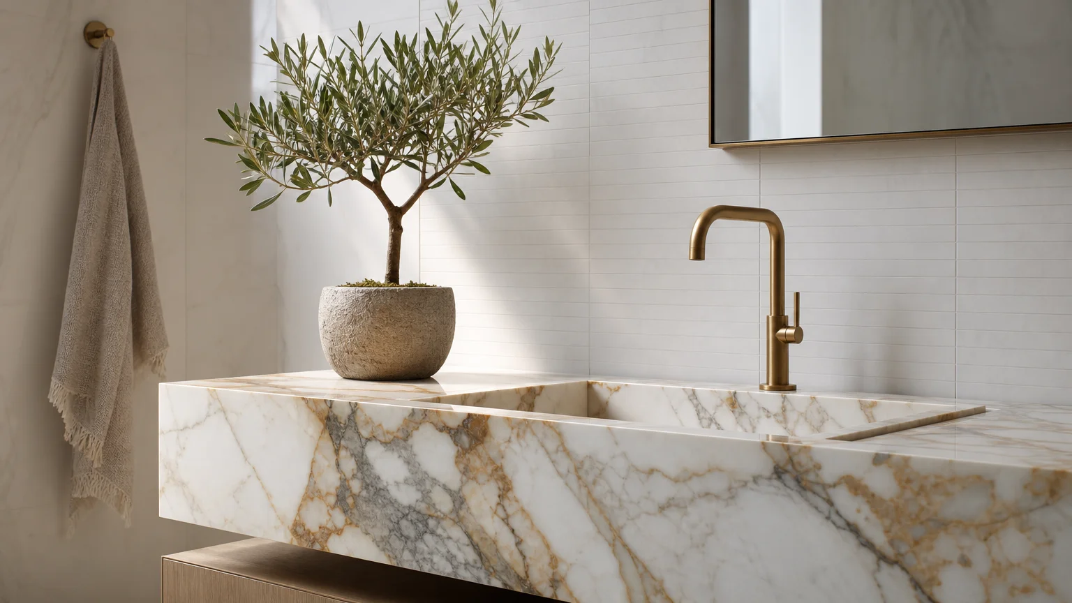
Creamy alabaster transcends the clinical sterility of pure white, delivering a warm, luminescent backdrop that allows natural materials to command the spotlight. Unlike brilliant whites that rely on stark blue undertones, alabaster leverages subtle yellow and grey bases to project a soft, inviting glow. This crucial distinction makes it an indispensable tool for elevated home decorating. You allow the intricate grain patterns of reclaimed oak, the organic veining of Carrara marble, and the plush texture of un-dyed wool to step forward when you paint your walls in this nuanced neutral. Alabaster operates as the quintessential canvas for the quiet luxury aesthetic, where the emphasis rests entirely on material quality and impeccable craftsmanship rather than loud, overwhelming colors. Use this shade extensively in expansive living rooms and open-concept dining areas to maximize natural daylight while maintaining a cozy, intimate ambiance. To prevent the space from feeling visually flat, introduce highly textured organic elements; think sisal wall coverings, bouclé upholstery, and raw ceramic accents. The subtle warmth of alabaster bridges the gap between these disparate textures, forging a cohesive, elegantly restrained environment. Homeowners who appreciate minimalist sensibilities will find alabaster to be the ultimate ally in achieving a warm, rather than austere, aesthetic.
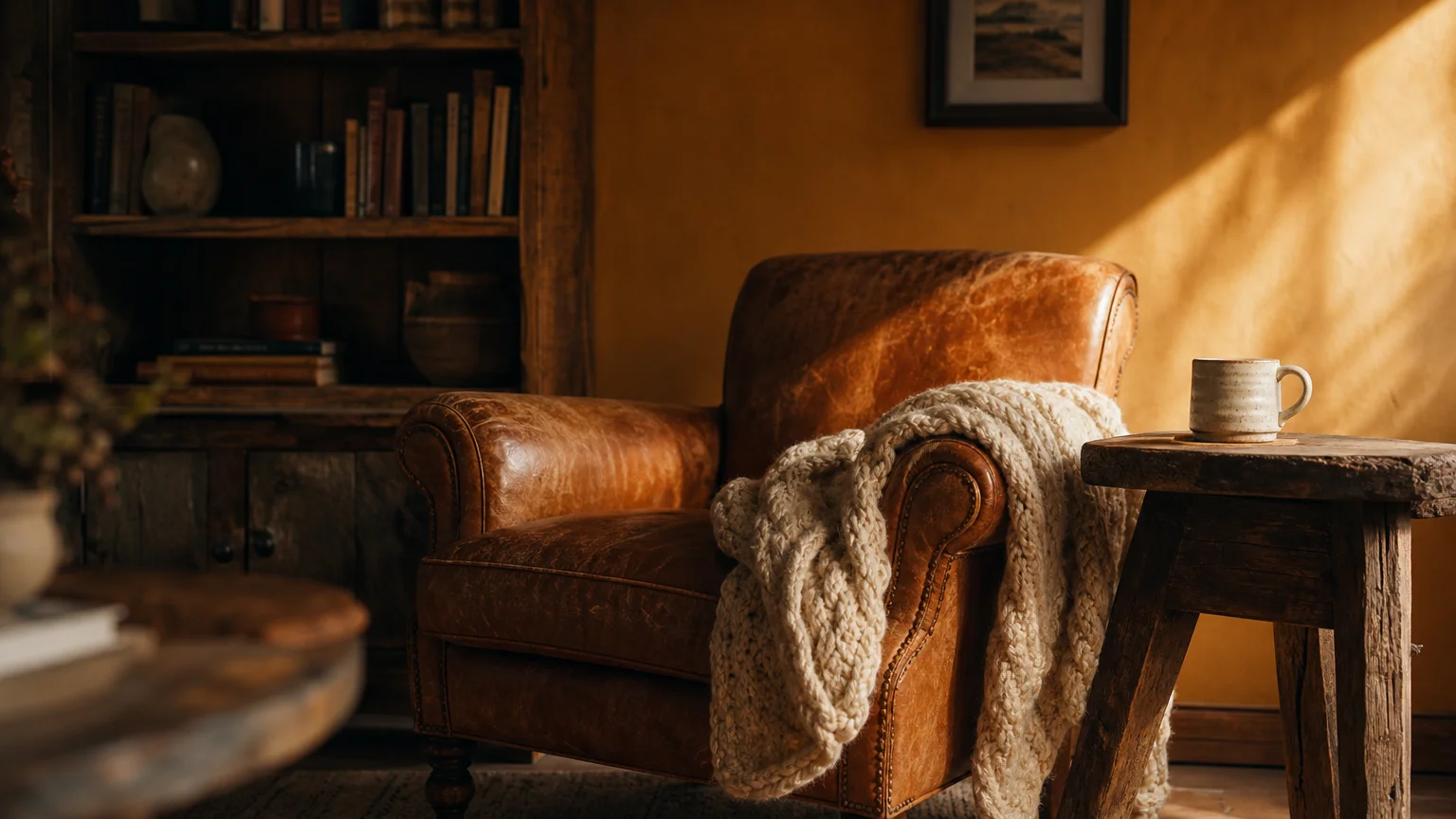
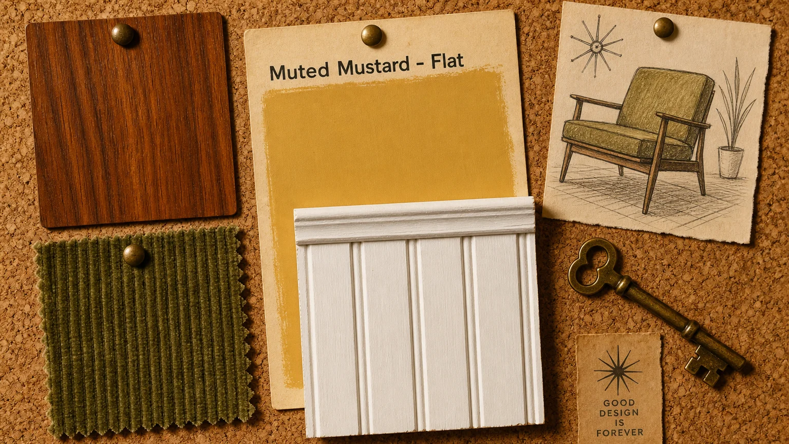
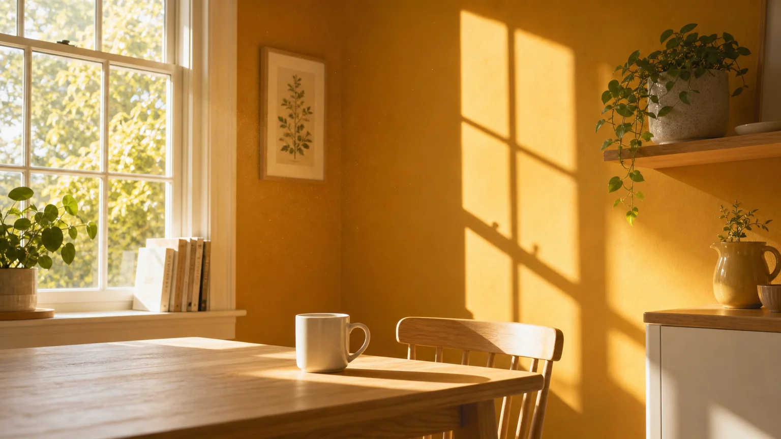
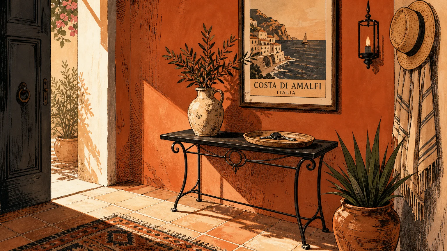
Trend #4: Earthy Ochre
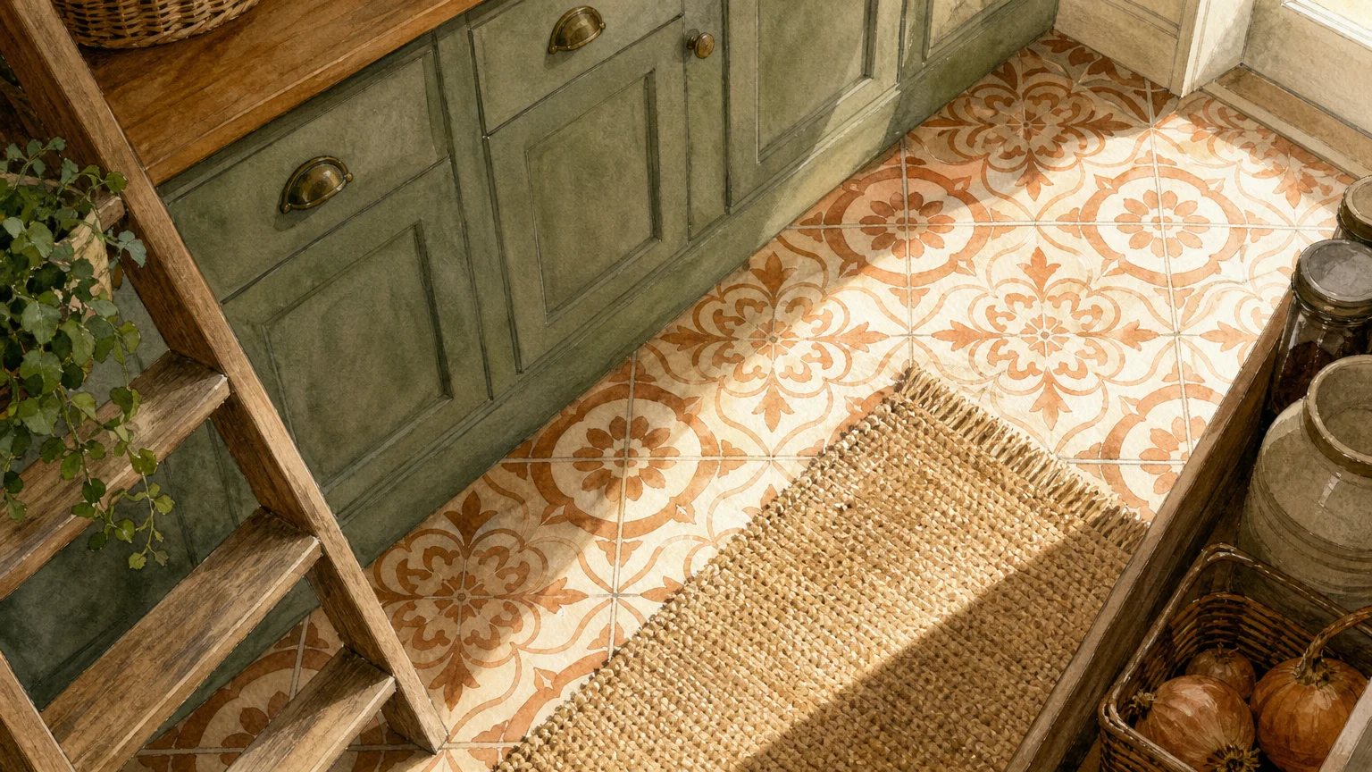
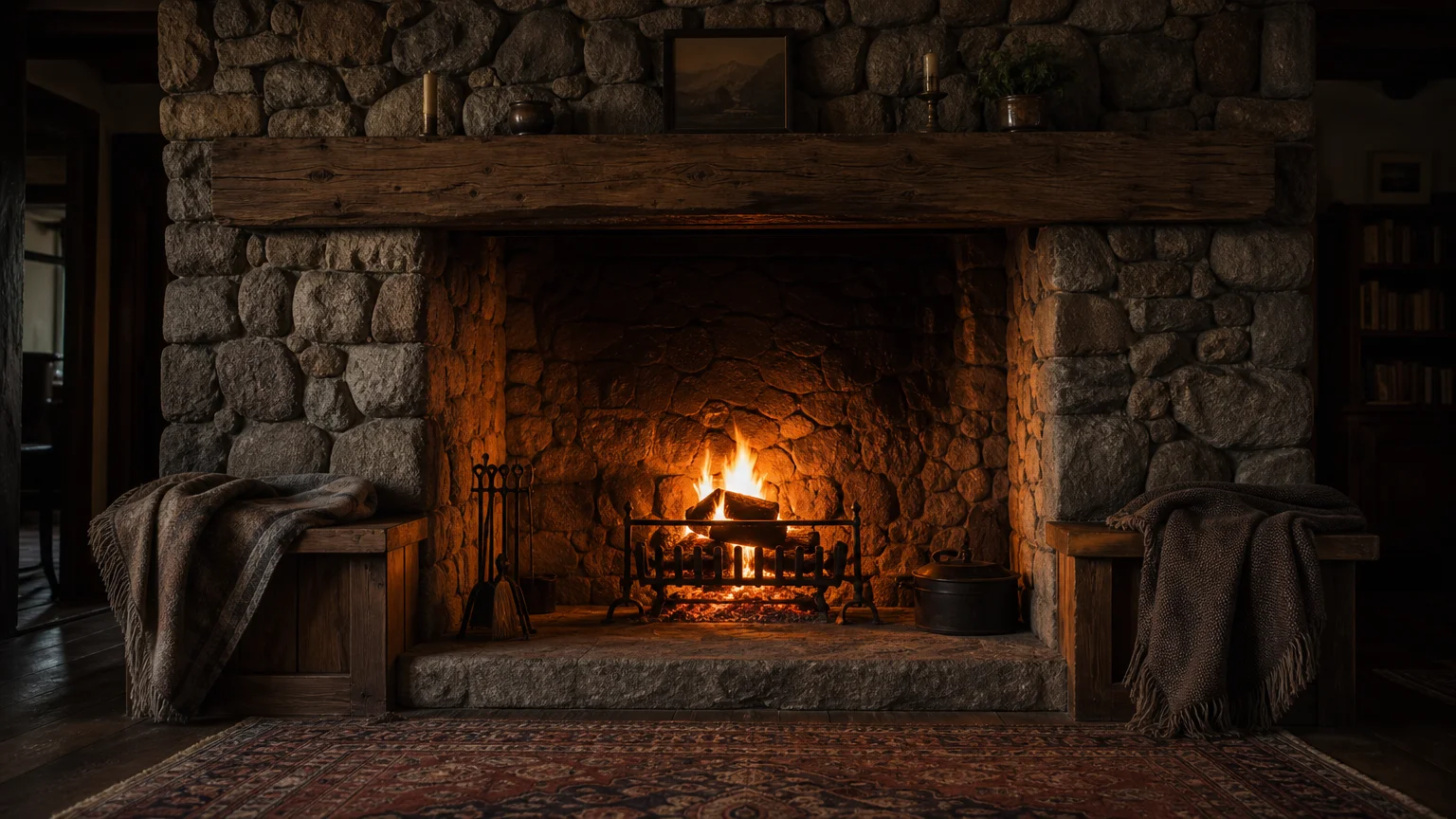
Earthy ochre injects a vital dose of golden warmth into interior design schemes, capturing the raw, unrefined beauty of natural mineral pigments. This deeply saturated mustard-yellow variation carries distinct brown undertones, ensuring it reads as a sophisticated neutral rather than a primary color. You instantly elevate the perceived value of raw, rustic materials when you introduce ochre into your color palettes. This hue forms a particularly striking alliance with dark, highly textured elements. Envision ochre walls framing an expansive fieldstone fireplace, complementing the deep patinas of aged leather seating, or highlighting the dramatic grain of scorched ash wood. The color evokes a strong sense of provenance, recalling ancient frescoes and sun-baked Mediterranean villas. Apply earthy ochre to transitional spaces like entryways or hallways to deliver an immediate, welcoming impact. When paired with natural terra cotta tiles or poured concrete floors, the color warms the austere nature of the masonry. Design professionals frequently rely on this dynamic shade to invigorate north-facing rooms, effectively faking the presence of golden-hour sunlight while maintaining an unbreakable visual link to the surrounding landscape. Furthermore, this color naturally conceals minor scuffs and wear, making it as highly practical as it is visually stunning.
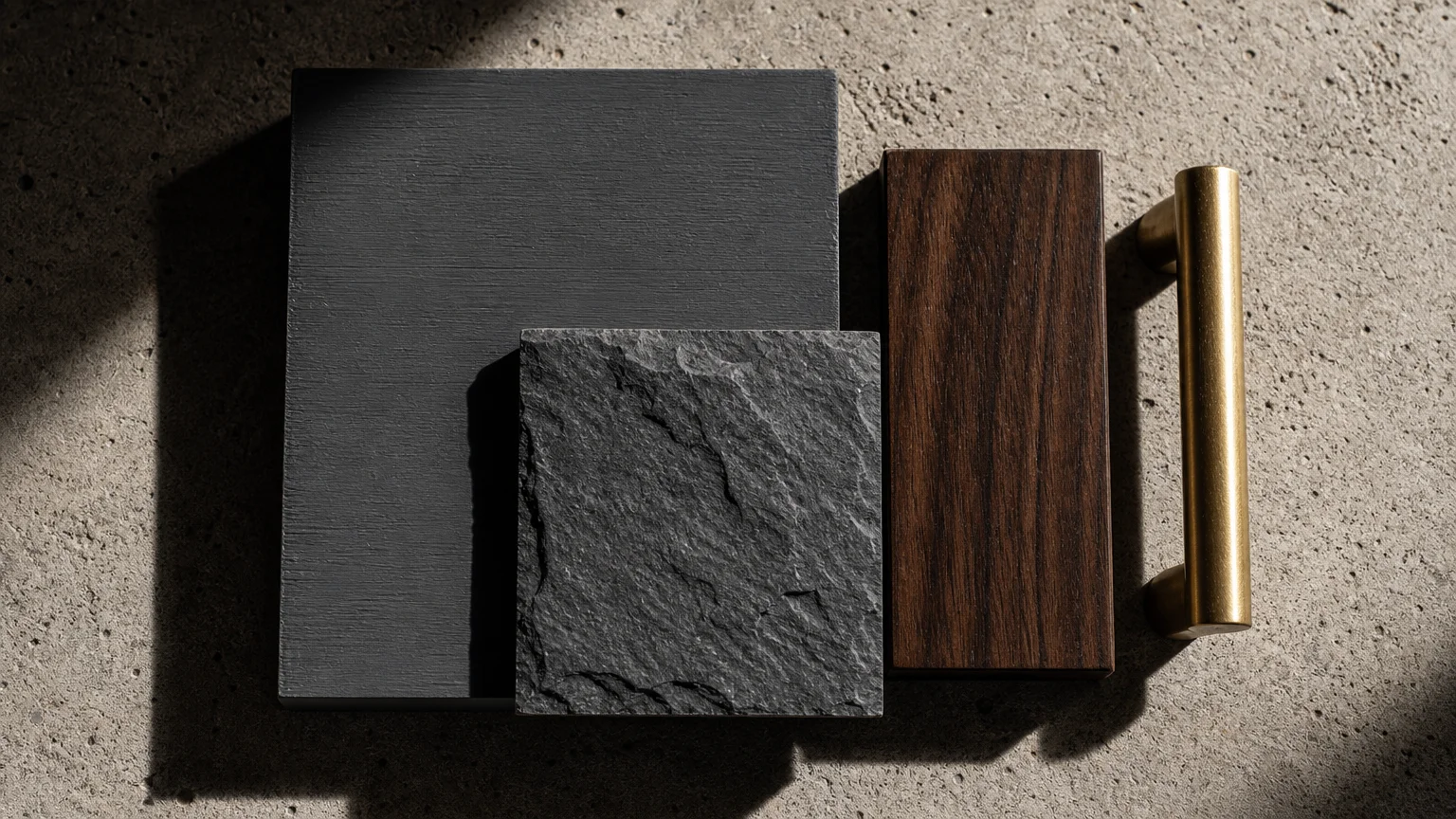
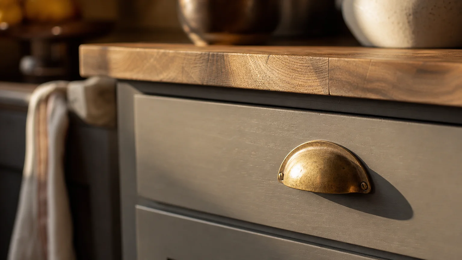
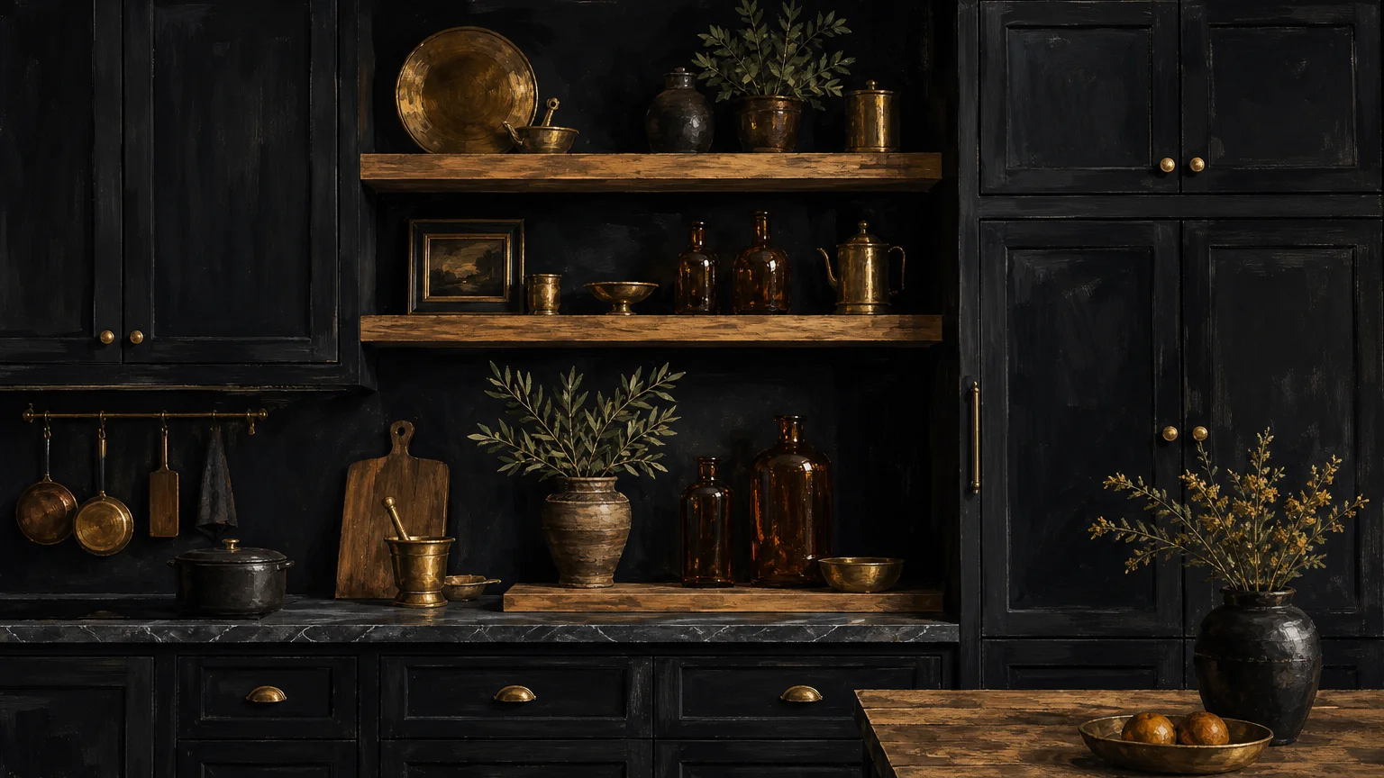
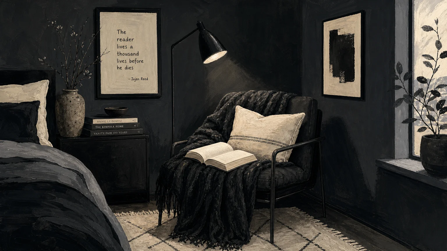
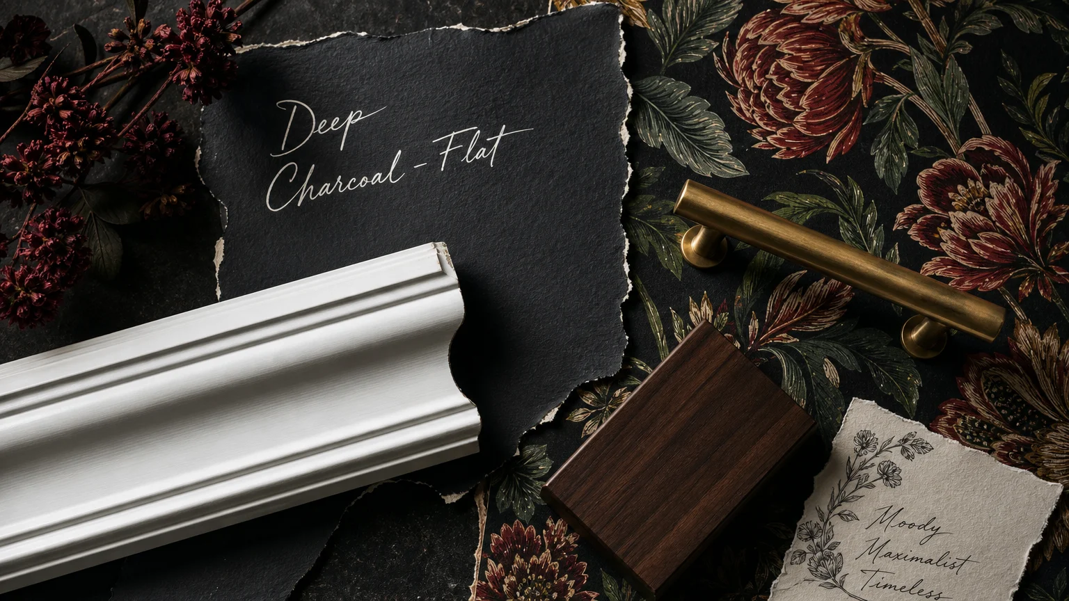
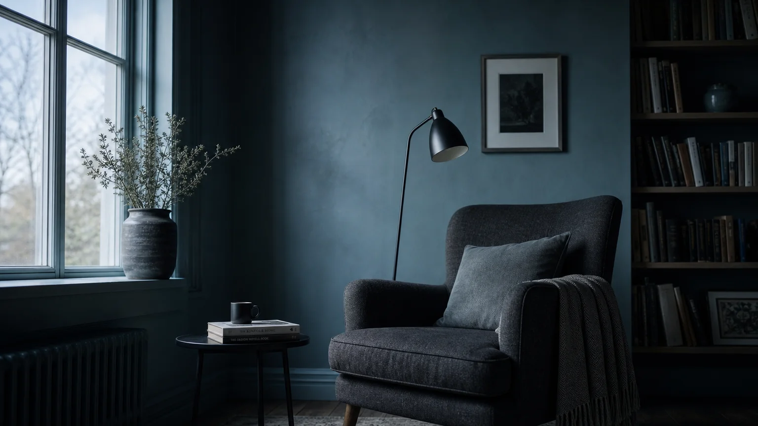
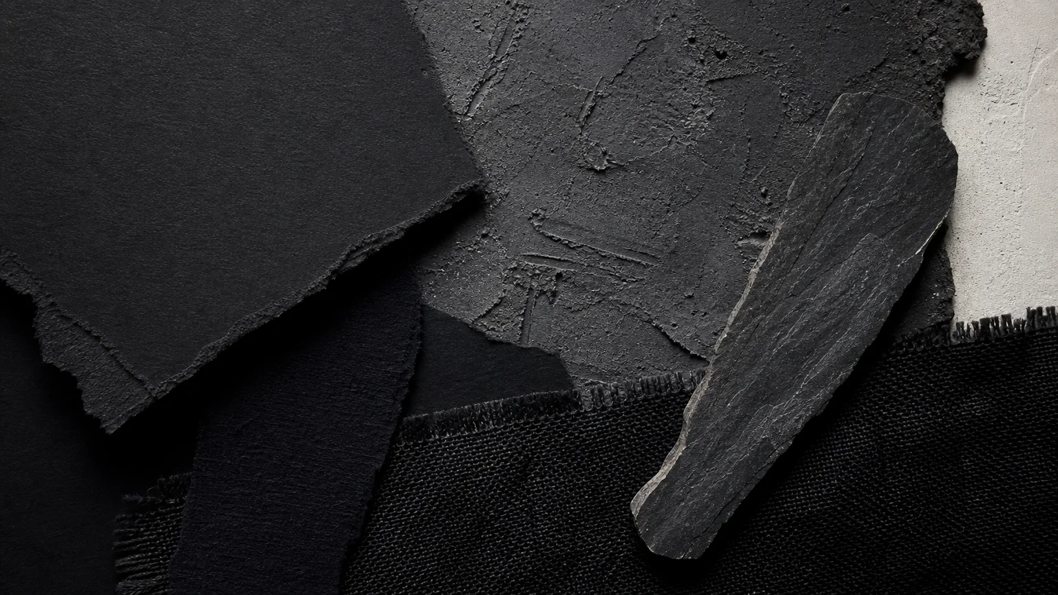
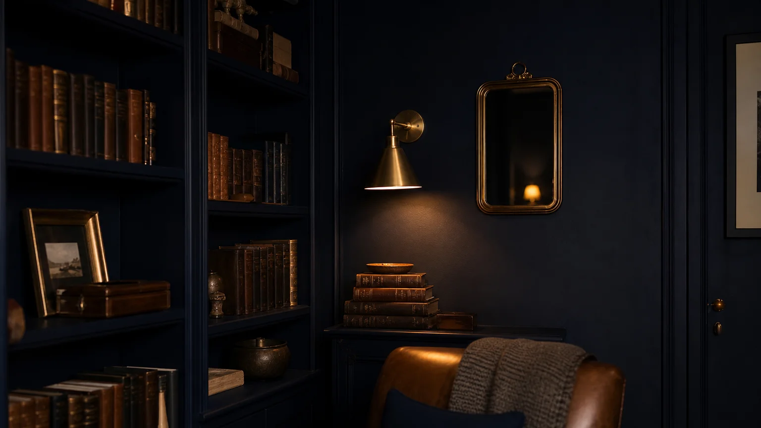
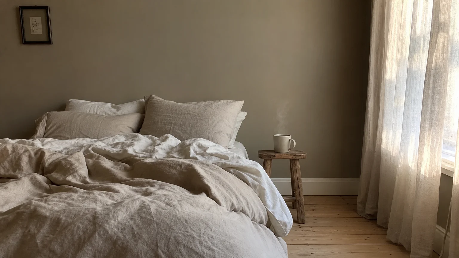
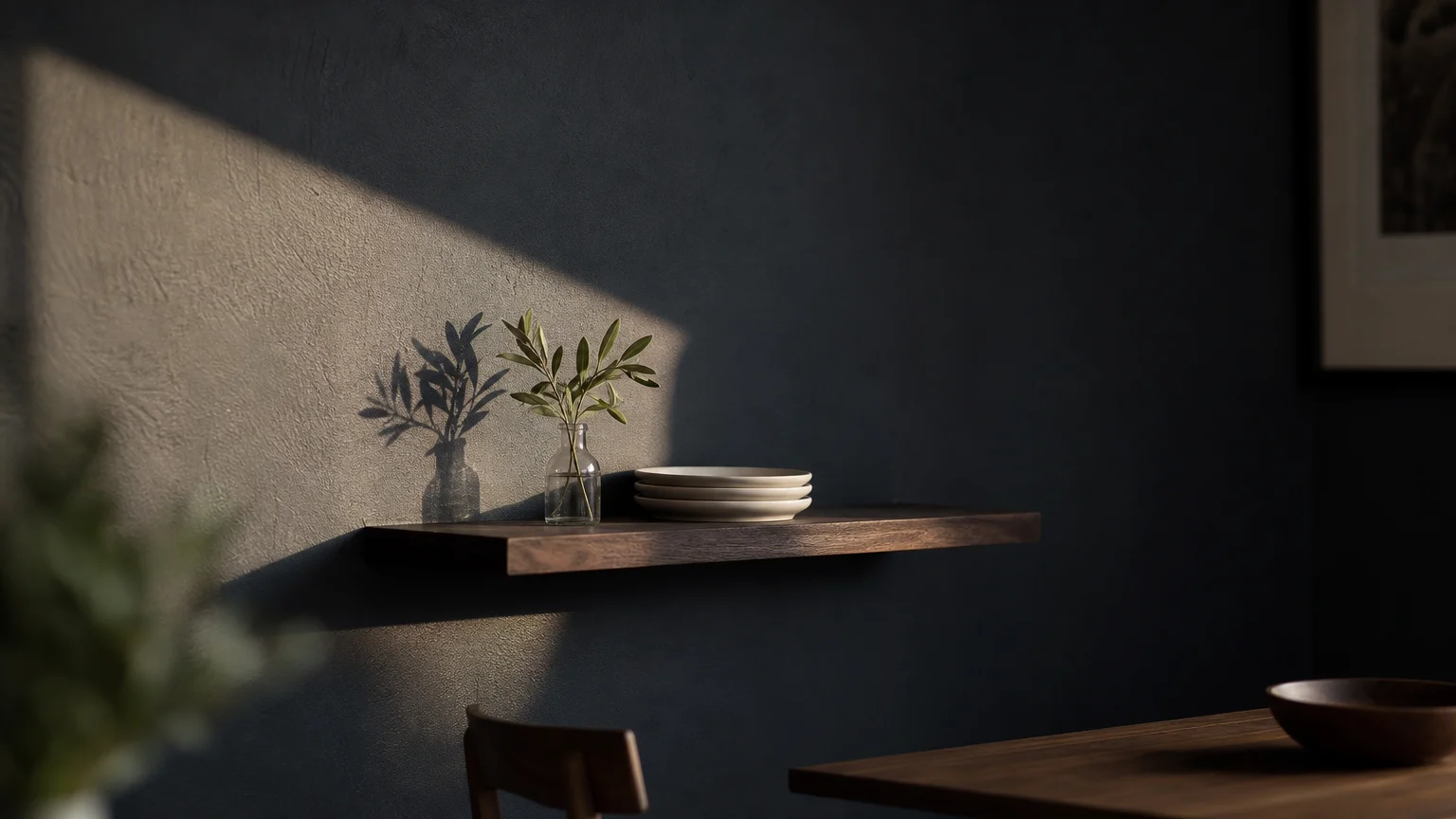
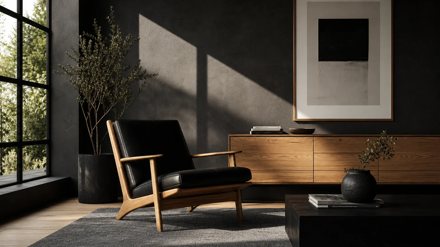
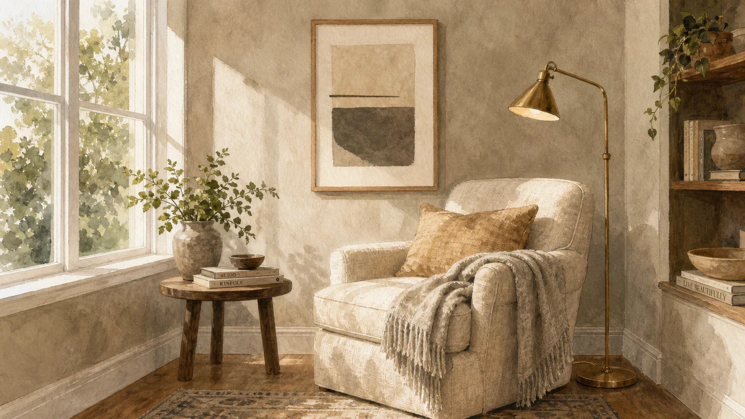
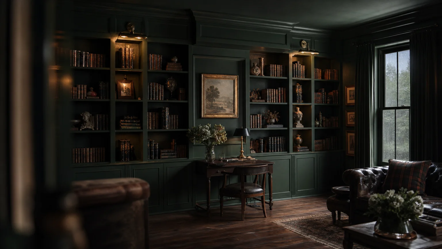
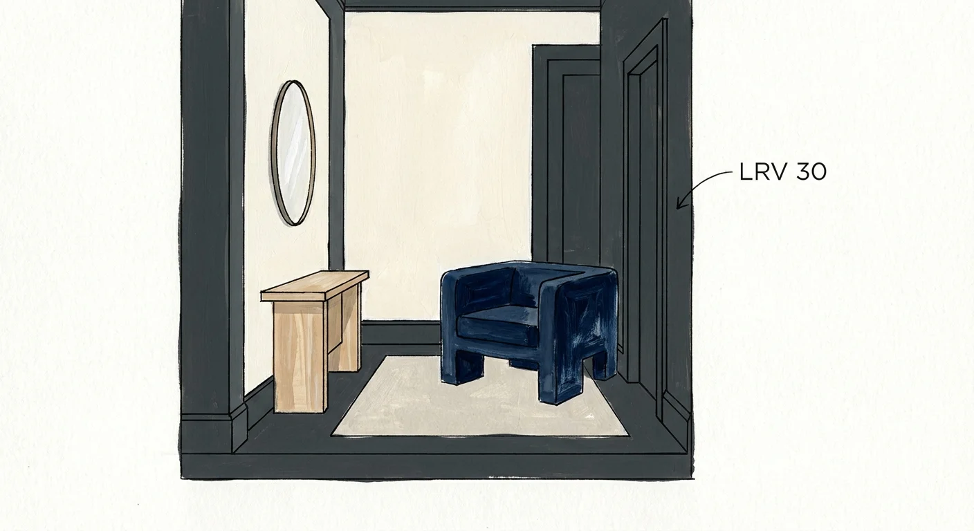
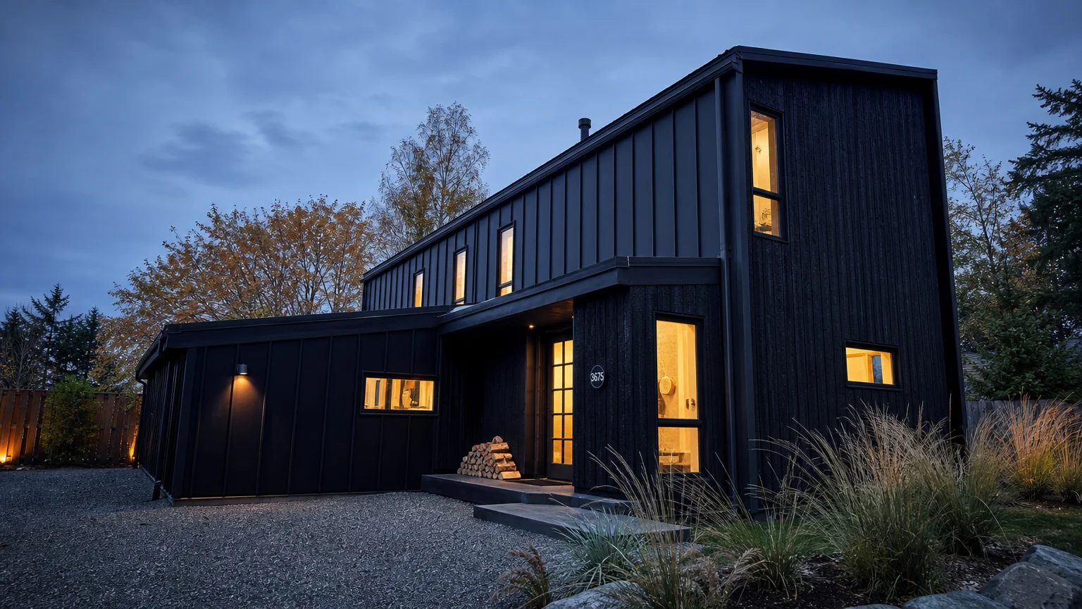
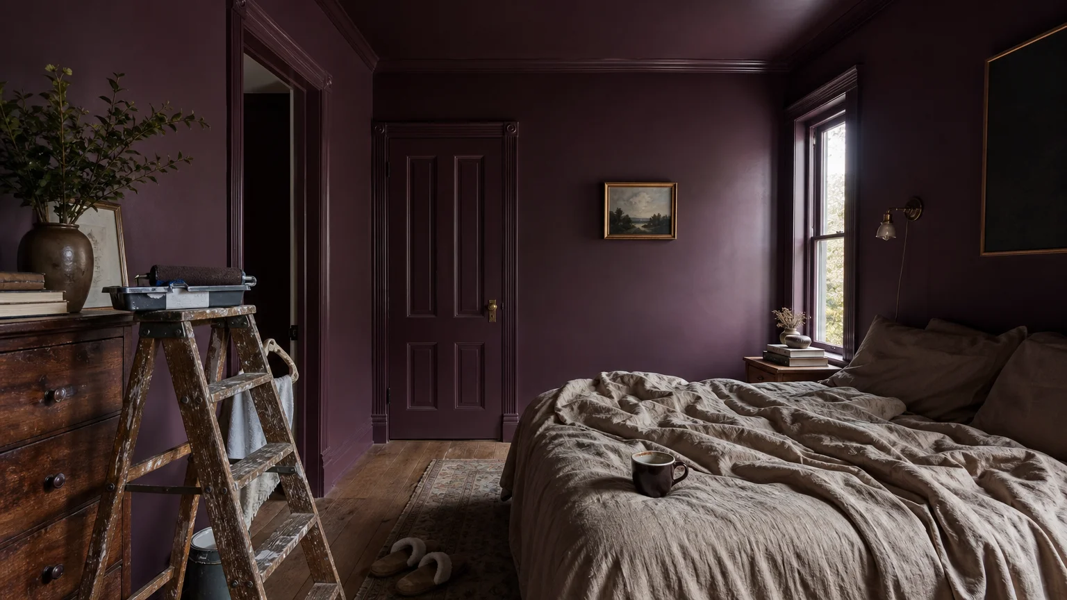
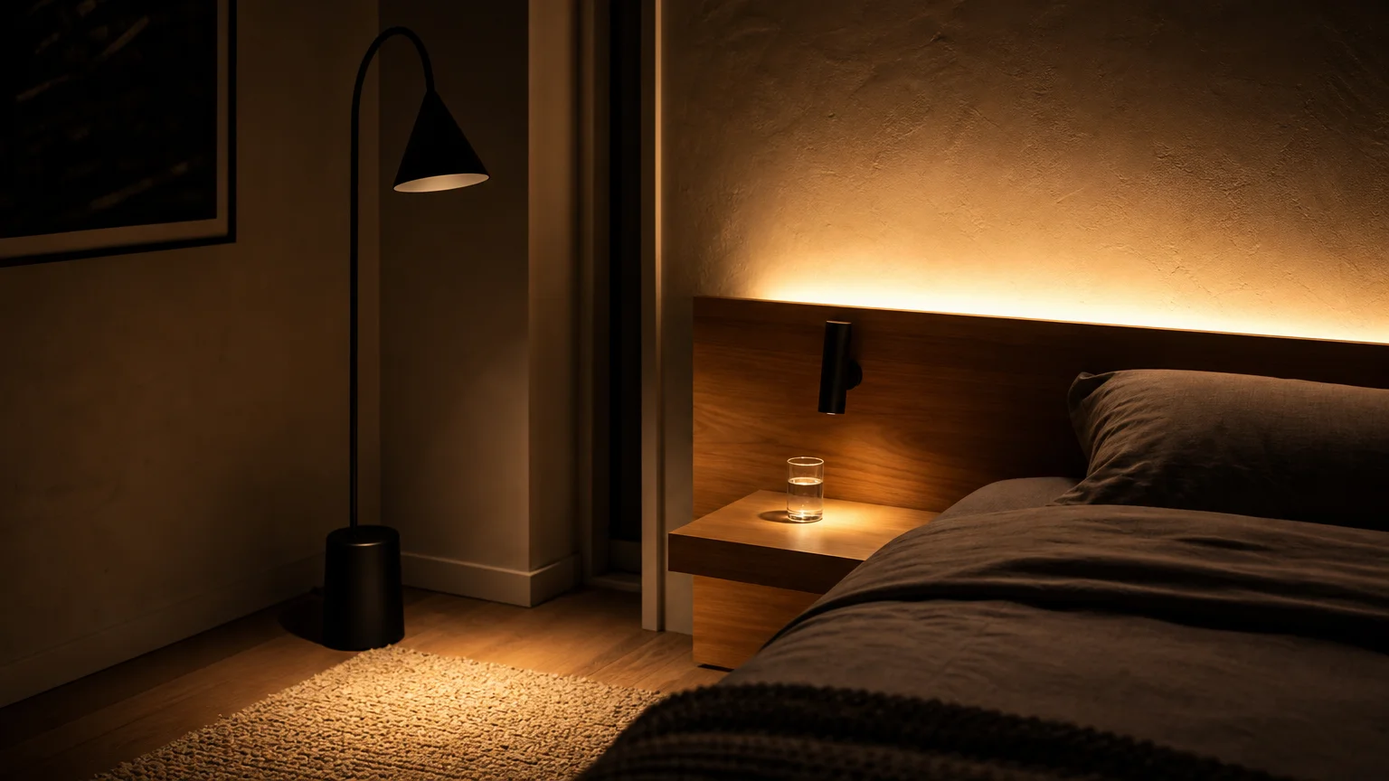
Trend #5: Soft Charcoal
Soft charcoal offers a masterclass in atmospheric depth, proving that dark paint colors can feel profoundly organic when executed with precision. This deep, slate-inspired grey abandons the harshness of pure black in favor of subtle blue and green undertones, mimicking the appearance of river stones and stormy skies. You create an enveloping, intimate sanctuary when you wrap a room in this dramatic hue. Soft charcoal serves as the ultimate foil for light, luminous natural materials. It creates a stunning high-contrast dynamic when placed alongside bleached blonde wood, honed travertine, and brushed brass fixtures. The dark backdrop forces these lighter elements to visually pop, highlighting their intricate textures and organic imperfections. Implement this bold choice in private spaces like libraries, home offices, or media rooms to foster a sense of focused tranquility. To soften the visual weight of the dark walls, incorporate an abundance of tactile materials. Drape organic cotton throws over seating, install woven cane light fixtures, and feature expansive slabs of lightly veined marble. This strategic interplay between light organic textures and deep charcoal walls defines contemporary, sophisticated home decorating. By committing to this dark, moody palette, you boldly redefine the parameters of what constitutes a relaxing, nature-inspired living space.
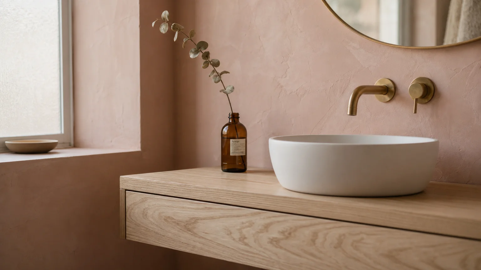
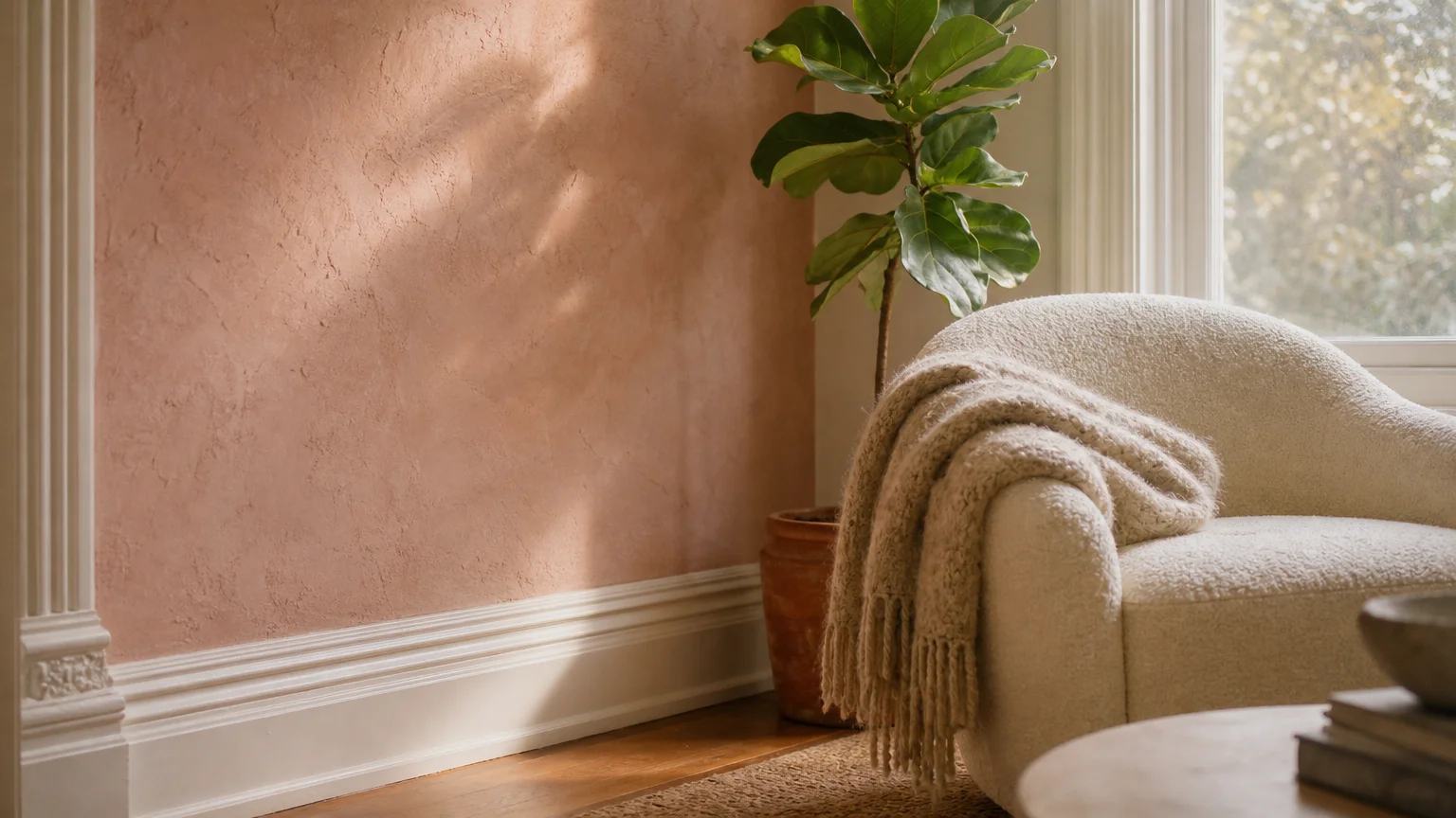
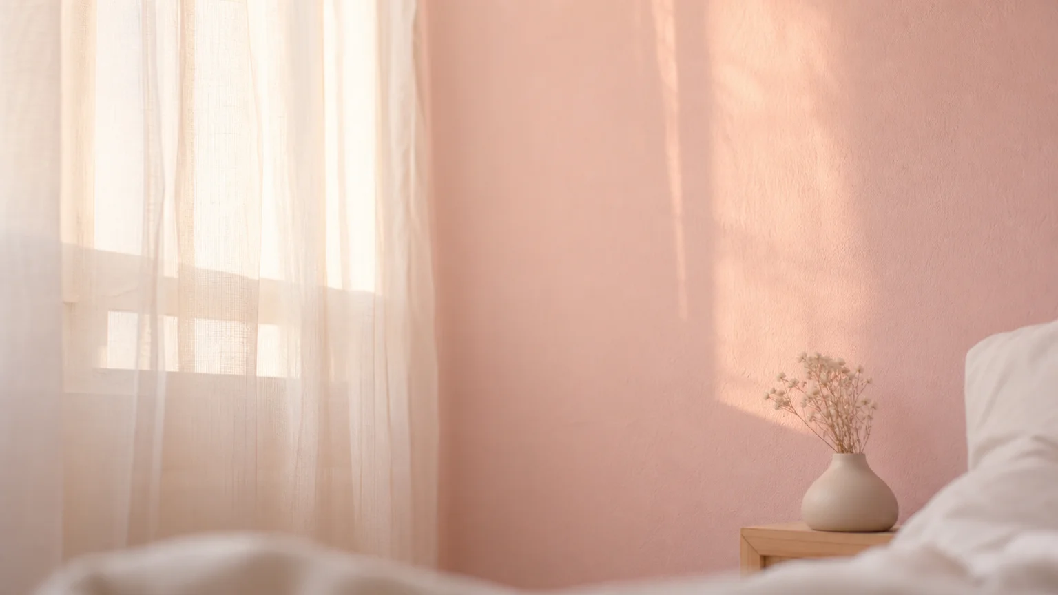
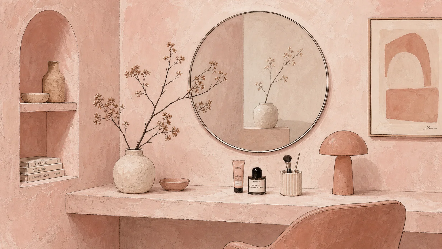
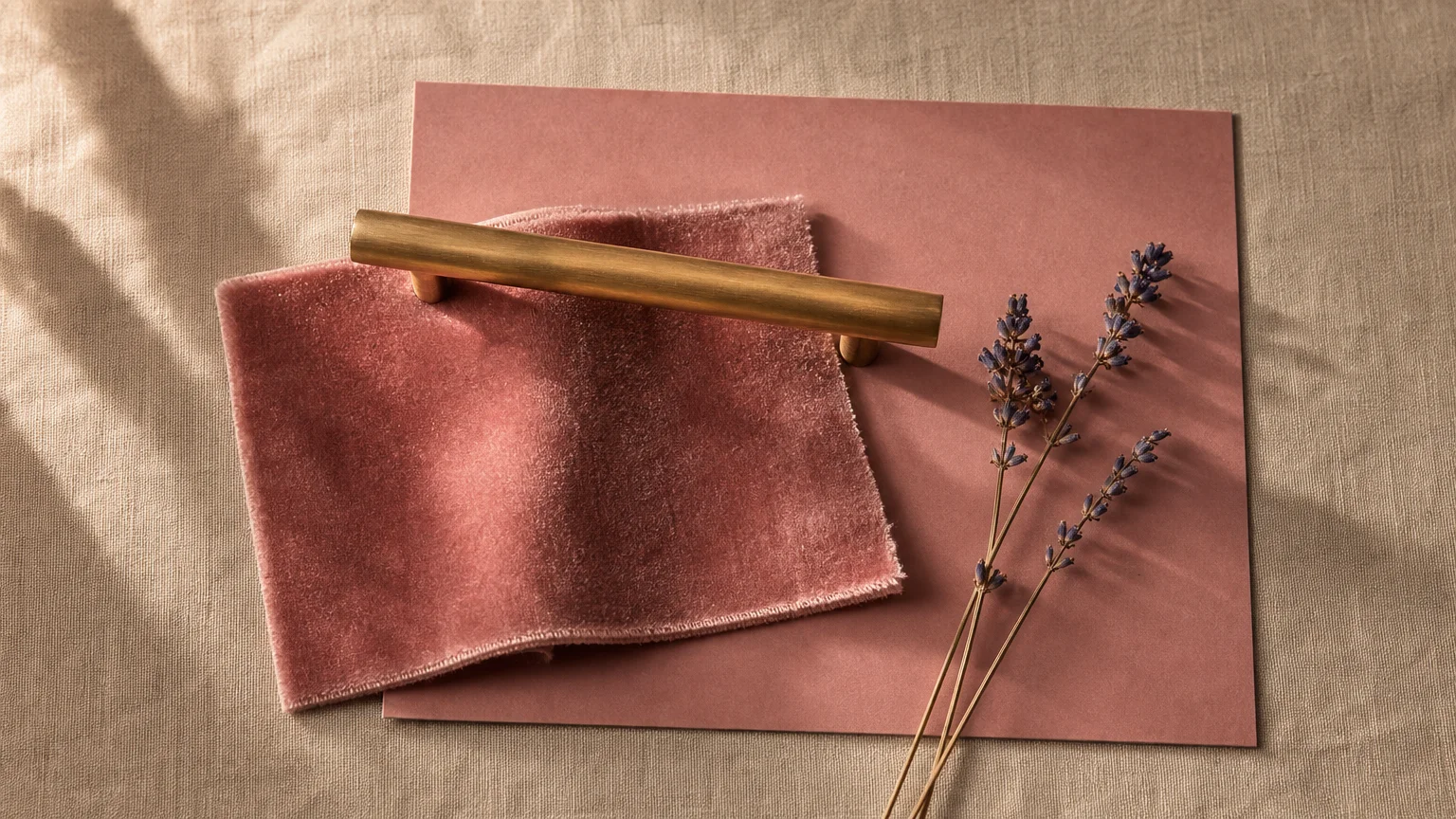
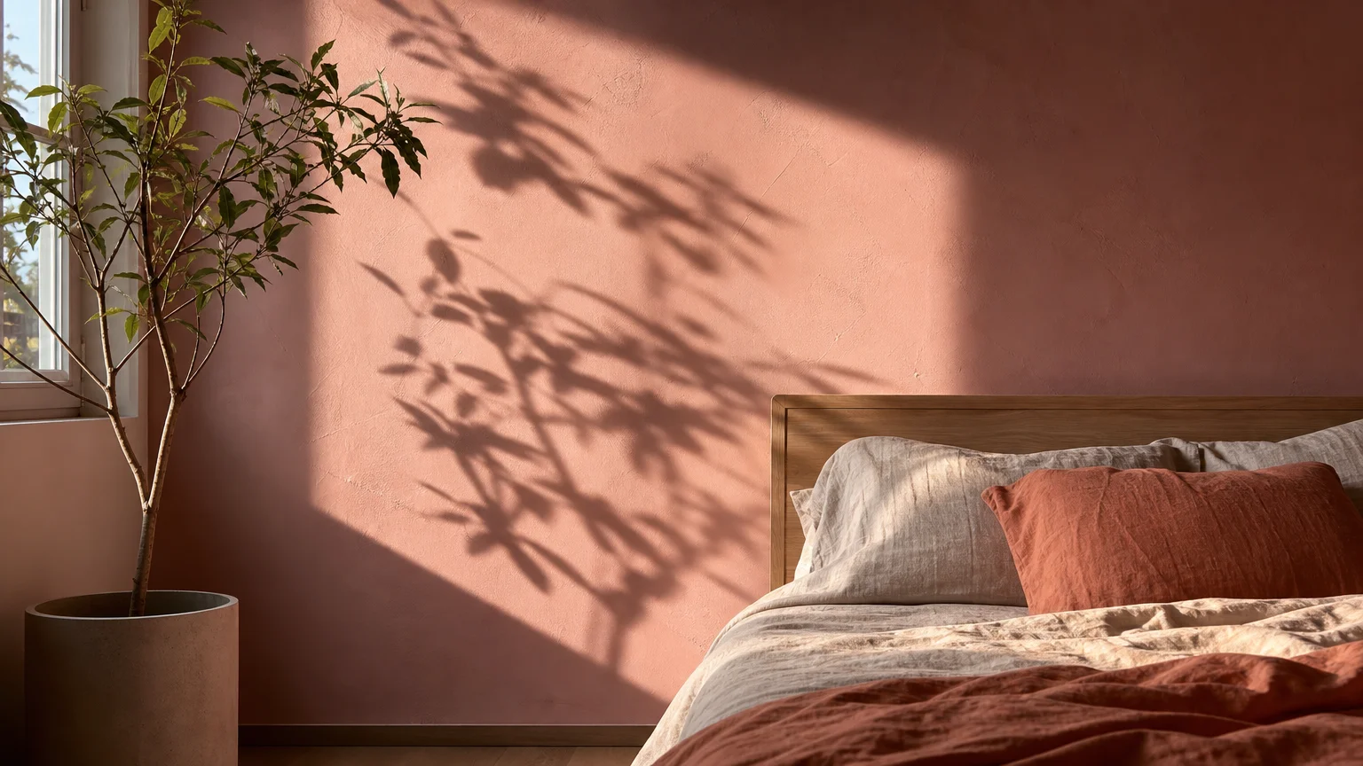
Trend #6: Dusty Plaster Pink
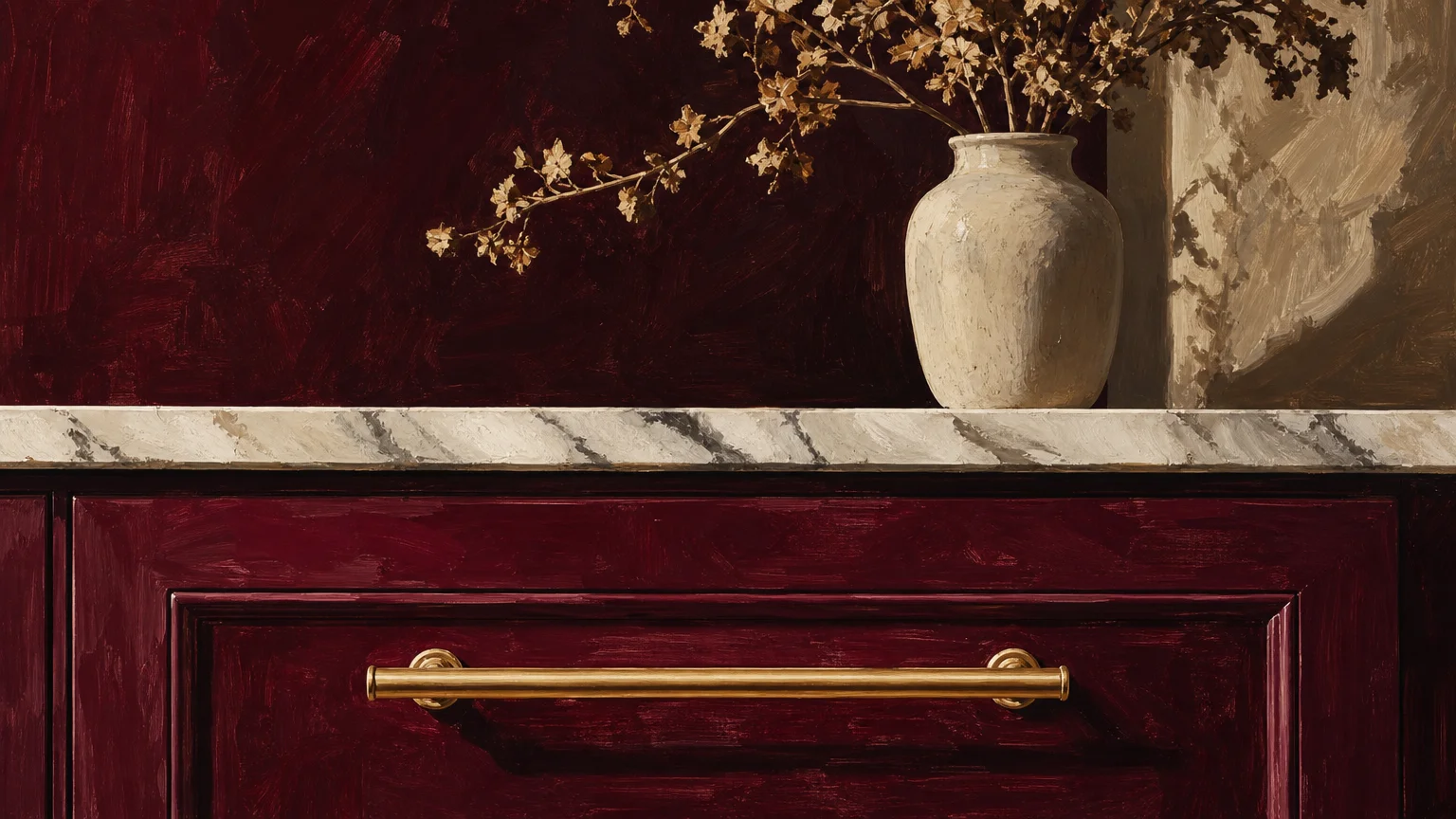
Dusty plaster pink redefines how we perceive rosy hues, stripping away all saccharine associations to reveal a mature, earthy neutral. This highly nuanced color draws inspiration from raw gypsum and traditional Moroccan tadelakt, featuring strong beige and grey undertones that ground the pink base. You effortlessly cultivate a soft, enveloping warmth in your living spaces when utilizing this complex shade. Plaster pink exhibits an extraordinary affinity for natural materials that possess inherent warmth. It sings when paired with pale bamboo flooring, intricate rattan furniture, and unglazed ceramic accents. The color acts as a subtle amplifier, drawing out the delicate blush tones hidden within natural copper and the warm veining found in certain marbles. Apply this versatile paint color to primary bedrooms and spa-inspired bathrooms to encourage relaxation and mindful unwinding. For a truly elevated interior design scheme, pair dusty pink walls with heavy, natural linen textiles and woven sisal rugs. The resulting aesthetic masterfully balances delicate color with robust, organic textures, proving that a space can feel simultaneously feminine, grounded, and intrinsically linked to the natural world. Ultimately, this color invites you to abandon outdated color rules and embrace a more nuanced, sophisticated approach to modern interior design.
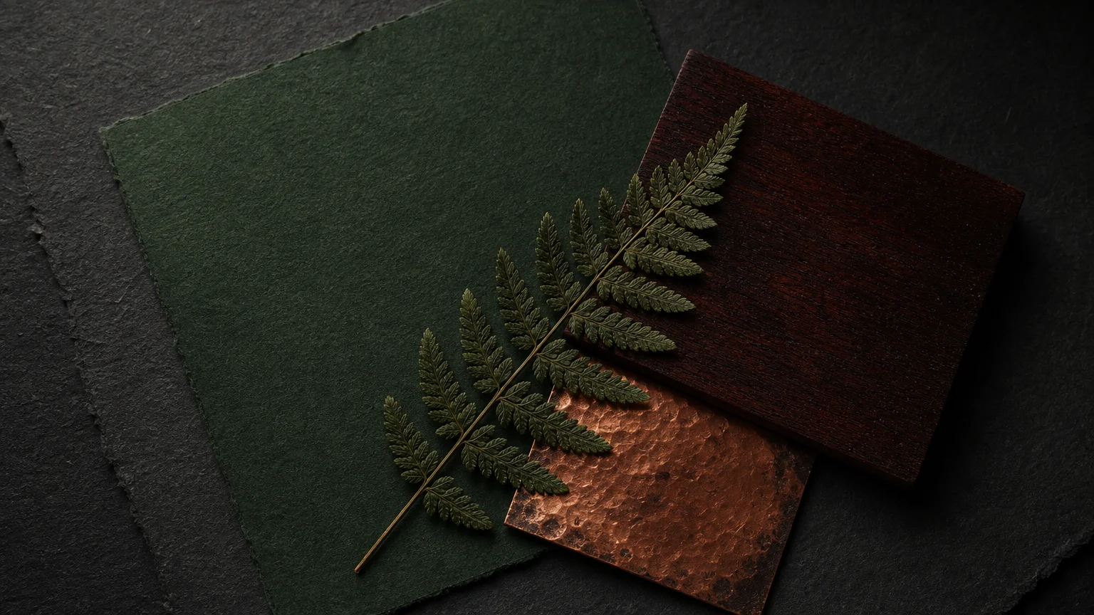
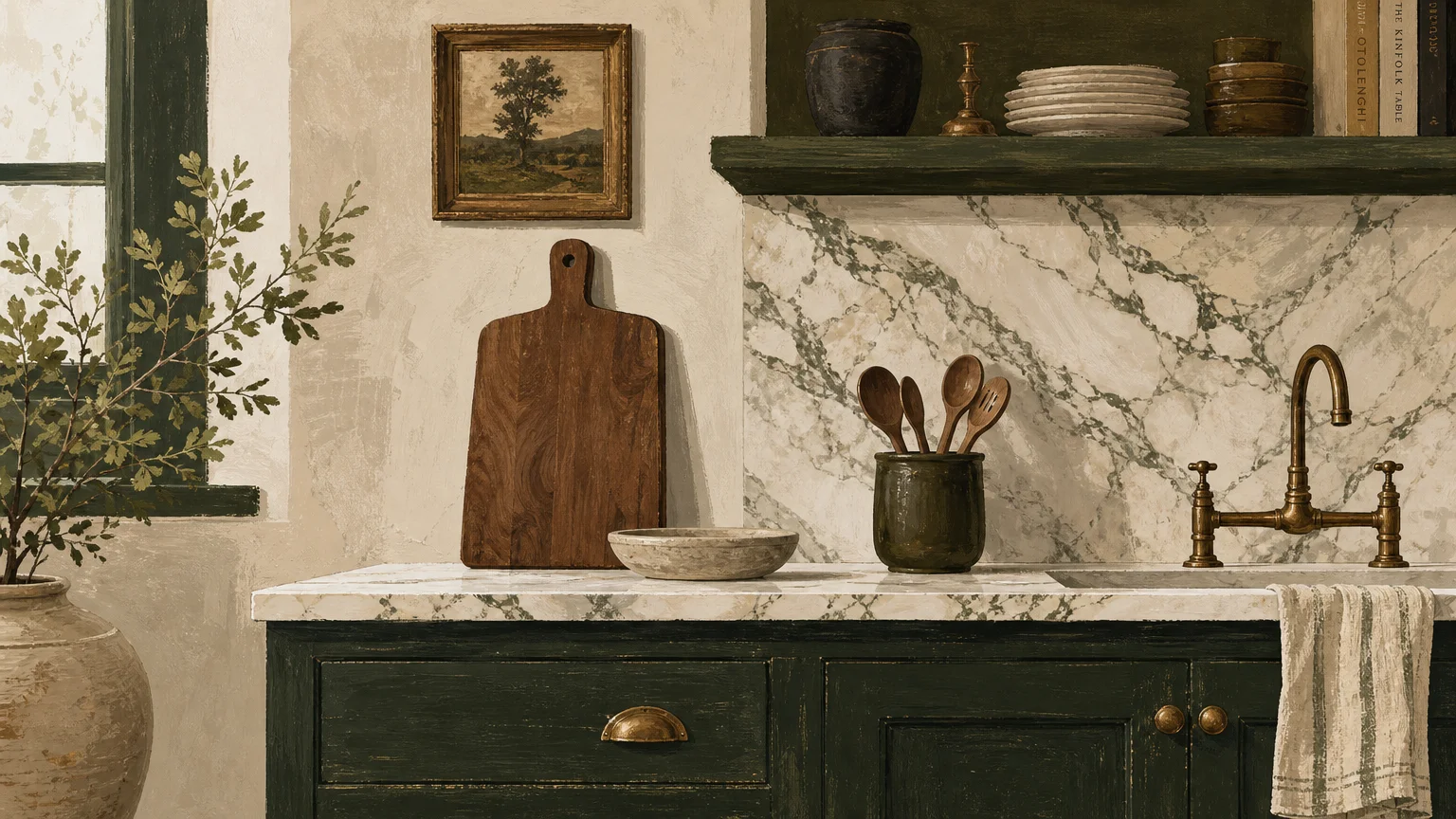
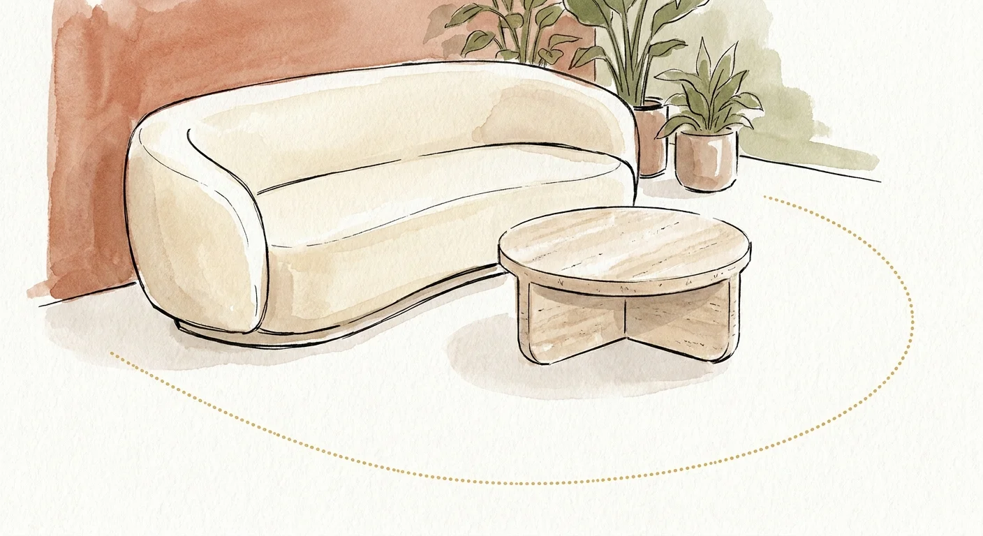
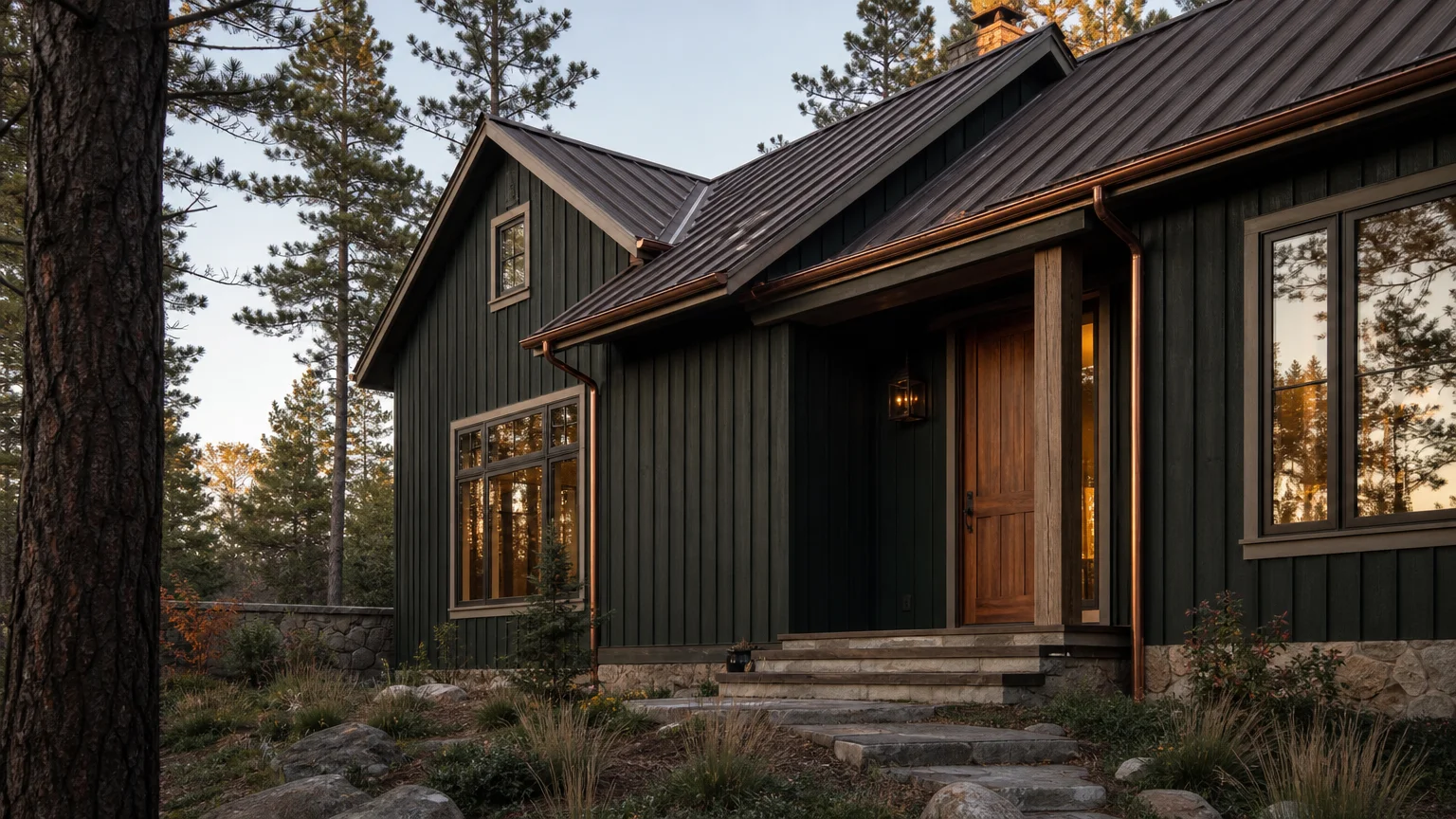
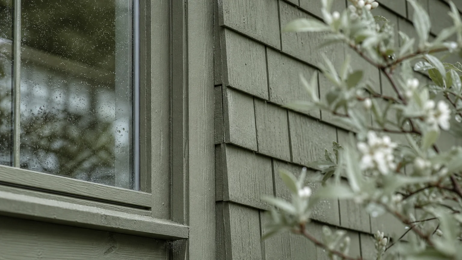
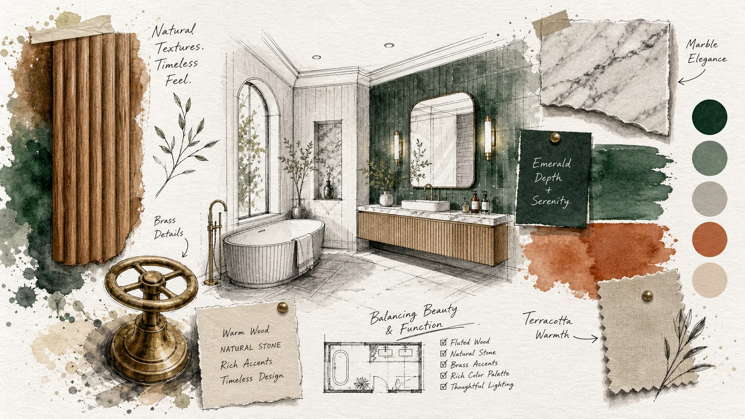
Trend #7: Deep Forest Green
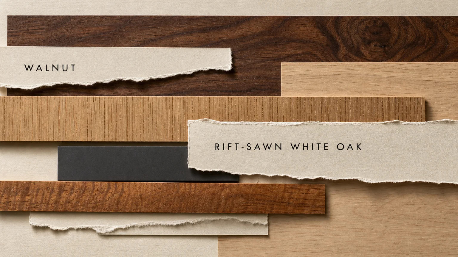
Deep forest green commands attention while remaining fundamentally rooted in the restorative power of nature. This saturated, jewel-toned hue captures the profound depths of ancient woodlands, bringing a sense of majestic stillness into the modern home. You establish an immediate atmosphere of refined luxury when you apply this color to millwork, wainscoting, or entire room envelopes. Forest green forms a deeply harmonious relationship with medium-to-dark natural woods. It exquisitely complements the reddish undertones of cherry and mahogany, while providing a stunning contrast against the golden warmth of aged oak. To maximize the impact of this pairing, incorporate natural stone elements featuring dark, dramatic veining, such as Verde Alpi or Nero Marquina marble. The tactile experience of the room becomes paramount when utilizing such a strong wall color. Layer plush natural textiles—think heavy cotton velvets and thick wool rugs—to absorb light and enhance the enveloping nature of the green. This specific shade frequently appears in high-end home decorating projects because it effortlessly bridges the gap between historical elegance and contemporary biophilic design, offering a timeless backdrop for organic elements. You simply cannot replicate the profound depth and character this color imparts when interacting with raw, unpolished architectural features.
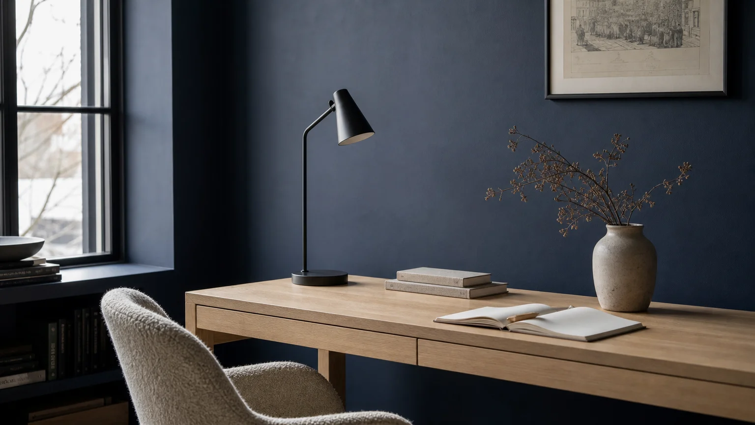
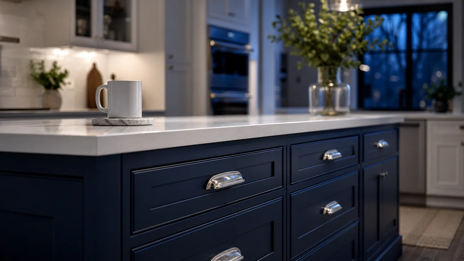
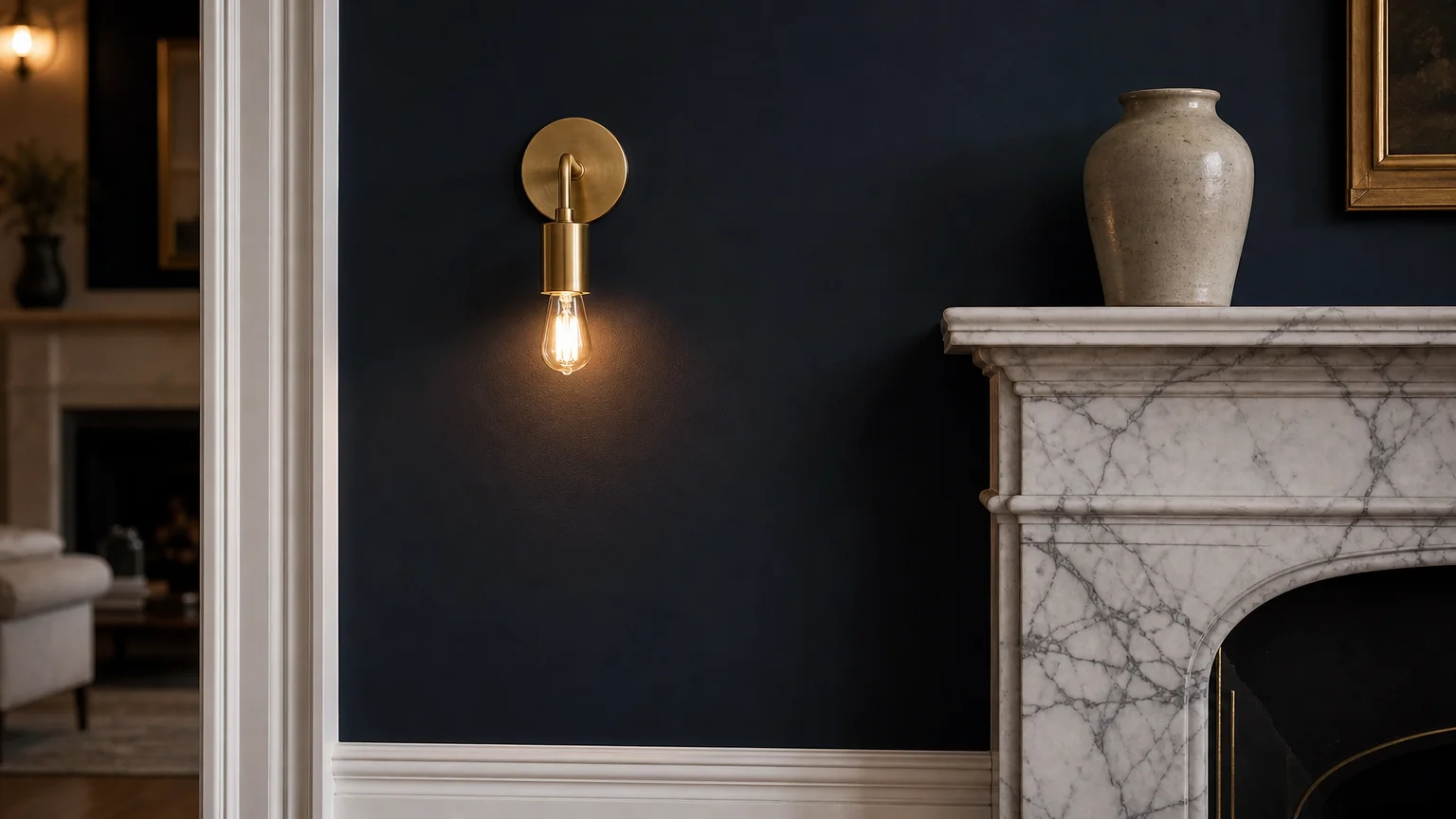
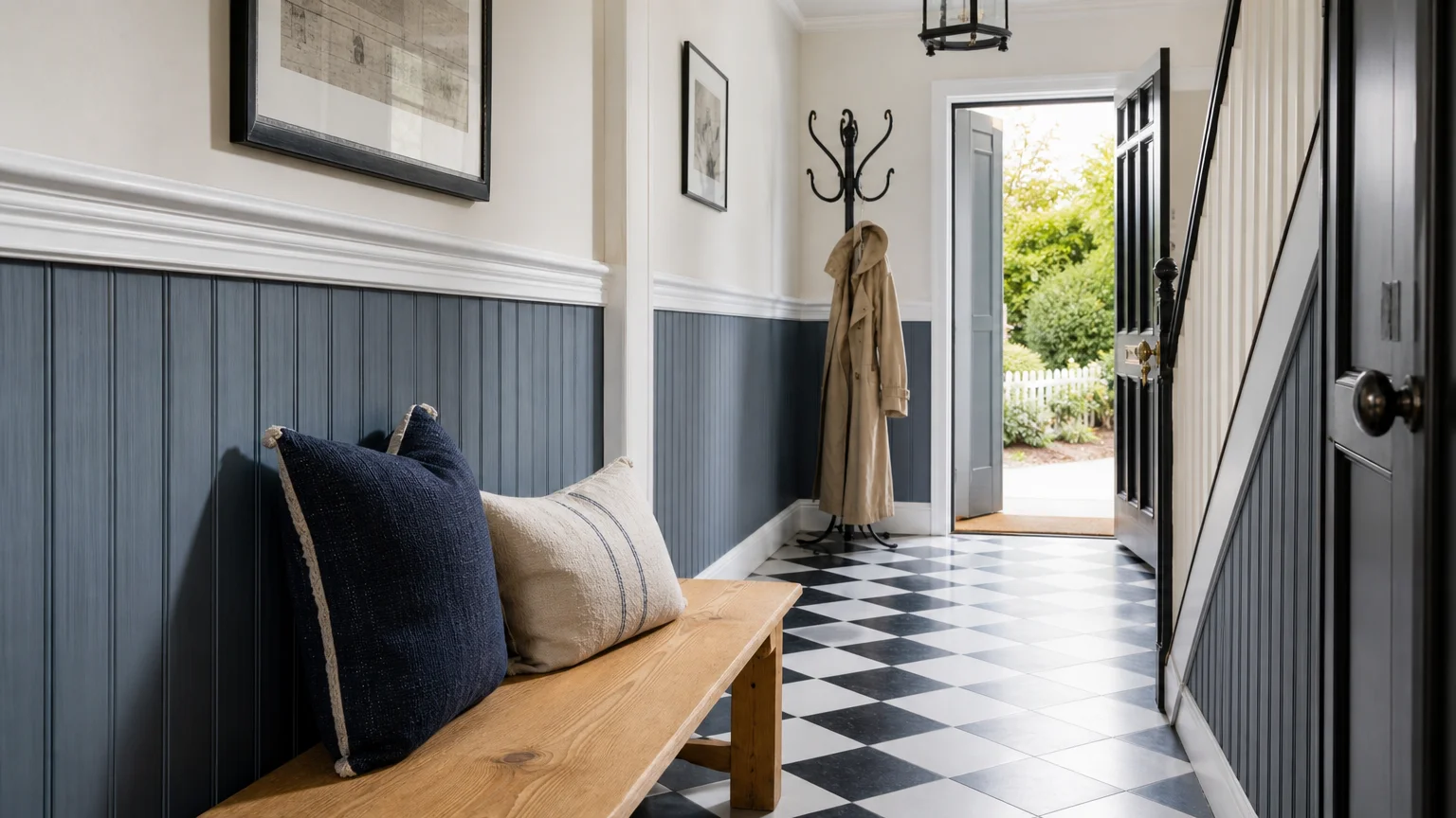
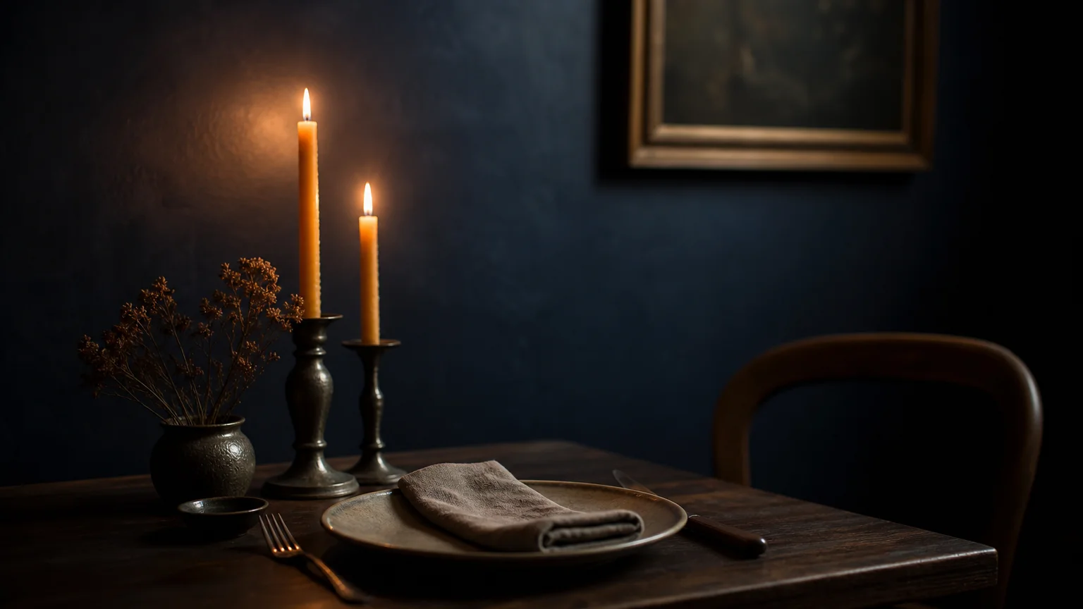
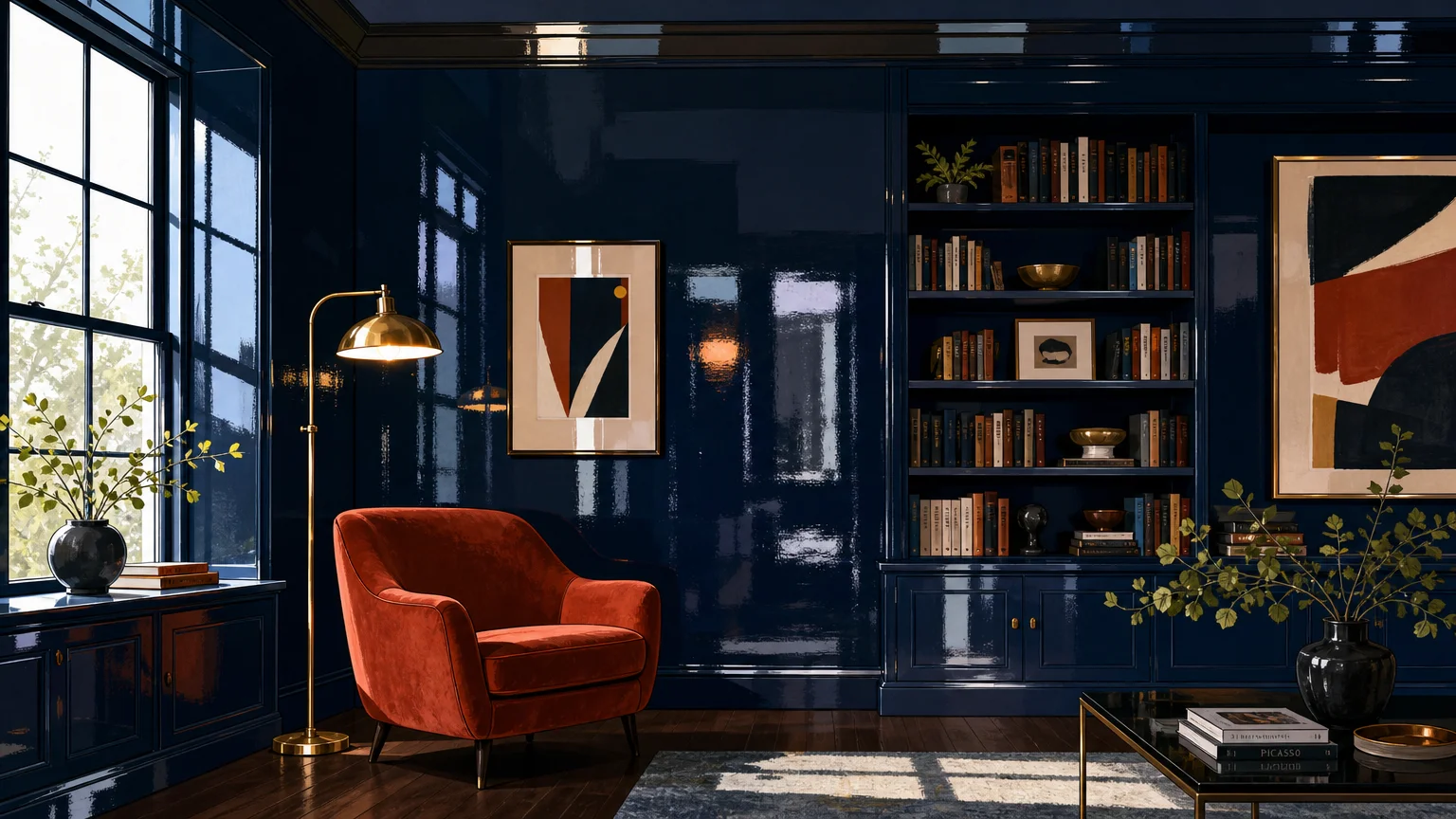
Trend #8: Muted Indigo
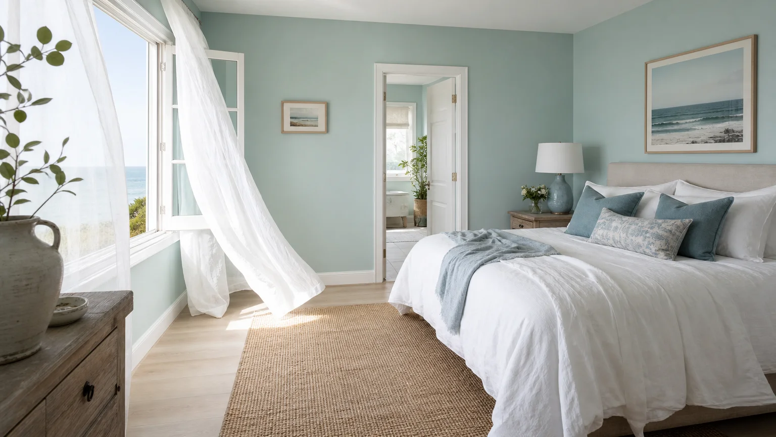
Muted indigo introduces the expansive, calming presence of the evening sky and deep oceans into your interior design vocabulary. Unlike vibrant, nautical blues, this sophisticated variation features a heavy infusion of grey, resulting in a moody, contemplative hue that feels entirely natural. You instantly lower the visual temperature of a room when you deploy this color, making it an exceptional choice for spaces flooded with intense, direct sunlight. Muted indigo creates a breathtaking synergy with pale, highly textured natural materials. It provides a striking, cool-toned contrast against the warmth of natural ash wood, woven water hyacinth, and light poured concrete. The dynamic tension between the deep blue walls and the light organic elements generates a sense of architectural rigor and purposeful design. Utilize this shade in dining rooms to create an intimate, sophisticated atmosphere for evening entertaining, or apply it to bedroom walls to promote deep, restorative sleep. When accessorizing an indigo room, rely on the raw, unpolished beauty of natural brass, tarnished silver, and heavy glass accents to reflect light and add necessary visual rhythm to the shadowed space. This mindful application of deep, muted color proves that serene spaces do not always require a pale, minimalist palette.
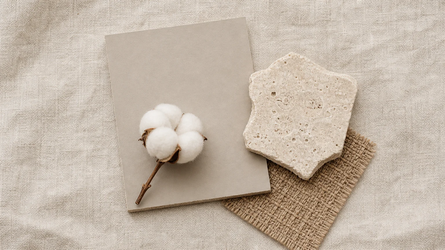
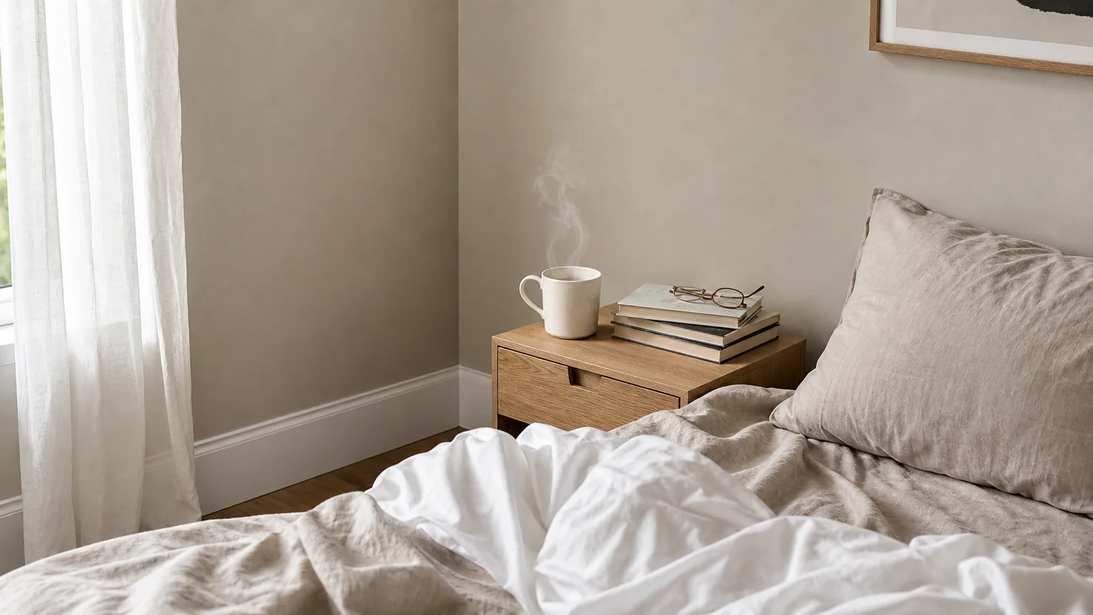
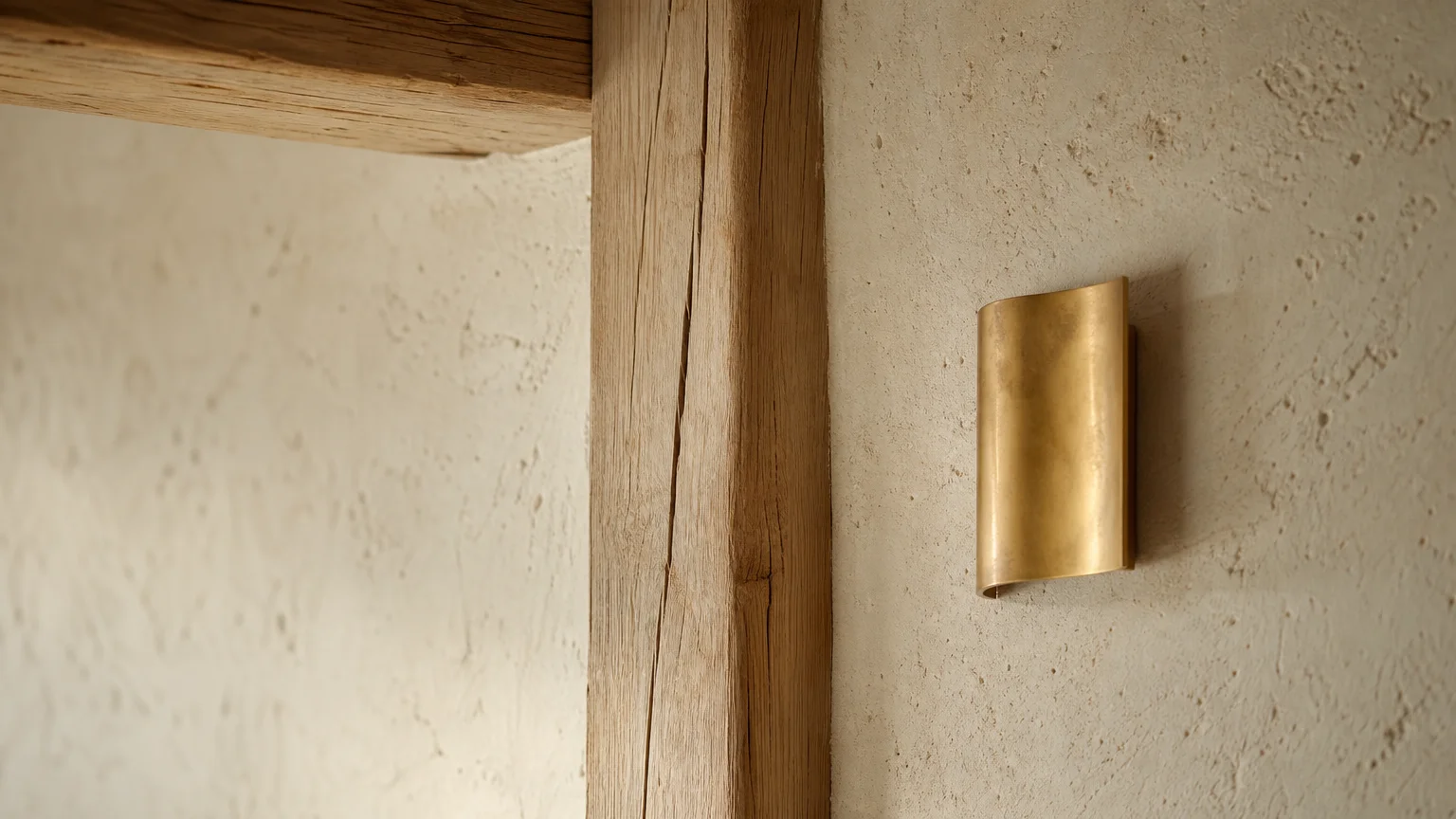
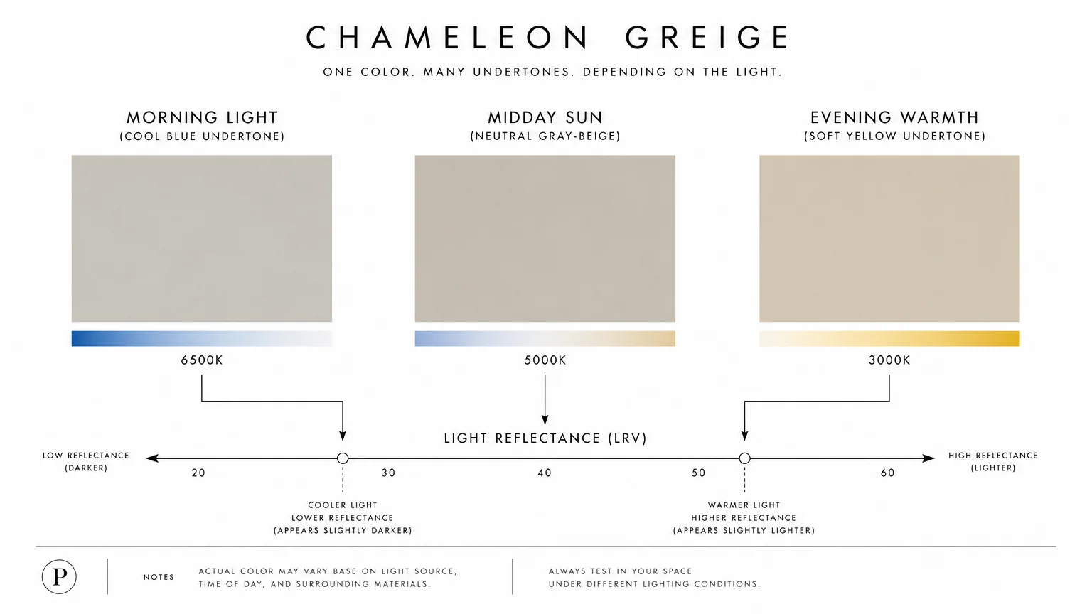
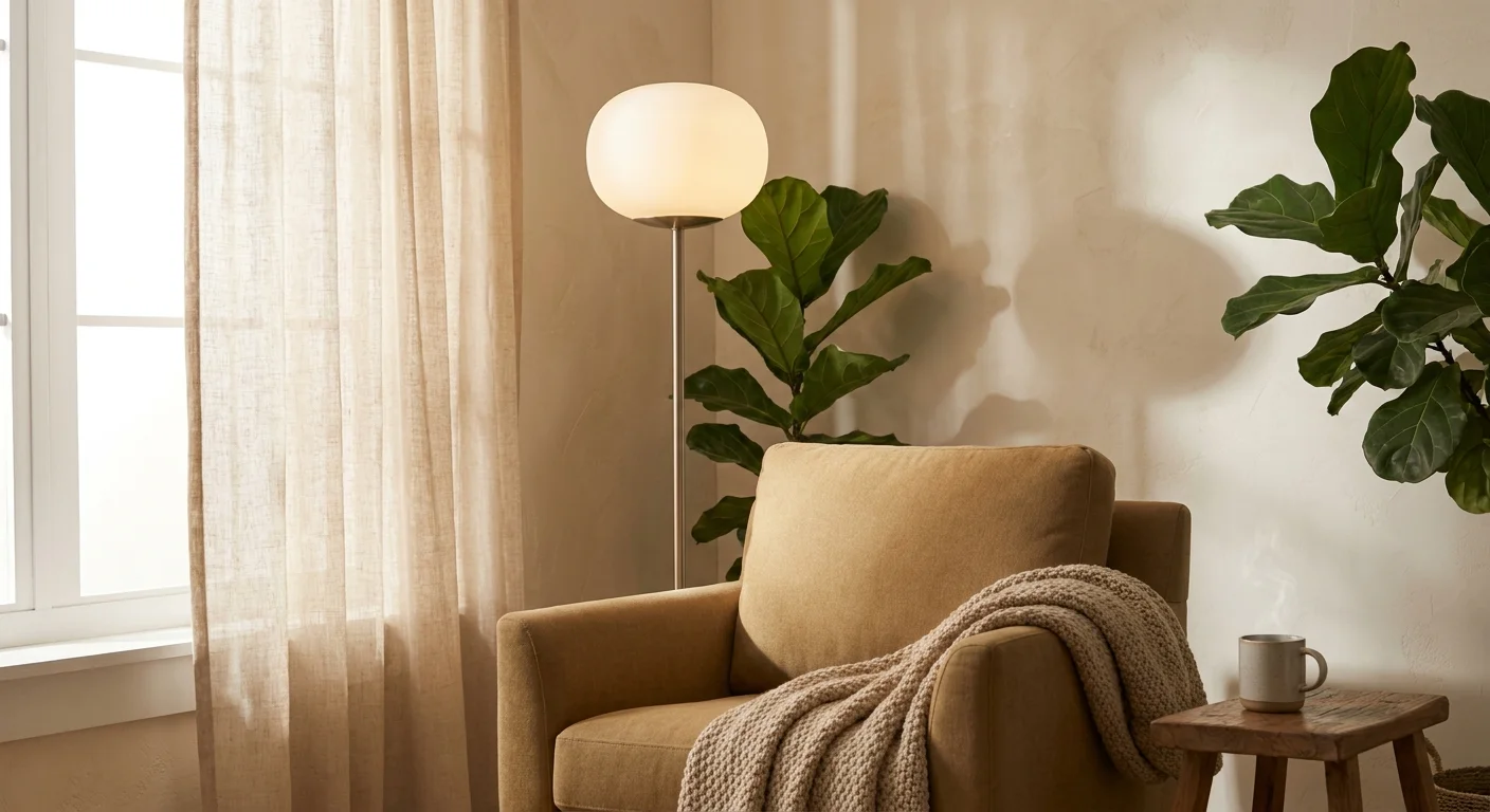
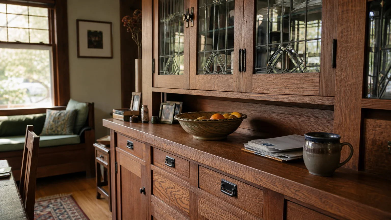
Trend #9: Warm Greige
Warm greige stands as the undisputed champion of the modern neutral palette, perfectly straddling the line between beige and grey. This highly adaptable shade mirrors the subtle, earthy tones found in decaying foliage and wild fungi, offering an incredibly sophisticated alternative to standard builder-grade neutrals. You provide your home with an unparalleled foundation of quiet, organic elegance when you embrace this complex hue. Greige paint colors possess a unique ability to adapt to shifting natural light, reading as a cool stone in the morning and a warm, comforting taupe by evening. This chameleon-like quality makes it the ideal partner for a vast array of natural materials. It seamlessly integrates with the rough, porous texture of limestone, the intricate weaving of natural cane, and the heavy, nubby surface of bouclé fabrics. Apply warm greige to expansive, open-concept living areas to establish a cohesive, unbroken visual flow. Design experts favor this shade because it never competes with the architectural features of a room; instead, it quietly supports and elevates the natural beauty of exposed wooden beams, natural fiber rugs, and raw stone fireplaces. You will quickly discover that this versatile shade becomes the unsung hero of your home, silently elevating every organic texture it encounters.
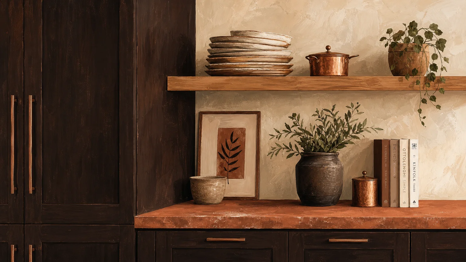
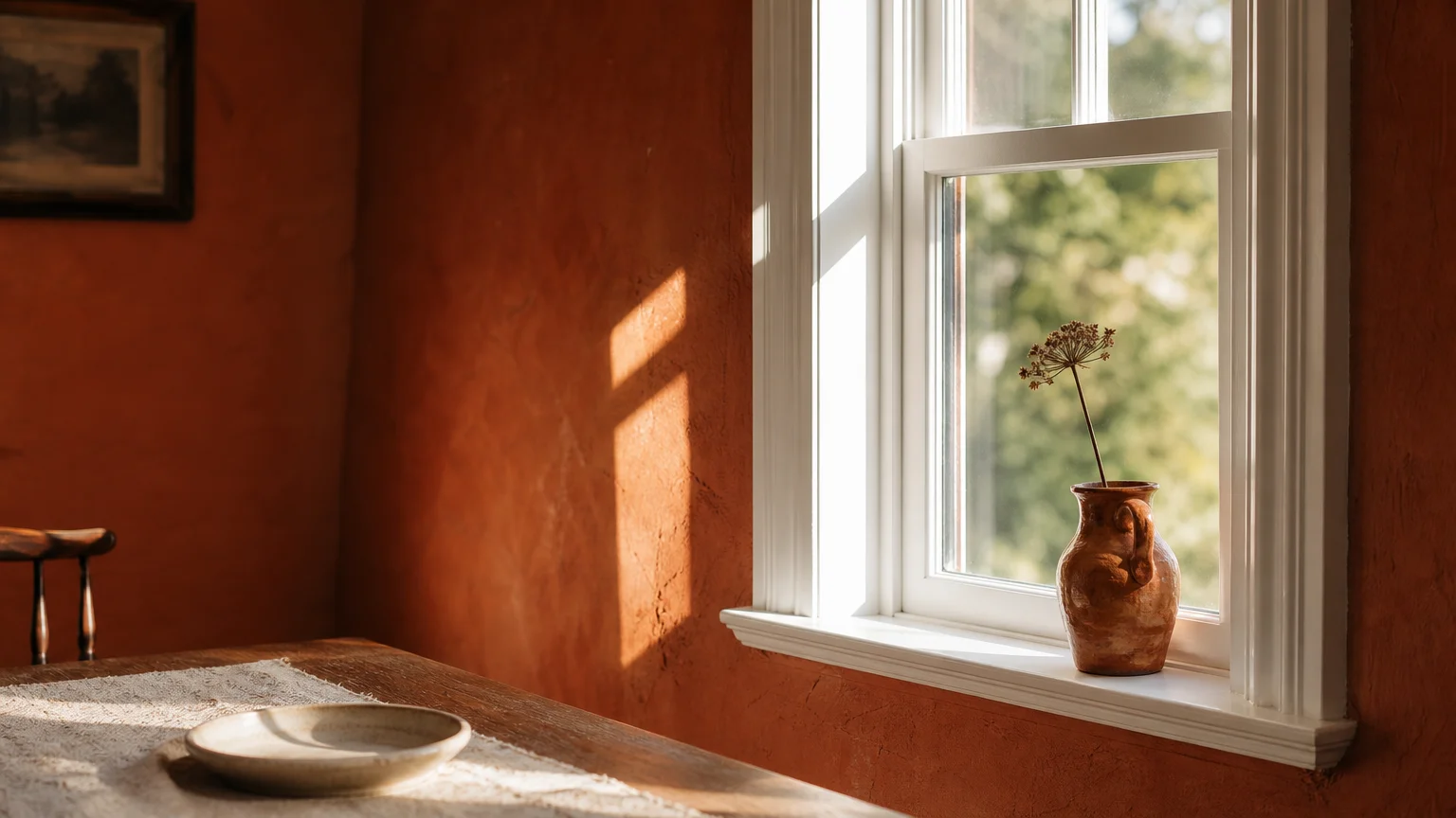
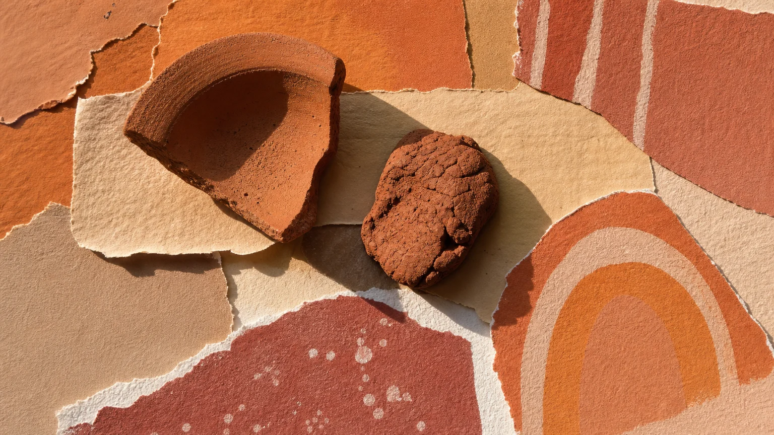
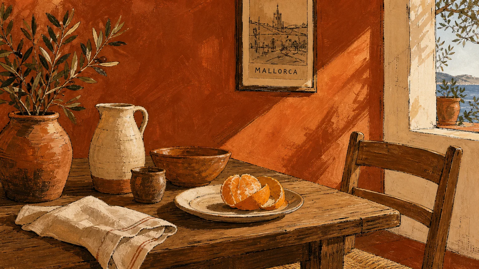
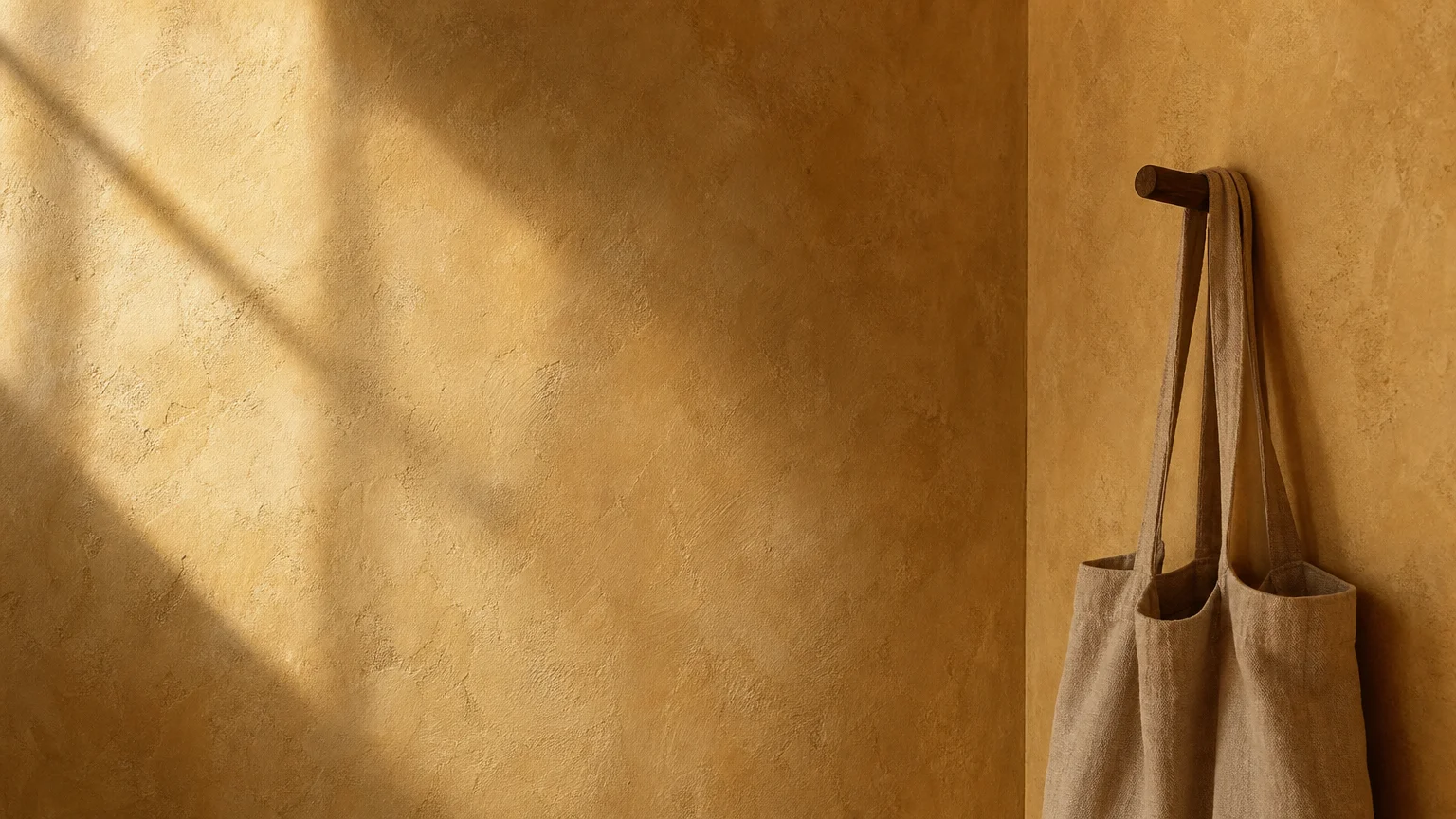
Trend #10: Sunbaked Clay
Sunbaked clay captures the intense, radiant heat of desert landscapes, offering a more vibrant, energetic alternative to traditional terracottas. This rich, rusty-orange hue pulses with life, injecting a necessary dose of vitality into subdued interior design schemes. You instantly transform sterile, unwelcoming rooms into vibrant, convivial hubs when you coat the walls in this earthy, unapologetic color. Sunbaked clay demands to be paired with equally robust natural materials. It forms a brilliant alliance with the dense, organic texture of natural cork flooring, the rich, honeyed tones of solid teak furniture, and the rustic charm of unglazed terracotta pottery. The color actively draws out the natural warmth of these materials, creating an environment that feels both curated and inherently wild. Utilize this dynamic shade in creative spaces, home studios, or eclectic kitchens where you want to stimulate energy and inspiration. To balance the intensity of the clay, incorporate large-scale, leafy indoor plants; the vibrant green foliage pops aggressively against the rusty background, cementing the room’s biophilic credentials. Embrace this fiery, earth-born color to craft a living environment that boldly celebrates the rugged, untamed elements of the natural world.
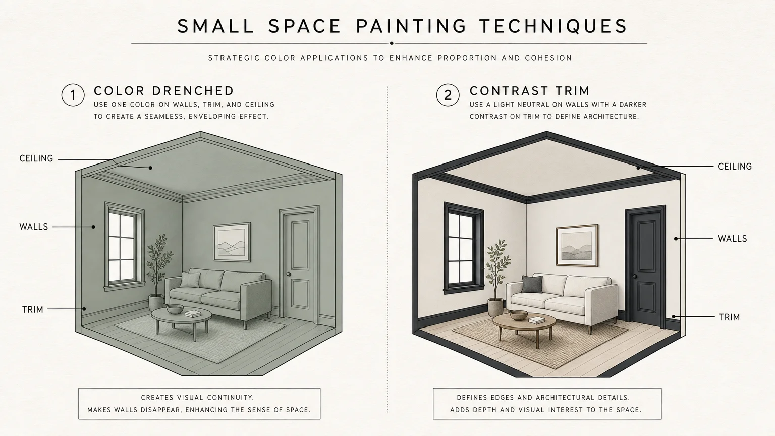
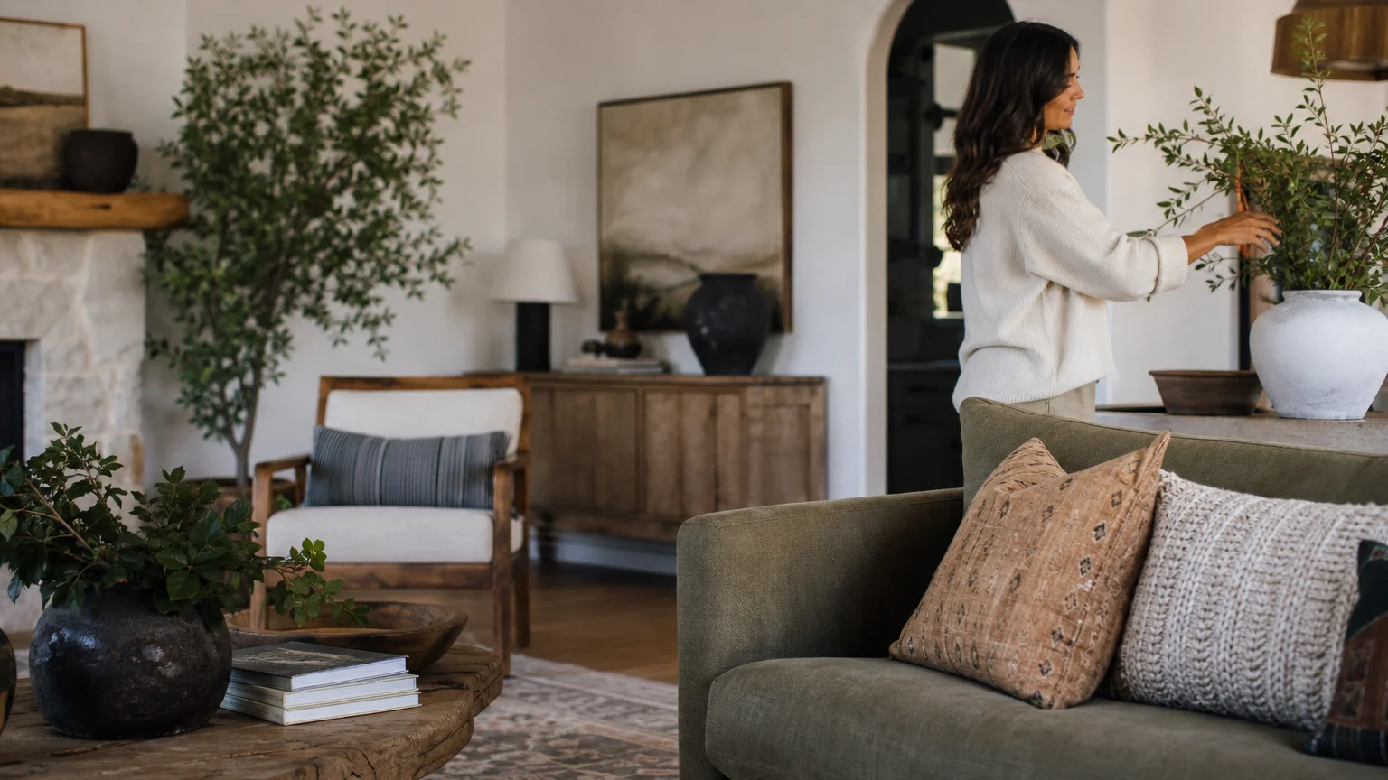
The Big Picture: Weaving These Trends into Your Home
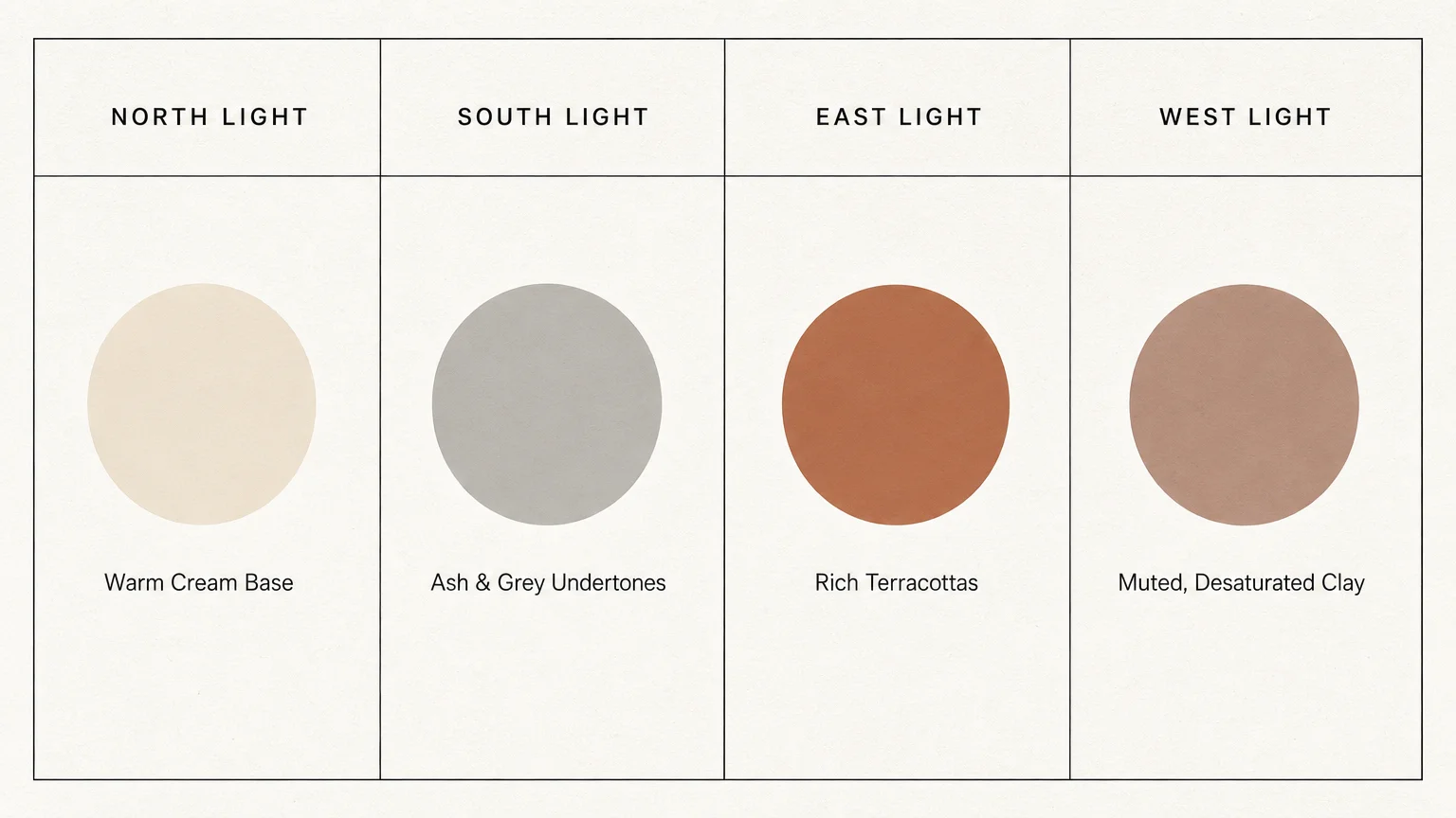
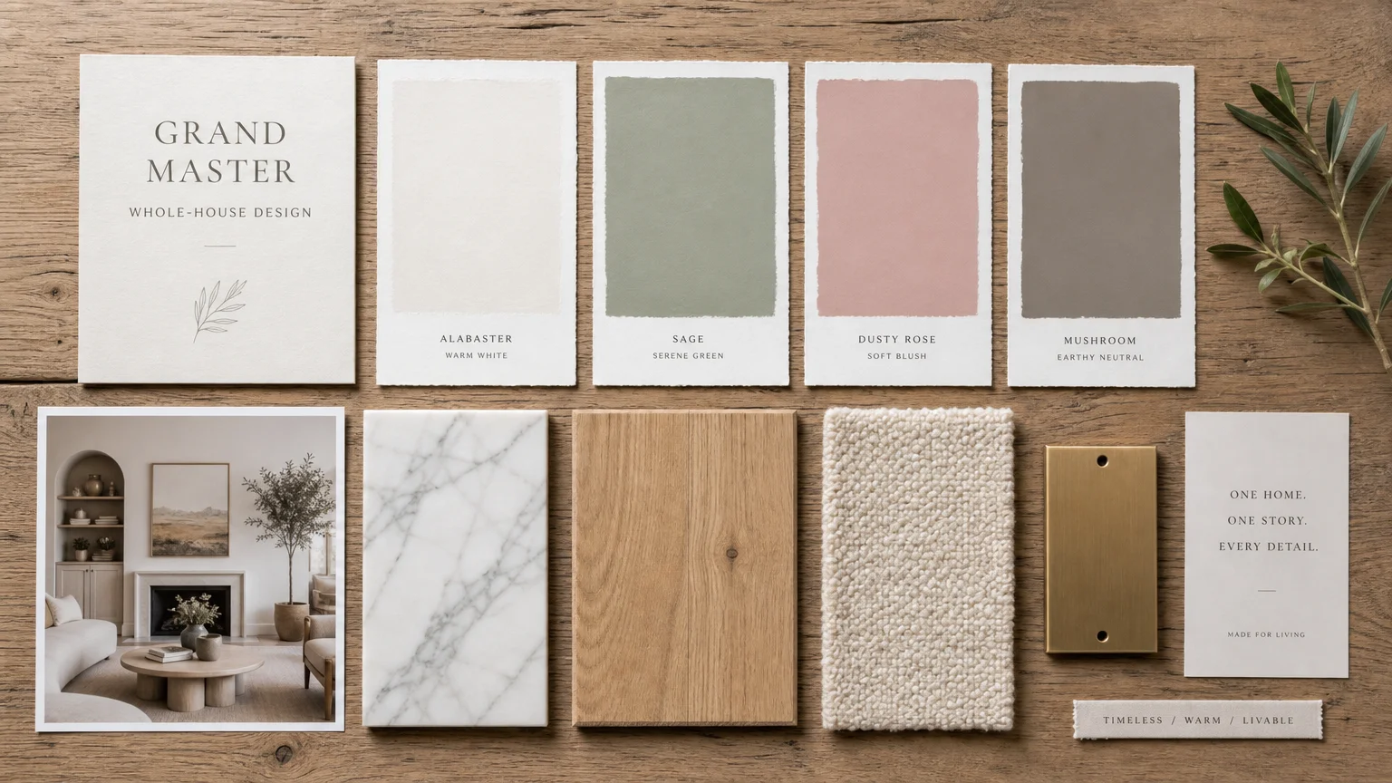
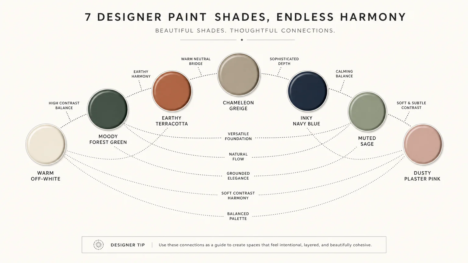
Achieving a sophisticated, cohesive aesthetic extends far beyond simply selecting the right paint colors. You must approach your home decorating as a holistic exercise, carefully balancing the visual weight of your walls with the tactile presence of your natural materials. Start by identifying the dominant organic elements already present in your space—whether that involves expansive hardwood flooring, an exposed brick wall, or a statement marble countertop. Let these architectural features dictate your color palettes.
If your home features predominantly cool-toned materials like slate or concrete, inject warmth with earthy ochre or sunbaked clay to establish a dynamic equilibrium. Conversely, if your rooms overflow with warm oak or cherry woods, utilize botanical sage or muted indigo to cool the visual temperature and create a restorative balance. Do not confine these hues strictly to your walls; extend them to your millwork, interior doors, and ceiling to create an enveloping, custom look. By intentionally pairing complex, nature-inspired colors with authentic materials, you transcend fleeting fads. You ultimately curate a living environment defined by quiet luxury, enduring style, and an unbreakable connection to the natural world.
Frequently Asked Questions
How do I determine the right paint finish for colors paired with natural materials?
Always prioritize matte or eggshell finishes when your goal is to complement natural materials. High-gloss or satin paints reflect light sharply, creating a synthetic sheen that contradicts the organic nature of wood, stone, and woven fibers. A flat or matte finish absorbs light gently, mimicking the porous textures found in nature and allowing the rich undertones of the color to shine without distraction.
Can I mix multiple earthy paint colors in an open-concept living space?
Yes, you can successfully mix multiple earthy tones, provided you establish a clear visual hierarchy. Select one dominant color—such as warm greige or creamy alabaster—to serve as the foundation for the main walls. Then, introduce stronger hues like deep forest green or muted indigo strategically on accent walls, kitchen islands, or built-in cabinetry. Ensure all selected colors share a similar muted, grey, or brown undertone to maintain a cohesive flow across your color palettes.
Will these nature-inspired color palettes feel outdated in a few years?
Nature-inspired palettes inherently resist the rapid aging associated with manufactured micro-trends. Because hues like sage green, terracotta, and charcoal directly mimic the timeless elements of the outdoors, they maintain their relevance and sophisticated appeal indefinitely. When you root your interior design choices in biophilic principles and authentic materials, you establish a foundational elegance that endures long past seasonal shifts in the design industry.
For the latest color forecasts, consult industry leaders like Pantone and paint companies like Benjamin Moore. For professional design standards, refer to the American Society of Interior Designers (ASID).
Disclaimer: This article reflects design trend analysis and predictions. Personal taste and timeless design principles should always guide your decorating choices.