
Choosing the right palette fundamentally alters the perceived dimensions of your compact rooms, transforming cramped layouts into spacious, curated sanctuaries. Paint serves as your most powerful tool for expanding tight dimensions; strategic hues manipulate light and shadow to recede walls and lift ceilings. While conventional wisdom once dictated that you must paint small areas stark white, modern color theory embraces sophisticated alternatives that inject character without overwhelming the footprint. You can deploy rich, space-enhancing paint choices—from enveloping dark tones that blur physical boundaries to luminescent neutrals that reflect maximum sunlight. By examining current designer-approved colors, you uncover dynamic interior color ideas capable of elevating any modest floor plan into a masterclass in spatial illusion and style.
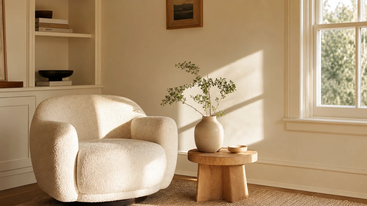
Trend #1: Luminous Warm Whites
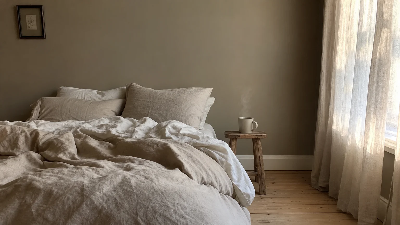
Architects and designers increasingly utilize warm whites to reflect natural light without creating the sterile, clinical atmosphere typical of hospital rooms. Pure, stark whites carry cool blue undertones that fall entirely flat in north-facing rooms or heavily shaded environments. By contrast, warm whites—infused with subtle hints of yellow, umber, or even faint peach—thrive in these darker settings by mimicking the glow of golden hour sunlight. You can leverage these hues as foundational small room paint colors, establishing a versatile canvas that amplifies your available light. Industry professionals often look for a Light Reflectance Value (LRV) between 75 and 85; this range maximizes light bounce while retaining enough pigment to register as a distinct color rather than a primer. To execute this trend effectively, embrace the technique of color drenching. You coat the walls, trim, doors, and even the ceiling in the exact same warm white shade. This continuous application eliminates visual breaks that chop up a compact space, effectively forcing the eye to glide upward and outward. When you restrict your palette to a single luminous neutral, your interior architecture feels seamless and expansive. Because the color steps back, you must introduce tactile variety through your furnishings. Layering boucle fabrics, bleached oak flooring, and matte ceramic accessories against a warm white backdrop ensures the room remains visually engaging. You transform cramped quarters into an airy, elevated sanctuary simply by shifting your foundational white a few degrees warmer.
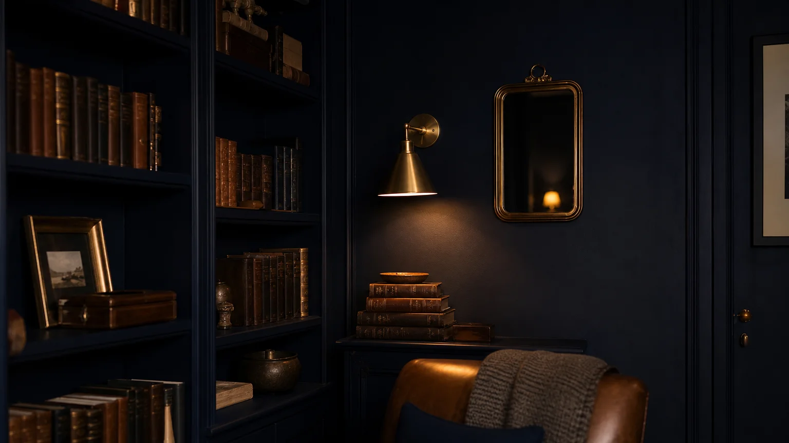
Trend #2: Enveloping Midnight Blue
Counterintuitive as it may seem, draping a tight room in deep, moody tones often produces a more profound sense of space than painting it white. Midnight blue absorbs shadows, blurring the distinct lines where your walls intersect with the ceiling. Without those harsh geometric boundaries, the room loses its defined edges and begins to feel expansive—mimicking the infinite depth of the night sky. Designers frequently deploy enveloping midnight blue in inherently dark environments, such as windowless powder rooms, narrow hallways, or secluded home libraries. Instead of fighting the lack of natural light with weak neutrals, you lean into the moodiness to create a deliberate, jewel-box aesthetic. This approach introduces instant provenance and quiet luxury into homes that might otherwise lack architectural significance. When selecting these designer-approved colors, seek out shades with deep charcoal or subtle green undertones rather than primary school blues; complexity elevates the finish. To prevent the environment from feeling cavernous, you must introduce elements that reflect light. Polished unlacquered brass hardware, heavily veined marble countertops, and strategically placed mirrors become essential components of your small home decor strategy. The high-contrast interplay between the matte, light-absorbing walls and the gleaming metallic accents provides a dynamic visual tension. You effectively manipulate perception, turning a claustrophobic footprint into a sophisticated, tailored retreat that feels completely intentional.
Trend #3: Earthy Sage Green
Integrating biophilic design principles fundamentally shifts how you experience a confined floor plan. Earthy sage green serves as the ultimate transitional hue, dissolving the physical barriers between your interior environment and the outside world. By bringing organic, nature-inspired tones indoors, you establish a psychological expansiveness that standard neutrals cannot achieve. Sage green operates at an ideal mid-tone frequency—dark enough to provide genuine character but light enough to maintain an airy atmosphere. You can utilize this versatile shade as a primary backdrop because it shifts beautifully throughout the day. Under the crisp morning sun, the paint reveals subtle, silvery gray undertones; as evening approaches and artificial lights take over, it warms into a rich, comforting olive. This chameleon-like quality makes sage green one of the most reliable interior color ideas for multifunctional areas like combined living and dining rooms or small home offices. The hue naturally reduces visual fatigue and lowers stress, transforming a tight space into a restorative haven. To maximize the impact of this color, pair it with organic textures and honest materials. Natural rattan chairs, tumbled travertine tables, and soft linen drapery harmonize effortlessly with a green palette. By keeping your material choices rooted in nature, you reinforce the restorative narrative of the paint. You create a cohesive, breathable environment that feels vastly larger than its actual square footage dictates.
Trend #4: Sun-Baked Terracotta
As interior design moves decisively away from the cool, clinical grays of the previous decade, warm, earth-pigmented hues are taking center stage. Sun-baked terracotta injects a vital dose of warmth and tactile energy into compact living spaces. While you might assume red-based tones would visually advance and make a room feel smaller, a dusty, muted terracotta actually creates a deeply enveloping and sophisticated atmosphere. The color radiates heat, counteracting the dreary chill of spaces that receive limited natural daylight. You can deploy this rich shade in a small dining room to cultivate an intimate, candlelit ambiance, or use it in an entryway to establish a welcoming, bold first impression. To execute this trend successfully, the finish matters just as much as the pigment. Standard flat latex paint can sometimes cause heavily pigmented reds to read as flat or lifeless. Instead, designers often specify lime wash or Roman clay applications for terracotta hues. These artisanal finishes introduce subtle movement and a suede-like texture to the walls, capturing ambient light in varied, dynamic ways. This textural depth distracts the eye from the limited dimensions of the room. When styling your space around sun-baked terracotta, balance the heat of the walls with cooler, grounding elements. Dark walnut woods, matte black metal accents, and lush, oversized houseplants create a beautifully balanced aesthetic. You transform an easily overlooked room into a captivating, culturally resonant environment.
Trend #5: Sophisticated Greige
The concept of a versatile neutral has evolved dramatically, culminating in the rise of sophisticated greige. A masterful blend of cool gray and warm beige, greige offers the ultimate foundational canvas for modest floor plans. Pure grays often render a small space icy and uninviting, while heavy beiges can feel dated and muddy. Greige strikes a flawless equilibrium, providing enough warmth to make the room feel hospitable while retaining a crisp, modern edge. This specific balance categorizes it as a premier space-enhancing paint, capable of reflecting ample light while maintaining deep architectural interest. Because the color is so highly adaptable, it forms an ideal backdrop for virtually any design style—from stark minimalism to layered maximalism. You can apply a soft, luminous greige in a narrow galley kitchen or a compact primary bedroom to establish a serene, cohesive flow. The hue changes subtly in response to its surroundings, pulling out the blue in adjacent artwork or highlighting the warmth in vintage rugs. For optimal results, utilize contrasting sheen levels within the same greige family. Painting your walls in a matte finish while finishing the baseboards and crown molding in a high-gloss sheen of the exact same color creates a subtle, light-catching border that outlines the room elegantly. This tone-on-tone strategy adds undeniable sophistication without cluttering the visual field, proving that restrained palettes often yield the most powerful spatial illusions.
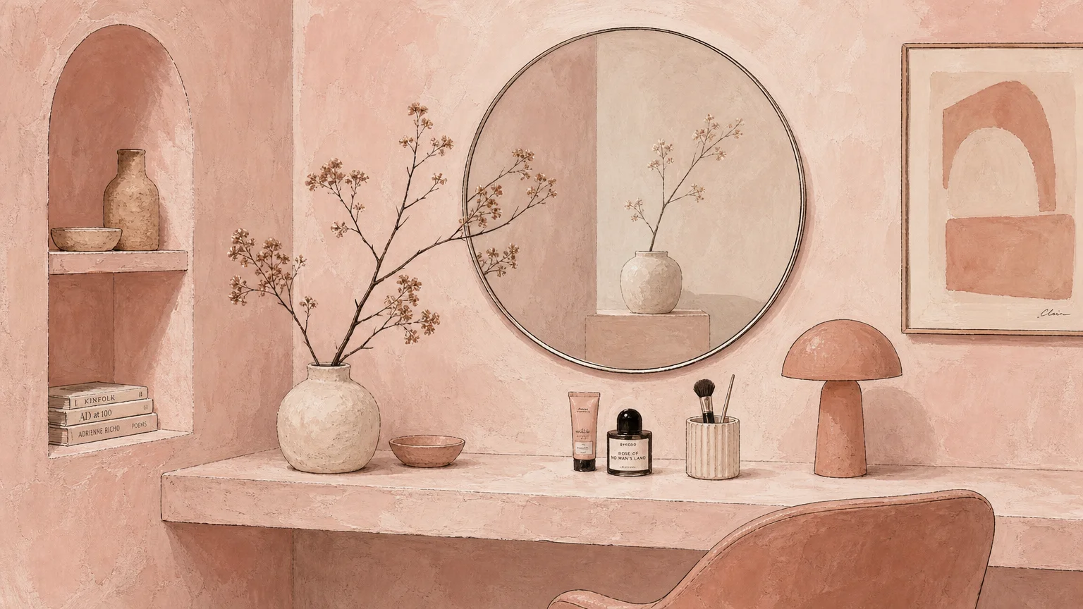
Trend #6: Plaster Pink and Muted Blush
Far removed from the youthful brightness of traditional bubblegum shades, plaster pink has matured into a deeply sophisticated, architectural neutral. Muted blush tones—often featuring dusty brown or subtle gray undertones—mimic the exceptionally flattering glow of sunset or soft candlelight. When you envelop a small space in these warm, flesh-toned hues, you immediately soften the harsh angles and tight corners of the architecture. Plaster pink reflects warmth onto the skin and the surrounding decor, generating an atmosphere of intimate luxury rather than confinement. Designers frequently utilize these tones in small bedrooms, dressing rooms, and even windowless bathrooms to establish a serene, boutique-hotel aesthetic. The inherent softness of the color reduces visual friction, allowing the eye to sweep across the room without interruption. To prevent the space from leaning overly sweet or heavily gendered, you must ground the palette with strong, contrasting elements. Deep burgundy accents, robust olive green upholstery, or heavily veined dark marble surfaces provide necessary visual weight and sophistication. The juxtaposition between the delicate plaster pink walls and these heavier materials creates a deeply compelling interior dynamic. By treating muted blush as a foundational neutral rather than an accent color, you introduce a layer of unexpected elegance. You elevate the small footprint, proving that limited square footage provides the perfect opportunity for daring, highly customized color stories.
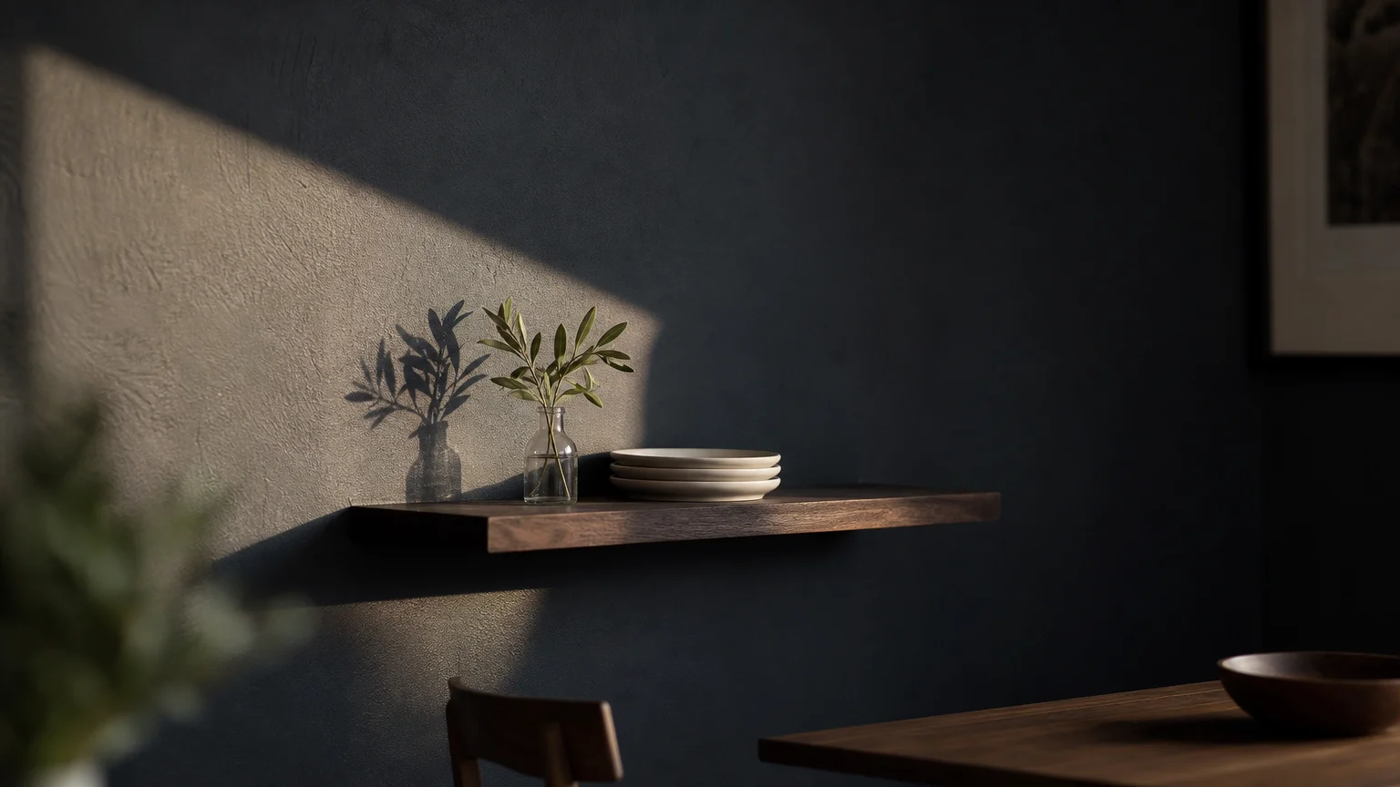
Trend #7: Dramatic Charcoal Black
Embracing true dark tones requires confidence, but the spatial rewards for compact environments are immense. While stark jet black can occasionally feel overly severe, dramatic charcoal black offers a nuanced, deeply layered alternative. Charcoal retains a subtle softness, often carrying faint undertones of blue, green, or brown that reveal themselves uniquely under different lighting conditions. This color operates as the ultimate boundary eraser; when applied to the walls of a small room, the dark pigment absorbs shadows and causes the physical parameters of the space to recede infinitely. You can harness this effect to completely transform a cramped media room, a tiny home office, or even a tight hallway. A dramatic charcoal palette serves as a highly effective gallery backdrop, making artwork, brass light fixtures, and architectural details pop with museum-like intensity. Furthermore, applying this dark hue to a low ceiling can perform a surprising visual trick: much like the night sky, a dark ceiling feels limitless, effectively tricking the brain into perceiving more vertical height. To ensure the space feels intentionally designed rather than accidental, your lighting scheme must be impeccable. You must layer multiple light sources—combining ambient overhead lighting with focused task lamps and atmospheric wall sconces. By pooling warm light against the moody charcoal walls, you create a dynamic, theatrical environment that maximizes style while completely defying its modest dimensions.
The Big Picture: Weaving These Trends into Your Home
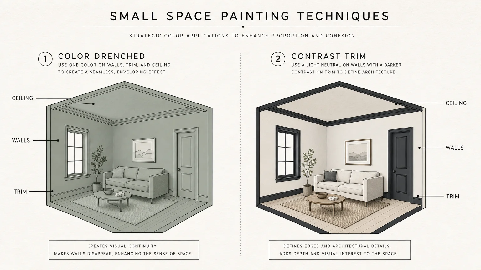
Identifying the perfect color represents only the first phase of your interior transformation; executing the application with precision determines your ultimate success. To truly leverage these small room paint colors, you must view your home as a holistic, interconnected environment rather than a series of isolated boxes. When navigating a compact floor plan, visual continuity becomes your greatest asset. You can establish this flow by carrying a single foundational color through your hallways and main living areas, reserving the more dramatic, saturated trends for enclosed spaces like bedrooms, bathrooms, or studies. This deliberate pacing creates a journey of contraction and expansion as you move through the home, making the overall footprint feel significantly larger and highly customized.
Beyond the pigment itself, the technical specifications of your paint play a critical role in spatial manipulation. You must carefully consider paint sheen and finish. Matte or flat finishes absorb light and brilliantly camouflage drywall imperfections, offering a velvet-like texture that elevates dark, moody colors. Conversely, eggshell or satin finishes reflect ambient light, making them indispensable for bouncing sunlight around a tight, warm-white living room. Your artificial lighting scheme also radically alters how these designer-approved colors perform. You should swap out harsh, cool daylight bulbs for warm-toned LEDs—typically around 2700K to 3000K—to accurately render the depth and warmth of your chosen palette.
Before committing to a full-room application, thoroughly test your selections. Paint large swatches on multiple walls and observe how the undertones shift from the crisp light of morning to the artificial glow of evening. Ultimately, your choice of space-enhancing paint must reflect your authentic lifestyle. While tracking trends provides excellent inspiration, you should curate your small home decor based on the hues that resonate with your personal aesthetic, ensuring your compact spaces remain as enduringly beautiful as they are functional.
For the latest color forecasts, consult industry leaders like Pantone and paint companies like Benjamin Moore. For professional design standards, refer to the American Society of Interior Designers (ASID).
Frequently Asked Questions
Can I use multiple dark colors in a single small space?
While you can introduce multiple dark hues, doing so in a tight floor plan often creates visual clutter that shrinks the room. Instead of mixing various dark pigments, professionals recommend selecting one primary dark color and utilizing it across multiple surfaces—a technique known as color drenching. If you paint your walls, trim, and doors in a unified charcoal or midnight blue, you eliminate the high-contrast lines that draw attention to the limited dimensions. You can then introduce secondary colors through your textiles, artwork, and lighting fixtures, keeping the architectural envelope seamless and expansive.
Which paint finish works best for expanding the look of a compact room?
The optimal finish depends entirely on the specific color you choose and the condition of your walls. For luminous warm whites and soft greiges, an eggshell or satin finish on the walls paired with semi-gloss trim maximizes light reflection, helping the room feel airy. However, when you utilize dark, dramatic tones like navy or terracotta, a matte or flat finish is generally preferred. Matte finishes absorb light, softening the harsh edges of the room and giving deep colors a sophisticated, velvety depth. Always ensure your walls are smooth before applying higher sheen paints, as they will highlight every structural imperfection.
How does natural lighting affect designer-approved colors in small rooms?
Natural light dictates how a paint color ultimately behaves within your home. North-facing rooms receive cool, bluish light that can make stark whites and cool grays feel clinical and depressing; these spaces require warm undertones like terracotta or warm white to counterbalance the chill. Conversely, south-facing rooms are flooded with warm, golden light throughout the day, allowing you to successfully deploy cooler tones like sage green or sophisticated greige without the space feeling icy. You must always test your chosen interior color ideas on multiple walls, monitoring how the shifting daylight interacts with the pigment’s underlying notes before making a final commitment.
Disclaimer: This article reflects design trend analysis and predictions. Personal taste and timeless design principles should always guide your decorating choices.