
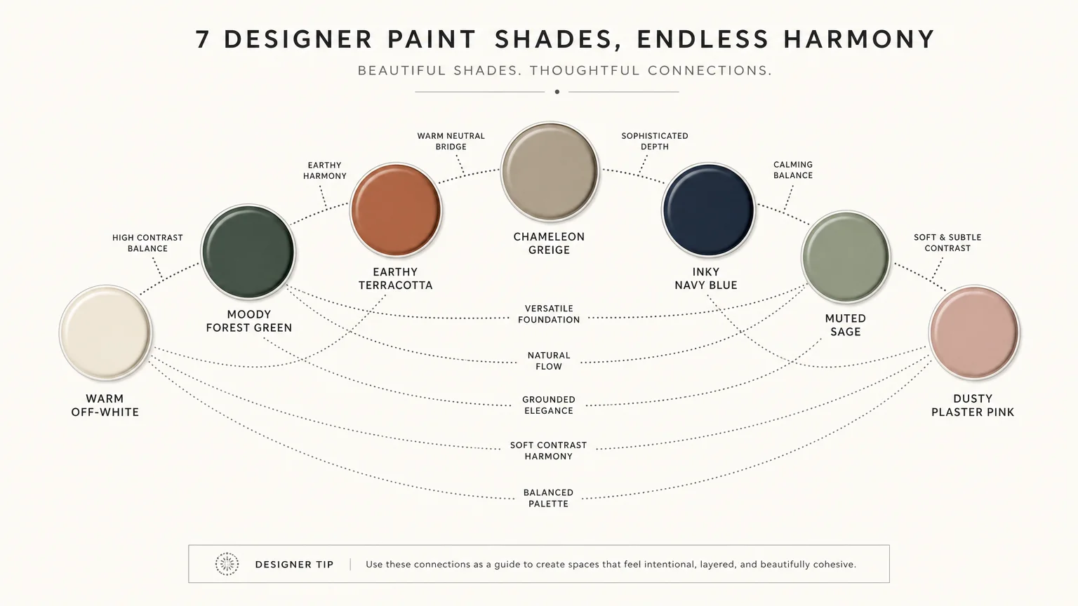
Discovering the exact paint shades that elevate a room from ordinary to architecturally profound saves you countless hours of agonizing over color swatches. Top designers rely on a closely guarded arsenal of specific, transformative colors that consistently deliver flawless results across varying lighting conditions. These proven formulations bridge the gap between fleeting fads and enduring elegance; they possess complex undertones shifting beautifully from morning sun to evening shadows. By adopting these exact hues, you harness the power of quiet luxury and give your walls a sophisticated provenance. Whether you want to saturate a dining room in moody drama or envelop a living space in organic warmth, these seven indispensable paints guarantee a masterful finish.
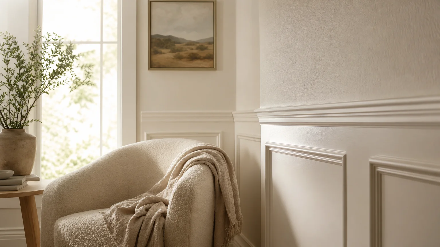
Trend #1: Warm, Complex Off-White
When creating a foundation for a room, stark gallery whites often feel clinical and abrasive in a typical residential setting. Instead, you need a complex off-white that offers high light reflectance without sacrificing an inviting sense of warmth. Designers repeatedly reach for creamy alabasters and soft doves to execute the principles of quiet luxury—an interior design philosophy prioritizing subtle, exceptional quality over loud, flashy statements. By applying a warm off-white to your walls, you establish a luminous envelope that flatters architectural details like crown molding, tall baseboards, and intricate wainscoting.
The secret behind these beloved shades lies entirely in their underlying pigmentation. A precise touch of yellow or warm gray prevents the color from turning sterile on cloudy afternoons or under cool LED lighting. Understanding Light Reflectance Value (LRV) remains crucial when selecting these neutral paints. LRV measures the percentage of light a paint color reflects on a scale of zero to one hundred. A shade hovering around an LRV of 85 provides the perfect balance; it bounces enough natural sunlight around the room to feel airy but retains enough pigment to contrast beautifully with bright, untinted white ceilings.
You can deploy this versatile shade across open-concept living rooms, kitchen cabinetry, and primary bedroom walls. It acts as the ultimate palate cleanser, allowing your highly textured fabrics, antique wooden furniture, and bold art pieces to take center stage without competing against the wall color. When you paint both the walls and the trim in the exact same warm white—varying only the finish from a velvety flat on the walls to a durable satin on the trim—you create a seamless, expansive environment that visually raises the ceiling height and bathes your home in a sophisticated glow.
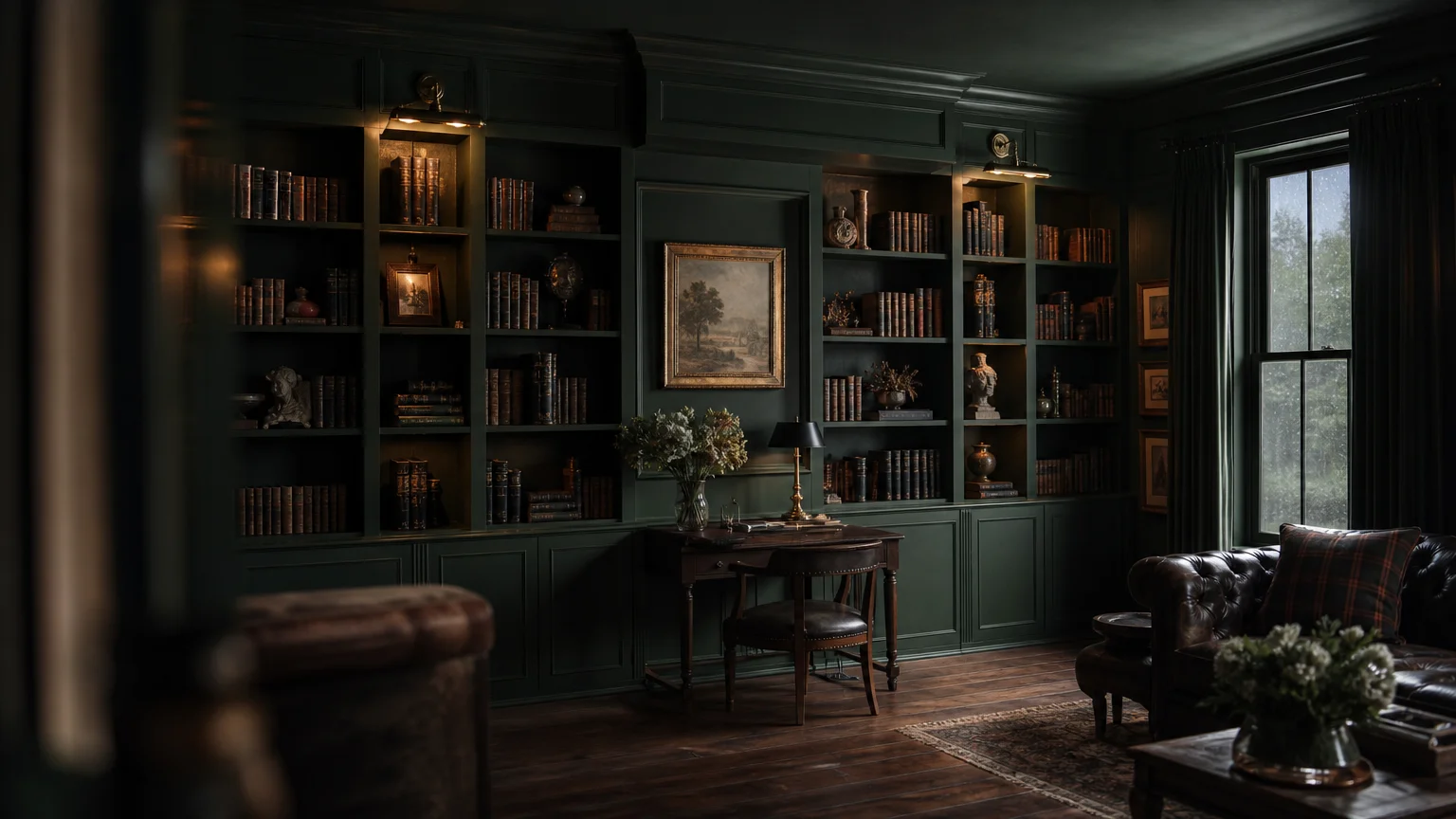
Trend #2: Moody Forest Green
Biophilic design is the practice of integrating natural elements into the built environment to improve mental well-being and cognitive function, and deep, moody forest greens act as the cornerstone of this prevailing philosophy. Top-tier designers use highly saturated botanical shades to bring the grounding majesty of the outdoors inside. Unlike vibrant jewel-tone emeralds, these complex dark greens carry heavy black, charcoal, or brown undertones, allowing them to function brilliantly as a dark neutral rather than an overwhelming primary color.
You can wrap an entire home library, a powder room, or a formal dining space in a dark green to create an intimate, jewel-box effect. Dark paint plays a fascinating trick on the human eye; it effectively blurs the hard edges and corners of a room. When you cannot clearly delineate where the walls meet the ceiling, the space paradoxically feels larger and infinitely deeper. Ground this rich wall color with highly tactile, natural materials. Pair a forest green space with unlacquered brass hardware, heavily veined marble countertops, and raw walnut flooring. The warm metallic accents gleam brilliantly against the dark, moody backdrop, perfectly mimicking sunlight piercing through a dense tree canopy.
Consider the psychological impact of your color choices: deep green naturally lowers the heart rate and reduces visual fatigue, making it an exceptional, data-backed choice for home offices where you spend countless hours staring at glowing screens. By saturating the walls, doors, and trim in the exact same moody green, you employ a highly effective technique known as color drenching. This method eliminates visual fragmentation, yielding a curated, custom look that elevates standard drywall into something texturally and architecturally profound.
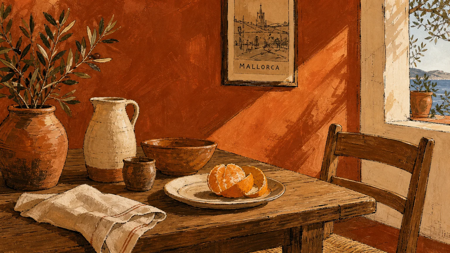
Trend #3: Earthy Terracotta
Modern design continuously shifts away from the stark, ultra-minimalist gray palettes of the previous decade and boldly embraces rich, sun-baked earth tones. Earthy terracotta brings an undeniable sense of provenance to your home. In interior design, provenance refers to the origin and historical authenticity of materials, meaning these specific colors feel deeply rooted in ancient civilization, Mediterranean landscapes, and traditional craftsmanship. A perfectly balanced terracotta strikes a delicate harmony between burnt orange, muted red, and soft brown.
Designers utilize terracotta to inject immediate warmth and character into sterile, boxy rooms that lack inherent architectural charm. Because terracotta absorbs light rather than reflecting it aggressively, it creates a cozy, enveloping atmosphere that feels especially welcoming during the evening hours. You can maximize the impact of this color by applying it via a specialty finish, such as a Roman clay or a traditional lime wash. These application techniques yield a mottled, suede-like texture that introduces physical depth and movement to your walls, transforming a flat surface into a piece of artisanal art.
When incorporating this earthy shade into your decorating scheme, you must balance its visual weight with organic, lighter elements. Terracotta pairs flawlessly with creamy bouclé upholstery, light French oak flooring, and woven rattan light fixtures. It also serves as an extraordinary backdrop for indoor foliage; the vibrant green of a large olive tree or a cascading pothos pops dramatically against the rusty, clay-colored walls. If painting an entire room feels too intimidating, consider brushing a muted terracotta onto the ceiling of a neutral dining room to draw the eye upward and create an intimate, canopy-like dining experience.
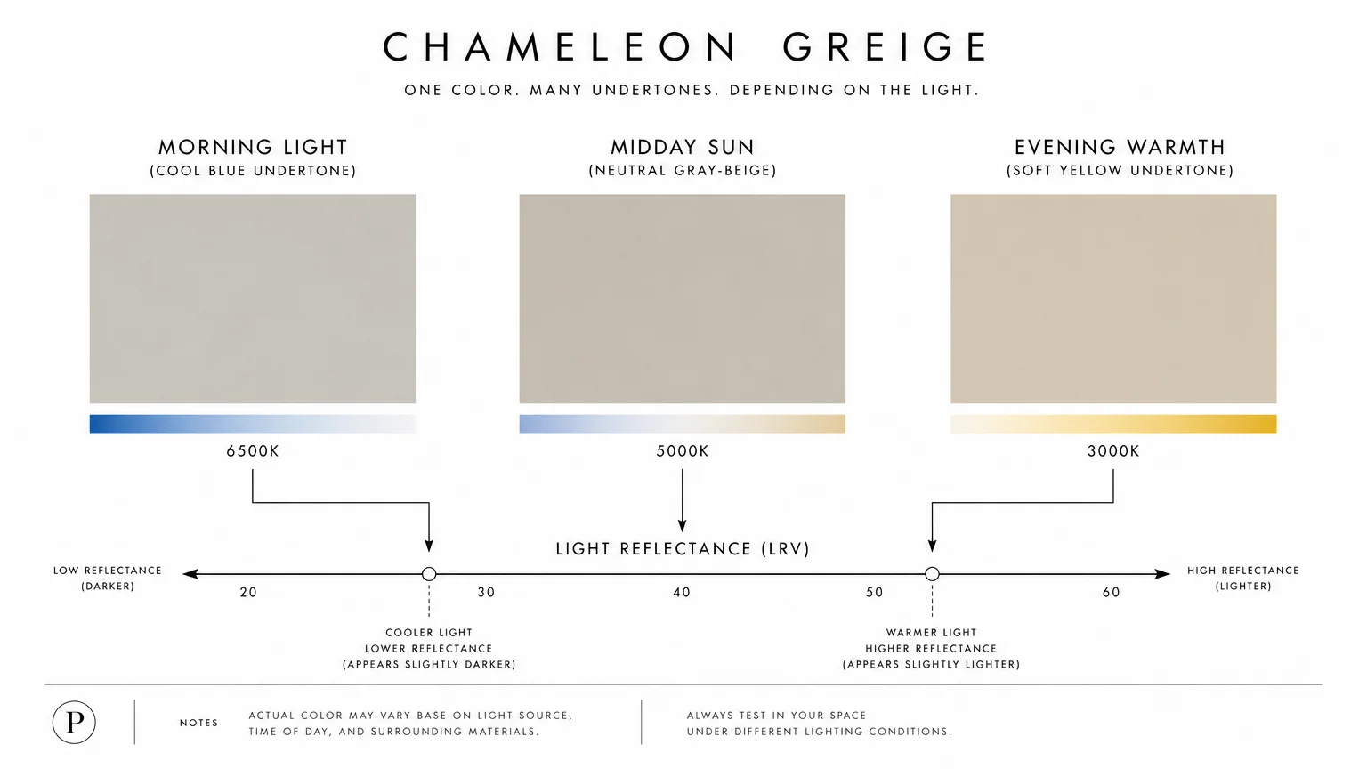
Trend #4: The Chameleon Greige
As homeowners transition away from the icy, cool-toned grays that dominated the early 2010s, they seek a transitional neutral that feels fresh yet familiar. Enter the perfect greige—a masterful, scientifically balanced blend of warm beige and soft gray. Designers return to this chameleon-like shade time and time again because it effortlessly adapts to changing lighting conditions and seamlessly bridges the gap between disparate design styles.
The true brilliance of a high-quality greige lies in its complex matrix of undertones. In a room flooded with crisp, cool morning light from east-facing windows, the color leans slightly gray, maintaining a clean and contemporary appearance. As the day progresses and warm, golden-hour sunlight pours through west-facing windows, the beige undertones activate, saturating the room in a rich, inviting warmth. This unique adaptability makes greige the ultimate problem-solving paint for sprawling, open-concept floor plans where natural lighting shifts dramatically from the kitchen to the living room.
You can lean heavily on this designer favorite when preparing a home for the real estate market or when you want to establish a timeless backdrop that outlasts fleeting micro-trends. To prevent a greige room from feeling muddy or flat, you must introduce strategic, high-contrast elements. Pair your greige walls with crisp, pure white window casings and baseboards to emphasize the warmth of the wall color. Next, introduce matte black hardware, structural iron light fixtures, and richly stained wood furniture. This layering of light, medium, and dark tones guarantees a dynamic, professionally styled aesthetic that feels both effortless and deeply intentional.
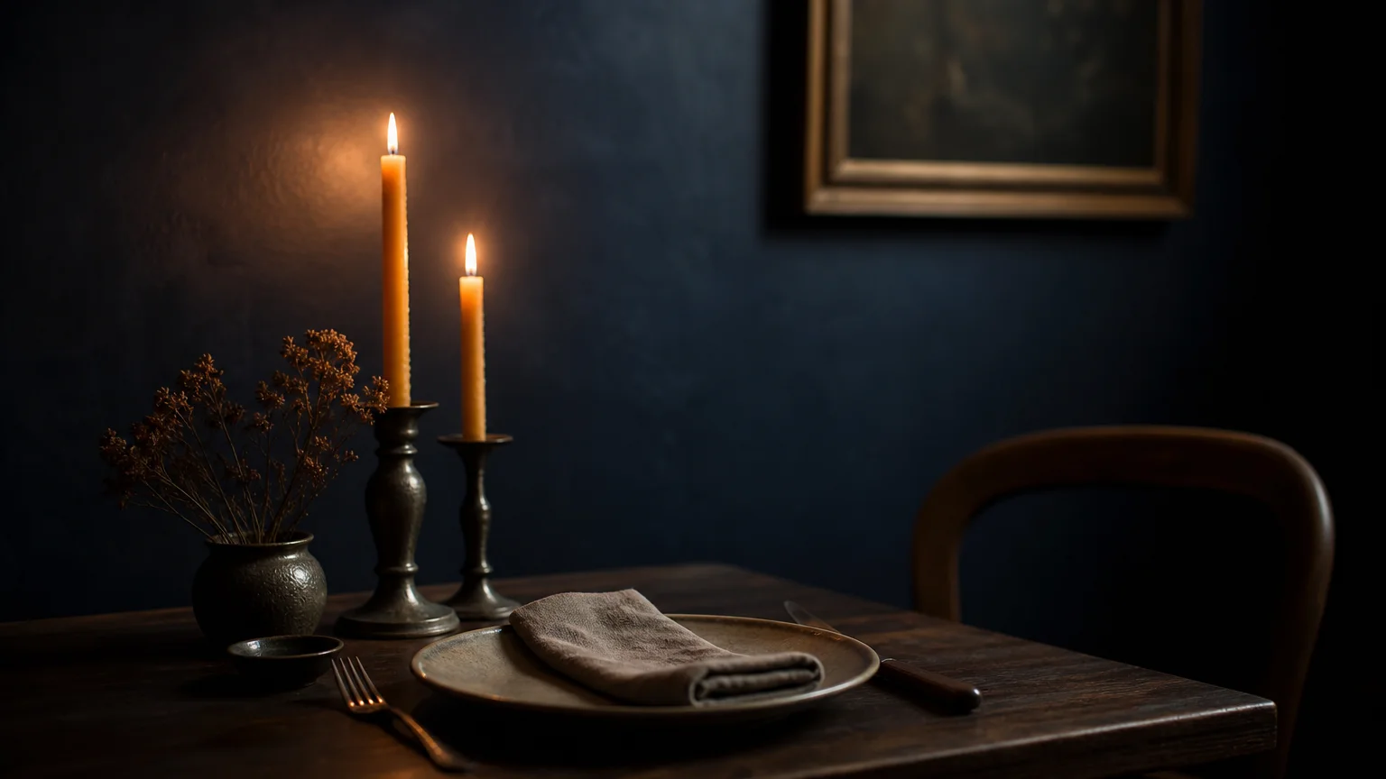
While design trends constantly ebb and flow, deeply saturated, inky navy blue remains a permanent fixture in the sophisticated designer’s toolkit. Unlike brighter, nautical blues that can feel juvenile or overly thematic, a true designer navy borders on charcoal or soft black. This heavy dose of gray and black pigmentation grounds the color, stripping away any garishness and leaving behind a dignified, historically rich hue that commands immediate respect.
Designers leverage inky navy to create a sense of dramatic tension and high contrast within a home. It serves as an incredibly elegant alternative to stark black, offering the same visual weight and anchoring effect but with a softer, more forgiving edge. You will frequently see top decorators applying this shade to substantial architectural elements: massive kitchen islands, floor-to-ceiling library built-ins, and expansive butler’s pantries. By grounding these large structures in a dark, recessive color, the surrounding space opens up and breathes more easily.
Navy blue also provides an unrivaled canvas for showcasing reflective surfaces and luxury finishes. Warm metallic tones—specifically brushed brass, antique gold, and polished copper—vibrate with intensity when set against an inky blue backdrop. If you want to create a truly spectacular dining room, consider painting the walls and trim a matte navy blue, then finishing the ceiling in a high-gloss lacquer of the exact same shade. The glossy ceiling will catch and reflect the warm glow of a centralized crystal chandelier, producing an atmospheric, glamorous environment that rivals the ambiance of a five-star boutique hotel.
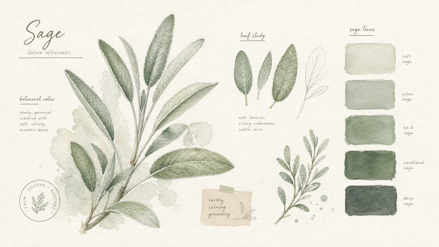
Trend #6: Soft Muted Sage
As the cultural emphasis on holistic wellness heavily influences modern interior design, homeowners increasingly demand living spaces that function as restorative sanctuaries. Soft, muted sage green directly answers this call. Hovering delicately between a silvery gray and a pale botanical green, this highly sophisticated shade actively lowers stress levels and promotes a profound sense of tranquility. It acts as a visual deep breath.
The beauty of a muted sage rests in its restraint; it offers just enough color to register as a distinct design choice without ever demanding your full attention. Because of its inherent soothing properties, designers frequently specify this color for primary bathrooms, guest bedrooms, and dedicated meditation or reading rooms. When natural light strikes a sage wall, it highlights the silvery-gray undertones, making the room feel crisp, clean, and restorative. At night, under warm artificial lighting, the green steps forward, creating a cocoon-like environment.
To maximize the spa-like qualities of this paint shade, you should pair it with a very specific, nature-inspired material palette. Light, whitewashed woods, honed Carrara marble, and polished nickel plumbing fixtures create a classic, timeless synergy with sage green. You can also layer in natural textiles like tumbled linen bedding, chunky wool throws, and woven jute rugs to enhance the room’s organic appeal. By treating sage green as a baseline neutral rather than an accent color, you effortlessly achieve an elegant, laid-back aesthetic that prioritizes your daily comfort and mental well-being.
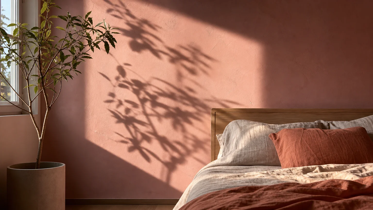
Trend #7: Dusty Plaster Pink
Historically relegated to nurseries and overtly feminine spaces, pink has experienced a massive, sophisticated renaissance. Designers now embrace dusty, plaster-toned pinks as incredibly versatile, complex neutrals. A mature plaster pink strips away the saccharine, bubblegum sweetness by incorporating heavy doses of brown, gray, and yellow undertones. The resulting color mimics the raw, unpainted plaster found in historic European villas, bringing an air of romantic antiquity to modern drywall.
One of the most compelling, practical reasons designers consistently use dusty pink is the remarkably flattering quality of the light it reflects. When you paint a room in this warm, fleshy tone, the ambient light bouncing off the walls casts a beautiful, healthy glow onto the skin of everyone inside. This cosmetic benefit makes plaster pink an unparalleled choice for formal dining rooms, intimate sitting areas, and elegant powder baths where you want your guests to feel and look their absolute best.
Dusty pink also provides a brilliant, unexpected counterpoint to cold, hard contemporary design elements. If your home features polished concrete floors, rigid angular furniture, and minimalist steel windows, applying a plaster pink to the walls instantly softens the harsh industrial edges. Pair this warm hue with luxurious, heavy textures like deep burgundy velvet drapery, chocolate brown leather armchairs, and dark walnut case goods. The tension between the soft, romantic walls and the heavy, masculine furniture creates a highly sophisticated, deeply layered space that challenges conventional color rules.
The Big Picture: Weaving These Trends into Your Home
While understanding these seven designer-approved paint shades gives you a distinct advantage, the true art of interior design lies in how you weave them together to form a cohesive, whole-house narrative. You should never view a room in total isolation; the color of your dining room must converse politely with the color of your adjacent hallway. To establish a harmonious flow, you can rely on the proven 60-30-10 rule. Dedicate 60 percent of your home’s square footage to a unifying foundation—such as a complex off-white or a versatile greige. Allocate 30 percent to secondary colors, utilizing shades like soft sage or plaster pink in bedrooms and bathrooms. Finally, reserve the remaining 10 percent for high-impact, dramatic moments, deploying inky navy or moody forest green in contained spaces like powder rooms, libraries, or on specific architectural focal points.
Before you commit to purchasing gallons of paint, you must rigorously test your selected shades in your actual environment. Paint large, two-foot by two-foot sample boards and move them around the room throughout the day. You will witness firsthand how a color that looks perfectly neutral at noon suddenly shifts green or purple under your evening lamps. Furthermore, you must evaluate these color swatches directly against your immovable, permanent finishes. A paint shade only works if it flatters your existing hardwood floors, stone countertops, and major upholstery pieces. By taking the time to observe these interactions, you ensure your final decision feels intentional, enduring, and deeply personal.
Frequently Asked Questions
How do I successfully mix warm and cool paint shades in the same house?
You can seamlessly mix warm and cool tones by ensuring they share a similar level of saturation and muddiness. If you pair a dusty, muted warm terracotta with a vibrant, primary cool blue, the jarring contrast feels chaotic. Instead, pair that dusty terracotta with an equally muted, gray-leaning cool navy. You must also distribute the temperatures strategically; use warm tones in north-facing rooms to counteract the cool, bluish natural light, and deploy cool tones in south-facing rooms to balance the intense, warm sunshine.
Do dark paint colors actually make a room look smaller?
Contrary to popular belief, dark paint colors do not inherently shrink a room. In fact, dark colors are highly recessive, meaning they visually pull away from the viewer. When you paint a small room—like a powder bath or a narrow hallway—in a dark, moody shade, the sharp corners and boundaries of the room fade into the shadows. This optical illusion makes the walls feel expansive and infinite, effectively making the tight space feel much grander and far more intimate.
What is the best paint finish for high-traffic areas?
For hallways, mudrooms, and family living spaces, an eggshell or satin finish provides the optimal balance of aesthetics and durability. Flat or matte paints absorb light beautifully and hide drywall imperfections, but they scuff easily and resist wiping. A high-quality eggshell finish offers a very subtle, elegant sheen while providing a protective surface that you can easily clean with a damp cloth, ensuring your designer shades look pristine for years to come.
Will these designer paint colors look dated in a few years?
The seven shades detailed above transcend fleeting, seasonal fads because they possess complex, heavily neutralized undertones rather than bright, synthetic pigments. Paint colors that rapidly fall out of style usually lack gray or brown grounding elements. Because these specific designer favorites draw direct inspiration from nature and historical architecture, they offer a timeless provenance that guarantees exceptional longevity in your home.
For the latest color forecasts, consult industry leaders like Pantone and paint companies like Benjamin Moore. For professional design standards, refer to the American Society of Interior Designers (ASID).
Disclaimer: This article reflects design trend analysis and predictions. Personal taste and timeless design principles should always guide your decorating choices.