
Crisp white trim acts as the ultimate architectural highlighter, offering a sharp boundary that instantly elevates the visual impact of your spaces. Selecting the right complementary paint shades determines whether a room feels disjointed or serves as a masterful display of interior design ideas. Pairing brilliant white moldings with intentional wall hues anchors your space, creating a cohesive framework for your entire aesthetic. Navigating available white trim paint colors and home color combinations requires a precise understanding of undertones and light reflectivity. Discover the exact paint hues that maximize the sophisticated contrast of white woodwork while infusing your home with enduring, high-end style.
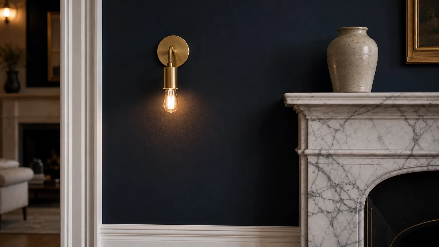
Embracing the principles of quiet luxury requires materials and hues that speak softly but resonate deeply. Dusty navy blue serves as the ultimate backdrop for this aesthetic, offering a masterclass in understated elegance. Unlike vivid primary blues that can quickly overwhelm the senses and dictate a room’s entire personality, a muted navy carries subtle gray undertones; these nuances anchor a living space with sophisticated gravitas. When you frame dusty navy walls with crisp white trim, you create a tailored, tuxedo-like effect that demands attention without appearing ostentatious.
The brilliant white architectural details cut through the dark wall color, providing necessary visual relief and sharply highlighting the room’s structural geometry. To maximize this impact, specify a dead-flat or matte finish for your navy walls. The lack of light reflection absorbs shadows and creates a velvety, immersive texture. Contrast this directly with a semi-gloss finish on your white baseboards and crown molding. The light bouncing off the glossy trim emphasizes the depth of the matte navy, delivering a layered, tactile experience. Industry data reveals a significant market shift toward these anchoring dark tones in primary living spaces, proving that moody colors provide unparalleled versatility. You can style a navy and white room with unlacquered brass fixtures and deeply veined marble to achieve a timeless, high-end environment that completely redefines traditional elegance.

Trend #2: Earthy Sage Green and Biophilic Design
Biophilic design prioritizes our inherent human connection to the natural world, transforming sterile houses into restorative, health-conscious sanctuaries. Earthy sage green perfectly captures this organic movement, bringing the tranquility of a lush forest canopy straight into your living room or bedroom. The true magic of sage green lies in its chameleon-like adaptability; its delicate balance of yellow and gray undertones shifts dynamically as natural daylight moves across your room from morning to dusk.
Framing sage green walls with stark white trim prevents the earthy color from skewing muddy or heavy. The bright white casings and baseboards mimic the dappled sunlight breaking through a treeline, keeping the overall atmosphere exceptionally fresh and invigorating. Concrete examples of this trend dominate recent international design exhibitions, where leading architects pair sage green plaster with light, bleached oak flooring to maximize environmental harmony. You can implement this aesthetic by layering organic textures—think raw Belgian linen drapery, honed travertine coffee tables, and woven rattan light fixtures. The stark white trim acts as the structural constant that binds these diverse natural elements together seamlessly. This deliberate contrast ensures your biophilic retreat remains polished and intentional rather than overwhelmingly rustic.
Trend #3: Warm Terracotta and Artisanal Provenance
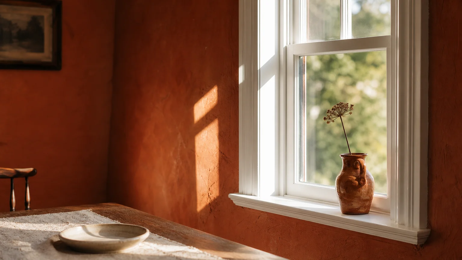
Modern interior design increasingly celebrates provenance—the origin, history, and authentic craftsmanship behind the materials we bring into our homes. Warm terracotta paint embodies this cultural shift toward artisanal authenticity, evoking powerful images of sun-baked Mediterranean clay and historic European ceramics. While terracotta infuses a dining room or private study with unparalleled warmth and intimacy, the bold, enveloping hue risks visually enclosing a space if executed without proper architectural boundaries.
Crisp white trim provides this necessary architectural relief. It acts as a clean, modern framework that stops the intense color from overwhelming the eye. This stark contrast actively modernizes the rustic shade, brilliantly bridging the gap between old-world charm and contemporary elegance. To execute this look flawlessly, opt for terracotta shades with dusty, muted brown undertones rather than vivid, aggressive oranges. Balance the grounded, heavy energy of the terracotta walls by pairing your high-contrast white trim with matching brilliant white ceilings; this technique visually raises the height of the room and reflects ambient light downward. Introduce sculptural brass wall sconces and deeply saturated vintage wool rugs to highlight the rich, baked tones of the walls, resulting in a vibrant yet deeply comforting environment.
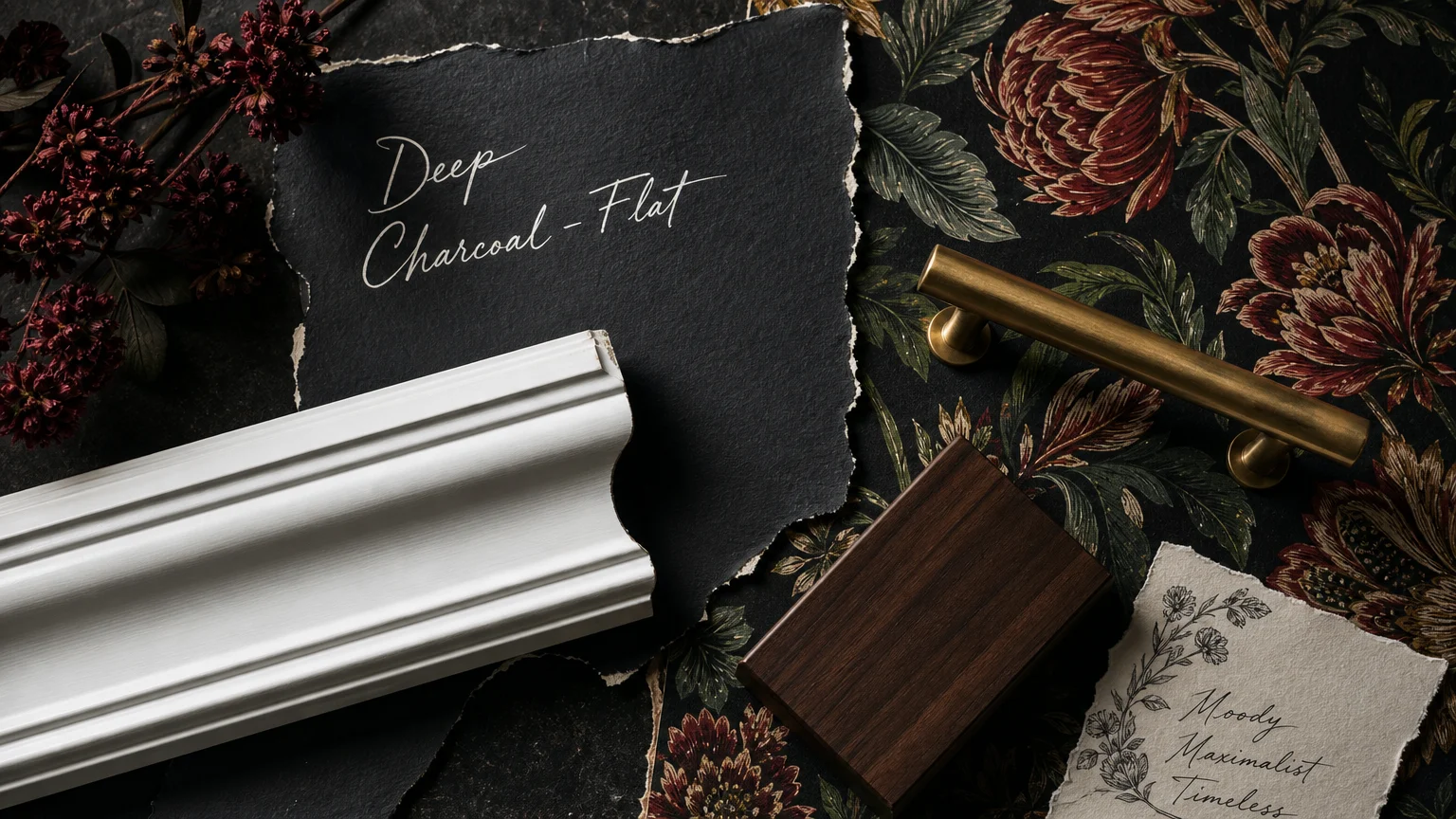
Trend #4: Deep Charcoal and Moody Maximalism
Moody maximalism fiercely rejects the sterile, all-white rooms of the previous decade in favor of drama, enveloping depth, and unabashed character. Deep charcoal stands at the absolute forefront of this design rebellion, offering a softer, more highly nuanced alternative to flat pitch black. Charcoal naturally absorbs light, blurring the physical boundaries of a room and creating a surprising sense of infinite space—a counterintuitive but highly effective visual strategy for compact home libraries, intimate dining spaces, or small powder rooms.
When strategically paired with bright white trim, charcoal walls deliver an undeniably striking visual punch. The white baseboards, picture rails, and window casings act as a glowing perimeter, defining the room’s geometry against the shadowy, atmospheric walls. Understanding Light Reflectance Value (LRV) helps explain the power of this dynamic; deep charcoal typically features an LRV strictly below 15, while a true white trim pushes an LRV of 85 or higher. This extreme mathematical juxtaposition commands immediate attention. Style your charcoal and white spaces with jewel-toned velvet upholstery, oversized abstract artwork, and polished chrome accents. The brilliant white trim ensures the room continually retains a crisp, tailored edge, entirely preventing the moody atmosphere from crossing the line into a gloomy or cavernous space.
Trend #5: Soft Greige and Warm Minimalism
The lengthy era of cool, sterile gray has officially concluded, generously making way for the inviting, human-centric embrace of warm minimalism. Soft greige—a masterful, balanced blend of gray and beige—dominates this new design philosophy. It offers a highly versatile neutral foundation that feels entirely modern yet universally comfortable. Finding the perfect greige requires careful consideration of underlying pigments; you want a sophisticated shade that leans toward a dusty taupe without ever reading as a dated, yellow-heavy tan.
Pure white trim plays a critically crucial role in modernizing greige walls. The stark white sharply delineates your home’s architecture, providing a crisp, clean frame that highlights the complex, shifting warmth of the wall color. Without the defining presence of white trim, greige risks visually washing out a room or creating a monolithic, uninspired aesthetic box. Implement this highly effective color combination in open-concept living spaces to establish a seamless, calming flow from the kitchen directly into the family room. You can further enhance the warm minimalist vibe by incorporating bouclé accent chairs, matte black architectural hardware for a touch of grounding contrast, and minimal linen window treatments that allow maximum natural sunlight to illuminate the subtle nuances of the greige paint.
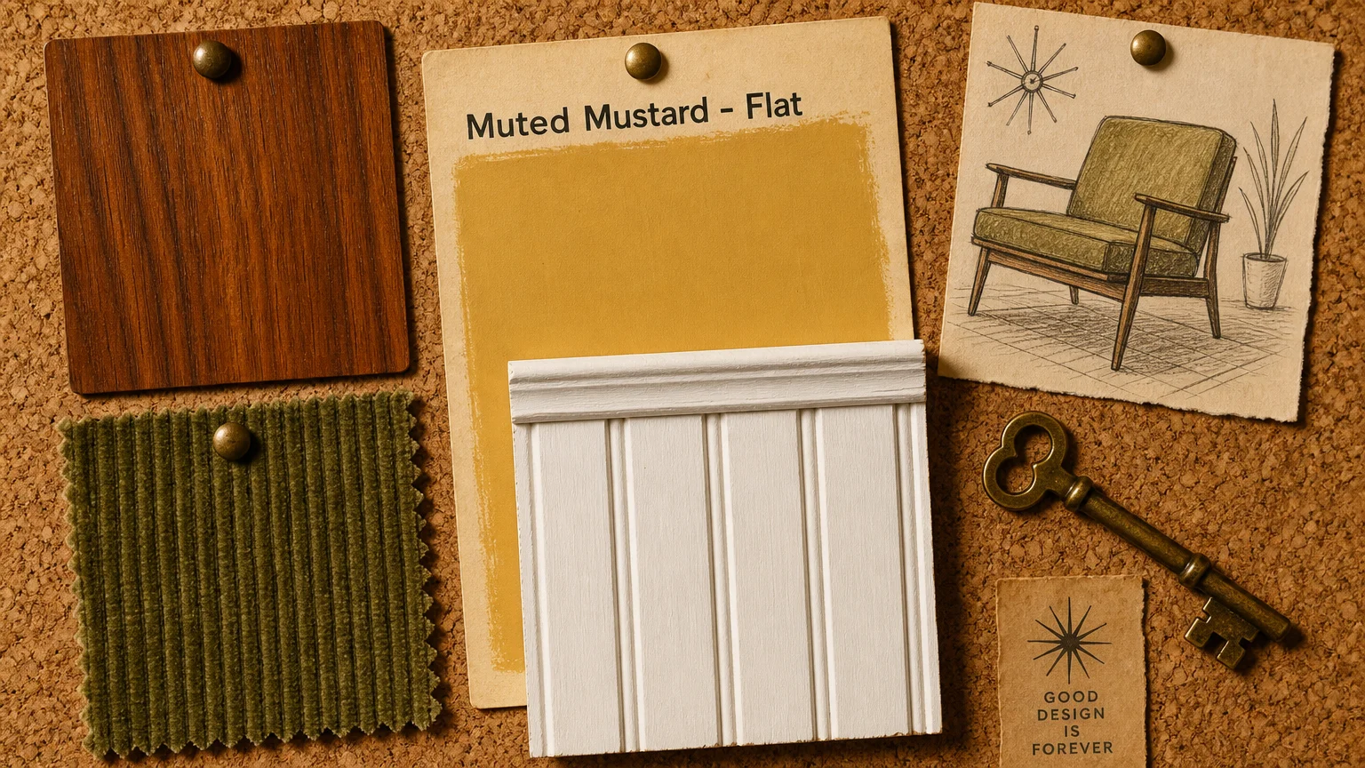
Trend #6: Muted Mustard Yellow and Nostalgic Revival
Nostalgic design elements are rapidly infiltrating modern homes, heavily influenced by the earthy, fiercely optimistic palettes of the 1970s. Muted mustard yellow captures this ongoing retro revival perfectly, deliberately injecting spaces with a joyful, golden-hour glow regardless of the actual time of day. However, successfully decorating with yellow requires strategic restraint to entirely avoid creating an environment that feels juvenile or overwhelmingly stimulating.
Crisp white trim serves as the ultimate neutralizing agent in this colorful scenario. Substantial white crown molding and thick, historic baseboards cut sharply through the vibrancy of the mustard, establishing a mature, highly sophisticated framework. Apply muted mustard predominantly in north-facing rooms that naturally receive cooler, blue-tinted sunlight; the yellow paint artificially warms the space and effectively counteracts the climatic chill. Treat your mustard yellow walls as a rich, textural backdrop for authentic mid-century modern furniture, dark walnut wood tones, and lush, trailing indoor greenery. The sharp white architectural details keep the overall aesthetic firmly rooted in the present day, clearly proving that vintage-inspired wall colors look incredibly chic and decidedly contemporary when appropriately framed by modern boundaries.
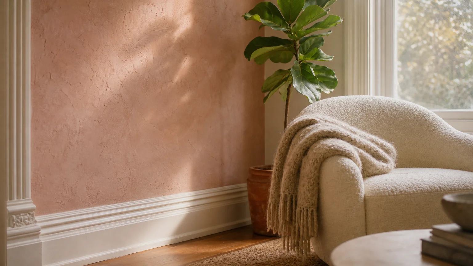
Trend #7: Plaster Pink and Tactile Elegance
Pink has officially shed its purely adolescent reputation, rapidly maturing into a highly sophisticated neutral currently favored by top-tier architectural designers. Plaster pink—a dusty, thoroughly muted shade that accurately mimics the raw, unrefined beauty of setting plaster or unglazed clay—brings an undeniable tactile elegance to primary bedrooms, luxurious en-suite bathrooms, and formal living areas. This specific hue universally flatters almost every skin tone, naturally creating a warm, ambient reflection that makes occupants look and feel their absolute best.
When you pair plaster pink with bright white trim, the resulting aesthetic feels distinctly fresh, romantic, and unapologetically high-end. The white casings cleanly highlight the subtle gray and soft peach undertones baked directly into the pink paint, effectively preventing the color from reading as overly sweet or saccharine. Elevate this powerful combination by focusing heavily on wall texture; utilize a specialized limewash or Roman clay finish for the pink walls to add subtle movement, depth, and historical gravitas. Complement the soft, powdery finish of the walls and the sharp crispness of the white trim with brushed nickel or living unlacquered brass plumbing fixtures. This highly nuanced approach to pink delivers a serene, restorative environment that subtly whispers luxury.
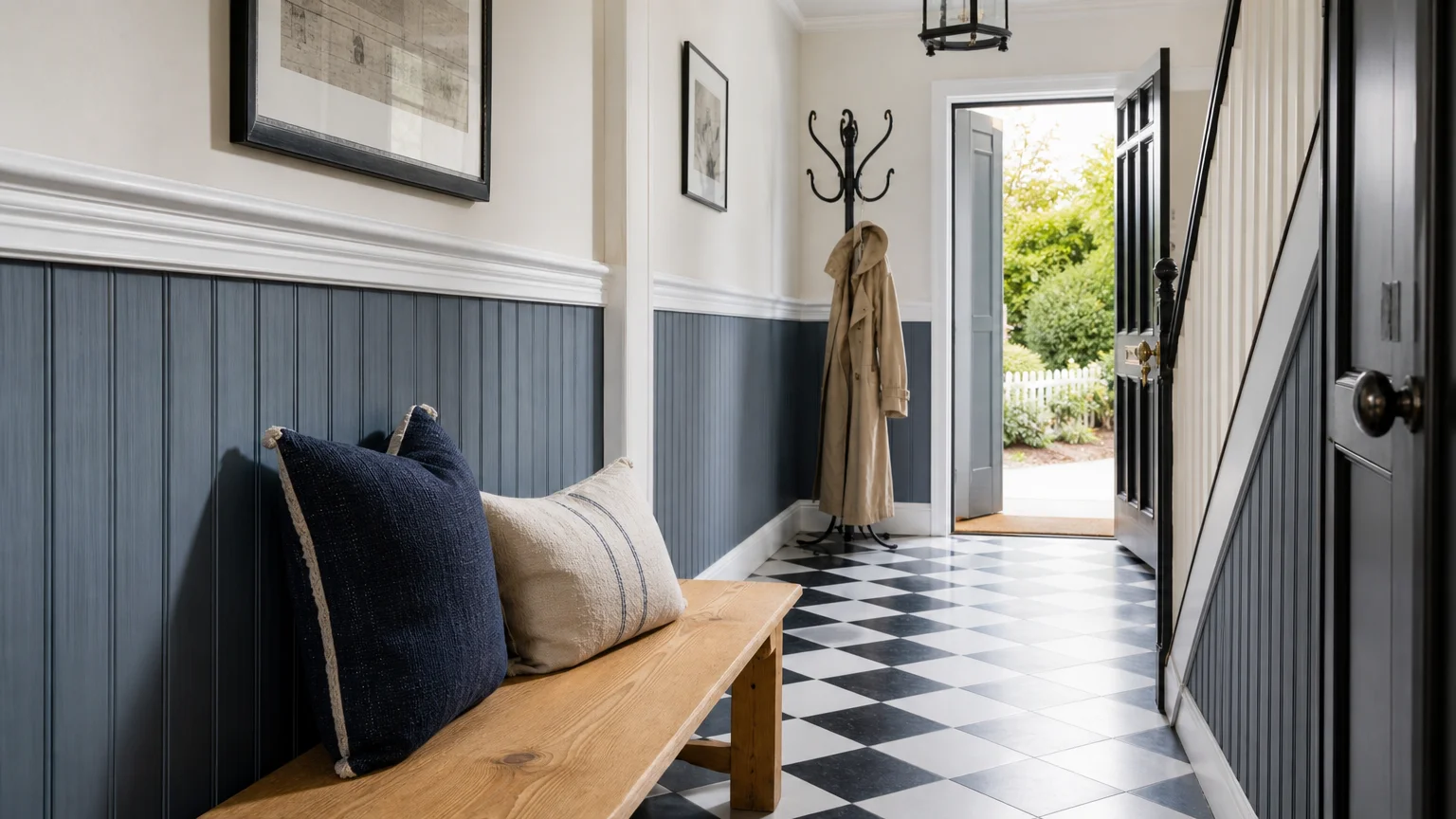
Trend #8: Slate Blue and Transitional Chic
Transitional design successfully bridges the persistent gap between traditional comfort and contemporary clean lines, appealing directly to homeowners who appreciate historic architectural details but actively crave modern functionality. Slate blue perfectly encapsulates this highly balanced aesthetic. Infused with heavy gray and very subtle green undertones, slate blue feels historically significant yet entirely updated for modern living. It possesses a unique, chameleon-like quality, appearing as a moody, stormy gray on cloudy days and revealing its rich, saturated blue core under direct, bright sunlight.
Brilliant white trim acts as the vital, high-energy catalyst that brings slate blue completely to life. The high-contrast white instantly brightens the overall visual palette, proudly highlighting the intricate details of traditional wainscoting, picture rails, or heavy baseboards. Slate blue excels practically and aesthetically in high-traffic areas like mudrooms, formal dining rooms, and grand entryways, providing a highly durable, elegant backdrop that masks daily wear significantly better than lighter builder-grade neutrals. Pair this classic color combination with polished mahogany or cherry furniture for a traditional lean, or surround it entirely with light ash wood and streamlined, low-profile silhouettes for a distinctly modern edge. The white trim ensures the slate blue remains crisp, defined, and purposeful in either scenario.
The Big Picture: Weaving These Trends into Your Home
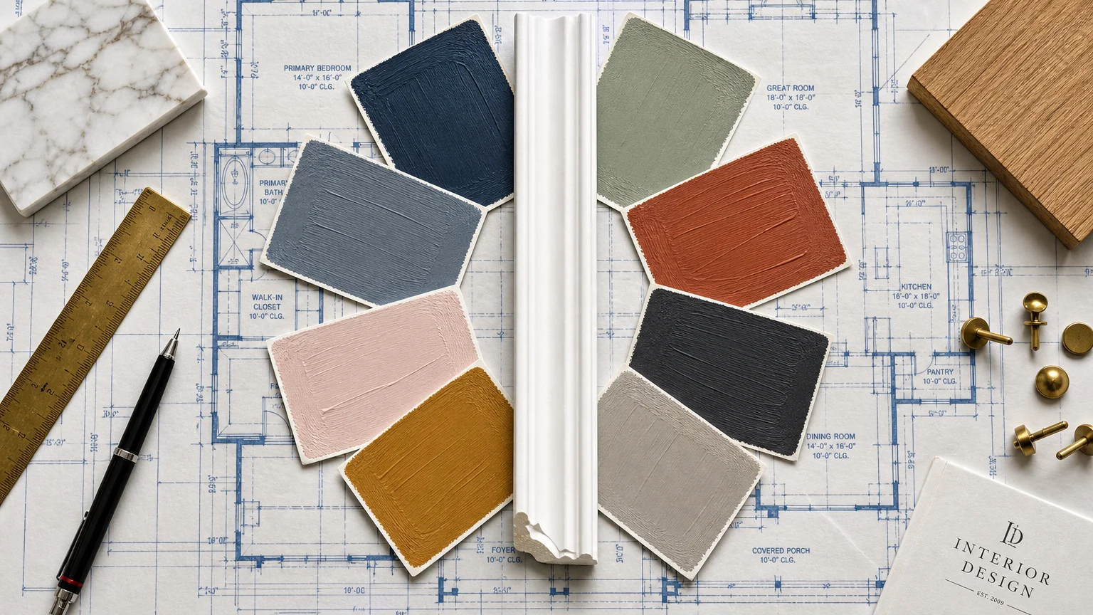
Adopting new color palettes requires significantly more than simply rolling a fresh coat of paint onto your drywall; it demands a comprehensive, holistic approach to your home’s unique architecture, natural lighting, and spatial flow. Finding the right wall color inspiration always begins with critically assessing the physical realities of your specific environment. Natural lighting dramatically alters how a paint shade reads throughout the day. A dusty navy blue that looks incredibly chic and inviting in a sun-drenched, south-facing living room might feel oppressively dark and enclosing in a windowless interior hallway. Always test large, physical paint swatches on multiple walls and observe them continuously from early morning until late at night before making a financial and aesthetic commitment.
Furthermore, you must remember that white trim is not a monolith. The broad term encompasses hundreds of distinct shades, each engineered with its own highly specific undertones. If you select a warm wall color like artisanal terracotta or soft greige, deliberately pair it with a white trim that features subtle warm undertones—like a drop of cream or yellow—to maintain visual harmony. Conversely, cool-toned walls like slate blue or deep charcoal explicitly demand a stark, pure white with high reflectivity to maximize the crisp, tailored contrast.
Finally, maintain strict color continuity by keeping your trim color entirely consistent throughout the entire house, even as your primary wall colors shift dynamically from room to room. This single, unifying architectural element creates a powerful subconscious visual flow, ensuring your property feels like a deliberately curated estate rather than a fragmented, chaotic collection of disconnected design trends.
Frequently Asked Questions
How do I choose the correct white trim paint to match my wall color?
The professional secret lies in accurately identifying the undertones of both your primary wall paint and your chosen trim paint. If your wall color features warm undertones—such as earthy sage green, warm terracotta, or soft greige—opt for a white trim infused with a subtle hint of cream or yellow to maintain an inviting, cohesive harmony. For cool-toned walls like dusty navy blue or deep charcoal, explicitly select a pure, brilliant white or a white formulated with faint gray undertones. This rigorous matching process ensures the visual contrast remains crisp and entirely intentional rather than accidentally clashing.
Do dark wall colors make a room look significantly smaller when paired with white trim?
Dark colors do not inherently shrink a room; rather, they actively absorb light and visually blur the hard edges of the space, which can successfully create a surprising illusion of expansive depth. When you frame a moody color like deep charcoal with bright white baseboards and heavy crown molding, the high-contrast trim sharply defines the room’s overarching architecture. This precise visual geometry firmly grounds the eye and provides structural clarity, effectively preventing the dark walls from feeling cavernous or claustrophobic.
Can I mix different paint trends within an open-concept home?
Yes, you can mix trends, but successful execution strictly requires a unifying visual thread to prevent spatial chaos. In an expansive open-concept layout, you must maintain a single, consistent white trim paint color across all adjoining spaces. This continuous architectural outline provides a highly reliable visual boundary. You can transition smoothly from a soft greige living area into a bold slate blue dining space seamlessly, provided the trim remains totally uniform and you cleverly echo accent colors through textiles, rugs, and artwork to physically bridge the distinct living zones.
What paint finish is best for white trim to maximize contrast?
Interior design professionals almost universally recommend a semi-gloss or satin finish for white trim, regardless of the accompanying wall color. The significantly higher sheen level of a semi-gloss paint actively reflects both natural and artificial light, causing the architectural details to literally shine and stand out. When intelligently paired with a dead-flat or matte finish on the primary walls, the resulting textural disparity massively amplifies the visual contrast, making the white trim appear even sharper and more structurally pronounced against your complementary paint shades.
For the latest color forecasts, consult industry leaders like Pantone and paint companies like Benjamin Moore. For professional design standards, refer to the American Society of Interior Designers (ASID).
Disclaimer: This article reflects design trend analysis and predictions. Personal taste and timeless design principles should always guide your decorating choices.