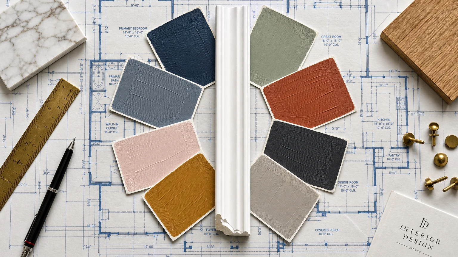
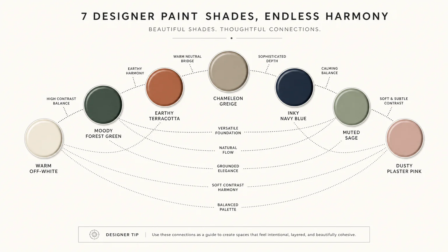
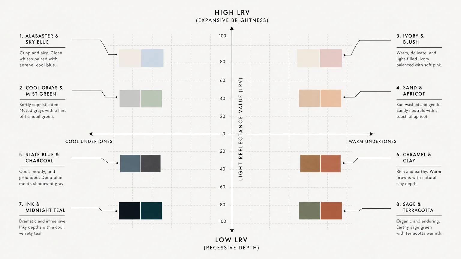
Transforming a cramped bathroom into a spacious sanctuary requires mastering the optical illusions of color. The right palette immediately pushes walls outward and lifts ceilings, giving your space a breathable, expansive feel without the expense of a physical renovation. Small spaces demand strategic chromatic choices—hues that manipulate light and shadow to trick the eye. Whether you prefer the soothing embrace of quiet luxury or the crisp contrast of modern biophilic design, careful paint combinations redefine spatial perception. By balancing undertones, light reflectance values, and strategic finishes, you can achieve a sophisticated, elevated aesthetic that maximizes every square inch of your bathroom.
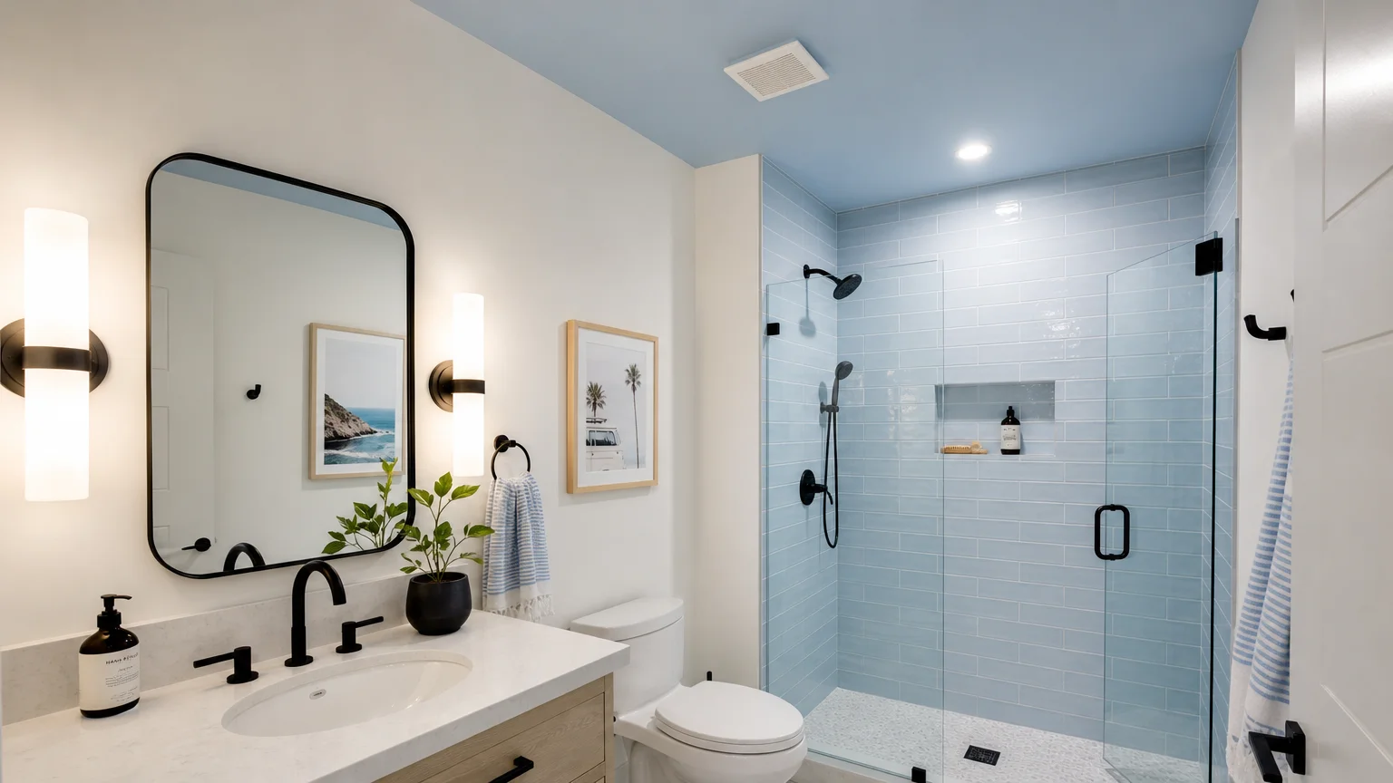
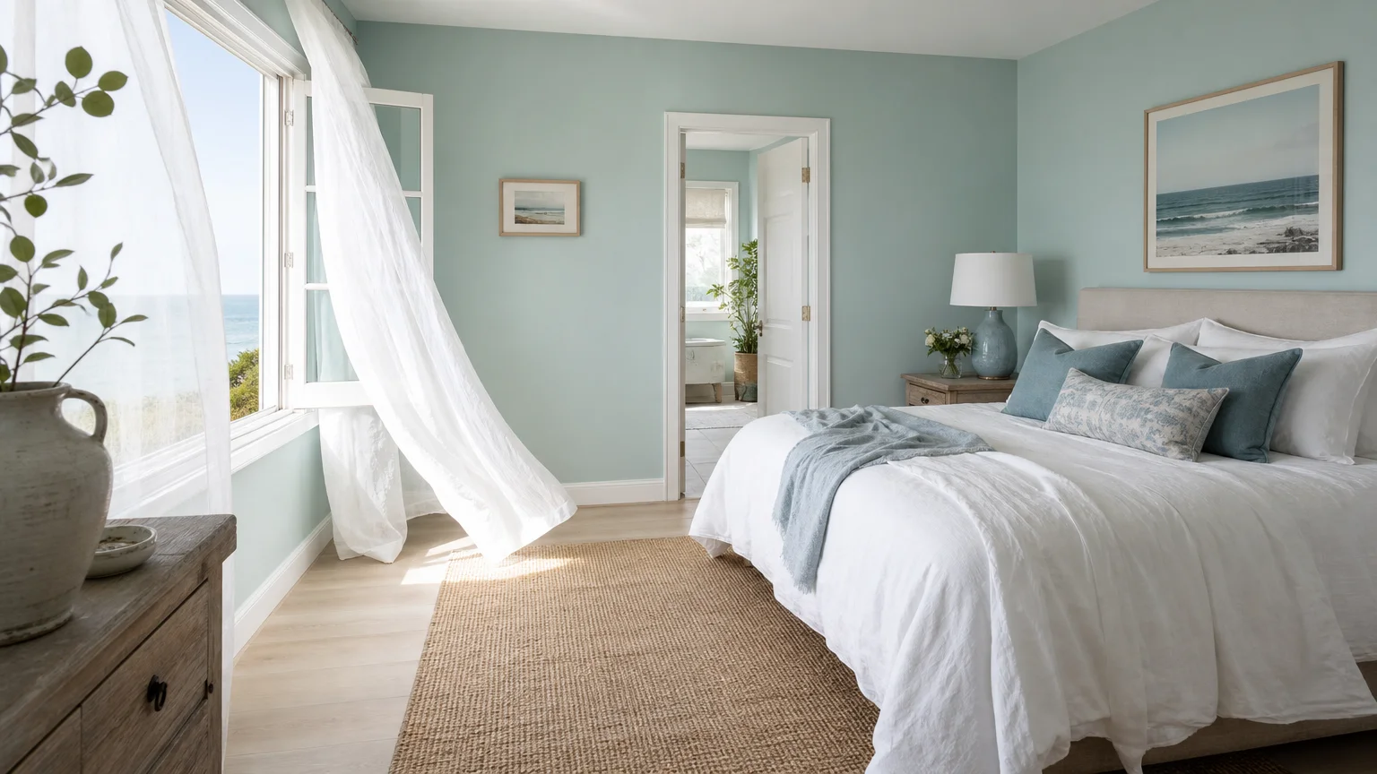
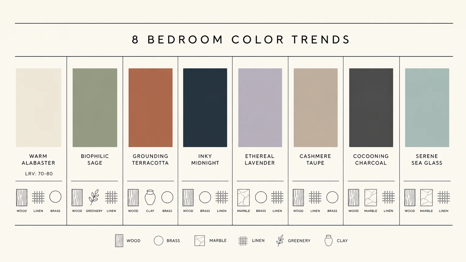
Trend #1: Alabaster White and Ethereal Sky Blue
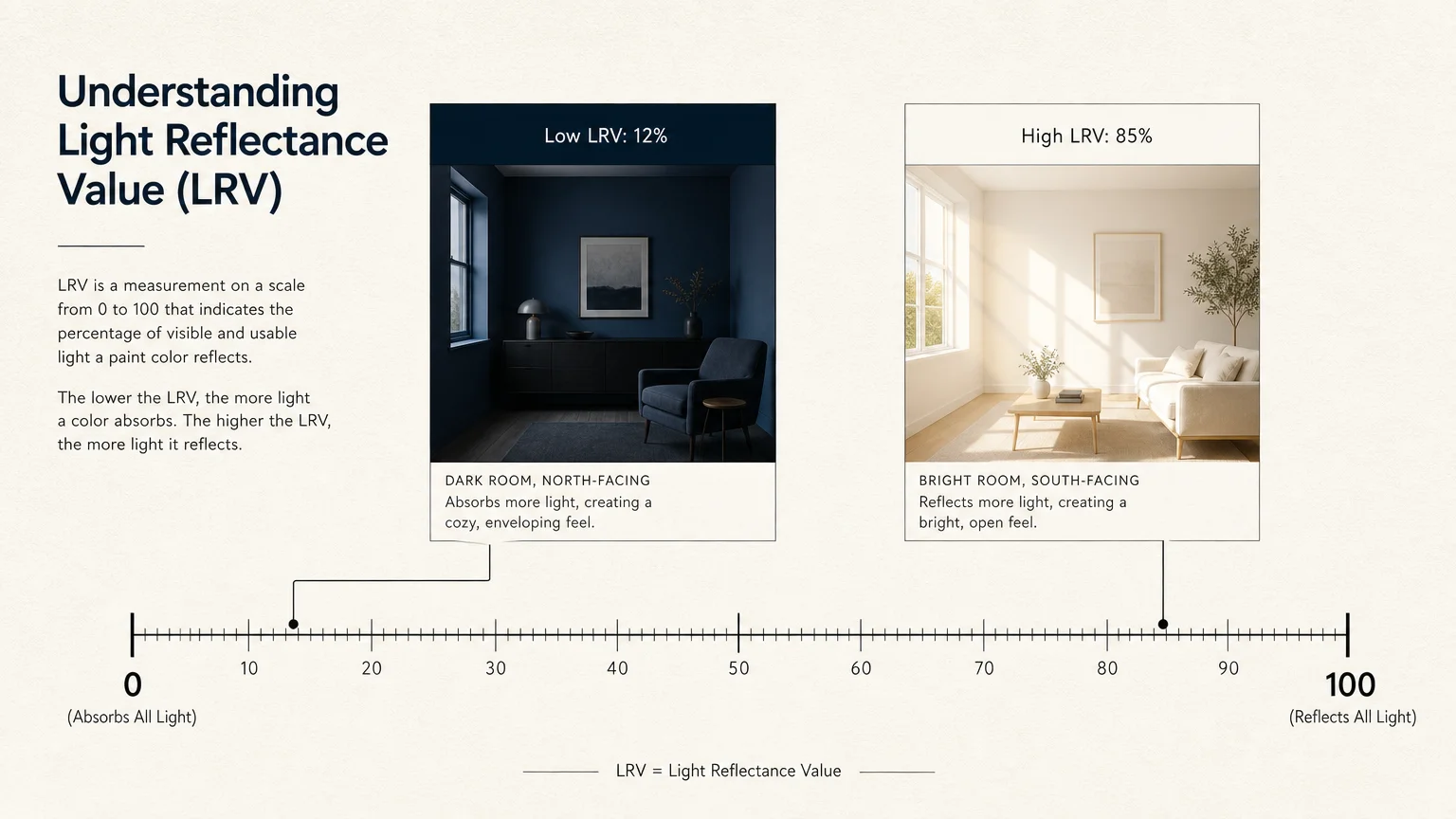
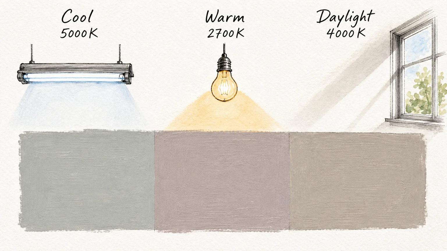
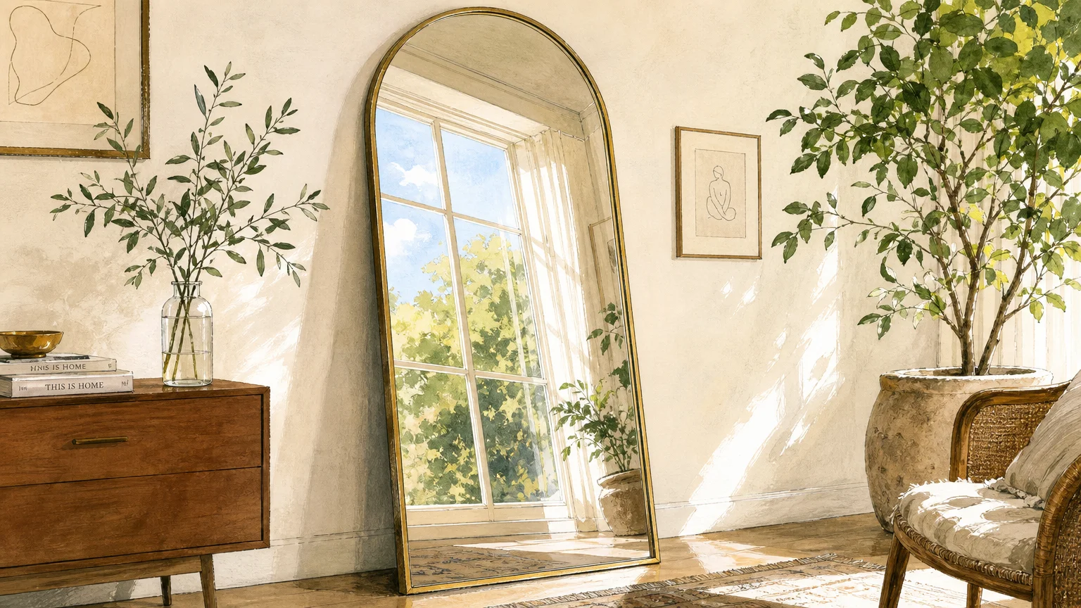
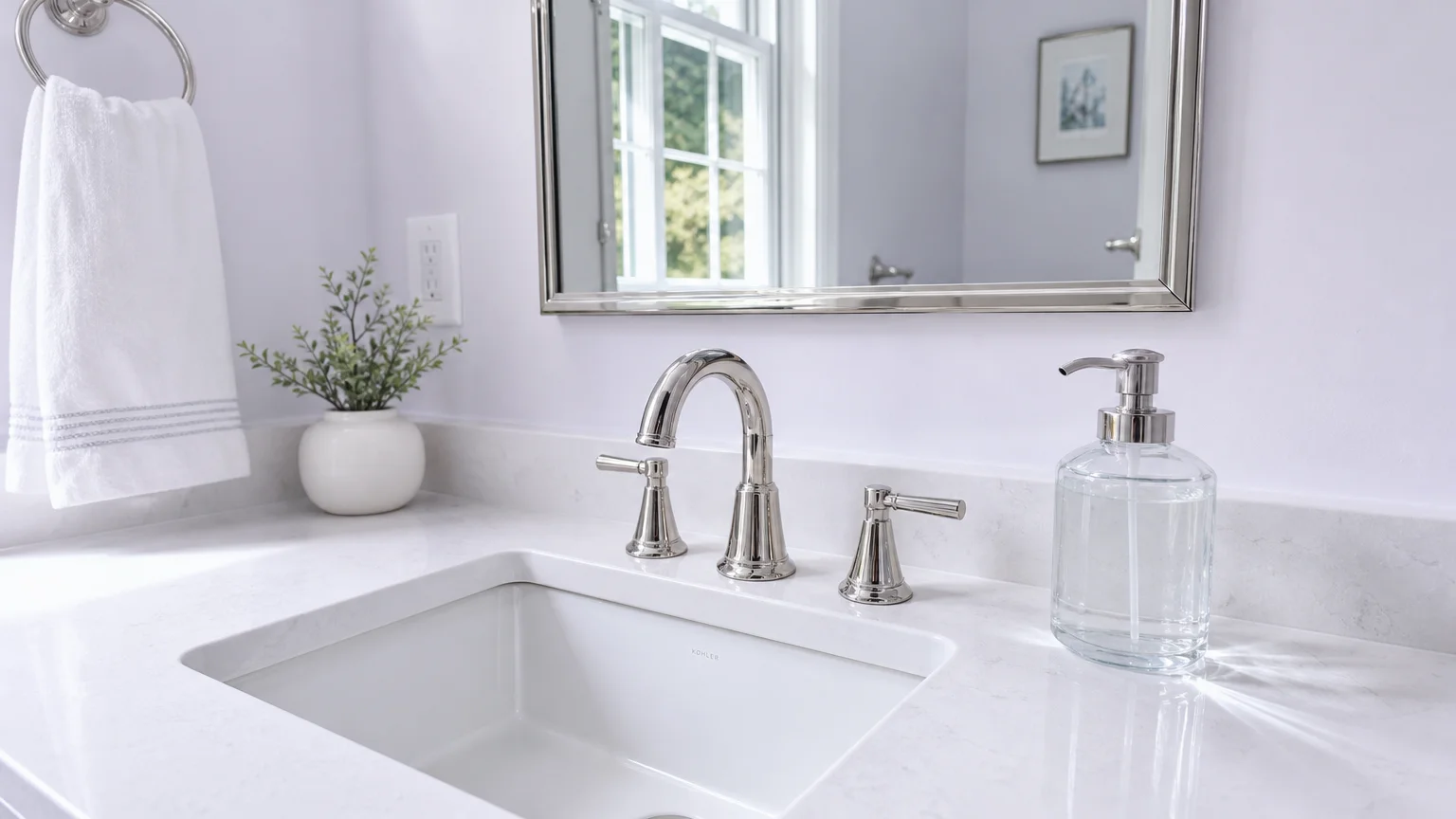
Harnessing the power of high Light Reflectance Value (LRV) remains one of the most effective strategies for visually expanding a room. Alabaster white acts as a brilliant canvas, bouncing both natural and artificial light around the space to dissolve harsh shadows that typically emphasize tight corners. When you pair this luminous neutral with ethereal sky blue, you recreate the infinite expanse of the outdoors right inside your home. This combination leverages a fundamental principle of human perception: cool colors recede from the eye, making the surfaces they cover appear further away than they actually are.
To implement this palette effectively, apply your alabaster white to the walls and direct the ethereal blue toward the ceiling. Painting the ceiling a pale, airy blue creates an illusion of overhead infinite space, lifting the visual lid off a cramped powder room. Alternatively, utilize sky blue in glossy ceramic tiles within the shower enclosure; the reflective surface multiplies the available light, while the cool tone pushes the back wall of the shower deeper into the distance. This dynamic interplay between bright white and recessive blue establishes a clean, uplifting environment that defies its own square footage.
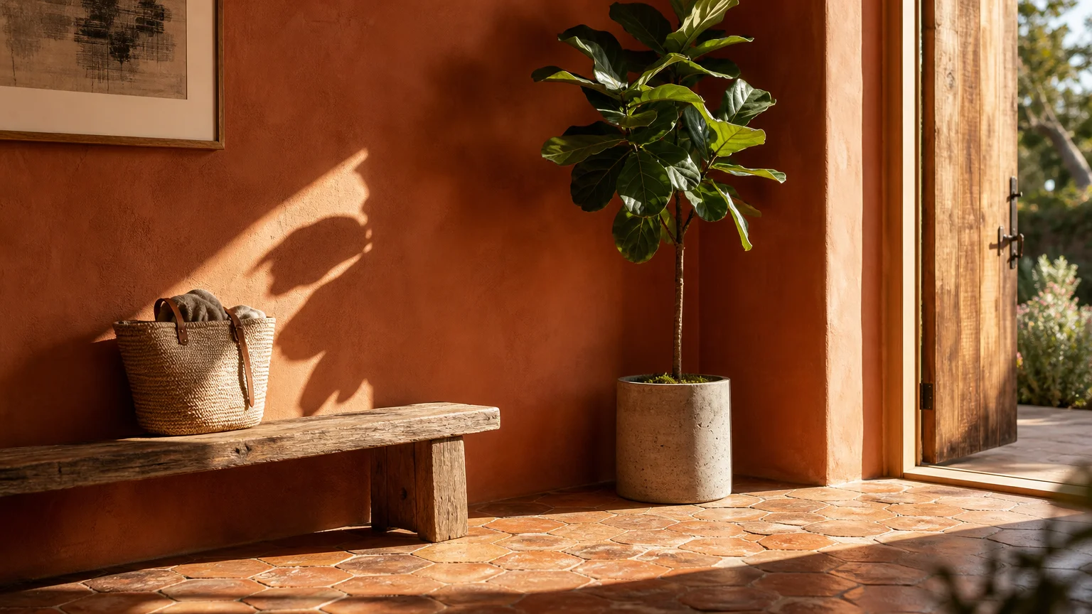
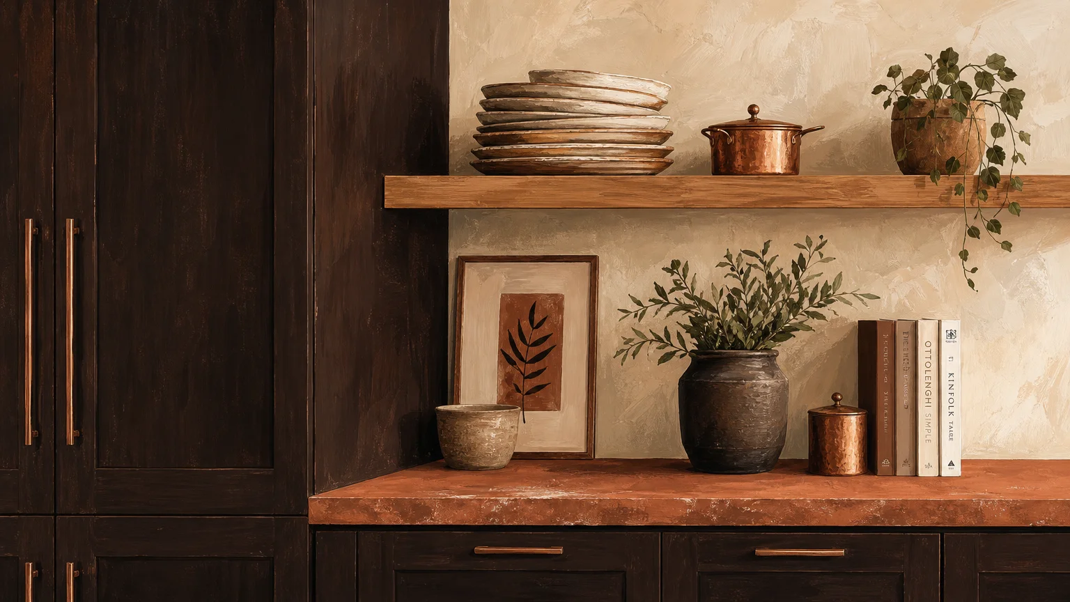
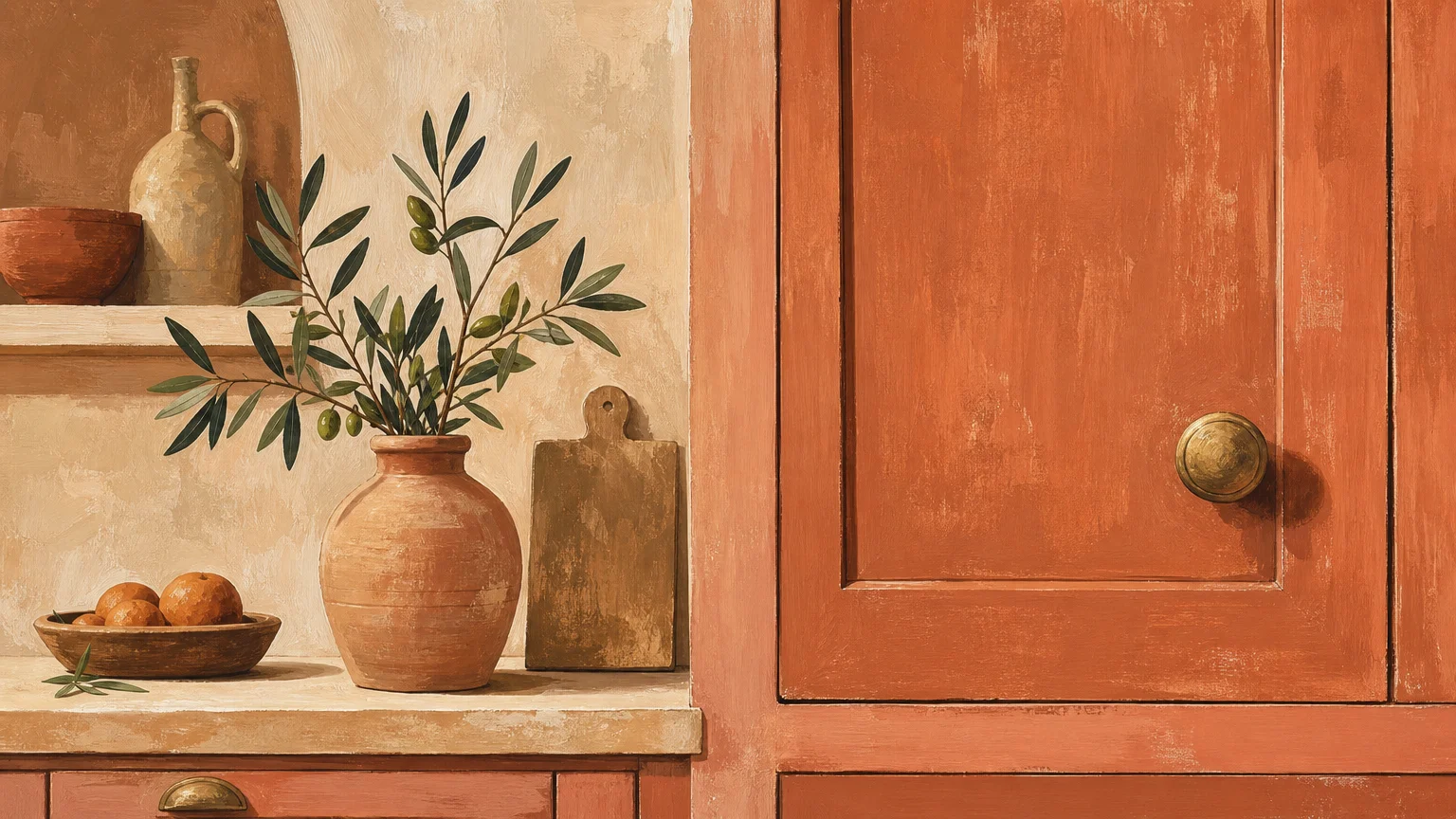
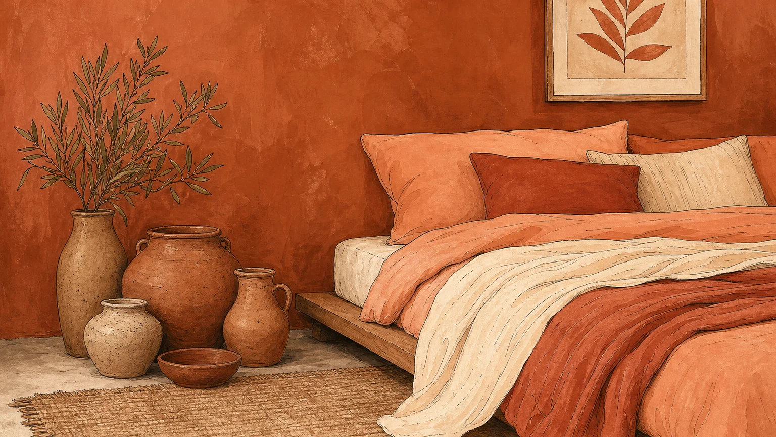
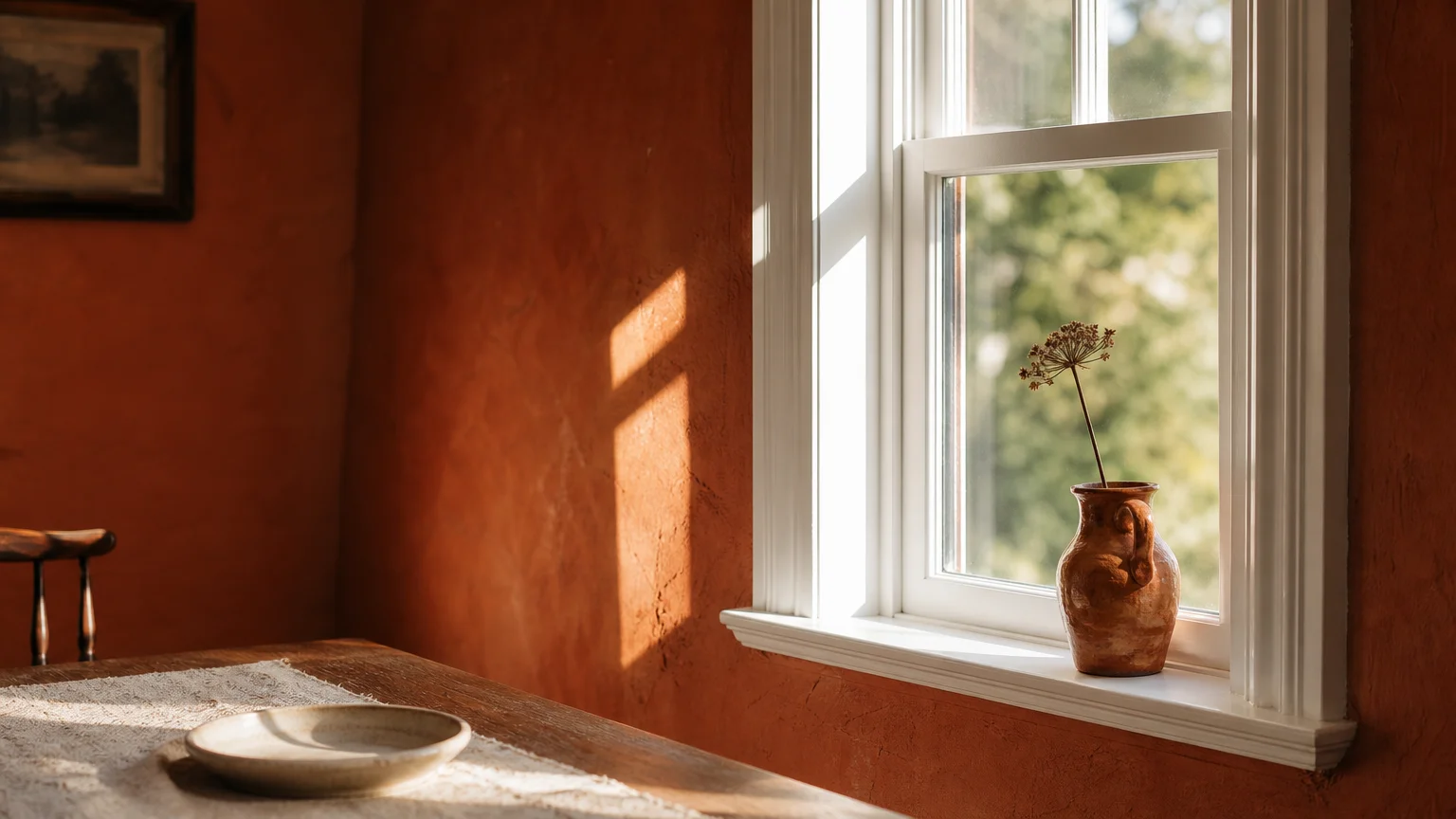
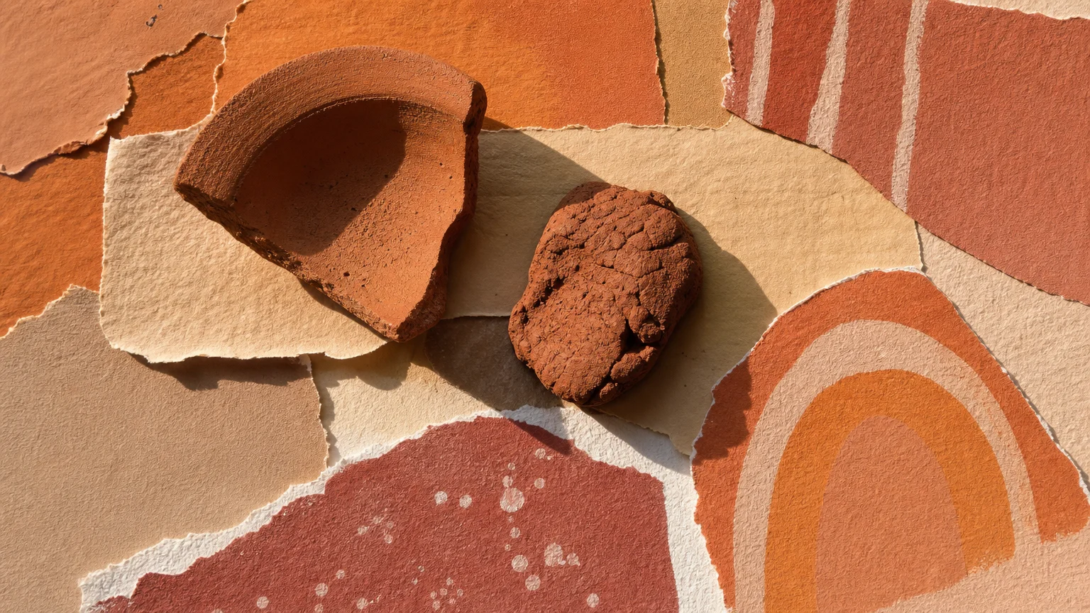
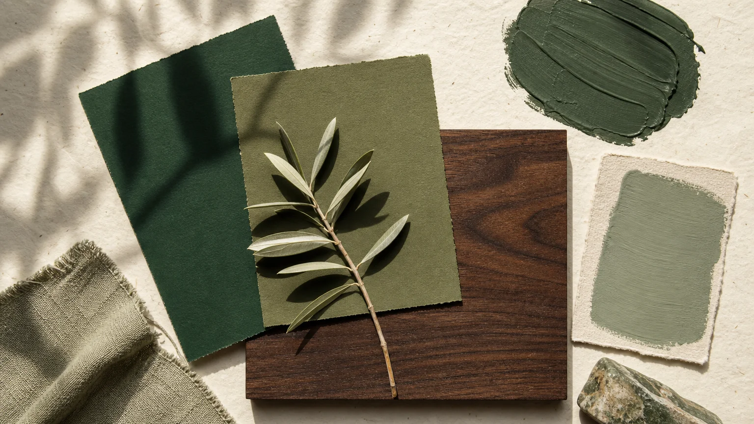
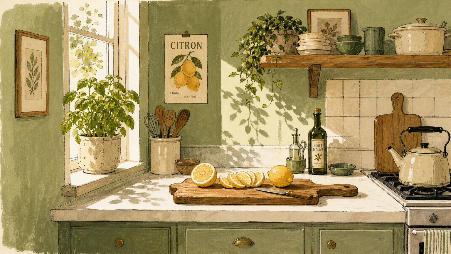
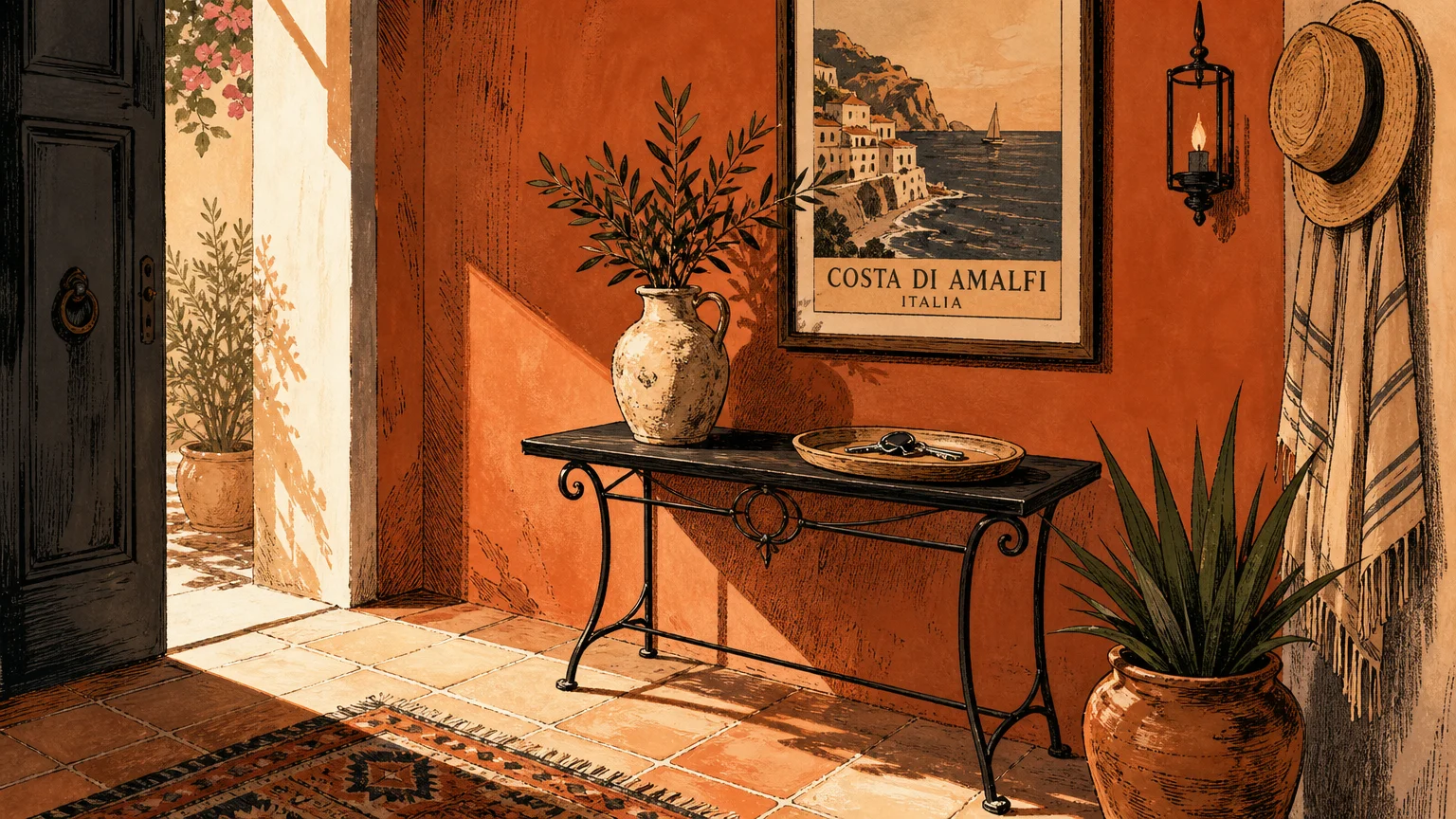
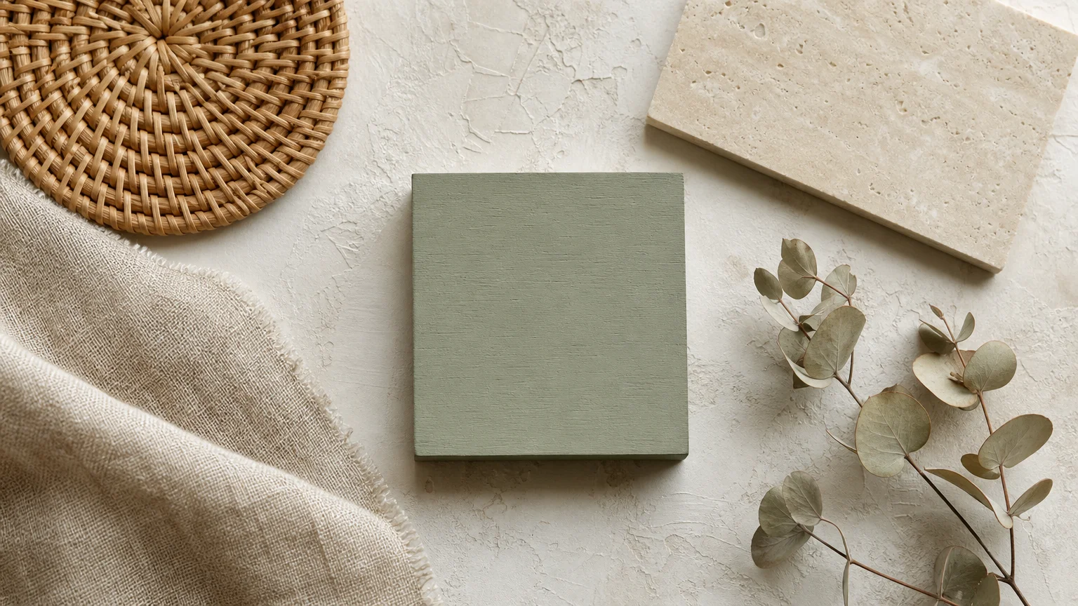
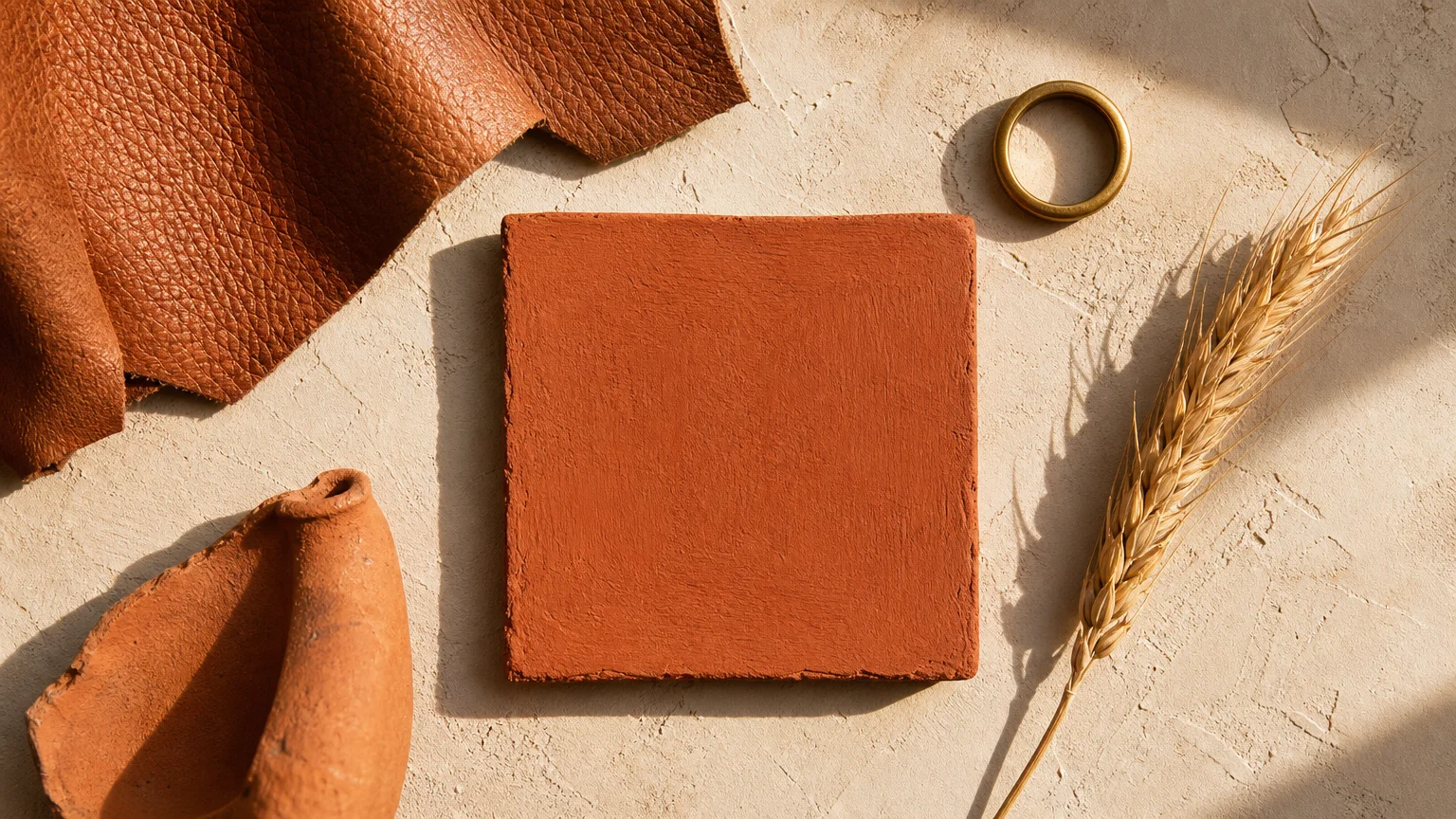
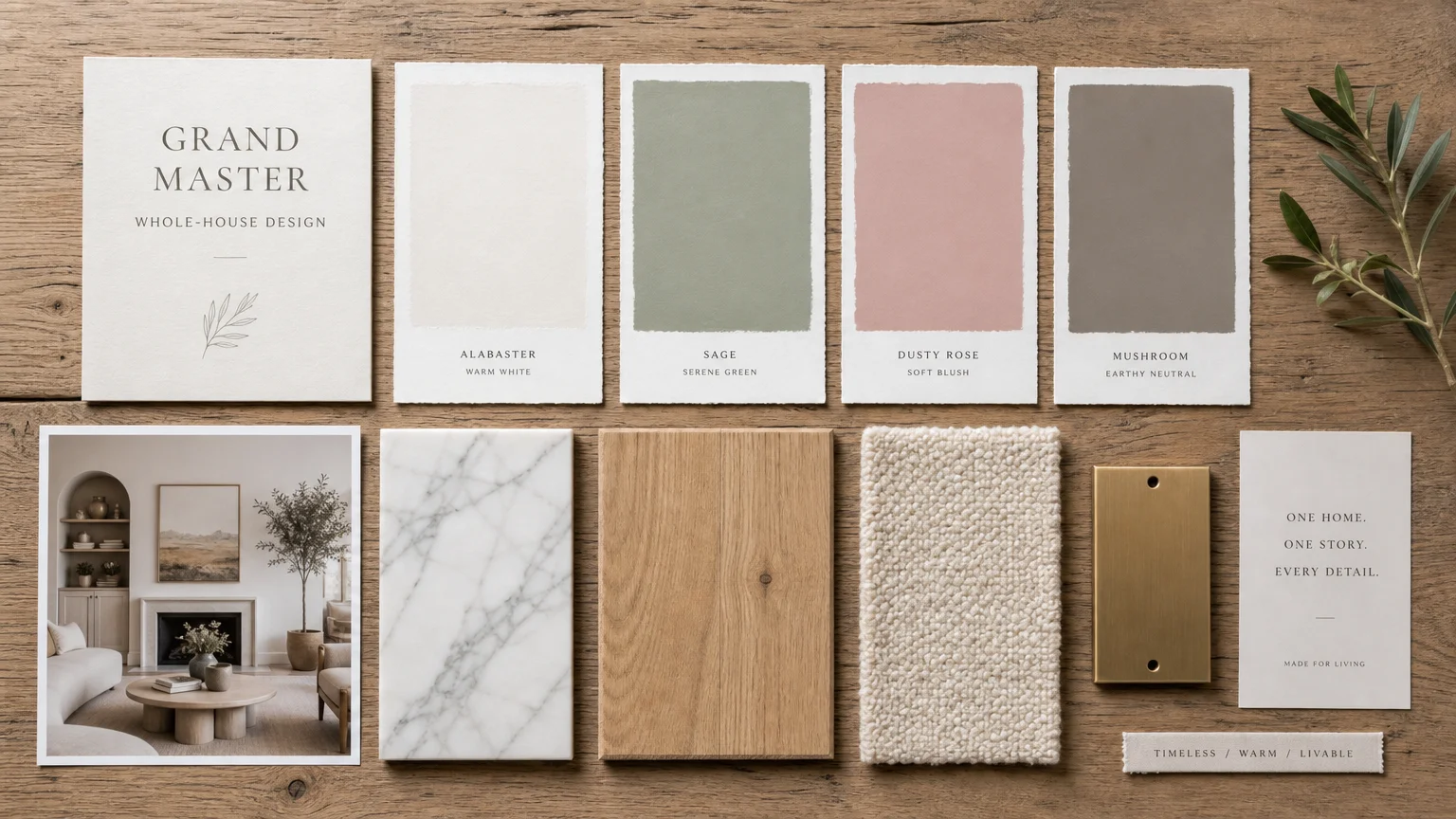
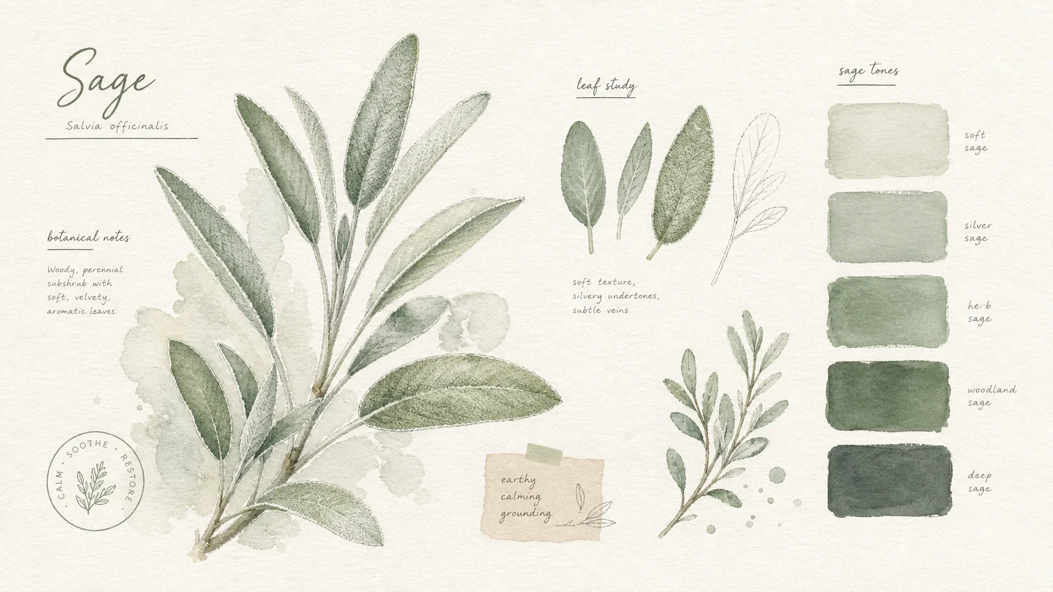
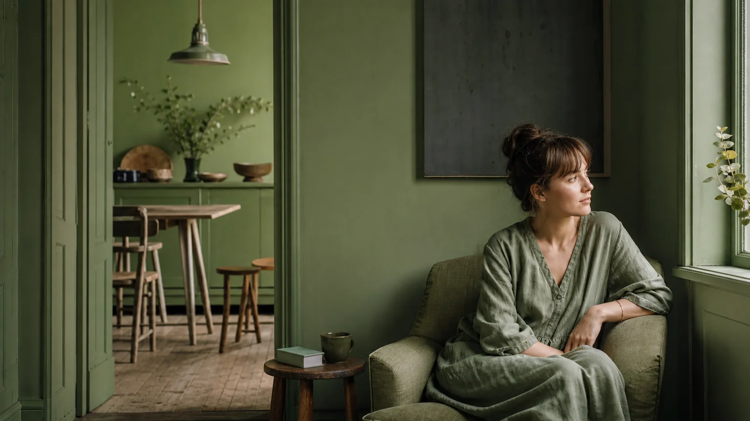
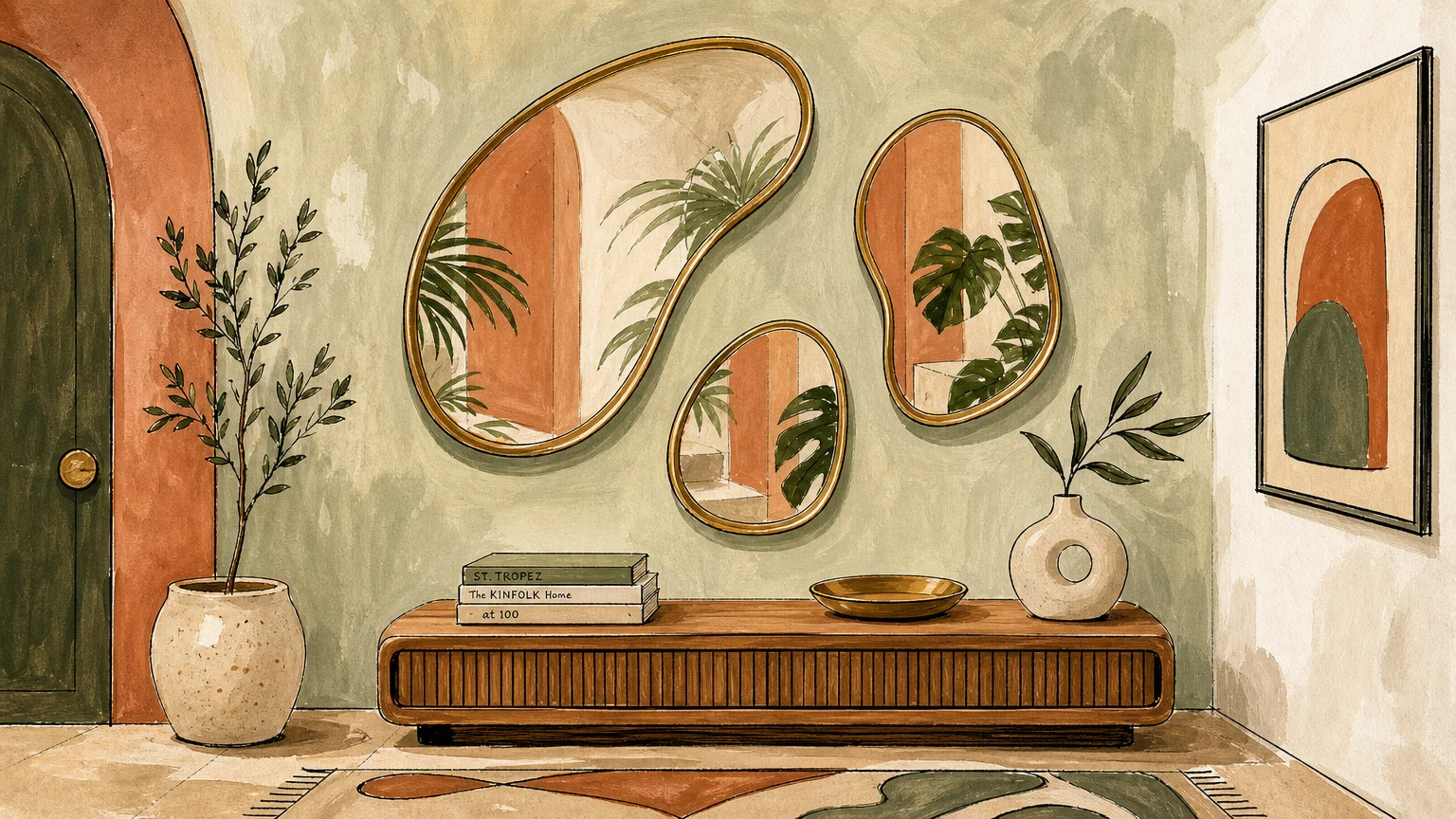
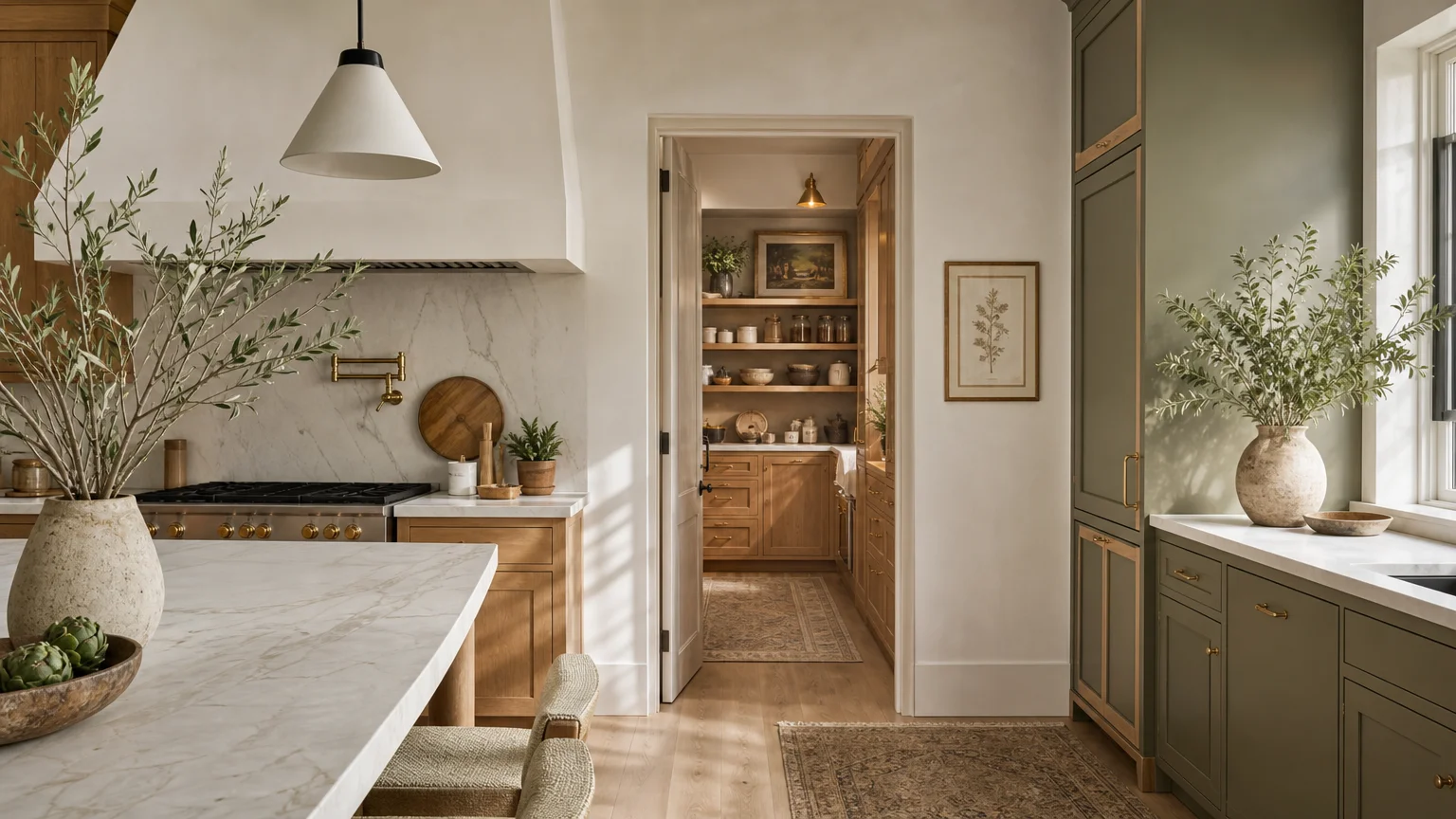
Trend #2: Sage Green and Warm Terracotta
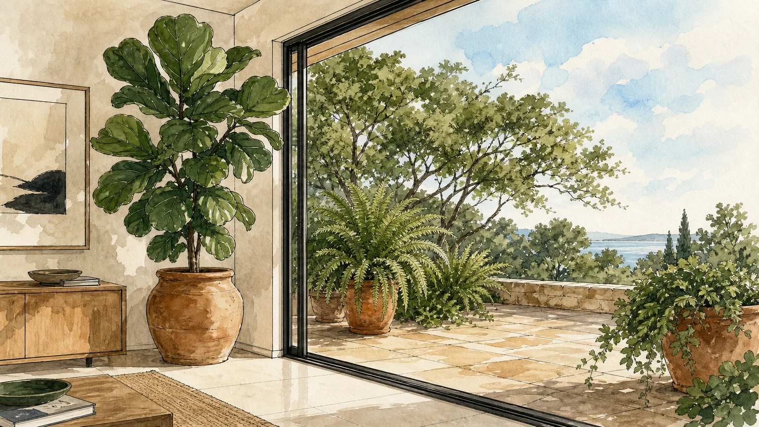
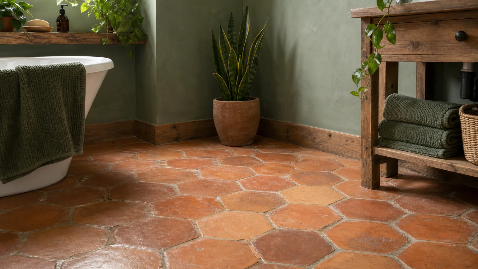
Rooted deeply in the principles of organic modernism, the pairing of sage green and warm terracotta brings the grounding elements of nature into your home. This aesthetic shift moves away from clinical, sterile bathroom decor and embraces a biophilic approach that prioritizes human connection to natural environments. Sage green acts as a complex neutral, possessing enough gray undertones to feel sophisticated while retaining the soothing, restorative qualities of foliage. Terracotta introduces a tactile, baked-earth warmth that anchors the space without enclosing it.
In a diminutive bathroom, applying color horizontally can drastically alter the perception of width. Ground the room with terracotta floor tiles—preferably natural Zellige or matte porcelain—to establish a warm, weighted foundation. From the baseboards up, envelop the walls in soft sage green. Because sage is a muted, low-saturation hue, it does not aggressively demand the eye’s attention; instead, it gently fades into the periphery, softening the hard architectural lines of the room. This combination makes the space feel like a sunlit garden enclosure, turning a claustrophobic footprint into a serene, expansive retreat.
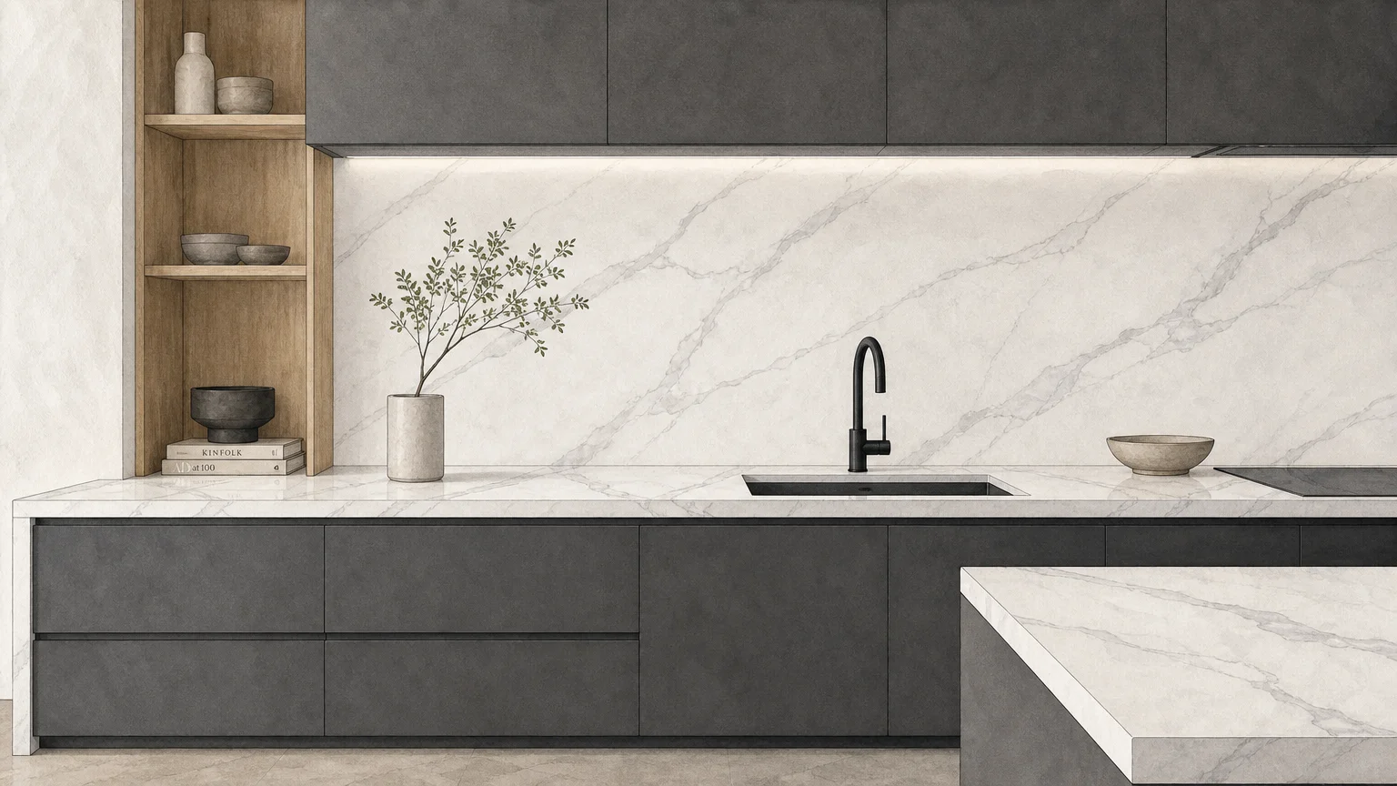
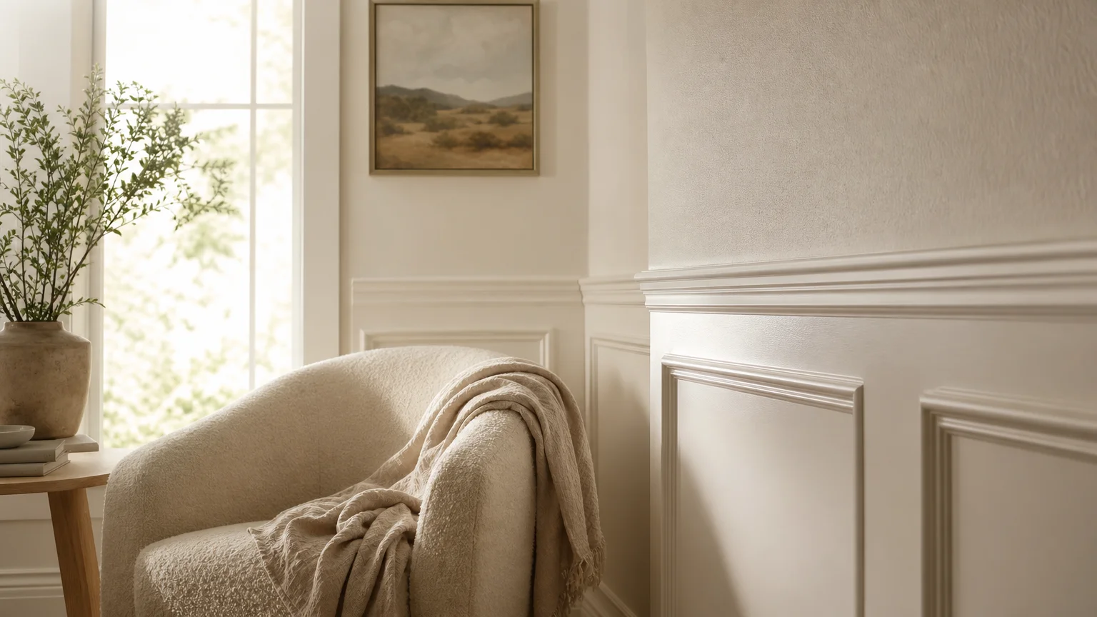
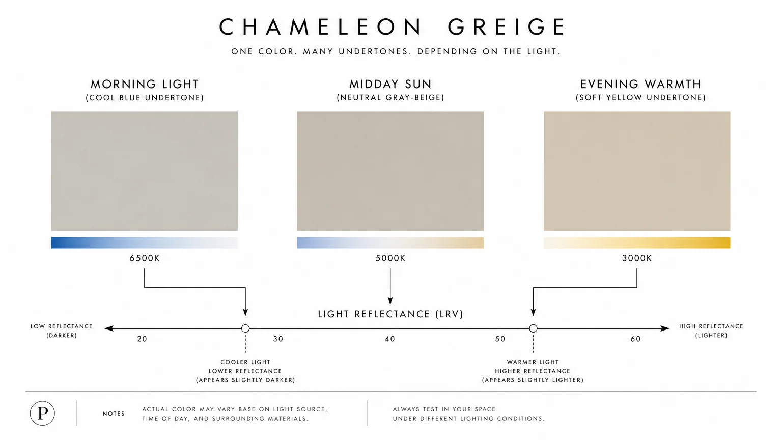
Trend #3: Monochromatic Greige and Ivory
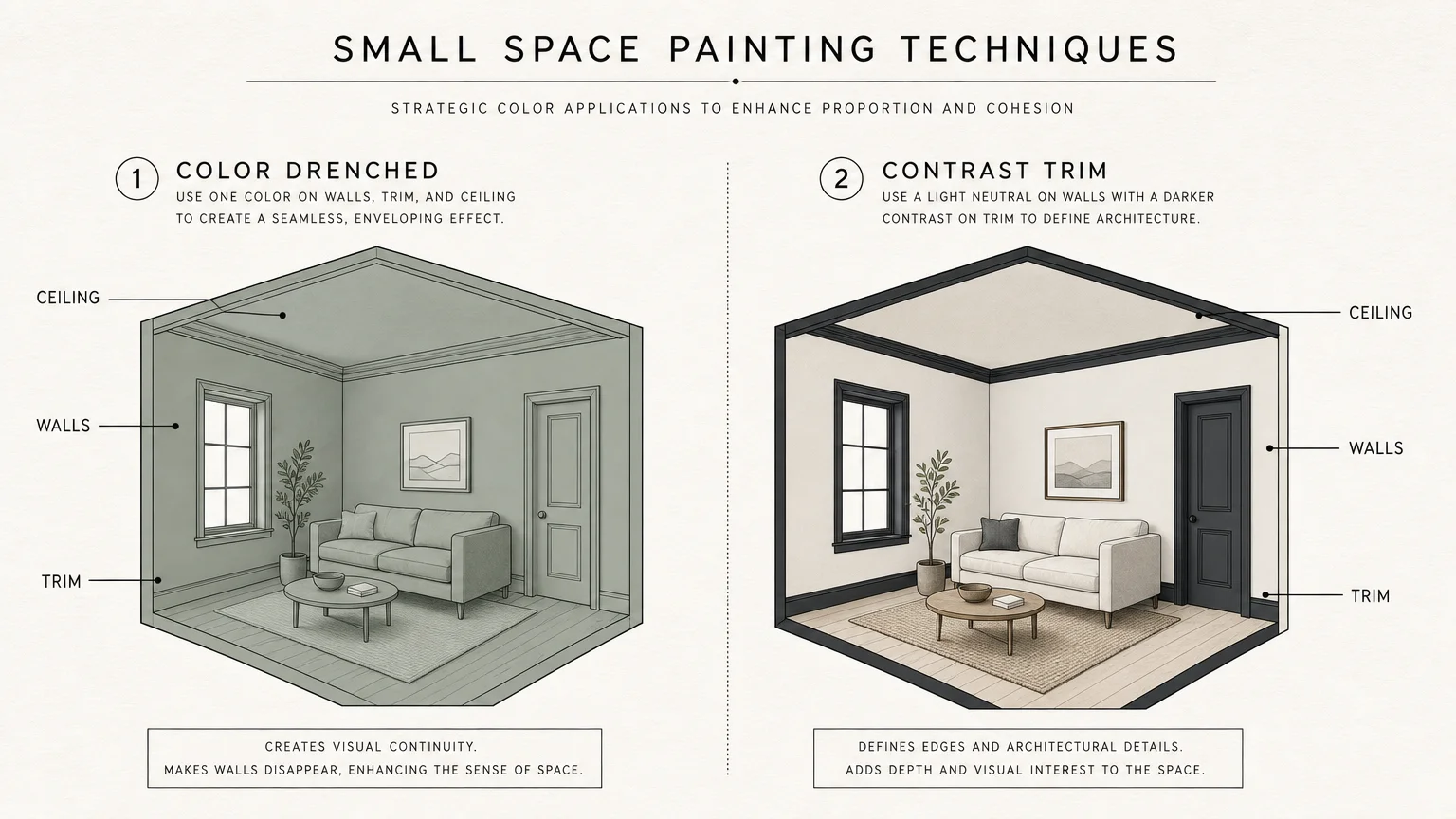
The concept of “quiet luxury” focuses on meticulous craftsmanship, subtle textures, and a masterfully restrained color palette. By utilizing a monochromatic scheme of greige (a sophisticated blend of gray and beige) and ivory, you eliminate the visual boundaries that chop a small room into even smaller fragments. High-contrast color blocks force the eye to stop at every corner and molding, emphasizing the exact dimensions of the space. Tone-on-tone applications allow the eye to glide seamlessly across walls, trim, and ceilings.
To execute this look without it falling flat, you must rely on varying paint finishes and layered textures rather than distinct color shifts. Coat your walls in a velvety eggshell greige, paint the baseboards and window casings in a satin finish of the exact same shade, and introduce ivory through your stone vanity top or plush textiles. The subtle difference in sheen catches the light differently, providing necessary depth while maintaining an unbroken visual continuum. This unbroken flow creates a sweeping sense of elegance, tricking the brain into perceiving a much larger, more cohesive interior design.
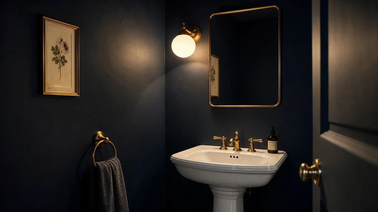
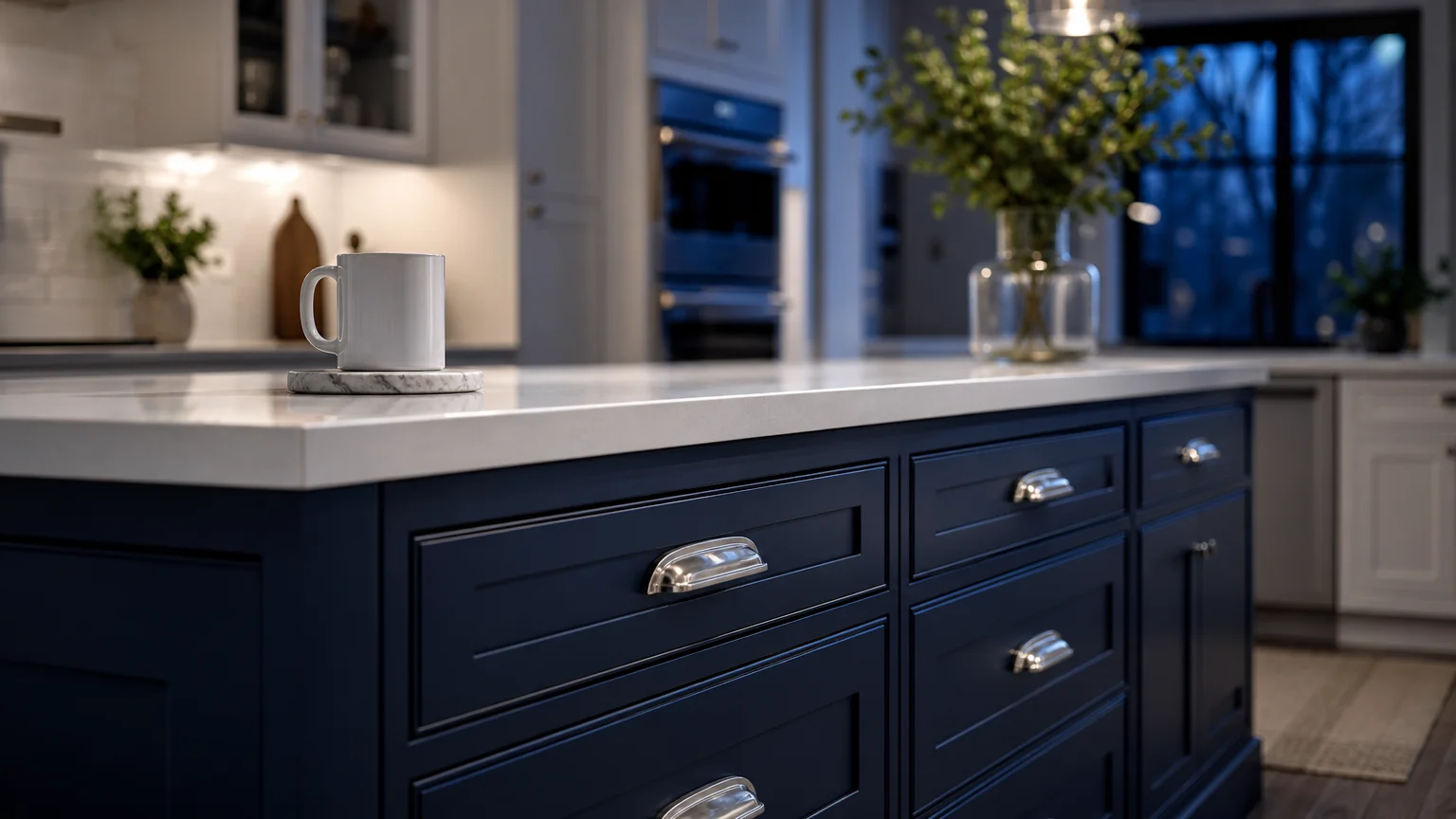
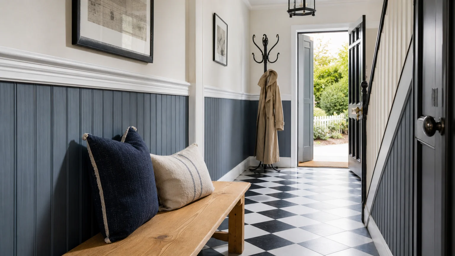
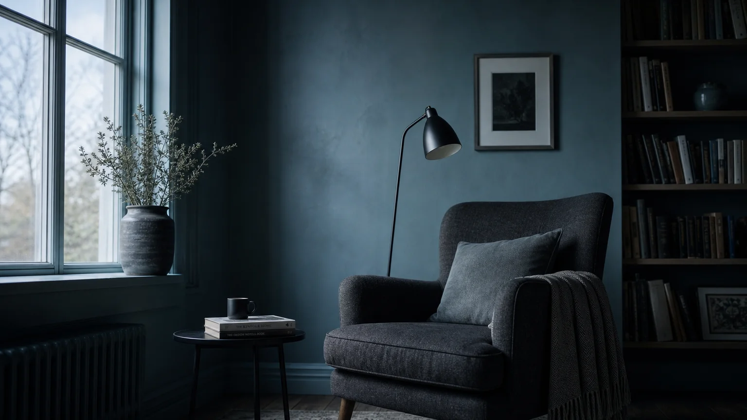
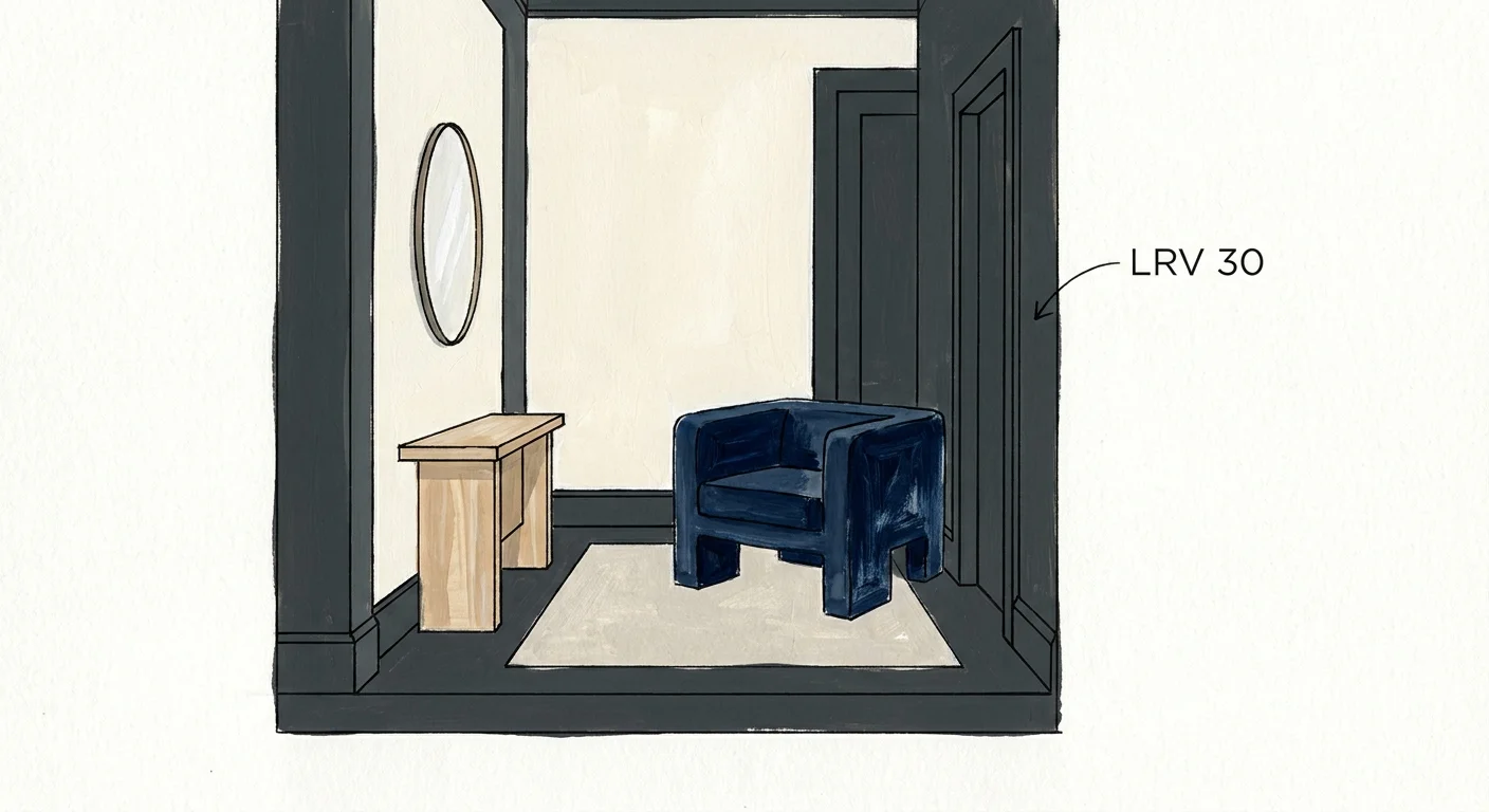
Trend #4: Midnight Navy and Crisp White
While convention suggests that dark colors shrink a room, a highly strategic application of deep hues can actually manufacture the illusion of profound depth. Midnight navy paired with crisp white delivers a sharp, nautical elegance that commands attention. The stark contrast between the two colors creates a structural framework that distracts from the proximity of the walls. When applied correctly, dark colors absorb light and blur the defining edges of a room, creating a shadowbox effect where the actual boundaries become ambiguous.
To maximize this spatial illusion, install crisp white wainscoting or vertically stacked subway tile on the lower third of your walls. Paint the remaining upper section, including the ceiling, in midnight navy. The white lower half reflects light exactly where you interact with the vanity and mirrors, ensuring the room remains functional and bright. Meanwhile, the dark upper walls and ceiling vanish into a canopy of shadows, simulating the expansive night sky. This high-contrast horizontal division also visually stretches the width of the walls, making the bathroom feel both wider and infinitely taller.
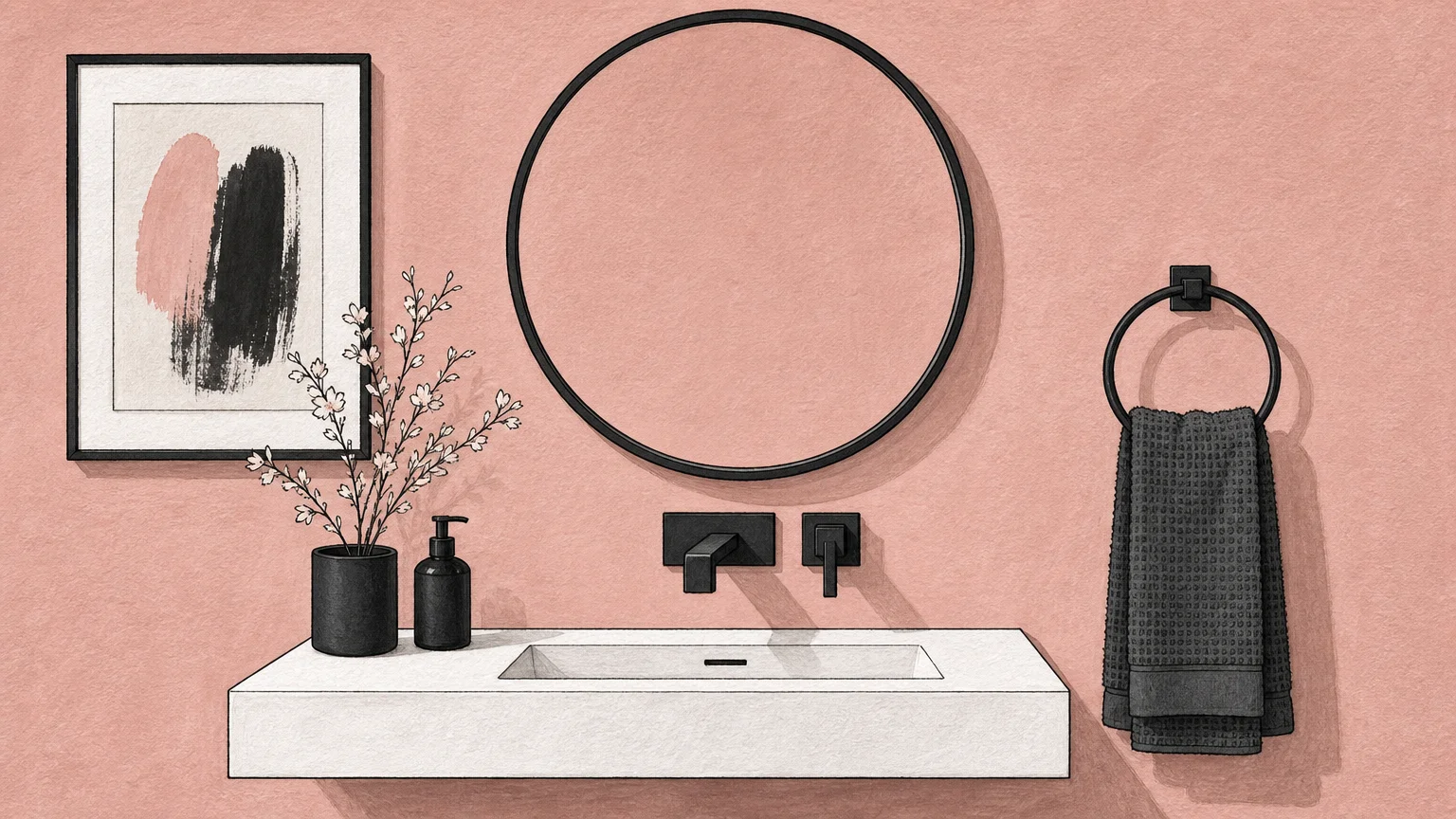
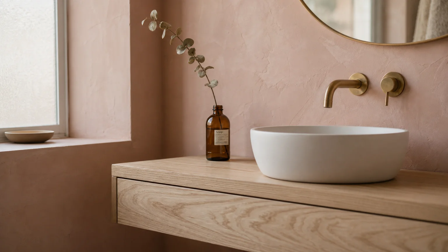
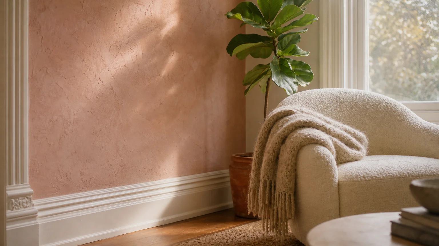
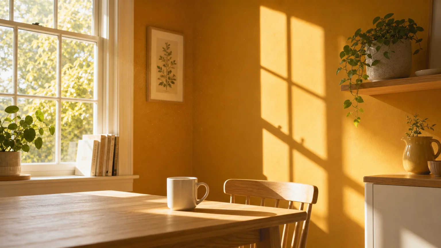
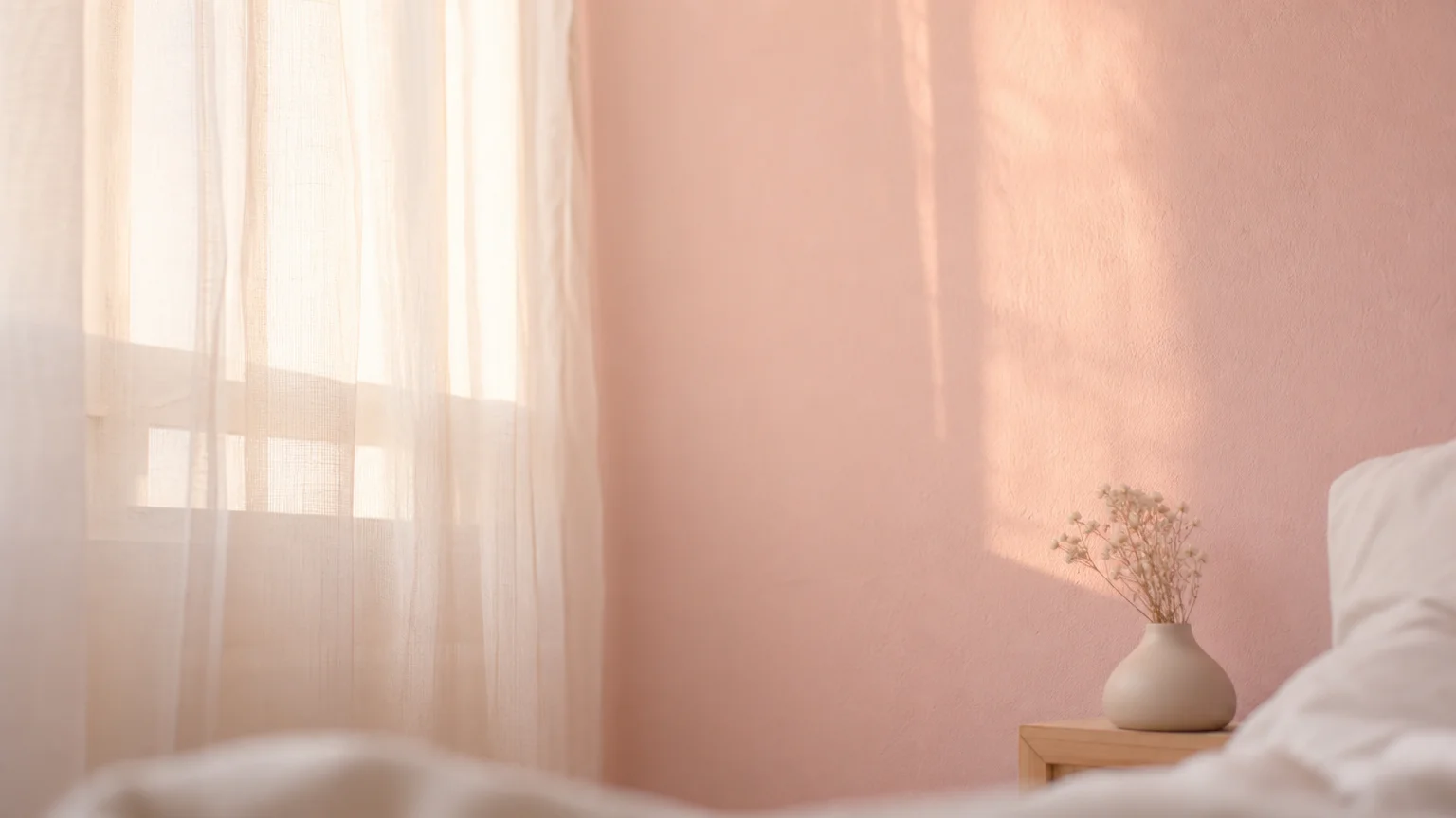
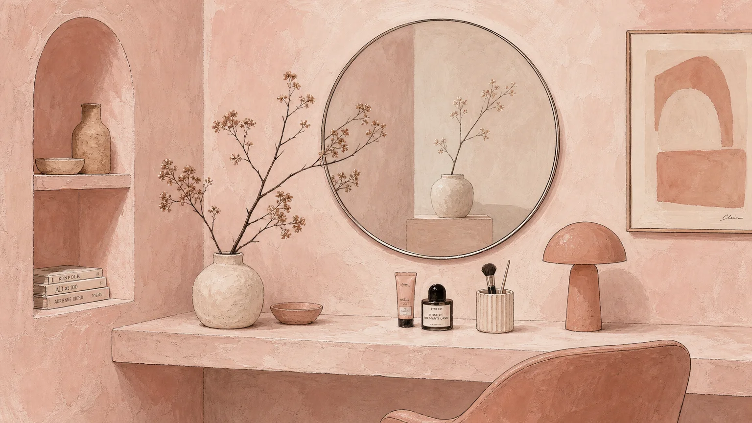
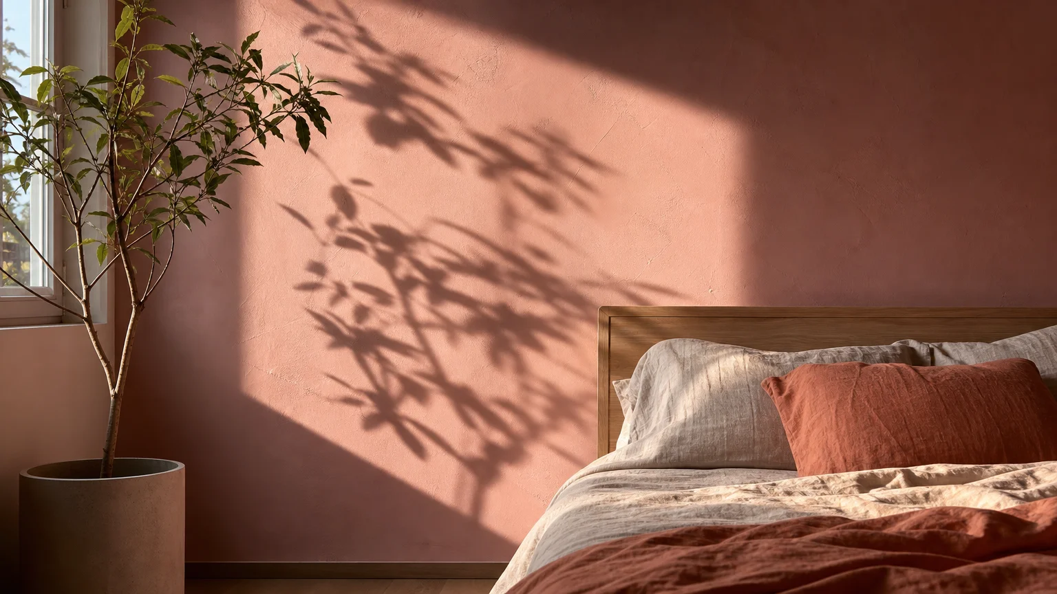
Trend #5: Soft Blush and Matte Black
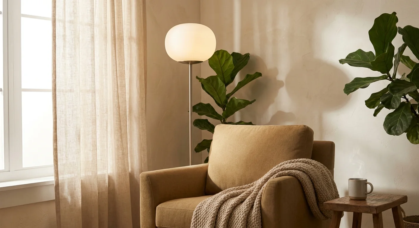
Moving beyond the transient pastel crazes of previous decades, soft blush has matured into a highly refined, warm neutral that flatters all skin tones—a crucial factor for bathroom lighting. When contrasted with the sharp, graphic punch of matte black, blush loses any residual sweetness and becomes a pillar of sophisticated, contemporary design. Small bathrooms often suffer from a lack of natural light, which can render standard white paint gray and dingy. Blush infuses the space with a radiant, inherent warmth that mimics the glow of golden hour.
The secret to expanding a room with this combination lies in the strategic placement of the matte black accents. Use blush on the walls to wrap the room in a gentle, expansive glow. Then, introduce matte black through slender, linear elements: a thin-framed mirror, minimalist cabinet hardware, or a sleek faucet. These high-contrast dark lines draw the eye actively around the room, forcing it to travel from point to point. This induced visual movement mimics the experience of taking in a large room, thereby making your compact bathroom feel dynamic and generously proportioned.
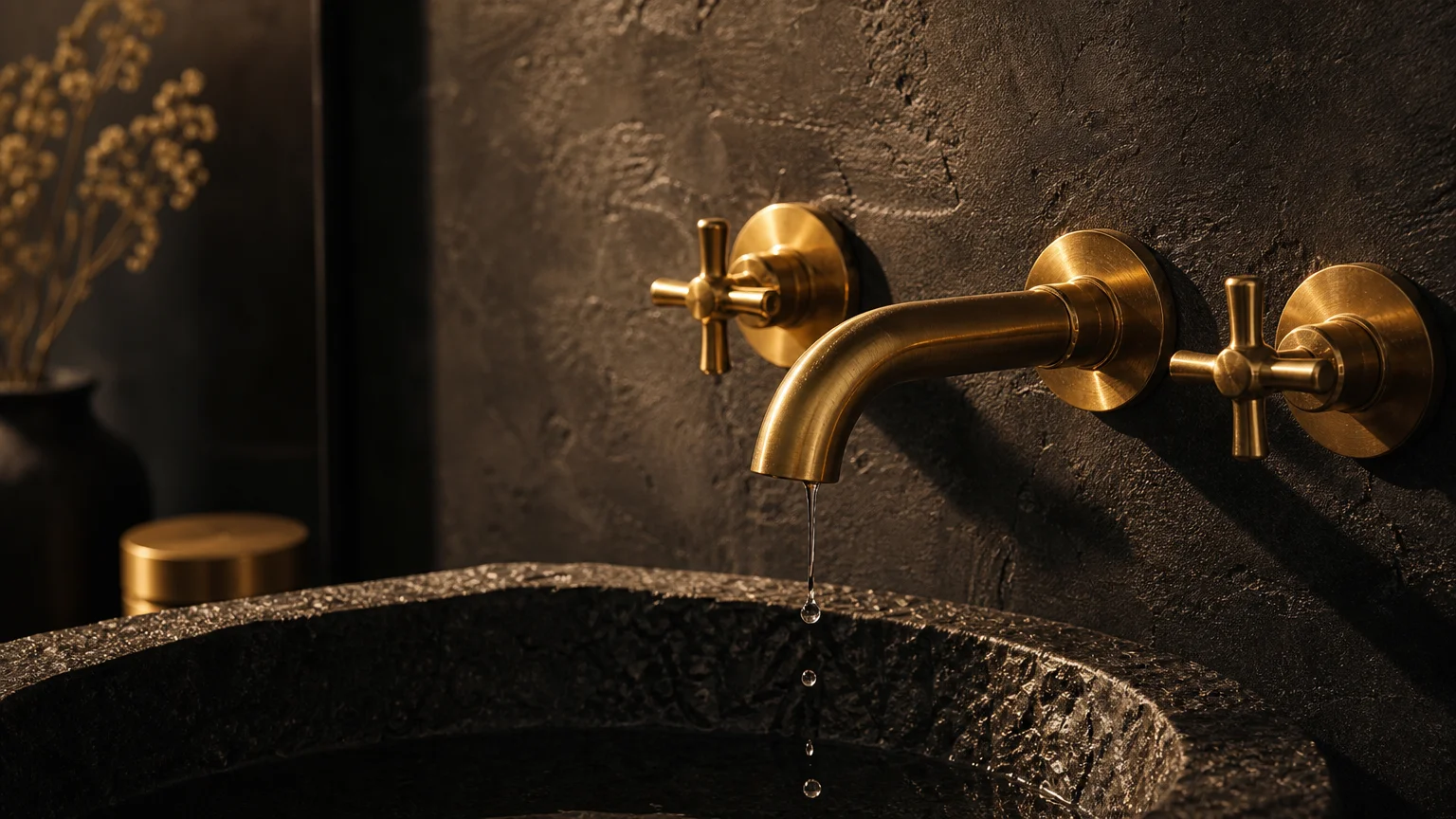
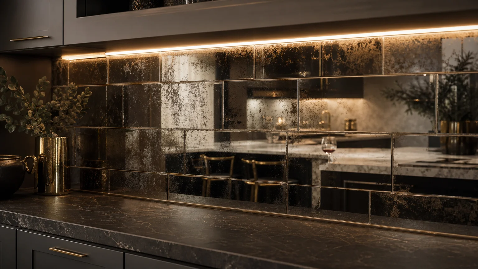
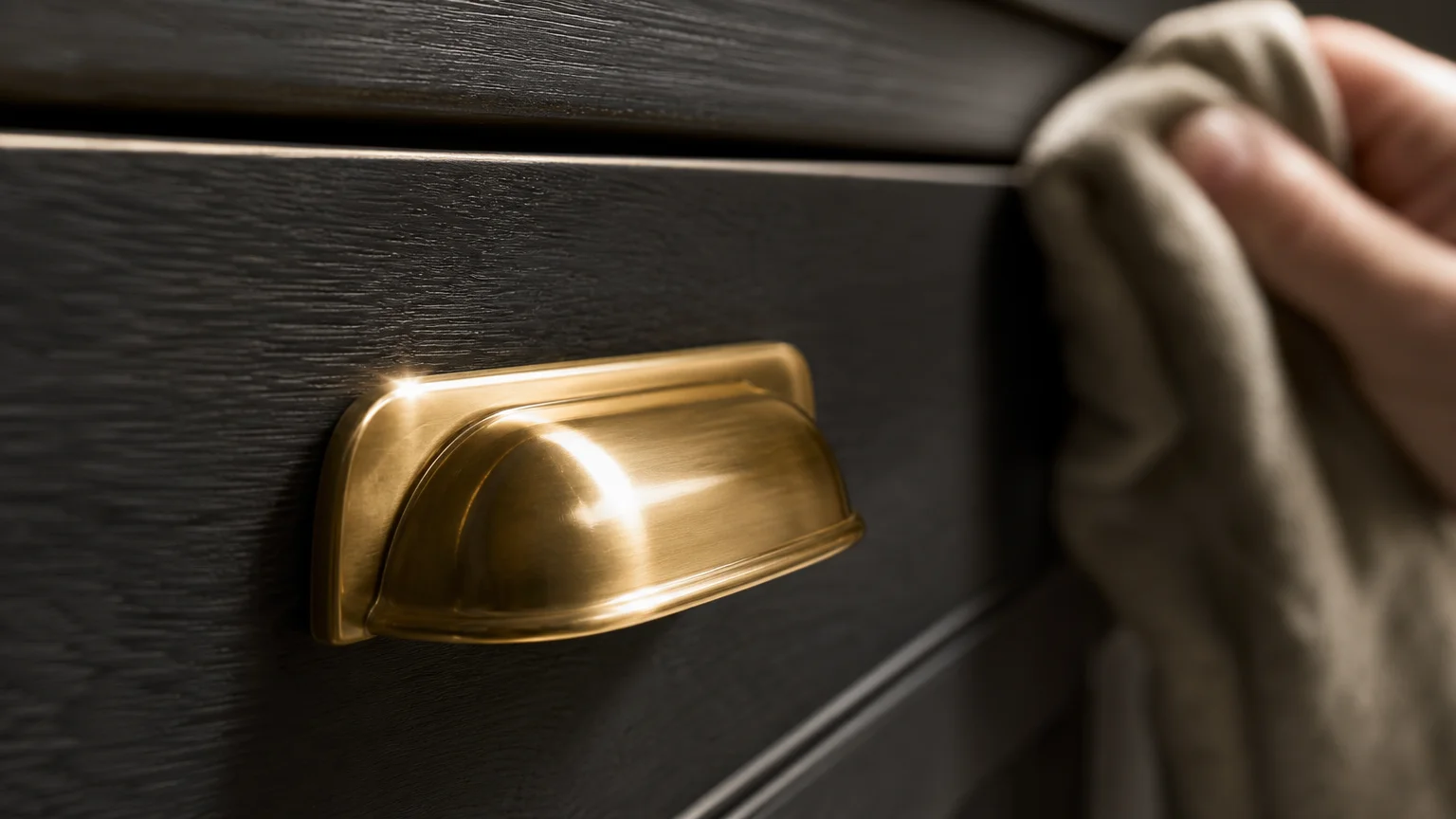
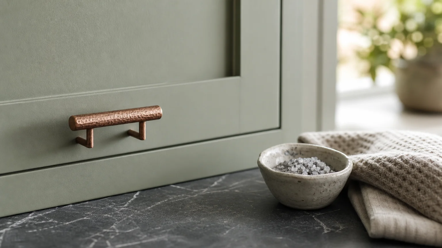
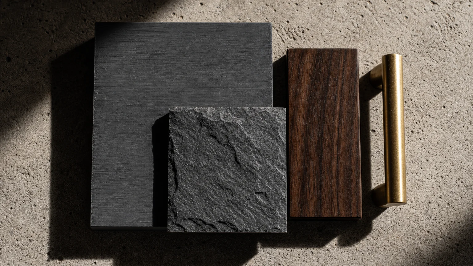
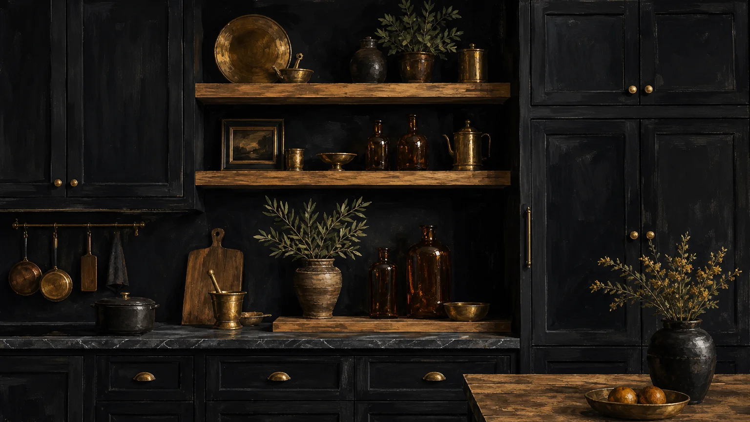
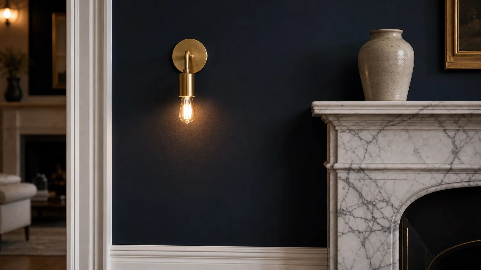
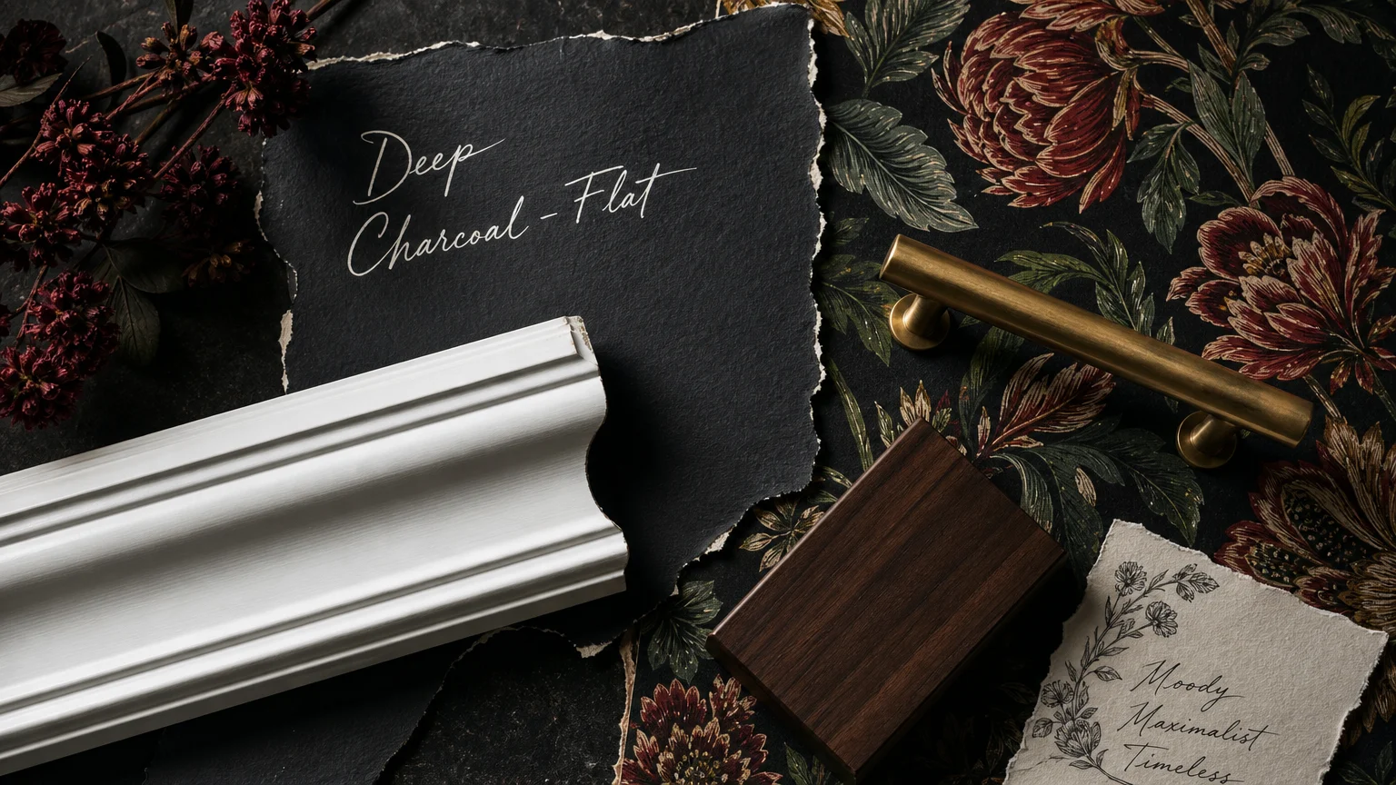
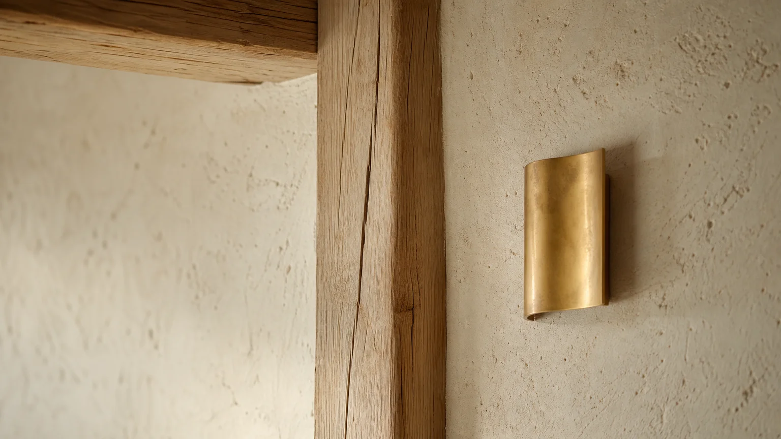
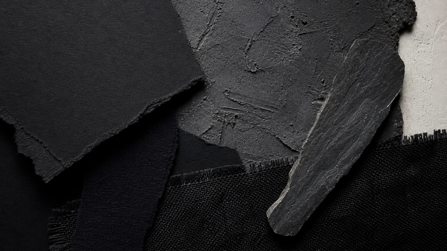
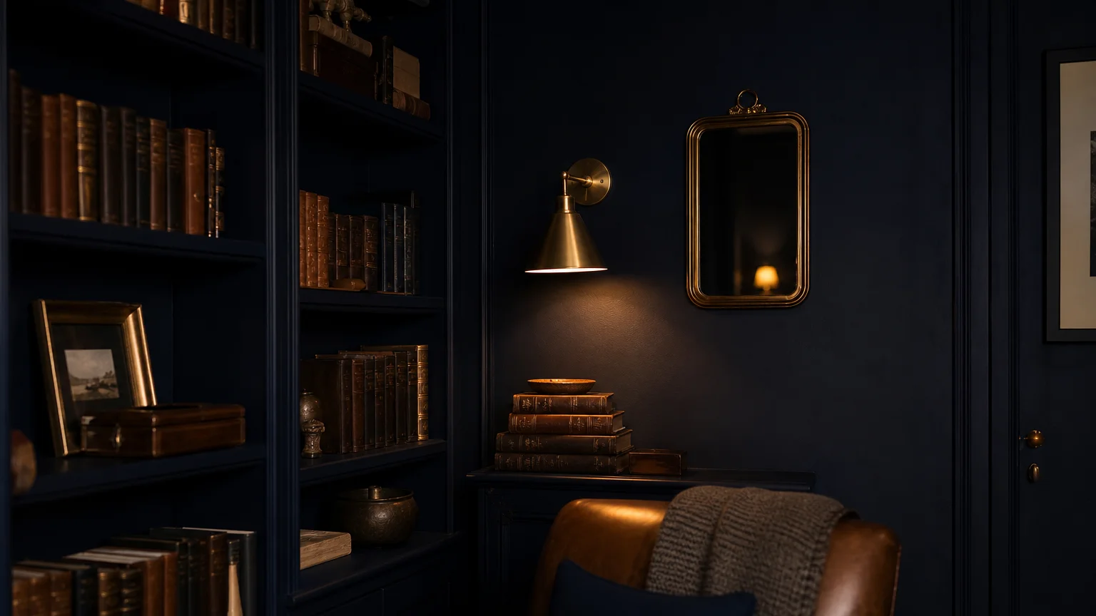
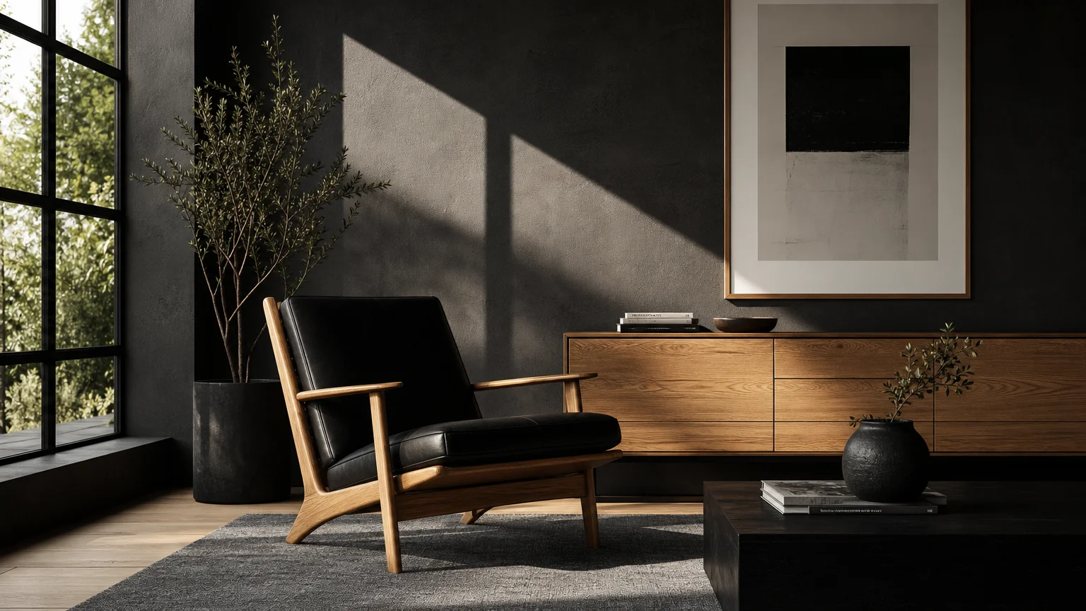
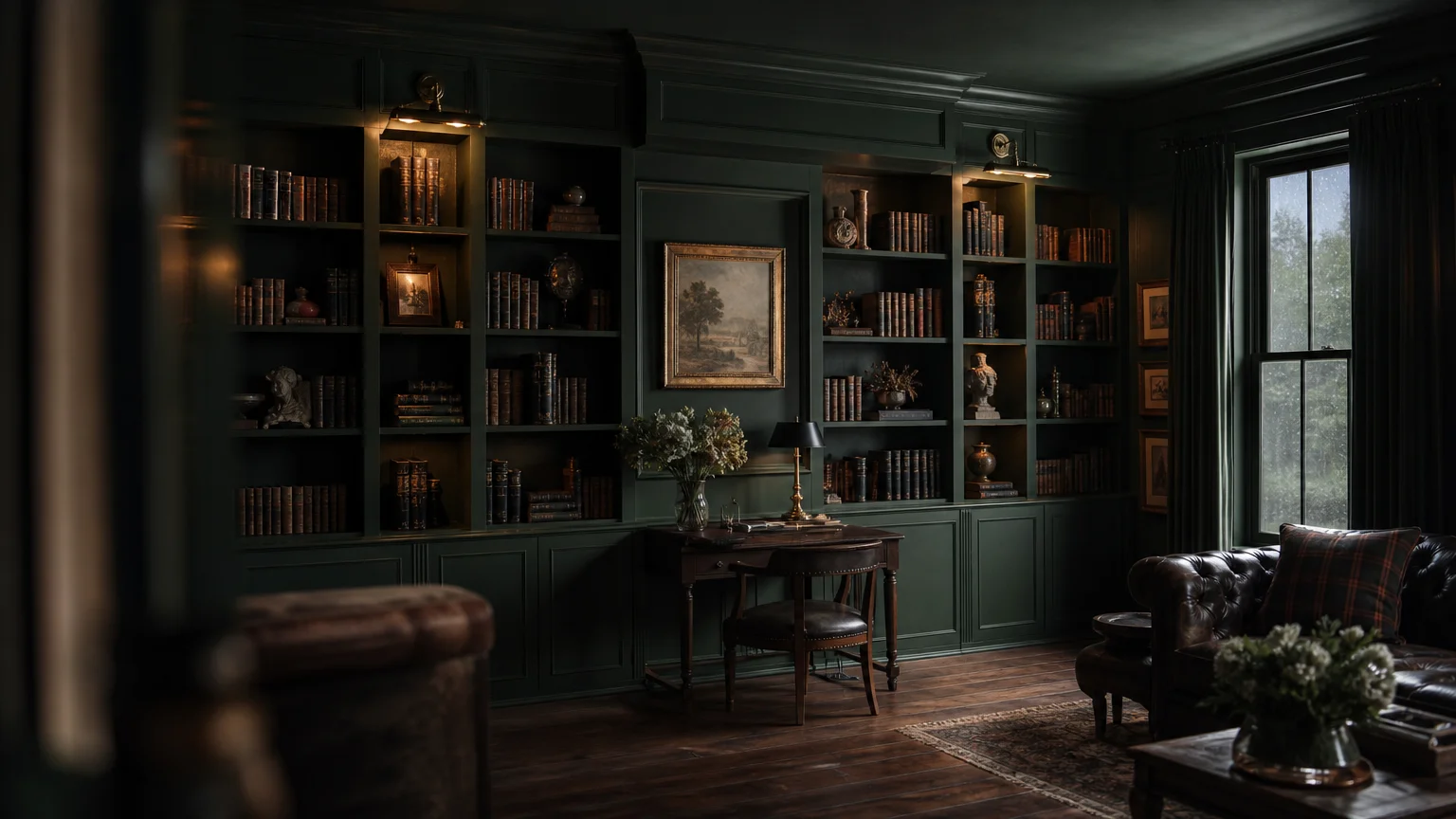
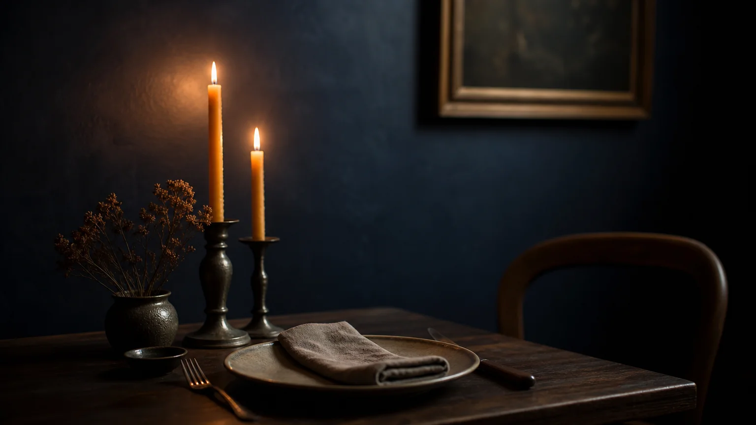
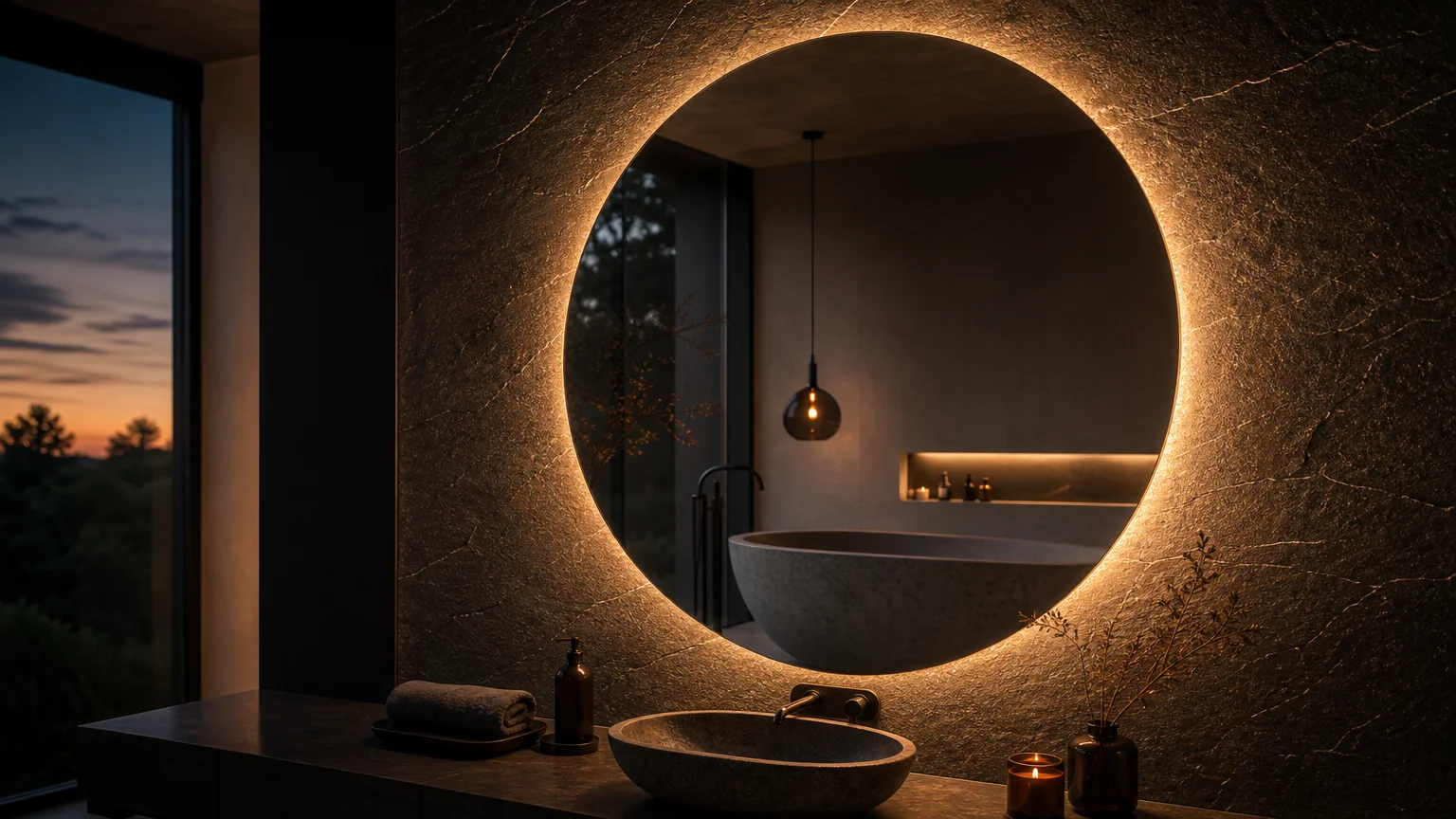
Trend #6: Deep Charcoal and Luminous Brass
Sometimes the most effective way to handle a small, windowless bathroom is to stop fighting its intimate nature and instead lean heavily into it. This approach, often referred to as the “jewel box” effect, utilizes deep, saturated colors to create an atmosphere of enveloping luxury. Deep charcoal acts as a void, absorbing shadows and erasing the corners of the room. When you obscure the physical boundaries of the space, the mind perceives it as boundless.
To prevent the charcoal from feeling oppressive, you must introduce highly reflective, warm materials. Luminous brass hardware, sconces, and mirrors serve as vital light-catchers within the dark environment. The brass cuts through the deep gray, providing radiant focal points that bounce ambient light back into the room. For an unforgettable interior design statement, bathe the entire room—walls, ceiling, and trim—in the same charcoal hue. The seamless application ensures there are no visual interruptions, allowing the glowing brass fixtures to hover elegantly in an ostensibly infinite space.
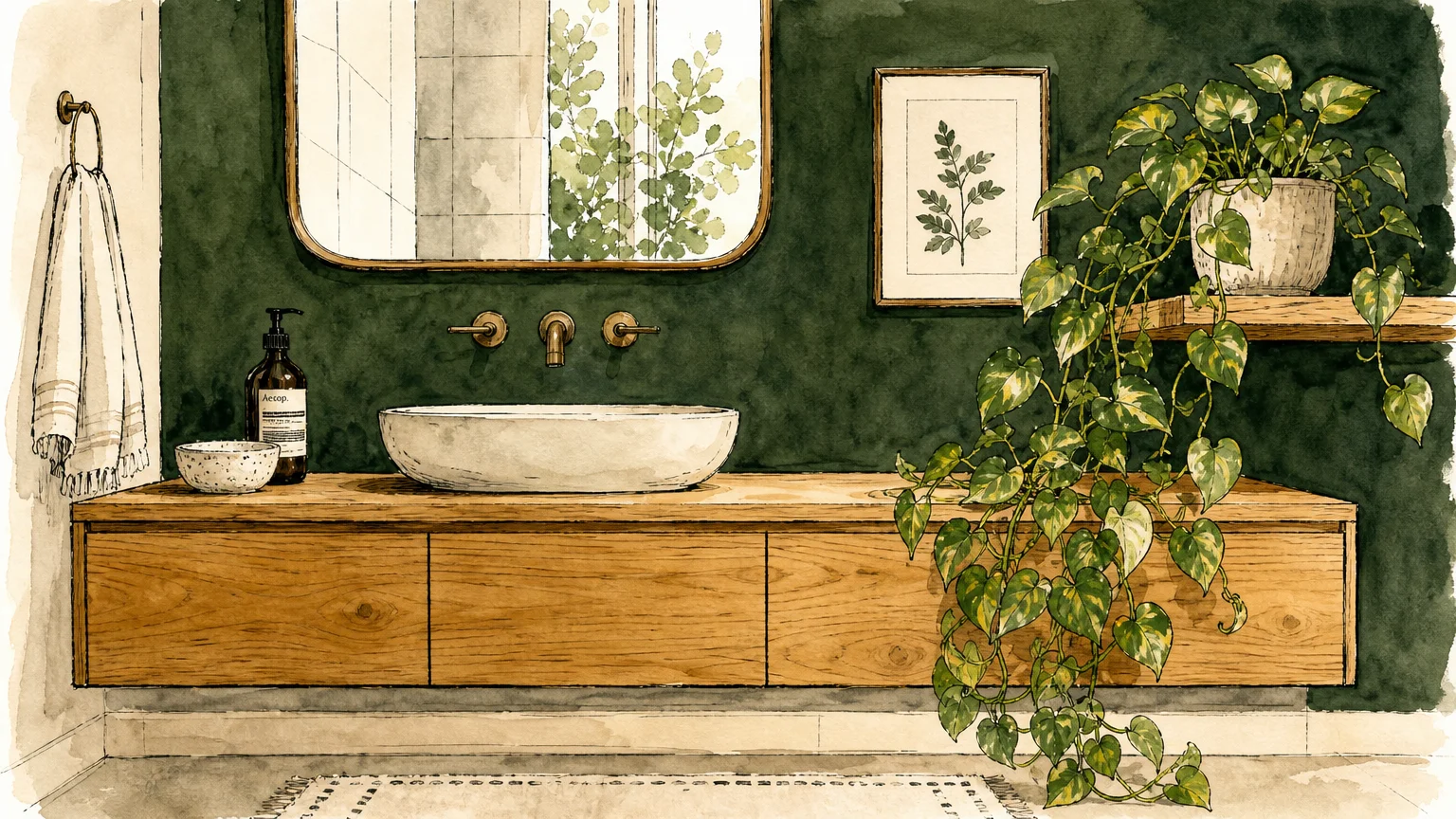
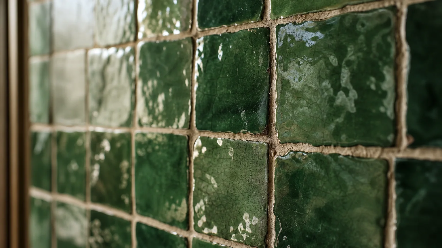
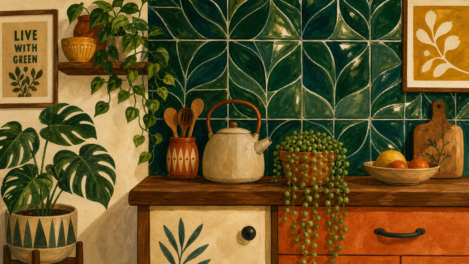
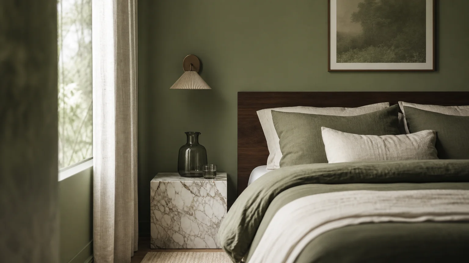
Trend #7: Forest Green and Natural Oak
Bringing the warmth and textural richness of living room decor into the bathroom creates a seamless flow throughout your home, elevating the overall provenance of your interior architecture. Forest green and natural oak form an aesthetic partnership that emphasizes verticality and organic warmth. Deep green provides a lush, grounding backdrop, while the blonde tones of natural oak introduce lightness and visual breathability.
To stretch your bathroom’s proportions, apply forest green through vertically oriented materials, such as beadboard paneling or straight-stacked rectangular tiles. The vertical lines force the viewer’s gaze upward, instantly lifting the perceived height of the ceiling. Pair this with a floating natural oak vanity. By keeping the vanity lifted off the floor, you expose more continuous square footage at the ground level; the more floor you can see, the larger the room registers to the brain. The oak’s light, natural grain prevents the dark green walls from feeling heavy, striking a perfect balance of earthy sophistication and airy spatial manipulation.
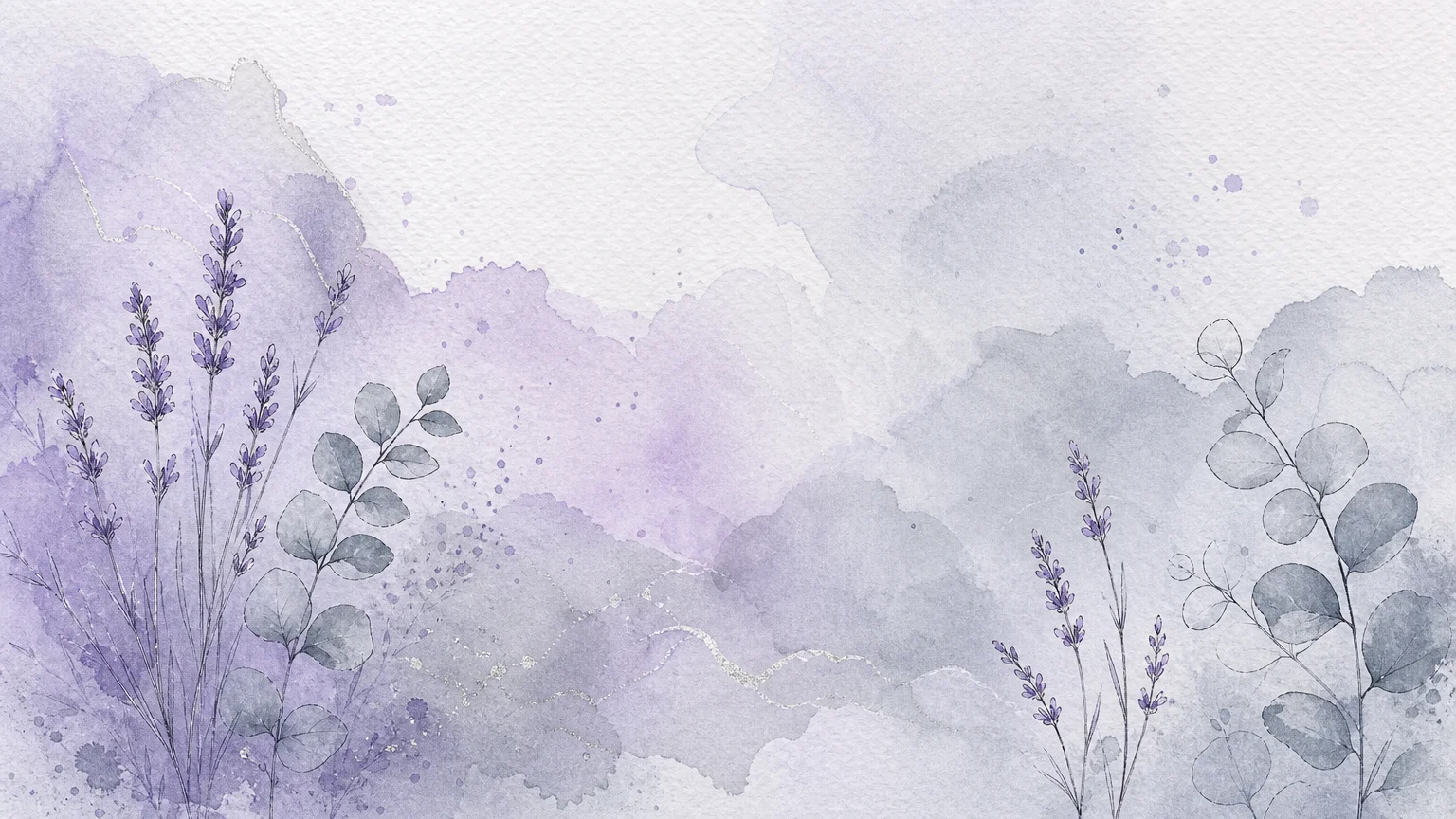
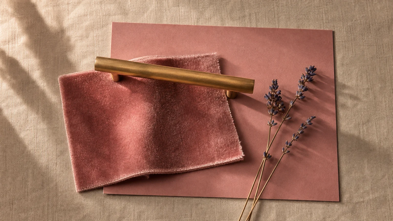
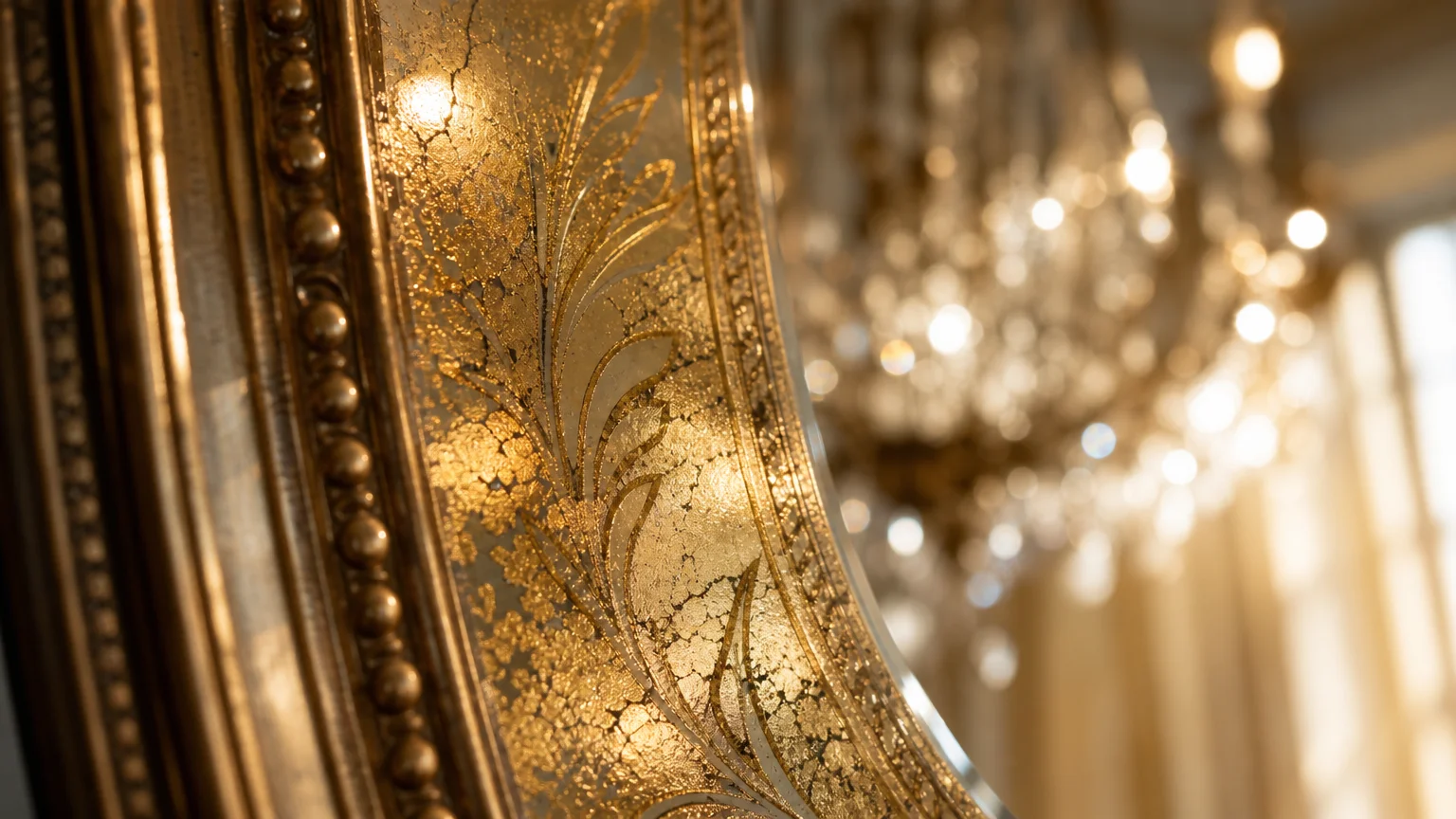
Trend #8: Pale Lavender and Polished Nickel
Pale lavender is experiencing a powerful renaissance in high-end design, stepping away from juvenile associations and emerging as a profoundly elegant, ethereal hue. Because lavender sits on the cooler end of the color spectrum, it inherently possesses recessive qualities; walls painted in this delicate shade appear to retreat, widening the hallway or powder room. Paired with the silver, mirror-like finish of polished nickel, this combination creates an environment that feels exceptionally clean, crisp, and filled with oxygen.
Polished nickel is crucial here because it reflects significantly more light than brushed or matte metals, acting almost like a secondary light source. To make your small bathroom feel remarkably larger, paint the upper walls pale lavender and install a large mirror framed in polished nickel above the vanity. Add matching polished nickel sconces on either side. The light from the sconces will bounce off the mirror, hit the reflective nickel surfaces, and wash over the recessive lavender walls, multiplying the available light and creating a brilliantly expansive, serene atmosphere.
The Big Picture: Weaving These Trends into Your Home
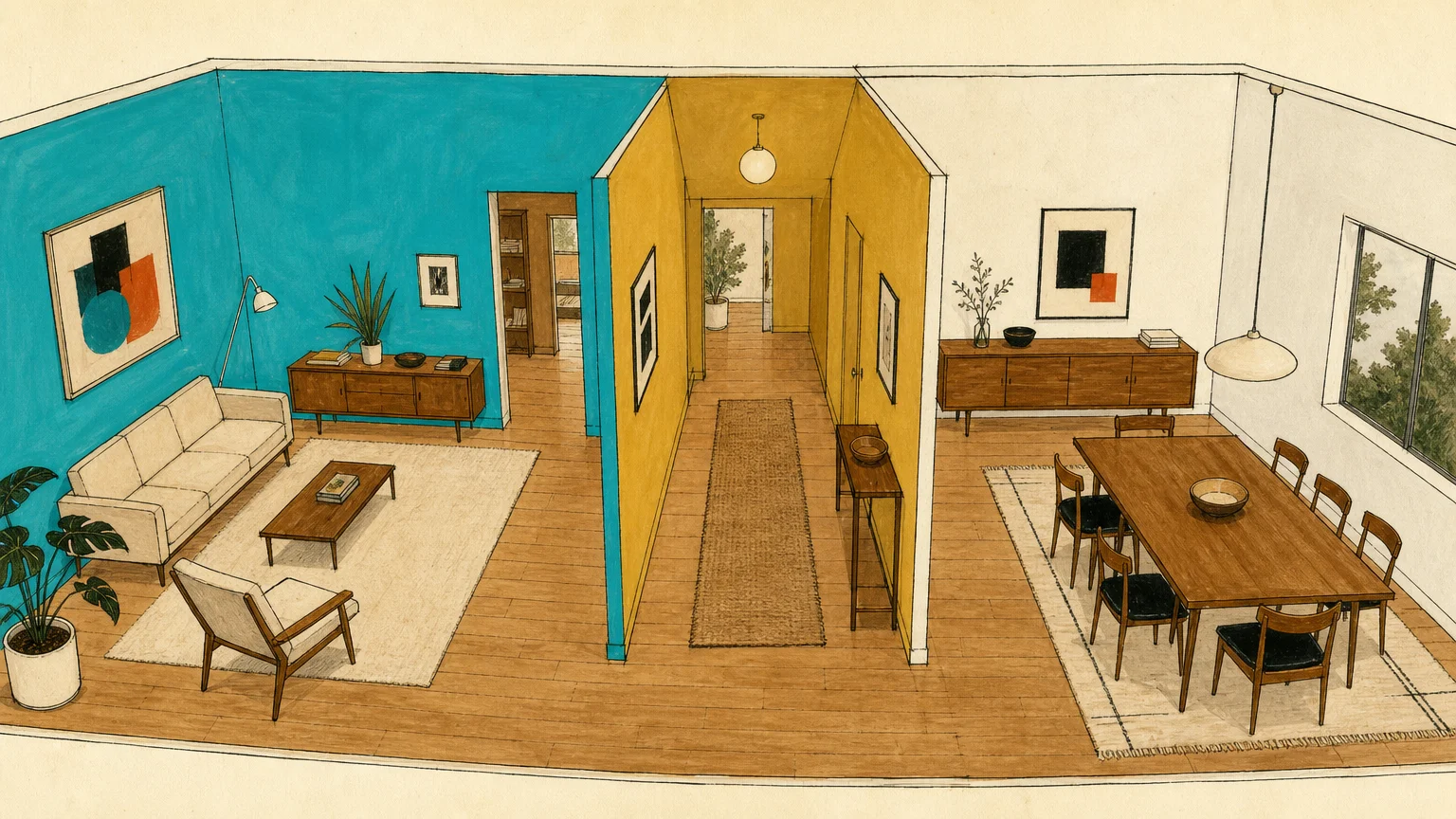
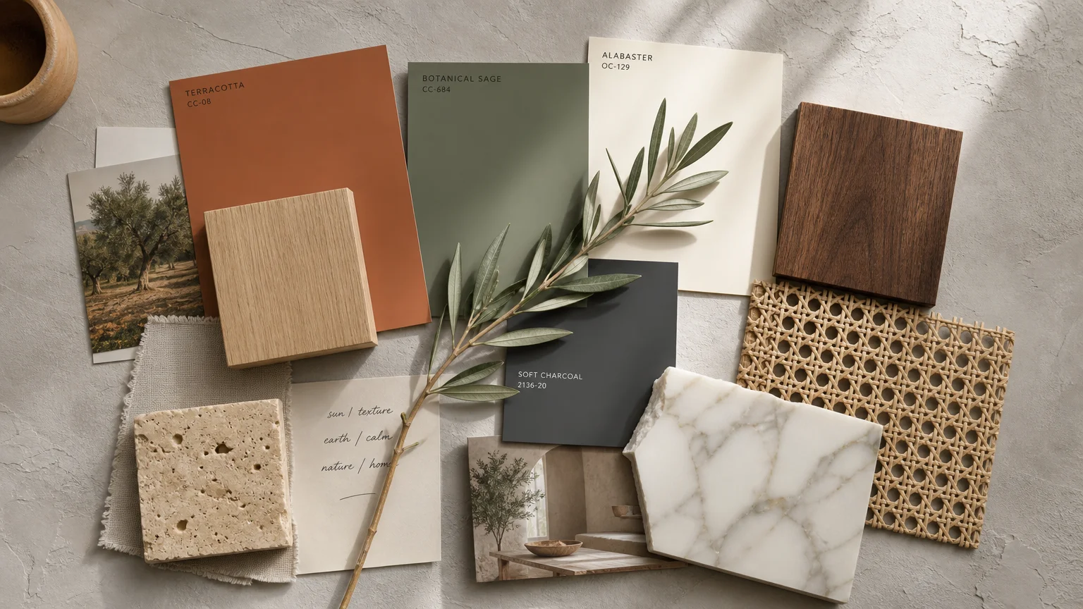
Implementing these bathroom color ideas successfully requires looking beyond the threshold of the bathroom door. A truly elevated home exhibits a sense of aesthetic continuity; your bathroom should feel like a deliberate extension of your broader interior design narrative. If your home features heavy timber beams and warm, earthy textiles, the Sage Green and Warm Terracotta palette will resonate beautifully, extending your home’s provenance into the private spaces. Conversely, if your living room leans into the sleek, tailored aesthetics of quiet luxury, the Monochromatic Greige and Ivory combination will maintain that seamless, sophisticated flow.
You do not need to replicate your living room’s exact color scheme, but you should establish a related undertone or material palette. Let your home’s foundational style dictate which of these eight trends you adopt. Furthermore, remember that the success of these spatial illusions heavily depends on decluttering. No paint combination can visually expand a bathroom that is physically choked with excessive toiletries and visual noise. Invest in closed storage solutions to maintain clean lines and allow your chosen paint combinations to perform their optical magic uninterrupted.
Frequently Asked Questions
How do I apply the 60-30-10 color rule in a physically cramped bathroom?
The 60-30-10 rule remains highly effective in small spaces because it prevents visual chaos. Dedicate 60 percent of the room to your dominant, space-expanding color—typically the walls or major tile installations. Allocate 30 percent to your secondary color, which could be your vanity cabinet, flooring, or a wainscoting detail. Reserve the final 10 percent for your high-impact accent, such as brass hardware, dramatic lighting fixtures, or vibrant textiles. This proportional discipline ensures the room feels deliberate and organized, which translates to a feeling of spaciousness.
Can dark paint combinations really work in a completely windowless bathroom?
Yes, dark paint combinations excel in windowless bathrooms when applied intentionally. Since a windowless room lacks natural light, attempting to make it feel bright and airy with stark white paint often results in a flat, clinical, and shadowy space. Embracing dark colors like Deep Charcoal or Midnight Navy transforms the architectural limitation into a deliberate mood. By utilizing the “jewel box” technique and supplementing with layered, warm artificial lighting and reflective metallic accents, you create an atmosphere of profound depth that completely distracts from the lack of natural light.
What paint finish maximizes the expansive effect of these color combinations?
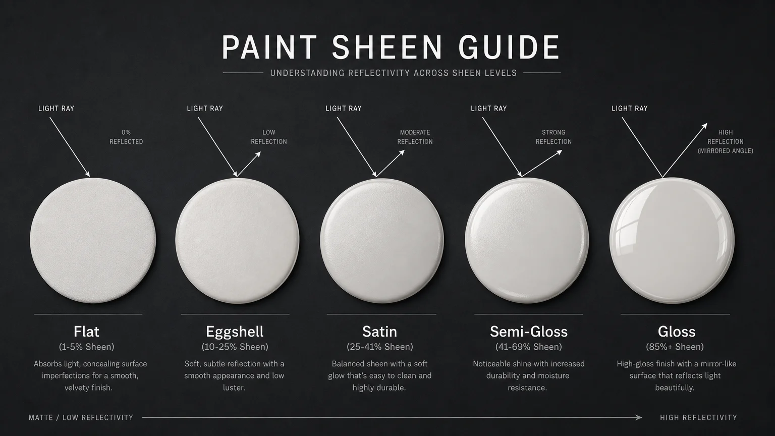
Selecting the correct paint sheen is just as important as selecting the color. In a bathroom, you must balance light reflection with moisture resistance. For the walls, a premium eggshell or satin finish is ideal; these sheens possess just enough luster to bounce ambient light around the room—thereby expanding the space—without highlighting every minor drywall imperfection. For the ceiling, use a flat or matte finish to hide flaws, unless you are deliberately applying a high-gloss lacquer to mimic a mirrored surface. Always reserve semi-gloss or high-gloss finishes for your trim, baseboards, and doors to create that subtle, depth-enhancing contrast.
For the latest color forecasts, consult industry leaders like Pantone and paint companies like Benjamin Moore. For professional design standards, refer to the American Society of Interior Designers (ASID).
Disclaimer: This article reflects design trend analysis and predictions. Personal taste and timeless design principles should always guide your decorating choices.