
Latest Color Trends For Living Rooms 2021
 When choosing colors for living rooms, several aspects must be taken into account, for example, the furniture and textures already present, in order to combine in the best way. We show you some colors and combinations that will be used this 2021 to inspire you.
Many styles have been a trend in recent years, as far as interior decoration is concerned, but many times we forget that simply what we want is a simple, cozy decoration that makes one really feel at home. That’s why we advise you not to get too complicated.
Latest colour trends for living rooms 2021
Shades of green
There are already several paint companies that have made their prediction regarding the colors that will be used in the home. And without a doubt, the color green has been a favorite for several seasons, and will continue to be. These are the shades of green that will be used in 2021.
Sage green
This tone is being used a lot. It is a dull pastel green, mixed with gray, very neutral. The environments feel very calm with this beautiful color.
You can also use a more saturated shade of green, not so pastel. Applied on a single wall it looks great.
Green foliage
The color of the vegetation is also being used a lot in interior decoration. It provides a lot of freshness and positivity.
Bluish green
Another beautiful shade of green, which mixed with blue, creates a beautiful and elegant composition in the environments.
Vivacious pastel shades
You can add a “playful” palette to the living room, with colors like Minion yellow, lime green or blue. What better way to show these great colors than in a cushion with an abstract, self-made print?
Orange style living room colors
The color rust orange and pumpkin, are another option to decorate this year. Combined with pink, brown, wine and earthy colors, they can be a great backdrop for a living room.
Orange and blue. These tones can give the living room a subtle and tasteful color that will welcome guests very well from the moment they enter the living room.
BONUS: What are the new colors for living living rooms?
Blue living room colors
The navy blue and the lighter tones pulling the cake, also make a great return.
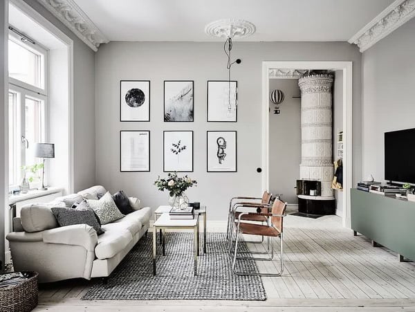
Gray living room colors
Neutral colors, such as gray, beige, creams, are one of the main trends this year. When we talk about neutral colors, we refer to harmonious decorative colors, which allow the possibility of combining with any other color.
Gray and white or beige
Grays can be used in all their shades, from very pale in pastel shades, to dark slate gray.
The gray combined with beige looks very pretty too.
Gray and orange
The living room is undoubtedly the most used space in the home, since there is a good part of the house activity, be it meetings, watching television or just hanging out.
For that reason, it is good to achieve a cozy and attractive space, which can be achieved using the color gray as the predominant color, adding some details in striking colors, for example, orange or red.
A rustic combination of light and worn woods, with soft and opaque gray, as well as an almost imperceptible nude tone. To remove the monotony, you can add cushions or blankets in magenta or salmon, which add a little energy.
The Best Combinations for Living Room Wall Colour Trends 2022
Gray and red
This combination of colors gives a lot of warmth to the living rooms.
Gray and yellow
The grays with the yellows are also going very well.
Gray and green
Beige living room
The color white, browns, beige, green and pastel blue, always look good in any environment. They are neutral base colors, easy to combine, not very attractive, which quickly adapt to the classic furniture materials, such as wood or metal.
This is another example of how the living room is a whole and it is not a matter of choosing without criteria. The dark or raw cream color is neutral, but in this case, its contrast with several paint works of strong colors, achieves a stimulating living room.
If we talk about materials, wood, velvet, leather or the fabric you like, they can stand out on a neutral background, for example, blank walls. Look at this spectacular living room, it seems like a dream Who would think that a dark sand or earthy brown color would look so elegant? The combination with the white ceiling provides elegance, and the sofa, curtains and carpet, the exact combination.
This photo shows a typical luxury lounge from the 30-40s, style that is being seen again today.
Tables and cabinets in dark wood are very elegant and shine in space, black furniture is also very interesting.
The luminaries on the other hand, tend to follow trends in dark wood and light screens, although there are also options in iron or aluminum with white screens.
The navy tones always give a calm appearance, and they look perfect on a neutral background.
One of the best options is to combine dark brown and white, with pastel colors like light blue or pale yellow. This combination of colors, manages to give warmth, but at the same time does not obscure the living room, maintaining its vitality and color.
Paint Color combinations for living rooms
We will focus on some decorative color combinations for the living room that work very well.
Neutrals and oranges
If white, very soft raw and nude tones predominate in the living room, you can give subtle flashes of color through floral patterns, with polka dots or stripes, with ranges ranging from red to orange.
These interventions of color would be convenient to do them in cushions, lampshades and centerpieces.
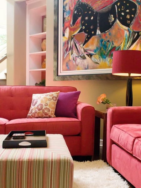
Roses and Fuchsia
A harmonious combination of soft roses, accompanied by a lot of natural flower, glass and metal coffee tables and class furniture, with embossed prints, looks fabulous.
Red and beige
Given that the living room is a place to relax and have fun, you can mix colors boldly, such as red, fuchsia and orange.
Blue and white
White, blue and red, go perfectly together. The point of union with the house, can be through dark woods, although they can also be clear, achieving fresher results.
This image focuses on a pastel blue, combined with nude colors, while taking advantage of the cushions to introduce strong tones, striped patterns and textures, which emphasize the hue.
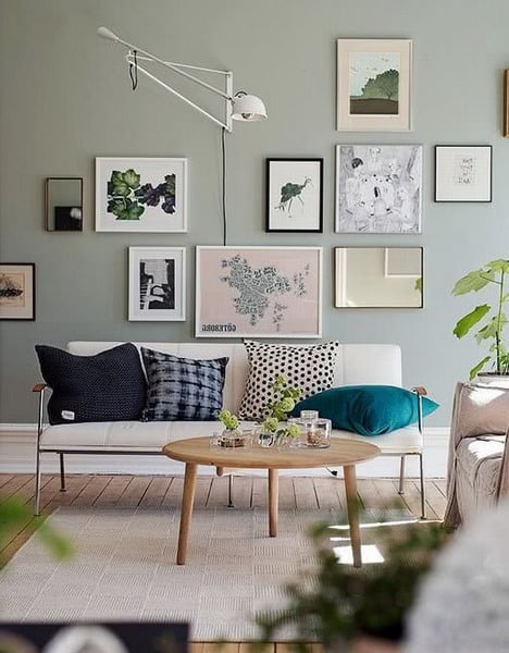
Green and beige
In the photos you will see below, there are the combinations of different shades of green with earth tones, purple and the magnificent combination with pastel blue, complemented with nude, camel, khaki, lots of wood and wicker.
Lilac and purple
These colors combined with green, achieve very energizing spaces.
Yellow and neutral
There are colors that are used very often in interior decoration, because they are classic and easy to combine. In addition, they are perfect because they do not require so much care. Some of those colors are brown, black, blue, and other dark shades that come in handy because they do not require constant cleaning.
But if you want an interior decoration in bright, summer and warm colors, which although very clear and that require a lot of care in terms of cleaning, result in very pleasant atmospheres.
One of those colors that illuminate the living room, make it feel warmer because they are summer colors, and combine well within many decorative styles, is yellow. Ideal for decorating a yellow living room with white, although we already know that yellow also blends well with other citrus colors such as orange or green.
In this case the fusion of yellow and white gives us a flirtatious, modern, relaxed, illuminated but also “neat” appearance. Yellow, like other light colors that resemble it, give a feeling of neatness.
9 Key Living Room Interior Trends In 2022
Colors for small living rooms 2021
Neutral colors
One of the most popular resources is the use of neutral colors in walls, floor, ceiling and furniture upholstery. A palette of muted or beige targets will expand the space, moving the walls away. Soft tones also tend to illuminate a living room as they reflect light better. In addition to enlarging an area, a neutral palette imparts instant sophistication and creates a calm environment.
Touches of bright colors
Just because your living room is small does not mean you have to sacrifice color. You can use bright and fresh colors to add interest to the space. Just be sure to limit the palette to two or three colors to achieve a revitalizing, but not overwhelming, space.
Dark colors
Do not be afraid to use dark colors, even in a small space. Lighter colors could make the living room feel bigger, but deeper tones add drama and style. If you opt for a dark color in the paint, you can choose a semi-gloss or satin finish, which will reflect the light in the living room. Leave the windows bare to keep the space light and ventilated.
Only white
The white-based color scheme gives a small living room a soothing and organized look. White is a great option to reflect light and add visual space.
Light rugs
A light colored carpet can expand a living room, especially if the floor is dark in color.
10 Best Living Room Paint Colours 2023
Rustic living room colors 2021
Rustic green
The green off looks very cozy when combined with antiques.
Blue
In rustic houses, blue can be used as a contrasting color of furniture.
Gray
It does not have to be bleak when contrasted with whites, earthy browns and other warm tones. Here, the walls are painted gray, achieving a rustic and sophisticated atmosphere.
White
Illuminate your home giving the walls a moderate touch of warmth with a shade of white.
Trend colors for minimalist living rooms
Neutral tones
Opting for a minimalist appearance does not mean that you should only use black and white in an impersonal and almost sterile way. In fact, there is a very fine line between charming minimalist interiors and monotonous and boring ones. This is precisely the reason why we suggest that you induce some flavor playing with the different neutral tones.
Touches of color
You can also add small touches of color to a minimalist living room.
Living Room Furniture: New Interior Trends 2022-2023
Color Trends 2021
2021 is just around the corner, it’s time to learn about trendy colors. Experts in design, Dora Blaskievich of branding studio Charm Creative and chief designer Frederick Eshrich of creative agency Someoddpilo, told about the main color trends 2021.
In good design, the most important thing is color, and then other visual elements. If you want your design to be always in trend, you need to carefully monitor the color trends of the upcoming season. Let’s find out what colors will be in trend in 2021 and how to correctly combine them in their projects.
Trend No. 1. Natural calming colors
We are constantly on the move. New technologies, an endless stream of information – all this tires and causes stress. A person often feels annoyed than relaxed. Therefore, the main trend in 2021 is the search for calm and inspiration in urban chaos. The main color trend is a maximum of naturalness, naturalness, proximity to nature.
The world’s largest paint companies Behr, Sherwin Williams and PPG have recently released their color palettes – these are calm and soft shades inspired by nature and freshness. Among the shades of Behr are dusty lilac, fresh green, exotic orange, muted red, graphite, creamy mushroom. Mostly in the 2021 palette, muted and pastel shades.
“The faster the technologies that simplify our lives develop, the more we want to slow down this speed and return to the roots. There is a need for simplicity and avoiding technology, people crave closeness with nature. Color Chinese Porcelain (Chinese porcelain) is associated with the sea and sky, creating an atmosphere of tranquility, ”says Di Schlotter, senior color manager at PPG.
“The popularity of the natural palette in graphic design began in 2019. Instagram accounts were decorated in pastel brown and green shades. Of the decorative elements in the first place – plant illustrations. I believe that the tendency to get closer to nature will not disappear soon, ”says Blaskevich of Charm Creative.
How to use natural shades in your projects
Choose natural shades. People are desperate for peace! Calm and inspire with your designs. To better understand the combination of colors, we recommend reading our article “6 main rules of color theory that anyone needs to know. ”
Trend No. 2. Bold contrasting colors
According to Blaskevich, contrasting combinations will become the 2021 color trend along with neutral anti-stress palettes.
“To achieve a bold and unusual effect, combinations of paired colors that are traditionally considered conflicting will help: red with light pink or neon pink in combination with the color of the first-person. Create a playful and bizarre design, ”advises Blaskevich.
How to use contrasting colors in your projects
Do not be afraid to be bold when working with color. The combination of contrasting colors with neutral shades will create a spectacular design.
“Choose one or two bright colors, and neutral shades will do the rest,” says Blaskevich. “Neutral colors are a kind of“ rest ”for the eyes and a background for vibrant colors, onto which the whole focus shifts.”
Combining bold contrasting colors will be one of the most interesting color trends in 2021. Experiment with fancy colors on social networks and blogs. What about contrasting Canva patterns for YouTube?
Trendy colors for spring / summer 2021
You can not talk about color trends without Pantone recommendations – this is a global authority in the field of design. Pantone Color Institute, Pantone Color Institute, determines color trends in every area of design twice a year in spring and autumn, from fashion to interior and graphics. You can read about the main color of the year that the company annually announces in this article, but for now Pantone has released a report on the trends of the spring / summer 2021 season and has chosen the most fashionable colors.
So what colors are included in this palette? The color trends of the spring / summer 2021 season include many orange, red and blue shades, as well as four key neutral shades: universal khaki, dark blue, shiny white and ashen.
According to Pantone, “the trendy colors of spring / summer 2021 reflect naturalness and ease. At the same time, for the era of intense self-expression, this list contains colors that can be used to create a special palette that emphasizes uniqueness, modernity and a passion for entertainment. ”
How to combine trendy colors of 2021 in your projects
The shades in the Pantone palette are classic and balanced. “Pantone’s spring / autumn 2021 trends make me think of a return to a more modernistic ideal, a thoughtful and classic color combination,” says Frederick Ashrich.
When creating your designs, combine shades in such a way as to cause a friendly feeling, a feeling of getting to know the audience. The classic is definitely in fashion in 2021, so the design based on the familiar color palettes will look modern.
Pantone’s trendy colors of 2021 include orange, red, and blue. Want these colors to stand out in your designs? Take a look at Canva’s templates.
Another color trend in 2021: a combination of colors and textures
Another interesting trend in the coming 2021 goes beyond the usual color – a combination of shades and textures.
“The use of Cinema 4D software for 3D rendering is actively spreading in graphic and visual design. The program models the textures of different materials – polished metals, marble patterns, plasticine surfaces, ”says Ashrich.
In 2021, it is recommended to add texture to the color, not only in the interior, but also in the design of business cards, logos, posters.
How to combine colors and textures to be in trend
When creating your design, try to think outside the box and go beyond the simple choice of color. Come up with interesting ways to combine color and texture. Add metallic polish to blue for a more dramatic finish. For neutral shades, choose a natural texture (imitation of wood bark, stone, use floral ornaments). Add visual interest to the muted design. Get creative by combining different colors and textures. Design from trendy colors for the coming year!
Start using 2021 color trends
Already now you can create a design based on the fashionable shades of 2021 using the Canva editor. Color trends of the coming year are already found in clothing, interior design and social networks.
Start applying color trends already on your Instagram profile. Also, our article “20 Instagram Trends in 2021: What Content People Expect” will be useful to you. Take it to a new level, inspired by the upcoming 2021!