Painting your ceiling the right color instantly manipulates spatial perception, pushing boundaries upward to transform confined areas into expansive sanctuaries. You can fundamentally alter a room’s architecture without swinging a single sledgehammer simply by rethinking the traditional flat white fifth wall. Interior design now treats the ceiling as a primary canvas for spatial illusion. Using specific shades, light reflectance values, and strategic finishes, you can trick the human eye into perceiving significant additional height. Whether you apply a cool-toned pastel that mimics the receding atmospheric sky or a deep, dramatic hue that erases visible borders like the night canopy, mastering ceiling paint unlocks your home’s hidden volume.

Trend #1: Soft Sky Blue
Focus heavily on the psychological phenomenon of atmospheric perspective. When you look up at the daytime sky, your brain naturally interprets the vast blue expanse as infinite and completely unconfined. 
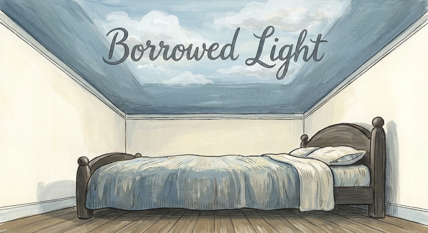
By painting a ceiling a soft, desaturated blue—think along the lines of Benjamin Moore’s Constellation or Farrow & Ball’s Borrowed Light—you replicate this majestic natural phenomenon directly indoors. The cool undertones inherent in light blue actively pull away from the viewer; this powerful optical illusion makes the physical drywall appear much higher than its actual architectural measurement.
This approach excels beautifully in bedrooms, primary bathrooms, and sunrooms where you want to foster a restorative, tranquil, and distinctly airy atmosphere. To ground the space effectively, pair a sky blue ceiling with crisp, warm-white walls and rich, medium-tone hardwood flooring. The sharp contrast anchors the room below while allowing the ceiling to soar endlessly above. When selecting your specific shade of blue, purposefully opt for tones with subtle gray undertones rather than pure, vibrant pastels. A highly saturated blue can feel oppressive and visually advance toward you, whereas a muted, gray-leaning blue perfectly mimics the authentic, receding morning sky.

Trend #2: High-Gloss Brilliant White
While standard builder-grade flat white remains the default across modern residential construction, upgrading to a high-gloss brilliant white completely alters the spatial dynamics of any small room. High-gloss finishes operate through the scientific principle of specular reflection—acting almost like a pristine mirror suspended directly above your head. By aggressively bouncing both natural sunlight from your windows and artificial illumination from your lamps around the room, a glossy white ceiling effectively doubles the perceived volume of the space.
The sharp reflections create a profound sense of architectural depth that a traditional matte finish simply absorbs and kills. Achieving this highly luxurious look requires meticulous, painstaking preparation from your painting team. Because high-gloss paint highlights every single structural imperfection, your ceiling drywall must be skim-coated to a flawless, glass-like finish before a single drop of paint is ever applied. This technique shines brilliantly in spaces suffering from lower natural light levels, such as narrow hallways or modest formal dining rooms, where capturing and amplifying every available photon becomes crucial. The resulting aesthetic aligns perfectly with the current quiet luxury movement—elevated, highly intentional, and undeniably glamorous.

Trend #3: Monochromatic Cream
Color drenching has taken the interior design world by storm, serving as a transformative design strategy that involves painting your walls, baseboards, crown molding, and ceiling the exact same shade of warm, inviting cream. When you entirely eliminate the high-contrast lines between the vertical walls and the horizontal ceiling, you remove the hard visual stops that tell the human eye exactly where the room ends. Without a stark white ceiling drawing a distinct architectural boundary, the surrounding walls appear to stretch endlessly upward.
Monochromatic cream brings a sophisticated, enveloping warmth to a confined space, completely avoiding the clinical, sterile feeling that stark white environments can sometimes produce. To execute this unified trend with professional finesse, you must vary your paint finishes rather than your paint colors. Apply a durable, washable eggshell finish to your walls, a smooth satin finish to your trim, and a flat or ultra-matte finish to your ceiling. This extremely subtle shift in sheen reflects ambient light differently across the various surfaces, adding necessary architectural depth and rich tactile interest while maintaining the uninterrupted, expansive spatial illusion.

Trend #4: Pale Blush Pink
Moving away from traditional stark neutrals, pale blush pink has emerged as a formidable powerhouse shade for expanding spatial perception. This delicate hue offers much-needed warmth without the heavy visual weight typically associated with darker reds or oranges. A blush ceiling casts a highly flattering, ambient glow throughout the entire room, expertly mimicking the soft, expansive light of early dusk. Because the color feels so unexpectedly refined on a ceiling, it instantly draws the eye upward, naturally elongating the vertical lines of your living space.
This technique works exceptionally well in living rooms and primary suites featuring north-facing windows; the pink actively counteracts the inherently chilly, blue-toned light typical of northern exposures. For a high-end, curated look, balance the softness of a blush ceiling with deeply grounded wall colors. Dark forest greens, moody charcoals, or rich navy blues on the walls create a striking, sophisticated juxtaposition. The dark walls beautifully frame the perimeter of the space, while the luminous pink ceiling feels as though it is floating away into the ether.

Trend #5: Charcoal Black
It may seem entirely counterintuitive, but painting your ceiling a deep charcoal black can actually make a confined room feel vastly larger. This brilliant optical trick leverages the “night sky effect.” Deep, dark colors absorb ambient light and obscure physical boundaries. When you look up at a black ceiling, especially in a room layered with strategic ambient lighting, the corners and edges dissolve into the shadows. The physical ceiling effectively disappears, leaving behind a profound sense of structural infinity.
This dramatic approach proves particularly effective in basement renovations, home theaters, or intimate powder rooms where you simply cannot fight the lack of natural light. Instead of struggling to brighten a naturally dim space with weak pastels, leaning into the darkness creates an expansive, jewel-box aesthetic. You must always use an ultra-flat finish for a black ceiling. Any sheen will catch the light and reveal the exact location of the drywall, completely shattering the illusion of endless, boundary-free space.

Trend #6: Luminous Lavender
Lavender is experiencing a major renaissance in high-end interior design, prized heavily for its unique ability to inject vitality into a room while remaining visually recessive. As the absolute coolest tone on the color wheel, purple inherently retreats from the viewer. A highly desaturated, luminous lavender ceiling provides the same spatial expansion as a pale blue, but it carries a much more complex, sophisticated provenance. The subtle red undertones hidden deep within the purple prevent the room from feeling frigid, striking a perfect balance between cool expansion and warm livability.
This shade stands as a magnificent choice for eclectic interiors or historic home renovations where you want to honor classic architecture while seamlessly introducing a fresh, modern perspective. Pair a luminous lavender ceiling with creamy white walls, warm textiles, and unlacquered brass hardware. The metallic accents will catch the subtle warmth of the lavender overhead, creating a cohesive, deeply customized environment that feels both expansive and intimately curated.

Trend #7: Soft Mint Green
Rooted deeply in biophilic design principles, a soft mint green ceiling visually connects your interior space to the expansive natural world outside. Green universally represents growth, vitality, and wide-open landscapes; bringing this hue to the fifth wall psychologically lifts the ceiling by associating it with the boundless canopy of nature. Mint green possesses a remarkably high light reflectance value (LRV), meaning it effectively bounces a significant amount of illumination back down into your primary living area, keeping the atmosphere feeling airy and entirely unconfined.
To maximize this expansive effect, surround your mint ceiling with organic textures and natural materials. Incorporate light white-oak flooring, raw linen drapery, and woven rattan light fixtures into your floor plan. The seamless combination of the airy green overhead and tactile, earthy materials below grounds the human body while allowing the mind to perceive the architecture as much taller and more open than its actual square footage dictates.

Trend #8: Warm Greige
Finding the perfect middle ground between the somewhat sterile nature of pure white and the heavy, oppressive presence of dark gray leads you directly to warm greige. This highly sophisticated blend of gray and beige offers a subtle, architectural elegance that expands a room without ever demanding the spotlight. A warm greige ceiling actively lowers the visual contrast against mid-tone walls, creating a seamless visual flow that actively prevents the eye from halting abruptly at the cornice line.
When selecting a greige specifically for spatial expansion, closely scrutinize the paint’s light reflectance value. You need a shade with an LRV hovering between 60 and 70—light enough to feel genuinely uplifting but pigmented enough to provide legitimate color depth. Greige ceilings excel specifically in open-concept living spaces, subtly defining the area overhead while remaining neutral enough to complement evolving furniture styles and seasonal decor changes. It remains the ultimate quiet luxury choice for homeowners seeking inherent spaciousness.

Trend #9: Metallic Champagne
For a truly opulent approach to making a room feel substantially larger, a metallic champagne ceiling offers unparalleled light-manipulating capabilities. Unlike high-gloss paint, which provides a direct, mirror-like specular reflection, metallic paints contain finely ground mica or metal particles that scatter light in multiple complex directions. This gorgeous diffuse reflection casts a warm, multidimensional glow that effectively blurs the structural plane of the ceiling, making it highly difficult for the human eye to determine exactly how high the room actually stretches.
The champagne hue—a far more sophisticated step up from stark silver or heavy, dated brass—adds a crucial layer of glamorous warmth. This specific trend is best deployed in spaces that heavily feature statement lighting, such as formal dining rooms centered around an intricate crystal chandelier. The metallic flecks overhead will continuously catch and amplify the glow of the light fixture, throwing dancing reflections around the room and creating a dynamic, expansive atmosphere that feels uncommonly grand.

The Big Picture: Weaving These Trends into Your Home
Understanding the optical physics of color represents only the first step; executing these trends successfully requires thoughtful, meticulous integration into your broader design scheme. Expanding a room visually is never about applying a trendy color indiscriminately; it requires analyzing your specific architectural constraints and leveraging high-quality paint to solve them. Before committing to a ceiling color, you must observe exactly how natural light travels through your specific space over the course of an entire day. A pale blush pink might look undeniably magnificent in the cool, flat light of a northern exposure but could easily turn overly saturated and oppressive in a blazing, south-facing room.
Always paint large, two-foot test swatches directly onto the ceiling—not just the walls—because the horizontal plane receives and reflects light entirely differently than vertical surfaces do. Your flooring choices also play a massive, undeniable role in how ceiling colors are ultimately perceived. Dark, espresso hardwood floors naturally absorb light, making a highly reflective or receding ceiling color even more critical for maintaining a sense of open volume. Conversely, light-colored flooring actively bounces light upward, giving you much more freedom to experiment with dramatic shades like charcoal black without accidentally turning the room into a cave. Remember that the ceiling serves as your fifth wall; treat it with the exact same respect, financial investment, and rigorous design consideration as the other four. By doing so, you elevate the entire structural feel of your home, proving definitively that you do not need to add expensive square footage to dramatically increase your living space.
Frequently Asked Questions
Should I paint my ceiling the same color as the walls?
Yes, painting your ceiling the exact same color as your walls—a renowned technique known as color drenching—is an exceptional way to make a confined room feel substantially larger. By erasing the contrasting line where the wall physically meets the ceiling, you entirely eliminate visual boundaries. The eye continues upward without any harsh interruption, successfully creating a compelling illusion of endless vertical height. For the best architectural results, always use a flat finish on the ceiling and a durable eggshell finish on the walls to add subtle depth.
How does natural light impact ceiling paint perception?
Natural light drastically alters how any ceiling paint reads in a room. Because the ceiling exists as a horizontal plane positioned directly above the primary light source (your windows), it usually falls in a natural shadow, making colors appear significantly darker than they do on a well-lit wall. Always select a ceiling paint shade that is one or two shades lighter on the paint swatch than you think you need. Furthermore, southern exposures warm up colors beautifully, while northern exposures cast a cool, bluish light that can make cool-toned ceilings feel icy if left unbalanced.
Can I use these techniques on heavily textured ceilings?
You certainly can, but you must strictly adjust your chosen finish strategy. Heavily textured ceilings, like popcorn or heavy swirl patterns, catch ambient light unevenly and cast thousands of tiny, distracting shadows. If you have a textured ceiling, absolutely avoid high-gloss or metallic finishes; they will mercilessly highlight every single bump and make the ceiling feel heavily weighted and much lower. Stick exclusively to ultra-flat or dead-matte finishes in colors like soft sky blue or monochromatic cream to visually smooth out the rough texture and lift the ceiling.
What is Light Reflectance Value (LRV) and why does it matter for ceilings?
Light Reflectance Value (LRV) serves as a critical metric that measures the exact percentage of visible light a paint color reflects, scaled from 0 (absolute black) to 100 (pure white). When trying to make a room feel bigger, selecting ceiling paint with a high LRV is generally highly beneficial because it maximizes the available ambient light. However, as demonstrated by the charcoal black trend, extremely low LRV colors can also effectively expand a space by intentionally hiding physical boundaries deep in shadow. Understanding LRV helps you predict exactly how a specific color will behave overhead.
For the latest color forecasts, consult industry leaders like Pantone and paint companies like Benjamin Moore. For professional design standards, refer to the American Society of Interior Designers (ASID).
Disclaimer: This article reflects design trend analysis and predictions. Personal taste and timeless design principles should always guide your decorating choices.
