
8 Classic Wall Colors That Never Feel Dated

Choosing the right interior paint saves you from the exhaustive cycle of repainting every time a micro-trend fades. By anchoring your home in classic wall colors, you establish a sophisticated foundation that effortlessly adapts to evolving furniture styles, textiles, and artwork over the decades. These enduring hues deliver immediate aesthetic value and long-term versatility—proving that true elegance defies the relentless churn of passing fads. Selecting a timeless palette requires understanding undertones, natural light exposure, and spatial dynamics rather than blindly following social media algorithms. Explore these eight proven shades that consistently deliver refined, steadfast beauty, ensuring your living spaces maintain their polished allure long after fleeting seasonal obsessions disappear from the design conversation.
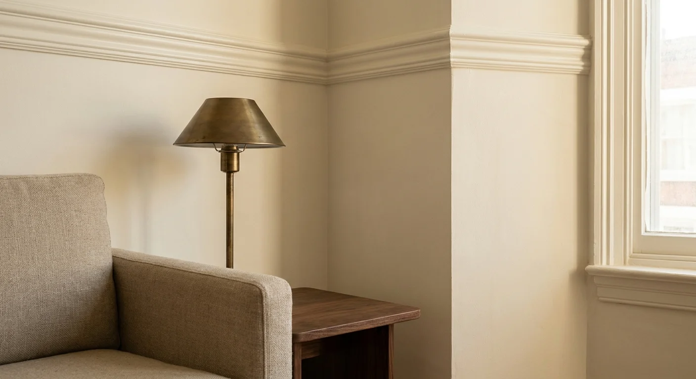
Close-up of an interior corner with warm white walls, walnut wood furniture, and a brass lamp in natural light.
Warm alabaster white walls and elegant crown molding create a sophisticated backdrop for this brass lamp.

Trend #1: Warm Alabaster White

Warm alabaster white serves as the ultimate chameleon in interior design; it provides a crisp, clean canvas without the sterile austerity of pure gallery white. This enduring shade owes its popularity to a subtle infusion of warm undertones—often ochre or barely-there grey—which absorbs and reflects natural daylight beautifully. You will find that alabaster walls cultivate a sense of expansive serenity, anchoring spaces that range from historic estates to contemporary, organic modern lofts. The psychological impact leans heavily into the concept of quiet luxury, fostering an environment that feels simultaneously curated and effortlessly comfortable.

When establishing a material palette, this classic neutral harmonizes flawlessly with rich walnut flooring, unlacquered brass hardware, and highly textured textiles like raw linen, mohair, and bouclé. High-quality formulations, such as Benjamin Moore’s White Dove or Farrow & Ball’s Pointing, offer an unparalleled depth of color. Rooms boasting southern exposure amplify the creamy warmth of the pigment, while cooler northern light tempers the hue into a sophisticated, soft bone tone. For a foolproof, elevated application, drape your entire living room—walls, crown molding, and baseboards—in the same alabaster shade using varying sheens. Applying a flat finish on the walls and a satin finish on the millwork achieves a subtly textured, monochromatic elegance. By leveraging this foundational color, your statement artwork, vintage rugs, and architectural details naturally take center stage, ensuring the room remains undeniably chic and deeply personal regardless of how your styling preferences evolve over the decades.

A moody library corner with deep navy blue walls, a gold mirror, and warm lighting.
Deep navy walls create a sophisticated backdrop for a gold mirror reflecting a cozy leather armchair.

Trend #2: Moody Navy Blue

Navy blue stands as the interior design equivalent of a tailored bespoke suit—striking, dignified, and immune to the passing whims of trend forecasters. This deeply saturated hue commands attention while paradoxically acting as a neutral backdrop, making it one of the most versatile dark colors available for residential spaces. The profound depth of a true navy blue absorbs shadows, cleverly blurring the physical boundaries of a room to make small spaces feel remarkably infinite and intimate at the same time. You can trace its provenance back to stately historic libraries and formal dining rooms, yet it translates seamlessly into contemporary media rooms and sleek kitchen cabinetry.

Exceptional options like Sherwin-Williams’ Naval or Farrow & Ball’s Hague Blue ground an interior, offering a sense of stability and profound calm. To maximize its impact, pair navy walls with warm, reflective materials that slice through the darkness; think burnished copper fixtures, polished gold mirrors, and light white-oak flooring. Crisp white wainscoting layered below a navy upper wall provides a classic nautical-meets-traditional contrast, while a floor-to-ceiling drenching in a high-gloss marine blue pushes the aesthetic toward glamorous, high-end drama. The color thrives on contrast, serving as the perfect foil for cognac leather upholstery, vibrant emerald velvets, and abstract contemporary art. Your home benefits from navy blue because it delivers intense character and architectural weight without overwhelming the senses, offering enduring elegance year after year.

Watercolor illustration of a peaceful bedroom with soft sage green walls and botanical accents.
Soft sage green walls provide a serene backdrop for this cozy bedroom featuring natural wood and greenery.

Trend #3: Soft Sage Green

Soft sage green brings the restorative power of the natural world directly into your home, effortlessly fulfilling the core principles of biophilic design. As an enduring paint trend, this muted, silvery-green hue acts as a gentle, organic bridge between the outdoors and your interior architecture. The true magic of sage lies in its heavy grey undertone, which drastically dials down the visual vibrancy and transforms a traditional green into a sophisticated, whispering neutral. You will notice that sage green reduces visual fatigue, making it a spectacular choice for spaces dedicated to rest and focus, such as primary bedrooms, home offices, and sun-drenched breakfast nooks.

Renowned shades like Benjamin Moore’s October Mist shift dynamically throughout the day; morning sunlight highlights their crisp botanical freshness, while artificial evening light pulls forward their warm, enveloping grey notes. Sage green pairs exceptionally well with organic materials and earthy textures. Imagine grounding the room with reclaimed terracotta tiles, layering in woven rattan furniture, and finishing the space with honed marble countertops. Warm metallics, specifically aged brass and oil-rubbed bronze, pop beautifully against the muted green background. By embracing this organic hue, you create a sanctuary that feels eternally fresh and grounded, bypassing the rapid life cycle of neon accents or overly vibrant jewel tones in favor of enduring tranquility and sophisticated calm.

A diagram showing the color spectrum between beige and grey, identifying 'Greige' as the perfect middle ground.
Sophisticated greige perfectly balances the warmth of sand beige with the clean, modern look of stone grey.

Trend #4: Sophisticated Greige

Bridging the gap between the stark coolness of pure grey and the traditional warmth of beige, greige has solidified its status as an indispensable classic wall color. This masterful hybrid neutral provides an incredibly flexible foundation that caters to nearly every design aesthetic, from rustic farmhouse and transitional spaces to ultra-modern minimalism. The genius of greige is its chameleonic ability to adapt to its surroundings; it intuitively picks up on the undertones of your furniture, flooring, and natural lighting. If you place a cool-toned sofa in a greige room, the grey notes advance; if you introduce warm mahogany antiques, the beige undertones instantly warm up the space.

This remarkable adaptability makes standout formulas like Sherwin-Williams’ Agreeable Gray an exceptionally safe yet sophisticated investment for long-term homeowners. Greige effectively eliminates the sterile, industrial feel often associated with pure grey, replacing it with an inviting, earthy elegance. It serves as an ideal backdrop for transitional spaces like long hallways, grand foyers, and sprawling open-concept living and dining rooms. To elevate a greige palette, incorporate rich textural contrasts rather than relying on bright, saturated colors. Layered jute rugs, tumbled limestone fireplaces, and heavy linen drapery add crucial depth to the neutral walls. Matte black hardware and blackened steel architectural window frames provide a sharp, contemporary punctuation mark against the soft greige canvas, ensuring the overall design remains crisp, tailored, and universally appealing for decades.

An entryway with earthy terracotta walls, clay floor tiles, and a wooden bench in the afternoon sun.
Warm sunlight glows against earthy terracotta walls, highlighting a potted olive tree and rustic wooden bench.

Trend #5: Earthy Terracotta

Earthy terracotta captures the baked warmth of ancient clay, infusing your interiors with a rich, historic resonance that synthetic, highly saturated colors simply cannot replicate. Far from a fleeting bohemian fad, muted terracotta has cemented its place as a timeless color choice due to its undeniable warmth and deep provenance in Mediterranean and Southwestern architecture. This earthy hue ranges from soft, dusty apricot to deep, rusted brick, offering a spectrum of intensity that you can tailor to your specific comfort level. Terracotta walls excel in spaces where you want to foster conviviality and intimacy, making the color a brilliant selection for formal dining rooms, cozy dens, and eclectic kitchens.

Industry favorites like Farrow & Ball’s Red Earth wrap the room in a comforting, sun-baked embrace that stimulates conversation and visual warmth. To keep terracotta feeling sophisticated rather than overwhelming, strictly balance the robust wall color with cool, contrasting structural elements. Crisp white architectural trim, cool-toned slate flooring, and honed soapstone countertops temper the heat of the walls beautifully. Mid-century modern teak furniture and lush, large-scale indoor greenery also complement the clay tones flawlessly, creating a vibrant, layered aesthetic. Embracing terracotta demonstrates a highly confident design perspective, proving that enduring paint trends do not always have to be pale neutrals to maintain their long-term relevance, spatial harmony, and aesthetic power.

A professional home office with dark charcoal walls and black-and-white framed art.
Rich charcoal walls create a sophisticated backdrop for the classic wooden desk and monochrome gallery wall.

Trend #6: Rich Charcoal Grey

When you desire the drama of black but require a softer, more forgiving backdrop, rich charcoal grey presents the ultimate classic alternative. This deeply saturated, enveloping shade carries a profound sense of architectural gravity, instantly modernizing a space while retaining a deeply classic sensibility. Charcoal grey possesses a unique, velvety depth that blurs the harsh lines of a room, creating a cocooning effect that feels incredibly luxurious and intentionally designed. It functions beautifully as an anchor in a design scheme, allowing the sculptural shapes and varied textures of your furnishings to take precedence.

You will find charcoal grey particularly effective in intimate spaces like home theaters, formal libraries, and sophisticated powder rooms, where a moody, atmospheric vibe is paramount. Outstanding hues like Benjamin Moore’s Kendall Charcoal act as a magnificent gallery wall backdrop; stark black-and-white photography pops with striking clarity, while colorful abstract canvases gain an undeniable vibrancy against the dark, moody canvas. To prevent a charcoal room from feeling overly cavernous, strategic lighting and material selection are critical. Utilize layered ambient lighting, from brass wall sconces to crystal chandeliers, to aggressively bounce light around the space. Incorporate highly reflective surfaces like polished chrome, antiqued mirrors, and lacquered accent furniture. Paired with wide-plank light oak flooring, charcoal grey walls deliver a masterclass in high-contrast, timeless design that effortlessly transcends the shifting tides of interior fashion.

Mid-century style gouache illustration of a kitchen with dusty blue walls and yellow chairs.
Soft dusty light blue walls create a timeless backdrop for this cheerful mid-century modern dining space.

Trend #7: Dusty Light Blue

Dusty light blue evokes the serene expansiveness of a clear morning sky, bringing an unparalleled sense of calm and clarity to interior spaces. Unlike the saturated pastel blues often relegated to children’s nurseries, a classic dusty blue incorporates a heavy dose of grey or slate, elevating it into a sophisticated, adult-appropriate neutral. This subtle muddying of the pigment is the absolute secret to its longevity; it ensures the color feels elegant and historical rather than overly sweet or saccharine. Dusty blue boasts a rich design lineage, frequently appearing in the formal drawing rooms of European estates and the grand interiors of Colonial homes.

Today, standout formulas like Sherwin-Williams’ Upward serve as a brilliant palette cleanser for modern living rooms, spa-like primary bathrooms, and airy guest bedrooms. The hue visually recedes, tricking the human eye into perceiving the walls as farther away, which makes smaller, cramped spaces feel instantly larger and more breathable. When designing with dusty light blue, leverage its cool nature by pairing it with contrasting warm architectural tones. Honey-toned wood floors, woven seagrass rugs, and antique brass plumbing fixtures inject necessary warmth, preventing the room from feeling icy or sterile. Crisp white wainscoting and heavy crown molding frame the blue perfectly, offering a crisp, tailored finish that deeply honors traditional design principles while feeling entirely fresh for modern living.

A cottage kitchen with buttermilk yellow walls and morning sunlight streaming through lace curtains.
Creamy buttermilk yellow walls create a warm, timeless atmosphere in this sunlit kitchen filled with fresh lemons.

Trend #8: Creamy Buttermilk Yellow

Often misunderstood and unfairly dismissed by modern minimalists, creamy buttermilk yellow operates as a historic powerhouse in the world of classic wall colors. This soft, pale, buttery hue possesses a unique capability to inject pure sunshine into a room, making it an invaluable architectural tool for spaces that suffer from poor natural light or gloomy, north-facing exposures. True buttermilk yellow steers entirely clear of neon or bright primary yellow tones; instead, it relies heavily on a delicate, creamy base that feels cheerful yet incredibly refined. The color traces its noble roots back to traditional English country homes and grand neoclassical estates, where it was highly prized for its ability to create a welcoming, hospitable atmosphere.

You will find that formulas reminiscent of Farrow & Ball’s Farrow’s Cream work absolute wonders in bustling family kitchens, inviting entryways, and cheerful breakfast rooms. The hue pairs masterfully with classic architectural details, shining alongside crisp white beadboard, rich mahogany antiques, and classic blue-and-white porcelain collections. To ground the inherent lightness of the yellow paint, strictly introduce robust, earthy materials like tumbled brick floors, honed soapstone counters, and dark-stained oak beams. By adopting this gentle, optimistic color, you create a vibrant, welcoming home environment that defies the sterile, grey-washed interiors of recent years, opting instead for an enduring, joyful elegance that simply never goes out of style.

A design grid showing swatches of all 8 classic colors with labels and recommended wood-tone pairings.
This palette maps eight classic wall colors and wood finishes for a cohesive and timeless home.

The Big Picture: Weaving These Trends into Your Home

Adopting classic wall colors requires substantially more than simply rolling a fresh coat of paint onto your drywall; it demands a strategic, holistic approach to your entire interior environment. When you integrate these enduring hues, critically consider how the colors flow from one room to the next, creating a cohesive visual narrative throughout your home. You do not need to paint your entire house a single shade of alabaster or greige to achieve harmony. Instead, establish a dominant, light neutral for your sweeping main living areas and strategically deploy the deeper, moodier classics—like moody navy blue or rich charcoal grey—in enclosed spaces like formal dining rooms, libraries, or studies to create deliberate architectural rhythm and visual surprise.

Furthermore, the paint finish you select plays a monumental role in the final aesthetic outcome. Matte and flat finishes offer a velvety, sophisticated look that expertly hides drywall imperfections, while eggshell or satin finishes provide crucial wipeability and durability in high-traffic zones like central hallways and family kitchens. Always invest in sample pots and test your selected paint colors on multiple walls, observing them over a full twenty-four-hour period. Natural sunlight shifts drastically from dawn to dusk, and artificial LED lighting can inadvertently pull unexpected undertones from your seemingly safe neutral paint colors. By treating these classic colors as a vital foundational layer rather than a mere afterthought, you empower your home to evolve gracefully alongside your shifting tastes, furniture upgrades, and lifestyle needs for decades to come.

Frequently Asked Questions

How do I properly choose between a cool and warm neutral wall color?

The primary determining factor should always be the natural light entering your specific space. North-facing rooms receive cool, bluish daylight that can make grey paints feel frigid and uninviting; these challenging spaces benefit tremendously from warm neutrals like greige, alabaster, or buttermilk yellow. Conversely, south-facing rooms receive intense, golden sunlight that can overwhelm warm paints, making cool tones like dusty blue, sage green, or charcoal grey feel perfectly balanced and inherently elegant.

Can I successfully mix multiple classic colors within an open-concept floor plan?

Yes, strategically mixing classic colors enhances the architectural depth of an open-concept space, provided you rigorously maintain a unified undertone. Designate a primary light neutral for the sweeping exterior walls, and boldly use a stronger classic—such as sage green or earthy terracotta—on architectural focal points. Applying these accent colors to a fireplace bump-out, a massive kitchen island, or the interior backing of a built-in bookcase brilliantly anchors the different functional zones without disrupting the overall flow.

Do classic wall colors genuinely work with ultra-modern furniture and decor?

Absolutely. In fact, classic wall colors provide a fundamentally necessary grounding effect for contemporary and ultra-modern furniture. The striking juxtaposition of sleek, avant-garde silhouettes against a historically rooted color like moody navy or creamy alabaster adds intense visual tension and sophisticated layering. This intentional high-low mix of eras and styles prevents a modern room from feeling like a sterile, untouchable showroom, successfully injecting vital character, provenance, and warmth into your curated space.

For the latest color forecasts, consult industry leaders like Pantone and paint companies like Benjamin Moore. For professional design standards, refer to the American Society of Interior Designers (ASID).

Disclaimer: This article reflects design trend analysis and predictions. Personal taste and timeless design principles should always guide your decorating choices.

zeidqi
Author and editor. I write about Interior designs, Beauty tips, IT services for business, Real estate and architectures. Strongly passionate about games, comics, art, design, fashion and decoration, I will tell you in detail the best stories in the world of beauty and will guide you through the most popular trends of the moment.

Recent Articles

Related Stories

Stay on op - Ge the daily news in your inbox