
The Big Picture: Weaving These Trends into Your Home
Understanding the optical physics of color represents only the first step; executing these trends successfully requires thoughtful, meticulous integration into your broader design scheme. Expanding a room visually is never about applying a trendy color indiscriminately; it requires analyzing your specific architectural constraints and leveraging high-quality paint to solve them.
Before committing to a ceiling color, you must observe exactly how natural light travels through your specific space over the course of an entire day. A pale blush pink might look undeniably magnificent in the cool, flat light of a northern exposure but could easily turn overly saturated and oppressive in a blazing, south-facing room.
Always paint large, two-foot test swatches directly onto the ceiling—not just the walls—because the horizontal plane receives and reflects light entirely differently than vertical surfaces do. Your flooring choices also play a massive, undeniable role in how ceiling colors are ultimately perceived.
Dark, espresso hardwood floors naturally absorb light, making a highly reflective or receding ceiling color even more critical for maintaining a sense of open volume. Conversely, light-colored flooring actively bounces light upward, giving you much more freedom to experiment with dramatic shades like charcoal black without accidentally turning the room into a cave.
Remember that the ceiling serves as your fifth wall; treat it with the exact same respect, financial investment, and rigorous design consideration as the other four. By doing so, you elevate the entire structural feel of your home, proving definitively that you do not need to add expensive square footage to dramatically increase your living space.
Frequently Asked Questions
Should I paint my ceiling the same color as the walls?
Yes, painting your ceiling the exact same color as your walls—a renowned technique known as color drenching—is an exceptional way to make a confined room feel substantially larger. By erasing the contrasting line where the wall physically meets the ceiling, you entirely eliminate visual boundaries. The eye continues upward without any harsh interruption, successfully creating a compelling illusion of endless vertical height. For the best architectural results, always use a flat finish on the ceiling and a durable eggshell finish on the walls to add subtle depth.
How does natural light impact ceiling paint perception?
Natural light drastically alters how any ceiling paint reads in a room. Because the ceiling exists as a horizontal plane positioned directly above the primary light source (your windows), it usually falls in a natural shadow, making colors appear significantly darker than they do on a well-lit wall. Always select a ceiling paint shade that is one or two shades lighter on the paint swatch than you think you need. Furthermore, southern exposures warm up colors beautifully, while northern exposures cast a cool, bluish light that can make cool-toned ceilings feel icy if left unbalanced.
Can I use these techniques on heavily textured ceilings?
You certainly can, but you must strictly adjust your chosen finish strategy. Heavily textured ceilings, like popcorn or heavy swirl patterns, catch ambient light unevenly and cast thousands of tiny, distracting shadows. If you have a textured ceiling, absolutely avoid high-gloss or metallic finishes; they will mercilessly highlight every single bump and make the ceiling feel heavily weighted and much lower. Stick exclusively to ultra-flat or dead-matte finishes in colors like soft sky blue or monochromatic cream to visually smooth out the rough texture and lift the ceiling.
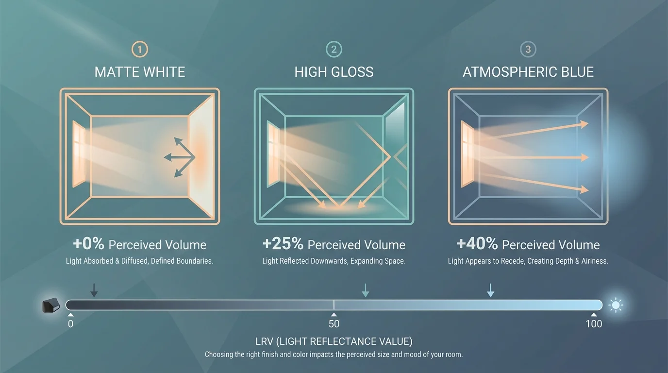
What is Light Reflectance Value (LRV) and why does it matter for ceilings?
Light Reflectance Value (LRV) serves as a critical metric that measures the exact percentage of visible light a paint color reflects, scaled from 0 (absolute black) to 100 (pure white). When trying to make a room feel bigger, selecting ceiling paint with a high LRV is generally highly beneficial because it maximizes the available ambient light. However, as demonstrated by the charcoal black trend, extremely low LRV colors can also effectively expand a space by intentionally hiding physical boundaries deep in shadow. Understanding LRV helps you predict exactly how a specific color will behave overhead.
For the latest color forecasts, consult industry leaders like Pantone and paint companies like Benjamin Moore. For professional design standards, refer to the American Society of Interior Designers (ASID).
Disclaimer: This article reflects design trend analysis and predictions. Personal taste and timeless design principles should always guide your decorating choices.