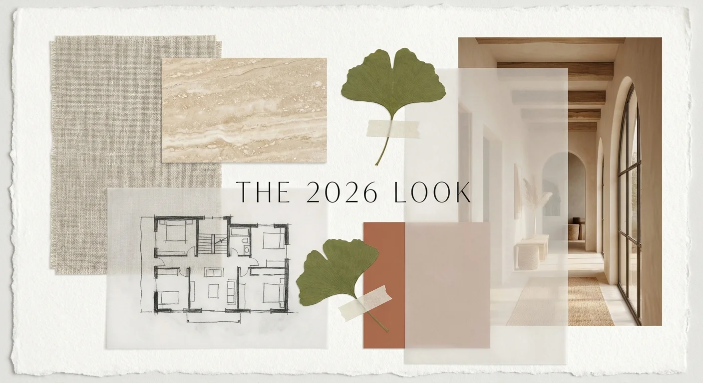
Introduction: Defining the Look of 2026
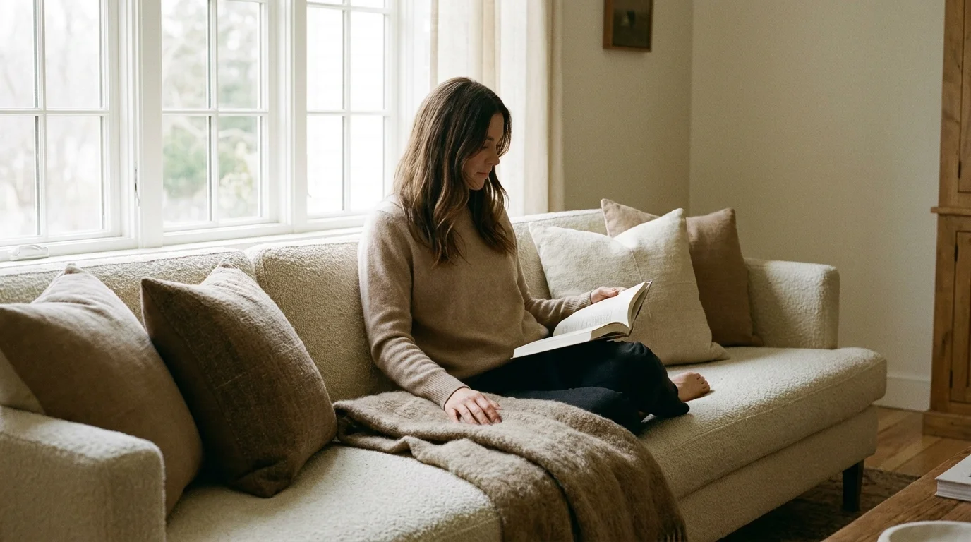
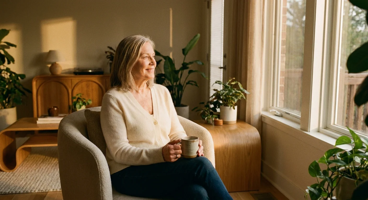
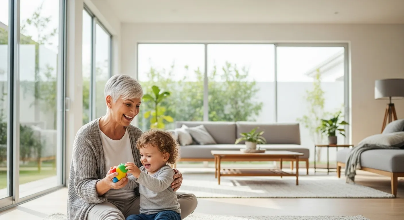
Aging in place is undergoing a massive aesthetic renaissance. You no longer have to choose between functional accessibility and high-end design; today, the two concepts work in perfect harmony. In 2026, the modern senior home embraces rich, deeply comforting palettes that prioritize psychological well-being as much as visual appeal. The design world has officially moved past the sterile, clinical whites and the outdated, overly muted pastels that once defined senior living spaces. Instead, we are entering an era of sophisticated, intentional color design that elevates everyday living and celebrates the art of growing older with style.
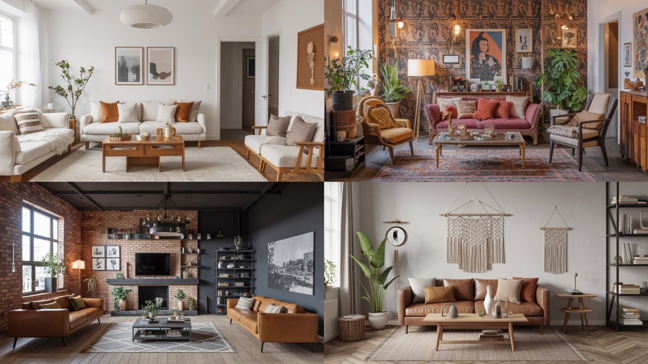
When analyzing the home color trends 2026 has introduced, a clear narrative emerges: you want spaces that feel both luxurious and emotionally grounding. Color choices directly impact your mood, your energy levels, and even your physical spatial awareness—factors that become increasingly important as you age. Aging eyes require specific lighting and color contrasts to navigate spaces safely, but these functional requirements should never compromise your personal taste. You deserve an environment that feels curated, intentional, and inspiring.
By adopting these fresh home look concepts, you create environments that feel vibrant, engaging, and undeniably chic. This guide explores six transformative color movements shaping interior design right now. You will discover practical ways to integrate these hues into your own living spaces, ensuring your home remains a welcoming sanctuary for years to come. Whether you are planning a full-scale renovation or simply looking for small updates, these insights provide the blueprint for a truly elevated interior.
———
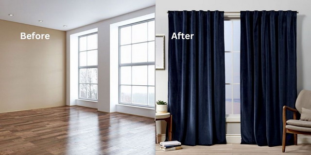
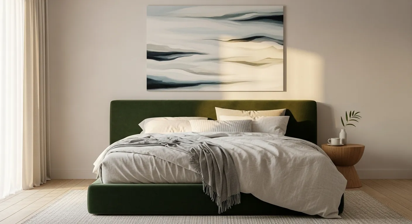
Trend #1: Warm, Enveloping Terracottas
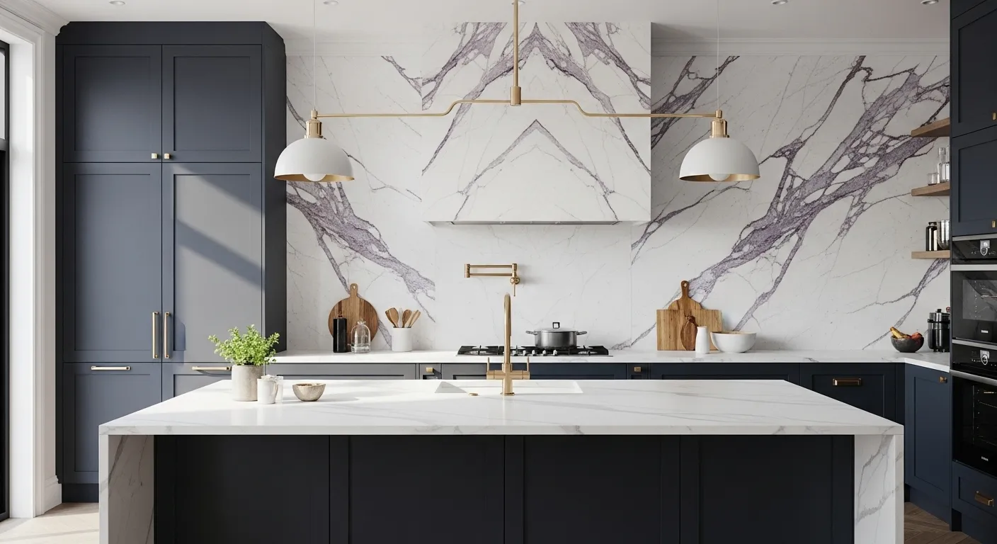
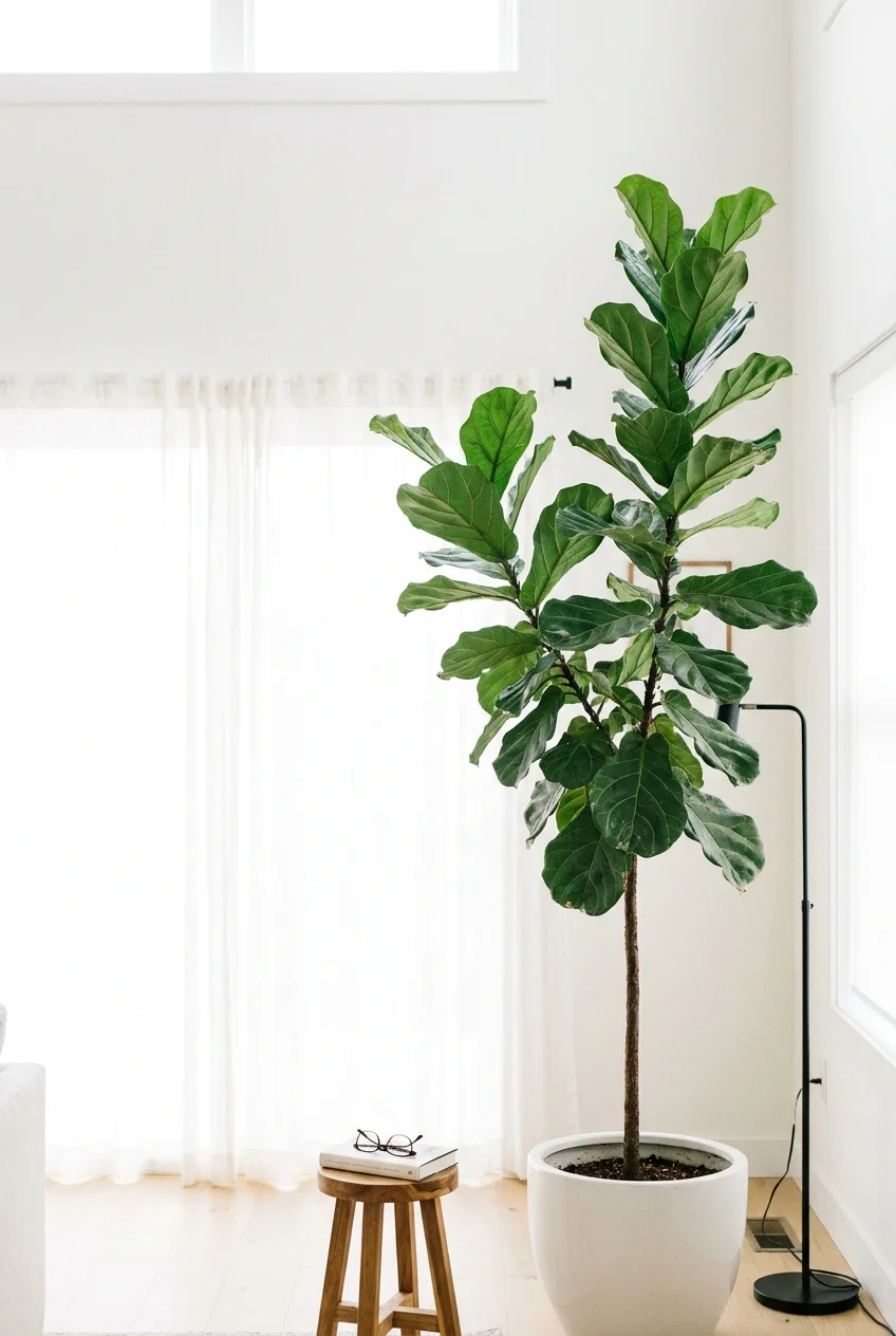
Let us examine the vibrant resurgence of terracotta. Far from the heavy, muddy browns of the early 2000s, the 2026 iteration of terracotta is luminous, breathable, and deeply connected to nature. This trend leans heavily into the concept of biophilic design—the practice of connecting interior architecture to the natural world—to foster a profound sense of peace and groundedness. Designers are moving toward baked clay, rich sienna, and sun-washed brick hues that physically wrap a room in visual warmth.
For a modern senior home, warm terracotta serves as an ideal backdrop for living rooms and gathering spaces. As your vision changes with age, stark white walls often create an uncomfortable glare when hit by direct, bright natural sunlight. Terracotta effectively absorbs that harsh light, diffusing a soft, flattering warmth throughout the room. The color inherently draws people together, stimulating conversation and creating an atmosphere of quiet luxury—a design ethos that values subtle elegance, craftsmanship, and high-quality materials over flashy, short-lived trends.
To implement this trend effectively, consider painting your primary living area in a soft, baked-clay hue. Pair these walls with natural wood furniture, textured linen upholstery, and unlacquered brass accents to elevate the overall sophistication. If committing to an entire room feels too bold for your current aesthetic, apply terracotta to an accent wall behind a prominent piece of furniture or use it in transitional spaces like hallways and vestibules. The strategic placement of this earthy tone envelops the space in warmth without overwhelming the senses, offering a grounded, secure feeling that enhances daily living.
———
Trend #2: Restorative Sage and Olive Greens
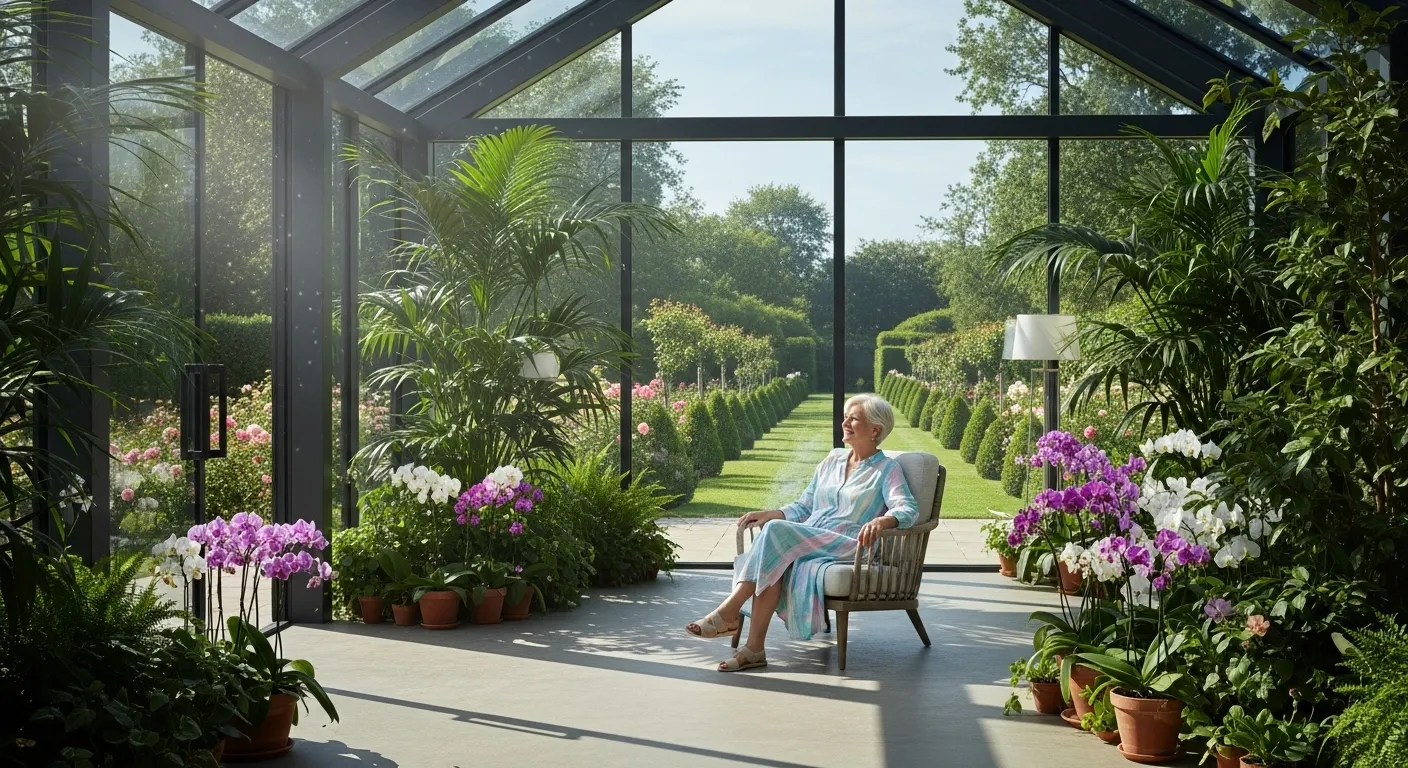
Nature continues to heavily influence interior color tips for the coming year, and green remains at the absolute forefront of this movement. However, the vivid emeralds and dark forest greens of previous years have softened dramatically. We now see a massive surge in restorative sage, muted olive, and soft, silvery moss greens. These organic shades act almost as modern neutrals, seamlessly blending with various architectural styles while offering distinct, measurable psychological benefits.
Green sits at the exact center of the visible color spectrum, making it the easiest color for the human eye to perceive. This scientific reality makes it an exceptional choice for senior living spaces, as it demands virtually zero eye strain. When you surround yourself with these restorative greens, you naturally lower your heart rate and reduce stress levels. They evoke the tranquility of a lush, overgrown garden, providing a masterfully calming backdrop for reading nooks, primary bedrooms, and spa-like bathrooms.
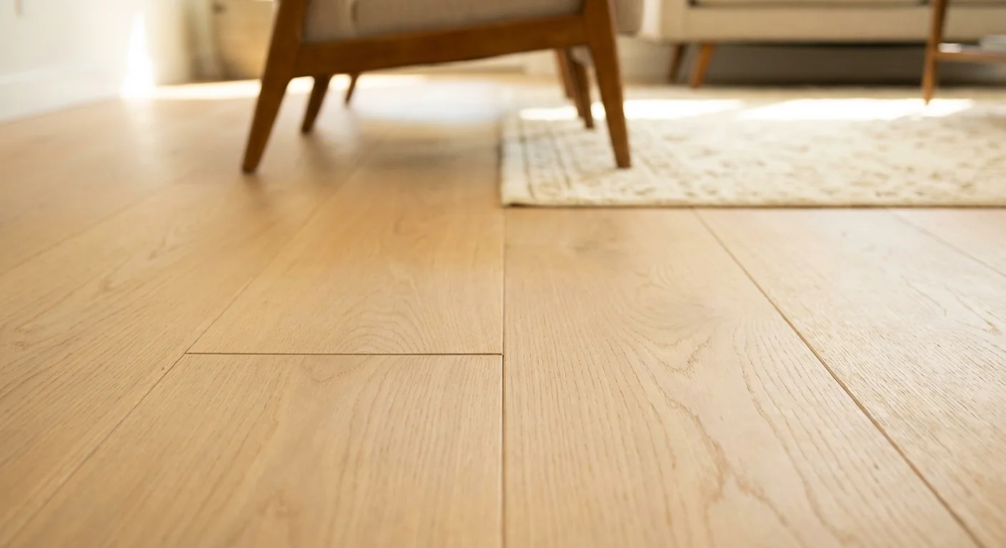
When you explore paint ideas seniors can easily adopt, consider using a soft silvered sage in the bedroom to promote deep, restorative sleep. Olive green works beautifully on kitchen cabinetry or built-in bookcases, offering a sophisticated, deeply rooted contrast against light quartz countertops and warm oak floors. You can also layer multiple different shades of green within the exact same room—perhaps a lighter sage on the walls paired with deeper olive velvet textiles—to create a compelling sense of depth and architectural interest without ever relying on harsh visual contrasts.
———
Trend #3: Soft, Luminous Buttermilk Yellows
For years, high-end designers avoided yellow, associating the hue with overly bright, frenetic spaces that felt visually chaotic. In 2026, yellow makes a triumphant, highly refined return in the form of soft, luminous buttermilk. This particular shade is creamy, incredibly subtle, and inherently optimistic. It provides the absolute perfect design solution for rooms that lack natural light, instantly warming up cold, north-facing spaces that might otherwise feel gloomy or uninviting.
As you age, the biological lenses of your eyes gradually yellow and thicken. This common physiological shift filters out blue light and causes interior environments to appear noticeably darker than they actually are. Buttermilk yellow brilliantly counters this natural biological change by reflecting ambient light efficiently and physically amplifying the brightness of a room. It delivers a fresh home look that feels uplifting and invigorating, ensuring your home never feels closed in or heavily shadowed.
Integrate buttermilk yellow into the exact spaces where you begin your daily routine, such as kitchens, sunrooms, breakfast nooks, or primary bathrooms. It pairs exceptionally beautifully with crisp white trims, natural stone textures like honed travertine, and polished nickel hardware. Unlike the vibrant, neon lemon yellows of the past, modern buttermilk carries enough warm beige undertones to feel sophisticated, anchored, and deeply grounded. It acts as a gentle, comforting embrace, starting your morning with a subtle but highly effective boost of energy and positivity.
———
Trend #4: Deep, Grounding Oceanic Blues
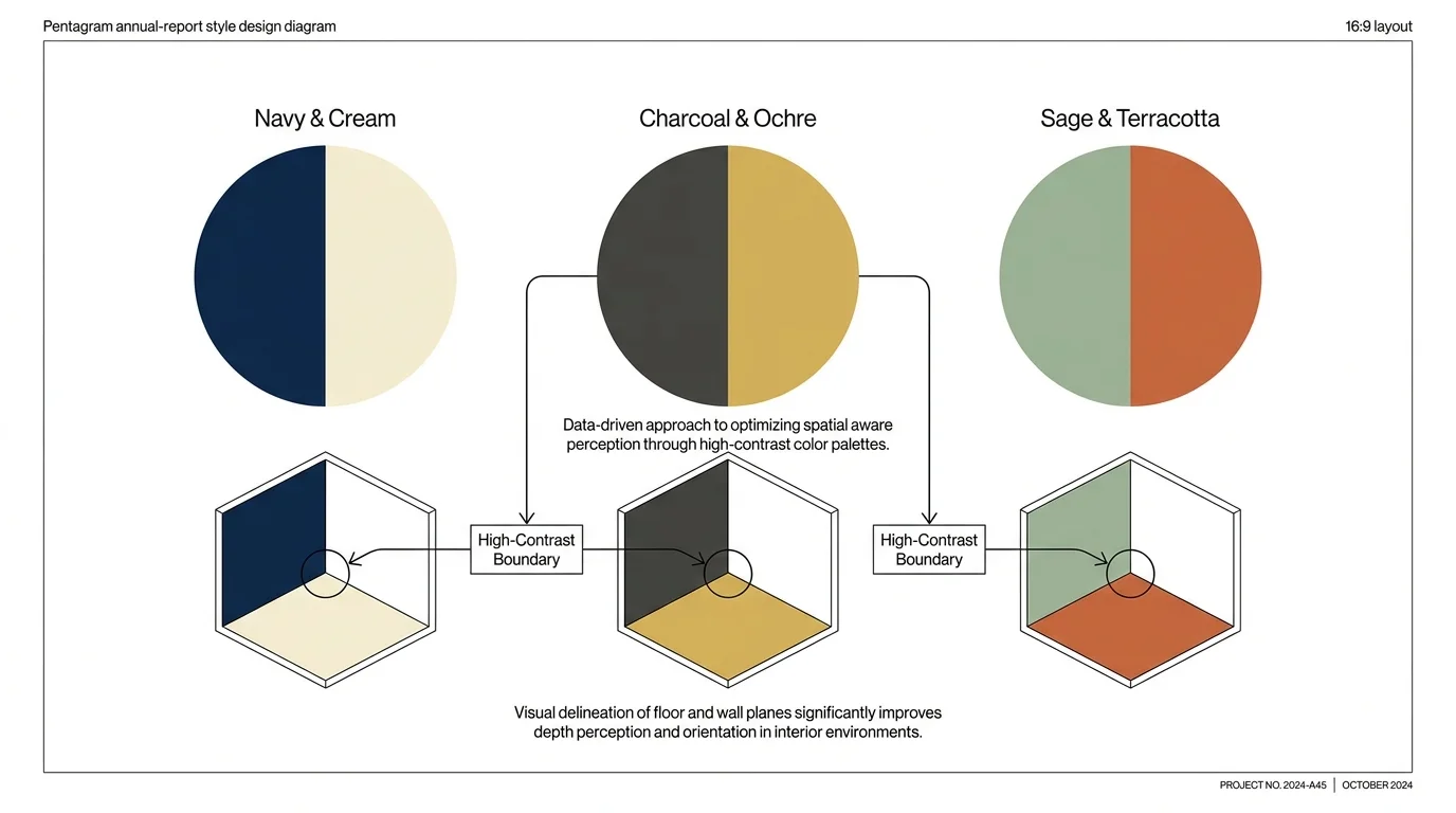
While warm tones unquestionably dominate much of the 2026 forecast, cooler shades still play a vital, structural role in creating balanced, elegant interiors. Deep, grounding oceanic blues—think marine navy, slate blue, and deep, stormy indigo—bring a necessary visual weight and architectural structure to your spaces. These specific colors speak loudly to the concept of provenance, carrying a profound sense of history, steadfast stability, and timelessness that resonates deeply with mature homeowners who appreciate legacy and classic design.
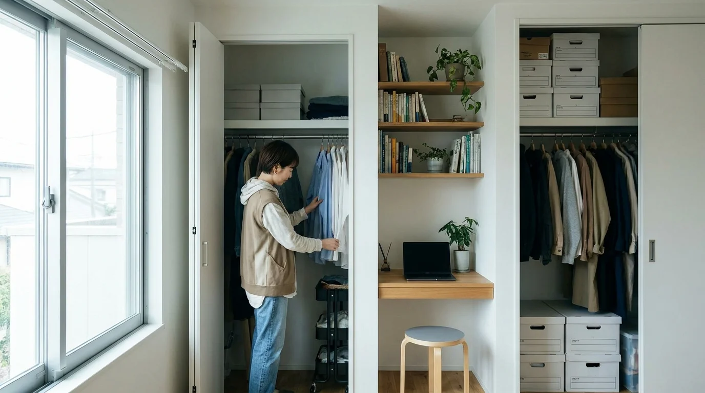
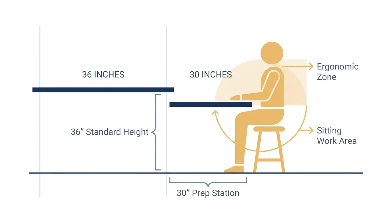
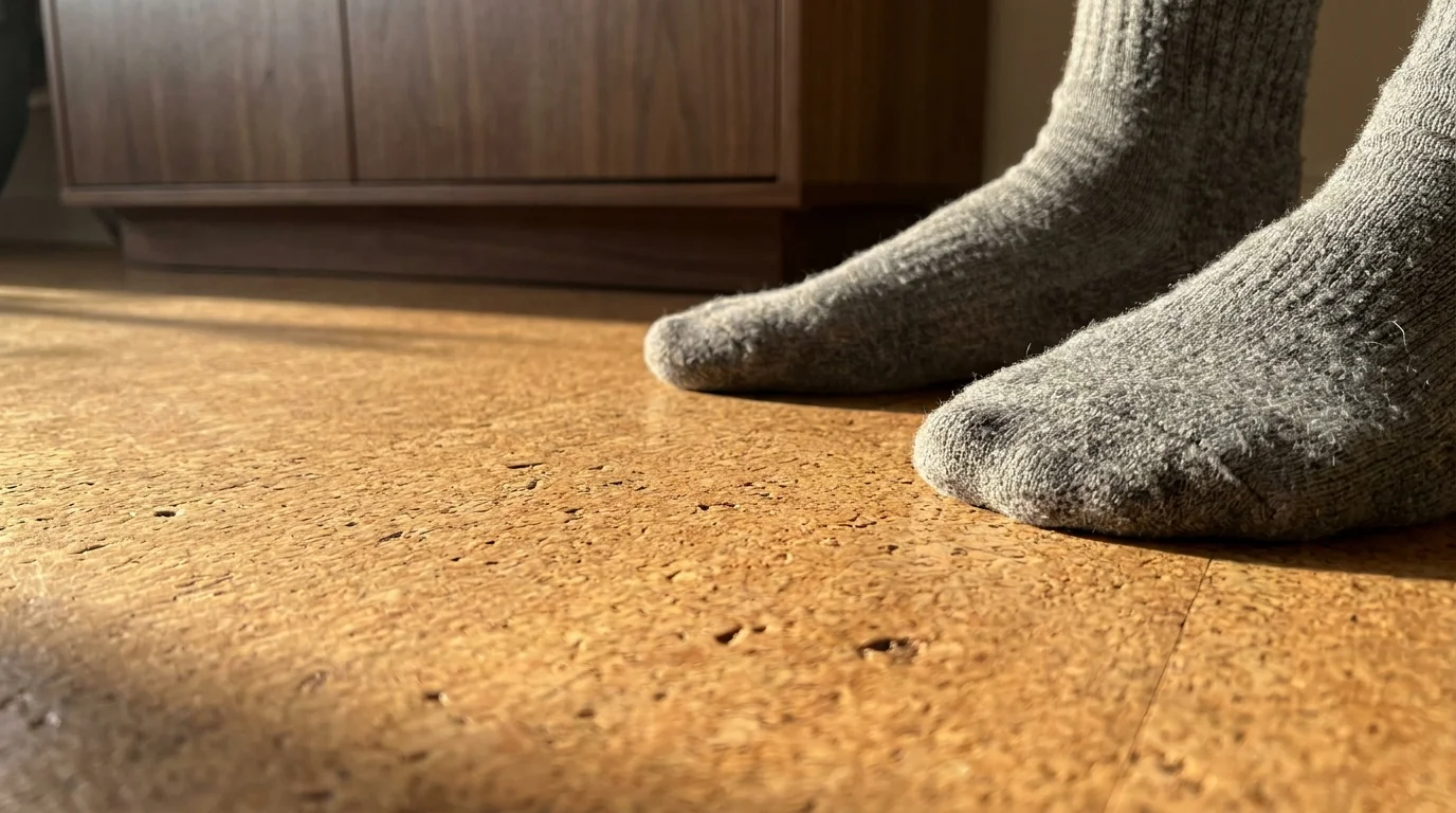
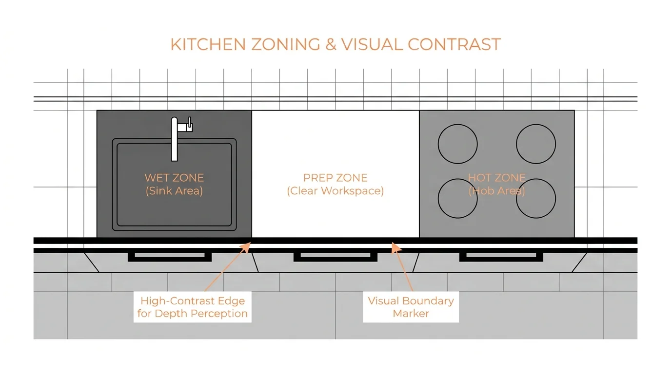
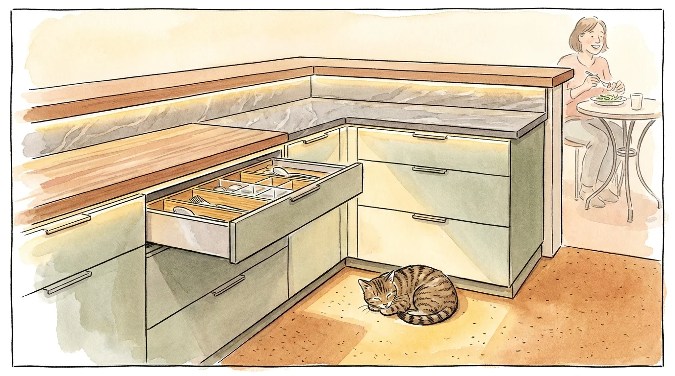
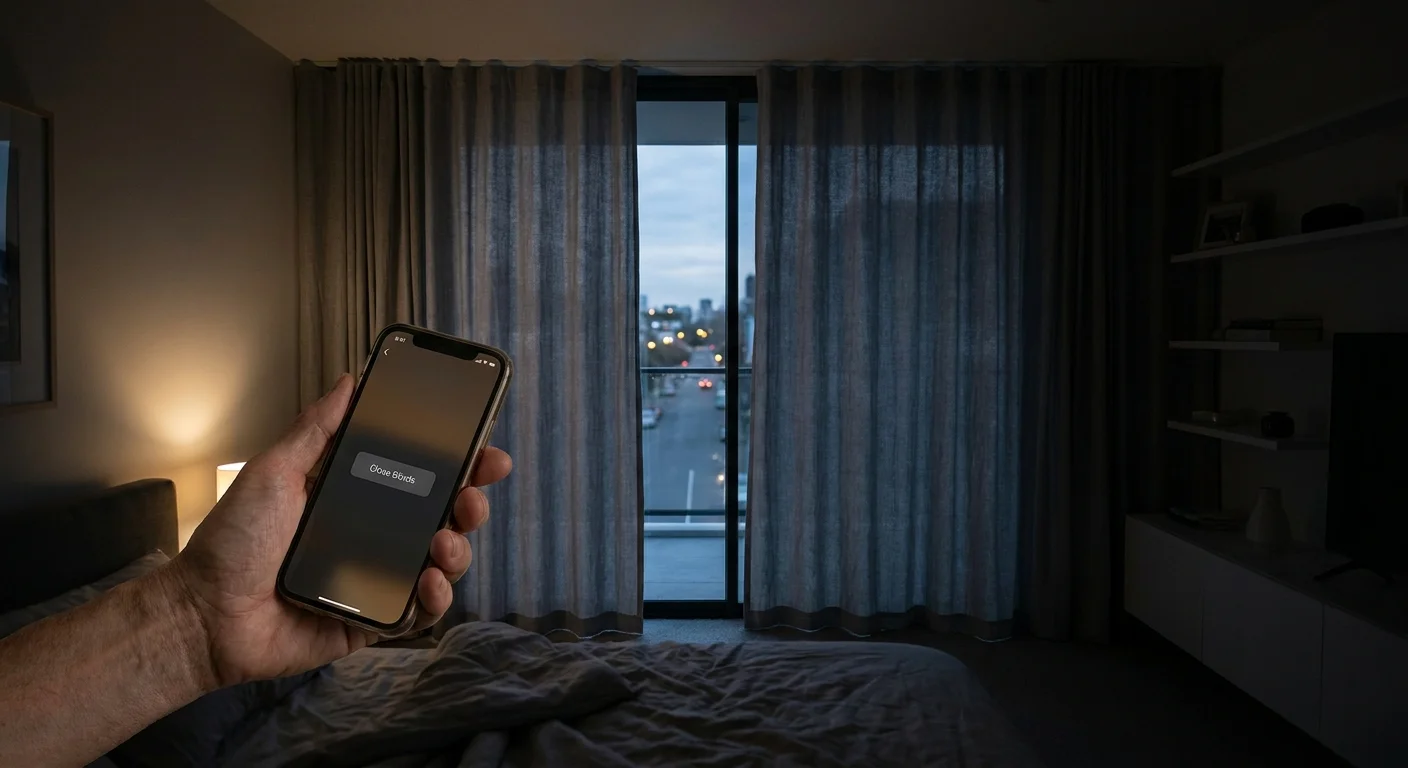
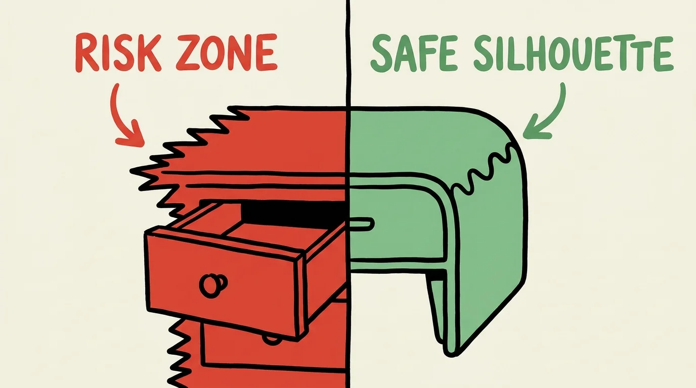
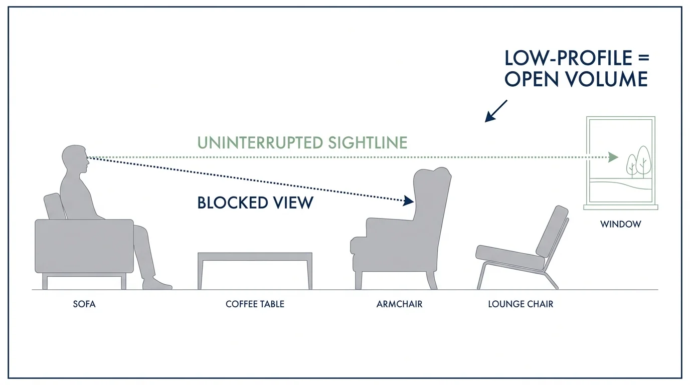
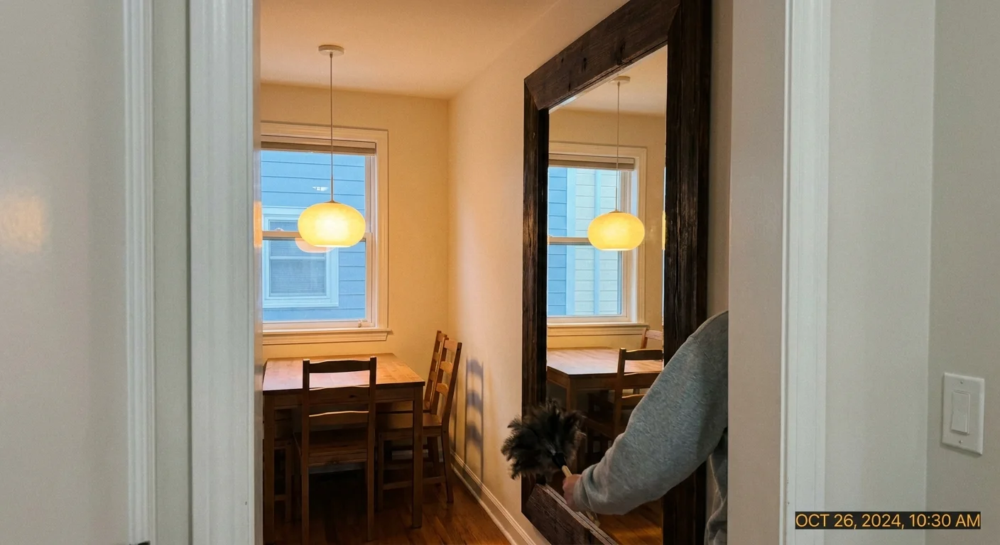
From a highly practical standpoint, dark blues provide critical visual contrast. Spatial awareness and depth perception often decline with age, making it increasingly difficult to distinguish between adjoining surfaces of similar light colors. By introducing a dark blue accent wall or decisively painting your baseboards, interior doors, and doorframes in a deep marine shade against much lighter walls, you establish stark, clear visual boundaries. This strategic, intentional use of high-contrast design significantly improves safety and room navigability without making the space look like a clinical care facility.
Use oceanic blues in formal dining rooms to curate an intimate, sophisticated atmosphere perfect for evening entertaining. Alternatively, apply a dusty slate blue to built-in living room bookshelves or a central fireplace surround to anchor a large, open-concept space. Complement these deep, immersive blues with warm metallic finishes—like heavily aged brass or brushed copper—to entirely prevent the room from feeling cold. The resulting aesthetic masterfully balances striking visual clarity with an undeniable, refined elegance.
———
Trend #5: Sophisticated Plaster and Warm Neutrals
The era of cool, flat grays has gracefully come to an end. Home color trends 2026 celebrate sophisticated, highly textured warm neutrals. We are specifically highlighting shades of rich alabaster, organic oatmeal, soft taupe, and earthy mushroom. These colors frequently incorporate tactile, artisanal finishes like authentic limewash, Roman clay, or Venetian plaster, actively adding subtle movement, depth, and shadow to your walls rather than a flat, uninspired layer of basic paint.
Warm neutrals offer the ultimate interior versatility, serving as a quiet canvas that deliberately allows your personal art collections, cherished family heirlooms, and statement furniture to take their rightful center stage. For seniors actively looking to downsize their footprint or streamline their interior belongings, these shades provide a remarkably clean, uncluttered aesthetic that still feels deeply welcoming. They embrace the movement of quiet luxury, where the true beauty of a space lies in the raw quality of the light, the subtle interplay of physical textures, and the impeccable craftsmanship of the materials.
If you are updating your current home but prefer a conservative, timeless palette, gradually transition your walls from stark builder-grade white to a rich, enveloping warm taupe. Use an eggshell or satin finish to ensure the walls reflect a soft, flattering sheen while remaining highly durable and easy to clean. Layering various neutral shades—such as oatmeal walls, heavy cream upholstery, and light-washed oak floors—creates a visually cohesive, expansive environment. This intentional monochromatic approach visually enlarges smaller spaces, making your entire home feel airy, unbound, and infinitely luxurious.
———
Trend #6: Gentle Berry and Muted Plums
The final major color trend of 2026 introduces a profound touch of romantic elegance through gentle berry tones and soft, muted plums. Actively moving away from the stark, high-contrast harshness of pure black and white, leading designers now utilize these deep, dusty purples and muted reds to add theatrical drama and undeniable richness to interior spaces. These specific colors feel inherently regal, historically grounded, and offer an incredibly flattering, warm backdrop for both natural sunlight and artificial evening lighting.
Psychologically, rich berry tones actively stimulate feelings of warmth, nostalgic comfort, and even physical appetite, making them spectacular, scientifically backed choices for formal dining areas or transitional spaces like entryways and foyers. For a modern senior home, a muted, dusty plum provides an excellent, sophisticated alternative to traditional bright reds, which can sometimes feel overly aggressive or visually exhausting to the eye. These softer, deeper hues create an immediate sense of envelopment and rooted security.
Incorporate gentle berry tones through strategic, highly intentional paint applications. Consider painting a small powder room entirely in a muted plum—including the baseboards, crown molding, and ceiling—to create a stunning, immersive jewel-box effect. If painting a whole room feels like slightly too much of a firm commitment, introduce these lavish colors through heavy, sweeping linen drapery, a plush, tactile velvet armchair, or an oversized area rug. These rich, concentrated accents powerfully ground lighter rooms, drawing the eye and effortlessly adding a distinct layer of curated sophistication to your design scheme.
———
The Big Picture: Weaving These Trends into Your Home
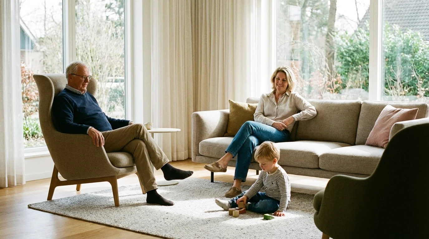
Understanding the psychology and impact of individual colors acts as only the first critical step; the true, lasting art of interior design lies in precisely how you seamlessly weave them together. You do not need to overhaul your entire house from top to bottom to successfully achieve a stunning visual update. Instead, strategically identify the specific areas where you spend the vast majority of your time and concentrate your design updates there. A single, well-lit room freshly painted in a restorative sage or a cramped entryway instantly refreshed with warm terracotta can fundamentally shift the energy and flow of your daily routine.
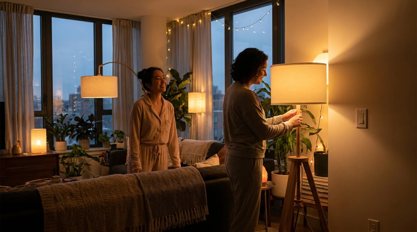
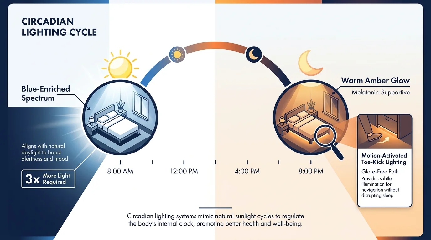
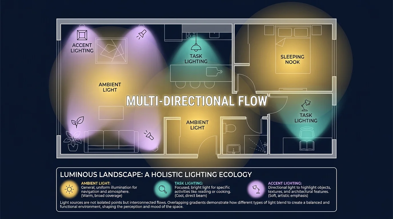
When practically applying these interior color tips, you must always consider your specific lighting conditions. The exact way a color looks in a bright, sun-drenched commercial showroom will always differ drastically from how it appears in a dimly lit residential hallway. Always thoroughly test large swatches of paint on multiple different walls within the room, and carefully observe how the color naturally shifts from bright morning sun to artificial evening light. Lighting significantly impacts how aging eyes actively perceive color, so ensure your rooms consistently feature a well-planned combination of ambient overhead lights, targeted task lighting for reading, and warm, low-level accent lamps to mitigate deep shadows.
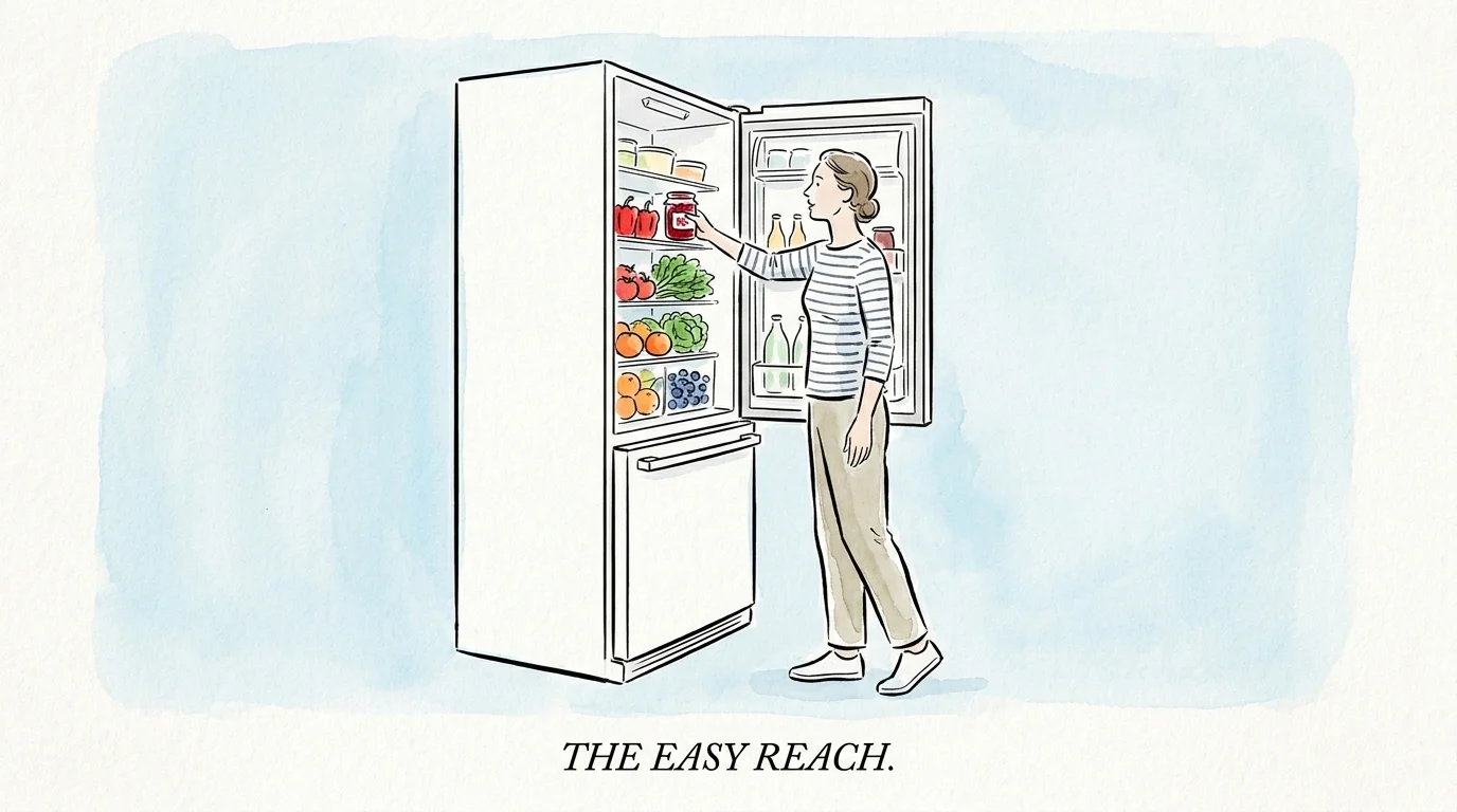
Furthermore, intentionally leverage your newly chosen color palette to vastly enhance your home’s daily functionality. Use highly contrasting shades to visibly define the sharp edges of stairs, kitchen countertops, and transitional doorways. Exceptional interior design should always deeply serve the actual people living within the space, masterfully harmonizing high-end aesthetic beauty with deeply practical, safe, everyday livability.
For the latest color forecasts, consult industry leaders like Pantone and paint companies like Benjamin Moore. For professional design standards, refer to the American Society of Interior Designers (ASID).
Disclaimer: This article reflects design trend analysis and predictions. Personal taste and timeless design principles should always guide your decorating choices.
———
Frequently Asked Questions
How do aging eyes affect color perception in interior design?
As you grow older, the natural lenses inside your eyes gradually become denser and take on a slight yellow tint. This biological change inherently acts as a filter, reducing the amount of light that actually reaches the retina and specifically filtering out cooler, blue-toned light. Consequently, colors can easily begin to appear washed out, significantly darker, or heavily muted. Recognizing this shift explains exactly why incorporating warm, luminous hues like buttermilk yellow or bright, light-reflecting warm neutrals dramatically improves your ability to see and navigate your home comfortably. Proper color selection directly compensates for these inevitable visual changes, reducing eye strain and preventing spatial confusion.
What is the best paint finish to use in a modern senior home?
While flat or deeply matte finishes beautifully hide drywall imperfections, they actively absorb precious light and prove notoriously difficult to clean. For a highly functional residence, industry experts overwhelmingly recommend utilizing an eggshell or satin finish for primary walls. These specific finishes provide a very gentle, flattering sheen that effectively bounces ambient light around the room, making spaces feel significantly brighter and visually larger. Furthermore, they are highly durable and incredibly easy to wipe down. For structural trims, baseboards, and interior doors, opt for a semi-gloss finish; the stark contrast in sheen between the satin walls and semi-gloss trim subtly helps aging eyes quickly differentiate between the wall and the doorway.
How can I use color to vastly improve safety and navigation without making my home look medical?
The secret to blending safety with high-end style lies purely in the intentional application of visual contrast. You do not need bright, industrial caution colors to achieve safety. Instead, employ sophisticated, deep shades—such as oceanic blue or muted plum—on crucial architectural elements like door frames, stair risers, or kitchen base cabinets. Contrasting a dark, handsome navy door against a warm, creamy alabaster wall creates a crisp, highly visible boundary that greatly aids depth perception. This strategic approach provides all the necessary visual cues for safe navigation while maintaining the elegant, curated aesthetic of a luxury residence.
Are cool colors like gray completely out of style for 2026?
The flat, sterile, inherently cool grays that heavily dominated the last decade have indeed fallen out of favor. They often feel deeply institutional and can make a room feel physically cold or unwelcoming. However, this does not mean you must completely abandon all cool tones. The 2026 approach to cool colors involves significant depth and complex undertones. If you love gray, pivot strongly toward sophisticated, highly textured slate blues and silvered sage greens. These complex variations provide the calming, grounding effect of traditional gray while injecting necessary warmth, life, and visual vitality back into your living spaces.
How do I practically test these 2026 color trends before committing to a full room renovation?
You should never purchase gallons of paint based solely on a tiny paper color card. To test these new color trends accurately, purchase small, liquid sample pots of your top choices. Paint sizable swatches—ideally at least two feet by two feet—directly onto heavy, movable poster board rather than directly onto your walls. Move these large painted boards around the room throughout the day, closely observing how the specific color interacts with the morning sunlight, the afternoon shadows, and your artificial evening lamps. This practical, foolproof method ensures you fully understand how the color physically behaves in your unique environment before you make a costly, permanent commitment.


")