

Color in the interior solves several problems at once. Firstly, it performs psychological functions: each version of the color combination evokes different emotions – from joy to irritation. In addition, with the help of the right color, the geometry and area of the room can visually change. Fashionable colors in the interior 2025 help create a calm atmosphere and saturate the living space with positive energy. Current color combinations are a unique response to the challenges of an aggressive world, an opportunity to create a space at home filled with positivity, peace and tranquility.
Fashionable colors in the interior 2025

Among the interior trends of 2025 there are many natural shades. Green, brown, olive and terracotta colors are presented in soft variations. They contribute to the creation of warm and gentle interiors. Modern designers prefer calm natural tones with a small number of bright details.
- One of the main trends in interior colors for 2025 is the widespread use of all shades of green. The reason for this was the strengthening of the eco-trend, the embodiment of which experts call biophilic design. Biophilia refers to the love of life and all living things. All people are connected with nature from birth, and modern designers also decorate interiors in green shades – from delicate mint to rich malachite.
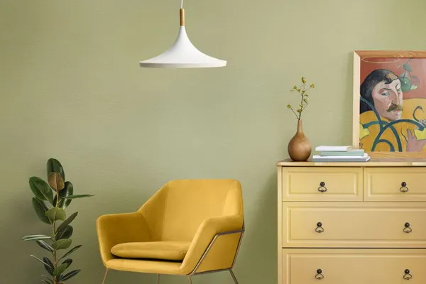
- If you are going to decorate your home in yellow, we recommend choosing calm mustard tones, rich lemon, acidic and yellow-green shades.
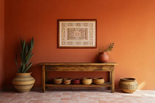
- A warm and positive orange living space is a source of dopamine and serotonin. Its most popular shades today are terracotta, peach, and persimmon.
- After the worldwide success of the film “Barbie,” the mass popularity of pink became a new trend, including in interiors.
- If you want to decorate your living space in purple, we recommend choosing soft and muted shades, which can be complemented with pinks, greens and blues for brightness and depth.
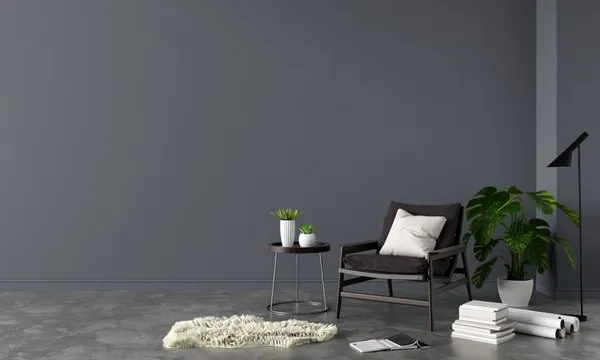
- Gray is considered a utilitarian color, the personification of practicality and functionality. Almost any shade can be combined with it, as with black.
- In comfortable and sophisticated brown interiors you will feel calm and protected.
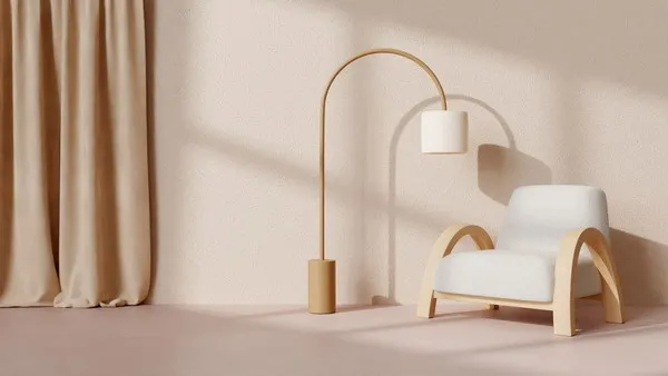
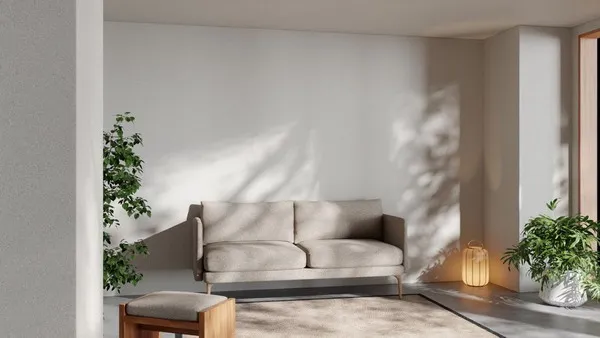
Fashionable and current colors look great against a background of white or beige tones, which can also be used as the main color scheme. If you dream of creating “quiet luxury” in your home, we advise you to give preference to white or beige colors. Such spaces are characterized by a calm, warm, restrained palette.
Peach Fuzz “Peach Fluff” – Color of the Year 2024
Light peach color, which the Pantone Institute considers the main shade of 2024, is soft, velvety, very delicate, with a subtle pink undertone. To refresh the interior, designers recommend using Peach Fuzz in textiles, accessories and decorative elements.
Almost all shades of gray, white, beige, brown and black look good in combination with “Peach Pooh”. To add some variety to your decor, add a fresh and eye-catching mint shade to Peach Fuzz.
“Peach Pooh” is suitable for creating accents. In basic interiors it is used in textiles and small decorative forms. If you want to decorate a room in this color or arrange furniture in Peach Fuzz shades, it is advisable to seek advice from a professional designer.
Apricot Crush
The delicate orange-peach hue has the energy of fruits, which are rich in vitamins and antioxidants. Are you bored with “calm”, laconic interiors? Then decorate the room in a modern, trendy, sophisticated, cheerful and invigorating color “Apricot Crush”.
A kitchen of this color is a great place to get a boost of energy and cozy gatherings with family and friends. If you decorate your living room in shades of Apricot Crush, it will perfectly help cope with uncertainty and anxiety. A children’s room in this color is a source of energy combined with softness and warmth.
Furniture, textiles and decor in Apricot Crush color are relevant in 2025. You can add shades to this color:
- gray;
- blue;
- beige;
- coral
Cool Matcha
Cool Matcha is the perfect blend of natural plant greens and soft pastels. Its calling card is calm: the shade has a therapeutic effect, helps relieve stress and calm anxiety.
Cool Matcha can be not only calming, but invigorating and refreshing when combined with bright shades. Designers are confident that all the trendy colors in the interior of 2025 will combine perfectly with each other, so the combination of Cool Matcha with “Peach Fluff” or, for example, “Sweet Hugs” will be quite appropriate.
Intense Rust
This noble and solemn color represents stability, tranquility and conservatism. The interiors are designed in the style of “quiet luxury”. It can be harmoniously combined with intense brown and gold. The living room in Intense Rust color will turn into a VIP zone, and the bedroom can be decorated in a “luxurious rococo” style using “Intense Rust”. The bright rainbow palette of colors harmonizes perfectly with the Intense Rust color:
- blue;
- purple;
- green;
- yellow.
“Intense rust” is suitable for creating stylish interiors in bright and spacious rooms. To prevent it from “eating” the entire space, decorate one wall – Intense Rust in this case will not be the main color, but an accent.
Sweet Embrace
To create a calm and welcoming space, modern designers recommend using Sweet Embrace, a soft and sophisticated ash pink hue. It resembles both clouds at dawn and a seashore in the first rays of sunlight. This shade can be used to decorate both the living room, where you can distance yourself from the flow of news and negative information, and the bedroom.
Sweet Embrace pairs with the following shades and color combinations:
- The combination of “Sweet Hugs” with white and gray is an excellent solution for creating an accent wall.
- Coffee and dark wood colors harmoniously complement the ash-pink interiors. The darkness in such a room can be removed with the help of white furniture, baseboards, doors and lamps .
- The gray-blue palette goes well with Sweet Hugs. You can create a positive mood in a cold room with the dusty pink color Sweet Embrace. To make it sparkle, consider pink decor and luscious accents.
- Use Sweet Embrace in combination with green shades such as sage, dark pine and sphagnum moss. A predominance of greenery or its use as accents is allowed.
- “Sweet hugs” can become the base color; in such interiors, blue or mustard colors can be used as accents.
- The Pantone Color Institute recommends pairing Sweet Embrace with dark purple. In this case, the rich wine color is balanced by a cool, dusty pink hue, which can be complemented with white and black accents.
Midnight Plum

The rich and mysterious dark purple hue has a lot in common with black. It is associated with outer space and endless universes. Midnight Plum is a reference to gothic and underground. Another association with the deep and languid “Midnight Plum” is late autumn, which brings peace and tranquility to the soul.
Interiors decorated in the muted color of Midnight Plum make a person relax. For this reason, bedrooms are decorated in such shades. It is also used to create rich, rich accents using textiles, decor or furniture. If you add a plum shade to the interior in the form of a rug , sofa or armchair, the room will seem deeper and conducive to reflection.
Sustained Gray
The conscious choice of environmentally friendly material in the design of the room can be emphasized with the help of a restrained and neutral gray achromatic color, with which any other shades are combined. If it serves as a background, such an interior can be complemented with various bright elements.
“Long-lasting gray” can be a base tone and an accent. It is perceived as a source of peace and helps create an atmosphere of relaxation and solitude, which is something that residents of big cities lack. Sustained Gray can be used to decorate a children’s room in which the child will feel comfortable and calm. The designers dilute the excessive calmness of “Long-lasting gray” with coral, turquoise and yellow accents.
We briefly described the current color trends 2025 in the interior. When decorating your house or apartment, remember that every color has a meaning. Their combinations help create the right mood and become non-verbal sources of information about the owners of the house, their lifestyle and habits.
Natural colors remain the most popular, so designers recommend using them as base colors, diluting the tranquility with bright accessories in the form of interior items or room decor. Experiments in combinations of shades are welcome, but you need to create, taking into account not only the beauty, but also the functionality of the premises.