

Your bedroom should serve as the ultimate sanctuary; choosing the right wall color represents the most effective way to establish that restorative atmosphere. Selecting soothing Benjamin Moore bedroom colors transforms a restless environment into a curated retreat designed for deep sleep and relaxation. The shifting focus toward wellness in interior design elevates color psychology from a mere aesthetic choice to a crucial component of your daily health routine. Moving beyond basic whites and uninspired grays requires a strategic understanding of undertones, light reflectance values, and spatial dynamics. By exploring these highly effective calming paint colors, you secure a solid foundation for a sophisticated space that genuinely supports your physical and mental recovery.
Trend #1: Quiet Moments 1563 and the Rise of Biophilic Design
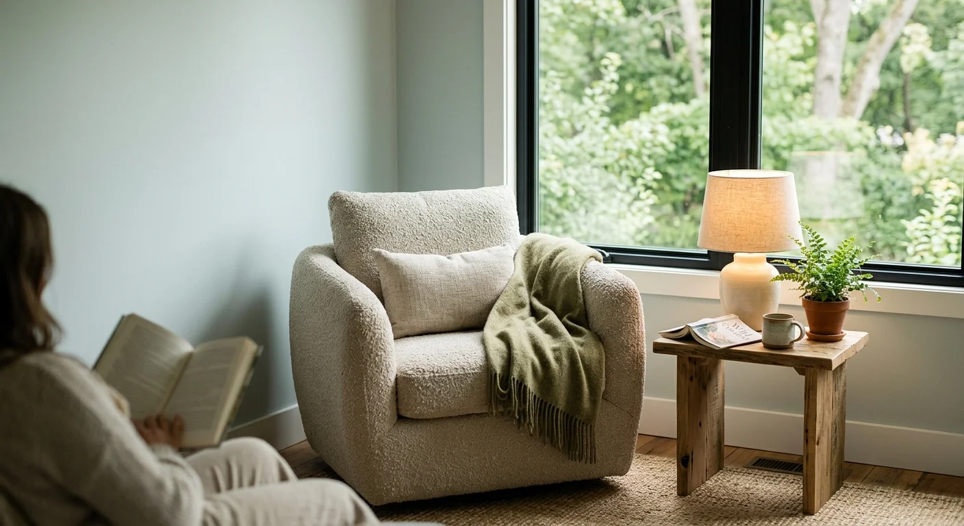
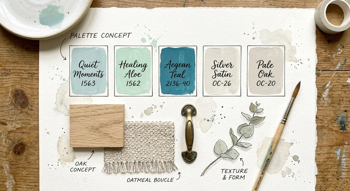
The interior design industry continues to lean heavily into biophilic design, a principle that seeks to connect our indoor spaces with the natural world. Quiet Moments 1563 perfectly captures this aesthetic movement. This specific hue operates as a gentle, light blue-gray with a distinct touch of green, mimicking the restorative qualities of a hazy morning sky or a tranquil body of water. Homeowners and designers gravitate toward this color because it instantly lowers the visual temperature of a room, creating an environment that feels breathable and expansive.
When you analyze the color psychology behind Quiet Moments, its effectiveness makes perfect sense. Blue tones slow the heart rate and reduce blood pressure, signaling to your brain that it is time to wind down. The gray undertones ground the color, preventing it from reading as a juvenile pastel or a nursery blue. Meanwhile, the subtle green brings a sense of vitality and balance. This complex interplay of pigments allows the paint to shift beautifully throughout the day. In the crisp morning light, it leans into its refreshing blue notes; under warm evening lamps, the gray and green undertones step forward to wrap the room in a cozy embrace.
To maximize the impact of this color, pair it with organic textures and natural materials. Light oak flooring, washed linen bedding, and raw ceramic table lamps complement the earthy subtlety of the walls. For your trim and ceiling, Benjamin Moore’s White Dove provides a creamy, soft contrast that enhances the soothing nature of Quiet Moments without introducing the harshness of a stark, brilliant white. You can introduce deeper contrast through matte black hardware or brushed brass sconces, which add a layer of sophisticated grounding to the ethereal backdrop.
Trend #2: Healing Aloe 1562 and the Wellness-Driven Space
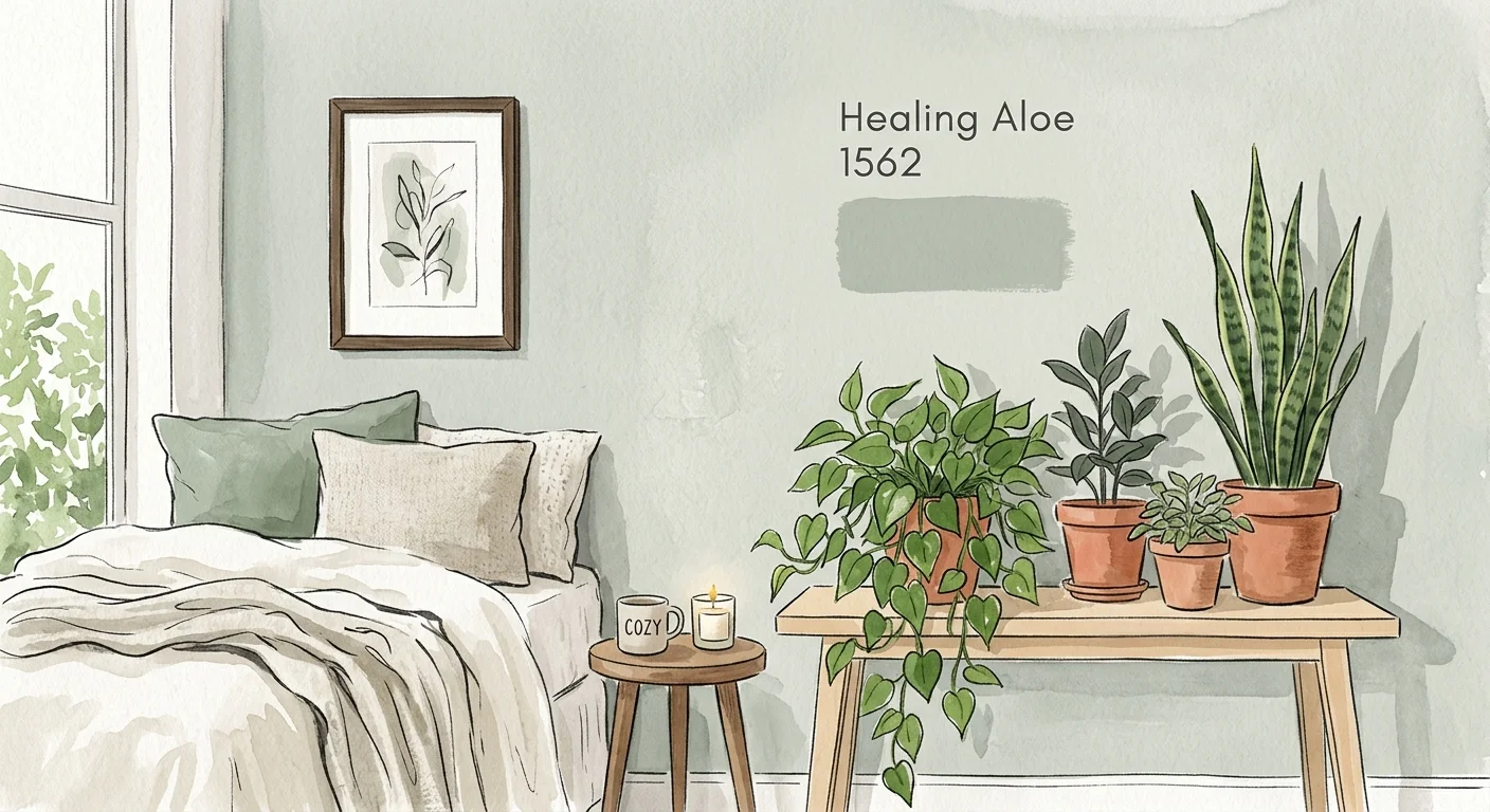
As homes increasingly function as private retreats away from the noise of the outside world, the demand for wellness-driven design has skyrocketed. Healing Aloe 1562 steps into this role flawlessly. It is an ethereal green-gray that feels incredibly delicate on the wall. While it shares some DNA with Quiet Moments, Healing Aloe leans decisively further into the green spectrum. This color embodies the concept of a botanical sanctuary, bringing the restorative power of an indoor garden directly onto your walls.
Green operates as the most restful color for the human eye to process because it sits at the exact center of the color spectrum. Your eye requires no adjustment to perceive it, which translates to immediate visual relaxation. Healing Aloe leverages this biological quirk brilliantly. It boasts a relatively high Light Reflectance Value (LRV), meaning it bounces a significant amount of natural light around the room. This makes it an exceptional choice for smaller bedrooms or spaces that suffer from limited window access. Rather than making a small room feel cavernous, it pushes the walls outward, creating an illusion of airy spaciousness.
Implementing Healing Aloe successfully requires a thoughtful approach to your secondary color palette. The trend of “tonal layering” works beautifully here. Mix various shades of green, sage, and mint through your textiles, rugs, and upholstery to create a rich, cohesive aesthetic. Natural wood tones—particularly medium-toned walnuts and warm bamboos—anchor the lightness of the walls and reinforce the organic theme. If you want to push your bedroom paint ideas into a more contemporary territory, consider painting your bedroom doors a deeper, complementary shade like Benjamin Moore’s Caldwell Green while keeping the walls Healing Aloe. This creates architectural interest while maintaining a unified, calming atmosphere.
Trend #3: Aegean Teal 2136-40 and the Cocooning Aesthetic
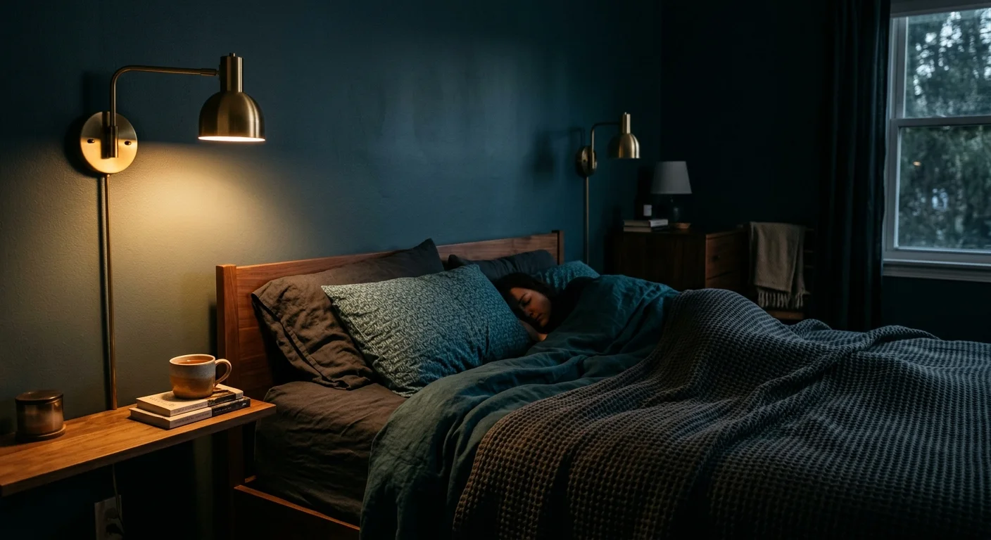
While light and airy colors traditionally dominate bedroom design, a powerful counter-trend has emerged: cocooning. This design philosophy embraces rich, mid-tone, and dark colors to create spaces that feel like a protective, enveloping embrace. Aegean Teal 2136-40, a former Benjamin Moore Color of the Year, stands as the ultimate champion of this moody, restorative aesthetic. It is a deeply complex blend of blue, green, and gray that exudes quiet confidence and historic elegance.
Many people fear that using a darker color in the bedroom will make the space feel small or claustrophobic. In reality, deep mid-tones blur the boundaries of a room, causing the corners to recede into shadow and making the space feel infinitely deeper. Aegean Teal accomplishes this while retaining enough vibrancy to avoid feeling gloomy. It provides exceptional visual weight, anchoring the room and allowing your furniture and artwork to stand out brilliantly against the saturated background. The strong presence of gray within the teal formulation ensures the color remains muted and sophisticated rather than loud or overwhelming.
To execute the cocooning trend with Aegean Teal, designers highly recommend the technique of color drenching. Instead of painting the walls teal and leaving the trim white, paint your baseboards, crown molding, and even the interior doors in the same Aegean Teal. You can use a matte or eggshell finish on the walls and a satin finish on the trim for a subtle textural contrast. This seamless application removes visual interruptions, allowing your eye to travel smoothly around the room, which profoundly enhances the calming effect. Pair this rich backdrop with terracotta accents, mustard yellow throw pillows, or deep rust velvet curtains to create a masterclass in complementary color theory.
Trend #4: Silver Satin OC-26 and the Evolution of Quiet Luxury
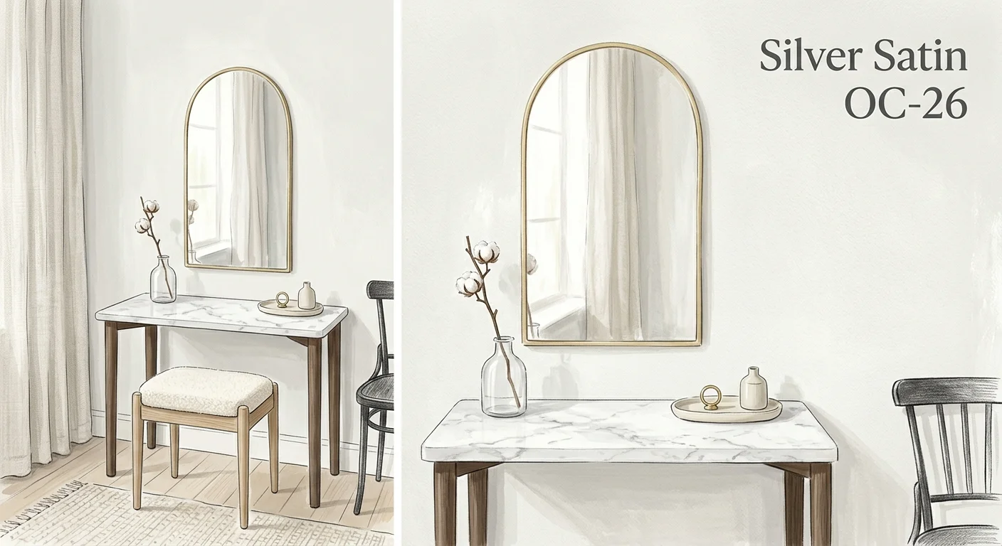
The stark, sterile whites and cold, industrial grays of the previous decade have officially made their exit. In their place, the “Quiet Luxury” movement champions warm, nuanced off-whites that radiate understated elegance. Silver Satin OC-26 captures this aesthetic perfectly. It is a highly sophisticated, pale gray with subtle lavender and warm beige undertones. When you want soothing wall colors that do not read as pastel or overtly colorful, Silver Satin delivers a pristine, high-end hotel experience right in your own home.
What sets Silver Satin apart from a standard builder-grade gray is its dynamic responsiveness to light. The faint lavender undertone acts as a secret weapon; it neutralizes any unwanted yellow or green light coming from outside, ensuring the paint maintains its crisp, clean appearance throughout the day. In south-facing rooms flooded with warm light, Silver Satin reads as a plush, airy white. In north-facing rooms with cooler light, it deepens into a gentle, silvery greige. This chameleon-like quality makes it one of the most reliable and foolproof Benjamin Moore colors on the market.
Designing a bedroom around Silver Satin requires a dedication to texture over high-contrast color. Because the walls remain quiet and neutral, you must introduce warmth and interest through tactile materials. Layer chunky wool blankets over crisp percale sheets. Introduce a plush, Moroccan-style Beni Ourain rug beneath the bed. Choose window treatments in heavy, unlined linen to diffuse incoming light softly. By keeping the color palette restrained to ivories, creams, and warm silvers, you force the brain to engage with the physical comfort of the space, resulting in a bedroom that feels exceptionally serene and intentionally designed.
Trend #5: Pale Oak OC-20 and the New Earthy Minimalism
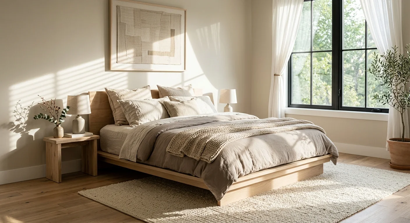
Earthy minimalism blends the clean, uncluttered lines of modern design with the grounding, organic warmth of nature-inspired hues. Pale Oak OC-20 embodies this balance, acting as the ultimate bridge between gray and beige. Often referred to as “greige,” this specific color provides a soft, mushroom-like warmth that feels incredibly inviting without tipping into the outdated, heavy beige territory of the early 2000s.
The brilliance of Pale Oak lies in its restraint. It offers just enough pigment to contrast beautifully with crisp white trim, highlighting the architectural details of your bedroom, yet it remains light enough to read as a neutral backdrop. It carries a subtle pink/taupe undertone that mimics the warmth of a setting sun. This undertone is crucial for bedrooms; it reflects warmly onto human skin, making you look and feel more rested when you look in the mirror each morning. It creates a gentle, nurturing environment that actively combats the clinical feel of purely modern architecture.
To leverage Pale Oak within the earthy minimalism trend, focus on introducing elements of provenance and craftsmanship. Think about incorporating a vintage wooden bench at the foot of the bed, a hand-thrown ceramic vase on the nightstand, or a piece of abstract art featuring deep charcoal and burnt sienna. Pale Oak loves to be paired with other natural finishes, particularly unlacquered brass, which develops a beautiful patina over time, and rich, dark leather. For the ceiling, a flat application of Benjamin Moore’s Chantilly Lace will provide a crisp, clean canopy that allows the warm taupe notes of the walls to sing.
The Big Picture: Weaving These Trends into Your Home
Understanding these aesthetic shifts and identifying the perfect soothing Benjamin Moore bedroom colors is only the first phase of your design journey. The true magic happens in the application and execution. To weave these trends cohesively into your personal space without the room feeling like a generic catalog page, you must respect the unique lighting and architectural conditions of your home.
Never commit to a gallon of paint based solely on a digital screen or a tiny paper swatch found in a hardware store. Your home’s specific lighting conditions—including the direction your windows face, the foliage outside, and the color temperature of your light bulbs—will drastically alter how these complex colors behave. Purchase large, peel-and-stick paint samples or paint generous swatches directly onto heavy poster board. Move these swatches around the bedroom over a period of 48 hours. Observe how Quiet Moments looks when the morning sun hits it, or how Aegean Teal transforms under the glow of your bedside reading lamp at midnight.
Furthermore, pay close attention to your chosen paint finish. The sheen you select drastically impacts both the color’s appearance and the room’s overall mood. For a truly calming environment, designers overwhelmingly recommend flat or matte finishes for bedroom walls. A matte finish absorbs light rather than reflecting it, creating a velvety, soft appearance that hides drywall imperfections and deepens the richness of colors like Healing Aloe and Pale Oak. Reserve satin and semi-gloss finishes strictly for your baseboards, doors, and window casings to provide structural definition.
Finally, remember the “fifth wall”—your ceiling. A bright, stark white ceiling can feel jarring against soft, muted walls, breaking the tranquil spell you have worked so hard to cast. Consider cutting your chosen wall color with 50% white paint for the ceiling, creating a gentle gradient that carries the soothing atmosphere all the way overhead. Alternatively, applying a coordinating warm white like White Dove ensures a seamless, restful transition from wall to ceiling.
Frequently Asked Questions
How do I choose between cool and warm soothing wall colors?
Your decision should rely heavily on the natural light your bedroom receives. North-facing rooms typically receive cooler, bluer light, which can make cool colors like blue and green feel icy. In these spaces, warm neutrals like Pale Oak or Silver Satin counteract the chill and introduce necessary coziness. Conversely, south-facing rooms receive warm, golden light throughout the day. Cool colors like Quiet Moments and Healing Aloe thrive here, as the warm sunlight balances their cool undertones, creating a perfectly harmonized environment.
Is the color drenching trend appropriate for calming paint colors?
Absolutely. Color drenching—the practice of painting the walls, trim, doors, and sometimes the ceiling the exact same color—is one of the most effective strategies for creating a restful bedroom. When you use contrasting trim (like bright white against a darker wall), your eye stops at every architectural break. By painting everything the same soothing hue, you eliminate these visual interruptions. The room feels softer, taller, and significantly more enveloping, which is the exact psychological response you want in a space dedicated to sleep.
Will these trending bedroom paint ideas look outdated in a few years?
The beauty of looking to Benjamin Moore colors for your sanctuary is their inherent timelessness. While the design industry uses terms like “biophilic” or “quiet luxury” to describe current cultural shifts, the colors themselves—soft blue-greens, warm off-whites, and rich teals—have historical staying power. Because these hues are rooted in the natural world rather than synthetic or neon palettes, they possess a classic longevity. You can easily update your bedding, lighting, and artwork over the years while leaving these sophisticated wall colors intact.
How does artificial lighting impact Benjamin Moore bedroom colors?
Artificial lighting plays a massive role in color perception. LED bulbs come in various color temperatures, measured in Kelvins (K). For a bedroom, you should strictly utilize warm light bulbs, ideally between 2700K and 3000K. This warm light beautifully enhances the subtle earthy tones in Pale Oak and Silver Satin, and it makes complex colors like Aegean Teal feel incredibly rich and cozy. Avoid daylight bulbs (4000K and above) in the bedroom, as they cast a harsh, blue-tinted light that washes out paint colors and disrupts your circadian rhythm.
For the latest color forecasts, consult industry leaders like Pantone and paint companies like Benjamin Moore. For professional design standards, refer to the American Society of Interior Designers (ASID).
Disclaimer: This article reflects design trend analysis and predictions. Personal taste and timeless design principles should always guide your decorating choices.
