

Painting your window trim is the most effective way to elevate your interior design without undertaking a massive renovation. Designers increasingly treat windows as architectural centerpieces rather than functional afterthoughts, moving beyond builder-grade white to frame outdoor views with sophisticated hues. Whether you want to anchor a bright living room with dramatic contrast or seamlessly blend your mullions into a monochromatic color palette, the right window paint colors instantly upgrade your home decor. From grounding earthy greens to unapologetic matte blacks, focusing on the trim creates a tailored, high-end aesthetic. Explore these twelve designer-approved window trim ideas to discover how strategic paint applications completely transform your space and highlight your architecture.
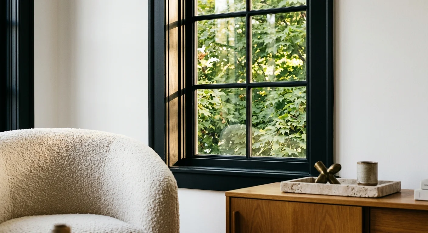
Trend #1: Matte Black for Modern Definition
Matte black remains a dominant force in contemporary interior design because it treats your window like a piece of bespoke art; the dark perimeter essentially acts as a mat board framing the outdoor view. Sherwin-Williams Tricorn Black offers a pure, un-tinted black that anchors a room without reading too harsh or sterile. This commanding color thrives in spaces flooded with natural light, where it provides necessary visual weight and prevents airy, expansive rooms from feeling ungrounded or floating. Designers consistently love pairing matte black window sashes with crisp, bright white walls and warm, natural wood elements to create striking, high-contrast environments that feel immediately updated. If you lean toward the trending quiet luxury aesthetic, black trim provides the perfect, rigid architectural structure against tactile, soft materials like limewash walls, nubby bouclé seating, and honed marble countertops. Rather than receding timidly into the background, black window paint colors demand attention and establish a decidedly modern, custom-built atmosphere in your home.
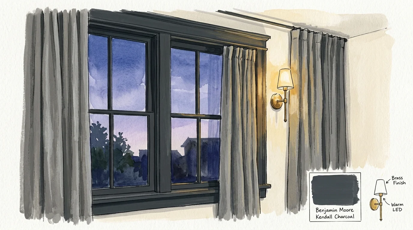
Trend #2: Deep Charcoal as a Softer Alternative
If pure black feels too severe or imposing for your specific home decor, deep charcoal provides a softer, highly sophisticated alternative that still delivers incredible visual contrast. Colors like Benjamin Moore Kendall Charcoal carry subtle, warm undertones that prevent the space from feeling cold, stark, or overly industrial. Charcoal grey effortlessly bridges the gap between modern edge and traditional comfort; it pairs beautifully with natural stone fireplaces, aged brass hardware, and heavy linen drapery. Interior designers frequently utilize charcoal on window trims in primary bedrooms and cozy, enclosed living spaces to foster a sense of intimacy and architectural strength. When you paint your mullions and casings in this rich, moody hue, the actual window structure seems to vanish at night, beautifully blurring the boundary between indoors and outdoors. This deliberate approach adds profound depth to your interior architecture without overpowering the rest of your carefully curated designer paint colors.
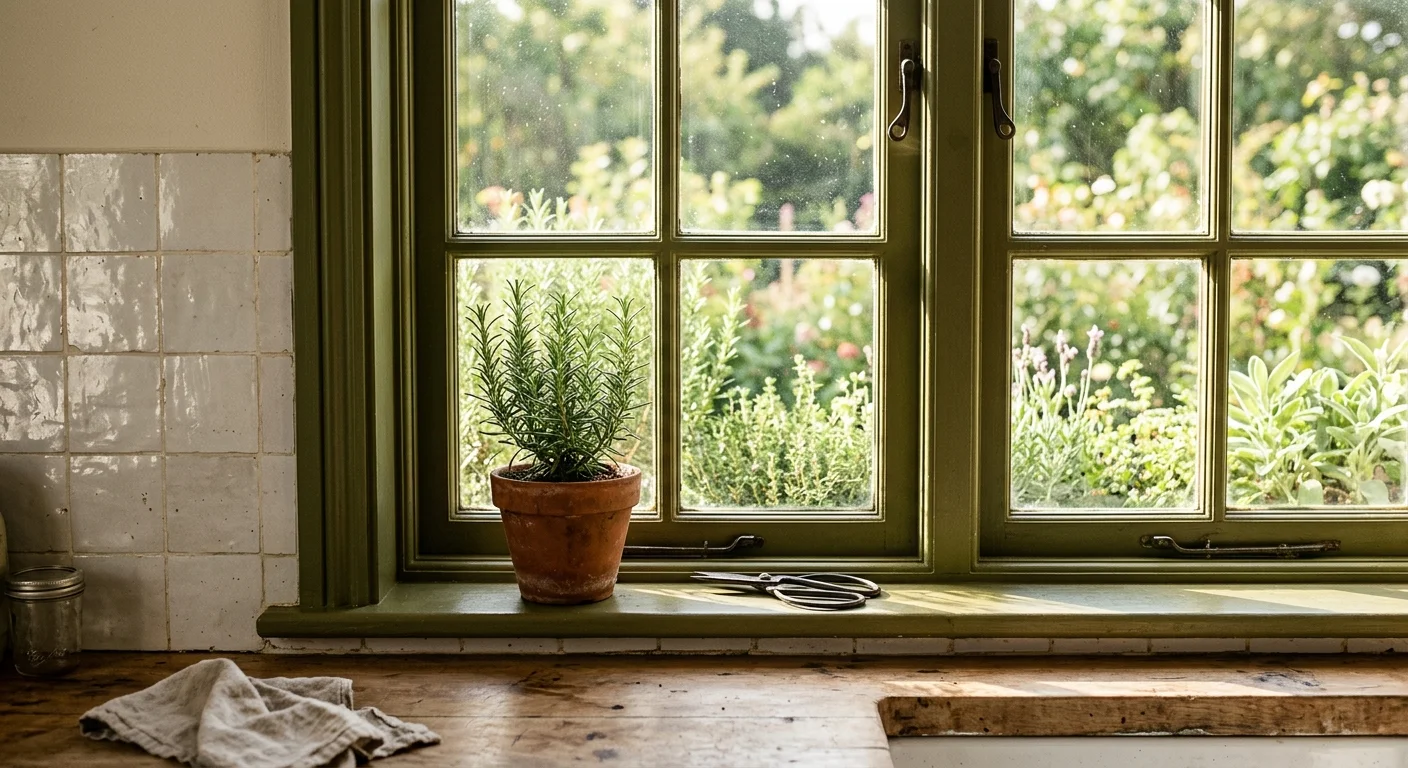
Trend #3: Earthy Olive Green for Biophilic Connection
Biophilic design continues to aggressively shape how we decorate our homes, and earthy olive green window trims offer a direct, undeniable visual connection to the natural world outside. Choosing a highly pigmented shade like Benjamin Moore Sussex Green pulls the lush foliage from your backyard straight into your living room, erasing the threshold between nature and interior design. Unlike bright, synthetic greens, olive carries heavy brown and gray undertones, allowing it to function almost entirely as a neutral base within your home. You can amplify this organic, restorative aesthetic by combining olive green window paint colors with raw, natural materials—think wide-plank European oak flooring, woven rattan accents, and handmade glazed ceramic tiles. This color excels dramatically in sunrooms, kitchens, and transitional spaces where bridging the gap between exterior landscaping and interior living is paramount. By framing your windows in olive, you establish a serene, deeply grounded environment that promotes daily relaxation and continuous visual harmony.
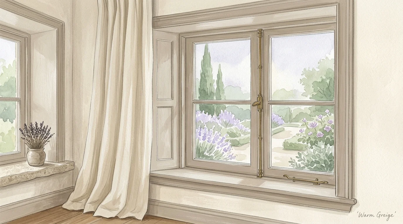
Trend #4: Warm Greige for Subtle Contrast
The era of stark, icy gray is firmly behind us; today’s leading designers heavily favor warm greige tones that bring subtle complexity and undeniable elegance to window trim ideas. Farrow & Ball Drop Cloth represents this widespread shift perfectly, offering a muted, earthy beige-gray that shifts dramatically in appearance as the sun moves throughout the day. Greige provides just enough deliberate contrast against creamy white walls to highlight your home’s architectural details without creating a jarring, aggressive visual break. This nuanced approach aligns flawlessly with the current industry preference for understated elegance and richly layered neutrals. You will find warm greige particularly effective in historic homes or rooms featuring extensive custom millwork, as it honors traditional provenance while feeling distinctly updated and fresh. Pair greige window trims with deeply textural elements like distressed vintage leather, antique Persian rugs, and tumbled limestone to cultivate a deeply inviting, lived-in aesthetic.
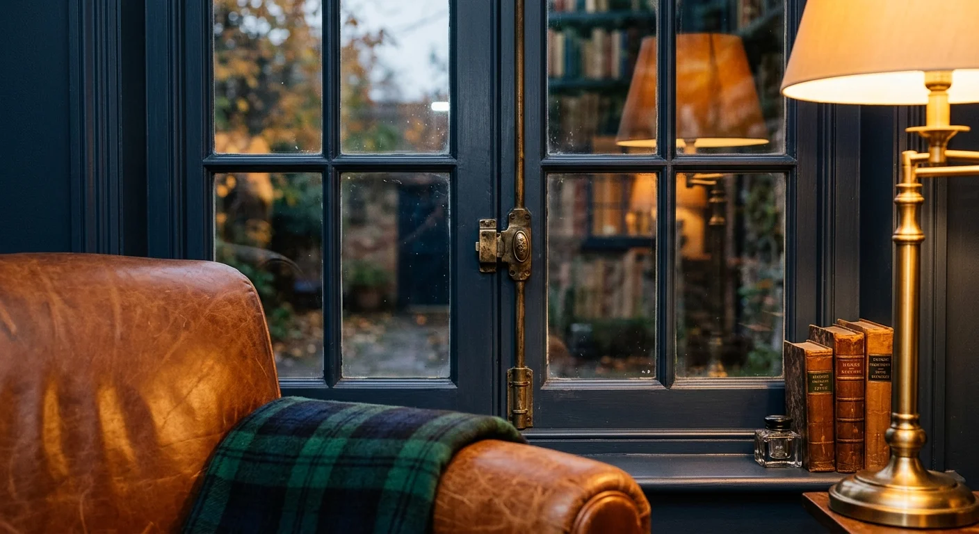
For those who appreciate traditional elegance but actively want to step outside the standard neutral spectrum, moody navy blue delivers unparalleled, commanding sophistication. A classic, deep hue like Sherwin-Williams Hale Navy infuses any space with historical depth and quiet, unwavering confidence. Designers frequently utilize navy on window trims in formal dining rooms, executive home offices, and cozy libraries to create a commanding, highly tailored look that feels both historic and timely. Because true navy absorbs natural light beautifully, it visually anchors the room and intuitively draws the eye outward toward the surrounding landscape. To maximize the dramatic impact of navy window paint colors, pair them with rich, inherently warm materials; polished mahogany furniture, brushed gold wall sconces, and cognac leather club chairs create a stunning complementary contrast. When you use navy on your window casings, you introduce a layer of bespoke craftsmanship that instantly elevates the perceived value of your interior design.
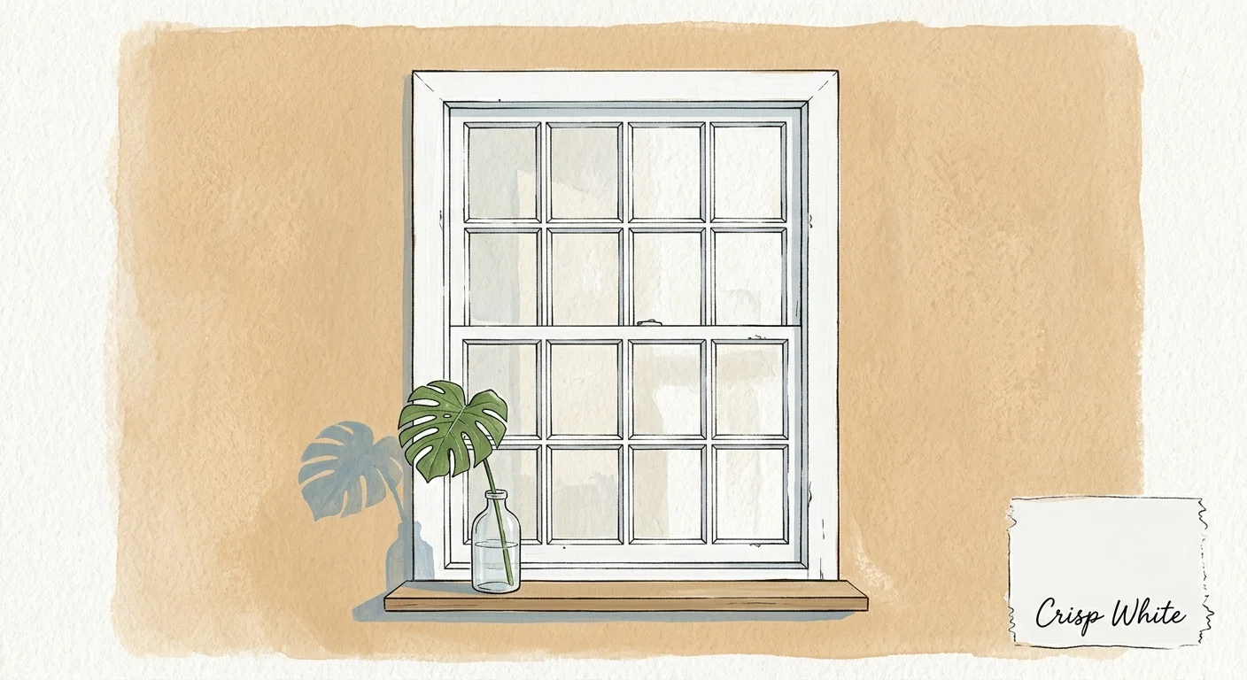
Trend #6: Classic Crisp White for Architectural Purity
While modern designers enthusiastically embrace bold, saturated hues, a classic crisp white remains an indispensable, highly effective tool for achieving architectural purity and maximizing natural light. However, the contemporary approach to white window trim is highly intentional rather than a lazy, builder-grade default. Benjamin Moore Chantilly Lace offers a remarkably clean, bright white completely devoid of distracting yellow or blue undertones, making it the perfect choice for illuminating modern, streamlined spaces. Painting your windows crisp white actively reflects maximum sunlight into your room, effectively tricking the human eye into perceiving the space as significantly larger and airier. This timeless, enduring choice shines beautifully in minimalist, Scandinavian-inspired, and airy coastal interiors where structural simplicity is key. To prevent white trim from feeling sterile or inexpensive, designers strategically contrast it with richly pigmented walls or heavily textured wallcoverings, ensuring the bright window casings pop as distinct architectural features.
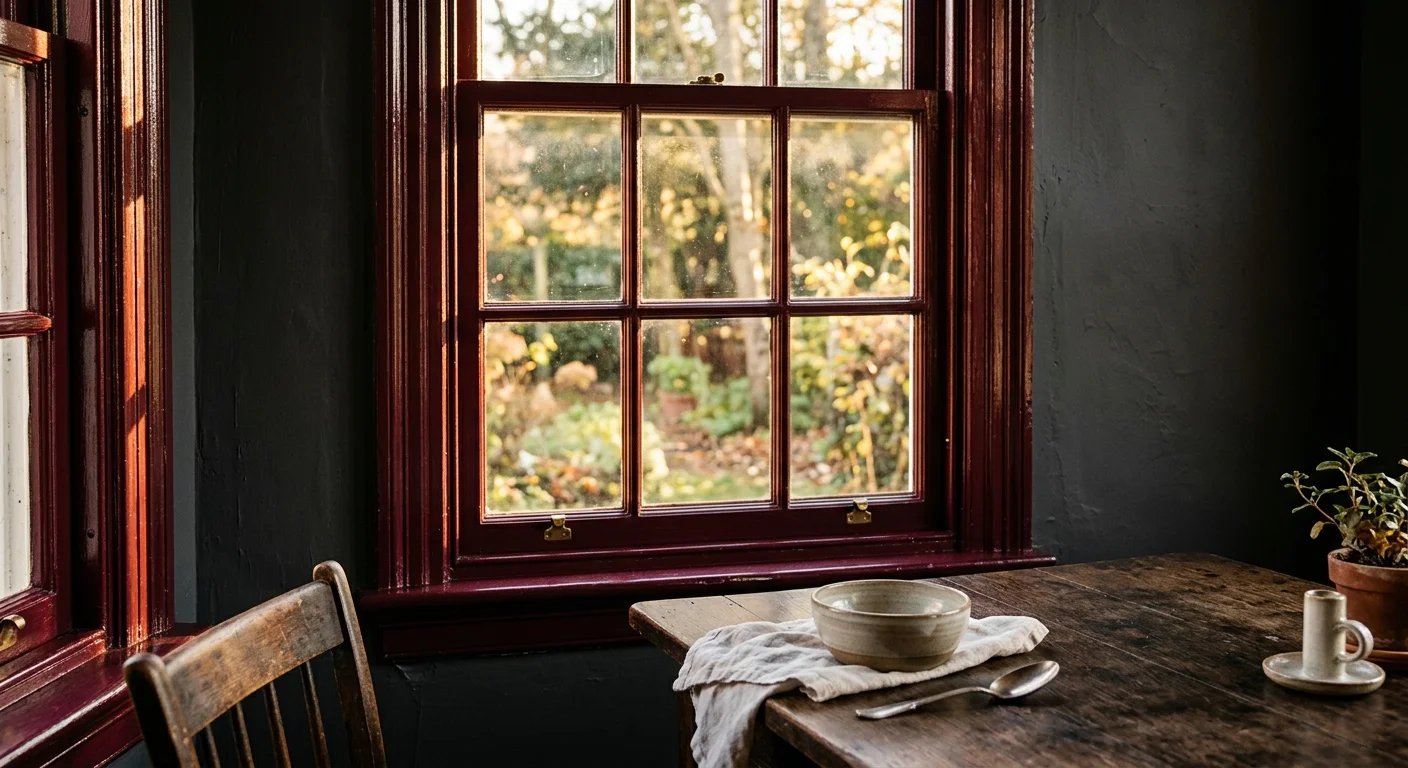
Trend #7: Rich Burgundy for Intimate Spaces
The immersive color-drenching trend has revolutionized how we approach interior paint, and carrying a rich burgundy across your walls and directly onto your window trims creates a breathtaking, cohesive jewel-box effect. Farrow & Ball Brinjal offers a complex, deep eggplant-red that changes dramatically as ambient light shifts throughout the day. Utilizing deep burgundy window paint colors feels inherently daring, yet it roots your home in classic, old-world romance and unapologetic luxury. This sumptuous, heavy shade excels in intimate, enclosed spaces—such as jewel-box powder rooms, quiet reading nooks, and cozy primary bedrooms—where you actively want to cultivate an enveloping, highly moody atmosphere. You can aggressively enhance the opulence of burgundy trim by layering plush, tactile textiles like heavy velvet drapery, thick mohair throws, and low-level ambient amber lighting. By treating the window casing with such a passionate color, you transform a standard architectural element into the room’s defining focal point.
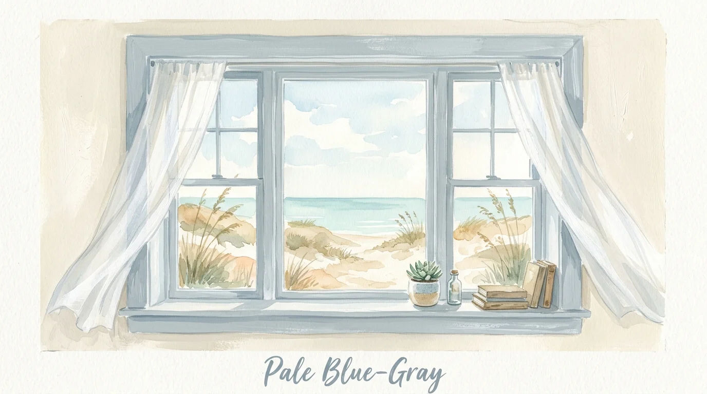
Trend #8: Soft Pale Blue-Gray for Coastal Calm
Bringing the serene color of the morning sky directly onto your window trim establishes an immediate, palpable sense of calm and expansive space within your home. Soft pale blue-gray, such as the highly popular Benjamin Moore Boothbay Gray, provides a gentle wash of color that feels perfectly historic yet remarkably fresh for contemporary living. This highly nuanced shade shifts effortlessly between pale blue, soft gray, and muted green depending on the surrounding daylight and exterior landscaping. Designers frequently leverage pale blue-gray in relaxed coastal, charming cottage, and modern transitional home decor to successfully invoke a breezy, optimistic energy. It serves as a beautifully understated framing device for waterfront views or lush backyard gardens, deliberately blurring the physical boundary between the interior and the natural environment. To complete this serene aesthetic, pair pale blue window trims with whitewashed woods, casual linen upholstery, and polished nickel hardware.
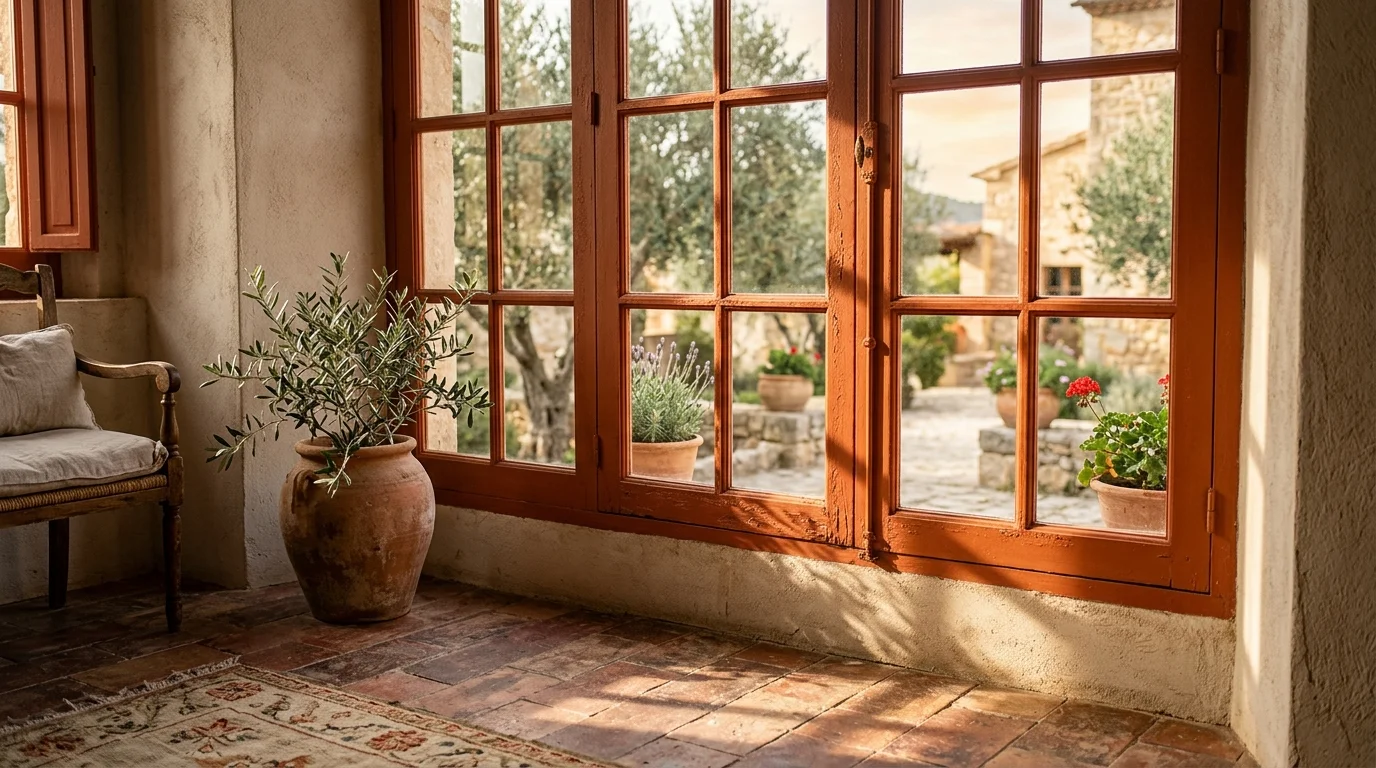
Trend #9: Warm Terracotta for Earthy Warmth
As global interior design continues to shift decidedly toward warmer, more comforting color palettes, terracotta has emerged as a surprisingly versatile and highly sought-after choice for statement window trim. Farrow & Ball Red Earth perfectly captures the baked, radiant warmth of Mediterranean landscapes and traditional Southwestern architecture, injecting an undeniable sense of vitality and life into your home. Terracotta window paint colors work brilliantly to visually warm up rooms that receive cool, bluish northern light, effectively balancing the overall color temperature of the space. This inherently earthy hue invites a highly tactile approach to decorating; you will frequently see designers pairing terracotta trims with heavily veined Calcutta marble, raw exposed timber beams, and artisanal hand-troweled plaster walls. Rather than relying on stark, modern contrasts, terracotta actively fosters a deeply organic, enveloping atmosphere that feels heavily grounded and intensely welcoming for family spaces.
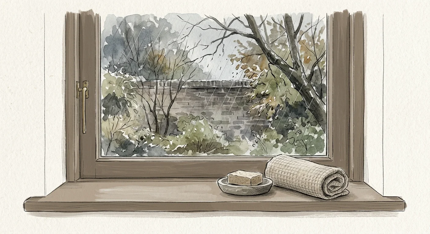
Trend #10: Earthy Mushroom Brown for Quiet Luxury
The massively popular quiet luxury movement relies entirely on highly curated, brilliantly understated color palettes, and earthy mushroom brown has officially dethroned cool gray as the ultimate sophisticated neutral. Sherwin-Williams Shiitake embodies this widespread design trend, offering a soft, muted brown that feels endlessly elegant and highly intentional. Painting your windows in a nuanced mushroom hue provides gentle architectural definition without the high visual contrast of black or charcoal, allowing your eye to transition smoothly from the interior walls to the outdoor scenery. Mushroom brown excels dramatically in spaces specifically designed for rest and regeneration, seamlessly tying together other organic, earthy elements within the room. You can successfully build a richly layered, monochromatic scheme by combining mushroom window trim with oatmeal-colored boucle fabrics, matte travertine stone, and unlacquered brass accents, resulting in an interior design that confidently whispers wealth and refined taste.
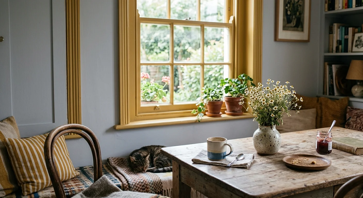
Trend #11: Muted Mustard Yellow for Playful Optimism
For those actively looking to inject unbridled joy, unique personality, and a distinct touch of historic charm into their home decor, muted mustard yellow provides an unexpected yet deeply sophisticated solution. Farrow & Ball India Yellow brings a wonderfully earthy, aged warmth that successfully prevents the bold color from feeling overly bright, jarring, or juvenile. Mustard window trims act exactly like encapsulated sunlight, instantly brightening dreary rooms and creating a highly personalized, wonderfully eclectic aesthetic. This specific color shines brilliantly in spaces that actively embrace maximalism or English country house styling, where fearless pattern mixing and antique wooden furniture rule the design narrative. Designers love to strategically pair mustard yellow designer paint colors with contrasting deep teal walls or rich burgundy accents to create dynamic, highly stylized environments. By committing to a bold mustard trim, you clearly showcase design confidence.
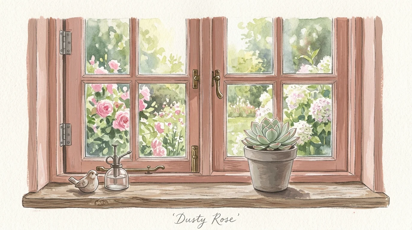
Trend #12: Dusty Rose for Gentle Warmth
Dusty rose has finally transcended its outdated reputation as a basic nursery color to become a highly respected, foundational neutral in high-end interior design circles. Farrow & Ball Setting Plaster delivers a beautifully muted, grown-up pink with heavy beige undertones that perfectly replicate the flattering, warm glow of a late afternoon sunset. Applying dusty rose directly to your window trim infuses the entire room with gentle, undeniable warmth that flatters all skin tones and actively softens harsh, direct natural light. This unexpected trim color works beautifully in both starkly contemporary and highly historic homes, offering a brilliantly subtle departure from standard, expected whites and creams. You can easily elevate the sophisticated edge of dusty rose window frames by pairing them with stark, modern metallic furnishings, deep charcoal gray accents, and sleek black marble surfaces. This deliberate juxtaposition of soft color and hard materials creates a perfectly balanced visual narrative.
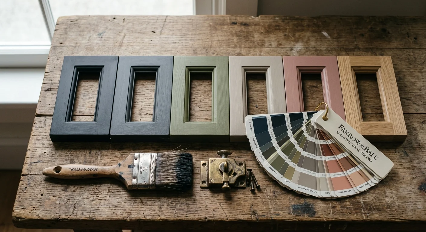
The Big Picture: Weaving These Trends into Your Home
Embracing distinct window paint colors requires a highly holistic approach to your interior design; you simply cannot treat the window in total isolation. When you introduce a strong, defining color to your architectural trim, you must intentionally weave that same hue—or carefully selected complementary tones—throughout the rest of the room to ensure a cohesive, intentional aesthetic. For instance, if you select a moody navy blue for your window casings, deliberately echo that specific color in your woven area rug, textured throw pillows, or a piece of prominent, large-scale artwork. This strategic repetition actively grounds the entire color scheme and successfully prevents the painted windows from feeling disconnected from the surrounding home decor.
Furthermore, you must always evaluate exactly how your chosen paint color interacts with the shifting natural light in your specific space. A deep, saturated charcoal that looks incredibly sophisticated in a sun-drenched, south-facing living room might feel excessively heavy and oppressive in a dimly lit, narrow hallway. You must also carefully consider the paint finish; professional interior designers typically prefer an eggshell or satin finish for window trims. These specific finishes provide essential durability and a subtle, refined sheen that highlights the architectural millwork perfectly, all without the glaring, distracting reflection of standard high gloss. Ultimately, thoughtfully painted windows serve as the vital connective tissue between your private interior sanctuary and the outside world.
Frequently Asked Questions
Can I paint my window trim a different color than my baseboards?
Absolutely. While traditional design rules often dictate matching all the trim throughout a room, modern interior design frequently breaks this convention to create stunning architectural focal points. Painting your window casings a contrasting color—like matte black, rich burgundy, or earthy olive—while keeping your baseboards a crisp white or wall-matching neutral draws the eye directly to the view outside. This technique beautifully emphasizes the structure of the window itself without overwhelming the entire space, keeping your home decor feeling balanced and intentional.
Do dark window paint colors make a room look smaller?
Contrary to popular belief, dark window trims can actually make a space feel larger and substantially more expansive. Because dark colors recede visually, painting your mullions and frames in shades like deep charcoal or navy allows the physical boundaries of the window to blur. Your eye naturally bypasses the dark, receding frame to focus heavily on the brighter exterior landscape, effectively extending your visual field well beyond the interior walls of your home.
How do I choose between warm and cool tones for my window trim?
Your decision should hinge primarily on your existing flooring, large furniture pieces, and the specific compass direction your room faces. If your home features warm wood floors and receives cool, bluish northern light, utilizing warm window trim ideas—like terracotta, greige, or mustard—will balance the chill and inject immediate coziness. Conversely, if your space is constantly flooded with hot, southern sunlight and features cool-toned stonework, utilizing crisp whites or pale blue-grays will heavily temper the heat and establish a refreshing, airy atmosphere.
What is the most durable paint finish for window trims?
When selecting designer paint colors for your windows, the finish is just as critical as the hue itself. Interior designers strongly recommend utilizing a satin or semi-gloss finish for all window casings and mullions. Windows naturally endure significant wear and tear from fluctuating temperatures, moisture condensation, and frequent physical contact when opening and closing. A satin finish provides a beautiful, understated sheen that aligns perfectly with modern home decor trends, while simultaneously offering a highly washable, protective surface that ensures your design investment lasts for years.
For the latest color forecasts, consult industry leaders like Pantone and paint companies like Benjamin Moore. For professional design standards, refer to the American Society of Interior Designers (ASID).
Disclaimer: This article reflects design trend analysis and predictions. Personal taste and timeless design principles should always guide your decorating choices.
