

Transforming a windowless corridor from a dreary transition space into a captivating visual destination relies entirely on mastering sophisticated color combinations. You can leverage the inherent moodiness of a dark space rather than fighting it with sterile, ineffective whites. By embracing rich hues and strategic contrasts, you establish an immersive, high-impact threshold that instantly telegraphs your interior design ethos. Current aesthetic shifts favor narrative-driven environments—spaces that envelop you and offer a deliberate atmospheric experience. When you deploy saturated tones alongside warm accents, you give these narrow arteries a distinct architectural provenance. Elevating your hallway decorating strategy requires the thoughtful pairing of saturated bases with luminous secondary tones, turning functional pathways into dramatic, welcoming galleries.
Trend #1: Ink Black and Burnished Gold
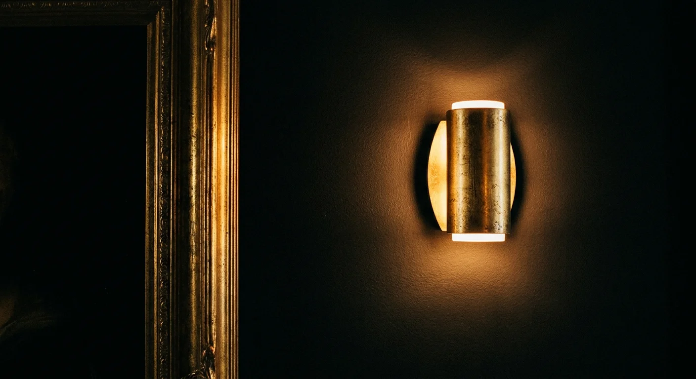
Embracing absolute darkness in a windowless space might feel counterintuitive, yet pairing ink black with burnished gold creates a masterclass in quiet luxury. Dark colors possess a unique ability to absorb shadows and blur the physical boundaries of a narrow corridor. When you saturate the walls in a true, deep black, you eliminate the harsh contrast of unlit corners, effectively making the walls recede. This dramatic backdrop sets a theatrical stage for high-impact metallic accents to shine with unprecedented brilliance.
The success of this combination lies heavily in your choice of finishes and textures. You must utilize a dead-flat or matte finish for the black paint to maximize its light-absorbing qualities; glossy blacks will reflect glare and highlight every wall imperfection. Conversely, your gold elements should feature a brushed or burnished texture rather than a highly polished sheen. Burnished gold carries an inherent architectural provenance, looking aged and intentional rather than flashy or superficial. This textural interplay ensures the hallway remains sophisticated and grounded.
To execute this look effectively, implement a color-drenching strategy by painting your baseboards, doors, walls, and ceiling in the identical ink black hue. Install burnished gold wall sconces at eye level to cast warm, directional pools of light across the matte surface. You can further enhance the scheme by hanging a substantial gold-framed mirror at the end of the hallway; this captures ambient light from adjacent rooms and draws the eye forward, making your dark hallway feel endlessly elegant.
Trend #2: Deep Aubergine and Muted Sage
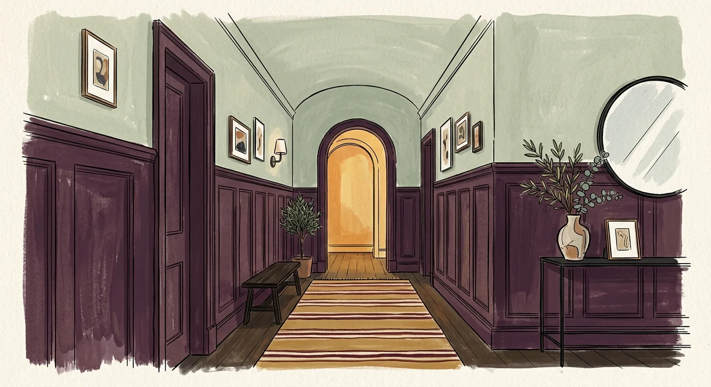
Deep aubergine currently dominates the conversation surrounding sophisticated hallway decorating. This rich, brown-toned purple offers an earthy depth that feels inherently regal yet incredibly grounded. When dealing with a corridor lacking natural light, you must rely on complex colors that shift dynamically under artificial bulbs. Aubergine provides this exact chameleon-like quality, shifting from warm chocolate to deep plum depending on your lighting. Pairing this heavy, saturated base with a muted sage green introduces a necessary biophilic balance, lifting the visual weight of the space without breaking the moody atmosphere.
You will find that the textural interplay between these two colors dictates the success of the hallway. Opt for a velvet or matte finish on your aubergine surfaces to absorb ambient light and soften the architectural lines of the corridor. Muted sage, applied in an eggshell finish, creates a subtle contrast that gently reflects light, providing visual relief. This combination mimics the natural shadows of a dense forest floor at dusk, enveloping you in a deeply calming, organic environment.
For a practical and actionable approach, apply deep aubergine to the lower two-thirds of your hallway walls using traditional wood wainscoting or beadboard. Coat the upper third of the walls and the ceiling in muted sage. This specific division of color anchors the narrow pathway while drawing the eye upward, giving the illusion of higher ceilings and transforming a cramped passageway into a deliberate, welcoming gallery.
Trend #3: Forest Green and Terracotta
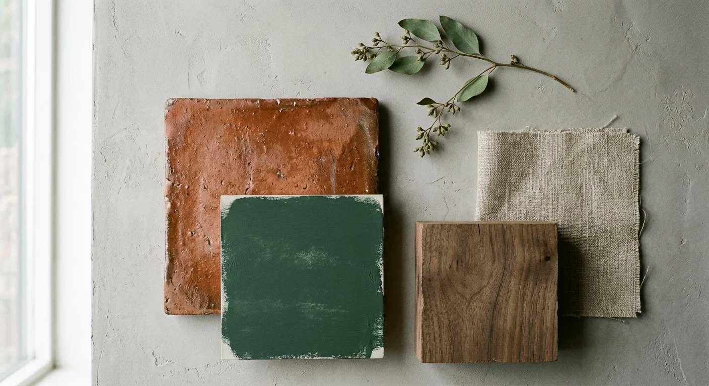
Embracing organic modernism in your home requires the confident use of nature-inspired palettes, and no pairing executes this better than forest green and terracotta. Dark hallways often feel disconnected from the outside world; injecting a heavy, saturated forest green onto the walls instantly re-establishes a link to the natural environment. Forest green acts as a protective, enveloping canopy that feels secure rather than confining. To counterbalance the cool depth of the green, you need the raw, baked-earth warmth of terracotta to ground the design and introduce an approachable, tactile element.
The materials you select for this combination matter immensely. The terracotta element should ideally come through authentic, physical textures rather than flat paint. Hand-fired clay tiles, textured terracotta runners, or artisanal ceramic wall sconces inject necessary provenance into the hallway. The slight imperfections and color variations found in natural terracotta break up the monolithic appearance of dark green walls, giving the space an aged, collected aesthetic rather than a contrived one.
When exploring hallway color ideas, consider committing to forest green walls and matching trim to create a seamless visual box. Introduce terracotta through a long, vintage runner rug stretching down the corridor, or install actual reclaimed terracotta brick flooring if a renovation allows. Enhance the warmth by selecting warm-toned, 2700K LED bulbs for your lighting fixtures, which will illuminate the red undertones of the terracotta and make the dark green walls feel incredibly inviting.
Trend #4: Midnight Teal and Unlacquered Brass
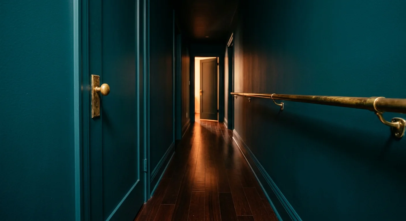
Midnight teal stands as a premier choice for homeowners seeking high impact without the starkness of true black. This complex hue straddles the boundary between deep navy and rich emerald, offering a sophisticated energy that enlivens a windowless space. Teal possesses a unique visual depth that visually pushes walls outward, directly counteracting the cramped sensation typical of narrow hallways. By pairing this oceanic tone with unlacquered brass, you create a timeless tension between deep, moody color and bright, reflective metal.
Unlacquered brass serves a specific, vital function in this color scheme. Unlike pre-sealed or lacquered metals that remain static, raw brass features a living finish that develops a unique patina over time. As you interact with door handles and light switches, the oils from your hands will naturally darken the metal, leaving the untouched areas bright. This organic aging process introduces an undeniable sense of provenance and history to your home, elevating the hallway from a basic transition zone into a curated architectural feature.
To maximize the dramatic effect, execute a comprehensive color-drenching strategy. Paint your hallway walls, ceiling, baseboards, and interior doors entirely in midnight teal, utilizing a satin finish on the trim for a subtle textural shift. Punctuate this dark canvas with heavy, unlacquered brass door hardware, brass-framed artwork, and traditional picture lights. The reflective brass elements act as jewelry for the space, catching the ambient light and guiding your guests seamlessly toward the adjacent living areas.
Trend #5: Chocolate Brown and Soft Celadon
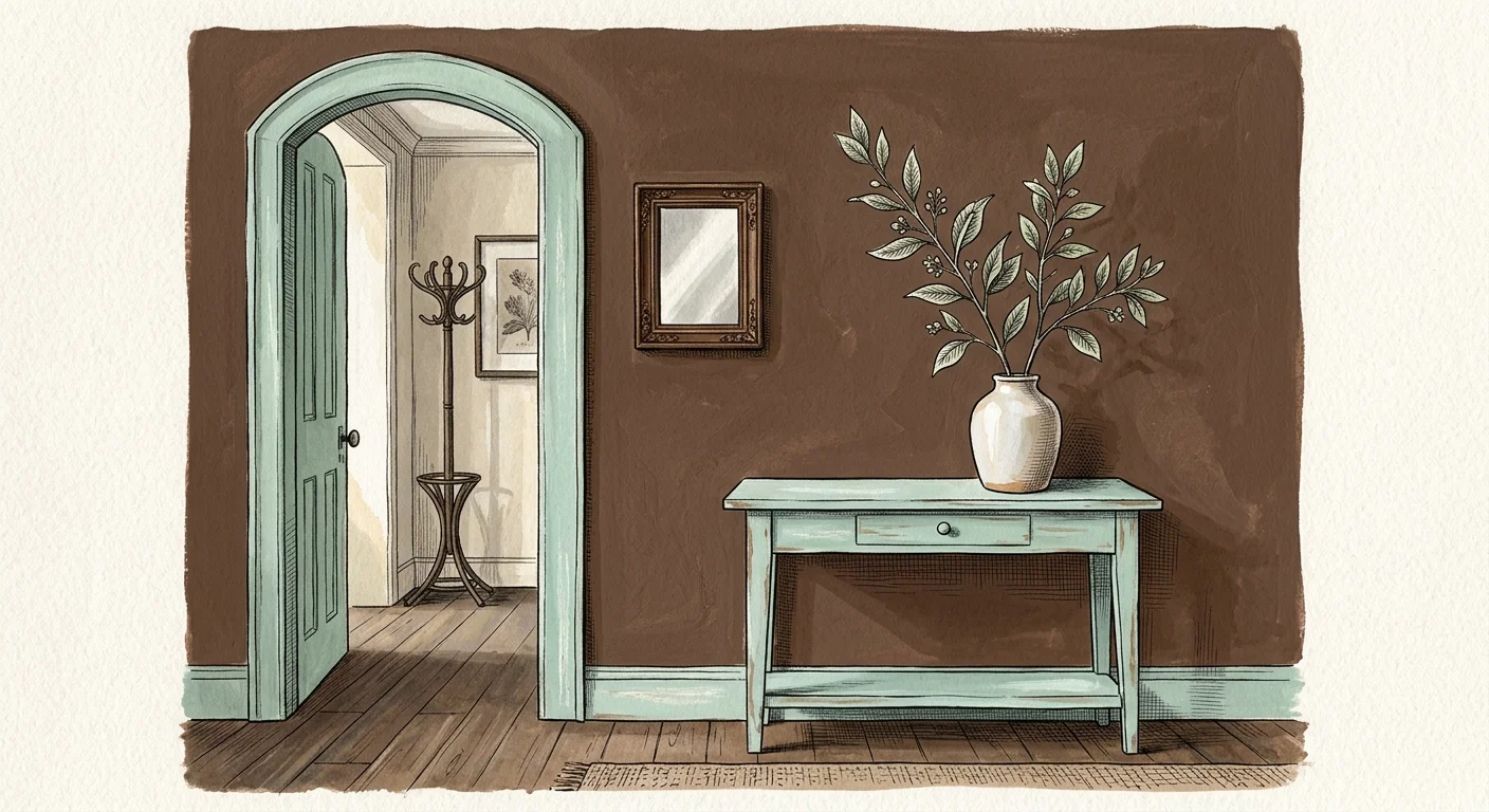
The renaissance of brown marks one of the most significant shifts in contemporary interior design. Chocolate brown offers a luxurious, enveloping warmth that grey and black simply cannot replicate. In a dark hallway, a heavy brown acts like a tailored woolen coat—it feels rich, comfortable, and distinctly protective. To prevent the brown from feeling overly heavy or cavernous, you must pair it with a delicate, historical hue. Soft celadon, a pale greyish-green, acts as the perfect visual palate cleanser, cutting through the density of the brown with an airy, refined crispness.
Texture plays an oversized role when implementing a primarily brown home color scheme. Flat brown paint can sometimes appear muddy in spaces lacking natural sunlight. Instead, you should rely on tactile materials to bring the color to life. Grasscloth wallpaper, rich walnut paneling, or heavily textured limewash infuses the chocolate brown with horizontal shadows and highlights, visually widening the narrow corridor. The soft celadon elements should remain smooth and understated, creating a satisfying tension between rough and refined surfaces.
Transform your corridor by wrapping the expansive wall surfaces in a deeply textured chocolate brown grasscloth. Frame the architectural elements—such as door casings, baseboards, and crown molding—in a smooth, satin celadon paint. You can carry the celadon onto the ceiling to reflect your artificial light downward, ensuring the space remains well-lit and functional. This specific pairing bridges the gap between mid-century warmth and traditional elegance, yielding a hallway that feels meticulously designed.
Trend #6: Charcoal Grey and Warm Amber
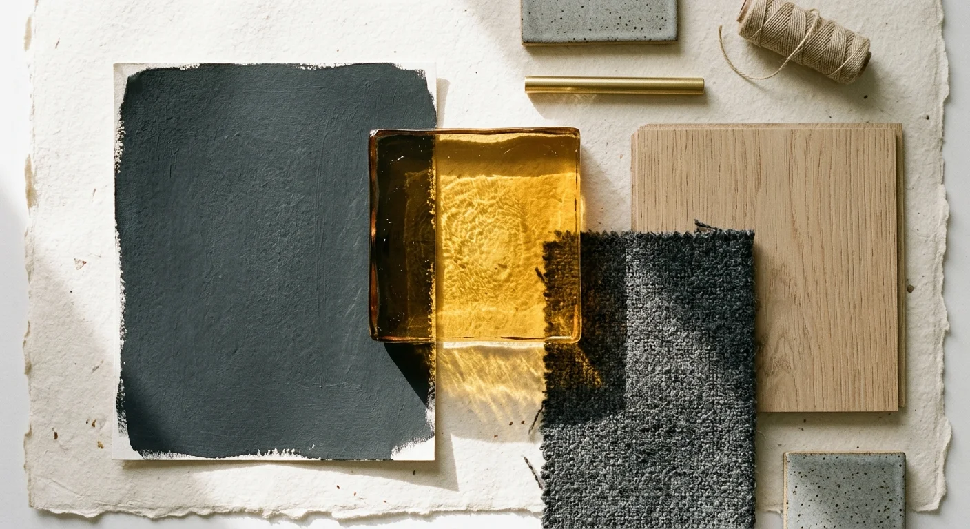
For homeowners transitioning away from the cool, clinical greys of the past decade, heavily saturated charcoal offers a dramatic, sophisticated upgrade. Charcoal grey absorbs light beautifully, blurring the hard angles of a narrow hallway to create an illusion of expansiveness. It provides the moody theatricality of black but retains a softer, more approachable edge. However, an entirely charcoal space demands an injection of warmth to prevent it from feeling industrial. Warm amber provides this necessary counterpoint, bathing the cool grey in a perpetual, golden-hour glow.
Amber elements introduce transparency and dimension to the heavy charcoal backdrop. You should seek out materials that naturally exude this honeyed warmth, such as tortoiseshell accents, stained glass, or highly polished burled wood. When light passes through amber glass, it casts dynamic, warm-toned shadows against the dark grey walls, instantly softening the atmosphere. This interaction transforms the hallway from a static passageway into a responsive, luminous environment that shifts beautifully throughout the evening.
Coat your hallway walls and ceiling in a flat charcoal grey to establish a quiet, shadow-rich foundation. Introduce warmth strategically by hanging a series of amber glass pendant lights down the center of the ceiling. You can further ground the scheme by placing a warm, amber-toned oak or walnut console table against the wall, styled with a brass table lamp. The amber lighting will reflect off the wooden surfaces, radiating a welcoming, fiery warmth that perfectly balances the dramatic charcoal walls.
Trend #7: Rich Burgundy and Creamy Oatmeal
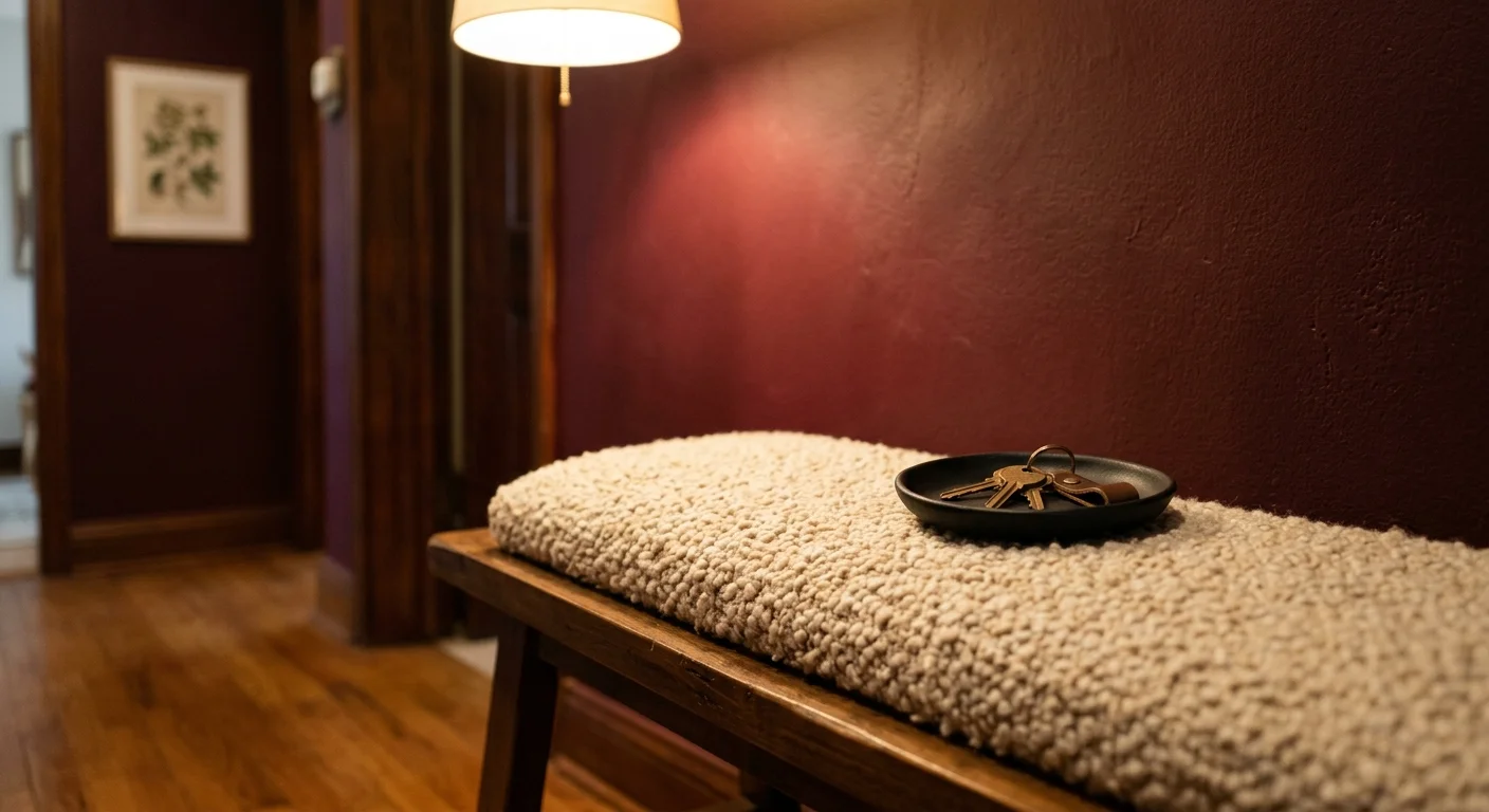
The strategic application of red—often referred to in design circles as the unexpected red theory—has evolved into a dominant aesthetic movement. Deep, wine-soaked burgundy brings a passionate, old-world elegance to dark hallways, proving that windowless spaces can handle high-intensity hues. Burgundy commands attention and naturally raises the perceived temperature of the room. To keep this potent color from overwhelming the senses, you must pair it with a deeply organic neutral. Creamy oatmeal offers the perfect, soft counterweight, neutralizing the burgundy without introducing the stark, jarring contrast of a pure white.
The success of this combination hinges on achieving a matte, tactile finish. Highly reflective burgundy can look dated, but a flat, velvety application feels inherently modern and sophisticated. Oatmeal surfaces should feature visible movement to maintain the organic narrative. Plaster treatments, Roman clay, or deeply textured linen wallpapers provide the oatmeal tone with necessary visual interest, ensuring the lighter sections of the wall do not fall flat against the powerful burgundy.
Anchor your hallway decorating strategy by painting all the doors and their corresponding trim in a high-impact, satin burgundy. Treat the surrounding walls with a creamy oatmeal limewash, employing broad, sweeping brushstrokes to create a sueded texture. Alternatively, lay down a thick, plush burgundy runner rug over light oak floors to lead the eye down the corridor. This combination strikes a masterly balance between bold architectural features and soft, welcoming textures.
Trend #8: Slate Blue and Alabaster
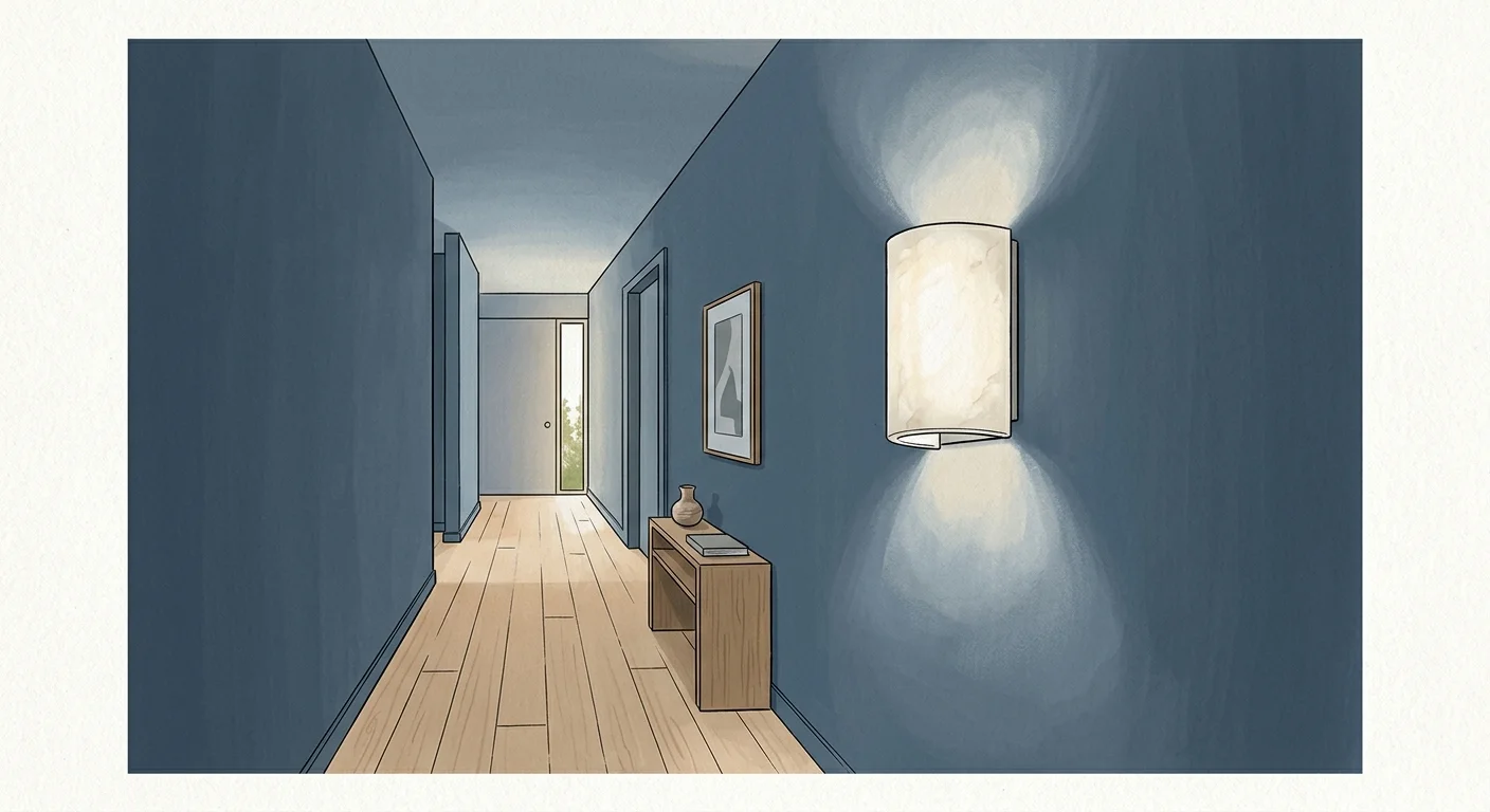
If your interior design preferences lean toward classical elegance, slate blue and alabaster provide a dramatic yet exceptionally serene hallway experience. Slate blue contains heavy grey undertones, giving it a muted, historical quality that feels grounded rather than overly vibrant. In a dark corridor, slate blue creates a quiet, contemplative atmosphere reminiscent of a twilight sky. Alabaster, an off-white with subtle warm and grey undertones, highlights the architectural details of the hallway without piercing the moody ambiance like a brilliant white would.
The interaction between these two colors relies heavily on traditional design principles. Slate blue inherently recedes from the eye, effectively pushing the walls of a narrow hallway outward. Alabaster provides structural definition, outlining the shape of the space and guiding physical movement. Because these colors sit comfortably together on a muted spectrum, they allow your artwork, lighting fixtures, and flooring to take center stage without competing for visual dominance.
Apply a flat slate blue paint to the primary wall surfaces, allowing the color to absorb the ambient light. Use a semi-gloss alabaster paint on your crown molding, baseboards, and any picture rail molding to clearly define the architecture of the space. To enhance this sophisticated palette, hang a gallery wall of black-and-white photography framed in slim, dark wood or aged brass. The alabaster trim will illuminate the borders of the room, while the slate blue ensures the hallway remains a dramatic, welcoming prelude to the rest of your home.
The Big Picture: Weaving These Trends into Your Home
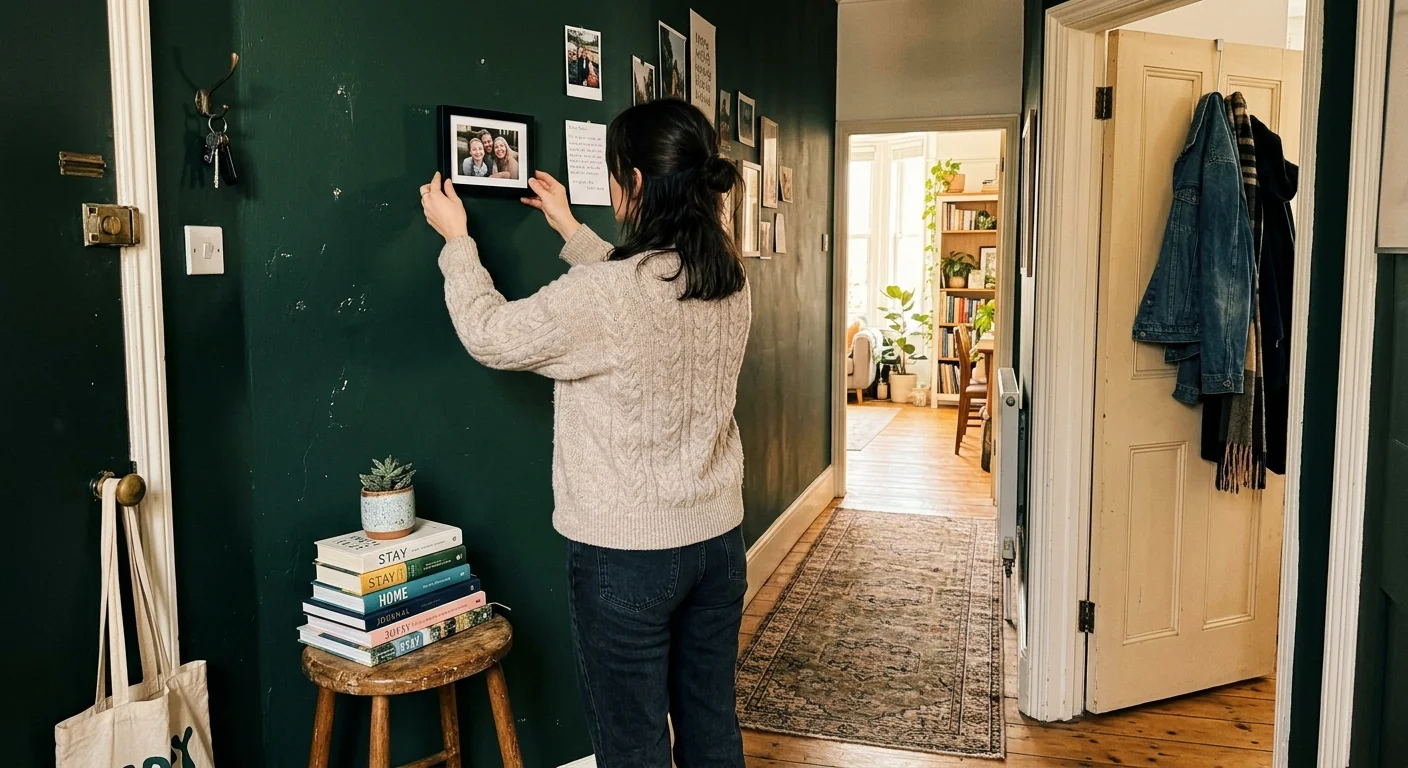
Successfully implementing these dark, moody color combinations requires a holistic approach to your broader home aesthetic. A dramatic hallway should not exist in a vacuum; it must communicate fluidly with your adjoining living rooms, bedrooms, and dining areas. You can achieve this cohesive flow by treating the dark hallway as a deliberate palate cleanser. When you transition from a brightly lit, neutral living room into a dark, enveloping corridor, and then back into a light-filled bedroom, the contrast enhances the architectural impact of every single space.
Sightlines dictate how you should plan this transition. Stand in your primary living area and look down the hallway. The dark hue you choose—whether it is ink black, forest green, or burgundy—should pull out an accent color already present in your main room’s rugs, pillows, or artwork. This visual echo ensures the moody hallway feels intentional rather than accidental. Additionally, maintaining consistent flooring throughout the transition zones prevents the dark walls from chopping the house into disjointed segments.
For the latest color forecasts, consult industry leaders like Pantone and paint companies like Benjamin Moore. For professional design standards, refer to the American Society of Interior Designers (ASID).
Frequently Asked Questions
Does painting a dark hallway make it feel smaller?
Contrary to popular belief, dark colors do not inherently shrink a room. In a windowless, narrow hallway, stark white paint often highlights the cramped dimensions and harsh shadows. Dark colors, however, absorb light and obscure the corners of the room, effectively blurring the physical boundaries. When you cannot easily see where the walls meet the ceiling, the space feels expansive, endless, and deeply enveloping rather than claustrophobic.
What is the most effective lighting strategy for moody corridors?
You must abandon flat, overhead lighting in favor of a layered, atmospheric approach. Harsh recessed lights wash out complex dark colors and cast unflattering downward shadows. Instead, install wall sconces at eye level to cast warm, horizontal pools of light that highlight the wall texture. Add targeted picture lights above your artwork, and ensure you use LED bulbs with a warm color temperature (around 2700K) to bring out the rich undertones of your selected paint.
Should I paint my hallway ceiling the same dark color as the walls?
Yes; employing a color-drenching strategy is highly recommended for dark hallways. Leaving the ceiling stark white while painting the walls dark creates a harsh visual ‘lid’ that visually lowers the height of the room and fragments the design. Painting the ceiling, walls, doors, and trim in the exact same dark hue creates a seamless, infinite box that wraps around you, maximizing the dramatic and welcoming impact of the color scheme.
How do I ensure my dramatic hallway flows into a bright living room?
You can seamlessly bridge a moody hallway and a bright living space by utilizing transition colors and consistent architectural details. Carry the dark hallway paint onto the interior frame of the doorway leading into the living room, creating a distinct, framed portal. Furthermore, ensure your baseboards or flooring material remain entirely consistent between the two spaces. You should also introduce a single, small accent piece in the bright living room—like a ceramic vase or a throw pillow—that perfectly matches the dark hallway color.
Disclaimer: This article reflects design trend analysis and predictions. Personal taste and timeless design principles should always guide your decorating choices.
