
The Big Picture: Weaving These Trends into Your Home
Adopting classic wall colors requires substantially more than simply rolling a fresh coat of paint onto your drywall; it demands a strategic, holistic approach to your entire interior environment. When you integrate these enduring hues, critically consider how the colors flow from one room to the next, creating a cohesive visual narrative throughout your home.
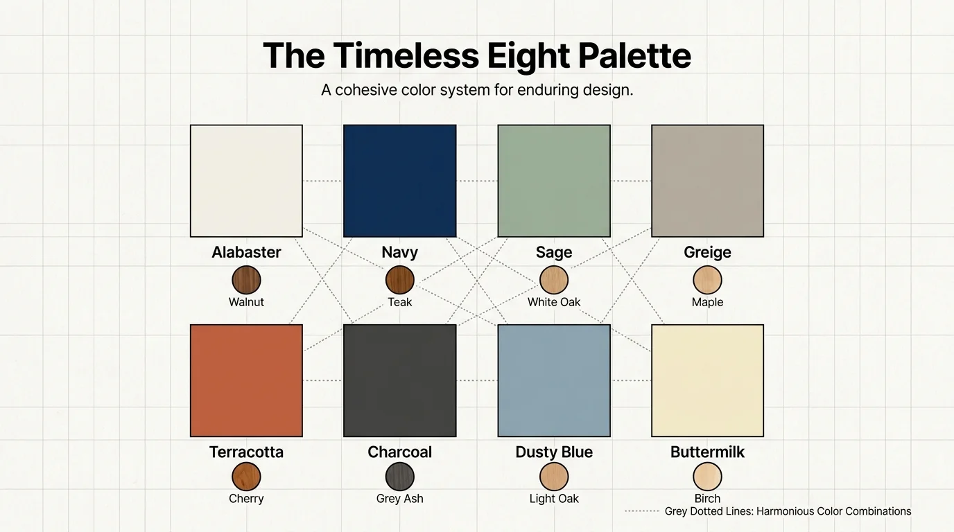
You do not need to paint your entire house a single shade of alabaster or greige to achieve harmony. Instead, establish a dominant, light neutral for your sweeping main living areas and strategically deploy the deeper, moodier classics—like moody navy blue or rich charcoal grey—in enclosed spaces like formal dining rooms, libraries, or studies to create deliberate architectural rhythm and visual surprise.
Furthermore, the paint finish you select plays a monumental role in the final aesthetic outcome. Matte and flat finishes offer a velvety, sophisticated look that expertly hides drywall imperfections, while eggshell or satin finishes provide crucial wipeability and durability in high-traffic zones like central hallways and family kitchens.
Always invest in sample pots and test your selected paint colors on multiple walls, observing them over a full twenty-four-hour period. Natural sunlight shifts drastically from dawn to dusk, and artificial LED lighting can inadvertently pull unexpected undertones from your seemingly safe neutral paint colors.
By treating these classic colors as a vital foundational layer rather than a mere afterthought, you empower your home to evolve gracefully alongside your shifting tastes, furniture upgrades, and lifestyle needs for decades to come.
Frequently Asked Questions
How do I properly choose between a cool and warm neutral wall color?
The primary determining factor should always be the natural light entering your specific space. North-facing rooms receive cool, bluish daylight that can make grey paints feel frigid and uninviting; these challenging spaces benefit tremendously from warm neutrals like greige, alabaster, or buttermilk yellow. Conversely, south-facing rooms receive intense, golden sunlight that can overwhelm warm paints, making cool tones like dusty blue, sage green, or charcoal grey feel perfectly balanced and inherently elegant.
Can I successfully mix multiple classic colors within an open-concept floor plan?
Yes, strategically mixing classic colors enhances the architectural depth of an open-concept space, provided you rigorously maintain a unified undertone. Designate a primary light neutral for the sweeping exterior walls, and boldly use a stronger classic—such as sage green or earthy terracotta—on architectural focal points. Applying these accent colors to a fireplace bump-out, a massive kitchen island, or the interior backing of a built-in bookcase brilliantly anchors the different functional zones without disrupting the overall flow.
Do classic wall colors genuinely work with ultra-modern furniture and decor?
Absolutely. In fact, classic wall colors provide a fundamentally necessary grounding effect for contemporary and ultra-modern furniture. The striking juxtaposition of sleek, avant-garde silhouettes against a historically rooted color like moody navy or creamy alabaster adds intense visual tension and sophisticated layering. This intentional high-low mix of eras and styles prevents a modern room from feeling like a sterile, untouchable showroom, successfully injecting vital character, provenance, and warmth into your curated space.
For the latest color forecasts, consult industry leaders like Pantone and paint companies like Benjamin Moore. For professional design standards, refer to the American Society of Interior Designers (ASID).
Disclaimer: This article reflects design trend analysis and predictions. Personal taste and timeless design principles should always guide your decorating choices.