

Selecting the perfect neutral paint colors for home interiors transforms ordinary rooms into serene, sophisticated sanctuaries that reflect light and elevate everyday living. Neutral interior paint creates the ultimate foundational canvas, allowing architectural details, textured textiles, and warm wood flooring to take center stage. By understanding how Light Reflectance Value, natural light orientation, and subtle undertones interact, you can curate a cohesive color palette that flows effortlessly across your entire floor plan. From luminous alabasters in sunlit family spaces to rich, cocooning taupes in tranquil private retreats, modern neutrals offer unprecedented aesthetic depth. Master these essential design principles to choose the best neutral paint colors that enhance space, maximize natural illumination, and endure far beyond passing trends.
Trend #1: Warm Alabasters and Luminous Chalk Whites
Warm white paint remains an absolute cornerstone of sophisticated interior design, shifting away from the stark, clinical blues of past decades toward soft, chalky undertones. Selecting popular neutral paint colors within the warm white family grants your home an expansive, airy quality while maintaining an inviting visual warmth. Paint formulas featuring subtle yellow, pink, or greige undertones catch natural sunlight beautifully; they prevent expansive open-plan spaces from feeling sterile or echoing like a gallery.
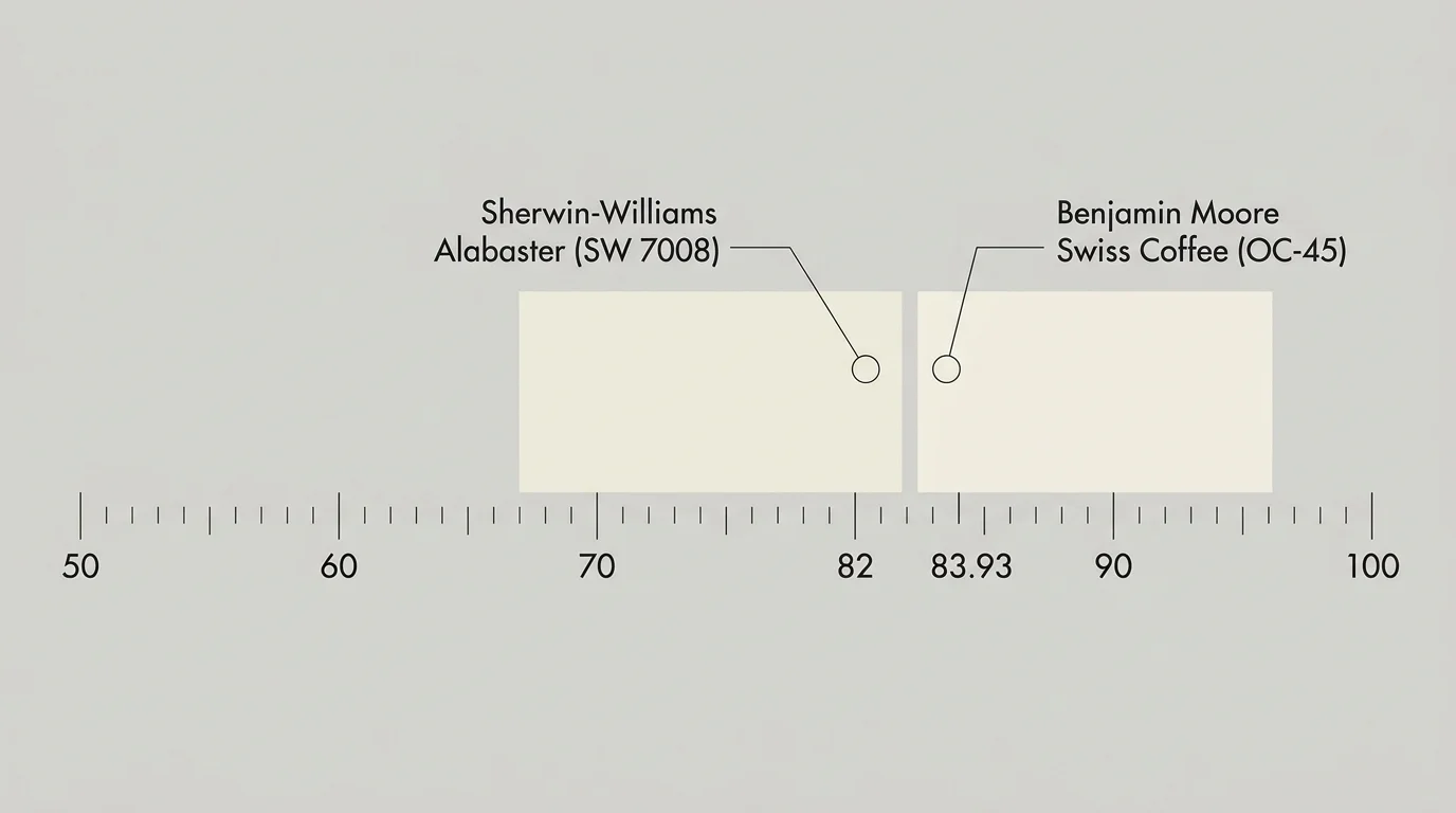
To execute this look seamlessly, evaluate the Light Reflectance Value (LRV) of your chosen shade. High LRV shades—ranging from 80 to 85—reflect substantial light, making them the best neutral paint colors for dim corridors, windowless hallways, and North-facing living rooms where diffuse cool daylight needs softening. Renowned shades like Sherwin-Williams Alabaster (SW 7008, LRV 82) and Benjamin Moore Swiss Coffee (OC-45, LRV 83.93) deliver this balanced glow without sliding into heavy cream territory; they bounce light across living areas while preserving architectural warmth.
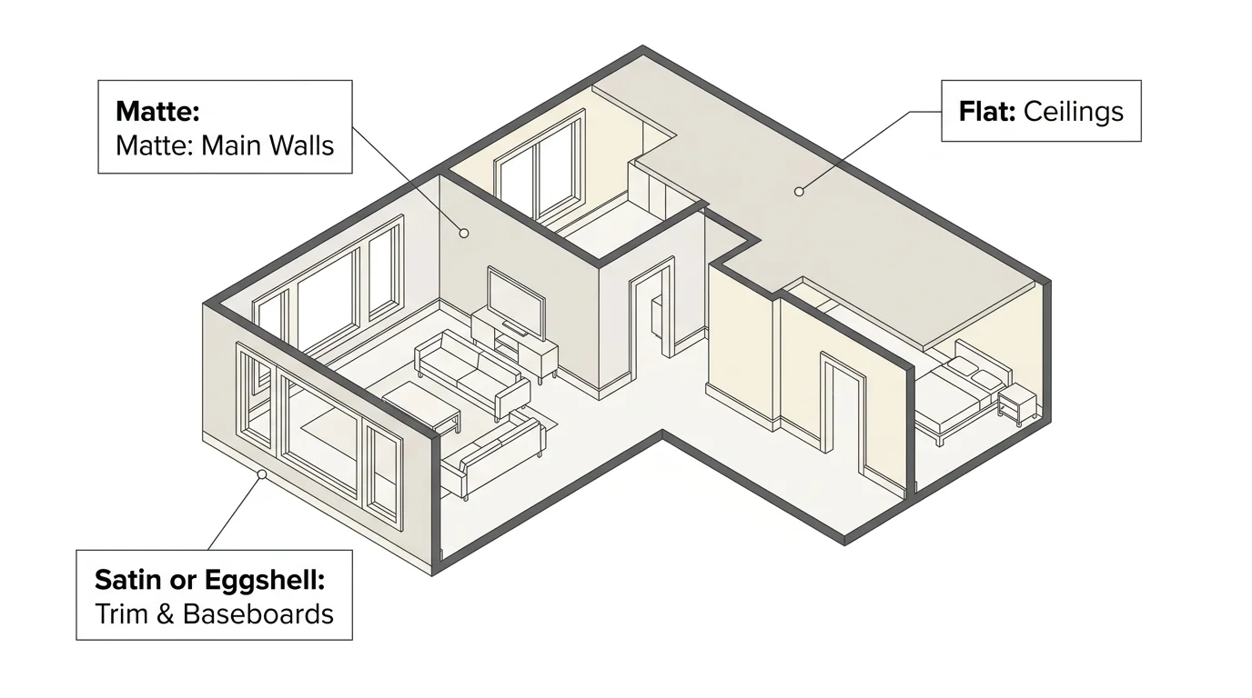
Pair warm alabasters with light white oak flooring, unlacquered brass light fixtures, and natural bouclé textiles to create a layered, multi-dimensional room. When applying these hues across open floor plans, maintain continuity by using the same neutral interior paint on trim, walls, and ceilings. Simply vary the paint finish—matte for main wall surfaces, satin or eggshell for baseboards and door casings, and flat finish for ceilings—to construct an understated, continuous architectural envelope that feels custom-built.
Designers frequently specify warm whites in high-traffic gathering areas where maximum daylight reflection is essential. In sunny South-facing rooms, these luminous shades melt into a soft parchment glow during peak daylight hours. In shadow-heavy spaces, the creamy base tones counteract dull gray cast, ensuring your living room feels buoyant and expansive from sunrise to twilight.
Trend #2: Complex Greiges and Modern Cashmere Neutrals
The evolution of greige—the harmonious union of crisp gray and cozy beige—continues to dominate contemporary design because of its extraordinary adaptability under changing illumination. Complex cashmere neutrals possess dynamic undertones that morph subtly throughout the day, responding intuitively to shifting daylight and warm evening lamp light. This versatility makes greige one of the most reliable paint colors for living room environments, where functional activity spans from morning work routines to evening relaxation.
Modern cashmere neutrals filter out the muddy, heavy qualities of traditional mid-2000s beiges while eliminating the icy undertones of pure slate gray. Shades like Benjamin Moore Revere Pewter (HC-172, LRV 55.5) and Sherwin-Williams Agreeable Gray (SW 7029, LRV 60) offer ideal mid-tone grounding. These shades harbor minute hints of green, violet, or umber that ground a space with quiet luxury, adapting gracefully to both classic and ultra-modern furnishings.
In residential projects, interior designers deploy these greiges alongside rich walnut cabinetry, honed marble surfaces, and woven linen drapery. In South-facing rooms flooded with intense sunlight, cashmere neutrals absorb harsh glare while sustaining refined warmth. In West-facing spaces, they temper the orange glow of late afternoon sun, providing a balanced, tranquil atmosphere at every hour of the day.
When decorating with cashmere greiges, introduce tonal contrast through your selection of soft furnishings. A cashmere neutral wall provides the ultimate backcloth for charcoal velvet sofas, dark bronze iron accents, and natural stone hearths. This balanced temperature profile allows you to transition your home decor across changing seasons without ever repainting your main living areas.
Trend #3: Creamy Vanilla, Oat, and Linen Hues
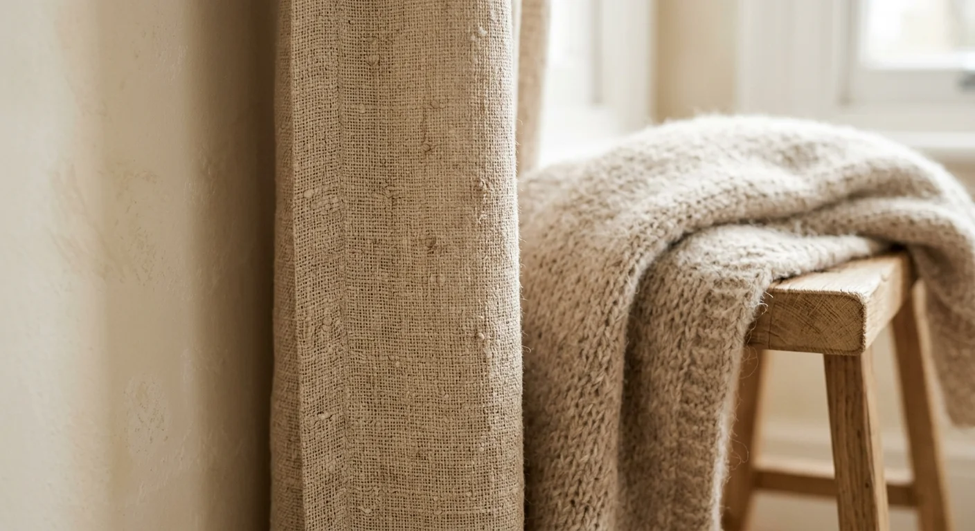
As home interiors embrace organic tactile experiences, creamy vanilla, oat, and unbleached linen shades have emerged as leading neutral paint colors for home transformations. Unlike bright whites that reflect light aggressively, these softly saturated creams absorb light gently, establishing an atmosphere of grounded elegance. They evoke raw architectural materials like limewash, travertine, and microcement, bridging traditional European craftsmanship with contemporary minimalist aesthetics.
These oat and linen tones excel in spaces dedicated to hospitality and nourishment, such as dining rooms, kitchens, and breakfast nooks. Colors like Benjamin Moore Cream Fleece (2161-50) or Sherwin-Williams Greek Villa (SW 7551, LRV 84) offer rich, tactile depth when painted across textured drywall or traditional plaster. When choosing paint colors for living room areas with soaring ceilings, these hues prevent high walls from feeling drafty, wrapping the space in a delicate golden glow.
To keep creamy neutrals feeling current rather than dated, avoid pairing them with orange-toned wood stains or honey oak trim. Instead, contrast them against deep charcoal accent pieces, dark bronze door hardware, and wire-brushed oak floorboards. Incorporating natural jute rugs, tumbled limestone tiles, and matte ceramic decor accentuates the organic character of this luminous palette.
In kitchen environments, creamy vanilla shades serve as an outstanding cabinet choice. They soften the hard edges of stone countertop slabs and stainless steel appliances. When paired with aged brass plumbing fixtures and open shelving in natural timber, oat-toned cabinetry creates a warm, hearth-centered atmosphere that draws family and guests naturally into the room.
Trend #4: Rich Earthy Taupes and Deep Cocoa Neutrals
For rooms designed for rest, concentration, and intimacy, dark neutral interior paint offers an irresistible alternative to pale shades. Rich earthy taupes, dark cocoa tones, and weathered slate neutrals bring atmospheric drama without sacrificing the quiet subtlety of a neutral foundation. These sophisticated hues harness high pigment density to create cozy, cocoon-like spaces that envelop you upon entering.
Taupe operates at the intersection of brown and gray, yielding a shade that feels grounded, refined, and deeply connected to nature. Paints like Farrow & Ball Elephant’s Breath (No. 229) or Sherwin-Williams Poised Taupe (SW 6039, LRV 22) provide exceptional visual depth in primary bedrooms, executive home offices, and formal dining spaces. In rooms with limited natural exposure, embracing dark neutral paint colors for home walls transforms atmospheric shadow into an intentional design feature rather than a spatial defect.
Style these deep taupes with opulent, touchable textures—think cognac leather armchairs, heavy velvet drapery, polished brass accents, and rich espresso wood furniture. To heighten architectural drama, paint baseboards, doors, and window casings in the exact same taupe shade as the walls. This monochromatic color-drenching technique streamlines visual breaks, elevating low ceiling heights and giving small rooms a tailored, high-end designer finish.
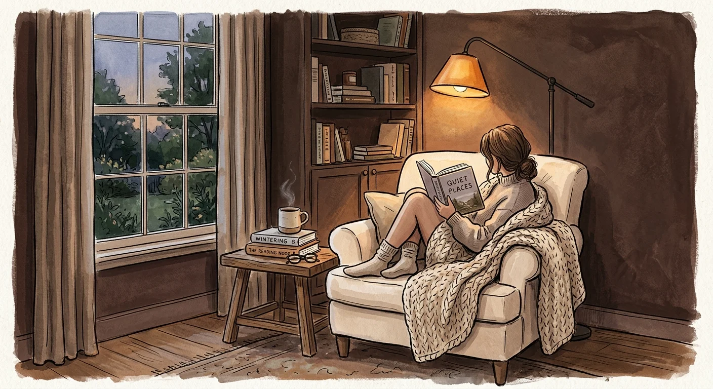
In executive home offices or private library nooks, cocoa-infused taupes promote focus and spatial calm. The deeper pigment values reduce visual eye strain caused by digital screens, while rich brown undertones instill a sense of permanent stability. Accentuate these rich tones with ambient lighting—such as low-kelvin table lamps and adjustable picture lights—to highlight wall art and warm timber grain.
Trend #5: Muted Botanical Sage and Slate-Green Neutrals
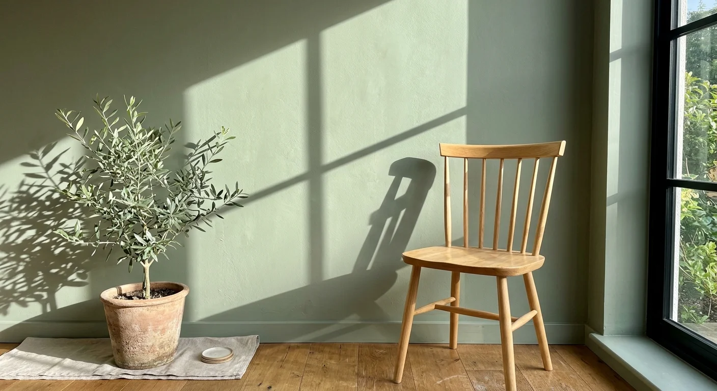
Biophilic design principles have redefined how we categorize neutral tones, bringing desaturated greens into the standard neutral palette. Muted botanical sage, dried eucalyptus, and grey-green slate act as nature’s neutrals, infusing indoor spaces with organic calmness and subtle chromatic character. Because green exists abundantly across natural landscapes, human eyes perceive muted green surfaces as soothing background tones rather than bold accent colors.
Selecting desaturated sage neutrals allows you to introduce soft color while maintaining full versatility for furnishings and decor. Iconic options like Sherwin-Williams Sea Salt (SW 6204, LRV 63), Benjamin Moore October Mist (1495, LRV 46.5), or Farrow & Ball Mizzle (No. 266) feature significant gray or silver undertones. These undertones keep the color understated, making them exceptional choice options for bathrooms, sunrooms, utility spaces, and serene guest quarters.
Enhance botanical neutrals by pairing them with authentic natural elements. Combine sage-painted cabinetry with soft white marble, unlacquered brass faucets, and natural rattan baskets. When utilized as secondary paint colors for living room cabinetry or built-in bookshelves, these botanical slate tones anchor surrounding neutral walls, establishing an organic, balanced visual rhythm throughout your residence.
In bathroom suites and home spas, slate-green neutrals evoke clean, restoration-focused energy. They complement white porcelain fixtures, light grey floor tiles, and warm teak wood accents. By reflecting soft green wavelengths into the room, these botanical shades create a calming, restorative sanctuary that connects your interior spaces directly to the outdoors.
Trend #6: Deep Charcoal, Graphite, and Smoked Slate Neutrals
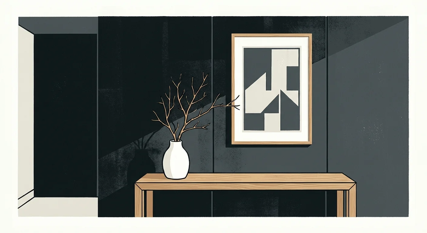
Deep charcoal, graphite, and soft black neutrals represent the ultimate expression of modern architectural contrast. Rather than stark, flat jet blacks that absorb all ambient light, these nuanced charcoal shades feature soft blue, violet, or green undertones that add depth and warmth to intense dark surfaces. Integrating dark neutrals grounds an interior scheme, giving lighter furniture pieces and natural woodwork a sharp, dramatic outline.
Designers frequently utilize popular neutral paint colors in the charcoal spectrum—such as Benjamin Moore Kendall Charcoal (HC-166, LRV 14.6) or Sherwin-Williams Iron Ore (SW 7069, LRV 6)—to highlight striking structural features. Applying deep graphite paint to kitchen islands, window sashes, accent walls, or compact powder rooms immediately elevates the space with high-end editorial contrast. In media rooms and home theaters, dark charcoal walls minimize glare from screens, elevating your viewing experience while surrounding you in cozy luxury.
Balance intense graphite neutrals with light-reflective materials to maintain spatial harmony. Contrast smoked slate walls with white oak flooring, warm alabaster ceilings, polished quartz, and plush bouclé textiles. By carefully managing light and shadow, these moody neutrals add timeless sophistication, proving that neutral paint colors for home spaces extend far beyond off-white.
In narrow powder rooms or small entry vestibules, applying charcoal neutral interior paint creates an intriguing spatial illusion. Rather than making a small room feel constricted, dark charcoal blurs room corners in shadow, making the walls recede visually. Pair this moody background with a dramatic backlit mirror and warm brass hardware to turn a modest half-bath into an unforgettable design highlight.
The Big Picture: Weaving These Trends into Your Home
Successfully incorporating neutral interior paint requires treating your entire home as an interconnected visual story rather than a collection of isolated rooms. To establish a seamless flow, establish a dominant base neutral that carries through high-traffic communal zones—such as entryways, corridors, and open-concept living rooms. From there, select complementary secondary neutrals that increase in saturation or shift in undertone as you transition into private, enclosed rooms like bedrooms, dens, and home offices.
Always test your prospective best neutral paint colors directly within your unique environment before making a final commitment. Paint large sample boards—at least two feet by two feet—and move them around your rooms throughout the day. Observe how morning light, harsh mid-day sun, and warm incandescent evening bulbs interact with the undertones. Pay close attention to how the paint interacts with your existing fixed finishes, including wood flooring, stone counter surfaces, and tile backsplash work.
Remember that depth in a neutral home relies heavily on texture and material contrast rather than bold color shifts. Layering diverse materials—such as raw timber, brushed metals, linen, velvet, and natural stone—against a thoughtful neutral paint scheme ensures your spaces feel rich, tactile, and deeply welcoming. By adhering to these enduring principles, you create an elegant home interior that feels timeless, personal, and effortlessly curated.
For the latest color forecasts, consult industry leaders like Pantone and paint companies like Benjamin Moore. For professional design standards, refer to the American Society of Interior Designers (ASID).
Frequently Asked Questions
How do I choose the best neutral paint color for a room with North-facing light?
North-facing rooms receive cool, diffuse daylight that can make gray or blue undertones appear cold and dreary. To balance this light, select warm neutral paint colors with pink, yellow, or soft beige undertones, such as Sherwin-Williams Alabaster or Benjamin Moore Swiss Coffee. Avoid cool greys or stark whites, which flatten out under cool daylight exposure.
What is Light Reflectance Value (LRV), and why does it matter when selecting neutral paint?
Light Reflectance Value (LRV) measures the percentage of light a paint color reflects on a scale from 0 (pure black) to 100 (pure white). Choosing paint colors for living room and dining spaces requires evaluating LRV to control brightness. High LRV colors (above 75) maximize light in dark spaces, while lower LRV shades (below 40) create cozy, dramatic environments.
Can I mix warm and cool neutral paint colors within the same home layout?
Yes, you can successfully mix warm and cool neutrals by maintaining a cohesive bridge color, such as a balanced greige. Maintain consistency in tone depth and ensure your hard finishes—such as wood flooring, stone counters, and metal hardware—echo the warm and cool tones across adjoining visual perspectives.
How do neutral interior paint colors affect the resale value of a property?
Popular neutral paint colors consistently maximize resale appeal because they allow prospective buyers to easily visualize their own furniture and personal decor in the space. Sophisticated neutrals like soft alabaster, modern greige, and warm cashmere offer a clean, updated aesthetic that signals high maintenance standards and broad contemporary design appeal.
Disclaimer: This article reflects design trend analysis and predictions. Personal taste and timeless design principles should always guide your decorating choices.
