

Your bedroom serves as your most intimate sanctuary, making your choice of bedding colors a critical factor in how you rest and recharge. While certain shades actively promote restorative sleep and align with contemporary quiet luxury, others completely disrupt the visual harmony of your space. Top interior designers have quietly phased out several formerly popular hues, noting their harsh psychological impact and tendency to date a room instantly. By understanding exactly which colors professionals avoid, you can elevate your bedroom decor from ordinary to expertly curated. Steer clear of these five specific bedding colors to ensure your personal retreat feels sophisticated, intentional, and deeply relaxing night after night.
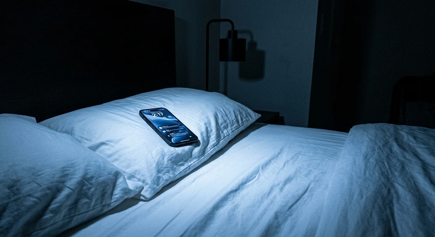
Trend #1: Stark Hospital White
The stark, optical white bed once stood as the ultimate symbol of boutique hotel luxury, dominating interior design trends for over a decade. However, the industry has fundamentally shifted away from this clinical aesthetic in favor of spaces that feel lived-in, organic, and deeply personal. Designers now recognize that bleached, cool-toned white lacks the necessary warmth to create a restorative sanctuary. Instead of feeling opulent, stark white bedding often reads as sterile and unforgiving; it reflects harsh blue light from ambient lamps and digital screens in a way that actively disrupts your natural circadian rhythm.
The severity of optical white instantly flattens the visual depth of a bedroom design. When you drape a large mattress in pure white, you sacrifice the subtle shadows and delicate highlights that give textiles their essential character. This specific color choice demands an impossible level of perfection that feels unlivable; a single wrinkle, a stray thread, or the slightest discoloration becomes an immediate, glaring focal point that ruins the aesthetic illusion.
Furthermore, the aggressive chemical bleaching process required to achieve this blinding white strips the raw fabric of its natural provenance. This manufacturing reality completely contradicts the growing industry movement toward biophilic design, which emphasizes an authentic connection to the natural world. Modern homeowners want their textiles to tell a story of craftsmanship and natural origins rather than chemical processing.
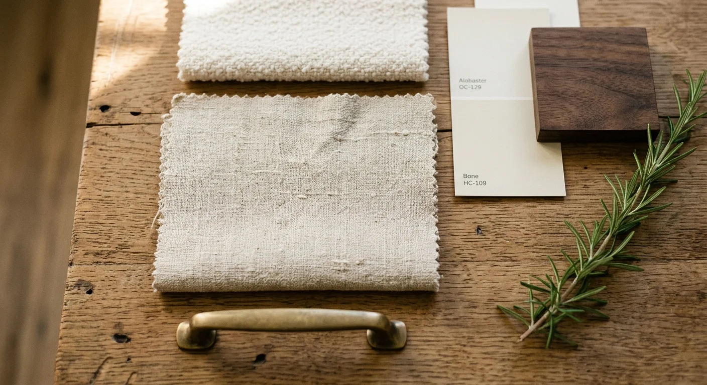
To achieve a fresh, luminous look without the aggressive glare, design professionals now turn to warm, complex neutrals. Ivory, alabaster, bone, and unbleached oatmeal offer the exact same light-reflecting benefits while maintaining a soft, enveloping atmosphere. These nuanced shades interact beautifully with natural sunlight and cast a deeply flattering, warm glow under evening lighting. By selecting a high-quality Belgian flax linen in a natural oat tone, you embrace the core tenets of quiet luxury—allowing the focus to remain entirely on the rich, tactile quality of the material rather than a visually jarring, artificial color.
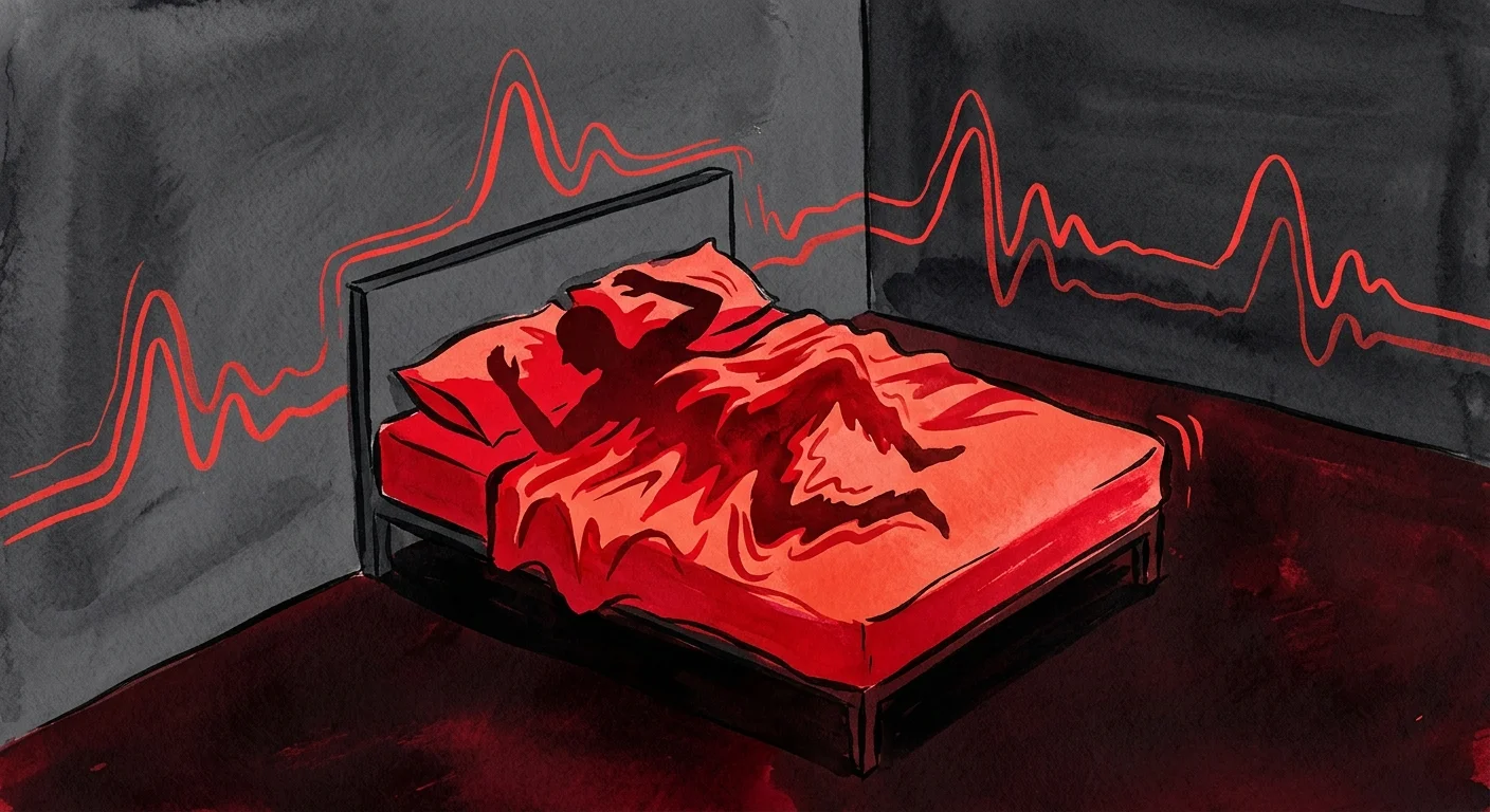
Trend #2: High-Intensity Crimson Red
Color psychology plays an undeniable role in successful home decorating, and high-intensity crimson red represents the absolute antithesis of relaxation. Red exists as the most stimulating color on the visible spectrum; decades of psychological research consistently demonstrate that exposure to saturated red actively elevates blood pressure, increases respiration rates, and triggers a state of high alertness. Designing a sleep environment around a color biologically wired to stimulate the human nervous system represents a fundamental flaw in bedroom design.
Beyond its physiological impact, crimson red completely overpowers a room’s spatial dynamics. Because saturated red carries massive visual weight, it visually advances toward the eye, making your bed appear significantly larger and disproportionately heavy. This optical illusion makes the surrounding room feel cramped, aggressive, and visually chaotic. When you introduce a massive block of primary red into a bedroom, it instantly dictates the entire design scheme, forcing every other piece of furniture and art to compete for attention.
The theatrical nature of bright red bedding also dramatically limits your styling options. It resists elegant layering and clashes violently with the subtle, organic textures that currently define high-end interior design trends. A stark red duvet cover visually demands absolute attention, entirely stripping the room of the sophisticated subtlety required for a true sanctuary.
If you feel deeply drawn to the warmth of the red family, designers recommend pivoting toward grounded, earthy iterations. Sun-baked terracotta, muted rust, deep clay, and rich burgundy offer the inviting warmth of red without the aggressive psychological triggers. These natural, muddy tones evoke a sense of grounding and stability. They pair magnificently with natural woods, brushed brass accents, and creamy neutrals, allowing you to build a complex, layered bedroom decor scheme that feels both passionate and profoundly restful.
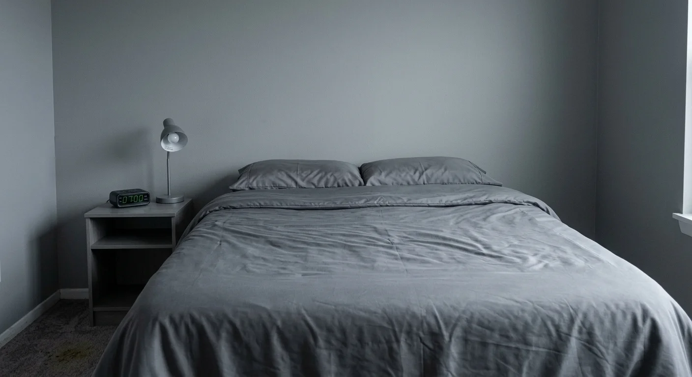
Trend #3: Dreary Builder-Grade Gray
The 2010s witnessed an unprecedented explosion of gray in home decorating; from walls to floors to bedding, flat gray saturated the market until it lost all its original sophistication. Today, elite designers actively avoid dreary, cool-toned gray bedding, viewing it as the fastest way to drain the life and energy out of a meticulously planned space. Often dubbed “millennial gray,” this specific hue has transitioned from a safe, modern neutral to a tired, corporate cliché.
Cool-toned grays carry dominant blue or purple undertones that act as visual black holes in a bedroom decor scheme. Instead of reflecting light, they absorb it, creating a shadowy, cavernous atmosphere that feels inherently melancholic. In north-facing rooms or spaces with limited natural light, gray bedding takes on a grim, concrete-like quality that mimics a rainy sky. Furthermore, cool gray notoriously casts a sallow, unflattering hue on human skin, which completely undermines the goal of creating a romantic or pampering environment.
The prevailing interior design trends have firmly pivoted back toward warmth, rendering these chilly, flat grays entirely obsolete. Modern design celebrates environments that envelop and comfort the inhabitant, a psychological need that stark gray fundamentally fails to meet. Continuing to use flat gray bedding instantly timestamps your bedroom, anchoring your aesthetic to a past decade rather than moving it forward.
To update a neutral bedroom gracefully, swap out cool grays for complex, inherently warm alternatives. Taupe, mushroom, greige, and warm stone offer the immense versatility of gray but incorporate crucial brown or green undertones. These multifaceted neutrals shift dynamically throughout the day, looking crisp in the morning light and incredibly cozy in the evening. They provide a highly sophisticated foundation that effortlessly supports both minimalist and maximalist design philosophies.
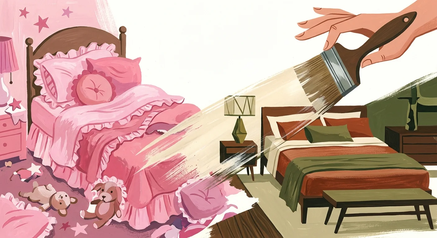
Trend #4: Overly Sweet Millennial Pink
Few colors have experienced a more dramatic rise and fall than the highly specific, sugary shade known as millennial pink. While this hyper-trendy pastel once dominated high-end catalogs and social media feeds, its ubiquity ultimately led to its downfall. Designers today categorically reject this overly sweet hue for bedding, as it infuses a bedroom with a distinctly juvenile energy that actively works against creating a mature, sophisticated retreat.
The primary issue with bubblegum or pastel pink lies in its lack of chromatic depth. These shades read as flat and synthetic, missing the complex undertones required to anchor a serious interior design scheme. When applied to large expanses of fabric like a duvet or a complete set of sheets, sweet pink easily overwhelms the space, making the room feel like a nursery rather than a primary suite. It forces an artificial sweetness that clashes with the organic, raw materials currently favored in modern home decorating.
Furthermore, relying on deeply entrenched micro-trends severely damages the longevity of your bedroom design. True luxury design aims for timelessness; it seeks to create spaces that will look just as elegant ten years from now as they do today. Bedding colors tied so closely to a specific cultural moment instantly date your home, requiring frequent and expensive updates to maintain a relevant aesthetic.
If you wish to incorporate the romantic, soft qualities of pink, designers suggest exploring nuanced, muddied variations of the hue. Plaster pink, dried rose, dusty mauve, and muted aubergine provide the same flattering warmth but feature complex gray or brown undertones. These mature shades carry a historical elegance, pairing beautifully with natural linen textures, dark walnut furniture, and deeply veined marble accents to create a space that feels both highly romantic and undeniably sophisticated.
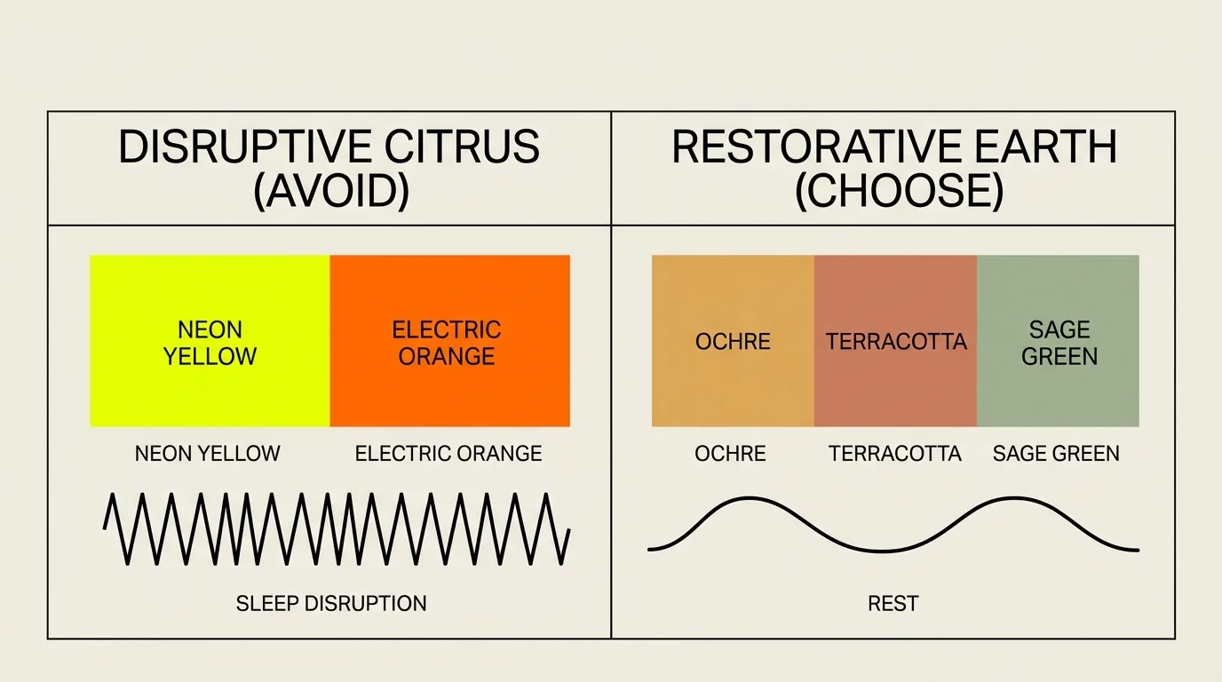
Trend #5: Neon and Saturated Citrus Hues
The recent surge in “dopamine decor” encouraged homeowners to experiment with bright, joyful colors, but applying this philosophy to your bedding represents a significant misstep. High-octane neon yellows, electric limes, and vivid synthetic oranges have no place in expert bedroom design. These fiercely saturated citrus hues cause immediate visual fatigue, aggressively bombarding the optic nerve and making true relaxation nearly impossible.
Your bed typically occupies 30 to 40 percent of your bedroom’s total visual real estate. Covering this massive footprint in a neon hue throws off the entire spatial equilibrium of the room. Saturated colors demand constant visual attention; when applied to the largest piece of furniture in the space, they completely drown out architectural details, subtle artwork, and delicate lighting fixtures. The result is a room that feels chaotic, loud, and visually exhausting.
Moreover, highly saturated synthetic colors cheapen the look of your textiles. Even high-thread-count Egyptian cotton or premium silk loses its luxurious appeal when dyed an artificial, glowing shade. These colors highlight every wrinkle and fold in an unflattering way, making expensive bedding look like cheap, fast-fashion home goods.
To safely inject joyful color into your bedroom decor, look to the natural world for inspiration. Goldenrod, rich ochre, deep saffron, and muted olive green deliver a massive dose of personality and cheerfulness without the aggressive visual assault of neon. These botanically inspired shades bring vibrant life into a room while maintaining a grounded, sophisticated profile that enhances, rather than destroys, the peaceful nature of your sleeping quarters.
The Big Picture: Weaving These Trends into Your Home
Understanding which bedding colors to avoid represents only the first step in mastering your bedroom design; the true artistry lies in how you weave sophisticated, restorative hues into your broader home decorating scheme. The most successful interior design trends currently emphasize cohesion, layered textures, and a seamless flow from one room to the next. Your bedroom should not exist as an isolated aesthetic island, but rather as the most private, tranquil extension of your home’s overarching narrative.
To build a truly timeless bed, start with a foundation of high-quality neutrals. Use unbleached linen, warm ivory percale, or soft taupe sateen for your fitted sheets and duvet covers. This neutral base provides ultimate flexibility, allowing you to introduce deeper, more complex colors through easily interchangeable elements. A textured throw blanket in deep rust, or a pair of velvet accent pillows in dusty mauve, adds profound visual interest without committing the entire room to a single color.
Always consider the tactile quality of your fabrics alongside their color. A beautifully complex shade of mushroom gray will still fall flat if printed on cheap, shiny polyester. Conversely, the natural slubs of raw silk or the relaxed crinkle of stonewashed linen will elevate even the simplest alabaster hue. By combining sophisticated, earth-grounded colors with undeniably premium textures, you guarantee a bedroom decor scheme that feels expertly curated, deeply restorative, and immune to the rapid turnover of fleeting design fads.
Frequently Asked Questions
How can I introduce meaningful color to my bedroom decor if I prefer a highly neutral foundation?
If you favor a tranquil, neutral base, introduce color through rich, textural layering rather than massive blocks of solid dye. Opt for a warm ivory or oatmeal duvet, and layer a heavyweight, saturated throw blanket—such as deep ochre or muted burgundy—across the foot of the bed. You can also utilize contrasting pillowcases or a patterned lumbar pillow that incorporates elegant, desaturated tones. This approach allows you to enjoy the vibrancy of color while maintaining the serene, quiet luxury of a neutral sleep space.
Do my specific bedding colors impact the overall interior design trends of my entire home?
Absolutely. While the bedroom remains a private sanctuary, successful home decorating relies on a cohesive visual thread that connects every room. If your home features a warm, earthy, biophilic palette, introducing stark hospital white or neon bedding will create a jarring psychological disconnect when moving from the hallway into the primary suite. Ensure your bedroom colors share similar undertones and saturation levels with the rest of your home to maintain a seamless, professionally designed flow.
Are exceptionally dark colors like charcoal, navy, or forest green still acceptable for bedroom design, or are they considered outdated like dreary gray?
Deep, enveloping colors remain highly favored by top designers, provided they possess warmth and complexity. Unlike flat, dreary builder-grade gray, colors like rich navy, dark aubergine, or deep forest green create a moody, cocoon-like atmosphere that many find incredibly conducive to sleep. The key to executing dark bedding successfully lies in the texture; utilize materials with a slight sheen or profound depth, such as washed velvet or high-quality sateen, to prevent dark colors from reading as flat or heavy.
How does natural and artificial lighting affect the way bedding colors appear in my space?
Lighting fundamentally dictates how the human eye perceives color. A color that looks perfectly warm in a brightly lit showroom may appear dreary and flat in a north-facing bedroom with cool natural light. Furthermore, the color temperature of your bedroom lamps heavily alters the appearance of your textiles; warm LED bulbs will enhance the red and yellow undertones of terracotta or ivory, while cool bulbs will wash them out. Always test fabric swatches in your specific bedroom under both morning sunlight and evening lamp light before committing to a new bedding palette.
For the latest color forecasts, consult industry leaders like Pantone and paint companies like Benjamin Moore. For professional design standards, refer to the American Society of Interior Designers (ASID).
Disclaimer: This article reflects design trend analysis and predictions. Personal taste and timeless design principles should always guide your decorating choices.
