
Trend #6: Faded Ochre
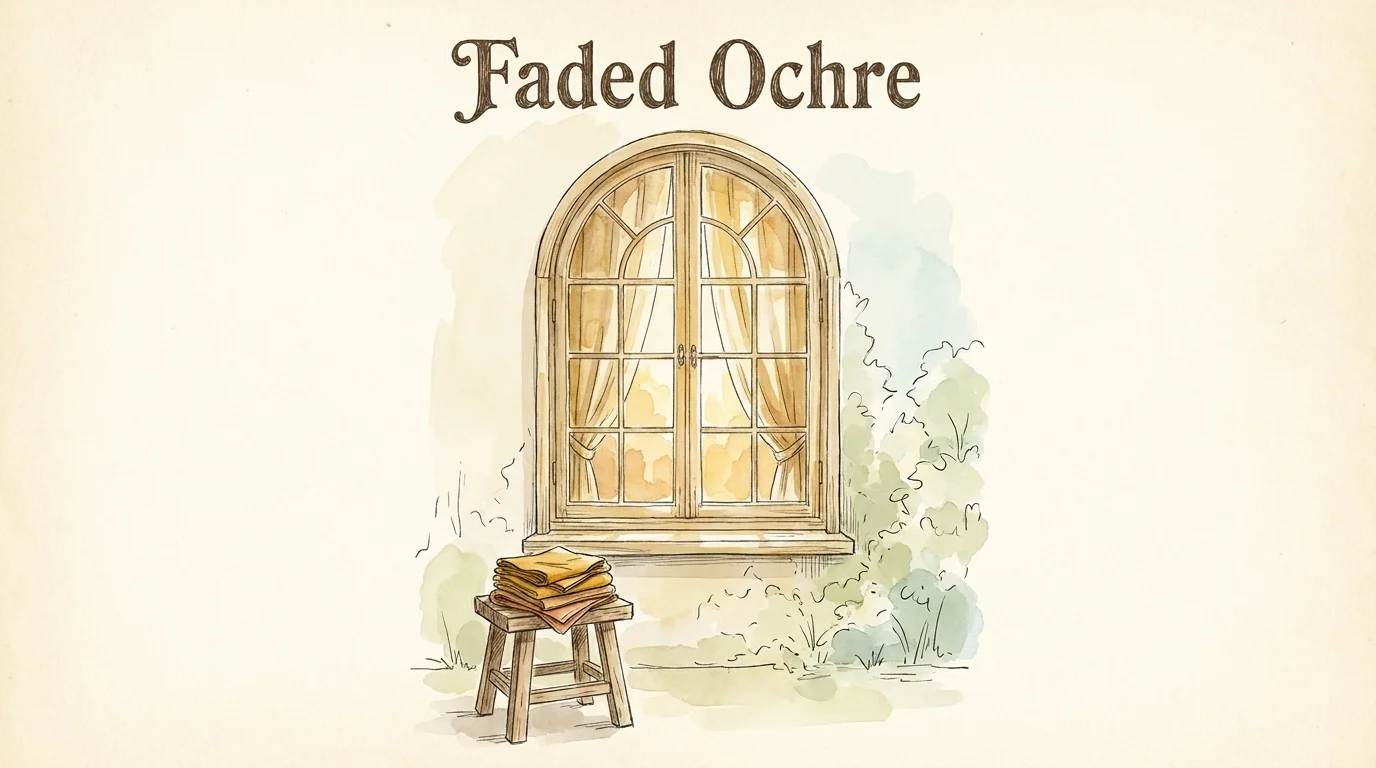
Capture the essence of sun-drenched minimalism by introducing faded ochre into your interior palette. This highly desaturated, golden-mustard hue brings the optimistic warmth of sunlight into your home without the jarring intensity of a traditional yellow. Faded ochre works magnificently in morning rooms, breakfast nooks, and transitional hallways, offering a gentle, energizing lift that feels entirely natural.
Faded ochre highlights architectural nuances brilliantly; if your home features traditional wainscoting, picture molding, or exposed ceiling beams, applying this golden shade allows those structural elements to cast deep, fascinating shadows.
The secret to styling this specific shade lies in maintaining a strict, earthy material palette. You should pair ochre walls with matte ceramics, bleached ash wood, and textural cotton throws to prevent the aesthetic from shifting into a retro pastiche.
The trend toward warmer, heavily pigmented neutrals reflects a broader cultural movement toward spaces that feel genuinely lived-in and historically grounded. Because ochre contains complex brown undertones, it responds beautifully to the dimming light of the evening, transforming into a rich, wrapping embrace by nightfall.