
Trend #3: Atmospheric Slate Blue
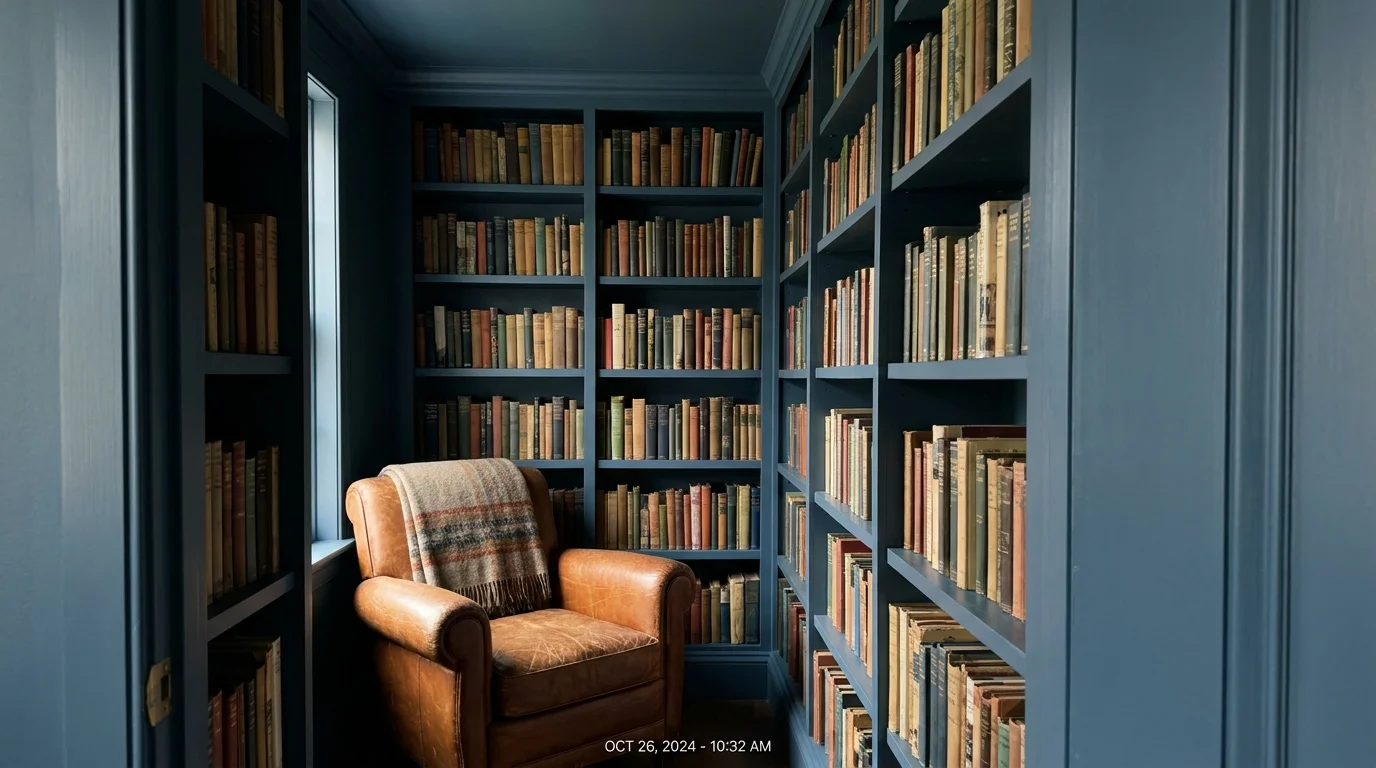
Moving away from the high-energy navy blues of the past, designers now favor atmospheric slate blue to cultivate spaces rooted in quiet luxury. This complex color straddles the boundary between storm clouds and the deep ocean, utilizing a heavy charcoal base to ground the coolness of the blue.
Slate blue inherently recedes from the eye, making cramped spaces feel expansive and boundless. You can utilize this shade to visually drop the ceiling in a soaring, echoey room, thereby creating a more intimate and cocoon-like atmosphere. When utilizing slate blue in a primary bedroom, extend the color up onto the ceiling.
This overhead application mimics the twilight sky, directly signaling to your brain that it is time to wind down. The serenity of slate blue pairs flawlessly with warm metallic accents, particularly burnished bronze and aged copper, which provide a necessary visual spark against the moody backdrop.
High-end interior trends rely on this color for spa-inspired bathrooms due to its clear association with rest and rejuvenation. Apply this color across all trim, doors, and walls to practice color drenching, a technique that eliminates jarring visual breaks and significantly enhances the calming properties of the room.