
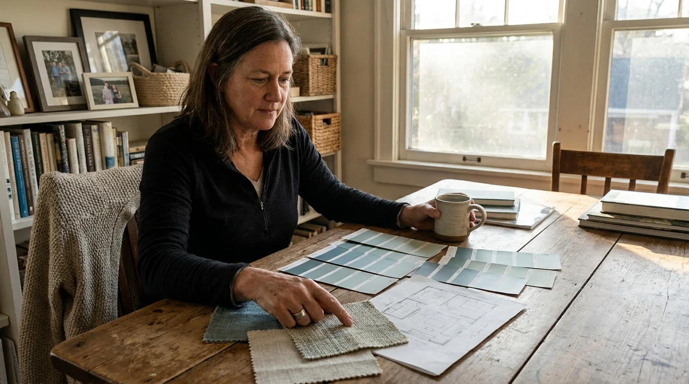
The Big Picture: Weaving These Trends into Your Home
Successfully integrating these designer-approved paint colors requires more than just purchasing a gallon of paint; it demands a strategic approach to your home’s unique lighting and architecture. To weave these calming hues seamlessly into your environment, you must first evaluate the natural light mapping within your space. Colors like deep aubergine and slate blue thrive in naturally darker rooms where you want to emphasize a cozy, enveloping atmosphere, whereas chalky mineral white and mushroom greige require adequate natural light to prevent them from looking entirely flat.
Instead of rigidly confining yourself to one trend, consider developing a cohesive whole-house palette. You can effortlessly transition from a muddy sage green living room into an earthy terracotta dining space by ensuring both colors share the same desaturated, gray-brown undertones. This shared underlying warmth acts as a visual thread, tying different rooms together without resorting to monotonous uniformity.
Furthermore, the paint finish you choose dictates the final emotional impact of the color just as much as the hue itself. High-gloss finishes reflect light sharply and increase visual energy, which directly counteracts the calming properties of these specific interior trends. Stick to flat, matte, or eggshell finishes for your walls to absorb light gently and enhance the tactile, velvet-like quality of the pigment. Ultimately, the most successful home design choices reflect your personal emotional responses. Test large swatches on multiple walls, observe how they interact with your existing furniture, and allow your instinct to guide you toward the shade that genuinely lowers your shoulders and deepens your breath.
Frequently Asked Questions
How do I mix these calming paint colors without creating a disjointed aesthetic?
The secret to mixing sophisticated paint colors lies in maintaining a consistent value and saturation level across your palette. If you choose a muted, highly desaturated muddy sage for your living room, you cannot successfully pair it with a bright, highly saturated primary blue in the adjacent hallway. Keep all your chosen hues slightly muted with gray and brown undertones. You can also create physical transitions using neutral spaces—like a mushroom greige corridor—to cleanse the visual palate between a terracotta dining room and an atmospheric slate blue study.
Do these subdued, nature-inspired colors have true longevity, or are they a passing interior trend?
Nature-inspired, complex hues possess immense staying power because they are rooted in human psychology rather than fleeting pop-culture aesthetics. Unlike neon brights or sterile grays, colors drawn from organic elements—like plaster, stone, and foliage—tap into our innate biophilic needs. By prioritizing shades that lower visual fatigue and create genuine comfort, you ensure your home decor will remain timelessly elegant. These nuanced colors have been utilized in historic architecture for centuries; they are simply experiencing a well-deserved modern renaissance.
Can I use dark colors like deep aubergine in small spaces without making the room feel claustrophobic?
Absolutely. In fact, applying dark, saturated colors to small, poorly lit rooms is a favored technique among high-end designers. When you paint a small space in a deep hue, the corners of the room visually recede and blur into shadow, creating an illusion of infinite depth. To maximize this elegant effect, you should employ the color drenching technique by painting your walls, baseboards, doors, and crown molding the exact same dark shade. This eliminates contrasting lines that chop up the space, resulting in a seamless, incredibly calming jewel box.
For the latest color forecasts, consult industry leaders like Pantone and paint companies like Benjamin Moore. For professional design standards, refer to the American Society of Interior Designers (ASID).
Disclaimer: This article reflects design trend analysis and predictions. Personal taste and timeless design principles should always guide your decorating choices.