
Choosing the right paint color fundamentally dictates the entire atmosphere of your home, yet professionals spot subtle missteps the moment they cross your threshold. You might spend days agonizing over swatches, only to realize the final application feels unexpectedly jarring or flat. These visual discrepancies usually stem from fundamental misunderstandings of light reflectivity, undertone clashes, and spatial scale. Recognizing these specific technical and aesthetic oversights allows you to elevate a standard room into a sophisticated, curated environment. Mastering the nuances of color selection prevents costly design mistakes and transforms your space with the practiced eye of a seasoned expert.
Error #1: Ignoring the Light Reflectance Value (LRV)
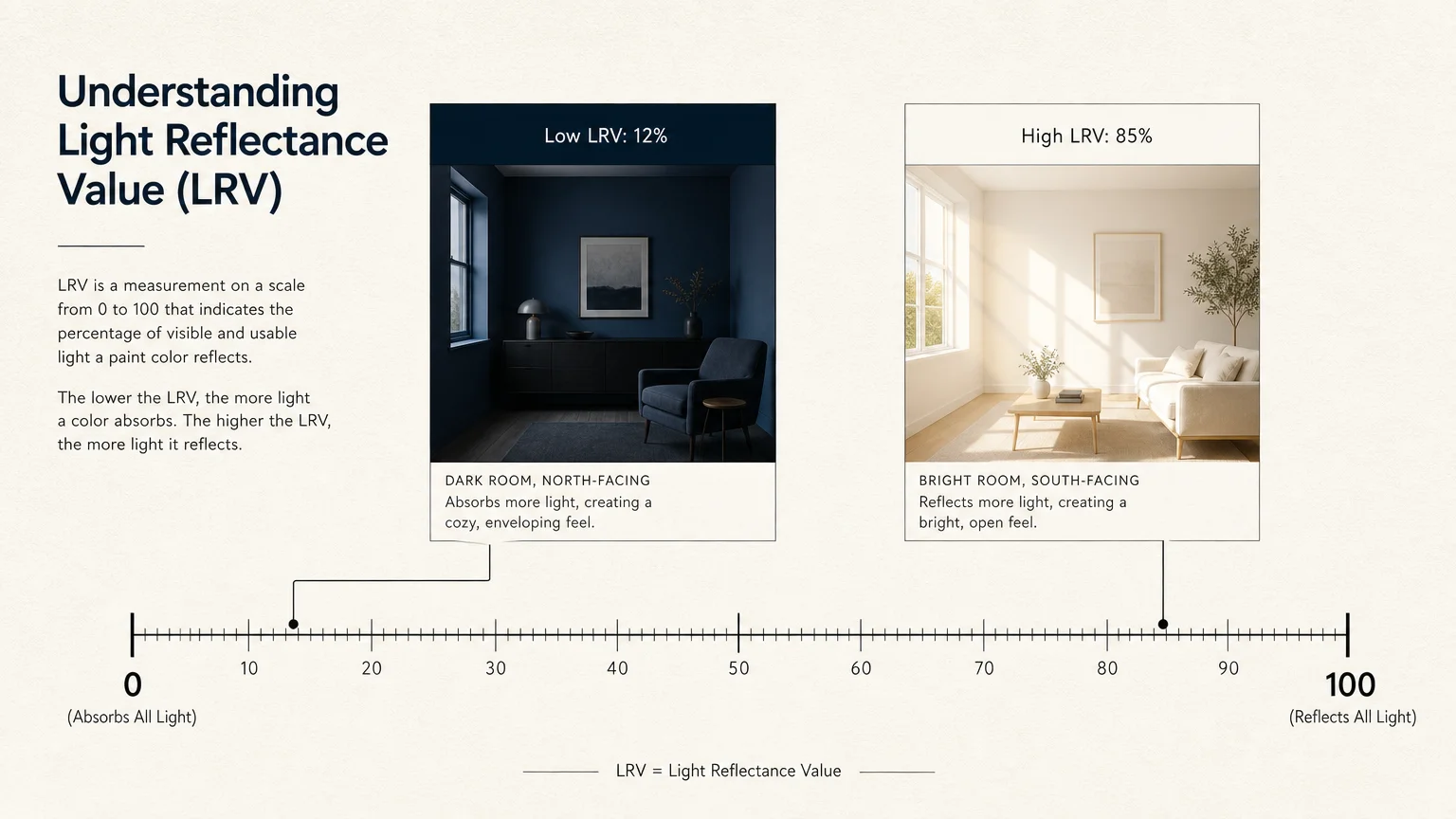
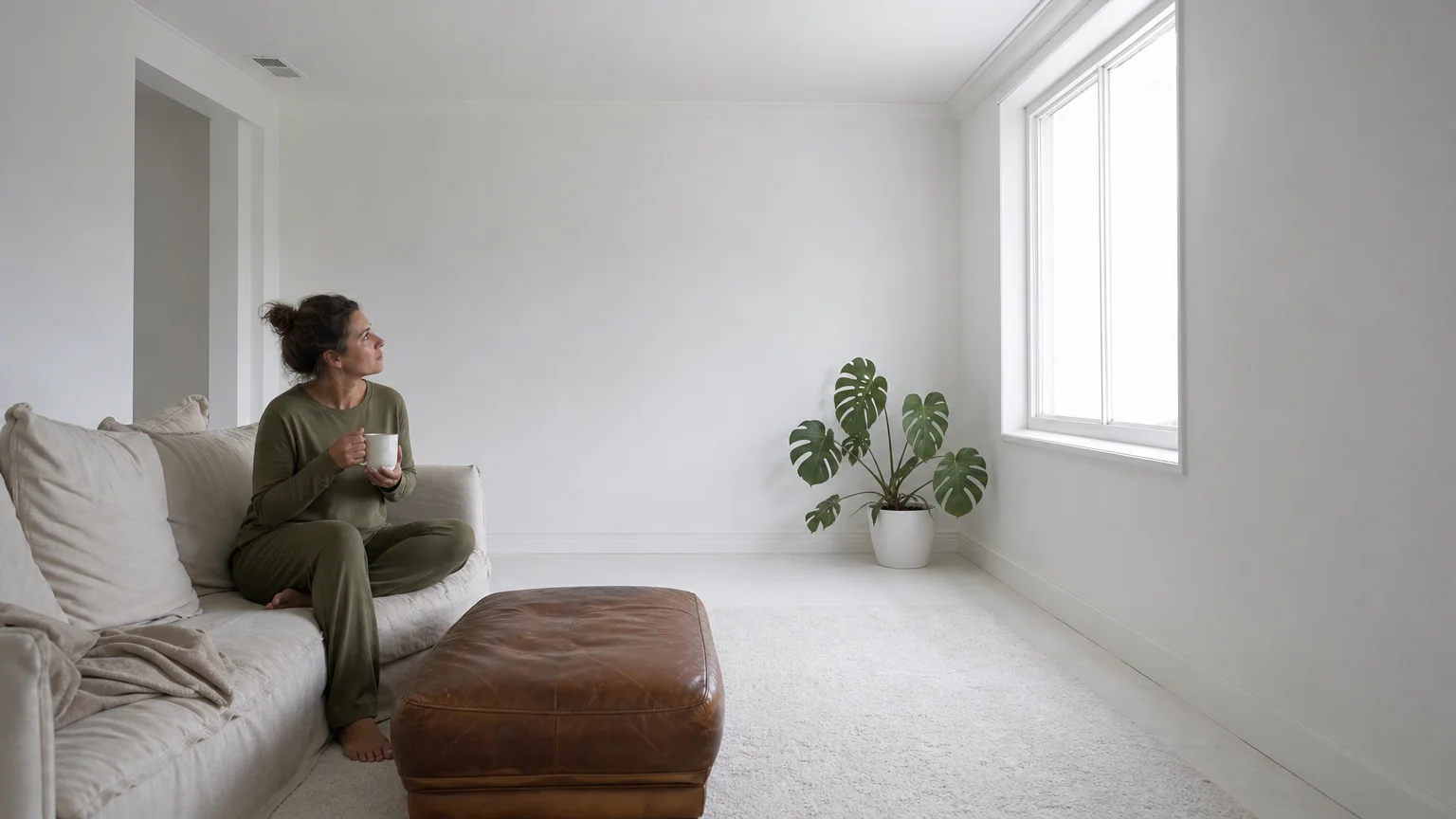
Every paint color inherently possesses a Light Reflectance Value—commonly referred to as LRV within the industry—which measures the precise percentage of visible light a painted surface will reflect or absorb. Professional designers evaluate this metric before even considering a hue’s aesthetic appeal, treating it as the mathematical foundation of spatial design. A fundamental error occurs when homeowners select a deeply saturated, low-LRV shade they admire in a magazine and apply it to a naturally dark, north-facing room. Because the paint absorbs whatever minimal light exists, the space instantly feels cavernous and oppressive rather than moody and intimate.
Conversely, applying a stark white paint with an LRV of eighty-five or higher in a sun-drenched, south-facing living room creates an uncomfortable, clinical glare that physically strains the eyes. Mastering successful paint color selection requires you to harmonize the paint’s reflective capabilities with your room’s natural solar exposure. You must always cross-reference the LRV number—typically printed on the back of the physical paint swatch or listed prominently on the manufacturer’s website—with the specific directional lighting of your space. By treating LRV as a critical design tool rather than an insider secret, you can intentionally manipulate the perceived brightness of your architectural envelope, ensuring your walls radiate a balanced, inviting warmth regardless of the time of day.
Error #2: Neglecting the Impact of Illuminant Metamerism
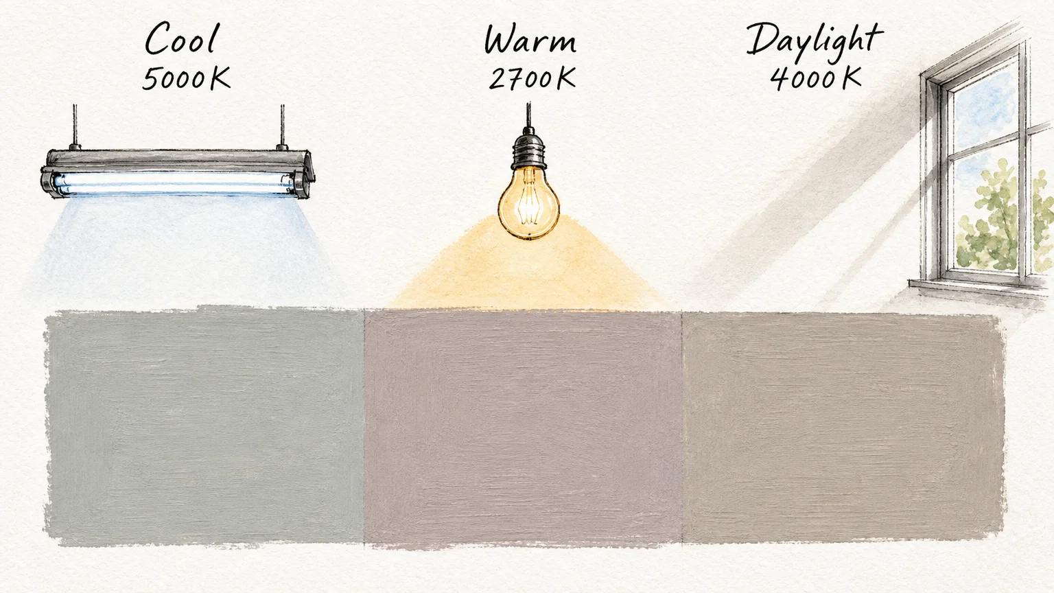
Beyond the inherent brightness of the paint itself, environmental lighting plays a deeply deceptive role in color perception through a phenomenon known scientifically as illuminant metamerism. This term describes how paint pigments dynamically shift and morph under varying light sources. A beautifully balanced greige might look perfectly neutral under the bright, cool fluorescent fixtures of a commercial hardware store, only to pull harsh, unappealing lavender or sickly green tones once applied to your dimly lit residential hallway. Homeowners frequently fall victim to this optical illusion, leading to irreversible decorating mistakes, by committing to a color based solely on a tiny paper swatch viewed under the wrong color temperature.
To circumvent this visual trap, interior design professionals employ rigorous, real-world testing methodologies. You should always bypass the direct-to-drywall testing method; instead, purchase sample pots and paint large, movable pieces of foam board with at least two coats of your chosen finish. Observe these generous swatches on multiple walls within the target room, carefully noting how the complex pigments react to the crisp, bluish morning sunlight, the warmer, golden afternoon rays, and the specific Kelvin temperature of your evening LED lighting. Evaluating these subtle chromatic shifts guarantees your final selection remains sophisticated, cohesive, and true to your original vision around the clock.
Error #3: Clashing Undertones with Fixed Architectural Elements
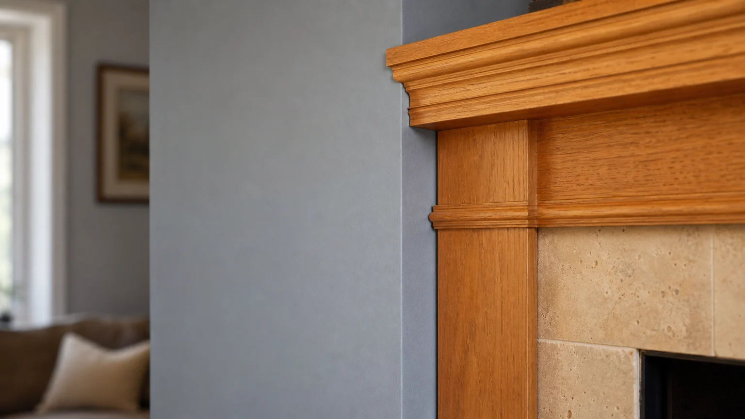
Even if you master lighting and reflectance, ignoring the existing elements in your room guarantees aesthetic friction. Every paint color features a mass tone—the dominant color you immediately perceive—and a subtle undertone, which represents the complex hues lurking just beneath the surface. Beige, for instance, is rarely just beige; it heavily leans toward green, pink, or yellow. A widespread error happens when a homeowner selects a wall color with an undertone that violently competes with the room’s fixed architectural finishes, such as hardwood flooring, stone fireplaces, or marble countertops.
Respecting the architectural provenance of your home means actively coordinating your paint with these permanent materials. If you pair a cool, blue-based gray wall paint with warm, honey-toned oak floors, the conflicting undertones will make the walls appear unpleasantly icy and the floors look excessively orange. To diagnose an elusive undertone before you paint, place your chosen paint chip directly next to a true primary color swatch; this intense contrast forces the hidden undertone to reveal itself visually. Ensuring that your wall color shares a harmonious temperature with your fixed elements is one of the most vital interior design tips for cultivating a space that feels intentional, grounded, and exceptionally bespoke.
Error #4: Misjudging the Appropriate Paint Sheen
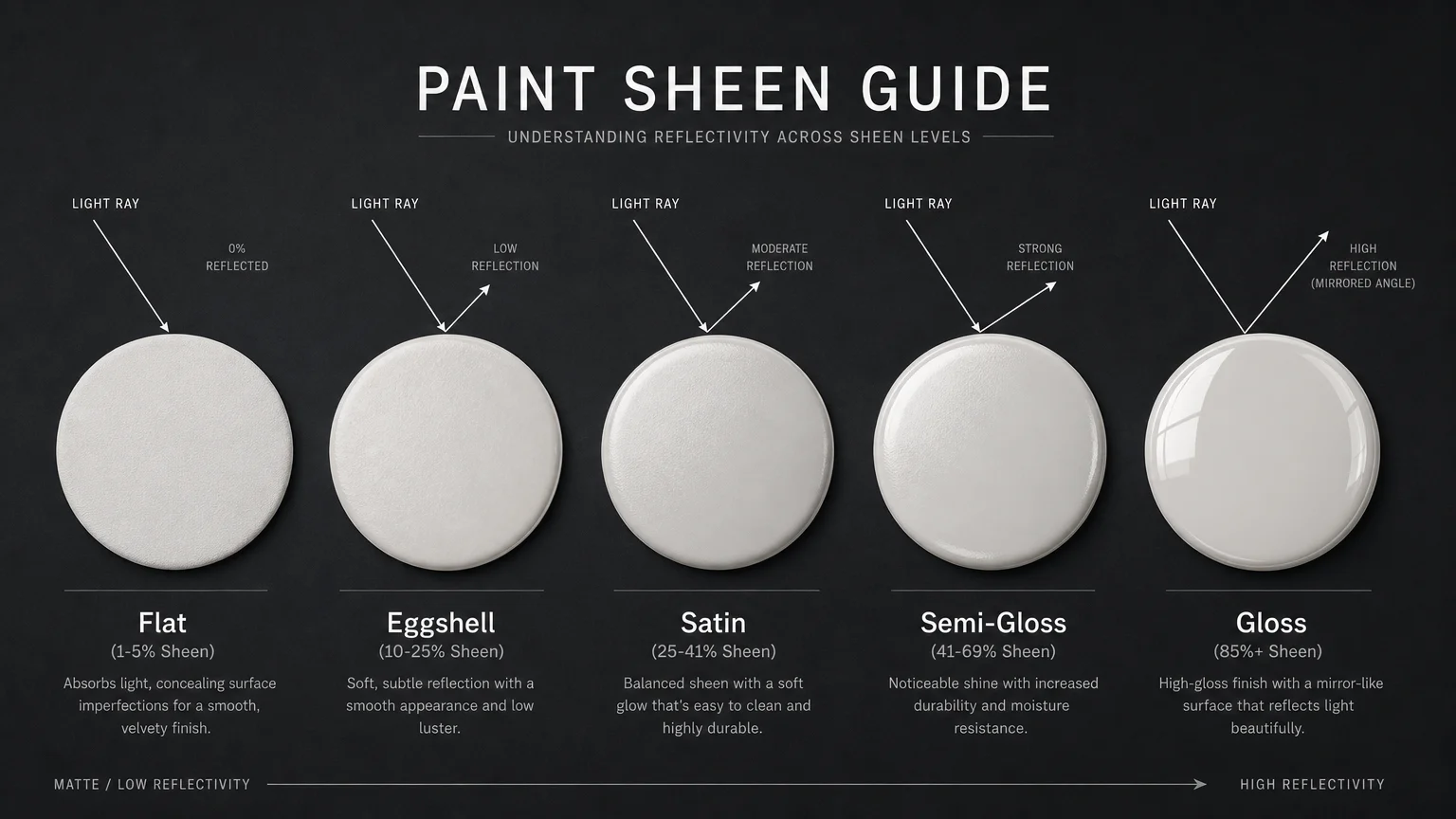
Color represents only one half of the aesthetic equation; the physical finish of the paint dictates the other. The sheen level you choose governs both the practical durability of the surface and the visual perception of the color itself. A persistent mistake homeowners make is selecting a finish entirely unsuited for the functional demands or physical condition of the room. Applying a high-gloss or semi-gloss finish to a wall with visible drywall imperfections acts as a visual magnifying glass; the highly reflective surface highlights every single bump, seam, and poorly sanded patch, instantly cheapening the room’s overall aesthetic.
Alternatively, utilizing a dead-flat finish in a high-traffic hallway or a moisture-heavy bathroom results in a surface that absorbs dirt and degrades quickly upon cleaning. Professionals rely on a strategic hierarchy of finishes to balance elegance with endurance. You should employ soft eggshell or luxurious satin finishes for main living areas, as they offer a velvety, sophisticated glow while remaining easily washable. Reserve dead-flat paints strictly for ceilings or extremely low-traffic adult bedrooms to absorb light and mask structural flaws. Mastering the nuanced application of sheen levels ensures your home painting ideas execute flawlessly, marrying high-end beauty with long-term residential practicality.
* Engaging and relevant? Yes (“illustrating how playing it safe can feel sterile”).
* No quotes/attribution? Yes.
*
Error #5: Playing It Too Safe with “Quiet Luxury” Whites
A widespread misunderstanding of modern design aesthetics leads many homeowners directly into the trap of sterile, uninspired environments. In an attempt to achieve the highly coveted “quiet luxury” aesthetic, people often default to stark, builder-grade white paint on every available surface. True quiet luxury does not equate to an absence of color; rather, it relies on complex, muddy neutrals, layered textures, and deep architectural depth. When you paint a room entirely in an uncalibrated white without incorporating substantial architectural interest or warm textiles, the space feels clinical, unfinished, and distinctly lacking in character.
Instead of fearing color, embrace the restorative principles of biophilic design by introducing hues drawn directly from the natural world. Incorporating muted sage greens, warm terracottas, and grounding earthen taupes creates a tactile, restorative environment that pure white simply cannot achieve. If you remain committed to a light palette, select complex, creamy off-whites that feature deep umber or warm ochre undertones to provide necessary visual weight. Elevating your home means moving beyond the safety of default primer shades and intentionally selecting colors that wrap the room in a sophisticated, curated warmth.
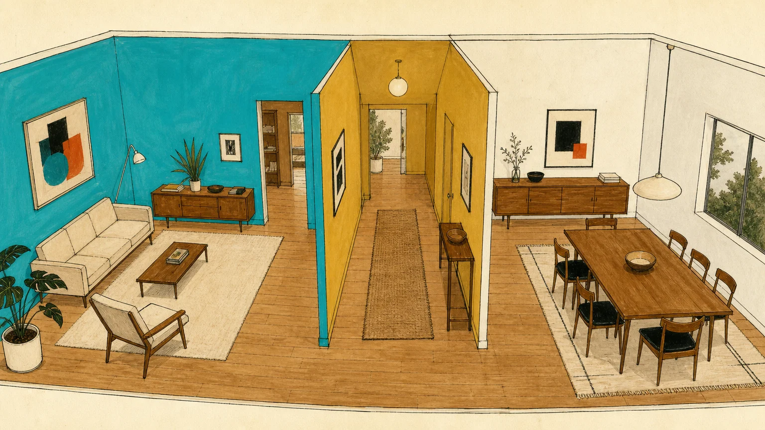
Error #6: Creating Disjointed Transitions Between Rooms
Individual rooms do not exist in a vacuum, yet many homeowners approach painting as a series of isolated, disconnected projects. This compartmentalized strategy results in choppy color zones that severely disrupt the visual flow of the home. Standing in a neutral living room and peering into a jarringly bright lime green kitchen adjacent to a pastel blue dining room creates a disorienting funhouse effect. This lack of transitional harmony destroys the home’s cohesive provenance and immediately flags the space as amateurly designed.
To cultivate a genuinely high-end atmosphere, you must consider the sightlines of your property. Walk through your home and observe which rooms are visible from various vantage points. Professional designers build a whole-house color palette by establishing a foundational neutral thread that carries throughout the primary living spaces, ensuring every adjoining room speaks the same visual language. You can safely introduce distinct colors into enclosed spaces like powder rooms or studies, but the main arteries of your home demand a unified progression. Utilizing varying saturations from a single color strip or consistently repeating a specific warm or cool undertone guarantees your home feels like a singular, meticulously planned estate rather than a chaotic patchwork of conflicting home painting ideas.
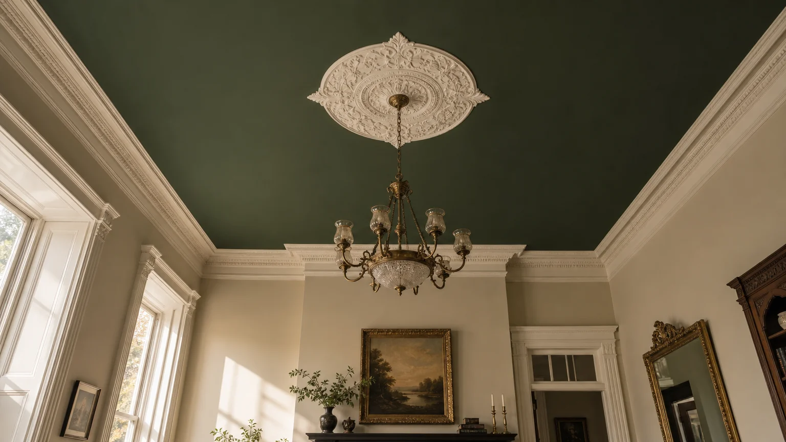
Error #7: Overlooking the Ceiling as the “Fifth Wall”
The most pervasive oversight in residential painting exists right above your head. By default, the vast majority of homeowners paint their ceilings a stark, out-of-the-can flat white, treating this massive surface area as a complete afterthought. When you pair dark or richly pigmented walls with a harsh white ceiling, you create a severe, high-contrast horizontal break that visually stunts the room. This stark line draws the eye aggressively upward, ironically making the ceiling feel significantly lower and the room feel uncomfortably compressed.
To correct this, you must treat the ceiling as the crucial “fifth wall” of your design narrative. One of the most sophisticated solutions to this error is employing the technique of color drenching. By painting the walls, the crown molding, the baseboards, and the ceiling in the exact same hue, you effectively blur the hard structural boundaries of the room. This unbroken application of color allows the eye to travel seamlessly, creating an optical illusion of infinite height and deeply enveloping comfort. If drenching feels too bold, you can easily tint your ceiling paint with a twenty percent concentration of your chosen wall color, ensuring a gentle, harmonious transition that elevates the entire spatial experience.
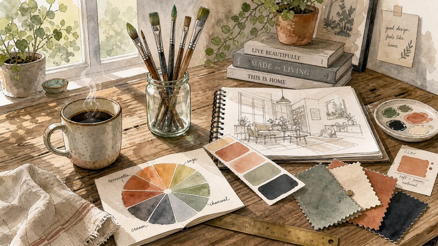
The Big Picture: Weaving These Trends into Your Home
Mastering these advanced concepts transforms the painting process from a stressful guessing game into a highly strategic design exercise. Recognizing the intricate dance between light reflectance, metamerism, and architectural undertones empowers you to make decisions with absolute confidence. The goal is never to chase fleeting fads, but rather to apply these professional insights to enhance the permanent structural beauty of your space. A well-painted room should feel inevitable—as though the color organically grew from the architecture itself.
When you synthesize these interior design tips, you stop decorating in reactionary bursts and begin curating a holistic environment. You learn to embrace the dramatic elegance of color drenching in a cozy study, the practical brilliance of an eggshell finish in a bustling family room, and the grounding nature of biophilic hues in your private sanctuaries. Ultimately, the true hallmark of luxury design is intentionality. By sidestepping these seven common pitfalls, you ensure your home reflects a refined, timeless sophistication that resonates the moment anyone walks through your front door.
Frequently Asked Questions
How do I identify the exact undertone of a complex neutral paint?
Identifying an elusive undertone requires controlled comparison. Paint a generously sized sample of your chosen neutral and hold it directly against pure color swatches of red, yellow, green, and blue. The intense contrast of the true primary colors will immediately force the hidden tint in your neutral—whether it leans slightly pink, distinctly green, or heavily yellow—to step visually forward. You should always perform this test in natural daylight to ensure complete accuracy.
Does the “color drenching” trend work effectively in small, windowless rooms?
Yes, color drenching actually excels in confined, low-light spaces like powder rooms, interior hallways, or basement studies. By painting the walls, trim, doors, and ceiling in a single, deeply saturated hue, you eliminate the contrasting architectural lines that visually chop a room into smaller pieces. This seamless application blurs the sharp corners and edges, tricking the eye into perceiving the space as infinitely expansive, cohesive, and remarkably dramatic.
How many paint colors should I ideally include in a whole-house palette?
For a beautifully cohesive home, professionals typically recommend a streamlined palette of three to five core colors. This curated selection should include a foundational neutral for the main thoroughfares, a coordinating secondary color for major living spaces, and one or two complementary accent colors for bedrooms or enclosed dining areas. Maintaining a tightly controlled palette ensures impeccable visual flow while allowing for distinct personality in isolated rooms.
Is it considered a decorating mistake to paint over natural wood trim?
Painting wood trim is entirely dependent on the architectural provenance and quality of the wood itself. If your home features rare, original mahogany or quarter-sawn oak from a historic era, painting it is generally discouraged as it erases irreplaceable architectural integrity. However, if the trim is standard, builder-grade pine or previously stained in a dated, orange-heavy finish that aggressively clashes with your modern aesthetic, painting it a crisp neutral or drenching it to match your walls is a highly effective way to instantly modernize your space.
For the latest color forecasts, consult industry leaders like Pantone and paint companies like Benjamin Moore. For professional design standards, refer to the American Society of Interior Designers (ASID).
Disclaimer: This article reflects design trend analysis and predictions. Personal taste and timeless design principles should always guide your decorating choices.