

The quickest way to fundamentally alter the psychology and atmosphere of your living space is through strategic color selection. Forget endless structural renovations; interior design experts know a thoughtful coat of paint instantly redefines a room’s aesthetic. Today’s most compelling interior color ideas move beyond stark minimalism, embracing immersive palettes that evoke deep emotional responses. Whether you want to cultivate quiet luxury in a sprawling living room or infuse a sterile dining area with biophilic warmth, the right hues serve as your ultimate design tool. By analyzing current cultural shifts and high-end home decorating movements, you can identify the specific color trends guaranteed to elevate your daily environment.
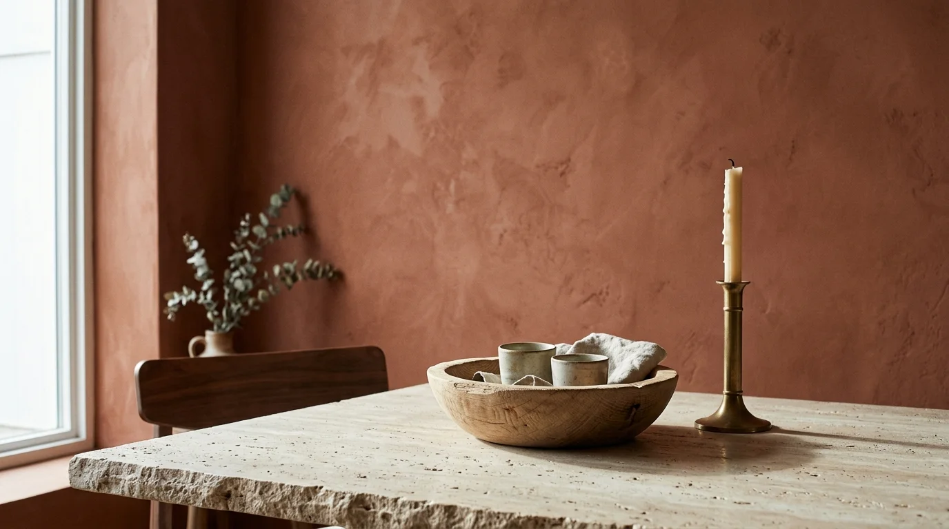
Trend #1: The Return of Earthy Terracotta and Baked Clay
Designers are officially moving away from the icy, cool grays that dominated the previous decade, pivoting sharply toward the grounding warmth of terracotta. This deeply resonant hue anchors a space, providing an immediate sense of provenance and historical depth that modern homeowners crave. Terracotta bridges the gap between raw, organic nature and refined interior architecture. By introducing baked clay tones into your home, you establish an environment that feels inherently comforting, welcoming, and deeply rooted in the natural world.
You can easily implement this trend through specialized paint finishes like limewash or Roman clay. These high-mineral applications bounce light irregularly across the surface, giving flat drywall a luminous, multidimensional quality that standard latex paint simply cannot achieve. When you apply a rich, matte terracotta to a dining room, you immediately lower the visual temperature of the space; this cultivates a cozy, intimate atmosphere that encourages guests to linger longer over meals. Furthermore, this color stimulates the appetite and fosters lively conversation, making it a highly functional choice for entertainment spaces.
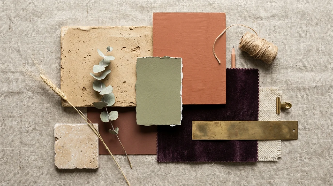
To execute this interior design strategy effectively, pair earthy clays with natural, unpretentious materials. Terracotta walls look exceptionally sophisticated alongside raw white oak flooring, unlacquered brass hardware, and tumbled travertine accents. If painting an entire room feels too ambitious, introduce this trend through tactile elements—consider heavy rust-colored velvet drapery, a large-scale Persian rug featuring baked clay motifs, or oversized ceramic vessels placed strategically in a stark hallway. These rich, muddy reds and browns represent essential room colors for anyone looking to cultivate a deeply welcoming, biophilic home.
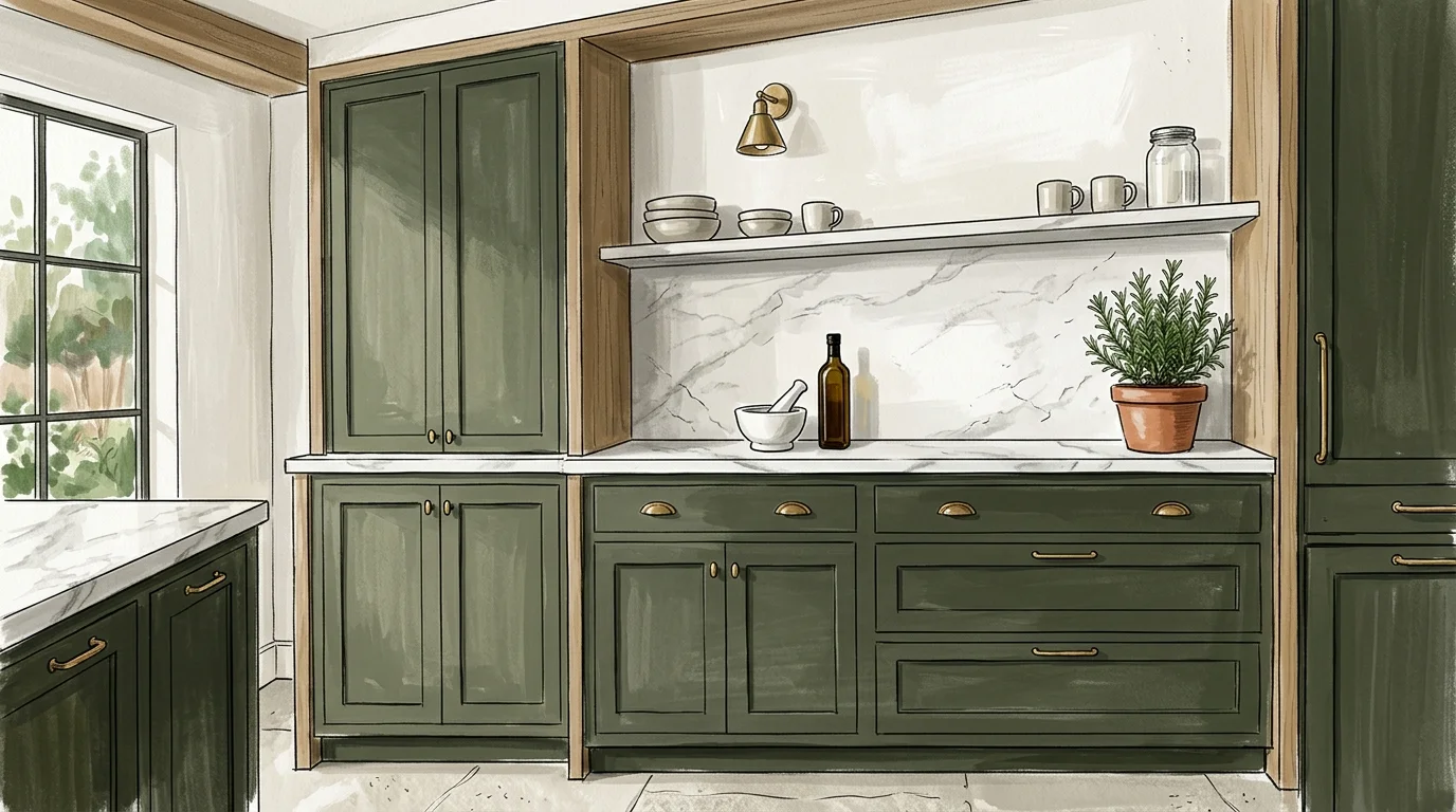
Trend #2: Immersive, Desaturated Sage and Olive Greens
Green has officially cemented its status as the ultimate contemporary neutral, taking the interior design world by storm. However, today’s prevailing trend leans heavily away from vibrant, synthetic emeralds and moves toward complex, desaturated sage and olive tones. These muddy, botanical hues serve as a psychological bridge between the exterior landscape and your interior living space. Incorporating biophilic design principles through these specific shades has a proven psychological impact; studies show that viewing natural greens actively lowers cortisol levels and promotes a profound sense of tranquility.
You will find immense value in applying these desaturated greens in transitional spaces and functional zones. Kitchens, in particular, benefit significantly from this trend. Painting your kitchen cabinetry in a soft, complex olive immediately elevates the room from a utilitarian cooking space to a sophisticated living area. When paired with honed Calacatta marble countertops and polished nickel hardware, sage green cabinets strike the perfect balance between traditional elegance and modern organic sensibilities. The color manages to feel both fresh and entirely timeless.
In intimate areas like primary bedrooms or home offices, you should strongly consider color drenching—painting the walls, trim, and interior doors in the exact same shade of muted green. This technique eliminates jarring visual breaks, creating a seamless, enveloping sanctuary. Complex greens interact beautifully with changing natural light; they read as crisp and invigorating during the morning hours, yet transform into cozy, shadowed retreats as the sun sets. By embracing these botanical interior color ideas, you introduce an effortless, restorative energy into your daily environment.
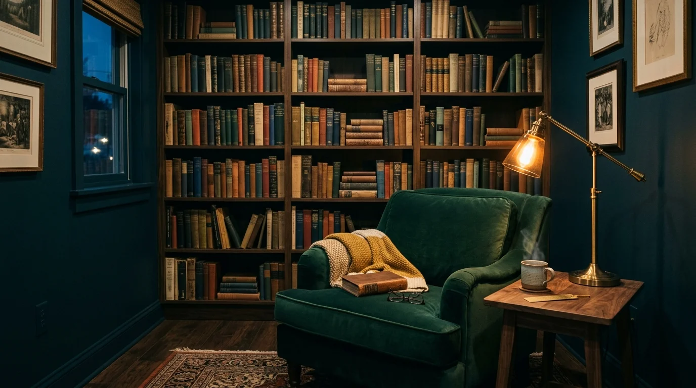
Trend #3: Moody and Immersive Jewel Tones
For years, conventional home decorating wisdom dictated that small, poorly lit rooms required bright white paint to feel larger. Designers now recognize this as a critical misstep that often results in gloomy, sterile boxes. The modern solution lies in embracing the darkness through moody, immersive jewel tones—think deep sapphire blues, rich ruby reds, and intense tourmaline greens. This bold strategy leans into the concept of quiet luxury, transforming an otherwise unremarkable room into a highly curated, dramatic jewel box.
When you commit to deep room colors, you effectively blur the structural boundaries of the space. Dark colors recede visually, tricking the eye into perceiving the walls as further away than they actually are. To maximize this expansive effect, you must paint the ceiling the exact same dark hue as the walls. This unbroken continuation of rich color draws the eye upward, making standard ceilings feel infinitely higher and giving the room an air of stately grandeur. This approach works exceptionally well in libraries, media rooms, powder baths, and intimate dens.
Texture plays a vital role when working with saturated jewel tones. Because dark walls absorb so much light, you must introduce highly reflective surfaces to keep the room from feeling oppressive. Incorporate high-gloss trim, strategically placed antique mirrors, and metallic accents like brushed gold or polished chrome. Velvet upholstery in complementary jewel tones further enhances the luxurious, tactile nature of the space. By masterfully balancing these deep hues with brilliant reflective accents, you create an environment that feels both endlessly sophisticated and profoundly comforting.
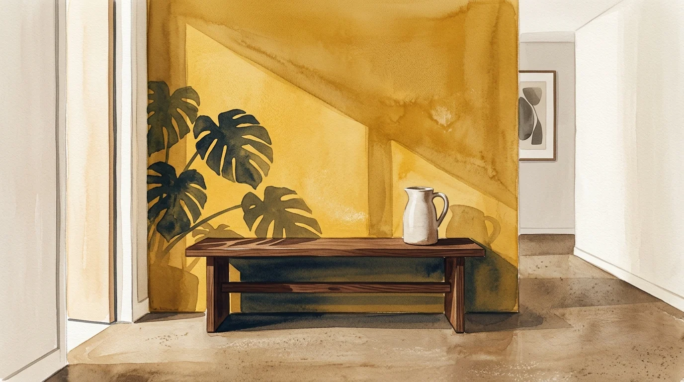
Trend #4: Sun-Baked, Muddy Ochre
Optimism is making a triumphant return to interior design, manifesting primarily through sun-baked, muddy yellows. Unlike the harsh, neon lemons of the past or the overly sweet pastel yellows of the early 2000s, today’s ochre is complex, sophisticated, and heavily grounded with brown undertones. This specific shade evokes a strong sense of European provenance, bringing to mind the sun-drenched facades of historic Tuscan villas or aged French countryside estates. Ochre offers a deeply resonant warmth that effortlessly elevates any interior environment.
You can use ochre to solve specific architectural and lighting challenges in your home. North-facing rooms generally receive cool, bluish light that can make standard neutral walls look dingy or depressing. By painting these specific rooms in a warm, muddy ochre, you artificially inject the energy of golden hour into the space, permanently counteracting the chilly natural light. The room instantly feels sunnier, more inviting, and significantly more dynamic, regardless of the weather outside.
Styling ochre requires a thoughtful approach to ensure the space remains chic rather than overwhelming. Designers frequently pair this historical hue with deep, contrasting colors to ground the brightness. Charcoal gray, deep indigo, and rich burgundy serve as excellent counterweights to ochre walls. If you prefer a softer aesthetic, mix muddy yellow with creamy whites, raw linen textiles, and light ash woods. Whether applied to an entire home office or used simply as an accent on a bold, painted ceiling, ochre stands out as one of the most uplifting interior color ideas available today.
Trend #5: Warm, Tactile Plaster Neutrals
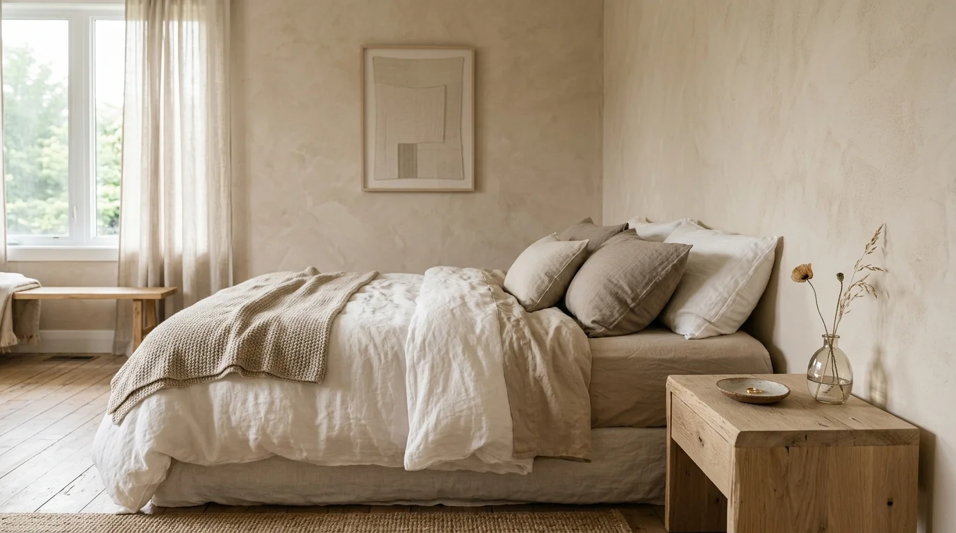
The era of the stark, hospital-white interior is decidedly over. Homeowners and designers alike are experiencing profound fatigue regarding sterile, purely white walls. In its place, a massive shift toward warm, tactile plaster neutrals has emerged. We are seeing a surge in demand for complex shades of taupe, mushroom, alabaster, and bone. These colors provide the clean, airy feeling of white but carry enough warm undertones to prevent the room from feeling clinical or unfinished.
What truly sets this trend apart is the emphasis on texture alongside the color itself. Flat, matte builder-grade paint is being rapidly replaced by finishes that offer visual movement. Venetian plaster, Roman clay, and heavily brushed limewash applications transform flat walls into dynamic canvases. These textured neutrals catch the sunlight differently throughout the day, creating soft shadows and highlights that give the room a subtle, lived-in energy. This commitment to artisanal finishes sits at the very heart of the quiet luxury movement.
These warm neutrals serve as the ultimate foundational backdrop for high-end home decorating. Because the walls do not aggressively compete for visual attention, they allow the quality of your furniture and textiles to take center stage. When working with plaster neutrals, you should layer similarly toned textures to build visual interest without relying on high contrast. Combine a nubby bouclé sofa, heavy linen drapery, and a plush wool rug—all in varying shades of taupe and cream—to create a living room that feels incredibly lush, sophisticated, and soothing.
Trend #6: Deep, Inky Aubergine
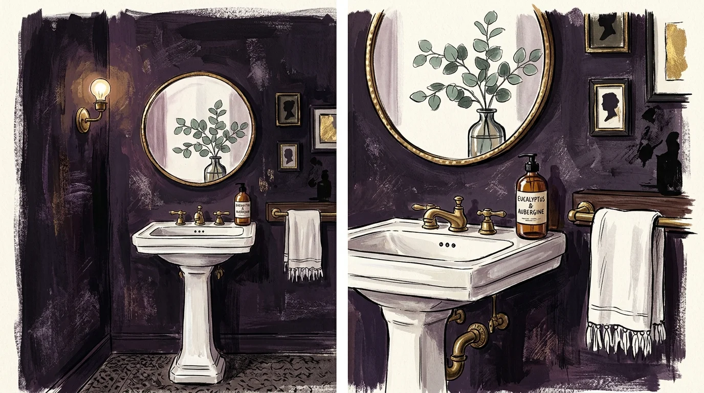
While navy blue and charcoal gray have long served as the default dark neutrals in home decorating, deep, inky aubergine has emerged as the sophisticated, unexpected alternative. This muted, dusty plum color offers immense depth and drama without the icy coldness often associated with true black or dark gray. Aubergine possesses an underlying red warmth that makes it uniquely inviting, striking a perfect balance between masculine tailored elegance and soft, romantic luxury.
Aubergine operates as a brilliant chameleon within your home, shifting its personality drastically depending on the lighting conditions. In bright, indirect daylight, it reads as a regal, highly tailored purple; under the warm, amber glow of evening lamps or candlelight, it deepens into a cozy, near-black neutral. This transformative quality makes it an exceptional choice for formal dining rooms, moody primary bedrooms, or elegant entry foyers where you want to make a powerful first impression on guests.
To truly elevate this color trend, pay close attention to your paint finish and complementary materials. Designers often recommend using a high-gloss or lacquer finish when applying aubergine to a ceiling; the glossy surface reflects ambient light beautifully, creating an atmosphere of unmatched elegance and giving the room a jewel-box glow. Pair aubergine walls with warm metallic accents, particularly unlacquered brass or antique bronze, to make the red undertones sing. Incorporating natural walnut furniture and heavily veined marble further enhances the rich, layered sophistication of this daring room color.
The Big Picture: Weaving These Trends into Your Home
Understanding individual color trends is only the first step; the true mark of masterful interior design lies in your ability to weave these hues together into a cohesive, harmonious home. You want to avoid a chaotic funhouse effect where every room features a drastically different, disconnected aesthetic. Instead, you must curate a flowing narrative that carries the eye smoothly from one space to the next. Sightlines are critical—stand in your hallway and observe how the colors of the adjacent rooms interact. The transition should feel intentional and unified.
To achieve this harmony, rely on the proven 60-30-10 rule. Dedicate 60 percent of the room to your dominant color (typically the walls), 30 percent to a secondary color (often found in upholstery or large rugs), and 10 percent to a bold accent color (introduced through artwork, throw pillows, or decorative objects). If you paint your living room a warm plaster neutral, use your 30 percent secondary color to introduce the sage green trend via a large velvet sofa. You can then carry that exact sage green into the adjacent kitchen, using it as the dominant 60 percent color for your cabinetry. This strategic repetition of color creates a subconscious sense of order and high-end design intent.
Finally, always ground your color palette with consistent architectural elements. Keeping your flooring, baseboards, and interior doors uniform throughout the house provides a steady visual anchor. When the foundational elements remain consistent, you give yourself the freedom to experiment confidently with bold, transformative room colors without losing the overall cohesion of your home decorating scheme.
Frequently Asked Questions
Q: How do I implement bold color trends without overwhelming my current furniture?
A: If you own highly patterned or brightly colored furniture, you must balance the visual weight of the room carefully. Instead of painting all four walls a bold jewel tone, start by applying the trending color to architectural features. Paint built-in bookcases, wainscoting, or even just the interior doors in a rich aubergine or sage green. Alternatively, use a warm plaster neutral on the walls to create a sophisticated, quiet backdrop that allows your statement furniture to breathe and stand out naturally.
Q: Are dark room colors just a passing phase, or do they have longevity?
A: Deep, moody colors boast incredible historical longevity; they have been utilized in stately European homes, classic libraries, and Victorian parlors for centuries. While the specific application method—such as modern color drenching—feels very current, the hues themselves are deeply traditional. By selecting complex, muted versions of dark colors rather than primary brights, you ensure your space will age gracefully and maintain its sophisticated appeal for decades.
Q: What is the best way to test these interior color ideas before committing?
A: Never paint small, isolated squares directly onto your current wall color, as the existing hue will inevitably distort your perception of the new sample. Instead, paint large, two-foot by two-foot poster boards with your chosen colors. Move these boards around the room over the course of several days. Observe how the color shifts in the morning light, under the harsh midday sun, and in the warm glow of your artificial evening lighting. This rigorous testing phase is crucial for confident decision-making.
Q: Can I use bold color trends in a small room, or will it make the space feel cramped?
A: You can absolutely use bold colors in small spaces; in fact, interior designers heavily encourage it. Small rooms often lack compelling architectural features, making them the perfect candidates for dramatic color applications. By wrapping a small powder room or intimate den entirely in a dark, rich hue, you obscure the corners and edges of the room. This technique tricks the brain, making the boundaries of the space feel infinite and enveloping rather than restrictive and cramped.
For the latest color forecasts, consult industry leaders like Pantone and paint companies like Benjamin Moore. For professional design standards, refer to the American Society of Interior Designers (ASID).
Disclaimer: This article reflects design trend analysis and predictions. Personal taste and timeless design principles should always guide your decorating choices.
