
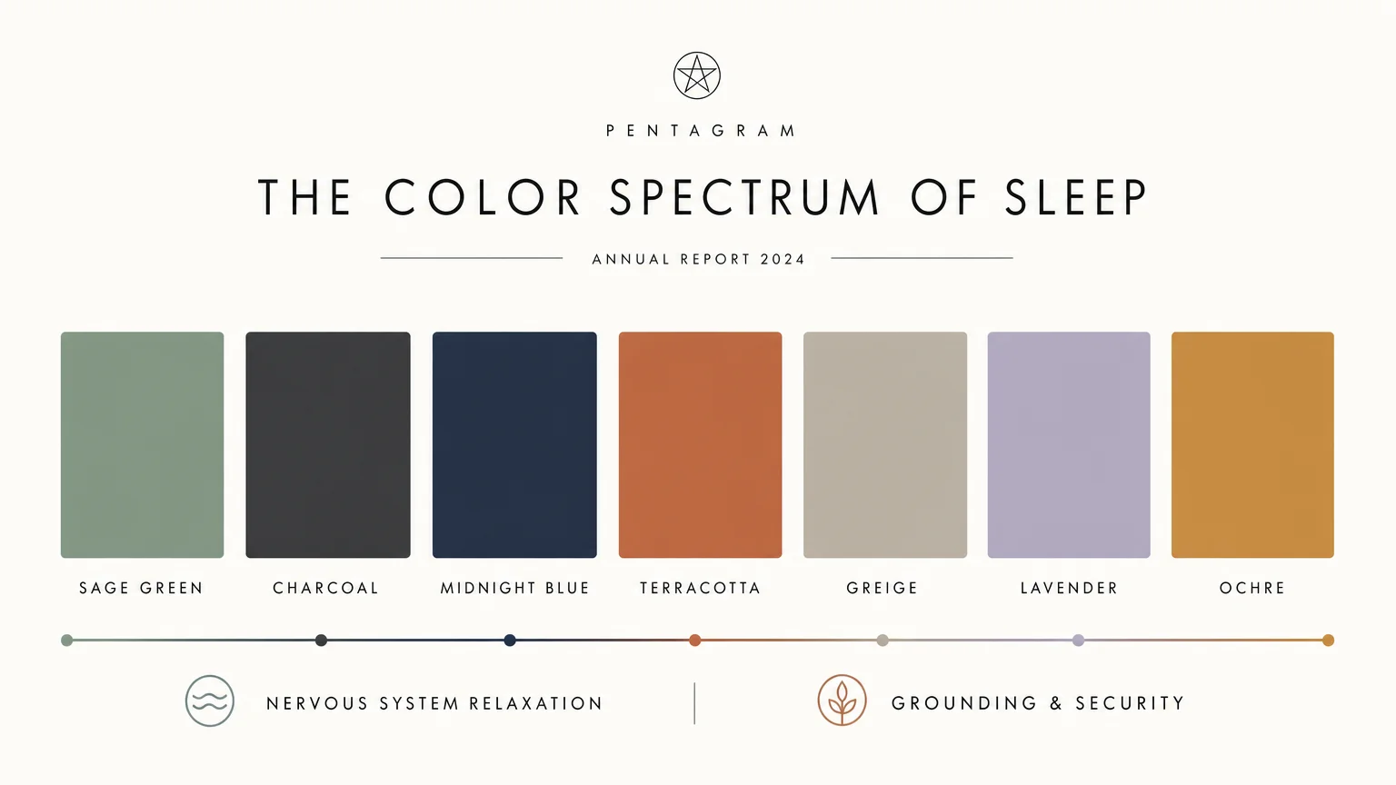
Your bedroom functions as the ultimate sanctuary for recovery; optimizing its color palette directly influences your physiological ability to achieve deep sleep. Color psychology demonstrates that specific wavelengths of light reflecting off your walls either stimulate your nervous system or signal your brain to release melatonin. By trading high-energy hues for restorative, low-stimulation shades, you transform your bedroom decor into an active sleep aid. Modern interior design shifts embrace a sophisticated approach to wellness, merging aesthetics with biological needs. Moving away from clinical whites, today’s sleep sanctuaries utilize nuanced, nature-inspired palettes. You can leverage these scientifically backed interior design trends to lower your heart rate, reduce visual clutter, and create an enveloping environment that drastically improves your nightly sleep quality.
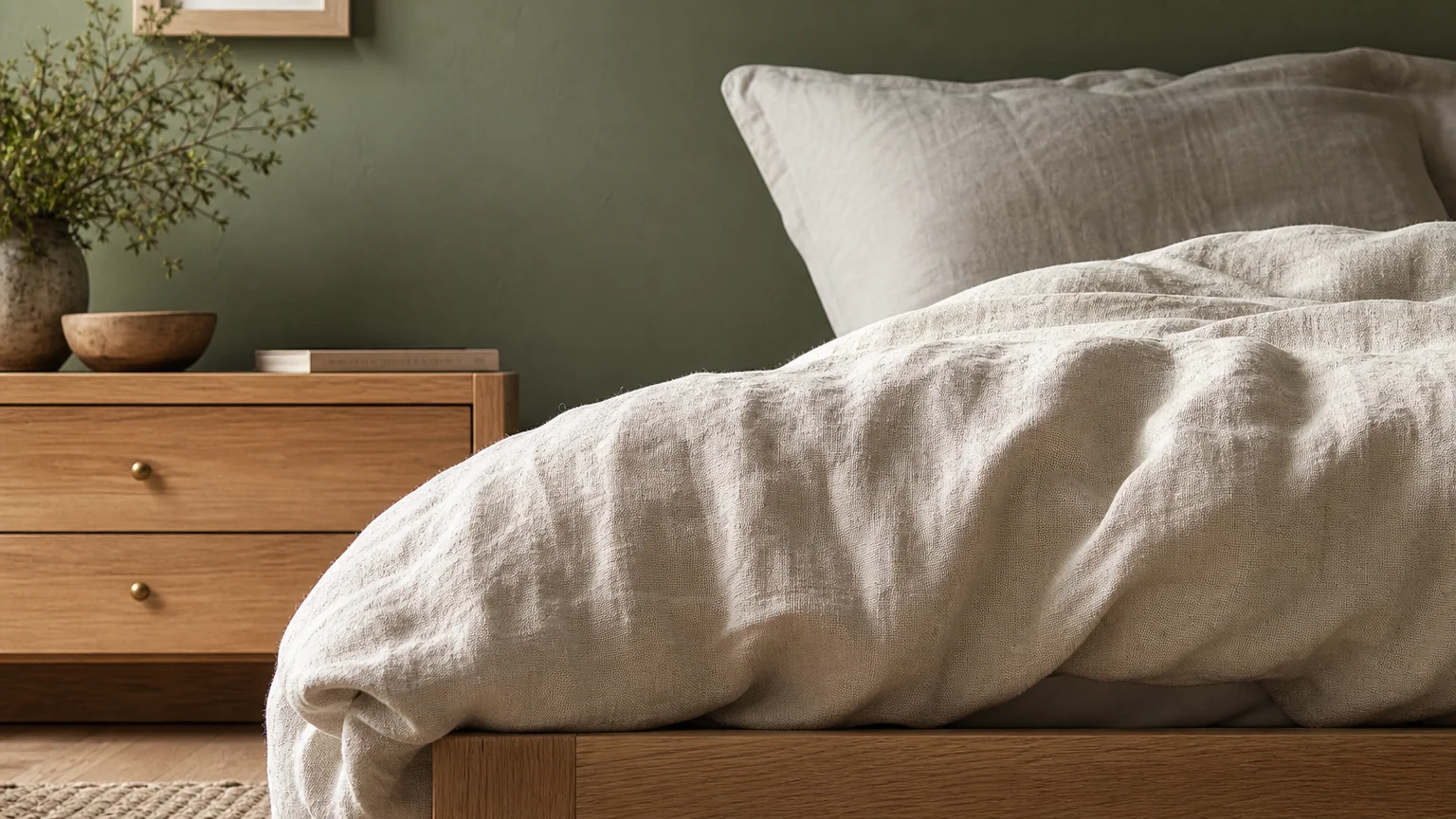
Trend #1: Organic Modernism and Sage Green
Green sits at the center of the visible spectrum, meaning human eyes require absolutely no adjustment to perceive it. This effortless visual processing translates directly into physiological relaxation, making green an undisputed champion in color psychology for sleep improvement. Today’s interior design landscape favors a specific iteration of this hue: a muted, silver-toned sage green rooted deeply in the principles of biophilic design. Biophilia suggests humans possess an innate biological desire to connect with nature, and bringing organic elements indoors significantly lowers cortisol levels. By wrapping your bedroom in a soft sage green, you simulate the calming canopy of a forest, prompting your parasympathetic nervous system to initiate the winding-down process.
To properly execute this trend, avoid highly saturated or synthetic greens. You want shades with prominent gray or brown undertones, ensuring the walls recede rather than demand attention. Pair your sage green walls with raw, natural materials to reinforce the organic modernism aesthetic. White oak flooring, tumbled brass hardware, and unbleached linen bedding create a textural richness that feels grounded and serene. Always select a matte or eggshell paint finish for the bedroom; glossy surfaces bounce light around the room, which creates visual stimulation and defeats the purpose of a rest-optimized space. A matte sage green absorbs excess light, giving your walls a velvety, enveloping quality that actively supports your transition into deep, restorative sleep.
Trend #2: Saturated Charcoal and Sensory Deprivation
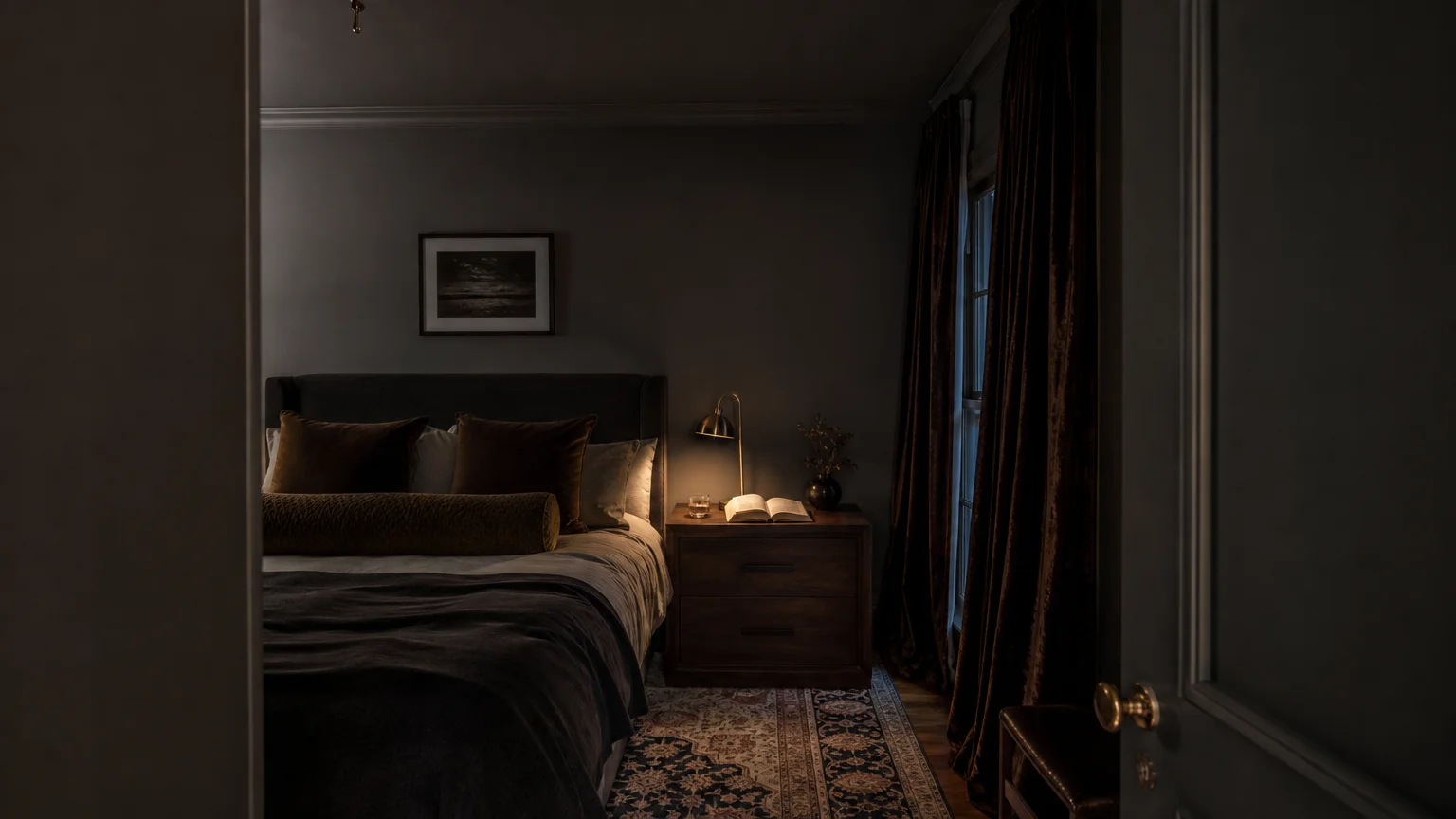
While conventional wisdom once dictated that bedrooms must feature light, airy colors to feel spacious, sophisticated interior design now recognizes the profound sleep benefits of dark, atmospheric hues. Saturated charcoal gray introduces a highly effective sensory deprivation aspect to your bedroom decor. When you utilize dark colors, you intentionally mimic the enveloping comfort of the night sky, sending powerful psychological cues to your brain that daylight hours have concluded. This visual shift directly encourages melatonin production, accelerating the time it takes you to fall asleep.
The application technique matters just as much as the color itself. To master this trend, embrace a technique known as color drenching. You paint your walls, baseboards, crown molding, doors, and even the ceiling in the exact same shade of flat charcoal. By eliminating contrasting white trim, you effectively erase the visual boundaries of the room. The corners blur into shadow, creating an infinite, cocoon-like atmosphere rather than a distinctly boxed-in space. This lack of sharp contrast stops your eyes from darting around the room, reducing cognitive load as you attempt to rest. Introduce warmth to a charcoal bedroom through rich textures rather than contrasting colors. Think heavy velvet drapery, deep walnut furniture, and layered wool rugs. These tactile elements prevent the dark palette from feeling austere, transforming your bedroom into an intimately tailored retreat designed exclusively for sensory unwinding.
Trend #3: Midnight Blue as the Ultimate Circadian Support
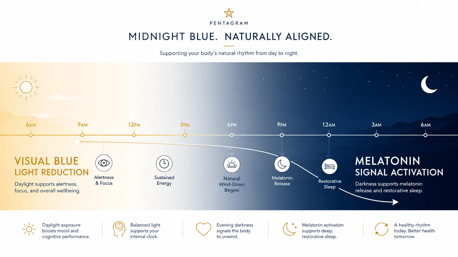
Deep blue operates as a structural pillar in color psychology, universally recognized for its ability to lower blood pressure, slow respiration rates, and stabilize heart rhythms. However, bright or primary blues carry energetic frequencies that can accidentally invigorate the mind. The current trend focuses exclusively on midnight blue—a profound, inky shade heavily mixed with black and gray undertones. This specific color profile aligns perfectly with sleep improvement strategies because it honors your circadian rhythm. It absorbs intrusive artificial light from streetlamps or passing cars, ensuring your sleeping environment remains as dark as possible throughout the night.
Incorporating midnight blue requires a strategic approach to lighting and material selection. Because the walls absorb so much light, you must layer your artificial lighting meticulously. Utilize warm-toned, low-wattage bulbs in bedside sconces and floor lamps to cast a gentle, amber glow against the deep blue backdrop. This high-contrast lighting scheme feels exceptionally luxurious and mimics the soothing effect of firelight against a night sky. To elevate the sophistication of midnight blue, introduce materials that reflect light gently. Antique brass mirrors, burnished bronze light fixtures, and silk accent pillows add necessary dimension without overwhelming the senses. The resulting aesthetic delivers a quiet luxury that feels both impeccably stylish and biologically optimized for profound rest.
Trend #4: Warm Terracotta for Grounding Security
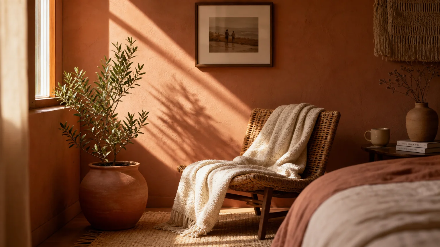
For years, cool-toned grays dominated bedroom interior design. Today, a distinct shift toward enveloping warmth has introduced baked terracotta as a premier color for sleep sanctuaries. Rooted in the rich hues of natural clay, terracotta taps into a primal psychological need for shelter and security. The color radiates an earthy, grounding energy that combats the sterile, over-digitized nature of modern daily life. Surrounding yourself with these deeply warming tones creates a subconscious feeling of being safely tucked away, which allows your hyper-vigilant nervous system to finally stand down.
To successfully integrate terracotta into your bedroom decor, you must manage its saturation. A vibrant, orange-heavy terracotta will stimulate the mind, mimicking daylight and disrupting sleep cycles. Instead, select a muted, dusty version that leans heavily into brown and pink territory. Think of the soft, faded color of old sunbaked bricks rather than bright pottery. Textural application heavily influences how this color performs in a bedroom. Plaster finishes or lime wash paints serve as the ideal medium for terracotta, providing a mottled, cloudy finish that adds incredible depth. The subtle variations in the plaster capture shadows beautifully as the sun goes down, transitioning the room from a warm daytime haven into a dim, cozy cave. Pair this color with creamy boucle upholstery, woven rattan nightstands, and heavy linen drapery to complete a deeply restorative, earth-bound aesthetic.
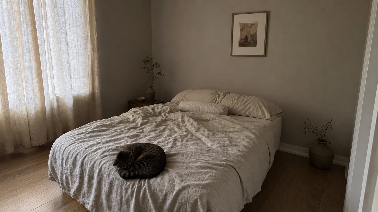
Trend #5: Soft Greige for Visual Decompression
Sometimes the brain requires absolute neutrality to power down. However, the stark, gallery-white walls of past minimalist trends often feel clinical and uninviting—hardly the emotional response you want in a space dedicated to comfort. Enter soft greige, the perfect marriage of warm beige and structural gray. This shade acts as the ultimate visual palate cleanser. By stripping away dominant color frequencies, soft greige provides immediate visual decompression. It removes all demanding stimuli from your field of vision, allowing your mind to empty itself of the day’s clutter.
Creating a successful greige bedroom relies entirely on the concept of quiet luxury and tone-on-tone layering. When your walls carry a subtle, quiet hue, your interior design must pivot to emphasize texture and silhouette over pattern and high-contrast color. Furnish your greige bedroom with pieces featuring curved silhouettes and organic shapes, completely avoiding harsh angles that create visual tension. Layer your bedding using multiple shades within the same greige family: a taupe linen duvet, stone-colored cashmere throws, and oat-hued percale sheets. This subtle gradation of neutral tones keeps the eye moving gently without ever arresting its attention. You achieve an incredibly sophisticated, hotel-like environment that prioritizes mental clarity and unbroken sleep above all else.
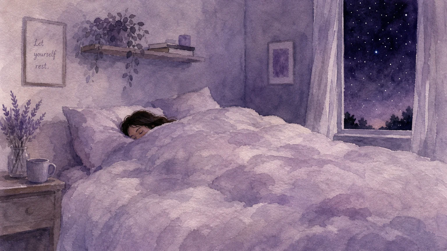
Trend #6: Dusty Lavender for Anxiety Reduction
Historically relegated to nurseries or feminine dressing rooms, purple has matured significantly within modern interior design. Specifically, dusty lavender has emerged as a powerhouse for anxiety reduction and sleep improvement. In color psychology, purple bridges the gap between the calming stability of blue and the warming comfort of red. When heavily muted with gray undertones, lavender loses its juvenile sweetness and adopts a highly sophisticated, restorative quality. Studies consistently link cool, floral-inspired hues with significant drops in nighttime anxiety, making this the ideal color choice for chronic over-thinkers who struggle to quiet their minds at bedtime.
To keep a lavender bedroom looking elegant rather than adolescent, provenance and pairing matter. Treat dusty lavender as a neutral backdrop rather than a feature color. Paint the walls, the baseboards, and the ceiling in this soft, smoky hue to create an immersive, cloud-like environment. Ground the airy quality of the lavender with dark, substantial furniture. Charcoal gray upholstered headboards, ebonized wood nightstands, and blackened steel light fixtures provide the necessary visual weight to anchor the room. By contrasting the delicate nature of dusty lavender with strong, masculine materials, you strike a perfect aesthetic balance. Your bedroom becomes a sanctuary that feels intentionally curated while delivering the profound psychological benefits of an anxiety-reducing color palette.
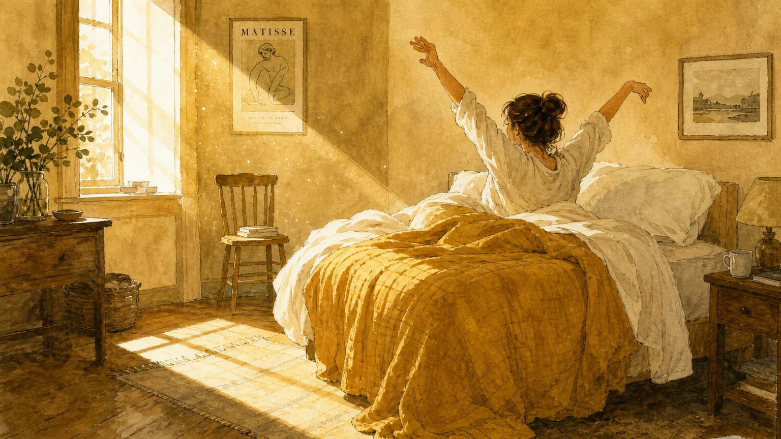
Trend #7: Muted Ochre for Waking Vitality
While optimizing your bedroom for falling asleep remains paramount, you must also consider the psychological impact of waking up. Muted ochre serves as a brilliant solution for individuals who experience seasonal affective disorder or struggle significantly with morning grogginess. Unlike bright, energetic yellows that aggressively stimulate the nervous system, muted ochre carries heavy brown and mustard undertones. It mimics the gentle, warming rays of golden hour rather than the harsh glare of midday sun. This hue provides a comforting, enveloping warmth at night while offering a subtle, uplifting psychological boost when you open your eyes in the morning.
Integrating muted ochre successfully requires extreme restraint. Using this color on all four walls can quickly overwhelm a sleep space. Instead, utilize ochre as an enveloping color block behind the bed, or apply it strategically through extensive drapery and large-scale textiles. Pair ochre with deep, grounding tones like forest green or espresso brown to maintain the overall darker, sleep-friendly aesthetic of the room. When you position muted ochre correctly, it catches the soft ambient light from your bedside lamps at night, creating a rich, fireside glow that encourages relaxation. In the morning, natural light illuminates the ochre, gently signaling to your circadian rhythm that a new day has begun, facilitating a smoother, more natural transition from deep sleep to waking vitality.
The Big Picture: Weaving These Trends into Your Home
Transforming your bedroom into an optimal sleep sanctuary requires more than simply purchasing a gallon of trending paint. You must integrate these color psychology principles holistically alongside lighting, texture, and architectural details to achieve genuine interior design success. Colors shift dramatically depending on their light source. A shade that looks perfectly muted and calming under natural daylight can morph into a harsh, stimulating color under the wrong artificial bulb. You must support your chosen color palette by strictly utilizing warm-spectrum lighting. Install bulbs with a color temperature between 2000K and 2700K in your bedroom to cast a soft, amber glow that actively supports melatonin production and complements these relaxing hues.
Furthermore, the tactile experience of your bedroom must match the visual promise of your paint color. If you paint your walls a soothing, biophilic sage green but dress your bed in scratchy, synthetic fabrics, your body will still register stress. Extend your color psychology choices into your material selections. Embrace natural, breathable fabrics like linen, organic cotton, and ethically sourced wool. These materials regulate your body temperature throughout the night, completely eliminating the physical disruptions that pull you out of deep sleep cycles. Remember that true sophistication lies in restraint. Do not attempt to incorporate multiple color trends into a single room. Select one cohesive color story that resonates most deeply with your personal psychological needs, commit to it through color drenching or tone-on-tone layering, and execute it using high-quality, matte finishes. By treating your bedroom as an integrated ecosystem of color, light, and texture, you elevate your home’s aesthetic while fundamentally improving your daily well-being.
Frequently Asked Questions
How do I test a calming bedroom color without committing to painting the entire room?
Never test paint directly on your current wall, as the existing color will distort your perception of the new shade. Instead, paint large sample swatches on sturdy watercolor paper or foam board. Move these painted boards around your bedroom at different times of the day. Pay special attention to how the color behaves under your artificial lamps at night, as this is the exact lighting environment you will experience right before sleep. You want to ensure the color retains its muted, calming properties under a warm-spectrum bulb.
Can I use dark color trends like saturated charcoal in a bedroom with minimal natural light?
Absolutely. A common interior design misconception insists that dark rooms must be painted white to artificially manufacture brightness. In reality, painting a poorly lit room white simply highlights the lack of light, resulting in a dingy, shadowed space. Embracing dark colors like charcoal or midnight blue in low-light bedrooms leans into the room’s natural architectural tendencies. You create an intentionally moody, enveloping, and cave-like environment that feels extraordinarily sophisticated and is inherently optimized for deep sleep.
What is the Light Reflectance Value (LRV) and why does it matter for a sleep-optimized bedroom?
Light Reflectance Value (LRV) measures the percentage of light a paint color reflects on a scale of zero (absolute black) to 100 (pure white). For a sleep-optimized bedroom, you generally want to select paint colors with a lower LRV, ideally between 15 and 40. Colors within this range absorb excess light rather than bouncing it around the room, which reduces visual glare and prevents overstimulation. Understanding LRV allows you to scientifically select colors that actively mute your environment, preparing your brain for rest.
Does the finish of the paint impact the color psychology of the bedroom?
The sheen of your paint drastically alters both the aesthetic and the psychological impact of the color. Glossy or satin finishes create reflective hotspots that catch the light, drawing your eye around the room and stimulating cognitive function. To maximize sleep improvement, you must exclusively use flat or matte paint finishes in the bedroom. Matte finishes absorb light, giving the walls a velvety, soft texture that blurs harsh architectural lines and significantly enhances the calming properties of the chosen color.
For the latest color forecasts, consult industry leaders like Pantone and paint companies like Benjamin Moore. For professional design standards, refer to the American Society of Interior Designers (ASID).
Disclaimer: This article reflects design trend analysis and predictions. Personal taste and timeless design principles should always guide your decorating choices.