
Understanding how natural light interacts with wall colors is the ultimate secret to designing a spectacular, sunlit interior. Abundant daylight acts as a powerful magnifier, transforming the best paint colors for homes with lots of natural light from flat swatches into dynamic, living elements. While dark rooms demand hues that generate artificial brightness, sun-drenched spaces afford you the luxury of experimenting with complex neutrals and deep saturations without creating a gloomy atmosphere. Harnessing this solar energy requires attention to the direction of your light source. By selecting shades with appropriate Light Reflectance Values, you prevent glaring overexposure while maintaining a perfectly balanced, sophisticated aesthetic throughout your living environment.
Trend #1: Warm Off-Whites and Mineral Plasters
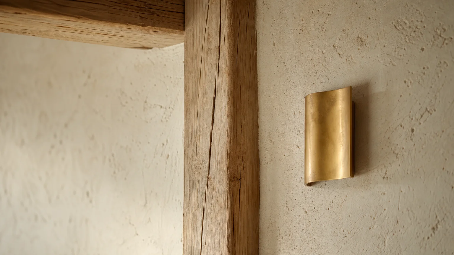
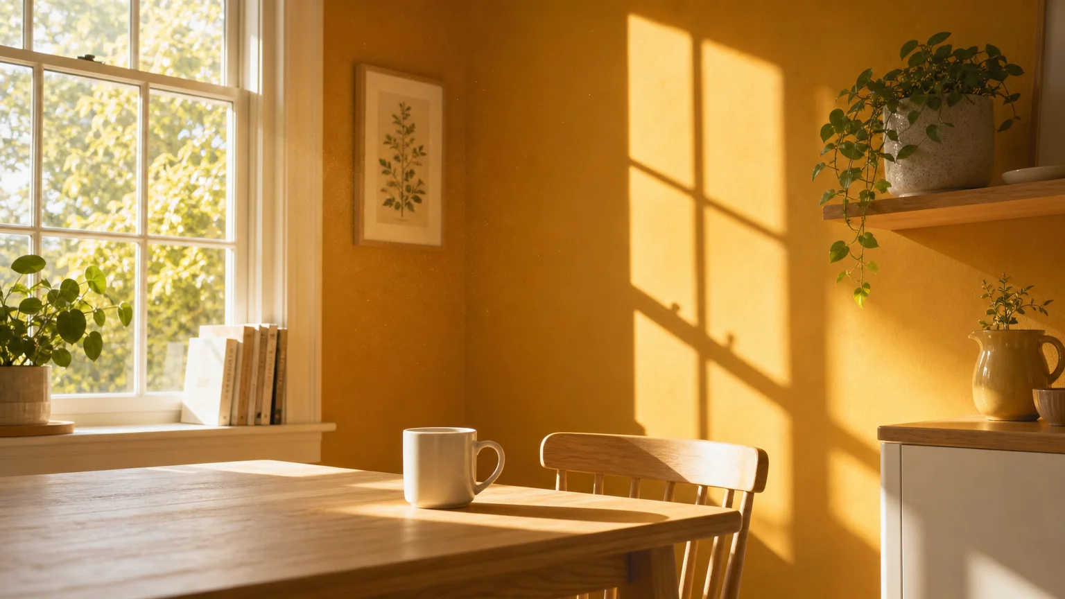
When you have large windows pouring brilliant daylight into a room, a stark, pure white paint will actively fatigue your eyes. The high Light Reflectance Value (LRV) of pure, untinted white bounces nearly every photon directly back into your visual field, creating a sterile, clinical environment rather than the relaxing retreat you envision. Evaluating reliable natural light paint colors requires a strategic pivot toward warm off-whites infused with subtle yellow, beige, or grey undertones. These mineral-inspired hues dial down the harsh glare while beautifully retaining the airy, spacious feeling that makes bright rooms so desirable.
The prevailing shift toward organic modernism heavily influences this aesthetic, favoring finishes that mimic the porous, uneven textures of natural plaster, limestone, and chalk. By opting for a creamy, nuanced off-white, you allow the incoming sunlight to gently wash over the walls, highlighting structural architecture rather than flattening the room into a glaring white box. Southern-facing rooms, which receive intense, warm sunshine throughout the afternoon, particularly benefit from off-whites with a hint of ash or grey to neutralize the yellowing effect of the sun. Conversely, northern light casts a cooler, distinctly bluish tint, requiring an off-white with a stronger beige or warm cream base to inject much-needed thermal balance.
Emulate this sophisticated trend by selecting eggshell or flat matte finishes. Their slightly porous surface absorbs light softly, enhancing the tactile, organic quality of your walls. Pair these serene walls with raw, wide-plank white oak flooring, unlacquered brass hardware, and heavy woven textiles to ground the ethereal brightness in tactile reality.
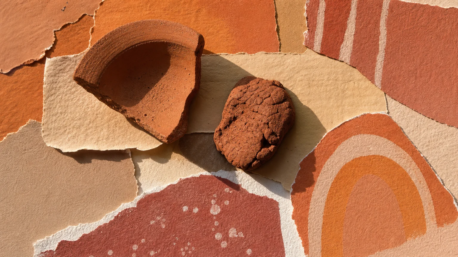
Trend #2: Earthy Terracottas and Sunbaked Clays
Natural light acts as an activating agent for red, orange, and brown undertones, making earthy terracottas and sunbaked clays phenomenally successful in bright spaces. If you apply a deep, rusty terracotta in a dimly lit, windowless corridor, it quickly reads as heavy and oppressive. However, when you introduce abundant sunlight, the pigment awakens. The walls emit an inherent, radiant warmth that captures the feeling of a Mediterranean villa at the peak of golden hour.
The enduring biophilic design movement continues to drive this trend, as homeowners actively seek to blur the boundaries between their interior sanctuaries and the rugged natural world outside. Terracotta serves as the perfect structural bridge, drawing the organic, grounding hues of rich soil and baked clay directly indoors. When working with these highly saturated colors, your specific window exposure dictates the exact shade you must choose to achieve perfect harmony. Western-facing rooms amplify warm tones as the sun sets, meaning a slightly muted, desaturated clay will prevent the room from feeling overwhelmingly hot and visually chaotic. Eastern-facing rooms, receiving the crisper, cooler morning light, can beautifully handle a richer, more robust terracotta, creating a cozy, enveloping breakfast nook or morning room.
Pair these sunbaked walls with crisp, ivory trim to maintain sharp architectural definition, or embrace a bold color-drenching technique by painting your baseboards, doors, and crown molding the exact same terracotta shade. This immersive approach eliminates visual interruptions, allowing the interplay of shifting sunlight and deep shadows to become the primary focal point of your design.
Trend #3: Atmospheric Dusty Blues and Muted Aquamarines
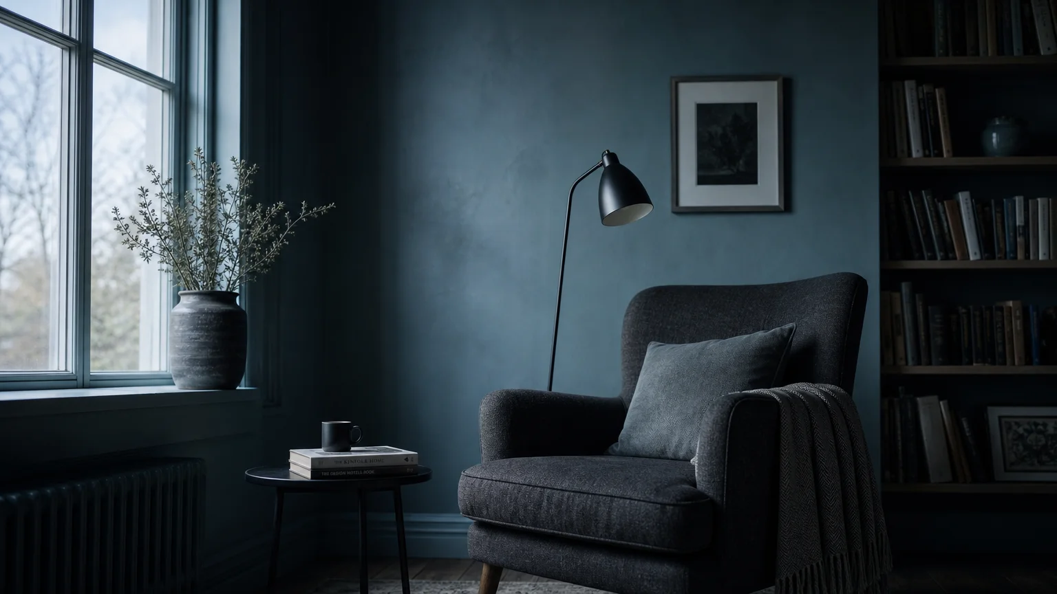
Homes flooded with southern or western light often battle a visual temperature that feels excessively hot and overwhelming during the peak hours of the day. To counteract this intense thermal energy, leading interior designers rely on atmospheric dusty blues and muted aquamarines. When you need bright room paint to perform as an aesthetic air conditioner, these cool-toned hues instantly soothe the senses and bring a crucial, balancing equilibrium to your sun-drenched interiors.
The current iteration of this color trend steers entirely clear of pastel, juvenile baby blues. Instead, the focus rests on sophisticated, grey-infused blues that embody the highly sought-after aesthetic of quiet luxury. These complex, moody colors shift beautifully and unpredictably throughout the day. Under the crisp, direct light of a bright midday, they appear remarkably fresh and vibrant. As dusk approaches and shadows begin to lengthen across the floor, they deepen into contemplative, elegant charcoals.
If your living room features wall-to-wall glazing or expansive skylights, an atmospheric dusty blue provides a sophisticated, grounding backdrop that prevents the space from feeling floaty or overexposed. The psychological impact of blue inherently lowers the heart rate and promotes a profound sense of tranquility, establishing it as an ideal choice for sunlit bedrooms and focused home offices. When executing this cool-toned color scheme, incorporate warm metallic accents—such as aged copper, polished brass, or burnished bronze—to introduce a deliberate, striking tension. The cool expanse of the blue walls juxtaposed against the radiant glint of warm metals creates a deeply layered, highly curated aesthetic.
Trend #4: Rich Forest and Olive Greens
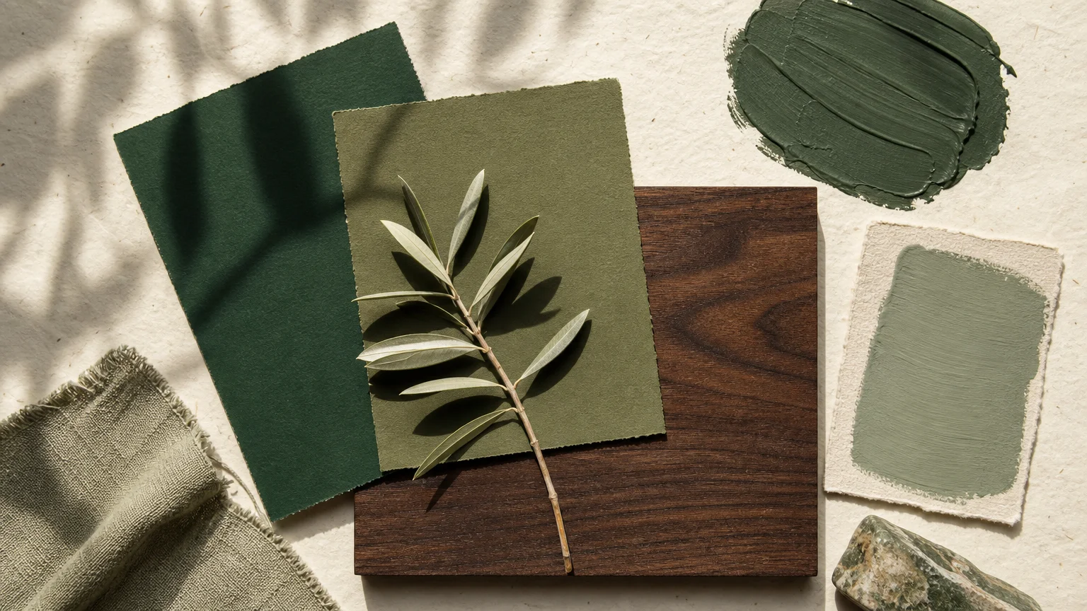
A pervasive design myth dictates that you must only paint bright rooms with light, reflective colors. In reality, rooms gifted with abundant natural light provide the absolute perfect canvas for dark, dramatic hues like rich forest and olive greens. Direct sunlight possesses the remarkable ability to penetrate deep, heavy pigments, revealing the complex, vibrant nuances of green that would otherwise remain totally hidden in the flat shadows of a darker room.
By enveloping a well-lit, window-heavy space in saturated olive green, you forge a direct visual continuation of the lush foliage outside your glass, solidifying a seamless indoor-outdoor connection. This deep, persistent connection to nature remains a cornerstone of contemporary interior decorating tips, grounding large spaces in organic reality. Olive green, possessing a subtle yellow undertone, practically sings under the warm rays of southern light, creating an environment that feels both vibrant and deeply historic. Forest green, leaning slightly cooler with a touch of blue, offers profound, sophisticated depth and works exceptionally well in dining rooms or residential libraries that receive strong, focused morning sunlight.
When you commit to these saturated greens, carefully consider the sheen of your paint. A completely flat finish absorbs maximum light, creating a velvety, luxurious appearance that masterfully hides drywall imperfections. Conversely, a satin finish reflects light subtly, highlighting the structural contours of custom millwork, beadboard, and cabinetry. To keep the deep green space feeling expansive rather than enclosed, pair these rich walls with pale travertine flooring, natural linen upholstery, and highly textured, light-toned rugs.
Trend #5: Muted Mustards and Golden Ochres
For those who wish to enthusiastically amplify the joy and kinetic energy of natural sunlight, muted mustards and golden ochres stand as the ultimate architectural color choice. Rather than attempting to tone down the sun, these colors wholeheartedly embrace it, capturing the luminous quality of daylight and radiating it back into the room, even on notoriously overcast days.
The secret to successfully implementing yellow in sunlit interiors lies in selecting shades deeply anchored by brown or grey undertones. A pure, primary yellow will quickly turn chaotic, acidic, and visually fatiguing when exposed to high-lumen natural light. Golden ochre, rooted deeply in natural, historic pigments utilized by artisans for centuries, offers a sophisticated provenance that elevates and grounds your design. This specific trend heavily references mid-century modern aesthetics and the global bohemian revival, yet it feels entirely contemporary and bespoke when applied with an educated, restrained hand.
Use mustard and ochre to foster conversation and activity in your sunlit interiors, applying them to bustling kitchens, formal dining rooms, or vibrant creative studios. Eastern-facing rooms benefit immensely from these energetic hues, as the paint visually warms up the cooler morning light and maintains a cheerful disposition as the afternoon shadows stretch. Master this striking color palette by offsetting the intense warmth of the walls with sharply contrasting, cool elements. Deep navy velvet sofas, stark black wrought iron light fixtures, and cold, heavily veined marble countertops provide the necessary visual breaks, ensuring the ochre remains a captivating feature rather than an overwhelming presence.
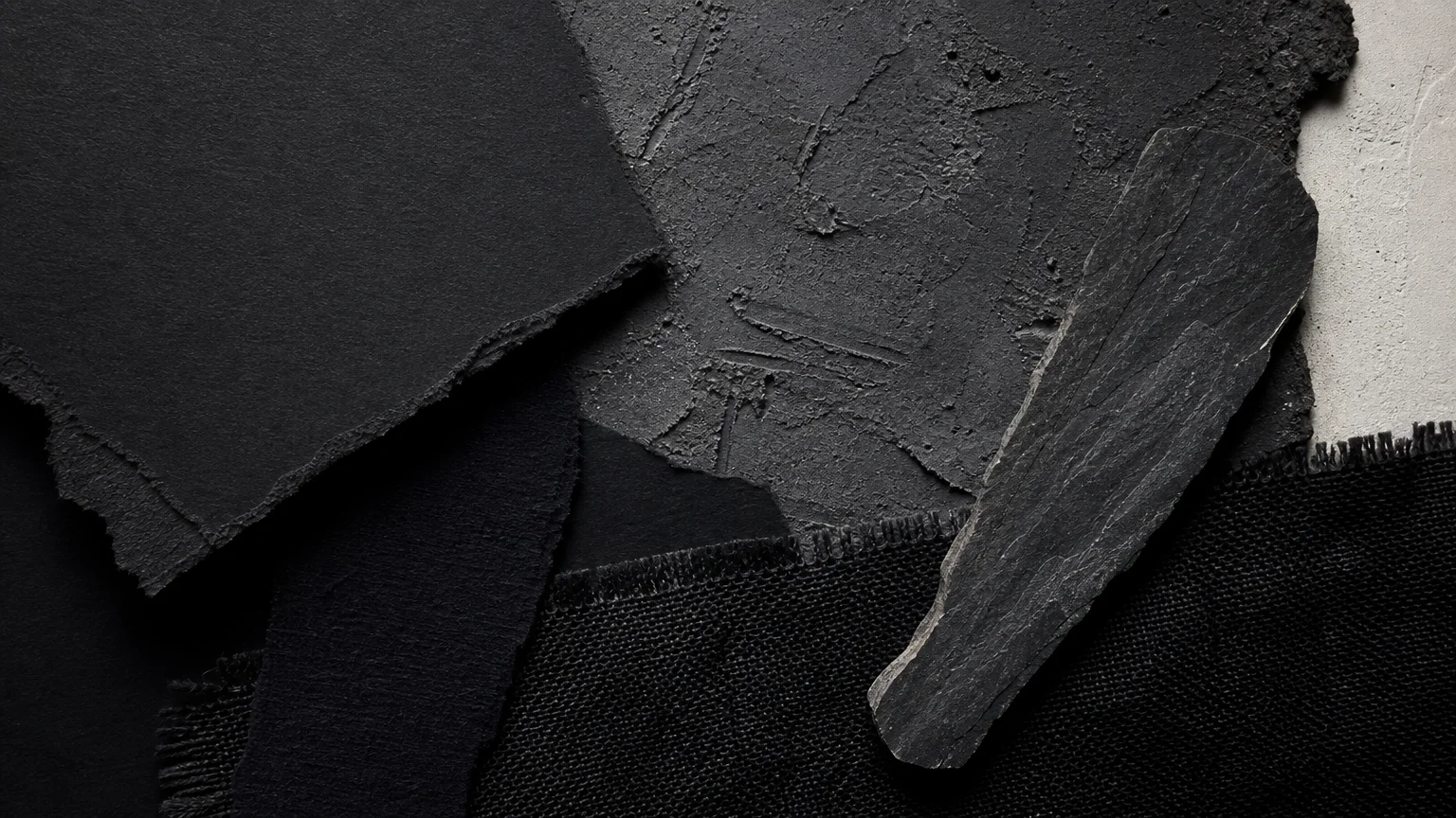
Trend #6: Chalky Charcoals and Soft Blacks
Embracing chalky charcoals and soft, muted blacks in a room flooded with natural light represents the absolute pinnacle of bold design confidence. While conventional decorating wisdom suggests painting bright rooms white to maximize reflection, painting a sunlit room black achieves something entirely different and profoundly striking: it perfectly frames the outdoors.
Much like the matte black bezel of a television screen enhances the perceived vibrancy and quality of the moving picture, black walls recede visually, drawing your eye immediately past the architecture and directly out to the bright windows and the landscape beyond. The sheer, overwhelming volume of natural light entering the space entirely prevents the dark paint from feeling oppressive or cave-like. Instead, the sunlight turns the walls into a sophisticated, moody canvas that brilliantly anchors your colorful furniture, curated textiles, and fine artwork.
When navigating this highly dramatic trend, the specific hidden undertone of your dark paint matters immensely. A dark charcoal carrying a violet or blue undertone will behave very differently than a soft black built upon a green or brown base. Southern light will forcefully pull out any hidden warmth nestled within the dark paint, while northern light will emphasize the colder, sleeker blue-grey notes. Prevent the space from feeling completely devoid of light reflection by incorporating highly reflective, glossy surfaces into your room design. Expansive antique mirrors, high-gloss lacquered ceilings, or large glass coffee tables will bounce the incoming sunlight around the dark room, creating a glamorous, dynamic interplay of heavy shadow and sharp illumination.
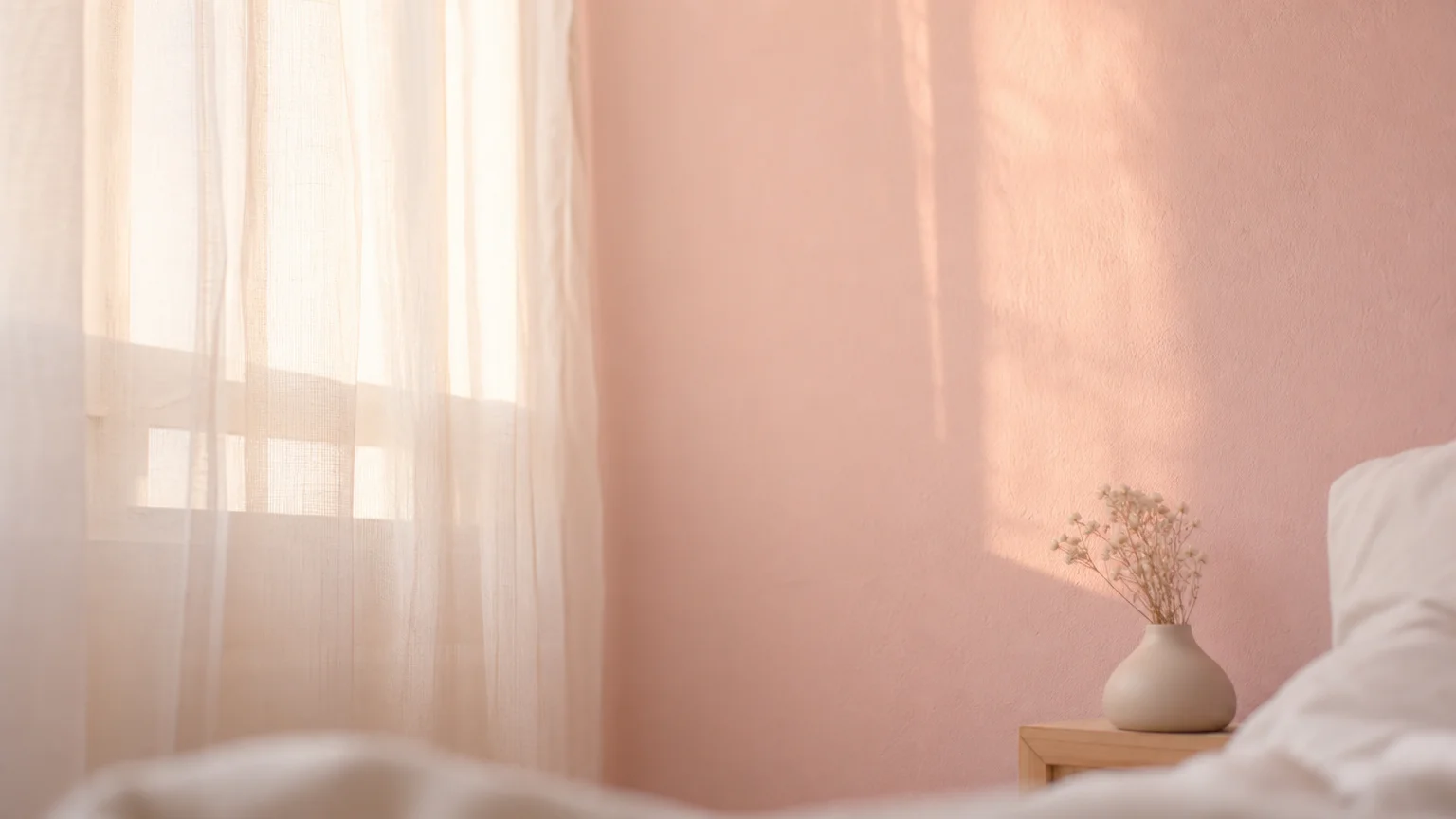
Trend #7: Barely-There Blushes and Plaster Pinks
Moving decisively away from the overtly feminine, saccharine connotations of past decades, barely-there blushes and muted plaster pinks have rapidly emerged as the new, sophisticated foundational neutrals for high-end, sunlit homes. These complex, highly desaturated pinks possess an incredibly flattering quality; they bounce a warm, gentle, rosy glow onto the skin of everyone sitting in the room, creating an atmosphere that feels inherently welcoming, intimate, and luxurious.
When a room receives a tremendous amount of direct natural daylight, standard whites and pale greys can often feel glaring, sterile, or shockingly cold. Plaster pinks elegantly bridge this gap, offering the desired lightness and spaciousness of a white wall but delivering a complex, shifting depth that changes dramatically depending on the exact time of day. In the crisp light of the morning, these walls may read as a warm, comforting beige. By sunset, as the light shifts toward the red spectrum, the walls ignite with a subtle, breathtaking coral radiance. This chameleon-like behavior makes blush an exceptional, versatile choice for sprawling open-concept living areas and serene primary bedrooms alike.
The physical texture of the paint plays a crucial, defining role in successfully executing this trend. Instead of standard flat acrylics, homeowners and designers are turning to traditional limewash, Roman clay, and micro-cement finishes to give these pink hues a mottled, suede-like appearance. The subtle, artisanal variations in the plaster finish catch the sunlight at different angles, creating a wall that feels highly tactile and vibrantly alive. Pair these gentle, glowing hues with raw concrete pillars, natural travertine floors, and sharp matte black hardware to deliver a perfectly balanced, fiercely modern interior.
The Big Picture: Weaving These Trends into Your Home
Understanding the intricate nuances behind these color trends provides an excellent foundation, but the true art of interior design lies in expertly weaving these colors into your specific, unique home environment. High-volume natural light is a highly dynamic, ever-changing architectural element. A complex wall color that looks mesmerizing and vibrant at ten in the morning might unexpectedly fall flat, turning dull and lifeless by four in the afternoon as the sun dips behind the trees.
Therefore, your first and most critical step before committing to home color schemes is exhaustive, rigorous testing. Never rely solely on a tiny, two-inch paper swatch illuminated by the artificial, fluorescent lighting of a hardware store. Instead, paint large, two-foot square sample boards, or utilize high-quality repositionable painted decals. Move these samples around the room, observing exactly how the hue interacts with your specific geographical light over a full forty-eight-hour cycle. Pay exceptionally close attention to how the exterior foliage outside your windows alters the incoming light; a massive, leafy oak tree can cast a distinct, heavy green filter into your living room during the peak summer months, fundamentally altering how a white or beige wall actually appears to the human eye.
Furthermore, achieving a cohesive, high-end aesthetic requires looking holistically beyond the painted walls. Your paint colors must enter a deliberate, harmonious dialogue with your flooring, cabinetry, and major upholstered furniture pieces. Adopting a new trend does not mean you must aggressively redesign your entire home simultaneously. Start strategically. Implement a bold, chalky charcoal in a sunlit dining room or a delicate plaster pink in a bright guest bedroom to gauge your visual comfort level. The ultimate goal of sophisticated design is to curate spaces that feel thoughtfully collected and highly personal over time. By combining these contemporary color trends with timeless design principles, you create a home that feels both urgently current and profoundly enduring.
Frequently Asked Questions
How do I choose a paint color based on the specific directional exposure of my room?
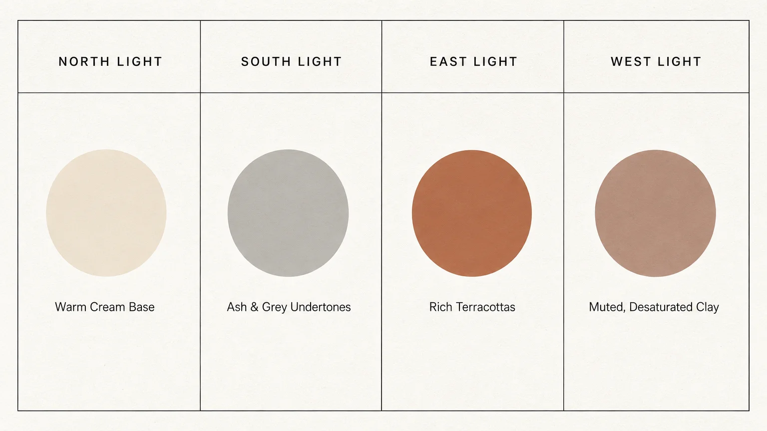
Directional exposure stands as the single most critical factor in color selection. North-facing rooms receive cool, indirect light that strongly amplifies blue and grey tones; counteract this frigid effect by choosing warm, yellow-based off-whites, terracotta, or rich earth tones. South-facing rooms enjoy intense, warm light all day long, allowing you to successfully utilize cooler blues, greens, or starker charcoals without the room ever feeling cold. East-facing rooms get bright, cool morning light and much darker afternoons, making highly adaptable, chameleon-like neutrals ideal. West-facing rooms receive fiery, intense late-afternoon sun, meaning you should generally avoid overly warm reds or bright oranges unless your goal is a highly dramatic, enveloping aesthetic.
Can I combine multiple trending colors within an open-concept sunlit space?
Yes, you can beautifully combine trends, but success relies entirely on establishing a strict, clear color hierarchy. Choose one dominant color to carry the vast majority of the wall space—such as a warm mineral off-white or a subtle plaster pink. Then, deploy secondary, bolder colors like deep olive green or golden ochre for strategic, high-impact focal points, such as a central kitchen island, expansive built-in bookcases, or a dramatic fireplace accent wall. Crucially, maintain a continuous, unifying thread through your trim color; painting all baseboards, doors, and window casings a consistent shade seamlessly unifies the distinct zones within a large open floor plan.
Do dark paint colors like charcoal or forest green have long-term design longevity?
Absolutely. While highly specific, trendy shades naturally fluctuate in popularity over the decades, the fundamental concept of utilizing dark colors to create architectural depth and visual contrast is deeply rooted in centuries of design history. Dark, saturated hues possess an inherently timeless quality, especially when applied thoughtfully to traditional architectural elements like library millwork, wainscoting, or coffered ceilings. Their longevity is secured by how masterfully they highlight the surrounding architecture and dramatically frame the natural light entering the room, making them a permanent staple in high-end, bespoke design rather than a fleeting, disposable fad.
How does paint sheen impact the way color behaves in a bright room?
Sheen determines precisely how much light reflects off the painted surface. In rooms flooded with intense natural light, high-gloss or semi-gloss finishes act almost exactly like mirrors, bouncing light aggressively around the space and glaringly highlighting every tiny drywall imperfection or uneven texture. Conversely, flat or matte finishes absorb the incoming light, providing a rich, velvety depth that makes the actual color pigment appear much more saturated, even, and elegant. For walls in exceptionally bright spaces, an eggshell or flat matte finish is almost always the most sophisticated, visually pleasing choice, reserving satin or semi-gloss finishes exclusively for highly trafficked doors and protective trim.
For the latest color forecasts, consult industry leaders like Pantone and paint companies like Benjamin Moore. For professional design standards, refer to the American Society of Interior Designers (ASID).
Disclaimer: This article reflects design trend analysis and predictions. Personal taste and timeless design principles should always guide your decorating choices.