
Choosing the right wall color anchors your entire design aesthetic and instantly elevates the perceived value of your space. True sophistication relies on classic paint colors that transcend fleeting fads, offering a versatile foundation for any architectural style. These timeless paint shades adapt effortlessly to changing lighting conditions and shifting interior paint ideas, ensuring your home feels both current and established. Instead of chasing the latest vibrant micro-trends, discerning homeowners embrace foundational hues that evoke a sense of quiet luxury. Master these ten enduring color profiles to craft sophisticated interiors that command attention while maintaining an inviting, deeply personal atmosphere for years to come.
Trend #1: Warm Alabaster White
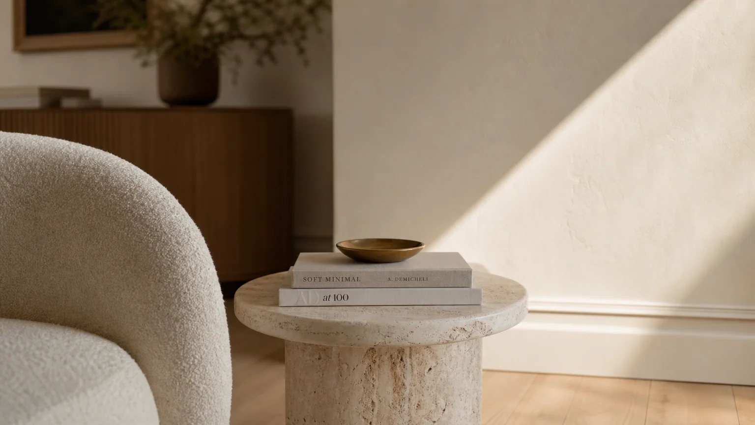
Organic modernism demands a foundation that feels both pristine and approachable. Warm alabaster white delivers exactly that, stepping away from the stark, blue-toned whites of the early 2010s to embrace a creamier, softer luminance. This shade owes its enduring popularity to its high Light Reflectance Value (LRV), allowing it to bounce natural sunlight gracefully across a room without feeling clinical. You establish an immediate sense of quiet luxury when you envelop your living spaces in this hue. Pair alabaster walls with tactile materials like tumbled travertine floors, pale European oak cabinetry, and rich bouclé upholstery. Because it lacks harsh undertones, this color acts as a gallery-quality backdrop, ensuring your curated art collection and structural furniture silhouettes remain the focal point. When exploring interior paint ideas, consider applying alabaster in an eggshell finish on walls with a flat ceiling to maximize light diffusion while maintaining a durable, wipeable surface. Use it to unify open-concept homes where transitioning colors might otherwise feel disjointed.
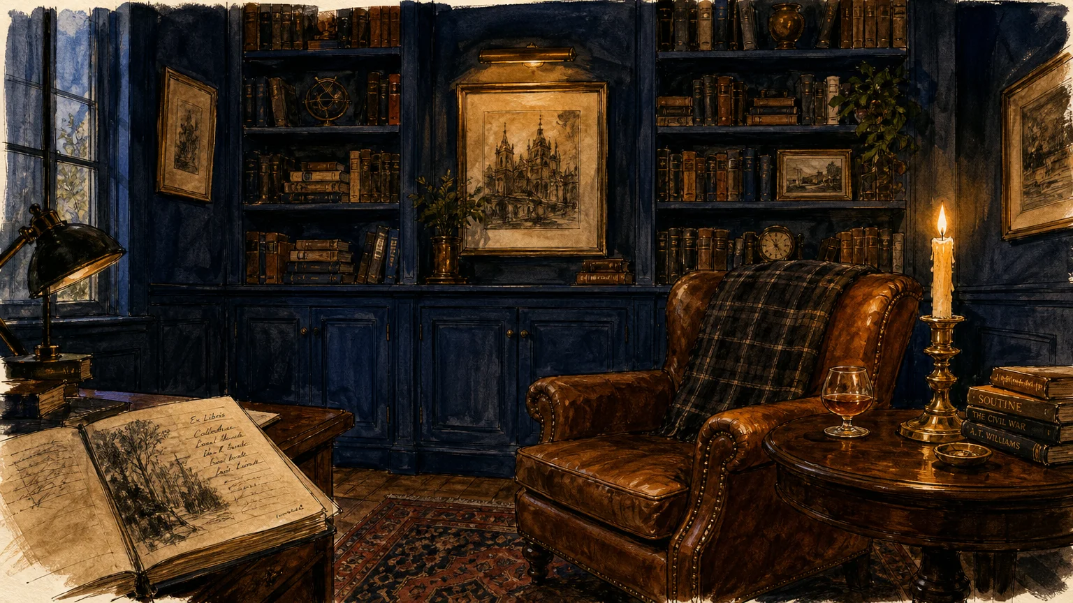
Deep, enveloping tones command attention, and moody navy blue remains the definitive choice for adding historic provenance to contemporary spaces. This shade operates as a complex neutral, absorbing excess light and blurring the hard physical boundaries of a room—a visual trick that makes smaller spaces, like intimate dining rooms or home libraries, feel unexpectedly expansive. Navy blue anchors a room with profound depth while maintaining a classic maritime elegance that pure black paint often lacks. To maximize its impact, coat the walls, trim, and ceiling in a unified matte finish; this creates a seamless, jewel-box effect. Introduce unlacquered brass hardware, cognac leather seating, and rich walnut wood tones to warm up the cool base of the blue. This powerful contrast defines sophisticated interiors, striking a perfect balance between dramatic, moody atmosphere and inviting, grounded comfort.
Trend #3: Serene Sage Green
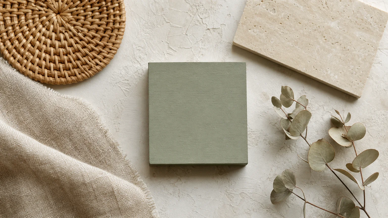
Biophilic design principles focus on our innate connection to the natural world, and serene sage green translates that philosophy directly onto your walls. This dusty, muted green mimics the soothing tones of a sunlit forest canopy, instantly lowering the visual pulse of a room. Homeowners gravitate toward sage because it bridges the challenging gap between a neutral backdrop and a committed color. It brings life into a space without overwhelming the senses. Apply sage green to your kitchen cabinetry or bedroom walls to create a restorative sanctuary. The color harmonizes flawlessly with natural textures—think woven rattan pendants, raw linen drapery, and honed limestone countertops. As a cornerstone of elegant home decor, sage shifts beautifully throughout the day, appearing silvery and crisp in morning light before warming into a cozy, earthy hue by dusk.
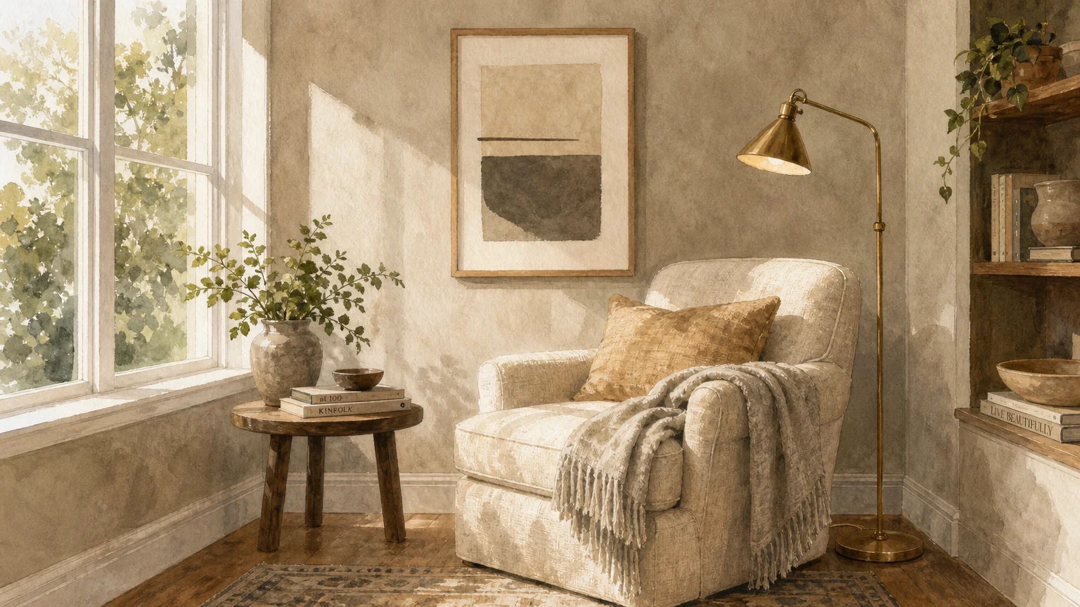
Trend #4: Rich Charcoal Gray
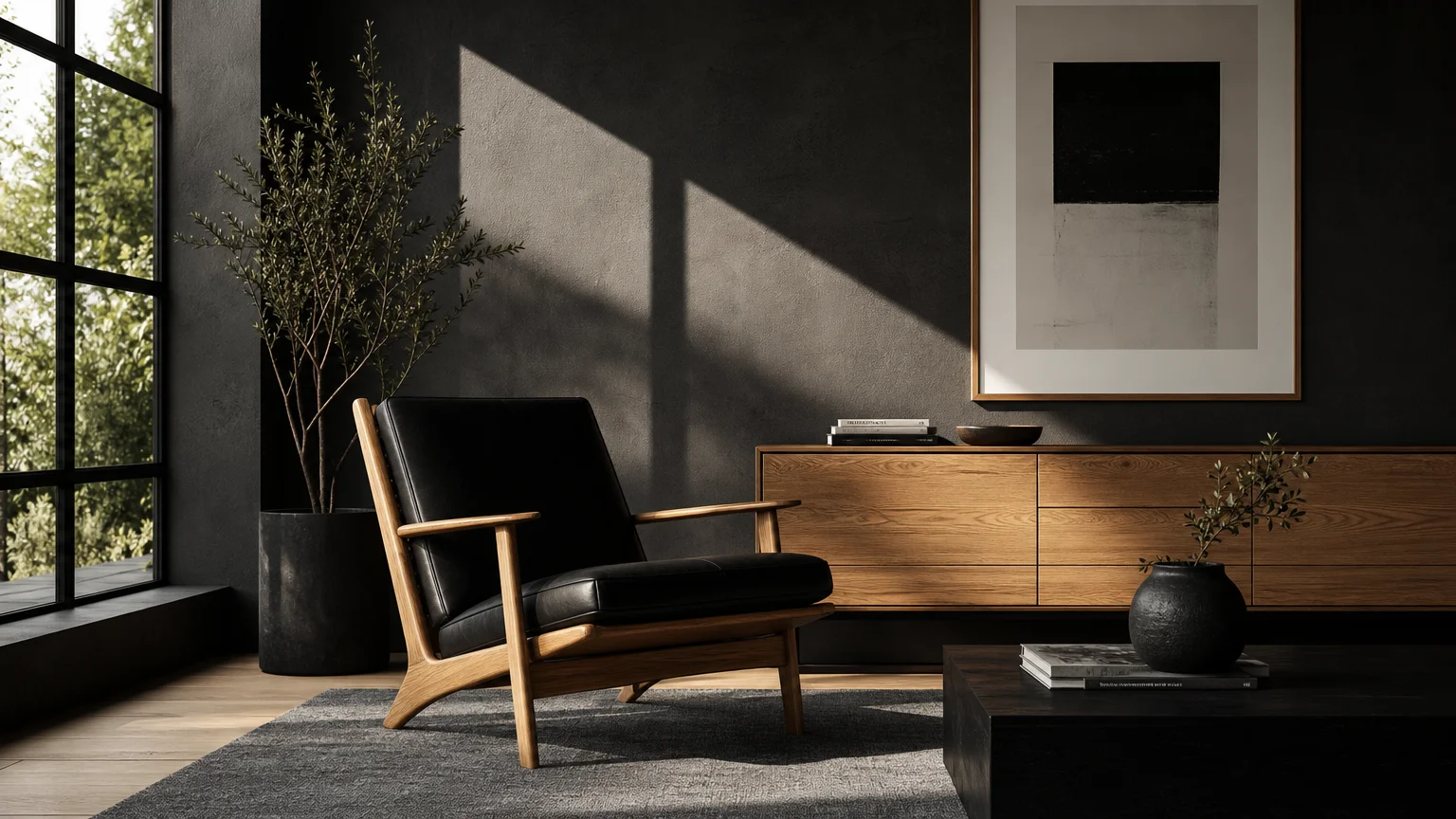
When you need architectural definition without the starkness of pure black, rich charcoal gray serves as the ultimate design tool. This sophisticated shade thrives on its inherent moodiness, offering a tailored, masculine edge that instantly elevates builder-grade spaces. Charcoal gray acts as a visual anchor; use it to highlight custom millwork, wainscoting, or a dramatic fireplace surround. The color’s immense depth provides a stunning high-contrast canvas for showcasing metallic accents—particularly polished nickel and brushed gold. To prevent the room from feeling cavernous, balance the dark walls with strategic, layered lighting and reflective surfaces like oversized antique mirrors or marble countertops. By enveloping a room in charcoal, you create an intimate, cocooning environment that feels simultaneously modern and deeply rooted in classic design traditions. It proves that dark colors can be endlessly inviting.
Trend #5: Luminous Greige
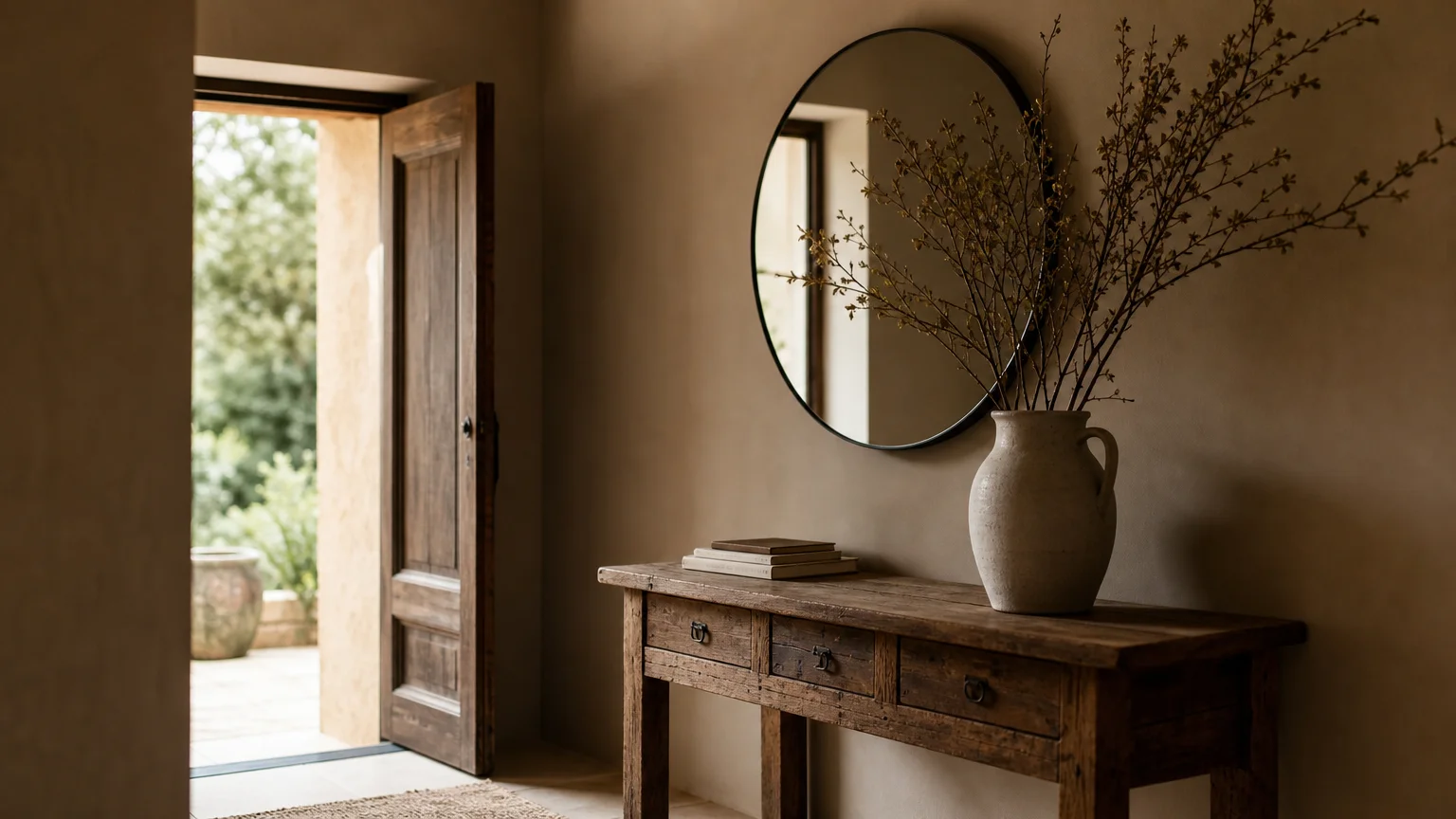
Luminous greige masterfully solves the eternal debate between warm and cool tones, serving as the ultimate chameleon in the world of interior design. This sophisticated blend tempers the icy austerity of gray with the inviting warmth of beige, resulting in a complex hue that adapts to its environment. Greige achieved its iconic status because it performs exceptionally well in tricky lighting situations, particularly in north-facing rooms where pure grays turn bleak and whites look dingy. You create a cohesive, elevated atmosphere when you use greige as your home’s primary foundational color. It aligns seamlessly with the principles of quiet luxury, allowing high-quality materials to shine. Complement greige walls with distressed vintage rugs, polished marble, and rich velvet textiles. For a truly tailored look, paint your baseboards and crown molding a shade darker than the walls, adding subtle architectural interest without disrupting the room’s serene, flowing energy.
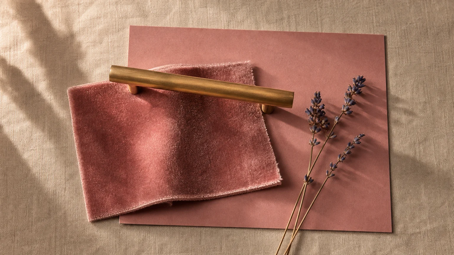
Trend #6: Dusty Rose
Shedding its juvenile associations, dusty rose has matured into a powerful, sophisticated neutral that flatters both the architecture of a room and the people within it. This grown-up iteration of pink carries brown and gray undertones, anchoring the color and preventing it from skewing too sweet. Historic manor houses have utilized similar plaster-pink shades for centuries to reflect a subtle, warm glow into formal sitting rooms. Today, dusty rose brings that same flattering warmth to modern, cold spaces. Implement this timeless paint shade in a primary bedroom or a formal dining room to cultivate an atmosphere of understated glamour. The key to elevating dusty rose lies in your contrasting elements. Pair it with dark, grounding woods like mahogany or espresso-stained oak, and introduce sharp, modern lines through lighting fixtures to maintain a contemporary, chic aesthetic that defies fading fads.
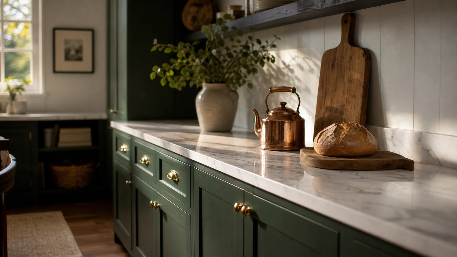
Trend #7: Deep Forest Green
Steeped in heritage richness, deep forest green brings the distinguished aesthetic of an old-world study directly into modern living spaces. This color taps into the growing desire for homes that feel curated, established, and layered over time. Forest green absorbs light to create an enveloping, protective atmosphere that invites quiet reflection and deep conversation. Unlike lighter botanical shades, this robust color holds its own against heavy furniture and dramatic architecture. Utilize deep forest green in spaces meant for evening gathering, such as dining rooms, libraries, or media rooms. The richness of the green provides an extraordinary backdrop for antique gold frames, glowing amber lampshades, and highly textured fabrics like mohair and tweed. When applying these classic paint colors, consider a satin finish on beadboard or paneling to catch ambient light and highlight the carpentry’s intricate, custom details.
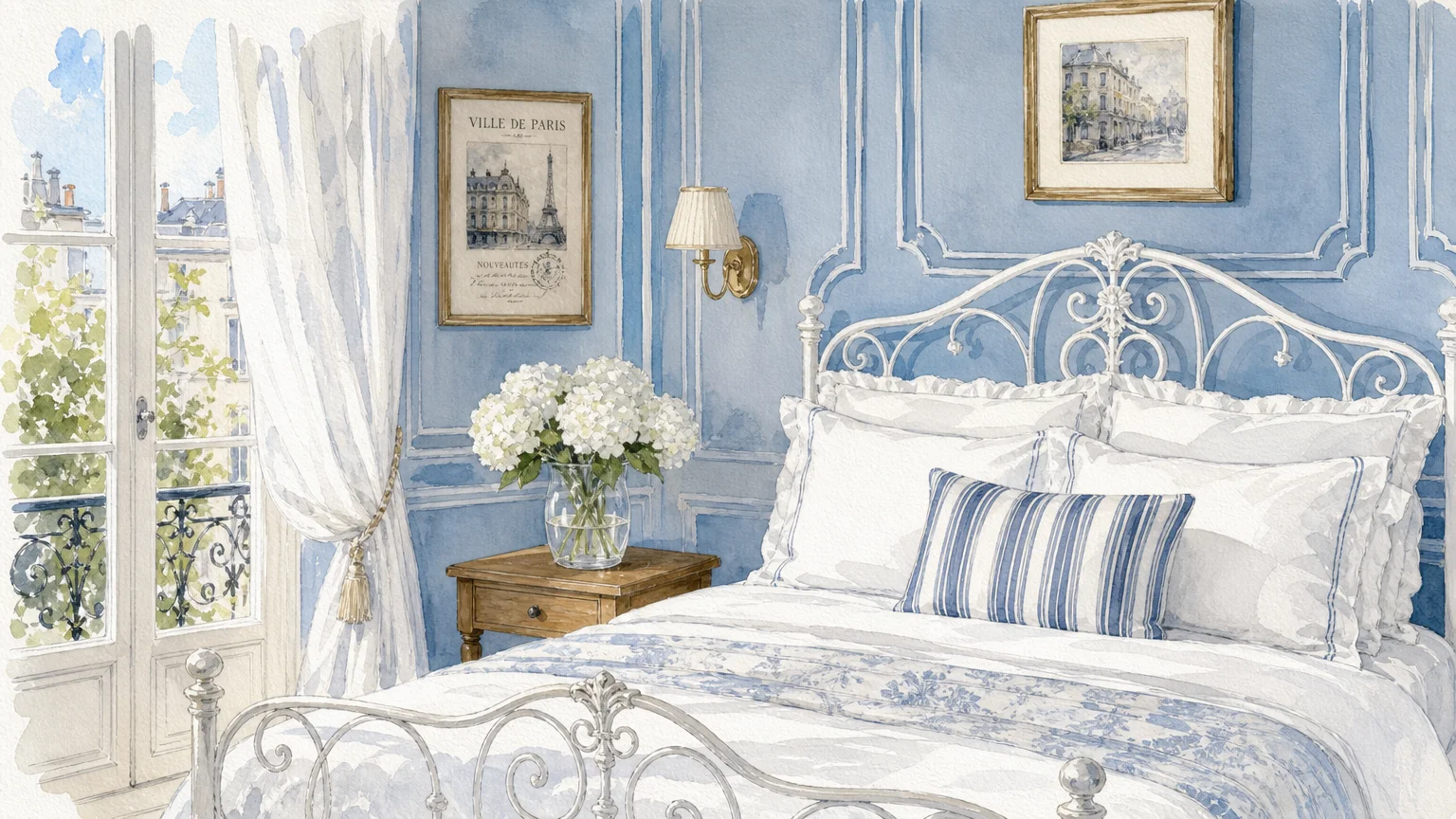
Trend #8: Classic French Blue
Evoking the airy sophistication of a Parisian apartment, classic French blue delivers European elegance straight to your walls. This specific shade features a slightly desaturated, gray-leaning profile that keeps it looking refined rather than overly vibrant. French blue creates an immediate psychological sense of calm, making it a perennial favorite for primary suites and luxurious guest bathrooms. Its versatility allows it to pivot stylistically based on your furnishings; it feels crisp and coastal alongside white linen and slipcovered sofas, yet incredibly formal when paired with crystal chandeliers and antique silver. To master this look, combine French blue walls with brilliant, crisp white trim to emphasize architectural boundaries. When planning your interior paint ideas, remember that this blue beautifully offsets warm metallic tones, making unlacquered brass sconces or antique gold mirrors pop with unparalleled brilliance and elegant home decor flair.
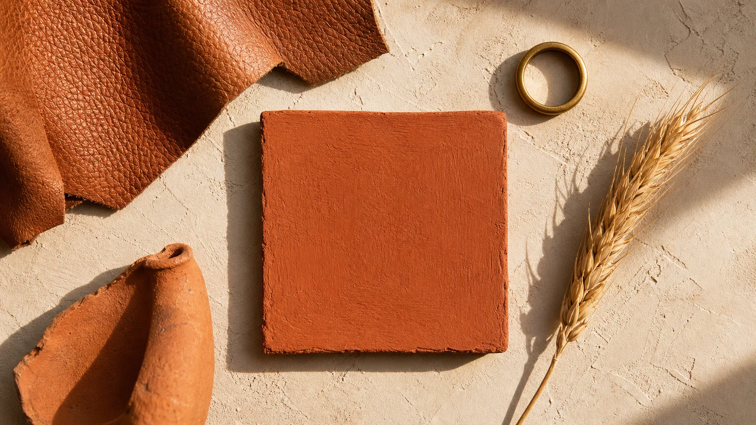
Trend #9: Warm Terracotta
As design shifts away from sterile environments toward highly tactile, artisanal spaces, warm terracotta has reclaimed its position as a highly desirable foundational color. This baked-earth tone instantly injects soul and character into a room, recalling the sun-drenched facades of Mediterranean villas. Terracotta works brilliantly because it provides the vibrancy of a red or orange but remains grounded by deep brown undertones, ensuring the space feels cozy rather than chaotic. Embrace terracotta in spaces where you want to stimulate energy and warmth, such as kitchens, breakfast nooks, or creative home offices. The color pairs intuitively with raw, organic materials. Introduce heavily textured plaster finishes, handmade ceramic tiles, and chunky woven textiles to amplify the artisanal aesthetic. By surrounding yourself with these earthy, classic paint colors, you cultivate a deeply welcoming environment that celebrates natural imperfections and authentic craftsmanship.
Trend #10: Earthy Mushroom
Earthy mushroom represents the pinnacle of sophisticated, enveloping neutrals. Sitting comfortably between taupe and deep brown, this structured shade replaces the stark grays of the past decade with something far more complex and inviting. Mushroom owes its massive appeal to its ability to create a cocooning effect while maintaining a clean, tailored appearance. It serves as an exquisite canvas for the quiet luxury aesthetic, where the focus remains on the provenance and quality of the materials rather than loud patterns. Wrap a living room or a primary bedroom in earthy mushroom to establish an instantly grounding atmosphere. The color harmonizes beautifully with tone-on-tone layering; mix it with creamy bouclé armchairs, oatmeal-colored linen drapery, and dark bronze hardware. This deliberate, monochromatic layering results in elegant home decor that feels intentionally designed, profoundly comfortable, and relentlessly chic from floor to ceiling.
The Big Picture: Weaving These Trends into Your Home
Transitioning these timeless paint shades from mere inspiration into a cohesive reality requires a strategic approach to your home’s unique layout and lighting. Start by evaluating your space’s natural light exposure; a luminous greige that glows beautifully in a sun-drenched, south-facing room might read flat and lifeless in a dim, north-facing hallway. Always test large swatches directly on your walls, observing how the undertones shift from bright morning light to artificial evening illumination before committing.
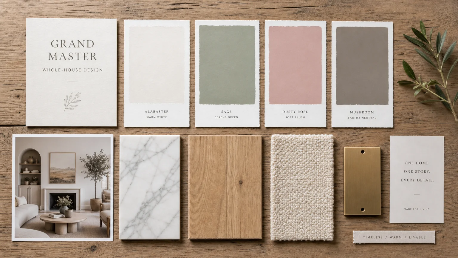
Instead of viewing each room in isolation, curate a whole-home color palette that flows organically from the entryway to the back bedrooms. Utilize the classic 60-30-10 rule to maintain visual balance: dedicate 60 percent of your home’s square footage to a dominant neutral like warm alabaster or earthy mushroom, allocate 30 percent to a secondary shade like serene sage green for cabinetry or accent walls, and reserve 10 percent for a high-impact, dark tone like deep forest green applied through textiles, trim, or smaller adjacent spaces like powder rooms. When you repeat these colors in varying proportions throughout the house—perhaps echoing a moody navy dining room with navy throw pillows in the adjacent living room—you establish a rhythmic, deliberate design. This thoughtful integration prevents your home from feeling like a disjointed series of trends and instead creates a unified, sophisticated environment that reflects your personal narrative.
Frequently Asked Questions
How do I choose between warm and cool classic paint colors?
Your decision should hinge directly on your home’s fixed elements and its natural light exposure. Look closely at your flooring, countertops, and large furniture pieces. If your home features warm wood floors and beige stone, warm tones like terracotta, alabaster, and mushroom will integrate seamlessly. Conversely, if you have cool gray veining in your marble or dark slate floors, classic French blue or charcoal gray will complement those existing finishes beautifully. Additionally, use warm colors to inject life into chilly, north-facing rooms, and employ cool tones to temper the intense heat of south-facing sunlight.
Can I mix multiple dark, timeless paint shades in an open floor plan?
Mixing dark shades requires deliberate spatial planning to avoid a heavy, visually cluttered environment. In an open floor plan, it is best to establish one primary dark anchoring color—such as moody navy—for a defining architectural feature, like a massive built-in bookcase or a sprawling kitchen island. If you want to introduce a second dark shade, like forest green, relegate it to a clearly defined adjacent zone, such as a walk-in pantry or a powder room tucked off the main space. Always use transitional neutrals to buffer these deep colors and maintain necessary visual breathing room.
Does lighting really change how sophisticated interiors appear?
Lighting fundamentally dictates color perception, making it the most critical factor in your design execution. The exact same paint formula will look entirely different under crisp daylight bulbs compared to warm, ambient incandescent lighting. Natural light also alters color rendering significantly; morning light skews cool and blue, while afternoon sunlight casts a warm, golden hue. To ensure your interior paint ideas translate beautifully from the hardware store to your walls, you must test generously sized paint samples in the specific room, observing them on different walls and at various times of the day.
For the latest color forecasts, consult industry leaders like Pantone and paint companies like Benjamin Moore. For professional design standards, refer to the American Society of Interior Designers (ASID).
Disclaimer: This article reflects design trend analysis and predictions. Personal taste and timeless design principles should always guide your decorating choices.