

Transforming a strictly utilitarian bathroom into a restorative sanctuary requires mastering the art of bathroom wall pairings, as vertical spaces dominate your visual field and set the room’s entire psychological tone. You can achieve genuine spa bathroom ideas by moving beyond singular flat paint colors and embracing dynamic, tactile combinations that mimic the natural world. Strategic material pairings—such as merging water-resistant textured woods with artisanal plasters—reduce harsh acoustics while visually lowering your heart rate. Interior design trends now heavily favor these sensory-rich environments over sterile clinical whites. By carefully layering relaxing bathroom colors alongside organic textures, you establish an immersive retreat that delivers daily rejuvenation and significantly elevates your home’s intrinsic value.
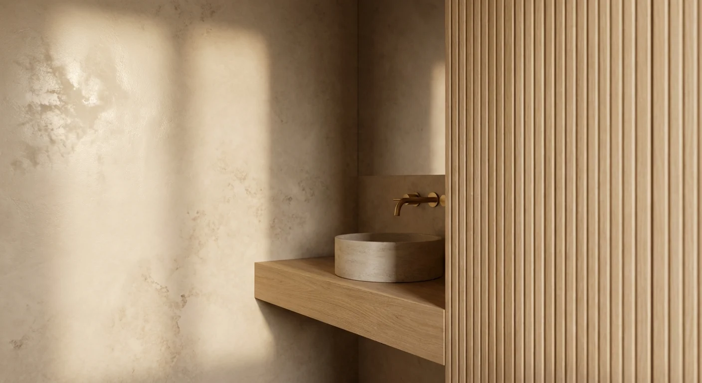
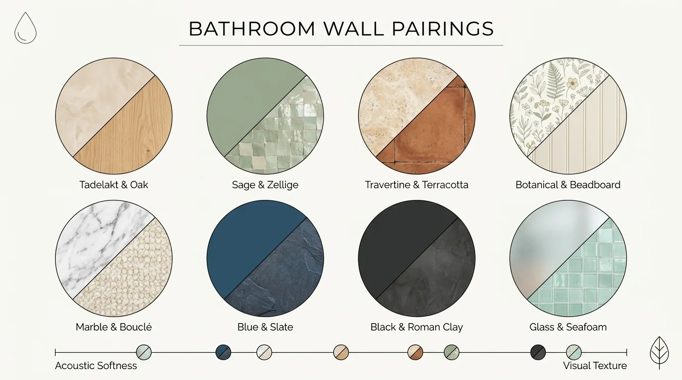
Trend #1: Tadelakt Plaster and Vertical Ribbed Oak Paneling
The movement toward “Organic Modernism” relies heavily on materials that feel grounded and historically rooted, which is precisely why tadelakt plaster paired with ribbed oak paneling reigns supreme in high-end design. Tadelakt—a waterproof, lime-based plaster originating from Moroccan architecture—cures into a smooth, stone-like finish that possesses a subtle, cloudy depth. When you apply this artisanal plaster to your shower enclosure and pair it with vertical ribbed oak paneling on the dry vanity walls, you create an environment that feels both earthy and architecturally significant.
This pairing works because it balances opposing sensory inputs. The plaster provides a cool, continuous surface that bounces soft, diffused light around the room; meanwhile, the natural wood introduces crucial visual warmth and acoustic dampening. Bathrooms inherently contain hard, reflective surfaces that cause sound to bounce aggressively, destroying any potential for relaxation. By integrating ribbed wood, the varying depths of the fluting scatter sound waves, dramatically reducing echoes. To execute this pairing successfully, keep your wood tones in the pale oak or light walnut family, and tint your plaster to a warm alabaster or soft bone shade. This low-contrast harmony ensures the textures remain the focal point rather than the color disparity.
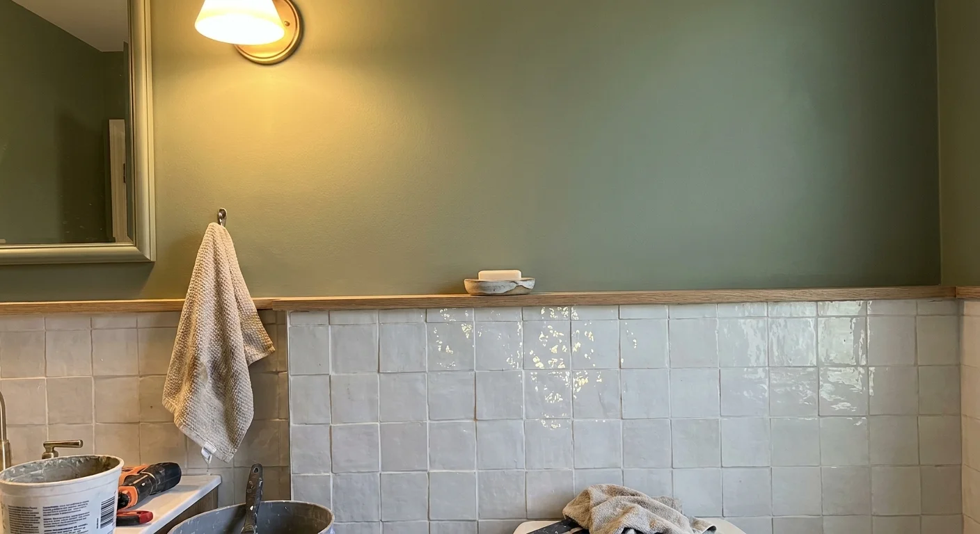
Trend #2: Sage Green Paint and Glossy White Zellige Tiles
Biophilic design dictates that humans possess an innate biological connection to nature, and incorporating nature-inspired elements indoors actively reduces cortisol levels. You can leverage this biological reality by pairing matte sage green paint with glossy white zellige tiles. Sage green ranks among the most relaxing bathroom colors because the human eye requires virtually no adjustment to perceive it on the retina, creating an immediate sense of visual rest. When establishing a bathroom accent wall, reserve the green paint for the upper two-thirds of the room and anchor the lower third with authentic zellige.
Zellige tiles are hand-molded clay tiles baked over olive branches, resulting in highly irregular surfaces and undulating glazes. When you stack these glossy tiles along your lower walls, they act as subtle mirrors. They catch and refract both natural daylight and ambient vanity lighting, preventing the matte green paint from absorbing too much illumination and making the room feel enclosed. This dynamic interplay between the light-absorbing matte paint and the light-reflecting artisanal tile generates an atmospheric glow reminiscent of a high-end wellness retreat. For the most cohesive look, use a tight grout line in a warm white to let the jagged edges of the zellige shine.
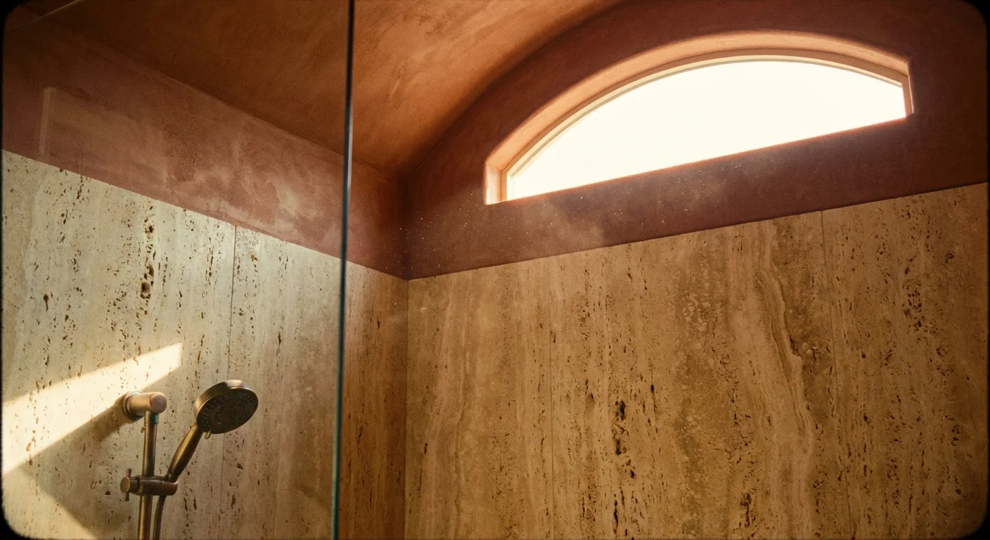
Trend #3: Large-Format Travertine and Warm Terracotta Limewash
The revival of Mediterranean influences in interior design brings a renewed appreciation for raw, porous stones. Large-format travertine slabs paired with warm terracotta limewash transport you instantly to a European thermal bath. Travertine offers a magnificent tactile beauty characterized by its natural pitting and distinct veining. By utilizing oversized slabs—such as 24-by-48-inch tiles—you drastically reduce grout lines, creating a seamless, monolithic appearance that expands the visual footprint of a small bathroom.
To offset the visual weight of the stone, apply a terracotta-tinted limewash to the opposing walls or the ceiling. Limewash paint penetrates the wall surface rather than sitting on top of it, curing to form a breathable, velvety finish that reveals subtle brushstrokes and organic movement. The iron-rich terracotta hues warm up the cooler, gray-beige undertones found in natural travertine. This specific pairing relies heavily on thermal mass aesthetics; the materials physically look like they hold heat, tricking the mind into feeling warmer and more relaxed before the bathwater even runs. Protect the travertine with a penetrating, matte sealer to ensure it withstands daily moisture without losing its raw, ancient appeal.
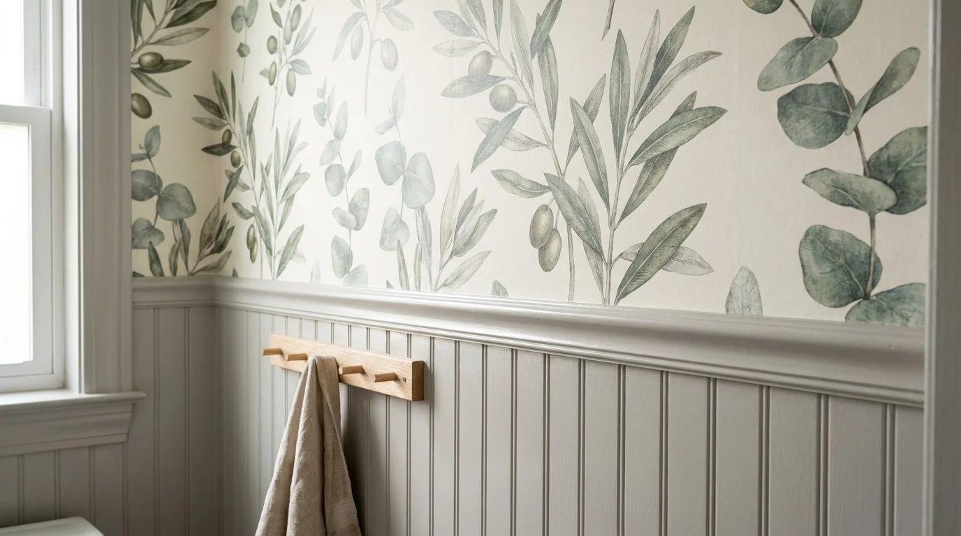
Trend #4: Botanical Wallpaper and Soft Gray Beadboard Wainscoting
If your aesthetic leans toward classic, transitional elegance, pairing an oversized botanical wallpaper with soft gray beadboard wainscoting provides a timeless route to a spa-like atmosphere. Wallpaper in a bathroom once terrified homeowners due to peeling risks, but modern vinyl-coated and non-woven wallpapers handle humidity exceptionally well when properly installed and ventilated. An oversized, muted botanical print introduces sweeping, organic lines that soften the rigid geometry of mirrors, countertops, and cabinetry.
Because botanical prints hold significant visual weight, running them from floor to ceiling often overwhelms the senses, creating chaos rather than tranquility. You solve this by installing traditional beadboard wainscoting on the lower portion of the wall, painted in a grounding, soft dove gray. The gray anchors the room and protects the lower walls from water splashes, while neutralizing the vibrant greens and blues typically found in botanical prints. For the most pleasing proportions, adhere to the architectural golden ratio: install the beadboard exactly one-third or two-thirds up the wall height, deliberately avoiding a halving of the room, which visually truncates the ceiling height.
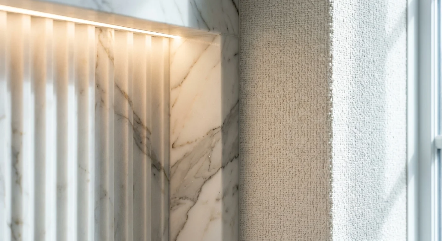
Trend #5: Fluted Marble Slabs and Creamy White Bouclé Vinyl
The concept of “quiet luxury” focuses on exceptional materials, meticulous craftsmanship, and understated restraint. To capture this upscale essence, pair precision-cut fluted marble slabs with commercial-grade bouclé-textured vinyl wallcoverings. Fluting entails carving deep, vertical grooves into solid stone. When applied to the wall anchoring your freestanding soaking tub, fluted marble draws the eye upward, accentuating the verticality of the room and establishing a monumental, architectural focal point.
However, an entirely marble-clad room quickly reads as a chilly, echoing cavern rather than a cozy spa. You mitigate this coldness by covering the remaining dry walls in a creamy white vinyl wallcovering designed to mimic the nubby, looped texture of bouclé fabric. High-end commercial wallcoverings now offer completely waterproof, scrubbable surfaces that perfectly replicate the tactile warmth of textiles. The juxtaposition of the cold, rigid, carved stone against the soft, yielding appearance of the faux textile yields an incredibly sophisticated tension. This tactile diversity forces you to engage with the room through touch as well as sight, deepening the immersive experience.
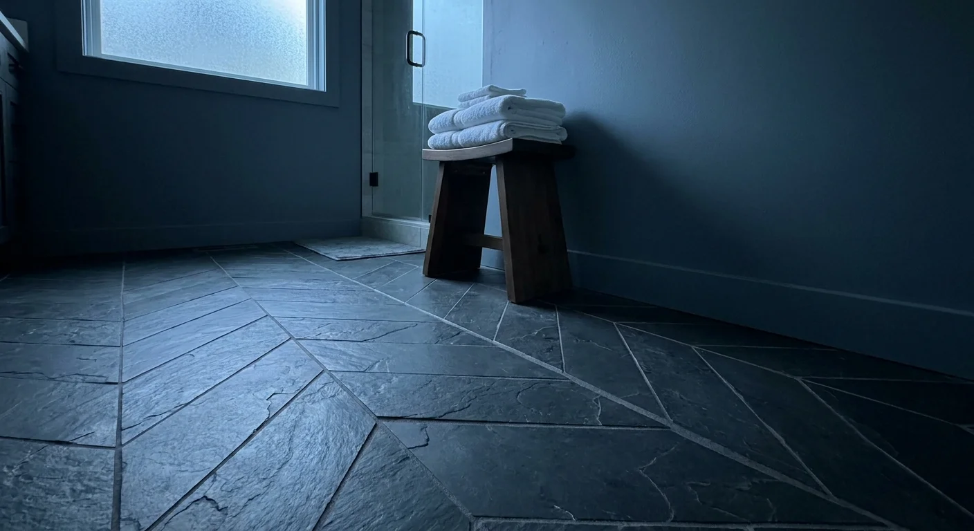
Trend #6: Muted Blue Paint and Charcoal Slate Chevron Tiles
Water-inspired palettes remain a staple in bathroom design, but contemporary spa bathroom ideas pivot away from bright aquas in favor of moody, muted slate blues. Pairing a desaturated, foggy blue paint with deep charcoal slate tiles laid in a chevron pattern creates a profoundly relaxing, subterranean atmosphere. This combination excels in bathrooms lacking abundant natural light, as it leans into the shadows to create a cocooning effect rather than fighting a losing battle to make a dark room feel bright.
Slate provides unparalleled slip resistance and durability, making it an excellent material to run continuously from the floor straight up the lower half of the shower walls. Installing the rectangular slate tiles in a sharp chevron pattern introduces forward momentum and kinetic energy, preventing the dark colors from feeling stagnant. Above the tile line, applying a muted blue paint—specifically one with a Light Reflectance Value (LRV) between 20 and 30—absorbs harsh artificial light and casts a flattering, diffused shadow. This deeply saturated pairing mimics the tranquil, hushed environment of a luxury steam room, encouraging deep, restorative breathing.
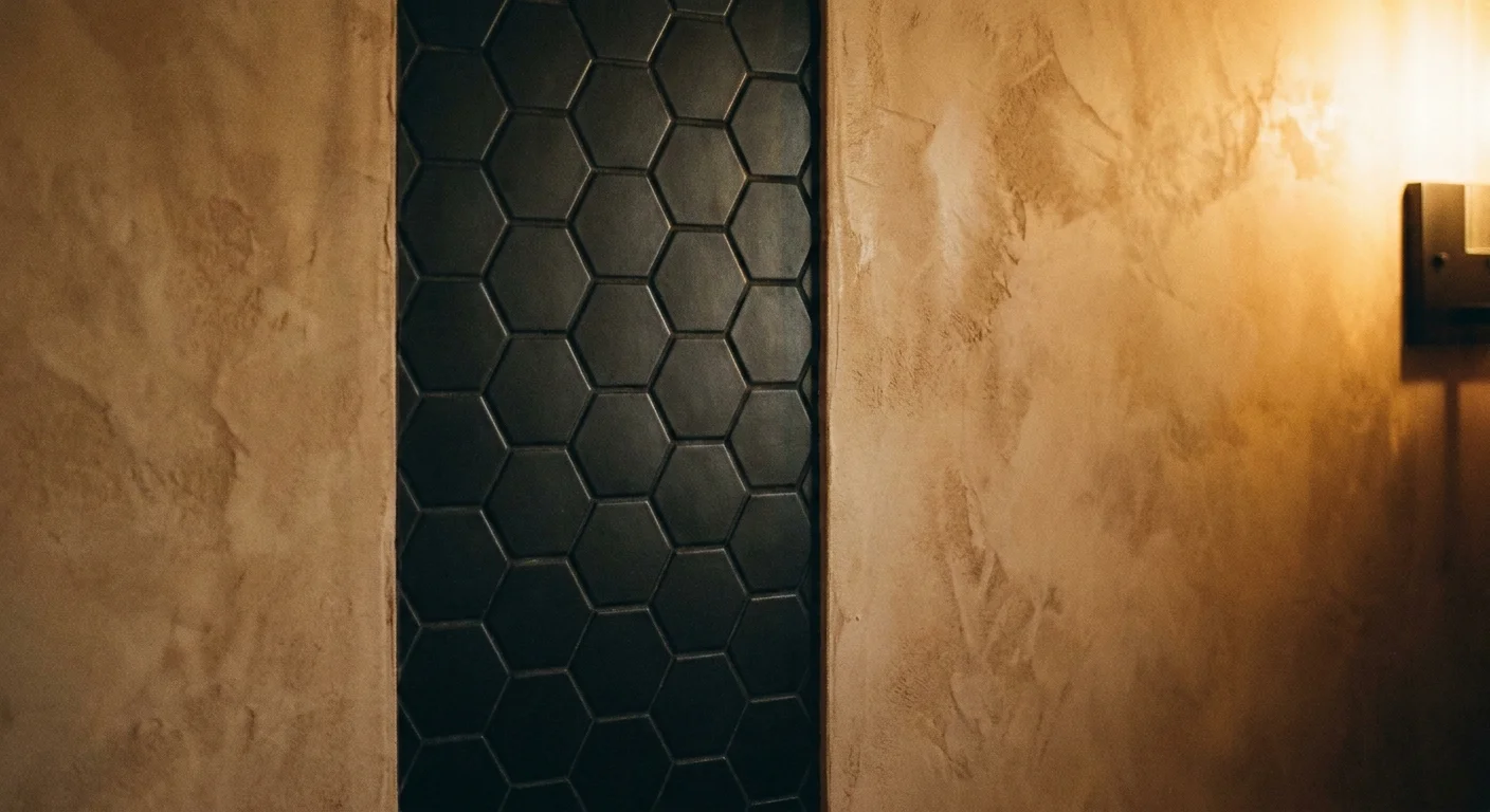
Trend #7: Matte Black Accent Tiles and Warm Beige Roman Clay
While spas frequently utilize light, airy palettes, modern sensory deprivation spas lean heavily into high-contrast serenity. You can replicate this cutting-edge aesthetic by combining striking matte black accent tiles with the rustic softness of warm beige Roman clay. Roman clay is a thicker, gypsum-based material applied with a putty knife, resulting in a smooth, mottled finish that resembles perfectly worn leather or honed suede. It lacks the shiny, mottled variance of Venetian plaster, providing a quieter, more understated background.
Use the matte black tiles strategically—perhaps lining the interior of a walk-in shower or defining a prominent vanity wall. Black absorbs light completely, creating a sense of infinite depth that visually pushes the walls backward. By framing this dark, modern tile with the earthy, hand-troweled texture of beige Roman clay, you prevent the black from feeling aggressive or industrial. The clay introduces human imperfection and warmth, serving as the perfect transitional material between the sleek plumbing fixtures and the architecture of your home. Incorporate warm, dimmable LED backlighting behind the mirrors to highlight the putty knife marks in the clay, enriching the texture.
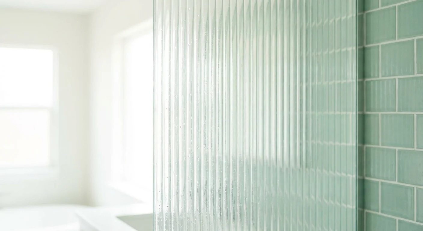
Trend #8: Ribbed Glass Partitions and Seafoam Green Subway Tile
Sometimes, creating a wall pairing involves light filtration as much as it involves solid materials. Integrating structural ribbed glass partitions alongside vertically stacked seafoam green subway tile crafts a luminous, retro-inspired spa aesthetic. Traditional clear glass shower enclosures often leave the space feeling exposed, while solid walls block essential light. Ribbed or fluted glass solves this dilemma by allowing light to pass through while obscuring shapes, offering a comforting sense of privacy crucial for a relaxing bathing experience.
Pair this textural glass with elongated subway tiles painted in a watery seafoam green, but install them in a vertical straight-stack pattern rather than a traditional brick lay. The vertical orientation of the grout lines perfectly echoes the vertical striations in the ribbed glass, establishing a rigorous, satisfying geometric harmony throughout the room. Seafoam green acts as a cooling agent, psychologically reducing stress. When sunlight filters through the ribbed glass and strikes the glossy green tile, it casts rippling, aquatic shadows across the floor, essentially turning your bathroom architecture into a dynamic, soothing light installation.
The Big Picture: Weaving These Trends into Your Home
Adopting these bathroom wall colors and material pairings requires a holistic approach to your interior architecture. The fundamental secret to a high-end spa aesthetic lies in restraint and proportion. When mixing two distinct wall materials, strictly avoid splitting the room precisely in half. Employ the 60/30/10 rule: let one wall treatment dominate 60 percent of the vertical space, allocate 30 percent to your secondary material, and reserve the final 10 percent for accents like metallic hardware, mirrors, and lighting fixtures.
Lighting remains the great multiplier of texture. If you invest in artisanal plasters, limewash, or fluted stone, standard overhead recessed lighting will flatten these surfaces and hide their beauty. You must incorporate grazing light—such as wall sconces positioned close to the wall or LED strips hidden in ceiling coves—to wash light down the vertical surfaces. This lighting technique highlights the peaks and shadows of your tactile materials, amplifying the organic, spa-like ambiance.
Finally, ensure your metal finishes bridge the gap between your chosen wall materials. If you pair a cool-toned slate with a moody blue paint, warm up the room with unlacquered brass or brushed bronze fixtures. If your walls feature warm terracotta and travertine, polished nickel or matte black hardware will provide the necessary visual snap to keep the room feeling crisp and modern. By balancing texture, proportion, and light, you guarantee your bathroom functions not merely as a washroom, but as a dedicated domestic retreat.
Frequently Asked Questions
How do I mix these wall pairings in a small bathroom without overwhelming the space?
In a compact bathroom, rely on monochromatic material pairings rather than high-contrast colors. For example, pair white zellige tiles with a soft cream limewash. You still gain all the textural benefits and light-play necessary for a spa environment, but the lack of harsh color breaks prevents the room from feeling chopped up. Additionally, use large-format tiles to minimize grout lines, which reduces visual clutter and makes the walls appear expansive.
Are plaster finishes like Tadelakt and Roman Clay truly durable in wet environments?
Tadelakt is inherently waterproof; artisans have used it in Moroccan hammams for centuries, making it perfectly suitable for shower interiors when applied and sealed correctly by a professional. Roman clay and standard limewash, however, are not naturally waterproof. You must restrict these finishes to dry zones—like vanity walls or the upper halves of the room—and always apply a high-quality, clear topcoat to protect them from ambient humidity and stray splashes.
What is the most effective way to transition between two different wall materials?
The transition point requires deliberate design intent. If you are merging a thick material like stone with a thin material like wallpaper, cap the stone with a matching bullnose tile, a sleek metal Schluter strip, or a milled wood chair rail. This architectural cap provides a clean visual stopping point and prevents dust from settling on the raw edge of the tile. For flush materials, such as paint meeting tile, a crisp, color-matched grout line or a minimalist metal edging ensures a modern, tailored finish.
For the latest color forecasts, consult industry leaders like Pantone and paint companies like Benjamin Moore. For professional design standards, refer to the American Society of Interior Designers (ASID).
Disclaimer: This article reflects design trend analysis and predictions. Personal taste and timeless design principles should always guide your decorating choices.
