
The Big Picture: Weaving These Trends into Your Home
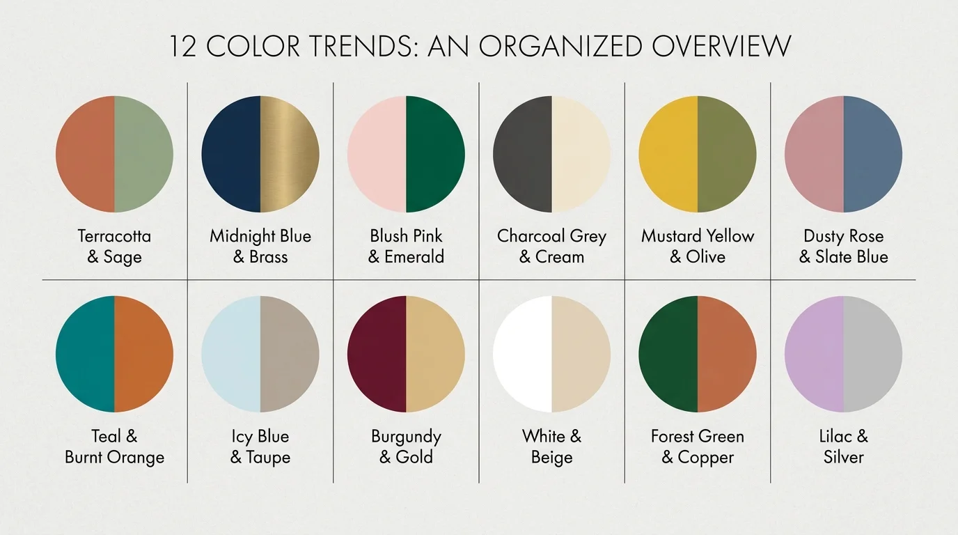
Understanding these sophisticated color palettes is only the first step; applying them cohesively requires restraint and strategic planning. Interior designers frequently employ the 60-30-10 rule to ensure a room feels balanced rather than chaotic. Allocate 60 percent of the room to your dominant color—typically applied to walls, ceilings, and large foundational furniture pieces.
Dedicate 30 percent to your secondary hue, utilizing it for drapery, accent chairs, or large area rugs. The final 10 percent should consist of your high-impact accent color, delivered through throw pillows, artwork, ceramics, and lighting fixtures. This mathematical approach guarantees visual harmony, even when working with daring color combinations.
Furthermore, natural light serves as the ultimate dictator of how color behaves within your living room. A muted celadon that looks ethereal in a bright, south-facing room may appear muddy and depressing in a north-facing space heavily shadowed by trees.
Always test your desired paints by applying large swatches to different walls and observing how the undertones shift from the cool morning light to the warm glow of sunset. Ultimately, while interior designer color obsessions provide excellent directional inspiration, your personal connection to a palette must take precedence. A truly luxurious home reflects the provenance and unique narrative of the people living inside it.
Frequently Asked Questions
How do I test modern living room palette ideas before fully committing?
The most effective method for testing colors without ruining your current walls is to paint large, rigid foam boards with your selected hues. Move these boards around the room over the course of several days. Lean them against windows, place them in dark corners, and view them under your artificial evening lighting. Alternatively, many high-end paint manufacturers now offer large-scale, peel-and-stick fabric swatches that accurately represent the final finish and can be easily repositioned without damaging drywall.
Do dark living room color combinations trending right now work in small spaces?
Yes, dark colors can completely transform small living rooms when applied correctly. Employing a technique known as color drenching—where you paint the walls, trim, doors, and ceiling in the same dark hue, such as midnight blue or charcoal grey—eliminates visual boundaries. Without contrasting white trim to outline the exact dimensions of the room, the corners recede into shadow, creating an optical illusion that makes the space feel surprisingly expansive and infinitely cozier.
How can I blend these interior designer color obsessions with my existing furniture?
You do not need to replace your entire furniture collection to update your living room’s palette. Utilize bridging elements to connect your older pieces to the new colors. Large area rugs, patterned throw pillows, and expansive artwork serve as excellent unifiers. If you are introducing a terracotta and sage green palette, find a vintage rug that incorporates both those new hues alongside the color of your existing sofa. This creates a deliberate, collected aesthetic that feels organically layered.
For the latest color forecasts, consult industry leaders like Pantone and paint companies like Benjamin Moore. For professional design standards, refer to the American Society of Interior Designers (ASID).
Disclaimer: This article reflects design trend analysis and predictions. Personal taste and timeless design principles should always guide your decorating choices.