The fastest way to transform chaotic environments into calming spaces is through the strategic application of restorative paint colors. Finding the perfect restorative shade requires moving beyond basic whites and exploring complex, nature-inspired hues that interact beautifully with shifting natural light. Today’s sophisticated home decor relies on a nuanced palette—think muddy sages, muted terracottas, and atmospheric blues—that actively fosters domestic tranquility. As interior trends shift toward wellness-centric home design, professionals prioritize colors with subtle gray undertones that provide architectural depth. You can establish a profound sense of serenity by embracing these nine specific, designer-approved colors formulated to bring enduring peace to your most frequented rooms.

Trend #1: Warm Plaster Pink
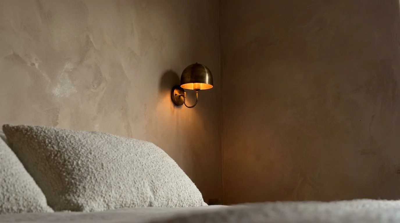
Embrace the shift toward organic modernism with warm plaster pink, a color that fundamentally redefines how light behaves in your living spaces. Unlike the saccharine pastels of previous decades, this mature iteration features heavy beige and brown undertones, creating a grounded, earthy atmosphere. Designers frequently utilize these desaturated pinks in north-facing rooms because the underlying warmth counteracts the chilly blue daylight typical of those exposures. You can pair this shade with raw travertine, unlacquered brass, and heavily textured bouclé fabrics to achieve a deeply tactile environment. Incorporate warm, low-Kelvin LED lighting to wash the walls in a soft, flattering amber hue as the evening progresses. Avoid harsh, cool-toned bulbs that can instantly wash out the delicate beige undertones. The popularity of this hue stems from our collective desire for spaces that feel inherently nurturing rather than sterile. By enveloping a bedroom or a formal dining room in a muted plaster pink, you instantly soften hard architectural lines and cultivate an inviting, restorative glow. Paint finishes matter immensely here; select a matte or flat finish to mimic the chalky, light-absorbing qualities of historic European lime washes.

Trend #2: Muddy Sage Green
Muddy sage green stands at the forefront of biophilic design, offering a direct visual tether to the natural world just outside your window. This sophisticated hue succeeds because of its heavy gray influence, which mutes the vibrancy of the green and transforms it into a highly versatile neutral. Environmental psychologists consistently note that green wavelengths require less effort for the human eye to perceive, actively reducing eye strain and mental fatigue. You will find this color exceptionally effective in home offices or expansive living rooms where sustained focus and relaxation must coexist. As modern technology dominates our daily routines, bringing the outside in has never been more vital. Elevate this sage green by layering your space with massive, statement-making indoor botanicals like an ancient olive tree or a sprawling weeping fig. To maximize the calming effect, complement sage walls with natural white oak flooring, honed marble countertops, and rich walnut accents. The high-contrast interplay between the muted walls and warm wood tones delivers a refined, grounded aesthetic. When you select a muddy sage, test the swatch against your baseboards; the right shade should look almost gray in the evening shadows while revealing its verdant heart in the morning sun.

Trend #3: Atmospheric Slate Blue
Moving away from the high-energy navy blues of the past, designers now favor atmospheric slate blue to cultivate spaces rooted in quiet luxury. This complex color straddles the boundary between storm clouds and the deep ocean, utilizing a heavy charcoal base to ground the coolness of the blue. Slate blue inherently recedes from the eye, making cramped spaces feel expansive and boundless. You can utilize this shade to visually drop the ceiling in a soaring, echoey room, thereby creating a more intimate and cocoon-like atmosphere. When utilizing slate blue in a primary bedroom, extend the color up onto the ceiling. This overhead application mimics the twilight sky, directly signaling to your brain that it is time to wind down. The serenity of slate blue pairs flawlessly with warm metallic accents, particularly burnished bronze and aged copper, which provide a necessary visual spark against the moody backdrop. High-end interior trends rely on this color for spa-inspired bathrooms due to its clear association with rest and rejuvenation. Apply this color across all trim, doors, and walls to practice color drenching, a technique that eliminates jarring visual breaks and significantly enhances the calming properties of the room.

Trend #4: Earthy Terracotta
Earthy terracotta introduces profound textural warmth without overwhelming your senses, proving that calming colors do not have to be strictly cool-toned. Rooted in the rich clay soils of the Mediterranean, this baked-earth hue provides an immediate sense of provenance and artisanal craftsmanship to otherwise generic spaces. Modern variations of terracotta lean heavily into dusty rust and burnt umber, deliberately avoiding any harsh orange saturation. You can dramatically improve the ambiance of a dimly lit dining room by enveloping it in this shade; the walls will seemingly radiate their own internal heat. Terracotta walls look particularly striking against wide-plank European oak floors or even poured concrete, which juxtaposes the rustic warmth of the walls with a sleek, industrial edge. Designers frequently combine terracotta with natural linen upholstery, woven rattan lighting fixtures, and deeply veined soapstone to emphasize an unpretentious aesthetic. The psychological comfort of this color lies in its deep connection to ancient, natural building materials. If you feel hesitant about painting an entire room, try introducing terracotta on a library ceiling or inside architectural alcoves to foster a subtle, welcoming energy.

Trend #5: Mushroom Greige
Mushroom greige serves as the ultimate transitional neutral, bridging the gap between stark minimalism and cozy traditionalism. Unlike the cool, clinical grays that dominated early home decor cycles, this updated shade incorporates substantial taupe and beige undertones. These warm additions prevent the color from feeling institutional, ensuring your home remains a sanctuary rather than a cold showcase. Greige actively absorbs surrounding colors, meaning it beautifully reflects the greenery from your garden or the warmth of your hardwood flooring. Because greige contains such a complex mix of pigments, it shifts dramatically throughout the day. You will notice it appearing cooler and more stone-like in the brisk morning air, only to warm into a rich, enveloping taupe as the afternoon sun streams through your windows. You can leverage this chameleon-like quality in open-concept floor plans where the paint must transition seamlessly across different lighting zones. Pair mushroom greige walls with tonal upholstery, layered jute rugs, and striking black iron hardware to anchor the softness of the palette. Industry experts champion this color because it provides the quietest possible background for your daily life.

Trend #6: Faded Ochre
Capture the essence of sun-drenched minimalism by introducing faded ochre into your interior palette. This highly desaturated, golden-mustard hue brings the optimistic warmth of sunlight into your home without the jarring intensity of a traditional yellow. Faded ochre works magnificently in morning rooms, breakfast nooks, and transitional hallways, offering a gentle, energizing lift that feels entirely natural. Faded ochre highlights architectural nuances brilliantly; if your home features traditional wainscoting, picture molding, or exposed ceiling beams, applying this golden shade allows those structural elements to cast deep, fascinating shadows. The secret to styling this specific shade lies in maintaining a strict, earthy material palette. You should pair ochre walls with matte ceramics, bleached ash wood, and textural cotton throws to prevent the aesthetic from shifting into a retro pastiche. The trend toward warmer, heavily pigmented neutrals reflects a broader cultural movement toward spaces that feel genuinely lived-in and historically grounded. Because ochre contains complex brown undertones, it responds beautifully to the dimming light of the evening, transforming into a rich, wrapping embrace by nightfall.

Trend #7: Deep Aubergine
Deep aubergine proves that dark, saturated colors possess an incredible capacity to soothe the nervous system. This blackened purple-brown represents the pinnacle of cocooning elegance, offering a moody alternative to standard charcoal or black. Aubergine absorbs almost all available light, which blurs the physical boundaries of a room and creates a deeply introspective environment. You will find this rich hue particularly transformative in media rooms, libraries, or small powder rooms that lack natural daylight. Instead of fighting the darkness of a windowless space, aubergine leans into the shadow, turning an architectural flaw into a dramatic feature. Complement your aubergine walls with rich, tactile fabrics like heavy silk drapery, mohair upholstery, and thick wool rugs. These opulent textures absorb light similarly to the matte paint, doubling down on the room’s luxurious, sound-dampening qualities. To balance the visual weight of the paint, incorporate reflective surfaces like antiqued mirrors, polished nickel plumbing fixtures, and glossy ceramic tiles. When applied in an eggshell finish, the subtle sheen highlights the red undertones, infusing the space with undeniable warmth.

Trend #8: Chalky Mineral White
Step away from stark, optic whites and embrace the tactile simplicity of a chalky mineral white. True, brilliant whites often bounce light aggressively, creating a clinical glare that strains the eyes and heightens anxiety. Conversely, mineral whites feature subtle infusions of limestone, alabaster, and raw cotton, giving the paint a soft, almost porous visual texture. Unlike standard builder-grade white, which relies on synthetic blue brighteners, chalky mineral whites derive their luminosity from natural earth pigments. You can use this highly nuanced shade to unify disparate architectural elements in older homes or to soften the severe angles of contemporary new builds. Designers consider this the foundational color for quiet luxury interiors, where the focus remains strictly on high-quality materials rather than loud visual statements. Pair mineral white walls with dramatically veined Calacatta marble, brushed oak cabinetry, and raw, unsealed brass hardware that will develop a living patina over time. To fully capture the calming magic of this shade, specify a low-sheen or matte finish; the lack of reflection emphasizes the color’s inherent softness and mimics raw architectural materials.

Trend #9: Smoky Sea Glass
Smoky sea glass perfectly captures the restorative essence of coastal restraint, stripping away the literal nautical clichés in favor of subtle, atmospheric color. This complex hue balances equal parts pale blue, muted green, and soft gray, mimicking the fog rolling off a cold ocean. Because it naturally lowers the perceived temperature of a room, smoky sea glass operates as the ultimate antidote to a hot, chaotic, and stressful world. You can employ this shade to spectacular effect in south-facing rooms that receive intense, direct sunlight throughout the day; the cool undertones will temper the heat and glare beautifully. Instead of defaulting to a bright white trim, try painting your baseboards and casings a color just two shades darker than the smoky sea glass walls. This subtle, tone-on-tone approach elevates the architectural sophistication of the room while maintaining an unbroken, peaceful visual flow. To enhance the serene, watery nature of the paint, layer your space with crisp percale linens, light-washed woods, and subtle woven textures like seagrass or sisal. Depending on the time of day, your walls will seamlessly morph between a sophisticated gray and a pale, watery blue.

The Big Picture: Weaving These Trends into Your Home
Successfully integrating these designer-approved paint colors requires more than just purchasing a gallon of paint; it demands a strategic approach to your home’s unique lighting and architecture. To weave these calming hues seamlessly into your environment, you must first evaluate the natural light mapping within your space. Colors like deep aubergine and slate blue thrive in naturally darker rooms where you want to emphasize a cozy, enveloping atmosphere, whereas chalky mineral white and mushroom greige require adequate natural light to prevent them from looking entirely flat.
Instead of rigidly confining yourself to one trend, consider developing a cohesive whole-house palette. You can effortlessly transition from a muddy sage green living room into an earthy terracotta dining space by ensuring both colors share the same desaturated, gray-brown undertones. This shared underlying warmth acts as a visual thread, tying different rooms together without resorting to monotonous uniformity.
Furthermore, the paint finish you choose dictates the final emotional impact of the color just as much as the hue itself. High-gloss finishes reflect light sharply and increase visual energy, which directly counteracts the calming properties of these specific interior trends. Stick to flat, matte, or eggshell finishes for your walls to absorb light gently and enhance the tactile, velvet-like quality of the pigment. Ultimately, the most successful home design choices reflect your personal emotional responses. Test large swatches on multiple walls, observe how they interact with your existing furniture, and allow your instinct to guide you toward the shade that genuinely lowers your shoulders and deepens your breath.
Frequently Asked Questions
How do I mix these calming paint colors without creating a disjointed aesthetic?
The secret to mixing sophisticated paint colors lies in maintaining a consistent value and saturation level across your palette. If you choose a muted, highly desaturated muddy sage for your living room, you cannot successfully pair it with a bright, highly saturated primary blue in the adjacent hallway. Keep all your chosen hues slightly muted with gray and brown undertones. You can also create physical transitions using neutral spaces—like a mushroom greige corridor—to cleanse the visual palate between a terracotta dining room and an atmospheric slate blue study.
Do these subdued, nature-inspired colors have true longevity, or are they a passing interior trend?
Nature-inspired, complex hues possess immense staying power because they are rooted in human psychology rather than fleeting pop-culture aesthetics. Unlike neon brights or sterile grays, colors drawn from organic elements—like plaster, stone, and foliage—tap into our innate biophilic needs. By prioritizing shades that lower visual fatigue and create genuine comfort, you ensure your home decor will remain timelessly elegant. These nuanced colors have been utilized in historic architecture for centuries; they are simply experiencing a well-deserved modern renaissance.
Can I use dark colors like deep aubergine in small spaces without making the room feel claustrophobic?
Absolutely. In fact, applying dark, saturated colors to small, poorly lit rooms is a favored technique among high-end designers. When you paint a small space in a deep hue, the corners of the room visually recede and blur into shadow, creating an illusion of infinite depth. To maximize this elegant effect, you should employ the color drenching technique by painting your walls, baseboards, doors, and crown molding the exact same dark shade. This eliminates contrasting lines that chop up the space, resulting in a seamless, incredibly calming jewel box.
For the latest color forecasts, consult industry leaders like Pantone and paint companies like Benjamin Moore. For professional design standards, refer to the American Society of Interior Designers (ASID).
Disclaimer: This article reflects design trend analysis and predictions. Personal taste and timeless design principles should always guide your decorating choices.
