
Transform your bland rooms into captivating spaces by embracing bold wall colors that elevate your entire interior design scheme. While neutral palettes offer safety, saturated hues inject life, provenance, and distinctive character into your home. Paint colors serve as the foundational architecture of a room’s atmosphere, dictating how light bounces across your flooring and how your home decor resonates within the space. You do not need to fear vibrant or deep tones when you understand how to balance them with the right textures and furnishings. Discover twelve daring shades that effortlessly bridge the gap between high-end editorial aesthetics and livable comfort, giving you the actionable decorating ideas necessary to execute a flawless color transformation.
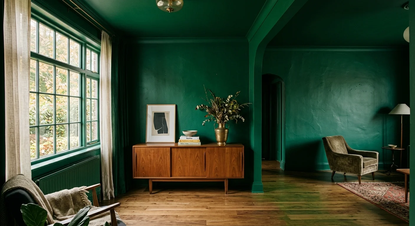
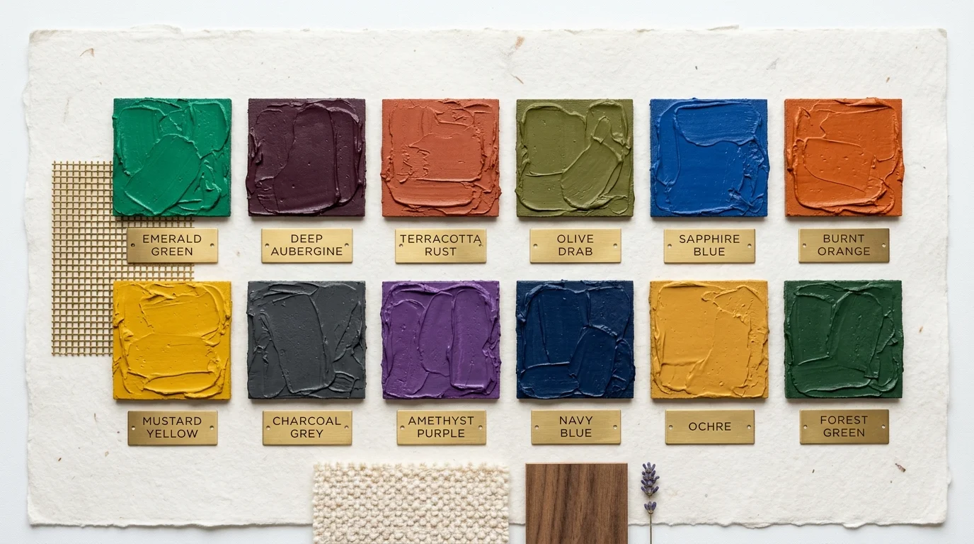
Trend #1: Saturated Emerald Green
Emerald green dominates the biophilic design movement by bringing the restorative energy of the outdoors directly into your home. This rich, jewel-toned hue offers a sophisticated departure from safe sage greens, demanding attention while maintaining an undeniable elegance. You can anchor a sprawling living room by wrapping all four walls—and the ceiling—in a high-quality, matte emerald finish. This immersive technique, widely celebrated as color drenching, eliminates harsh visual boundaries and makes the ceiling appear infinitely higher. To maximize the impact of emerald green, pair it with highly tactile materials like mohair upholstery, unlacquered brass hardware, and heavily veined marble fireplaces. Industry data from recent international design exhibitions highlights a forty percent increase in the use of saturated greens within high-end residential projects, proving its impressive staying power. The color thrives alongside medium-toned walnut flooring, which grounds the vibrant walls and reinforces the organic aesthetic. Embrace this daring shade when you want a space that feels both unabashedly opulent and intimately connected to the natural world.
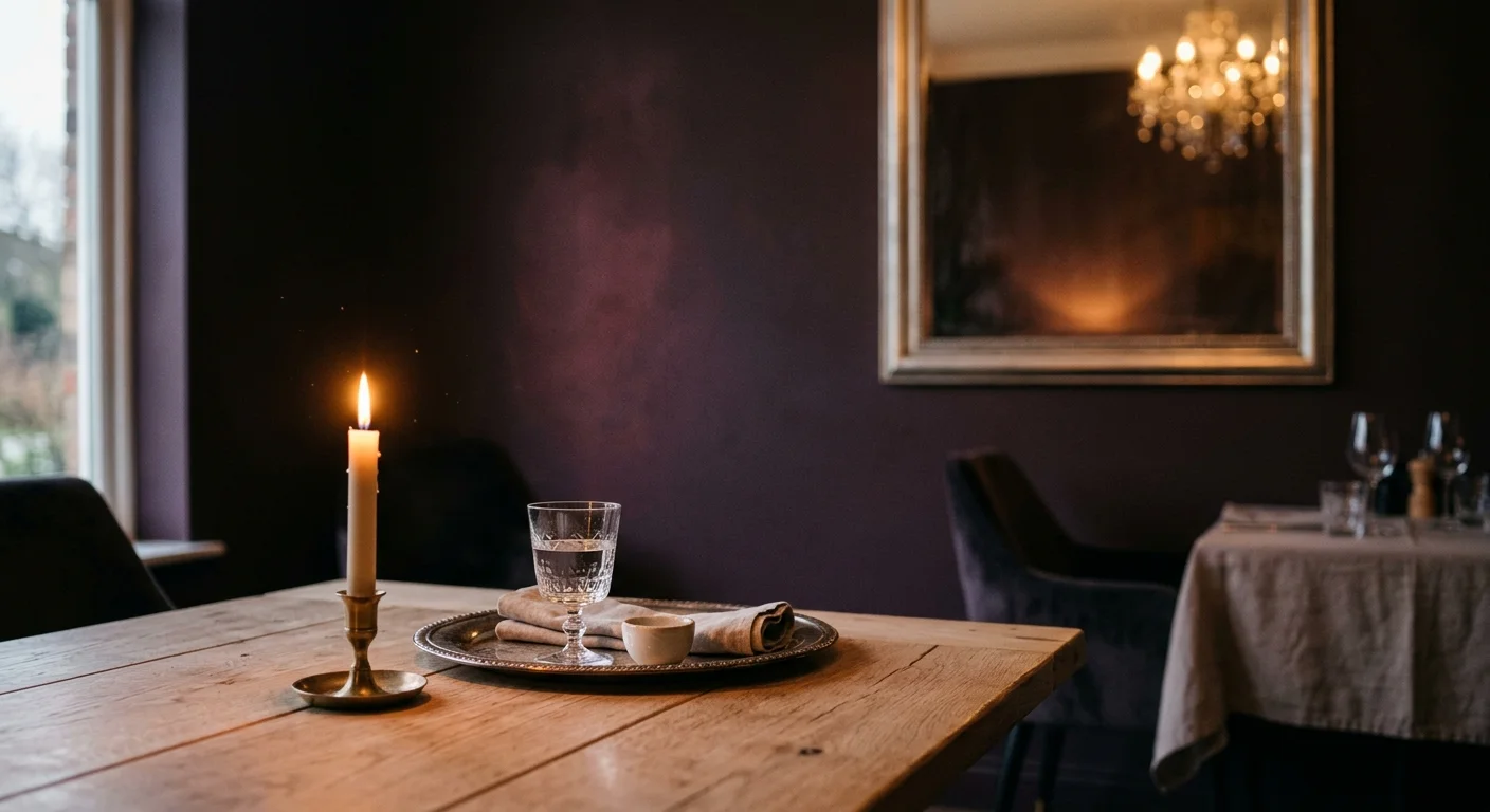
Trend #2: Deep Aubergine
Deep aubergine serves as the ultimate expression of quiet luxury in contemporary interior design. Moving beyond the starkness of pure black or the ubiquity of navy, this complex, purple-brown shade introduces unparalleled architectural depth to your dining rooms and intimate study areas. Aubergine shifts dramatically throughout the day; it appears almost charcoal in the crisp morning light but reveals its rich, warm undertones under the soft glow of evening chandeliers. You should utilize this color to create a moody, enveloping atmosphere that encourages lingering conversations over dinner. Concrete examples of this trend in action include pairing aubergine walls with pale, wide-plank European oak flooring to create a striking, high-contrast environment. Introduce reflective surfaces—such as antiqued wall mirrors or polished silver serving pieces—to bounce ambient light around the room and prevent the dark hue from feeling oppressive. When you commit to deep aubergine, you instantly elevate the perceived provenance and historical integrity of your home decor.
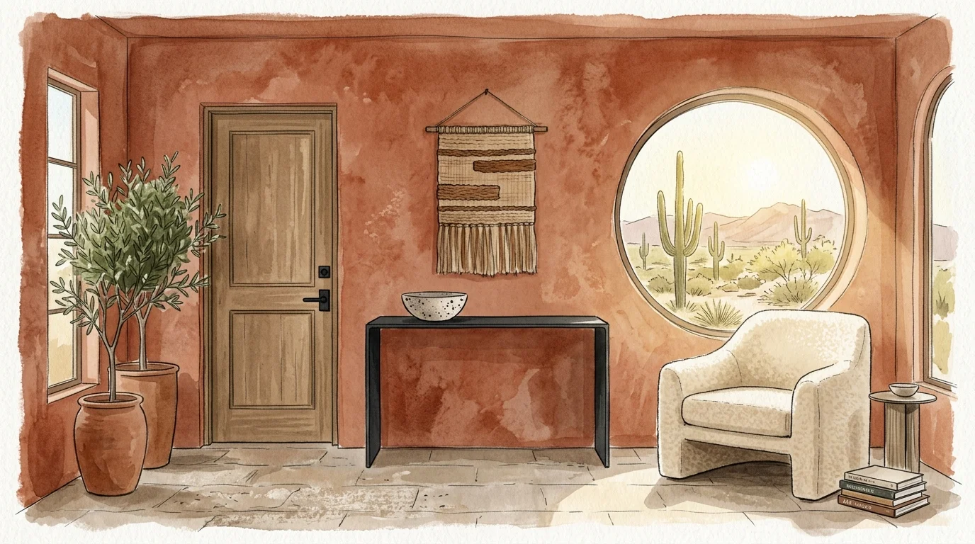
Trend #3: Terracotta Rust
Terracotta rust bridges the gap between organic modernism and vibrant home decor, offering a baked-earth warmth that instantly humanizes stark architectural lines. This dynamic color pulls inspiration directly from ancient Mediterranean ceramics and sun-baked desert landscapes, providing a grounded, highly tactile aesthetic. You will find that terracotta works exceptionally well in transitional spaces like grand entryways, long hallways, or sunrooms where abundant natural light can activate its fiery undertones. To execute this bold choice flawlessly, apply a lime wash or Roman clay finish rather than standard flat interior paint. These specialized treatments add a mottled, suede-like texture to your walls, mimicking the historical depth of old-world masonry. Terracotta pairs beautifully with creamy bouclé fabrics, matte black ironwork, and lush, oversized indoor foliage. Recent industry surveys indicate that modern homeowners are increasingly seeking environments that promote psychological comfort; terracotta answers this call by transforming sterile, white-box rooms into inviting, soul-nourishing sanctuaries.
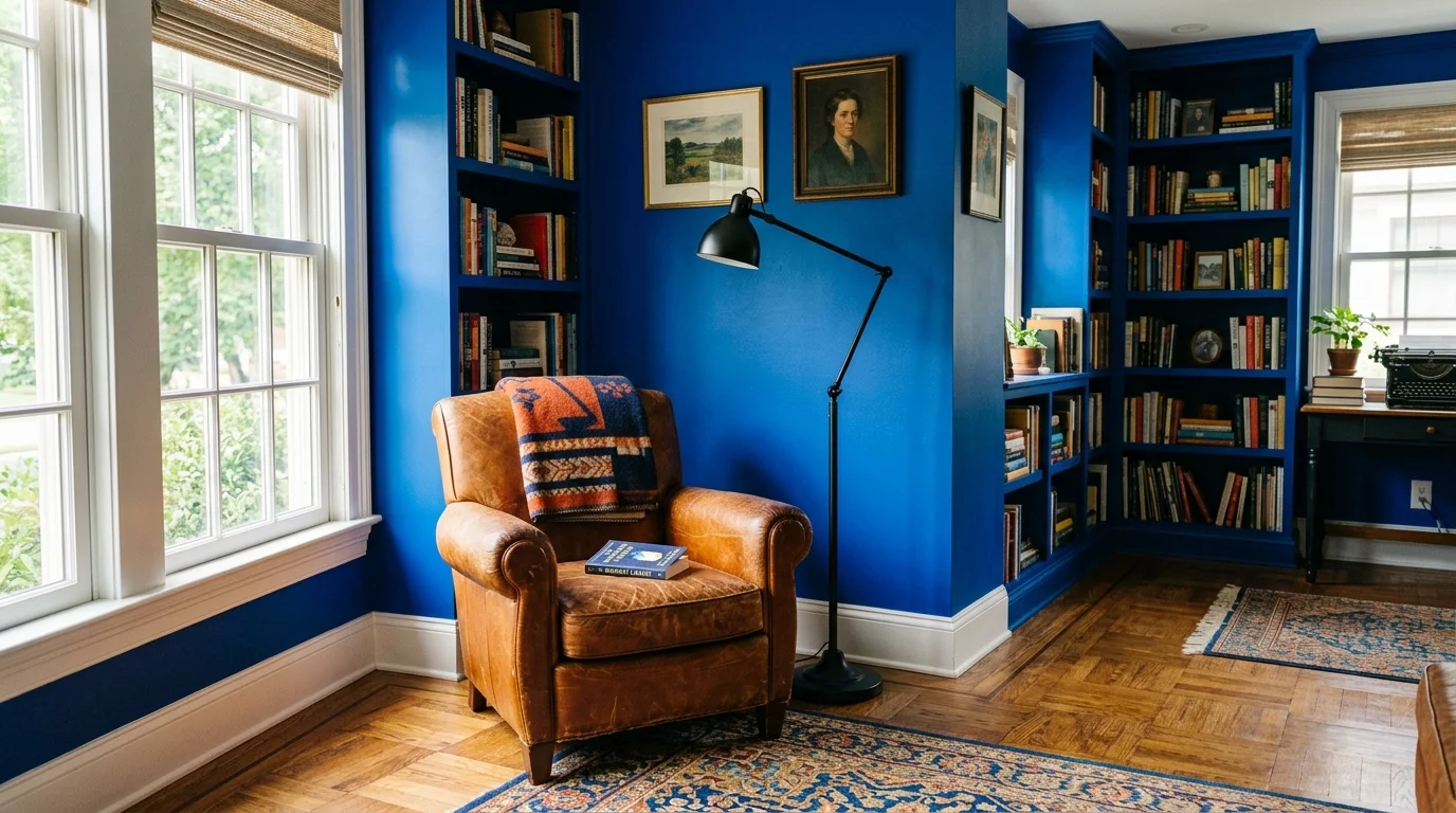
Trend #4: Cobalt Blue
Cobalt blue injects a jolt of high-frequency energy into any interior space, serving as a fearless antidote to muted, overly safe color palettes. This electric shade possesses a brilliant clarity that draws the eye immediately and makes your architectural features pop with unprecedented intensity. While some cautious decorators reserve bold blues for small powder rooms, you can make a monumental impact by utilizing cobalt in a central living space or a heavily trafficked kitchen. Imagine vibrant cobalt cabinetry contrasting sharply against pristine white quartz countertops and warm terracotta floor tiles. The secret to making cobalt blue work lies in careful restraint regarding your secondary colors; you must allow the vivid blue to stand as the undisputed hero of the room. Soften the visual intensity by incorporating warm natural wood tones, such as teak or mahogany, which provide necessary visual grounding. When you embrace cobalt blue, you demonstrate a confident command of color theory and a willingness to champion joyful design.
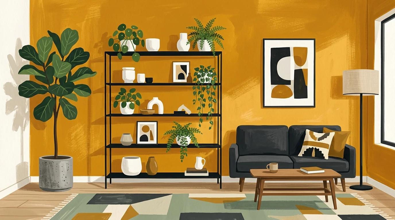
Trend #5: Ochre Yellow
Ochre yellow captures the elusive golden hour and locks it permanently within your walls, infusing your home with an undeniable sense of optimism and historical richness. Unlike the jarring, synthetic yellows popular in previous decades, true ochre contains earthy brown undertones that make it incredibly sophisticated and surprisingly versatile. This bold wall color thrives in rooms that receive limited natural light, artificially warming the space and successfully combating architectural gloom. You can leverage ochre yellow to revitalize a drab home office or a neglected guest bedroom. Pair these radiant golden walls with contrasting cool tones—such as a sleek slate grey sofa or cool bluestone tile flooring—to achieve a masterclass in balanced color palettes. Incorporate distressed vintage rugs that feature complementary navy and crimson threads to tie the room’s disparate elements together seamlessly. By utilizing ochre, you tap into a timeless, globally inspired aesthetic that feels both carefully curated and effortlessly welcoming to anyone who enters.
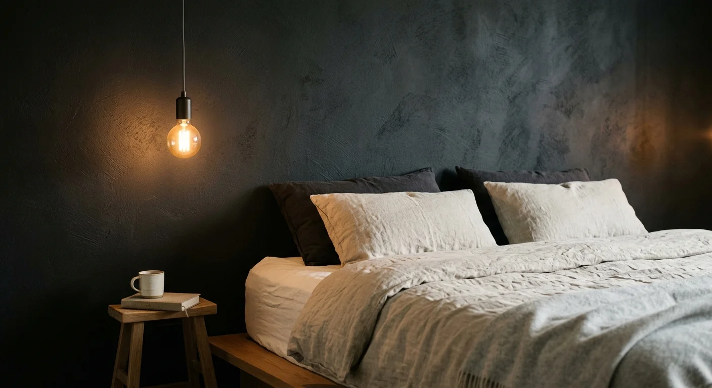
Trend #6: Charcoal Black
Charcoal black redefines the absolute boundaries of modern home decor by proving that the darkest hues can actually make a physical space feel vastly more expansive. True black can occasionally appear flat and institutional, but charcoal contains subtle grey and blue nuances that provide essential visual depth and movement. You can utilize charcoal black as a striking, dramatic backdrop for your curated art collections; the dark walls cause framed canvases and vibrant photographs to leap forward visually. This bold color excels in living rooms and media rooms where you actively want to minimize visual distractions and enhance screen viewing. To prevent a charcoal room from feeling like a subterranean cavern, you must implement a highly layered lighting strategy. Combine recessed architectural lighting with sculptural floor lamps and warm-toned LED bulbs. Introduce highly textured materials like rough-hewn stone, chunky bouclé upholstery, and heavily grained wood furniture to capture the light and add necessary tactile interest against the dramatic walls.
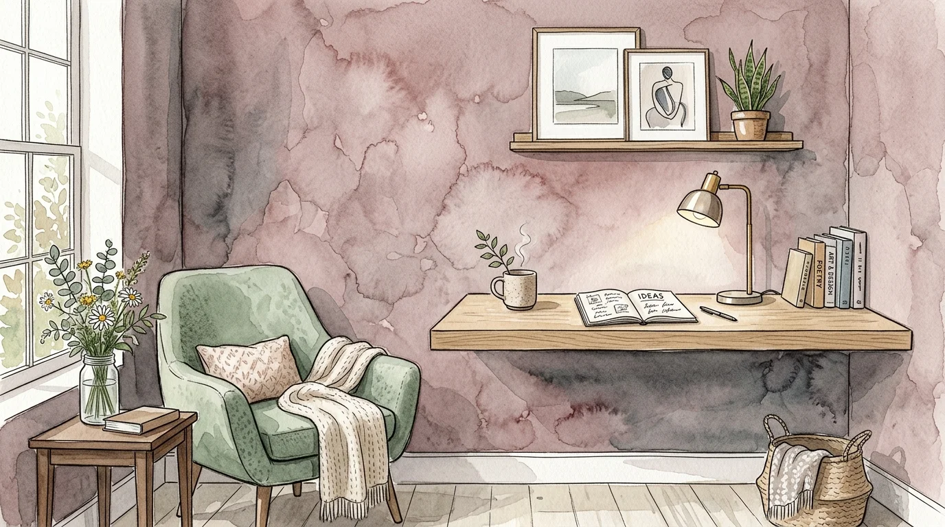
Trend #7: Complex Dusty Rose
Complex dusty rose strips away all the juvenile connotations of traditional pastel pink, emerging as a mature, nuanced neutral alternative for highly sophisticated interiors. This refined shade incorporates subtle beige and grey undertones, creating a muddy, desaturated hue that wraps your room in a gentle, exceptionally flattering warmth. Dusty rose provides an exceptional foundational palette for master bedrooms and luxurious dressing areas, casting a beautifully soft light that enhances skin tones and promotes deep relaxation. You should deliberately pair these blushing walls with contrasting masculine elements to achieve a perfectly balanced aesthetic. Think patinated bronze light fixtures, dark chocolate brown velvet headboards, and sharply structured, mid-century modern case goods. Recent retail sales data highlights a significant uptick in blush-toned paint purchases for primary living spaces, signaling a broader industry shift toward softer, more emotionally resonant environments. When applied correctly, dusty rose operates with the same versatility as beige, but with a far more compelling point of view.
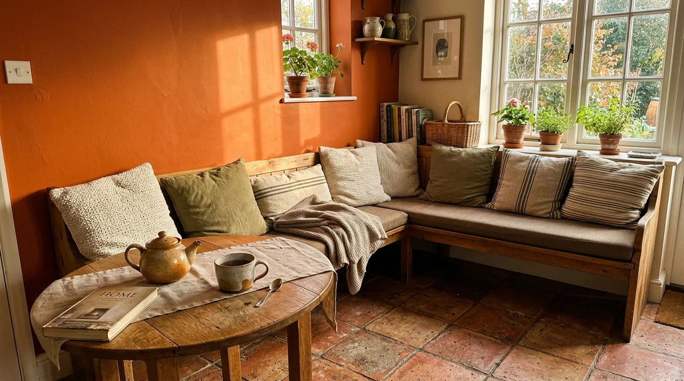
Trend #8: Burnt Orange
Burnt orange channels the nostalgic warmth of the 1970s design revival while remaining firmly rooted in crisp, contemporary sophistication. This bold, inherently energetic color naturally stimulates conversation and appetite, making it a premier choice for formal dining rooms and bustling eat-in kitchens. You can harness the transformative power of burnt orange to warm up cool, northern-facing rooms that otherwise feel stark and uninviting. To keep the overall aesthetic elevated rather than overly retro, avoid pairing this color with typical vintage clichés. Instead, surround your vibrant burnt orange walls with sleek, contemporary finishes like polished concrete flooring, stainless steel appliances, and minimalist, low-profile furniture. The vivid walls will serve as a dynamic counterpoint to these cool, industrial elements. Incorporate large-scale abstract artwork featuring muted earth tones to beautifully bridge the gap between the vivid paint and the surrounding neutral decor. Burnt orange demands decorating confidence, but it rewards you with a space that feels undeniably alive.
Trend #9: Teak Wood Brown
Teak wood brown embraces the current cultural movement toward enveloping, grounding interiors that prioritize genuine psychological comfort over fleeting aesthetic trends. Moving far beyond the flat, lifeless beiges of the early 2000s, this rich, deeply saturated brown mimics the mesmerizing depth of freshly oiled timber. You can use this bold wall color to create an instant sense of heritage and permanence, even within a newly constructed home. Teak wood brown excels in private libraries, secluded dens, and intimate sitting rooms where ultimate coziness remains the primary objective. Pair this luxurious, earthy shade with sharply contrasting jewel tones; imagine a brilliant sapphire blue velvet sofa resting elegantly against the warm, chocolate-toned walls. Maintain essential brightness in the room by keeping your ceilings crisp white and utilizing light-colored wool or sisal area rugs over your dark flooring. This specific color choice aligns perfectly with the quiet luxury aesthetic, proving that you do not need screaming colors to make a bold statement.
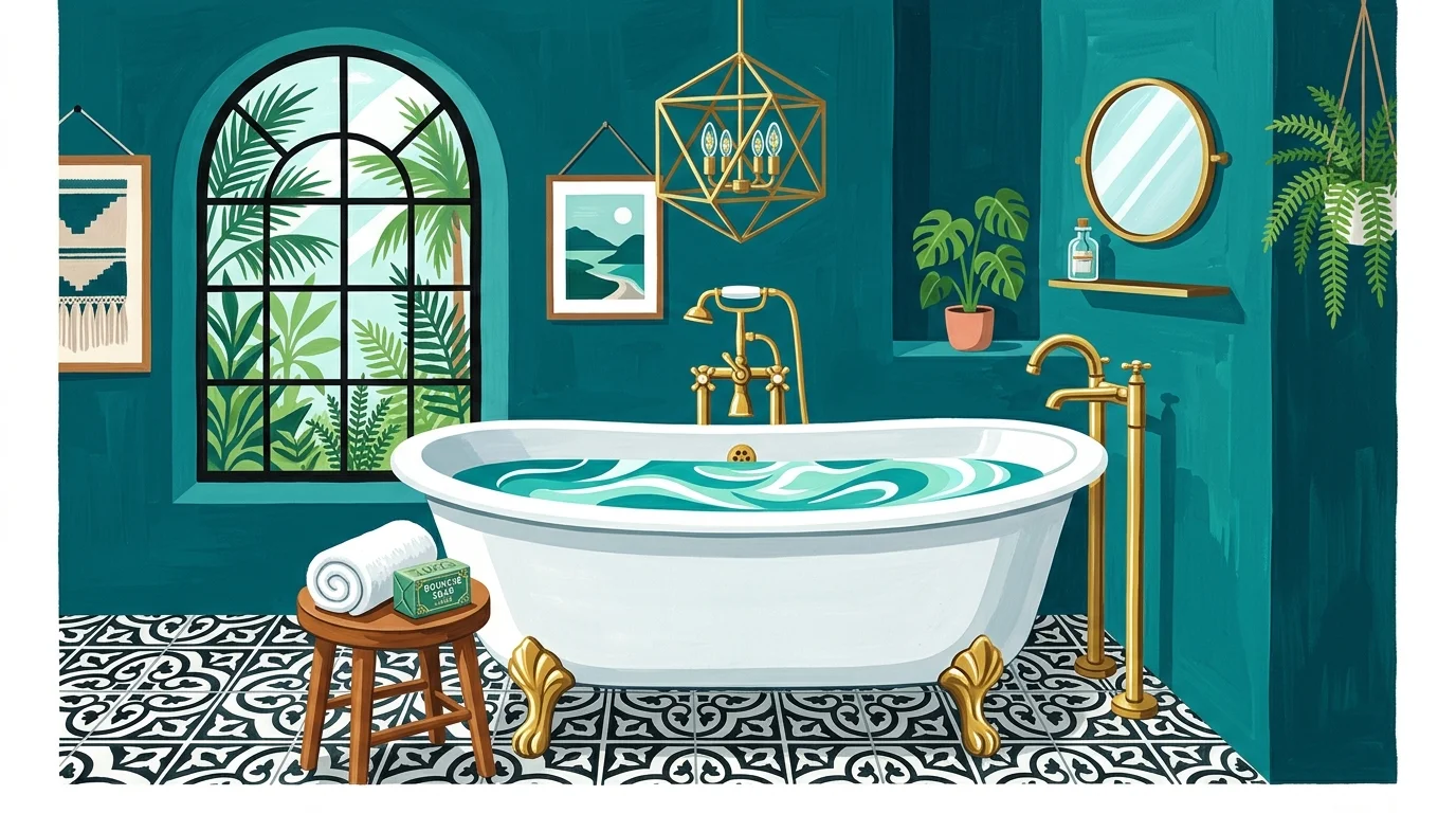
Trend #10: Peacock Teal
Peacock teal flawlessly masters the delicate balance between the calming, restorative properties of blue and the invigorating, lively energy of green. This luxurious jewel tone possesses an inherent, dramatic glamour that instantly upgrades the perceived financial value of your home decor. You can deploy peacock teal strategically in spaces where you want to make an unforgettable first impression, such as a grand entry foyer or a formal parlor. To maximize the opulent nature of this bold hue, choose a high-quality paint finish with a slight sheen, such as eggshell or satin, which will catch the ambient light and highlight the color’s shifting, oceanic depths. Peacock teal serves as the ultimate, sophisticated backdrop for warm metallic accents; gold, unlacquered brass, and polished copper elements will pop brilliantly against the dark walls. Anchor the room with classic architectural details like crisp white wainscoting or elaborate crown molding to provide a structured, traditional framework for the vibrant paint.
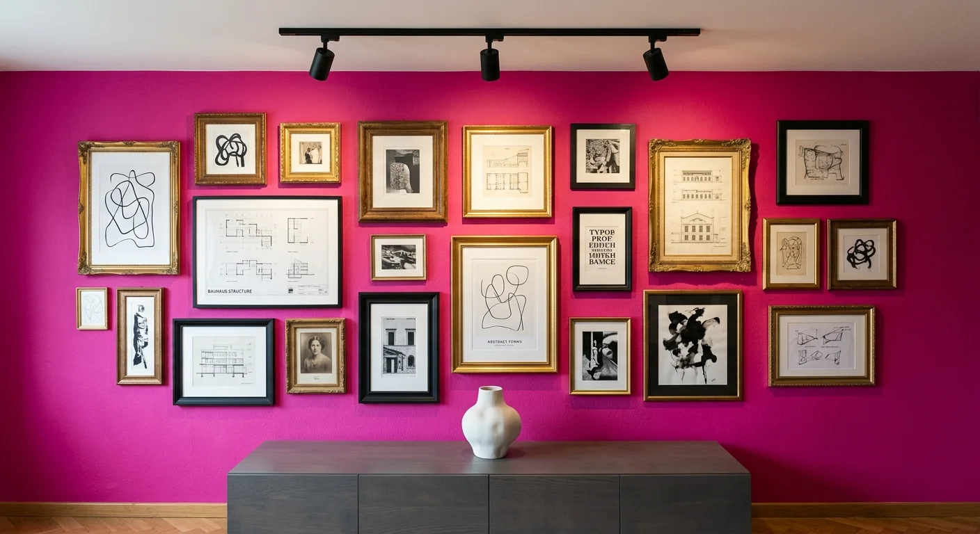
Trend #11: Electric Magenta
Electric magenta serves as the ultimate creative disruptor in the interior design world, explicitly challenging conventional color rules with its fearless, vivid saturation. As a direct descendant of recent high-profile global color forecasts, magenta injects pure joy and unapologetic creativity into your residential living spaces. You must use this intensely energetic color deliberately; it works best as a concentrated focal point rather than a sprawling, all-over wall treatment in highly trafficked areas. Consider painting a recessed architectural alcove, a dramatic hallway arch, or the walls of a vibrant powder room in this striking hue. To ground electric magenta and prevent it from completely overwhelming your senses, pair it meticulously with stark, architectural neutrals. Think crisp gallery-white trim, matte black metal hardware, and pale, ash-toned wood flooring. By treating the magenta wall as a massive, immersive piece of modern art, you create a thrilling dynamic tension between the playful color and the serious elements surrounding it.
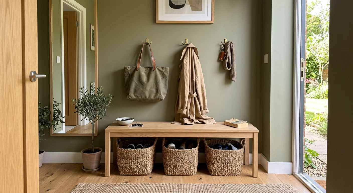
Trend #12: Olive Drab
Olive drab completely rehabilitates the historical concept of camouflage colors, emerging as a sophisticated, delightfully muddy hue that works remarkably well in elevated, contemporary interiors. This complex, yellow-based green shifts its appearance dramatically depending on the ambient light, providing a dynamic visual backdrop that never feels stagnant or boring. You can utilize olive drab as a richer, significantly more compelling alternative to standard grey or builder-grade greige. It looks particularly stunning in hardworking, utilitarian spaces like spacious mudrooms, organized laundry rooms, and functional kitchens, where it easily hides daily scuffs while adding tremendous architectural character. Pair your beautifully olive walls with natural, unlacquered oak cabinetry and honed black soapstone countertops to create a timeless, highly utilitarian aesthetic. Introduce warm, ambient lighting through classic brass sconces to successfully highlight the hidden golden undertones within the paint. Olive drab ultimately proves that bold wall colors simply need to possess incredible depth to completely transform your home.
The Big Picture: Weaving These Trends into Your Home
Integrating these bold wall colors into your home does not require abandoning your carefully cultivated personal aesthetic; rather, it demands a strategic approach to visual balance. When you introduce a saturated hue into a room, calibrate the surrounding decor to support the statement wall without competing against it. Rely on the guiding principles of quiet luxury by investing in tactile materials that anchor the space. For example, if you paint your living room a deep aubergine, balance that heavy visual weight with light, textured fabrics like sheer linen drapery and chunky wool rugs.
Furthermore, pay close attention to your flooring and lighting, as these foundational elements dictate how a paint color translates in real life. Cool-toned LED bulbs will flatten a complex terracotta, while warm lighting brings its earthy depths to life. Similarly, wide-plank oak flooring can soften the intensity of an electric magenta. View these colors not as fleeting trends, but as powerful architectural tools used to define the mood of your space. By thoughtfully pairing daring paints with curated furnishings, you ensure your interior design remains exceptionally sophisticated.
Frequently Asked Questions
How do I test a bold wall color before committing to a full room?
You should never rely on small paper swatches when selecting bold wall colors. Instead, purchase sample pots and paint large sections onto heavy cardstock or foam board. Move these boards around the room at different times of the day to observe how changing light interacts with the pigments. This method prevents your existing wall color from skewing your perception of the new shade.
Can I mix multiple bold colors within an open-concept living space?
Mixing multiple bold hues requires a masterful understanding of color theory, but you can achieve it by managing your sightlines. Choose one dominant bold color for your primary area, and introduce a secondary shade in an adjacent space like a dining nook. Ensure the two colors share a similar saturation level or undertone to maintain a cohesive flow throughout your home.
Will a dark paint color make my small room feel claustrophobic?
Contrary to popular belief, dark colors can actually expand a small space by blurring the visual boundaries of the room. When you paint the walls, baseboards, and ceiling in the same deep hue—a design technique known as color drenching—the sharp corners of the room visually recede. This approach creates an enveloping, luxurious jewel-box effect that feels intentional rather than cramped.
For the latest color forecasts, consult industry leaders like Pantone and paint companies like Benjamin Moore. For professional design standards, refer to the American Society of Interior Designers (ASID).
Disclaimer: This article reflects design trend analysis and predictions. Personal taste and timeless design principles should always guide your decorating choices.