Your living room serves as the emotional core of your home, and the right palette instantly dictates its atmosphere. Selecting modern living room palette ideas goes far beyond choosing a favorite hue; it requires a sophisticated understanding of how undertones, natural light, and contrasting shades interact. Interior designers are currently pivoting away from stark whites and predictable greys, instead embracing complex pairings that inject warmth, character, and psychological comfort into our daily spaces. By exploring the living room color combinations trending across high-end design projects, you can effortlessly elevate your environment to reflect these interior designer color obsessions. Discover the nuanced, transformative pairings currently redefining residential interiors below.

Trend #1: Terracotta and Sage Green
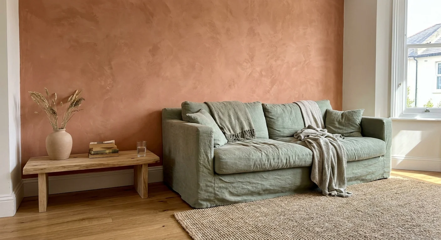
Biophilic design continues to dominate high-end interiors, shifting our focus toward the grounding, restorative elements of the natural world. Terracotta provides an earthy, baked-clay warmth that instantly anchors a room, while sage green introduces a muted, botanical freshness. Interior designers favor this combination because it successfully bridges the gap between vibrant color and restful neutrality. The psychology behind this pairing relies on our innate desire to connect with outdoor environments; terracotta mimics sun-baked earth, and sage mirrors drought-resistant foliage.
To execute this look successfully, prioritize matte finishes and natural textures. Imagine a living space featuring a lime-washed terracotta feature wall, complemented by an oversized, slouchy sage green linen sofa. Concrete data from recent design trade shows indicates a sharp increase in raw, unglazed ceramic accessories—the perfect vehicle for introducing terracotta into your home without committing to paint. Bring the palette together by incorporating natural oak flooring and woven jute rugs, ensuring the space feels curated and effortlessly organic.

Trend #2: Midnight Blue and Burnished Brass
The concept of quiet luxury has fundamentally altered how we approach elegant living spaces. Midnight blue acts as an endless, enveloping backdrop that feels infinitely more sophisticated than stark black. When paired with burnished brass, the resulting atmosphere exudes a moody, cinematic quality. The profound depth of midnight blue absorbs excess light, creating a cocooning effect, while the warm, reflective surface of burnished brass pierces the darkness, drawing the eye toward specific architectural details.
Implement this aesthetic by embracing color drenching—painting your walls, trim, and ceiling in the exact same shade of midnight blue. This technique blurs the hard edges of the room, making small spaces feel surprisingly expansive. Introduce burnished brass through high-impact touchpoints: a sweeping mid-century modern chandelier, heavy cabinet hardware, or a sleek nesting coffee table. Pair these elements with tactile fabrics like mohair or silk velvet to amplify the luxurious tension between the soft, dark upholstery and the rigid, glowing metal.

Trend #3: Plaster White and Warm Caramel
Organic modernism rejects the sterile, flat whites of the past decade in favor of dimensional, textured surfaces. Plaster white offers a dynamic canvas; its subtle variations catch the changing natural light throughout the day, adding quiet movement to your walls. Warm Caramel serves as the perfect grounding counterpart, introducing a rich, approachable warmth that prevents the white space from feeling clinical or cold. This pairing thrives on subtlety, relying entirely on the quality of the materials rather than loud pigment.
You can bring this sophisticated palette to life by applying authentic Venetian plaster or a high-quality Roman clay finish to your living room walls. Ground the airy vertical space with a low-profile, caramel-colored aniline leather sectional. The leather will patina over time, adding a layer of narrative and provenance to the room. Complete the look with honed travertine accent tables, sheer linen window treatments, and sculptural bleached wood accents to maintain the strict organic modernism ethos while maximizing everyday comfort.

Trend #4: Aubergine and Olive
Heritage revival brings historical, deeply saturated hues back into the contemporary design lexicon. Aubergine—a complex, bruised plum shade—commands attention with its regal, moody undertones. Olive green acts as the perfect neutralizing force, offering an earthy stability that prevents the purple tones from overwhelming the space. Interior designers are obsessed with this specific pairing because it instantly communicates worldly sophistication and creates an atmosphere of intellectual depth within a living room.
This color combination works exceptionally well in rooms featuring traditional architectural details like heavy crown molding, wainscoting, or built-in bookshelves. Consider painting custom millwork in a high-gloss aubergine to reflect ambient light, then soften the bold architecture with heavy olive green velvet drapery. If painting an entire room aubergine feels too daunting, flip the proportions. Use a muted olive tone for your primary wall color and anchor the seating arrangement with a deep aubergine mohair rug or a collection of jewel-toned throw pillows.

Trend #5: Soft Peach and Forest Green
Modern retro aesthetics celebrate unexpected pairings, and the resurgence of soft peach combined with dense forest green is leading the charge. Peach provides a highly flattering, ambient warmth that mimics the golden hour, casting a subtle, optimistic glow across the room. Forest green provides the necessary visual weight and seriousness, anchoring the ethereal quality of the peach. This high-contrast dynamic balances playful lightness with traditional gravity, resulting in a living room that feels both youthful and deeply sophisticated.
To master these modern living room palette ideas, keep the application intentional and structural. A soft peach limewash on the ceiling and walls creates an immersive, sun-drenched environment. Disrupt this softness with substantial, brutalist-inspired forest green elements—perhaps a monolithic marble fireplace surround or a deeply tufted emerald green velvet chesterfield sofa. Incorporate highly polished burl wood furniture and subtle brass accents to bridge the gap between the warm peach walls and the cool, dense green upholstery.

Trend #6: Charcoal Grey and Amber
We are witnessing a definitive shift away from the cool, stark greys that dominated the early 2010s. Today, designers favor charcoal grey—a shade so deep it borders on soft black. This profound neutral creates a dramatic, cinematic environment. Amber serves as the vital energy source in this pairing, cutting through the heavy charcoal with a fiery, golden luminescence. The tension between the shadowy walls and the glowing accents generates a highly sophisticated, evening-ready atmosphere perfect for entertaining.
Lighting plays the most crucial role in executing this trend. Paint your walls in a flat, matte charcoal to absorb ambient light and reduce glare. Then, introduce amber strategically through architectural lighting and accessories. Vintage Italian amber glass pendants, backlit cognac leather shelving, and glowing tortoiseshell acrylic side tables transform the room from a dark box into a glowing jewel box. Add plush, low-pile wool rugs in a muted slate tone to soften the auditory acoustics of the room while maintaining the dark, intimate aesthetic.

Trend #7: Dusty Rose and Deep Charcoal
Pastels are maturing, shedding their juvenile connotations to become foundational elements in high-end design. Dusty rose carries complex, muddy undertones that elevate it from a simple pink to a sophisticated, grounding neutral. Deep charcoal provides the ultimate masculine counterweight to the feminine energy of the rose. This delicate push-and-pull creates a balanced, compelling interior that feels incredibly modern and emotionally resonant without leaning too heavily into either gendered design trope.
Apply dusty rose to your walls using a chalky, ultra-matte paint finish to emphasize its sophisticated nature. Contrast this soft perimeter with sharp, architectural charcoal interventions. A sleek, charcoal-stained oak media console, a pair of modernist black iron lounge chairs, or deep graphite window frames provide the necessary visual anchor. Concrete floors or wide-plank grey-washed oak floorboards help to unify the contrasting elements. The key is to keep the lines of your furniture clean and structural, allowing the juxtaposition of the colors to serve as the primary focal point.

Some color theories are timeless, but their application continually evolves. Mustard yellow and navy blue offer a classic, complementary high contrast that designers are currently reimagining through a highly textural lens. Mustard brings an earthy, energetic vibrancy that instantly warms a space, while navy blue offers the stability and psychological comfort of a stormy night sky. This dynamic pairing perfectly encapsulates current color trends living spaces rely on to feel both historically charming and vibrantly contemporary.
Avoid flat paint applications with this powerful duo; texture is mandatory to keep the look modern. Wrap the lower half of your walls in a rigid, navy blue beadboard or batten paneling to establish a traditional foundation. Above the paneling, apply a woven mustard yellow grasscloth wallpaper to introduce raw, tactile energy. Keep your primary upholstery neutral—perhaps a tailored ivory bouclé sofa—and use the mustard and navy purely for architectural elements and large-scale abstract artwork.

Trend #9: Oatmeal and Chocolate Brown
The 1970s design revival continues to heavily influence our interiors, bringing forth a profound appreciation for tonal, earthy palettes. Chocolate brown has officially dethroned stark black as the preferred dark neutral in high-end design, offering a softer, more enveloping depth. Oatmeal—a complex, unbleached neutral with shifting grey and beige undertones—provides the perfect luminous canvas. Together, they create a highly restorative, incredibly chic environment that prioritizes comfort and tactile engagement over stark minimalism.
To capture this highly sought-after aesthetic, layer multiple shades of these two core colors through varying materials. Start with oatmeal-colored Roman clay walls to establish a warm, textured perimeter. Ground the space with a rich, chocolate-brown walnut coffee table and matching floating shelves. Upholster your seating in heavy oatmeal linen or nubby wool, and drape a dark espresso-toned alpaca throw over the armrest. By focusing strictly on these two hues and relying entirely on material variation, you create a masterclass in understated luxury.

Trend #10: Slate Blue and Rust
Elemental contrast drives some of the most compelling interior design work today. Slate blue carries cool, stormy, and watery undertones, instantly lowering the visual temperature and heart rate within a room. Rust, on the other hand, introduces an oxidized, fiery warmth reminiscent of aged iron and autumn leaves. Placed opposite each other on the color wheel, these two hues vibrate with dynamic energy while maintaining an elegant, muted sophistication that never feels overly aggressive.
Designers often utilize this combination in living rooms that receive an abundance of natural southern light. Paint the walls and ceiling in a unified slate blue to cool the harsh afternoon sun. Introduce rust through highly tactile, anchoring pieces—a rust-colored velvet tufted ottoman, heavily veined terracotta marble side tables, or a vintage Persian rug rich with oxidized orange and red dyes. Add touches of unlacquered brass and natural cane webbing to bridge the gap between the cool walls and the fiery upholstery.

Trend #11: Muted Celadon and Cream
As the outside world becomes increasingly chaotic, homeowners are demanding restorative, zen-like environments. Muted celadon—a pale, grey-tinged green historically found in ancient Chinese ceramics—has emerged as a powerful tool for soothing the nervous system. Cream serves as a significantly softer, more forgiving alternative to stark gallery white. This gentle, low-contrast pairing reflects light beautifully, creating a living room that feels expansive, breathable, and deeply meditative.
This is one of the best living room colors now for those who favor minimalist aesthetics but crave emotional warmth. Paint your walls in a soft cream, ensuring the paint formula features warm yellow undertones rather than cool blue ones. Introduce celadon through large-scale, impactful gestures: a pair of celadon glazed ceramic table lamps, a minimalist celadon wool rug, or custom linen drapery. Keep the architectural lines of the furniture low to the ground and incredibly simple, utilizing materials like blonde ash wood to maintain the spa-like atmosphere.

Trend #12: Burgundy and Blush
Monochromatic saturation is a daring design technique that involves layering different intensities of a single hue family to achieve profound intimacy. Burgundy is a heavy, wine-soaked color that anchors a room with historic gravity. Blush provides a delicate, airy contrast that prevents the dark red tones from feeling claustrophobic. By pairing these two extremes from the red spectrum, designers create an immersive, romantic environment that feels simultaneously modern and deeply traditional.
Execute this dramatic aesthetic by painting your walls in a soft, barely-there blush pink. The light walls will reflect a flattering glow throughout the space. Contrast this lightness with heavy, monolithic burgundy interventions. A deep burgundy velvet modular sofa serves as a breathtaking focal point, especially when paired with high-gloss burgundy lacquered accent tables. Incorporate heavily veined Calacatta Viola marble—which naturally features deep purple and burgundy veining—on your fireplace surround to seamlessly tie the contrasting shades together.

The Big Picture: Weaving These Trends into Your Home
Understanding these sophisticated color palettes is only the first step; applying them cohesively requires restraint and strategic planning. Interior designers frequently employ the 60-30-10 rule to ensure a room feels balanced rather than chaotic. Allocate 60 percent of the room to your dominant color—typically applied to walls, ceilings, and large foundational furniture pieces. Dedicate 30 percent to your secondary hue, utilizing it for drapery, accent chairs, or large area rugs. The final 10 percent should consist of your high-impact accent color, delivered through throw pillows, artwork, ceramics, and lighting fixtures. This mathematical approach guarantees visual harmony, even when working with daring color combinations.
Furthermore, natural light serves as the ultimate dictator of how color behaves within your living room. A muted celadon that looks ethereal in a bright, south-facing room may appear muddy and depressing in a north-facing space heavily shadowed by trees. Always test your desired paints by applying large swatches to different walls and observing how the undertones shift from the cool morning light to the warm glow of sunset. Ultimately, while interior designer color obsessions provide excellent directional inspiration, your personal connection to a palette must take precedence. A truly luxurious home reflects the provenance and unique narrative of the people living inside it.
Frequently Asked Questions
How do I test modern living room palette ideas before fully committing?
The most effective method for testing colors without ruining your current walls is to paint large, rigid foam boards with your selected hues. Move these boards around the room over the course of several days. Lean them against windows, place them in dark corners, and view them under your artificial evening lighting. Alternatively, many high-end paint manufacturers now offer large-scale, peel-and-stick fabric swatches that accurately represent the final finish and can be easily repositioned without damaging drywall.
Do dark living room color combinations trending right now work in small spaces?
Yes, dark colors can completely transform small living rooms when applied correctly. Employing a technique known as color drenching—where you paint the walls, trim, doors, and ceiling in the same dark hue, such as midnight blue or charcoal grey—eliminates visual boundaries. Without contrasting white trim to outline the exact dimensions of the room, the corners recede into shadow, creating an optical illusion that makes the space feel surprisingly expansive and infinitely cozier.
How can I blend these interior designer color obsessions with my existing furniture?
You do not need to replace your entire furniture collection to update your living room’s palette. Utilize bridging elements to connect your older pieces to the new colors. Large area rugs, patterned throw pillows, and expansive artwork serve as excellent unifiers. If you are introducing a terracotta and sage green palette, find a vintage rug that incorporates both those new hues alongside the color of your existing sofa. This creates a deliberate, collected aesthetic that feels organically layered.
For the latest color forecasts, consult industry leaders like Pantone and paint companies like Benjamin Moore. For professional design standards, refer to the American Society of Interior Designers (ASID).
Disclaimer: This article reflects design trend analysis and predictions. Personal taste and timeless design principles should always guide your decorating choices.
