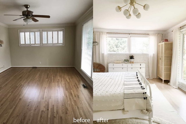
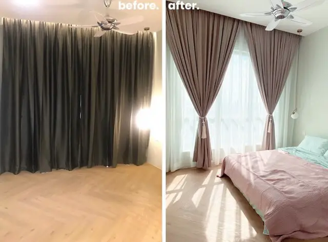
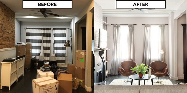
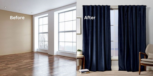
Hardwood floors have long been a symbol of sophistication and durability, representing a timeless flooring option that continues to evolve with modern design trends. In 2025, hardwood flooring is more than just a practical choice for homeowners; it has become a statement of luxury, environmental consciousness, and cutting-edge design. As interior design shifts towards sustainability, natural beauty, and functionality, hardwood floors remain at the forefront of these changes, offering a wide variety of options to suit every aesthetic and lifestyle need.

In 2025, hardwood flooring trends are being shaped by a growing desire for eco-conscious choices, low-maintenance designs, and a return to nature. Homeowners and designers are opting for materials that not only look stunning but are also environmentally responsible. From wide planks that create an expansive, luxurious feel, to natural and reclaimed wood that emphasizes sustainability, the trends reflect a balance between aesthetics and functionality.
One of the reasons hardwood flooring endures as a top choice is its versatility. Whether you’re crafting a minimalist, Scandinavian-inspired living space or embracing the warmth of a traditional, rustic home, hardwood can adapt seamlessly. Additionally, the push towards sustainable living has further enhanced the appeal of hardwood flooring, as eco-friendly materials and processes become more accessible. Consumers are looking for flooring solutions that are not only visually stunning but also have minimal environmental impact. With trends in sustainability, texture, and color leading the charge, 2025 is set to be a dynamic year for hardwood floors.
In this article, we will explore the hottest hardwood flooring trends for 2025, starting with a look at how natural and eco-friendly materials are shaping the industry and continuing with insights into the rising popularity of wide plank hardwood floors.
Natural and Eco-Friendly Materials: Sustainable Choices for Modern Homes
One of the biggest shifts in hardwood flooring trends for 2025 is the increasing focus on sustainability. Consumers are becoming more aware of their environmental impact and are actively seeking eco-friendly materials for their homes. As a result, natural and sustainably sourced hardwood floors are set to dominate the market. Whether it’s reclaimed wood with a rustic patina or responsibly harvested hardwood from certified forests, homeowners are prioritizing materials that minimize their carbon footprint while adding beauty and character to their spaces.
Reclaimed Wood: A Sustainable and Stylish Option
Reclaimed wood has emerged as a top choice for eco-conscious homeowners in 2025. This type of wood is salvaged from old buildings, barns, and factories, where it’s repurposed to create stunning, one-of-a-kind flooring. Not only does reclaimed wood reduce the demand for newly harvested trees, but it also comes with a rich history and unique aesthetic. The weathered textures, natural imperfections, and aged patina of reclaimed wood add character and charm to any space, making it a perfect fit for rustic, farmhouse, or industrial design styles.
In addition to its sustainability benefits, reclaimed wood has become a popular choice for those who want to bring a sense of authenticity into their homes. Each plank tells a story, with knots, grain patterns, and even nail holes contributing to its distinct appearance. This trend reflects a broader shift towards valuing materials that feel personal and rooted in history. In 2025, homeowners are embracing imperfections and natural variations, moving away from the cookie-cutter, uniform flooring styles of the past.
FSC-Certified Hardwood: Responsible Sourcing
Another important trend for 2025 is the growing demand for FSC-certified hardwood. The Forest Stewardship Council (FSC) certification guarantees that the wood is sourced from responsibly managed forests that meet strict environmental and ethical standards. Choosing FSC-certified hardwood allows homeowners to make ethical choices while still enjoying the luxurious look and feel of high-quality wood flooring.
FSC-certified wood comes in a wide range of species, from oak and walnut to cherry and maple, offering the same durability and beauty as non-certified wood. The difference is that FSC certification ensures sustainable forest management, protecting biodiversity and local communities. In a world increasingly focused on reducing deforestation and environmental impact, FSC-certified hardwood is becoming a must-have for eco-conscious homeowners.
Low-VOC Finishes: Healthier Homes, Cleaner Air
Beyond the wood itself, 2025 is seeing a rise in demand for low-VOC (Volatile Organic Compounds) finishes. Traditional finishes and sealants can emit harmful chemicals into the air, negatively impacting indoor air quality and the health of those living in the home. Low-VOC finishes, on the other hand, are formulated to reduce these emissions, making them a healthier choice for families, particularly those with children or pets.
Many homeowners are also opting for natural oil-based finishes, which enhance the wood’s natural beauty while providing a breathable, eco-friendly layer of protection. These finishes penetrate the wood, allowing the grain to remain visible and the texture to stay intact, rather than creating a plastic-like barrier on top. The result is a natural, organic look that aligns with the broader trend of embracing nature in interior design.
In 2025, these eco-friendly finishes are being paired with a wide variety of hardwood species, from light, airy blonde woods to rich, dark tones, allowing homeowners to create spaces that are both visually appealing and environmentally responsible.
Wide Plank Hardwood Floors: Making a Statement
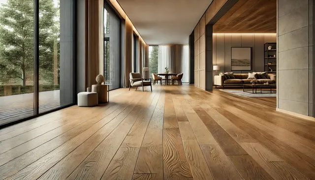
Another significant trend in 2025 is the growing popularity of wide plank hardwood floors. Traditionally, hardwood floors featured narrow planks, typically ranging from 2 to 3 inches in width. However, wider planks, which can measure anywhere from 5 to 12 inches across, are gaining traction for their ability to make spaces feel larger, more luxurious, and visually cohesive.
Wide plank floors have a more contemporary, streamlined look that appeals to modern homeowners who want to create an expansive, open feel in their homes. The larger surface area of each plank showcases the wood’s natural grain and texture more prominently, resulting in a floor that feels both grand and organic. In addition, wide planks minimize the number of seams and breaks in the flooring, creating a smoother, more seamless appearance.
Why Wide Planks Are Trending in 2025
One of the primary reasons for the rise of wide plank hardwood floors is their versatility. These floors work equally well in modern, minimalist spaces as they do in rustic or traditional homes. In modern interiors, wide planks in lighter tones like white oak or blonde maple create a sleek, airy look that complements neutral color palettes and open-concept layouts. For more rustic or farmhouse-style homes, wide planks in darker, distressed finishes add warmth and a sense of history to the space.
Wide planks are also ideal for larger rooms, where their size helps reduce the visual clutter of too many narrow planks. However, they can also make smaller rooms feel more expansive by drawing the eye along the longer lines of the boards, creating a sense of continuity and flow.
Engineered Wide Planks for Durability
While solid hardwood remains a popular choice, engineered hardwood is gaining ground, particularly in the wide plank format. Engineered hardwood consists of a thin layer of real hardwood on top of a plywood or high-density fiberboard (HDF) core. This construction makes it more stable and less susceptible to moisture and temperature fluctuations than solid hardwood, which can warp or shrink in response to humidity.
In 2025, engineered wide plank floors are becoming the go-to choice for homeowners who want the look of hardwood but need a more durable, versatile solution. Engineered hardwood can be installed in basements, kitchens, and even bathrooms, where traditional solid wood might not be an option.
Whether solid or engineered, wide plank hardwood floors are a statement-making trend for 2025, offering homeowners a way to blend modern elegance with natural beauty.
White Oak Hardwood Floors: A Timeless Choice for 2025
In 2025, white oak hardwood floors are enjoying a resurgence in popularity, becoming one of the most sought-after options for both modern and traditional interiors. White oak has long been prized for its strength, versatility, and neutral aesthetic, making it an ideal choice for homeowners who want a timeless floor that will withstand trends and heavy use.
One of the reasons white oak is such a popular choice in 2025 is its ability to fit seamlessly into a wide range of design styles. Its cool, neutral tones—ranging from pale blonde to warm honey—make it adaptable to various color schemes and décor styles. White oak’s grain is generally straighter and less pronounced than red oak, giving it a smoother, more uniform appearance that many homeowners prefer for a clean, contemporary look. This understated elegance allows white oak to complement minimalist, Scandinavian, and even industrial styles with ease.
In addition to its aesthetic appeal, durability is a major factor in the rise of white oak. White oak is a hardwood that can withstand heavy foot traffic, making it a perfect choice for high-traffic areas like living rooms, entryways, and kitchens. Its high density also makes it more resistant to dents and scratches, which is essential for families with children or pets. Moreover, white oak is naturally more water-resistant than many other wood species, making it a viable option for moisture-prone areas, such as bathrooms and mudrooms, when properly sealed.
Another reason white oak is trending in 2025 is its ability to take on a wide variety of stains and finishes. Whether you prefer the natural look of a clear matte finish or the bold contrast of a dark stain, white oak absorbs stains evenly, ensuring a smooth and consistent finish. In 2025, light, natural finishes are particularly in vogue, as homeowners gravitate towards the simplicity and warmth of raw, organic materials. However, darker stains that bring out the wood’s rich, deep hues are also on the rise, especially in spaces where contrast and drama are desired.
Lastly, white oak is a sustainable option, particularly when sourced from FSC-certified forests. Its widespread availability as a domestic hardwood means that it doesn’t need to be imported from overseas, reducing its environmental impact. Choosing white oak allows homeowners to enjoy a premium, long-lasting floor that is both stylish and eco-conscious.
Matte Finishes for Hardwood Floors: Understated Elegance
The glossy, high-shine finishes that once dominated hardwood flooring trends are being replaced by a more subtle, matte finish in 2025. This shift reflects a broader movement towards natural, organic textures in interior design, where less polished surfaces bring a sense of calm, warmth, and authenticity to a space. Matte finishes offer a number of benefits, both aesthetic and practical, making them a top choice for homeowners this year.
One of the main reasons homeowners are opting for matte finishes is their low-maintenance nature. While glossy finishes can look stunning when first installed, they tend to show every scratch, scuff, and bit of dust, requiring constant cleaning and upkeep to maintain their pristine appearance. Matte finishes, on the other hand, are much more forgiving. Their low-sheen surface hides imperfections, scratches, and everyday wear much better than glossy finishes, making them ideal for busy households or homes with pets and children.
Aesthetically, matte finishes provide a more natural, understated look, allowing the beauty of the wood itself to take center stage. Without the reflective shine of a glossy finish, the grain patterns, knots, and textures of the wood are more visible and emphasized. This makes matte-finished hardwood floors feel more organic and connected to nature, aligning with the growing trend towards biophilic design, where homeowners seek to bring elements of the outdoors into their living spaces.
Matte finishes also pair well with a wide range of design styles. In modern, minimalist homes, matte floors help create a seamless, grounded feel, allowing other design elements like furniture and artwork to stand out. In more traditional or rustic settings, a matte finish adds warmth and character to the space, enhancing the texture and depth of the wood. Whether your home leans towards sleek modernism or cozy, lived-in charm, matte-finished hardwood floors are versatile enough to work with a variety of aesthetics.
Another factor driving the matte finish trend in 2025 is the focus on health and sustainability. Many matte finishes are created with low-VOC (Volatile Organic Compound) or even zero-VOC products, which are better for both the environment and indoor air quality. Homeowners are becoming more conscious of the materials they bring into their homes, and eco-friendly finishes are an important part of that decision-making process. Matte finishes, particularly those made from natural oils, enhance the wood’s durability while being safe for the home and the planet.
In conclusion, matte finishes provide a sophisticated yet practical option for hardwood flooring in 2025, offering homeowners a way to embrace the natural beauty of wood while minimizing maintenance and environmental impact.
Herringbone and Chevron Patterns: Adding Texture and Movement
Classic, intricate patterns are making a big comeback in 2025, with herringbone and chevron hardwood floors leading the way. Once reserved for grand European estates or formal spaces, these patterns are now being used in modern homes to add texture, visual interest, and movement to floors. Homeowners are rediscovering the elegance and sophistication of these designs, but with a contemporary twist that feels fresh and relevant for today’s interiors.
The herringbone pattern consists of rectangular planks arranged in a zigzag pattern, creating a sense of movement and flow across the floor. It is a timeless design that has been used for centuries, but in 2025, it’s being reimagined for modern living spaces. Herringbone floors are perfect for adding subtle texture to a room without overwhelming the overall design. They work well in both large, open spaces like living rooms and more intimate areas like hallways, where the pattern can help guide the eye and enhance the sense of space.
On the other hand, the chevron pattern features planks that are cut at an angle and arranged in a continuous V-shape, creating a bold, geometric look. While herringbone tends to have a softer, more traditional feel, chevron is all about making a statement. In 2025, chevron hardwood floors are being used in contemporary homes to create a striking visual effect that adds energy and drama to the space. This pattern is particularly well-suited for modern interiors with clean lines and minimalist furniture, where the floor itself becomes a focal point.
Both herringbone and chevron patterns are being paired with a variety of wood tones and finishes in 2025, from light, airy shades like white oak to deep, rich hues like walnut or mahogany. This versatility allows homeowners to create a custom look that fits their individual style. For example, a light-colored herringbone floor can add a sense of openness and lightness to a space, while a dark, dramatic chevron pattern can create contrast and depth in a more formal setting.
In addition to their aesthetic appeal, herringbone and chevron patterns are also highly durable. The interlocking design of these patterns provides additional stability, making them a great choice for high-traffic areas or homes with children and pets.
In conclusion, the resurgence of herringbone and chevron patterns in 2025 offers homeowners a chance to add timeless elegance and modern flair to their floors. Whether you’re looking for a subtle texture or a bold design statement, these patterns are sure to elevate the look of any space.
Dark Stained Hardwood Floors: Rich, Dramatic Elegance
In 2025, dark stained hardwood floors are making a bold statement in interior design, offering a striking contrast to the lighter, more natural tones that have dominated in recent years. These rich, deep hues—ranging from espresso and walnut to nearly black—bring a sense of luxury, depth, and sophistication to any space. Dark-stained floors are perfect for creating a dramatic and moody atmosphere, ideal for homes that aim to exude elegance and refinement.
One of the main reasons homeowners are gravitating towards dark-stained hardwood floors is their ability to add contrast. In modern interiors, dark floors juxtaposed with light walls and furniture create a visually dynamic space that feels both contemporary and classic. This contrast draws the eye to architectural details, furniture, and other design elements, allowing them to stand out more prominently. Dark floors also work well in more traditional or rustic homes, where they can enhance the warmth and richness of the space.
Popular stains like ebony, espresso, and dark walnut offer different variations of dark tones. For a modern, high-end look, homeowners often choose high-gloss dark stains, which add a sleek, polished finish to the floor. On the other hand, matte dark finishes are becoming increasingly popular for those who want the richness of dark floors without the high maintenance that glossy finishes require.
Despite their elegance, dark-stained floors do have some maintenance considerations. While they can hide dust and dirt to a certain extent, scratches and scuff marks are more visible on dark surfaces. Regular cleaning and proper care are essential to maintain their pristine appearance. However, modern finishes and treatments have made dark floors more durable and resistant to wear, making them a viable option even for busy households.
Another advantage of dark-stained floors is their ability to ground a space. Dark colors create a sense of stability and coziness, making larger rooms feel more intimate and inviting. They can also enhance the architectural features of a room by drawing attention to baseboards, moldings, and door frames. For homes that aim to evoke a sense of grandeur and sophistication, dark-stained hardwood floors are an excellent choice in 2025.
Mixed Width Hardwood Floors: Dynamic and Customizable
In 2025, mixed width hardwood floors are gaining traction as a way to add a unique, personalized touch to flooring designs. This trend involves using planks of varying widths, often ranging from narrow to wide, to create a floor that feels more dynamic, visually interesting, and custom-designed. Mixed width floors offer a break from uniformity, adding texture and dimension that can elevate the overall look of a room.
One of the most appealing aspects of mixed width floors is their versatility. They can be used in a variety of design styles, from rustic to contemporary, allowing homeowners to create a floor that perfectly complements their space. In more traditional or rustic homes, mixed width planks can add a sense of history and craftsmanship, mimicking the appearance of floors that were installed in older homes, where the planks were cut by hand and varied in size. In modern spaces, mixing plank widths creates a unique focal point, breaking up the monotony of uniform floors and adding visual interest without overwhelming the design.
Mixed width hardwood floors also offer a way to balance old and new. Many homeowners are choosing to pair this flooring style with natural, distressed wood finishes that emphasize the texture and imperfections of the wood. This combination of mixed widths and natural finishes brings a rustic yet sophisticated look to a room, blending modern sensibilities with timeless craftsmanship.
In 2025, mixed width flooring is being used with a variety of wood species and tones, from light oak to dark walnut. Homeowners can choose to emphasize the variation in plank widths by using contrasting stains, or they can opt for a more subtle look by keeping the color consistent across the planks. The flexibility of mixed width floors allows for a high degree of customization, making them an attractive option for those looking to create a truly unique space.
Beyond their aesthetic appeal, mixed width hardwood floors can also be practical. In homes with large, open floor plans, mixed width planks help to break up the space and add a sense of structure. This can make the room feel cozier and more intimate, while still maintaining an open and airy feel. Additionally, the use of wider planks in high-traffic areas can reduce the number of seams in the floor, making it easier to clean and maintain.
Overall, mixed width hardwood floors are a trend to watch in 2025, offering homeowners a way to create a dynamic, custom look that blends tradition with modern design.
Distressed and Hand-Scraped Hardwood Floors: Vintage Charm and Character
As homeowners continue to embrace the charm of natural, imperfect materials, distressed and hand-scraped hardwood floors are becoming a major trend in 2025. These floors are designed to look aged and weathered, with intentional imperfections like scratches, knots, and texture variations that add character and depth to a space. Distressed and hand-scraped floors offer a lived-in, vintage look that brings warmth and personality to any room.
The appeal of distressed and hand-scraped hardwood floors lies in their ability to add a sense of history and authenticity to a home. Whether the wood is naturally aged or has been treated to mimic the effects of time, these floors create a feeling of rustic charm that’s perfect for farmhouse, industrial, and eclectic interior styles. Each plank is unique, with its own textures and imperfections, making the floor feel more organic and personal.
In 2025, the trend towards hand-scraped floors is particularly strong. These floors are crafted using traditional techniques, where each plank is scraped by hand to create a textured surface. This process results in a one-of-a-kind floor with irregularities that enhance the natural beauty of the wood. Hand-scraped floors are perfect for those who want to add depth and dimension to their space, as the textured surface catches the light and creates visual interest.
Distressed wood offers a similar effect, with planks that are treated to look worn and weathered. This can involve techniques like wire brushing, which removes the softer wood fibers and exposes the grain, or chemical treatments that give the wood a naturally aged appearance. Distressed floors are an excellent option for those who want the look of reclaimed wood without the higher price tag.
In addition to their aesthetic appeal, distressed and hand-scraped floors are highly practical. Because the wood already has intentional imperfections, it tends to hide scratches, dents, and scuffs more effectively than smooth, polished floors. This makes them a great choice for busy households with pets, children, or heavy foot traffic. The floors’ durability and ability to mask wear make them a popular choice for high-traffic areas like kitchens, living rooms, and entryways.
In 2025, distressed and hand-scraped floors are available in a variety of wood species, colors, and finishes, giving homeowners the flexibility to create the look they want. From light, sun-bleached oak to dark, rustic hickory, these floors can be tailored to fit a wide range of design styles, from cozy and traditional to bold and industrial.
Ultimately, distressed and hand-scraped hardwood floors offer a way to bring a sense of history and character into a home, making them a top trend for 2025. Whether you’re looking to add warmth to a modern space or enhance the charm of a rustic one, these floors are a beautiful and practical choice.
Blonde and Light-Colored Hardwood: Bright, Airy, and Timeless
In 2025, blonde and light-colored hardwood floors are continuing their reign as a top choice for homeowners who want to create bright, open, and welcoming spaces. This trend aligns with the ongoing desire for natural, airy interiors that reflect simplicity, minimalism, and an organic connection to nature. Blonde and light-toned wood species, such as white oak, maple, ash, and birch, are particularly popular because of their ability to brighten up a room, making it feel larger and more open.
Light-colored hardwood floors are perfect for homeowners who want a clean, modern look that doesn’t feel too cold or sterile. The soft, natural tones of blonde wood bring warmth and elegance to a space while maintaining a neutral palette that can easily be paired with various design elements. From Scandinavian-inspired interiors to coastal or minimalist décor, blonde hardwood offers versatility and timeless appeal.
One of the key benefits of blonde hardwood floors is their ability to enhance natural light. Lighter wood reflects sunlight rather than absorbing it, making rooms feel more spacious and inviting. This makes blonde hardwood an ideal choice for homes with smaller rooms or spaces with limited natural light, where creating a sense of openness is essential. The light color also helps to create a seamless transition between indoor and outdoor spaces, making it a great option for homes with large windows or open floor plans.
In 2025, we’re seeing blonde and light-colored hardwood floors paired with matte finishes, enhancing the natural beauty of the wood while maintaining a modern, understated look. These finishes allow the grain of the wood to shine through without the high-maintenance sheen of a glossy finish, making the floor both stylish and practical for everyday living. The result is a floor that feels grounded, organic, and effortlessly chic.
Additionally, blonde hardwood floors work well with the growing trend of biophilic design, where natural materials and elements are used to create a calming, nature-inspired environment. The soft, neutral tones of light wood contribute to this aesthetic, helping homeowners achieve a balanced, harmonious space that fosters relaxation and well-being.
Blonde hardwood floors are particularly popular in open-concept layouts, where their light, neutral color can unify different areas of the home. Whether used in kitchens, living rooms, or bedrooms, blonde floors create a sense of continuity and flow, making them a top choice for 2025’s flooring trends.
Engineered Hardwood: Versatility and Durability for Modern Homes
As homeowners look for flooring solutions that offer both beauty and practicality, engineered hardwood is emerging as a leading choice in 2025. Unlike solid hardwood, which is made from a single piece of wood, engineered hardwood consists of a top layer of real hardwood bonded to multiple layers of plywood or high-density fiberboard (HDF). This construction gives engineered wood superior stability and resistance to moisture, making it a more versatile option for a wide range of environments.
One of the primary reasons engineered hardwood is gaining popularity is its durability. The layered construction makes it less prone to expansion and contraction due to changes in temperature or humidity, which means it can be installed in areas where solid wood might not be suitable, such as basements, kitchens, or bathrooms. This versatility allows homeowners to achieve the look of hardwood throughout their home without worrying about warping or other issues caused by moisture.
In 2025, engineered hardwood is being used to replicate a wide variety of wood species and finishes, from light, Scandinavian-inspired oak to deep, dark walnut. The top layer of real wood means that engineered hardwood offers the same beauty and texture as solid wood, but with enhanced performance and a lower risk of damage in challenging environments. Many engineered hardwood floors can also be refinished once or twice, extending their lifespan and allowing homeowners to update their floors without replacing them entirely.
Sustainability is another key factor driving the popularity of engineered hardwood. Because it uses less real wood than solid hardwood, engineered flooring is often considered a more eco-friendly option. It makes use of fast-growing, renewable wood species for the core layers, while the top veneer can be made from more precious hardwood species, reducing the overall demand for slow-growing trees.
Homeowners are also drawn to engineered hardwood for its ease of installation. Unlike solid wood, which must be nailed down, engineered wood can be installed as a floating floor, glued down, or even stapled, making it a more flexible option for DIY enthusiasts or homes with unique structural needs.
In summary, engineered hardwood offers the best of both worlds: the beauty and authenticity of real hardwood, combined with the durability and moisture resistance of engineered construction. As homeowners continue to seek versatile, long-lasting flooring options, engineered hardwood is set to remain a key trend in 2025.
Sustainable Finishes and Sealants: Eco-Friendly and Health-Conscious Choices
In 2025, as homeowners become increasingly concerned about the environmental and health impacts of the materials they bring into their homes, the demand for sustainable finishes and sealants for hardwood floors is on the rise. Traditional finishes and sealants can contain high levels of Volatile Organic Compounds (VOCs), which are chemicals that can off-gas and contribute to poor indoor air quality. However, the latest trends emphasize low-VOC or even zero-VOC finishes that are safer for both the environment and the people living in the home.
One of the most significant developments in flooring trends is the growing use of natural oil-based finishes. These finishes penetrate the wood rather than sitting on top of it, enhancing the grain and natural beauty of the hardwood without creating a plastic-like surface layer. Natural oil finishes allow the wood to breathe and age gracefully, developing a patina over time. They also have the added benefit of being easier to repair: minor scratches or wear can be touched up with additional oil rather than requiring a full refinishing.
In addition to natural oils, homeowners are increasingly turning to water-based polyurethane finishes, which offer a lower VOC alternative to traditional solvent-based polyurethane. Water-based finishes dry quickly, emit fewer odors during application, and provide a clear, non-yellowing protective layer that preserves the natural color of the wood. These finishes are particularly popular for light-colored hardwood floors, where maintaining the wood’s natural hue is essential.
Another innovation in sustainable flooring is the use of wax and natural wax-based sealants. These products offer a durable, eco-friendly option for protecting hardwood floors without the harsh chemicals found in conventional finishes. Natural waxes are typically derived from beeswax, carnauba wax, or other plant-based sources, making them biodegradable and non-toxic. Waxed floors also have a unique luster that gives them a warm, organic appearance, perfect for homeowners who want a more natural aesthetic.
In 2025, homeowners are increasingly prioritizing finishes and sealants that not only protect their floors but also contribute to a healthier living environment. Whether opting for natural oils, water-based polyurethanes, or wax finishes, eco-friendly products are becoming the go-to choice for those looking to reduce their environmental footprint while maintaining the beauty and durability of their hardwood floors.
The focus on sustainable finishes reflects a broader shift towards eco-conscious design. As homeowners become more mindful of the environmental and health impacts of their choices, products that prioritize sustainability without compromising on style or performance are becoming a top priority.
Multi-Tonal Hardwood Floors: Depth and Dimension
In 2025, homeowners are looking for ways to add more complexity and texture to their floors, leading to the rise of multi-tonal hardwood floors. This trend involves using planks with varying shades of the same color family or incorporating different hues within the same installation to create a floor that is visually dynamic and full of depth. Multi-tonal floors are perfect for those who want a more customized and artistic approach to their hardwood, bringing a layer of richness and individuality to any room.
Multi-tonal hardwood floors work particularly well in open-concept homes, where the flooring needs to tie together different spaces without being monotonous. By combining several tones, these floors create visual interest and help to define areas within the home, making open layouts feel more structured and less uniform. The mix of tones can also mimic the natural variations found in reclaimed wood, giving the floor an organic, handcrafted feel.
In 2025, we’re seeing multi-tonal floors used in a variety of design styles. For example, in modern homes, combinations of cool greys and whites can add a sleek, minimalist feel, while more traditional homes might feature warm browns and honey tones for a cozier, more inviting atmosphere. In rustic or industrial interiors, multi-tonal floors that mix lighter and darker planks help to create a more rugged, worn-in appearance, adding to the overall character of the space.
One of the main advantages of multi-tonal hardwood floors is their ability to disguise imperfections. The natural variation in color helps to hide scratches, dents, and wear marks that would be more noticeable on a single-tone floor. This makes multi-tonal floors a practical option for busy households or homes with pets and children.
Ultimately, multi-tonal hardwood floors are a trend that offers homeowners a way to infuse their space with personality and uniqueness. The ability to customize the blend of tones to suit individual tastes and the overall design of the home makes this trend one of the most exciting and creative options for 2025.
Hardwood Floor Trends Conclusion: A Blend of Style, Function, and Sustainability
As we look at the hardwood floor trends of 2025, one thing is clear: homeowners and designers are increasingly seeking out flooring that combines aesthetic appeal, functionality, and sustainability. The trends reflect a deep appreciation for the natural beauty of wood, while also prioritizing eco-friendly practices and innovative finishes that cater to modern lifestyles.
From the resurgence of white oak and the preference for matte finishes to the rise of bold patterns like herringbone and chevron, homeowners are finding new ways to incorporate hardwood floors into their spaces that reflect their personal style. Dark stains are adding drama and elegance, while blonde and light-colored hardwood is opening up smaller spaces and enhancing natural light. Engineered hardwood continues to grow in popularity, offering durability and versatility for every room in the house, while the demand for sustainable finishes and materials is making homes healthier and more environmentally friendly.
The resurgence of textured finishes, like distressed and hand-scraped hardwood, reflects a desire for floors that feel lived-in and rich with character, while mixed width and multi-tonal floors offer ways to add visual interest and depth to any space. These trends reflect an ongoing shift towards a more personalized approach to design, where floors are not just a backdrop but a key part of the room’s character and atmosphere.
For homeowners looking to update their floors in 2025, there are countless options that blend style, durability, and sustainability. Whether you’re drawn to the warm, inviting tones of reclaimed wood or the sleek elegance of wide plank floors, the trends of 2025 ensure that there is a hardwood flooring option to suit every taste and lifestyle. Embracing these trends allows homeowners to create spaces that are not only beautiful but also functional, sustainable, and uniquely theirs.

