
Trend #4: Chromatic Dissonance & The ‘Wrong’ Color Theory
After years of living in the safe harbor of greige, beige, and muted earth tones, our eyes are hungry for color. But the return to color in 2026 won’t be a simple revival of bright, primary palettes. Instead, we will see a far more sophisticated and challenging approach: Chromatic Dissonance. This trend involves pairing colors that are traditionally considered to “clash,” creating a slight tension that is visually stimulating and intellectually engaging.
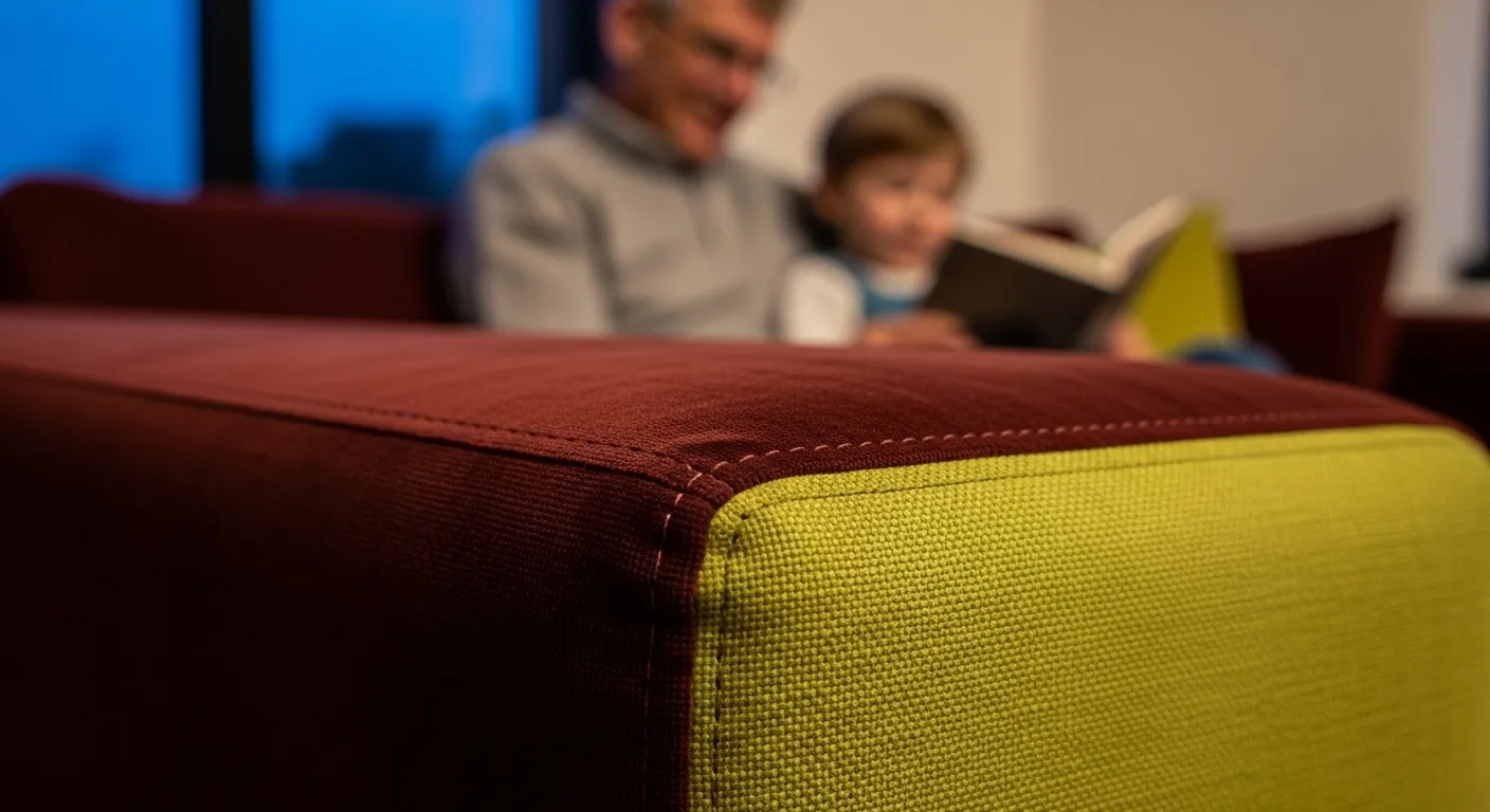
This isn’t about creating an unpleasant space. It’s about the confident, artful use of unexpected combinations that break the conventional rules of color theory. Think of a room anchored by walls in a deep, moody oxblood, accented with furniture in a sharp, acidic chartreuse. Or a pairing of dusty lilac with a bold, burnt orange. These combinations are deliberately chosen to provoke a reaction and challenge our perception of what “goes together.” They create energy and personality, pushing back against the passive, homogenous palettes that have dominated home decor.
Why now? Our visual literacy has been heightened by digital media, where bold and unusual color pairings are common in graphic design and branding. We are becoming more comfortable with visual complexity. Furthermore, advanced digital tools allow designers to experiment with millions of color combinations, visualizing these “wrong” pairings in realistic renderings before committing. This allows for more daring choices. For homeowners, the key is to use these dissonant pairings with intention. It might be a single piece of artwork, a statement armchair against a contrasting wall, or a collection of throw pillows. It’s a sign of design confidence and a powerful way to inject pure, unadulterated personality into a room.