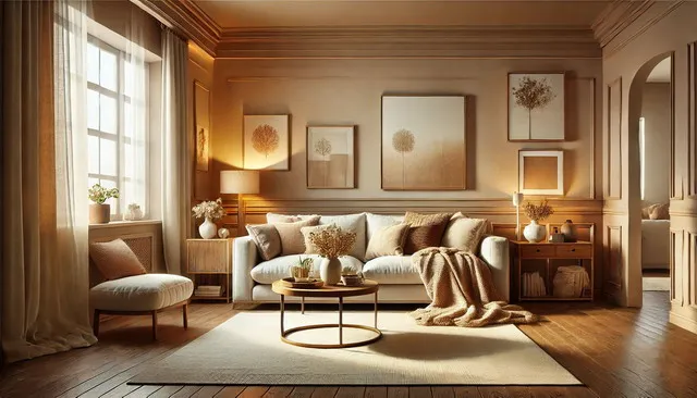
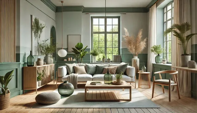
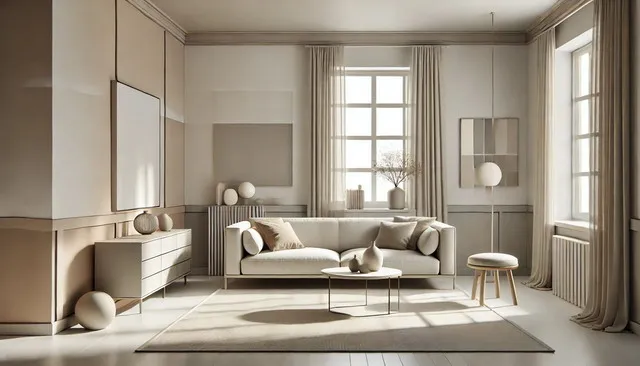
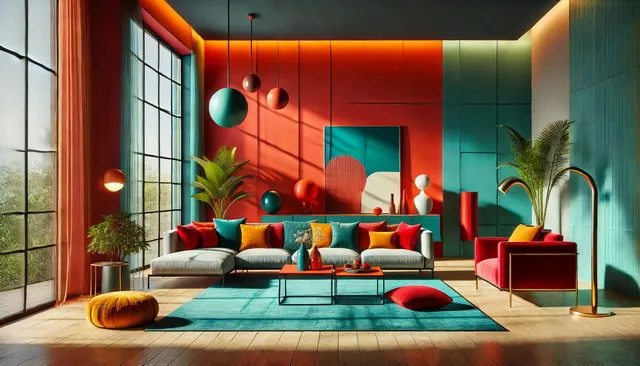
Trending interior paint colors for 2026 are set to redefine how we perceive and interact with our living spaces. As we embrace the new year, the world of interior design is vibrant with innovative color choices that reflect a blend of contemporary style, sustainability, and timeless elegance. The right paint color can dramatically transform a room, influencing its ambiance, functionality, and overall aesthetic appeal.
In 2026, the focus is on creating environments that foster well-being, creativity, and personal expression. This year’s color trends are inspired by the natural world, technological advancements, and a collective desire for spaces that offer comfort and rejuvenation. Whether you aim to craft a serene retreat, a bold statement area, or a minimalist sanctuary, the trending paint colors of 2026 provide a diverse palette to suit every taste and style.
This guide will take you through the most exciting interior paint color trends for 2026, offering insights into the latest palettes and practical advice on how to incorporate these hues into your home. From rich, earthy tones to vibrant, energizing shades, each section explores a different aspect of the 2026 color trends, helping you create a living space that is both stylish and reflective of your unique personality.
Join us as we explore the transformative power of color in interior design, guiding you to make informed, stylish choices that will enhance the beauty and functionality of your home in the year ahead.
Trending Interior Paint Color Palettes for 2026
As we approach 2026, interior paint color trends are evolving to reflect a blend of innovation and timeless elegance. The upcoming year promises a spectrum of hues that cater to diverse tastes and preferences. Whether you’re planning a complete home makeover or a subtle refresh, understanding the trending interior paint color palettes can help you make informed decisions that resonate with contemporary aesthetics.
Nature-Inspired Palettes
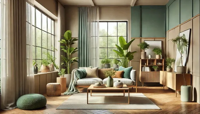
One of the most prominent trends for 2026 is the resurgence of nature-inspired color palettes. These palettes draw inspiration from the natural world, bringing the calming and rejuvenating qualities of the outdoors into our living spaces. Expect to see a lot of earthy tones such as sage green, terracotta, and warm browns. These colors not only create a soothing environment but also promote a sense of connection to nature, which is increasingly important in our fast-paced, digital world.
Soft Pastels and Muted Tones
Soft pastels and muted tones continue to dominate the color trends for 2026. These colors are perfect for creating serene and inviting spaces. Think blush pinks, soft lavenders, and muted blues. These shades work well in various rooms, from bedrooms to living areas, providing a subtle yet sophisticated backdrop that can be easily complemented with bolder accents and decor.
Bold and Vibrant Combinations
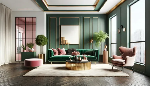
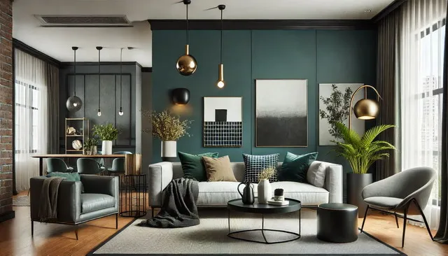
For those who prefer a more daring approach, bold and vibrant color combinations are making a significant impact. Jewel tones like emerald green, sapphire blue, and rich burgundy are being paired with contrasting hues to create dynamic and eye-catching interiors. This trend is all about making a statement and adding a touch of drama to your spaces. These bold palettes are particularly effective in larger rooms where they can truly stand out and transform the ambiance.
Neutral Grounding
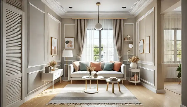
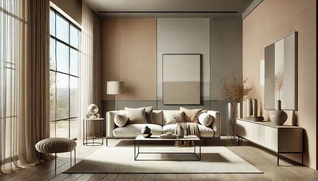
Neutrals are a timeless choice, and in 2026, they’re being used in innovative ways. Warm neutrals such as beige, taupe, and creamy whites are being paired with both vibrant and muted tones to create balanced and harmonious interiors. These neutral shades serve as a grounding element, allowing other colors in the palette to shine. This trend highlights the versatility of neutrals, proving that they can be both understated and impactful.
Monochromatic Schemes
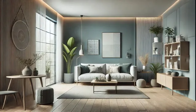
Monochromatic color schemes are gaining popularity for their simplicity and elegance. This trend involves using varying shades of a single color to create depth and interest. For example, different tones of blue can be used to create a cohesive yet dynamic look. This approach is particularly effective in modern and minimalist interiors, where the focus is on clean lines and a cohesive color story.
How to Choose the Right Palette
Selecting the right color palette for your home can be a daunting task. Here are a few tips to help you make the best choice:
- Consider the Mood: Think about the mood you want to create in each room. Soft pastels and muted tones are great for creating a calming atmosphere, while bold and vibrant colors can energize a space.
- Lighting: The amount of natural light in a room can significantly impact how colors appear. Test paint samples in different lighting conditions to see how they change throughout the day.
- Existing Decor: Consider your existing furniture and decor. Ensure that the new color palette complements the items you already have to create a cohesive look.
- Personal Preference: Ultimately, your home should reflect your personal style. Choose colors that you love and that make you feel comfortable.
Modern Interior Paint Color Trends for 2026
As we move into 2026, modern interior paint color trends are all about embracing individuality and making bold statements while maintaining a sense of harmony and balance. The modern aesthetic is characterized by clean lines, minimalism, and functionality, but this year, it’s also about infusing spaces with personality and warmth through innovative color choices. Here’s a look at some of the key modern interior paint color trends set to define 2026.
Rich, Deep Tones
Rich, deep tones are making a significant comeback in modern interior design. Colors like navy blue, forest green, and charcoal gray are being used to create dramatic, yet sophisticated spaces. These colors work well in both large and small rooms, adding depth and a sense of coziness. When paired with sleek, modern furniture and metallic accents, these deep hues can make a bold, contemporary statement.
Muted Earthy Colors
Muted earthy colors are another trend gaining traction in 2026. Shades like clay, olive green, and warm beige bring a touch of nature indoors, promoting a serene and grounded environment. These colors are perfect for creating a modern, yet timeless look. They pair beautifully with natural materials such as wood, stone, and leather, enhancing the overall aesthetic of a space.
Warm Neutrals
While cool grays and stark whites have dominated the modern design landscape for years, warm neutrals are now taking center stage. Colors like creamy ivory, soft taupe, and sandy beige are replacing the cooler tones, adding a layer of warmth and comfort to modern interiors. These shades create a welcoming atmosphere and are incredibly versatile, working well with a variety of design styles and color schemes.
Bold Accents
In 2026, modern interiors are not shying away from bold accent colors. Bright, vibrant hues like coral, teal, and mustard yellow are being used as accent walls, in artwork, and in furniture pieces to add pops of color and visual interest. These bold accents can break the monotony of neutral backgrounds and inject a sense of energy and creativity into a space.
Monochromatic Schemes
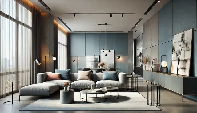
Monochromatic color schemes are a hallmark of modern design, and they continue to be popular in 2026. This trend involves using different shades and tints of a single color to create a cohesive and sophisticated look. For example, various tones of gray or blue can be layered throughout a room to add depth and dimension. This approach simplifies the design process while still achieving a polished, modern look.
Innovative Uses of Color
Modern design in 2026 is also about experimenting with unconventional uses of color. This includes painting ceilings in bold colors, creating geometric patterns on walls, and using color-blocking techniques to define different areas within an open-plan space. These innovative applications of paint allow homeowners to express their creativity and add unique touches to their interiors.
How to Incorporate Modern Colors
Incorporating modern paint color trends into your home can be both exciting and challenging. Here are a few tips to help you navigate the process:
- Start with a Neutral Base: Use warm neutrals as your primary color to create a balanced and cohesive foundation. This allows you to easily add bold accents and rich tones without overwhelming the space.
- Use Accent Walls: Choose a single wall to highlight with a bold, deep color. This can create a focal point and add interest without dominating the room.
- Experiment with Patterns: Don’t be afraid to try geometric patterns or color-blocking techniques. These can add a modern edge and make your space feel more dynamic.
- Balance with Natural Elements: Pair modern colors with natural materials like wood and stone to create a harmonious blend of contemporary and organic elements.
Best Interior Paint Colors for Small Spaces in 2026
Designing small spaces can be a challenge, but with the right paint colors, you can transform even the most compact areas into stylish and functional living spaces. In 2026, the trends for small spaces focus on maximizing light, creating an illusion of more space, and adding personality without overwhelming the room. Here are the best interior paint colors for small spaces in 2026 and how to use them effectively.
Light and Airy Neutrals
Light and airy neutrals remain a top choice for small spaces in 2026. Colors like soft white, light beige, and pale gray can make a room feel larger and more open. These colors reflect light, creating a bright and airy atmosphere. They serve as a perfect backdrop for various decor styles and can be easily paired with other colors and textures.
Soft Pastels
Soft pastels are making a significant impact in small space design. Shades like blush pink, soft lavender, and mint green add a subtle touch of color without overpowering the room. These hues can make a space feel more inviting and cheerful. Pastels are versatile and can be used in various ways, from painting all walls to creating accent areas that draw the eye.
Cool Blues and Greens
Cool colors like blue and green are excellent choices for small spaces. They have a calming effect and can make a room feel more spacious. Light shades of blue, such as sky blue or powder blue, are particularly effective in bedrooms and bathrooms. Similarly, light green shades like sage or mint can bring a refreshing and tranquil vibe to any small space.
Bold Accents
While light colors are generally preferred for small spaces, bold accents can add character and depth. In 2026, using bold colors like navy blue, emerald green, or even black on a single wall or in small areas can create a striking focal point. This technique adds dimension and breaks up the monotony of lighter colors, making the space feel more dynamic.
Monochromatic Schemes
Monochromatic color schemes are a smart choice for small spaces. By using different shades of the same color, you can create a cohesive and visually pleasing look. For example, various shades of gray or blue can be used to add depth and interest without making the space feel cluttered. This approach also helps to unify the room, making it appear larger.
Reflective Surfaces
Incorporating reflective surfaces alongside your chosen paint colors can enhance the sense of space. Metallic finishes, glossy paints, and mirrors can reflect light and add a touch of elegance to small rooms. Consider using glossy white paint on trim or incorporating metallic accents to complement your main color scheme.
Vertical Stripes
Vertical stripes are a timeless trick for making a room feel taller. In 2026, this technique remains popular, with many opting for subtle, tone-on-tone stripes to add height without overwhelming the space. Whether you choose to paint stripes on all walls or just one, this method can make a noticeable difference in how spacious the room feels.
How to Choose the Right Color for Your Small Space
Selecting the right paint color for a small space involves considering several factors:
- Natural Light: Assess the amount of natural light the room receives. Light colors work best in rooms with limited natural light, while darker colors can be used in spaces with ample sunlight.
- Room Function: Consider the function of the room. Bedrooms benefit from calming colors like soft blues and greens, while kitchens and living rooms can handle more vibrant hues.
- Personal Style: Your personal style should always be a guiding factor. Choose colors that you love and that reflect your personality.
- Complementary Decor: Ensure that your chosen paint colors complement your existing furniture and decor. A cohesive look will make the space feel more unified and larger.
Warm and Cozy Interior Paint Colors for 2026
Creating a warm and cozy atmosphere in your home is all about choosing the right paint colors that evoke feelings of comfort and relaxation. In 2026, the trends for warm and cozy interior paint colors are inspired by natural elements, rich earthy tones, and inviting shades that make your space feel like a sanctuary. Here are some of the top warm and cozy paint colors for 2026 and how to use them effectively.
Earthy Tones
Earthy tones are at the forefront of warm and cozy interior paint trends for 2026. Colors like terracotta, burnt sienna, and warm taupe bring a grounded, natural feel to any room. These shades mimic the colors found in nature, creating a serene and inviting environment. Use these colors in living rooms, bedrooms, or any space where you want to relax and unwind.
Rich, Warm Browns
Rich, warm browns are making a comeback in 2026. Shades like chocolate brown, caramel, and deep mocha add a sense of depth and richness to your interiors. These colors work particularly well in larger rooms and open-plan spaces, where they can create a cozy atmosphere without making the space feel cramped. Pair these warm browns with wooden furniture and soft textiles to enhance the coziness.
Soft, Warm Neutrals
Warm neutrals like creamy ivory, soft beige, and warm gray are perfect for creating a cozy backdrop in any room. These colors provide a versatile foundation that can be easily dressed up with colorful accents or kept simple for a minimalist look. Warm neutrals reflect light well, making rooms feel brighter and more spacious while still maintaining a cozy ambiance.
Cozy Reds and Oranges
Cozy reds and oranges are excellent choices for adding warmth and energy to a space. Shades like rust, cinnamon, and pumpkin spice can make a room feel inviting and vibrant. These colors are perfect for accent walls, dining rooms, and kitchens, where they can stimulate conversation and create a welcoming atmosphere. When using these bold colors, balance them with neutral tones to avoid overwhelming the space.
Warm Yellows and Golds
Warm yellows and golds bring a touch of sunshine into your home, making any space feel brighter and more cheerful. Colors like mustard yellow, goldenrod, and honey create a warm and welcoming environment. These shades are ideal for living rooms, kitchens, and entryways, where they can make a strong first impression and uplift the mood of the entire home.
Deep, Cozy Greens
Deep, cozy greens like olive, sage, and forest green are trending in 2026. These colors evoke the tranquility of nature and create a calming, cozy atmosphere. Use these greens in bedrooms, home offices, or reading nooks to create a serene and restful environment. Pair them with natural materials like wood and linen to enhance the earthy, cozy feel.
How to Use Warm and Cozy Colors
Incorporating warm and cozy colors into your home can transform your space into a comforting retreat. Here are some tips on how to use these colors effectively:
- Layering Shades: Combine different shades of warm colors to create depth and interest. For example, pair a warm neutral with a rich brown or a cozy red for a sophisticated look.
- Accent Walls: Use a warm, bold color on a single wall to create a focal point and add warmth without overwhelming the entire room.
- Complementary Textures: Enhance the cozy feel by incorporating soft textiles, such as wool throws, velvet cushions, and plush rugs, in complementary colors.
- Natural Elements: Combine warm paint colors with natural materials like wood, stone, and woven fibers to create a harmonious and inviting space.
- Lighting: Warm lighting can enhance the effect of warm paint colors. Use soft, yellow-toned lighting to create a cozy ambiance in the evenings.
Eco-Friendly Interior Paint Colors for 2026
As environmental awareness continues to grow, eco-friendly interior paint colors are becoming increasingly popular in 2026. Homeowners are seeking paints that not only enhance their living spaces but also have minimal impact on the environment. This trend combines aesthetics with sustainability, offering a palette of colors that are both beautiful and eco-conscious. Here are some of the top eco-friendly interior paint colors for 2026 and how to incorporate them into your home.
Natural Greens
Natural greens are a top choice for eco-friendly interior paint colors. Shades like moss green, sage, and fern bring the tranquility and freshness of nature indoors. These colors are derived from natural pigments, making them a sustainable option. Green is also known for its calming properties, making it ideal for bedrooms, living rooms, and home offices. Pair natural greens with wooden furniture and organic textiles to enhance the eco-friendly vibe.
Earthy Browns and Beiges
Earthy browns and beiges are perfect for creating a warm and inviting atmosphere while keeping sustainability in mind. Colors like sandy beige, clay, and walnut are made from natural earth pigments, reducing the environmental impact of synthetic dyes. These shades work well in any room, providing a neutral backdrop that can be easily paired with other eco-friendly materials like bamboo, jute, and reclaimed wood.
Soft Blues
Soft blues, such as sky blue, seafoam, and pale aqua, are trending in 2026 for their soothing and serene qualities. These colors evoke the calmness of water and the sky, promoting relaxation and well-being. Eco-friendly paint options in these shades often use non-toxic, low-VOC (volatile organic compounds) formulas, ensuring better indoor air quality. Use soft blues in bathrooms, bedrooms, and meditation spaces for a tranquil retreat.
Warm Neutrals
Warm neutrals, including ivory, almond, and warm gray, are versatile and timeless. These colors provide a subtle elegance and can be used throughout the home. Eco-friendly paints in these shades are often made with natural ingredients and sustainable manufacturing processes. Warm neutrals are perfect for creating a cohesive and harmonious look that complements various decor styles.
Vibrant Earth Tones
For those who want to add a pop of color while staying eco-friendly, vibrant earth tones like terracotta, ochre, and rust are excellent choices. These rich, warm colors bring energy and personality to a space. Eco-friendly options in these shades use natural pigments and low-impact production methods. Use vibrant earth tones as accent walls, in dining areas, or to highlight architectural features.
Soft Pastels
Soft pastels, such as blush pink, lavender, and mint, are not only trendy but also environmentally friendly when sourced from natural pigments. These gentle hues add a touch of whimsy and lightness to a room, making them ideal for nurseries, bedrooms, and creative spaces. Eco-friendly pastel paints are often free from harmful chemicals, ensuring a safer environment for you and your family.
How to Choose Eco-Friendly Paint
When selecting eco-friendly paint, consider the following tips to ensure you are making a sustainable choice:
- Check for Low VOCs: VOCs are chemicals that can off-gas from paint, affecting indoor air quality. Look for paints labeled as low-VOC or zero-VOC to minimize health risks and environmental impact.
- Natural Ingredients: Choose paints made from natural ingredients such as plant oils, clay, and mineral pigments. These paints are biodegradable and less harmful to the environment.
- Sustainable Brands: Support brands that prioritize sustainability in their production processes, packaging, and business practices. Many companies now offer eco-friendly paint lines that meet high environmental standards.
- Certifications: Look for certifications from reputable organizations such as GreenGuard, LEED, and EcoLogo, which ensure that the paint meets strict environmental and health criteria.
Incorporating Eco-Friendly Colors
Integrating eco-friendly paint colors into your home can be both stylish and sustainable. Here are some ideas on how to use these colors effectively:
- Accent Walls: Create a focal point with an accent wall in a vibrant earth tone or natural green. This adds interest without overwhelming the space.
- Complementary Decor: Pair eco-friendly paint colors with sustainable decor items like organic cotton fabrics, reclaimed wood furniture, and energy-efficient lighting.
- Layering Textures: Use different textures and materials in complementary colors to add depth and dimension to your eco-friendly color scheme.
- Natural Light: Maximize natural light to enhance the beauty of eco-friendly paint colors. Large windows, skylights, and light-colored curtains can help brighten your space.
Minimalist Interior Paint Color Trends for 2026
The minimalist design philosophy emphasizes simplicity, functionality, and the beauty of uncluttered spaces. In 2026, minimalist interior paint color trends are about creating serene, elegant, and timeless environments with carefully chosen hues that reflect tranquility and sophistication. Here’s a look at the top minimalist paint color trends for 2026 and how to effectively incorporate them into your home.
Crisp Whites
Crisp whites remain a staple in minimalist interior design. Shades like pure white, snow white, and ivory create a clean, airy atmosphere that makes any space feel larger and more open. These colors serve as a blank canvas, allowing you to focus on the architectural features and minimalist decor elements of your home. White walls are perfect for reflecting natural light, enhancing the brightness of a room, and providing a sense of purity and simplicity.
Soft Grays
Soft grays are a popular choice for minimalist interiors in 2026. Colors like dove gray, ash, and silver offer a subtle, sophisticated look that adds depth without overwhelming the space. These neutral shades pair well with a variety of materials and textures, making them versatile for different rooms. Gray walls can create a calming backdrop that complements minimalist furniture and decor, enhancing the overall aesthetic.
Muted Pastels
Muted pastels are gaining traction in minimalist design for their ability to add a hint of color without disrupting the serene atmosphere. Shades like soft blush, pale mint, and light lavender bring a gentle warmth to the space. These colors work well in bedrooms, bathrooms, and living areas, providing a subtle contrast to the more traditional white and gray palettes. Muted pastels can add a touch of personality while maintaining the minimalist ethos of simplicity and restraint.
Warm Neutrals
Warm neutrals, including beige, taupe, and warm ivory, are essential for creating a cozy and inviting minimalist space. These colors add warmth and depth without cluttering the visual aesthetic. Warm neutrals can make a minimalist home feel more welcoming and comfortable, particularly in living rooms and bedrooms. Pair these shades with natural materials like wood, linen, and leather to enhance the organic, grounded feel.
Greige
Greige, a blend of gray and beige, is a trending color in minimalist interiors for 2026. This versatile hue combines the sophistication of gray with the warmth of beige, creating a balanced and harmonious look. Greige is perfect for those who want a neutral backdrop with a bit more depth and complexity. It works well in any room and pairs beautifully with both cool and warm tones, making it a flexible choice for minimalist homes.
Deep Charcoals
For those who prefer a bolder approach to minimalist design, deep charcoals and blacks are making a significant impact. These dark shades can create a dramatic, yet elegant look that adds a touch of sophistication. Use deep charcoals as accent walls or in spaces where you want to make a statement, such as dining rooms or home offices. When paired with lighter colors and minimalist decor, these dark hues can add a striking contrast and elevate the overall design.
How to Incorporate Minimalist Colors
Incorporating minimalist paint colors into your home requires thoughtful consideration of how each color will interact with your space and decor. Here are some tips to help you achieve a minimalist look with these trending colors:
- Limit the Color Palette: Stick to a limited color palette to maintain the simplicity and cohesion of your design. Choose a few neutral shades and use them consistently throughout your home.
- Use Accent Colors Sparingly: Introduce accent colors sparingly to add interest and depth. Muted pastels or deep charcoals can be used as accents to create focal points without overwhelming the space.
- Focus on Texture: In a minimalist design, texture plays a crucial role in adding dimension and interest. Use different materials and finishes, such as matte and glossy paints, to create subtle variations and enhance the visual appeal.
- Maximize Natural Light: Leverage natural light to highlight the simplicity and elegance of minimalist colors. Large windows, skylights, and light-colored curtains can help brighten your space and make it feel more open.
- Complement with Minimalist Decor: Pair your minimalist color scheme with simple, functional furniture and decor. Choose pieces with clean lines, minimal ornamentation, and a focus on quality and craftsmanship.
Bold and Vibrant Interior Paint Colors for 2026
In 2026, bold and vibrant interior paint colors are making a significant impact in home design. These colors are all about making a statement, adding energy, and creating focal points that draw the eye. If you’re looking to inject some personality and excitement into your space, these trending colors are for you. Here’s a look at the top bold and vibrant interior paint colors for 2026 and how to use them effectively.
Jewel Tones
Jewel tones like emerald green, sapphire blue, and amethyst purple are trending in 2026 for their rich, luxurious feel. These colors bring depth and opulence to a room, making them perfect for spaces where you want to create a dramatic effect. Jewel tones work well in living rooms, dining rooms, and bedrooms, adding a sense of sophistication and glamour. Pair them with metallic accents and plush fabrics to enhance their luxurious appeal.
Fiery Reds
Fiery reds such as crimson, cherry, and scarlet are making a bold comeback. These vibrant hues add passion and warmth to any space. Red is a powerful color that can energize a room and stimulate conversation, making it ideal for dining areas, living rooms, and kitchens. When using red, balance it with neutral tones and soft textures to prevent it from becoming overwhelming.
Electric Blues
Electric blues, including cobalt, turquoise, and peacock blue, are perfect for creating a striking and modern look. These vibrant shades bring a sense of freshness and vitality to a space. Electric blues work particularly well in contemporary settings, adding a pop of color that feels both bold and sophisticated. Use these blues in accent walls, furniture, or decor to create focal points that capture attention.
Sunny Yellows
Sunny yellows like mustard, gold, and lemon are trending for their cheerful and uplifting qualities. These bright hues bring a sense of warmth and optimism to a room. Yellow is ideal for spaces that need a boost of energy, such as kitchens, home offices, and playrooms. Pair yellow with white or gray to create a balanced and harmonious look that feels fresh and inviting.
Vibrant Oranges
Vibrant oranges, including tangerine, burnt orange, and coral, are perfect for adding a touch of playfulness and creativity to a space. These bold colors can make a room feel lively and dynamic. Orange is a versatile color that can be used in various settings, from modern to bohemian. Use it in living rooms, entryways, or as an accent color to create a warm and welcoming environment.
Bold Purples
Bold purples like royal purple, violet, and magenta are making waves in 2026. These colors add a sense of mystery and luxury to a room. Purple is often associated with creativity and imagination, making it an excellent choice for home offices, studios, and bedrooms. Pair bold purples with gold or silver accents to enhance their regal feel.
How to Use Bold and Vibrant Colors
Incorporating bold and vibrant colors into your home can transform your space, but it requires careful planning to ensure the look is cohesive and not overwhelming. Here are some tips for using these striking colors effectively:
- Accent Walls: Use bold colors on a single wall to create a focal point without overwhelming the entire room. This approach works well in living rooms, bedrooms, and dining areas.
- Color Blocking: Combine multiple bold colors in a color-blocking scheme to create a dynamic and modern look. Use contrasting colors to add interest and energy.
- Furniture and Decor: Incorporate bold colors through furniture and decor items. A vibrant sofa, colorful artwork, or bold cushions can add pops of color without committing to painting entire walls.
- Balance with Neutrals: Balance bold colors with neutral tones like white, gray, or beige to create a harmonious look. Neutrals can help to ground the space and prevent it from feeling too chaotic.
- Lighting: Ensure that the room has adequate lighting to enhance the effect of bold colors. Natural light can help to bring out the vibrancy of the colors, while artificial lighting can be used to create different moods.
- Texture and Patterns: Use different textures and patterns to complement bold colors. Textured walls, patterned rugs, and mixed-material furniture can add depth and interest to a vibrant color scheme.
Neutral Interior Paint Color Trends for 2026
Neutral colors have always been a timeless choice in interior design due to their versatility and ability to create a calming atmosphere. In 2026, neutral interior paint color trends are evolving to incorporate more warmth and subtle variations, moving away from the cooler grays of the past. These colors serve as a perfect backdrop for various decor styles, allowing you to create a cohesive and inviting home. Here’s a look at the top neutral paint color trends for 2026 and how to use them effectively.
Warm Beiges and Taupes
Warm beiges and taupes are making a significant comeback in 2026. These shades offer a cozy, inviting feel that’s perfect for creating a welcoming home environment. Colors like sandy beige, warm taupe, and camel add a touch of warmth and sophistication to any room. These hues work well in living rooms, bedrooms, and dining areas, where they can create a neutral yet rich backdrop that complements various decor styles.
Soft Creams and Ivories
Soft creams and ivories are ideal for those who want a light, airy feel without the starkness of pure white. These colors add a subtle warmth and elegance to a space, making it feel more inviting. Shades like cream, ivory, and vanilla are perfect for any room in the house, providing a versatile canvas that can be easily dressed up with colorful accents or kept simple for a minimalist look.
Greige
Greige, a blend of gray and beige, continues to be a popular choice in 2026. This versatile hue combines the best of both worlds, offering the warmth of beige with the modernity of gray. Greige is an excellent choice for any room, providing a neutral backdrop that pairs well with a wide range of colors and materials. It’s particularly effective in creating a sophisticated and cohesive look in open-plan living spaces.
Soft Grays
While warmer neutrals are trending, soft grays still have a place in 2026’s color palette. Colors like dove gray, pearl gray, and silver offer a sleek, modern aesthetic that’s perfect for contemporary interiors. Soft grays are incredibly versatile and can be used in any room to create a calming and elegant atmosphere. Pairing gray with white trim and natural wood accents can enhance the overall look, adding depth and interest.
Muted Sage and Olive
Muted shades of sage and olive are emerging as popular neutrals in 2026. These colors bring a touch of nature indoors, offering a soothing and earthy feel. Muted greens work well in bedrooms, bathrooms, and living rooms, where they can create a tranquil and relaxing environment. Pair these shades with natural materials like wood, stone, and linen to enhance the organic, grounded feel.
Warm Whites
Warm whites, such as antique white, alabaster, and linen white, are perfect for those who prefer a light and bright space with a hint of warmth. These shades avoid the coldness of pure white while still offering a clean, fresh look. Warm whites are ideal for kitchens, bathrooms, and hallways, where they can maximize light and create a spacious feel. They also serve as a perfect backdrop for bold decor and artwork.
How to Use Neutral Colors
Incorporating neutral paint colors into your home can create a timeless and versatile foundation for your interior design. Here are some tips on how to use these trending neutral colors effectively:
- Layering Shades: Combine different shades of neutral colors to add depth and interest to a room. For example, use a warm beige on the walls with soft cream trim and ivory furniture.
- Textured Finishes: Use textured finishes, such as matte, satin, or eggshell, to add subtle variations and enhance the richness of neutral colors. Textured walls can create a more dynamic and visually appealing space.
- Accent Colors: Introduce accent colors through decor items like cushions, rugs, and artwork to add pops of color and personality. Neutrals provide a perfect backdrop for bold and vibrant accents.
- Natural Materials: Pair neutral colors with natural materials like wood, stone, and metal to create a harmonious and balanced look. These materials can add warmth and texture to neutral spaces.
- Lighting: Use warm lighting to enhance the effect of neutral colors. Soft, yellow-toned lighting can make a room feel cozier and more inviting, especially in the evenings.
- Minimalist Approach: Embrace a minimalist approach by using neutral colors to create a clean and uncluttered look. Focus on quality over quantity, and choose decor pieces that add value and style without overwhelming the space.
Interior Paint Colors Inspired by Nature for 2026
In 2026, there’s a significant trend towards bringing the outside in, with interior paint colors inspired by nature. These hues not only create a calming and serene environment but also help foster a sense of connection to the natural world. From earthy tones to botanical greens, nature-inspired colors are set to dominate the interior design landscape. Here’s a look at the top interior paint colors inspired by nature for 2026 and how to use them effectively in your home.
Earthy Browns and Terracottas
Earthy browns and terracotta shades are perfect for creating a warm, grounded atmosphere. Colors like burnt sienna, clay, and chocolate brown evoke the rich hues of the earth, making any space feel more cozy and inviting. These shades are particularly effective in living rooms and bedrooms, where they can add a sense of warmth and comfort. Pair these colors with natural materials like wood and stone to enhance their organic appeal.
Forest Greens and Mossy Hues
Forest greens and mossy hues bring the tranquility of the forest into your home. Shades like deep green, sage, and moss are perfect for creating a calming, nature-inspired retreat. These colors work well in any room, providing a sense of peace and relaxation. Forest greens are particularly effective in bedrooms and bathrooms, where they can promote a restful environment. Combine these greens with natural fibers and plants to create a cohesive look.
Ocean Blues and Aquatic Tones
Ocean blues and aquatic tones are ideal for bringing the refreshing feel of the sea into your home. Colors like turquoise, teal, and navy can create a serene and soothing atmosphere, reminiscent of coastal landscapes. These shades are perfect for bathrooms, bedrooms, and living areas, where they can add a touch of tranquility. Pair ocean blues with sandy neutrals and light wood finishes to enhance the coastal vibe.
Sunny Yellows and Golden Sands
Sunny yellows and golden sands are great for adding a touch of warmth and brightness to any room. Colors like mustard yellow, goldenrod, and soft amber evoke the warmth of the sun and the richness of sandy beaches. These hues are perfect for kitchens, dining rooms, and entryways, where they can create a welcoming and cheerful atmosphere. Pair these colors with white or cream accents to create a balanced and harmonious look.
Sky Blues and Soft Grays
Sky blues and soft grays are perfect for creating a light, airy feel in your home. Colors like baby blue, slate gray, and soft lavender evoke the expansive feel of the sky, making rooms feel more open and spacious. These shades are ideal for any room in the house, providing a versatile backdrop that can be easily paired with other colors and materials. Sky blues and soft grays work particularly well in living rooms and home offices, where they can create a serene and productive environment.
Earth Tones and Warm Neutrals
Earth tones and warm neutrals, such as beige, taupe, and warm gray, are essential for creating a nature-inspired aesthetic. These colors provide a neutral backdrop that complements a wide range of decor styles. Earth tones are perfect for creating a cohesive and harmonious look throughout your home. Pair these shades with natural textures like linen, wool, and rattan to enhance the organic feel.
How to Use Nature-Inspired Colors
Incorporating nature-inspired paint colors into your home can create a calming and rejuvenating environment. Here are some tips on how to use these colors effectively:
- Feature Walls: Use nature-inspired colors on a feature wall to create a focal point and add interest to a room. This technique works well in living rooms, bedrooms, and dining areas.
- Natural Textures: Combine nature-inspired colors with natural textures like wood, stone, and plants to create a cohesive look. These materials can enhance the organic feel of the colors.
- Layering Shades: Layer different shades of nature-inspired colors to add depth and dimension to a room. For example, pair forest green walls with moss green accents and natural wood furniture.
- Complementary Decor: Use complementary decor items like cushions, rugs, and artwork to enhance the nature-inspired color scheme. Choose pieces that reflect the colors and textures of the natural world.
- Maximize Natural Light: Maximize natural light to enhance the effect of nature-inspired colors. Large windows, skylights, and light-colored curtains can help brighten your space and bring the outdoors in.
- Accent Colors: Introduce accent colors through accessories and decor to add pops of color and personality. For example, use sunny yellows and ocean blues as accent colors in a primarily neutral room.
Trending Accent Wall Paint Colors for 2026
Accent walls are a fantastic way to add character and depth to any room without overwhelming the entire space with bold colors. In 2026, the trend for accent wall paint colors is all about making a statement while maintaining a cohesive design aesthetic. Whether you want to create a focal point, add a pop of color, or introduce texture, the following trending accent wall paint colors will help you achieve a stylish and contemporary look.
Deep Navy
Deep navy is a sophisticated and timeless choice for an accent wall. This rich, dark blue hue adds depth and drama to a space while remaining versatile enough to complement various color schemes. Deep navy works well in living rooms, bedrooms, and dining areas, where it can create a striking contrast against lighter walls and furnishings. Pair it with white trim and metallic accents for a modern, elegant look.
Forest Green
Forest green is another trending color for accent walls in 2026. This deep, earthy green brings a touch of nature indoors, creating a calming and inviting atmosphere. Forest green is perfect for bedrooms, home offices, and living rooms, where it can provide a sense of tranquility and balance. Combine this shade with natural wood finishes and botanical decor to enhance its organic appeal.
Bold Burgundy
Bold burgundy is a rich, warm color that adds a sense of luxury and sophistication to any room. This deep red hue is perfect for creating an accent wall that draws attention and adds warmth to the space. Burgundy works particularly well in dining rooms, bedrooms, and living rooms. Pair it with gold or brass accents and plush textiles to enhance its opulent feel.
Mustard Yellow
Mustard yellow is a vibrant and cheerful choice for an accent wall. This warm, golden hue brings a sense of energy and positivity to a room. Mustard yellow is ideal for kitchens, entryways, and living areas, where it can create a welcoming and lively atmosphere. Pair this color with neutral tones and natural materials for a balanced and harmonious look.
Charcoal Gray
Charcoal gray is a versatile and contemporary choice for an accent wall. This dark, muted gray adds depth and sophistication to a room without being too overpowering. Charcoal gray works well in modern and industrial interiors, providing a sleek backdrop for various decor styles. Use this color in living rooms, bedrooms, and home offices, and pair it with metallic accents and bold artwork for a chic and stylish look.
Teal
Teal is a bold and refreshing color that adds a touch of personality to any space. This vibrant blue-green hue is perfect for creating an accent wall that stands out and adds a sense of creativity and fun. Teal works well in bathrooms, bedrooms, and living rooms, where it can create a lively and dynamic atmosphere. Pair teal with neutral tones and natural textures to create a balanced and inviting space.
Warm Terracotta
Warm terracotta is a trending color for accent walls in 2026, bringing a sense of warmth and earthiness to a room. This rich, reddish-brown hue is perfect for creating a cozy and inviting atmosphere. Terracotta works well in living rooms, dining areas, and bedrooms, where it can add depth and character. Pair this color with natural wood finishes, woven textiles, and green plants to enhance its earthy appeal.
How to Use Accent Wall Colors
Using accent wall colors effectively can transform your space and create a focal point that enhances your overall design. Here are some tips for incorporating trending accent wall colors into your home:
- Choose the Right Wall: Select a wall that naturally draws attention, such as the one behind a bed, sofa, or dining table. This helps to create a focal point without overwhelming the room.
- Balance with Neutrals: Balance bold accent wall colors with neutral tones on the surrounding walls and furnishings. This ensures that the accent color stands out without clashing with other elements in the room.
- Incorporate Texture: Consider adding texture to your accent wall with techniques like shiplap, wainscoting, or wallpaper. This adds dimension and interest to the space, making the accent wall even more impactful.
- Use Complementary Decor: Enhance your accent wall color with complementary decor items such as cushions, rugs, and artwork. This helps to tie the color into the rest of the room and create a cohesive look.
- Lighting: Ensure that your accent wall is well-lit to highlight its color and texture. Use a combination of natural and artificial lighting to enhance the effect and create a warm and inviting atmosphere.
- Experiment with Patterns: Don’t be afraid to experiment with patterns on your accent wall. Stripes, geometric shapes, and floral designs can add a unique touch and make the wall even more eye-catching.

