
The Big Picture: Weaving These Trends into Your Home
Your front door does not exist in a vacuum; it serves as the critical transition point between your neighborhood environment and your personal, interior sanctuary. When evaluating these fresh front door shades, you must consider the holistic journey a guest takes when entering your home.
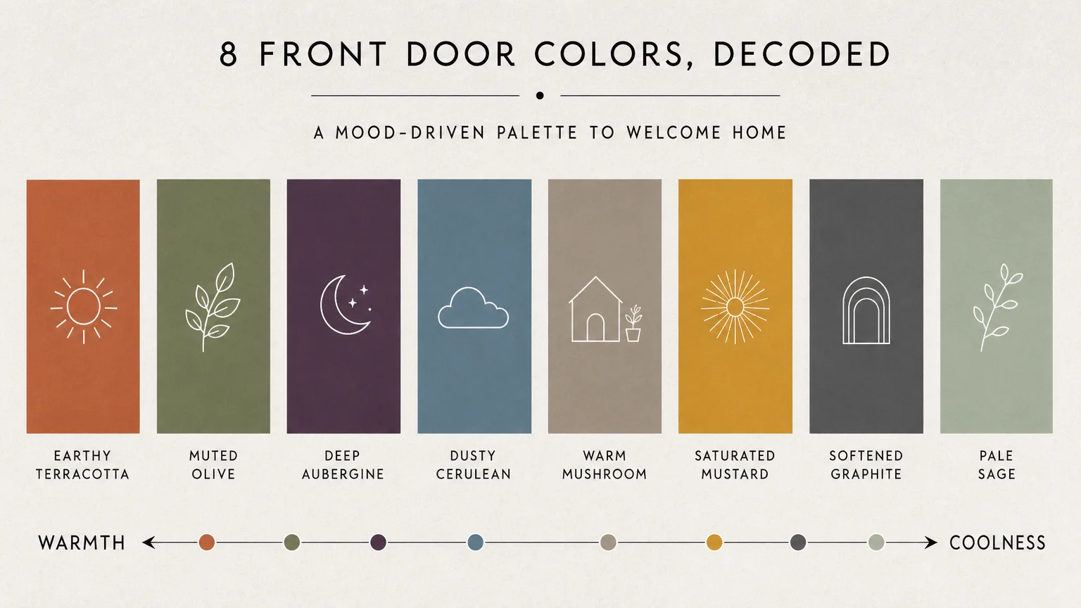
The color you select for your exterior should intuitively introduce the palette waiting in your interior foyer, living room, and dining room. If your interior leans heavily into warm, organic modernism, a terracotta or mushroom door sets the correct narrative from the curb.
Always test your exterior paint ideas before committing to a full transformation. Paint large foam boards with your top color choices and observe them outside against your doorframe. Evaluate the swatches at 8:00 AM, midday, and dusk.
Natural light dramatically alters how saturation and undertones appear; a dusty cerulean that looks perfect at noon might read as a flat gray by late afternoon.
By respecting your home’s architectural provenance and taking the time to test your colors in situ, you guarantee a sophisticated upgrade that feels both intentional and profoundly welcoming.
Frequently Asked Questions
How do I coordinate my front door color with my interior hallway palette?
Treat your front door as the prologue to your interior design story. You do not need to match the colors exactly, but they must share a cohesive undertone. If your hallway features cool, slate gray floors and crisp white walls, an aubergine or dusty cerulean door creates a logical transition. If your interior embraces warm woods and beige tones, opt for earthy terracotta or warm mushroom. Ensure the interior side of the door either matches the exterior bold color for a continuous flow or is painted to match your interior trim for a seamless, classic look.
Does sunlight exposure dictate which paint finish I should choose?
Absolutely. Doors facing south or west receive intense, direct sunlight for several hours a day. This harsh light quickly degrades lower-quality paints and aggressively highlights structural imperfections in high-gloss finishes. For high-sun exposures, a satin or semi-gloss finish formulated specifically for UV resistance offers the best longevity. Conversely, north-facing doors sit mostly in shadow, which can make colors appear flat and lifeless. A high-gloss finish on a north-facing door bounces available ambient light around, bringing vibrancy back to the shaded entryway.
What is the most effective way to test exterior paint ideas before committing?
Never test paint directly on the existing door, as the old color will alter your perception of the new swatch. Instead, purchase large, heavy-duty watercolor paper or foam core boards. Paint two coats of your chosen colors onto the boards. Tape these large swatches to your door and observe them over a 48-hour period. Pay specific attention to how the colors interact with your fixed elements—such as brickwork, roofing, and permanent hardscaping—during overcast conditions and bright, direct sunlight.
Can I apply contemporary colors to a heavily textured historic home?
Yes, contemporary colors beautifully update historic homes when chosen with respect for provenance. The secret lies in selecting muted, complex shades rather than bright, synthetic primaries. Muted olive, softened graphite, and dusty cerulean all feature the nuanced, muddy undertones characteristic of historical paint palettes. These colors feel fresh and modern but possess the visual weight and sophistication necessary to stand up to heavy stone, ornate woodwork, or classic brick facades without looking inherently out of place.
For the latest color forecasts, consult industry leaders like Pantone and paint companies like Benjamin Moore. For professional design standards, refer to the American Society of Interior Designers (ASID).
Disclaimer: This article reflects design trend analysis and predictions. Personal taste and timeless design principles should always guide your decorating choices.